DCA Ladder CalculatorThis script is a DCA (Dollar-Cost Averaging) Ladder Calculator with Risk & Leverage Management baked in.
It’s designed for both LONG and SHORT positions, and helps you:
🎯 Strategically scale into positions across multiple entry points
🔐 Control risk exposure via defined capital allocation
⚖️ Utilize leverage responsibly — for efficiency, not destruction
🧮 Visualize risk, stop loss level, and entry distribution
🔁 Adapt to trend reversals or key zones, especially when combined with reversal indicators or higher timeframe signals
🧠 How It Works
This tool takes a capital allocation approach to building a ladder of positions:
1. You define:
- Portfolio value
- Risk per trade (as %)
- Leverage
- Number of DCA levels
- Entry multiplier (e.g. 1x, 2x, 4x...)
2. The script then:
- Calculates total margin to risk = Portfolio × Risk %
- Calculates total leveraged position size = Margin × Leverage
- Distributes entries according to exponential weights (1x, 2x, 4x...), totaling 7 for 3 levels
- Calculates per-entry:
- Entry price (based on price zone spacing)
- Multiplier
- Exact margin per entry
- Leverage per entry (margin × leverage)
- Computes:
- Average entry price (margin-weighted)
- Approximate stop loss level based on recent ATR and price structure
- % drawdown to SL
- Total margin and position size
3. Displays all this in a clean on-chart table.
📈 How to Use It
1. Apply the indicator to a chart (default: 1D — ideal for clean zones).
2. Configure your:
- Portfolio Value (total trading capital)
- Risk per Trade (%) (your acceptable loss)
- Leverage (exchange or strategy-based)
- DCA Levels (e.g. 3 = anchor + 2 entries)
- Multiplier (typically 2.0 for doubling)
3. Choose LONG or SHORT mode depending on direction.
4. The table will show:
- Entry price ladder
- Margin used per entry
- Total position size
- Approx. stop loss (where your full risk is defined)
Use in conjunction with price action, S/R zones, trendline breaks, volume divergence, or reversal indicators.
✅ Best Practices for Using This Tool
- Leverage is a tool, not a weapon. Use it to scale smartly — not recklessly.
- Use fewer, higher-conviction entries. Don’t blindly ladder; combine with price structure and signals.
- Stick to your risk percent. Never risk more than you can afford to lose. Let this calculator enforce discipline.
- Combine with other confirmation tools, like RSI divergence, momentum shifts, OB zones, etc.
- Avoid martingale-style over-exposure. This is not a gambling tool — it’s for capital efficiency.
🛡️ What This Tool Does NOT Do
- This is not a trade signal indicator.
- It does not place trades or auto-manage positions.
- It does not replace personal responsibility or strategy — it's a tool to help apply structure.
⚠️ Disclaimer
This script is for educational and informational purposes only.
It does not constitute financial advice, nor is it a recommendation to buy or sell any financial instrument.
Always consult a licensed financial advisor before making investment decisions.
Use of leverage involves high risk and can lead to substantial losses.
The author and publisher assume no liability for any trading losses resulting from use of this script.
Indikator dan strategi

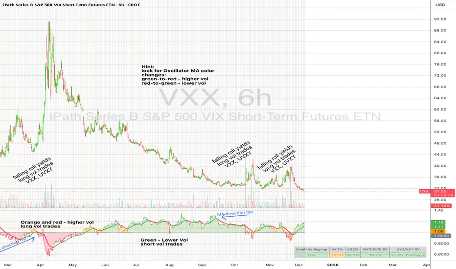
UM VIX30/VIX Regime & Volatility Roll Yield
SUMMARY
A front-of-the-curve volatility indicator that compares spot VIX to a synthetic 30-day VIX (VIX30) built from VX1/VX2 futures, revealing early volatility pressure, regime shifts, and roll-yield transitions. Ideal for timing long/short volatility trades in VXX, UVXY, SVIX, and VIX futures.
DESCRIPTION
This indicator compares spot VIX to a synthetic 30-day constant-maturity volatility estimate (“VIX30”) built from VX1 and VX2 futures. The VIX30/VIX Ratio reveals short-term volatility pressure and regime shifts that traditional VX1/VX2 roll-yield alone often misses.
VIX30 is constructed using true calendar-day interpolation between VX1 and VX2, with VX1% and VX2% showing the real-time weights behind the 30-day volatility anchor. The table displays the volatility regime, the VX1/VX2 weights, spot-term roll yield (VIX30/VIX), and futures-term roll yield (VX2/VX1), giving a complete, front-of-the-curve perspective on volatility dynamics.
Use this to spot early volatility expansions, collapsing contango, and regime transitions that influence VXX, UVXY, SVIX, VX options, and VIX futures.
HOW IT WORKS
The script calculates the exact calendar days to expiration for the front two VIX futures. It then applies linear interpolation to blend VX1 and VX2 into a 30-day constant-maturity synthetic volatility measure (“VIX30”). Comparing VIX30 to spot VIX produces the VIX30/VIX Ratio, which highlights short-term volatility pressure and regime direction. A full term-structure table summarizes regime, VX1%/VX2% weights, and both spot-term and futures-term roll yields.
DEFAULT SETTINGS
VX1! and VX2! are used by default for front-month and second-month futures. These may be manually overridden if TradingView rolls contracts early. The default timeframe is 30 minutes, and the VIX30/VIX Ratio uses a 21-period EMA for regime smoothing. The historical threshold is set to 1.08, reflecting the long-run average relationship between VIX30 and VIX.
SUGGESTED USES
• Identify early volatility expansions before they appear in VX1/VX2 roll yield.
• Confirm contango/backwardation shifts with front-of-curve context.
• Time long/short volatility trades in VXX, UVXY, SVIX, and VX options.
• Monitor regime transitions (Low → Cautionary → High) to anticipate trend inflections.
• Combine with price action, Nadaraya-Watson trends, or MA color-flip systems for higher-confidence entries.
• MA red → green flips may signal opportunities to short volatility or increase equity exposure.
• MA green → red flips may signal opportunities to go long volatility, reduce equity exposure, or take short-equity positions.
ALERTS
Alerts trigger when the ratio crosses above or below the historical threshold or when the moving-average slope flips direction. A green flip signals rising volatility pressure; a red flip signals fading or collapsing volatility. These alert conditions can be used to automate long/short volatility bias shifts or trade-entry notifications.
FURTHER HINTS
• Increasing orange/red in the table suggests an emerging higher-volatility environment.
• SVIX (inverse volatility ETF) can trend strongly when volatility decays; on a 6-hour chart, MA green flips often align with attractive short-volatility opportunities.
• For long-volatility trades, consider shrinking to a 30-minute chart and watching for MA green → red flips as early entry cues.
• Experiment with different timeframes and smoothing lengths to match your trading style.
• Higher VIX30/VIX and VX2/VX1 roll yields generally imply faster decay in VXX, UVXY, and UVIX — or stronger upside momentum in SVIX.
• The author likes the 6-hour chart for short vol, and the 30-minute chart for long vol. Long vol trades are fast and furious so you want to be quick.
Altcoin Relative Macro StrengthAltcoin Relative Macro Strength
Overview
The Altcoin Relative Macro Strength indicator measures the altcoin market's price performance relative to global macroeconomic conditions. By comparing TOTAL3ES (total altcoin market capitalization excluding Bitcoin, Ethereum and stable coins) against a composite macro trend, the indicator identifies periods of relative overvaluation and undervaluation.
Methodology
Global Macro Trend Calculation:
The macro trend synthesizes three primary components:
- ISM PMI – A proxy for the business cycle phase
- Global Liquidity – An aggregate measure of major central bank balance sheets and broad money supply
- IWM (Russell 2000) – Small-cap equity exposure, reflecting risk-on/risk-off market sentiment
Global Liquidity is calculated as:
Fed Balance Sheet - Reverse Repo - Treasury General Account + U.S. M2 + China M2
The final Global Macro Trend is:
ISM PMI × Global Liquidity × IWM
Theoretical Framework:
The global macro trend integrates liquidity expansion/contraction with business cycle dynamics and small-cap equity performance. The inclusion of IWM reflects altcoins' tendency to behave as high-beta risk assets, exhibiting sensitivity similar to small-cap equities. This composite exhibits strong directional correlation with altcoin market movements, capturing the risk-on/risk-off dynamics that drive altcoin performance.
Interpretation
Primary Signal:
The histogram displays the rolling percentage change of TOTAL3ES relative to the global macro trend (default: 21-period average). Positive divergence indicates altcoins are outperforming macro conditions; negative divergence suggests underperformance relative to the underlying economic and risk environment.
Data Tables:
Alts/Macro Change – Percentage deviation of the altcoin market's average value from the Global Macro Trend's average over the specified period
Macro Trend – Directional assessment of the macro trend based on slope and trend agreement:
🔵 BULLISH ▲ – Positive slope with upward trend
⚪ NEUTRAL → – Slope and trend direction disagree
🟣 BEARISH ▼ – Negative slope with downward trend
Macro Slope – Percentage rate of change in the global macro trend
Altcoin Valuation – Relative valuation category based on TOTAL3/Macro deviation:
🟢 Extreme Discount / Deep Discount / Discount
🟡 Fair Value
🔴 Premium / Large Premium / Extreme Premium
TOTAL3ES Mcap – Current total altcoin market capitalization (in billions)
Visual Components:
📊 Histogram: Alts/Macro Change
🟢 Green = Positive deviation (altcoins outperforming)
🔴 Red = Negative deviation (altcoins underperforming)
📈 Macro Slope Line
Color-coded to match trend assessment
Scaled for visibility (adjustable in settings)
Application
This indicator is designed to identify mean reversion opportunities by highlighting periods when the altcoin market materially diverges from fundamental macro and risk conditions. Extreme positive values may indicate overvaluation; extreme negative values may signal undervaluation relative to the prevailing economic and risk appetite backdrop.
Strategy Considerations:
- Identify extremes: Look for periods when the histogram reaches elevated positive or negative levels
- Assess valuation: Use the Altcoin Valuation reading to gauge relative over/undervaluation
Confirm with risk sentiment: Check whether macro conditions and risk appetite support or contradict current price levels
- Mean reversion: Consider that significant deviations from trend historically tend to revert
Note: This indicator identifies relative valuation based on macro conditions and risk sentiment—it does not predict price direction or timing.
Settings
Lookback Period – 21 bars (default) – Number of bars for calculating rolling averages
Macro Slope Scale – 3.0 (default) – Multiplier for macro slope line visibility

Daily Pivots (17:00 OHLC)These pivots are based on OHLC of previous 17:00 CT day (Futures reopen). If it doesn't look right try to click three dots on indicator and select "pin to right scale".

Daily Settlement High LowThis script extends a line from the high and low of the 14:59:30 CT Candle which is the CME daily settlement window for the SP500 and Emini500. Only works on the 30 second chart.

CharisTrend Indicatorthis trading indicator uses the following parameters EMA LOW (25 34 89 110 355 and 480) SMA(14 and 28) and Supertrend(14 3) for trading analysis and BUY/SELL Signals when the trade aligns.

SDFADE nuvolébasic script to signal mean reversions and alert fades when stretched to +/-2.5VWAP Standard Deviation

VWAP 1SD 2SD yasurferThis custom intraday indicator is designed to provide a detailed understanding of market equilibrium, volatility expansion, and trend structure by combining Session VWAP, Standard Deviation bands, and multi-timeframe EMAs. The script calculates cumulative volume-weighted price data throughout the trading day and automatically resets at the start of each new session. This ensures that the Session VWAP reflects only current-day trading activity, making it highly relevant for scalpers, day traders, and intraday swing setups.
The ±2 Standard Deviation bands illustrate where price is statistically stretched. These zones often act as areas of exhaustion, liquidity grabs, or potential momentum continuation points. By tracking variance around VWAP, the indicator helps traders quickly identify whether price is trading within a normal distribution or pushing into extreme territory.
A dynamic label displays the real-time percentage distance from VWAP, allowing traders to assess how far price has deviated from fair value. This is particularly useful for identifying overextended moves, mean-reversion opportunities, or breakout conditions.
The addition of EMA 50, EMA 200, and EMA 325 provides structural trend context—helping traders evaluate higher-timeframe alignment and potential confluence with VWAP levels. Overall, this indicator enhances clarity, timing, and decision-making by blending statistical tools with traditional trend analysis.

EMA Signals + HTF S/R + Diagonal (5-15m)Описание на русском
Скрипт строит две экспоненциальные скользящие средние (быструю и медленную EMA), а также SMA20 и SMA50, и использует их для генерации пошаговых сигналов входа. При пересечении EMA9 и EMA12 вверх выше SMA20 под свечой появляется зелёный круг, а когда после этого обе EMA оказываются выше SMA50, под ценой появляется плашка LONG; аналогично при пересечении вниз ниже SMA20 рисуется красный круг над свечой, и после ухода EMA под SMA50 формируется плашка SHORT.
Горизонтальные зоны поддержки и сопротивления вычисляются по пивотам старшего таймфрейма (по умолчанию 1 час) через request.security, каждая зона рисуется прямоугольником на графике и сопровождается подписью с ценой уровня и текущим количеством касаний ценой (Touches: N), которое считается на активном ТФ. Дополнительно скрипт строит одну диагональную линию поддержки: она протягивается от последнего ключевого минимума (pivot low с заданной «силой») к текущей цене и динамически обновляется при появлении нового важного минимума, рядом с линией отображается подпись Trend.
Description in English
This script combines EMA‑based signals, dynamic higher‑timeframe support/resistance zones, and a diagonal trendline from the latest key swing low. It plots two exponential moving averages (fast and slow EMA) along with SMA20 and SMA50, and uses them to create step‑by‑step entry signals: when EMA9 crosses above EMA12 while both are above SMA20, a green circle is shown below the bar, and once both EMAs move above SMA50 after that, a LONG label is printed below price; conversely, when EMA9 crosses below EMA12 while both are below SMA20, a red circle appears above the bar, and after both EMAs move below SMA50, a SHORT label is displayed above price.
Horizontal support and resistance zones are derived from pivot highs and lows on a higher timeframe (1‑hour by default) using request.security; each zone is drawn as a rectangle on the chart and annotated with the level price and the current number of touches by price (Touches: N), counted on the active timeframe. In addition, the script plots a single diagonal support line from the most recent key swing low (pivot low with configurable strength) towards the current price, updating it whenever a new important low appears, and shows a small “Trend” label near this line

Daily Range Zones: PDH/PDL with SL/TPThis indicator automatically plots the previous day's High and Low levels and projects dynamic Stop Loss (SL) and Take Profit (TP) zones based on the daily range percentage.
It is designed for traders focusing on daily range breakouts or mean reversion strategies around the Previous Day High (PDH) and Previous Day Low (PDL).
Key Features:
Level 0 & 1: Visualizes the exact High and Low of the reference timeframe (Daily).
Inner Zone (Orange): Calculated inside the range. Acts as a buffer for Stop Loss placement or entry zones for mean reversion.
Outer Zone (Purple): Calculated outside the range (extension). Acts as a primary Take Profit target for breakout trades.
Settings:
Fully customizable percentages for inner and outer zones.
Option to toggle between current day or previous day data.
Works on any timeframe (intraday charts recommended).

自定义时间竖线(北京时间) Custom Time Vertical (Beijing Time)Custom Time Vertical (Beijing Time)
Just use it to find whatever time period you want. HF!
标注出想要的时间段,使对交易时间段敏感的trader复盘更轻松。

Daily Settlement TWAPThis TWAP is reanchored to 14:59 CT everyday which is the CME settlement period for SP500 and Emini500 (14:59:30-15:00:00 CT). It has 5 standard deviations.

FTPM – Institutional Trend Pressure Suite @darshaksscThis indicator provides an informational view of market trend pressure using fractal-based momentum events, smoothed pressure calculations, higher timeframe confirmation, and divergence analysis. It does not produce buy or sell signals. Instead, it presents market context to help traders interpret trend conditions in a structured and data-driven way.
The indicator includes the following components:
1). Non-repainting Trend Pressure Engine
The pressure line is derived from confirmed fractal events, body-to-range ratios, displacement strength, and a controlled decay factor. The value is normalized to a 0 to 100 scale. A rising pressure value suggests increasing trend strength, while a declining value indicates weakening strength. This is informational only.
2). Pressure Shifts
The tool highlights transitions where pressure crosses above or below key thresholds. These labels do not represent entries or exits, but simply indicate contextual changes in momentum.
3). Higher Timeframe Pressure Confirmation
Users can compare current timeframe pressure to a selected higher timeframe. When both pressures align in similar regions, it may indicate agreement in broader market structure. This feature is informational only and does not generate trading signals.
4). Divergence Detection
Identifies confirmed bullish or bearish divergences between price pivots and pressure pivots. Divergences are simply analytical tools and should not be interpreted as actionable trading signals.
5). Institutional Dashboard
A multi-line dashboard summarizes current pressure, regime classification, higher timeframe regime, pressure direction, divergence status, and alignment conditions. The dashboard is informational only. No part of the dashboard should be interpreted as a trade instruction.
6). Dashboard Size Selector
Users may switch between Full, Medium, or Thin dashboard layouts to match their screen preferences. This affects only display, not indicator logic.
Important Notes
This indicator does not forecast future price movement.
It does not generate buy, sell, long, or short signals.
It does not guarantee profitable outcomes.
It is intended purely for visual analysis and market context.
All information is derived from confirmed historical data.
No part of this script is designed to automate trading decisions.
This tool is suitable for traders who want a clear, non-repainting visualization of pressure conditions and structural behavior without violating TradingView House Rules.
======================================================================
HOW TO USE
The indicator helps traders observe whether pressure is increasing or decreasing, whether higher timeframe conditions agree with the current chart, and whether divergences are present. All outputs are informational and should be combined with the user's preferred strategy or manual analysis. The indicator is not intended to signal trades or provide recommendations.
======================================================================
DISCLAIMERS
This indicator is for educational and informational purposes only.
It does not constitute financial advice.
It does not provide buy, sell, long, or short signals.
It does not predict future price movement.
Past performance does not guarantee future results.
======================================================================

Shezab AlgoLabs EMA Trend UtilityOverview
This tool is a clean and practical EMA trend utility built to help traders quickly understand market direction, trend regime, and momentum shifts. It plots a fast EMA and slow EMA using a branded color theme and highlights transitions between bullish and bearish conditions. The script also includes optional visual crossover markers to make regime changes easier to spot.
How it works
The relationship between the fast and slow EMA is used to classify the trend environment:
When the fast EMA is above the slow EMA, the market is considered in a bullish phase.
When the fast EMA is below the slow EMA, the market is considered in a bearish phase.
The script also provides optional:
Colored bars reflecting trend direction
Crossover labels to highlight momentum shifts
Background cloud to visually emphasize trending or neutral conditions
Optional alerts for crossover events
These visual features help traders recognize potential trend transitions without implying a complete trading system.
How to use it
This tool is designed as a supplemental decision aid. Traders can combine it with their preferred structure analysis, volume tools, oscillators, or confirmation methods. The crossover markers and alerts highlight shifts in trend behavior but are informational rather than mechanical buy/sell signals. Users should apply their own risk-management and entry criteria.
Originality
This script goes beyond a standard EMA by combining multiple elements into a single, cohesive trend-clarification tool:
• regime coloring
• optional cloud regions
• crossover markers
• visual dynamic styling using a unified aesthetic palette
It is not a mashup of existing scripts; all components are integrated specifically to support traders who prefer a simple-yet-clear visual framework for understanding trend behavior.

Helix Protocol 7 v2Helix Protocol 7 - Cascade Protection Update
Overview
This update adds Cascade Protection to Helix Protocol 7, a dual-layer defense system designed to prevent capital destruction during violent market crashes and cascading liquidation events. Mean reversion strategies are vulnerable to "catching falling knives" - buying repeatedly into a crash that keeps crashing. These protections intelligently pause buying during extreme volatility while preserving the ability to capture true bottom entries.
New Features
🛡️ Protection 1: BBWP Volatility Freeze
What it does: Monitors Bollinger Band Width Percentile (BBWP) to detect extreme volatility spikes. When BBWP exceeds the threshold (default 92%), ALL buy signals are frozen until volatility subsides.
Why it matters: During cascading liquidations (like BTC dropping from $92K to $84K in hours), BBWP spikes to extreme levels. These are precisely the moments when mean reversion buys are most dangerous. The freeze prevents buying during the chaos, then automatically unlocks when BBWP drops - allowing you to catch the actual bottom rather than averaging into a falling knife.
Settings:
BBWP Length: 7 (matches The_Caretaker's indicator)
BBWP Lookback: 100 (matches The_Caretaker's indicator)
BBWP Freeze Level: 92% (adjustable)
🛡️ Protection 2: Consecutive Buy Counter
What it does: Tracks how many buy signals have fired without an intervening sell. After reaching the maximum (default 3), additional buys are blocked until a sell signal fires and resets the counter.
Why it matters: Even after BBWP drops, a bounce might fail and continue lower. The counter ensures you can't infinitely average down into a position. It caps your exposure at 3 entries, preserving capital for better opportunities.
Settings:
Max Consecutive Buys: 3 (adjustable)
How The Protections Work Together
Buy Condition Triggered
↓
BBWP ≤ 92%? ──NO──→ ❌ BUY BLOCKED (Volatility Freeze)
↓ YES
Counter < 3? ──NO──→ ❌ BUY BLOCKED (Max Buys Reached)
↓ YES
✅ BUY SIGNAL FIRES
Counter increments (1/3 → 2/3 → 3/3)
Sell Signal Fires
↓
Counter resets to 0/3
Key Design Decision: BBWP freeze is absolute - even "EXTREME" band penetration signals cannot bypass it. This prevents the false confidence of "it's so oversold, it MUST bounce" during true market panics.
Sells are never affected by cascade protection. You always want the ability to exit positions and lock in profits during volatile rallies.
Panel Display
Two new rows in the info panel show real-time protection status:
RowExampleMeaningBBWP 87.3%OK (green)Buys allowedBBWP 94.2%FROZEN (red)Buys blockedBuy Counter2/3 (green)2 buys fired, 1 remainingBuy Counter3/3 (red)Max reached, buys blocked
Buy signal labels now display the counter: BUY: $86,360.43 CAPITULATION
New Alerts
⚠️ BBWP Freeze Activated: "CASCADE PROTECTION: BBWP hit 94.2% - Buys FROZEN"
⚠️ Max Buys Reached: "CASCADE PROTECTION: Max 3 consecutive buys reached - Buys FROZEN"
✅ BBWP Unlocked: "CASCADE PROTECTION: BBWP dropped to 88.1% - Buys UNLOCKED"
Alert JSON now includes consec_buys and bbwp fields for bot logging.
Real-World Performance
November 30 - December 1, 2025 BTC Cascade ($92K → $84K):
Without ProtectionWith Protection8+ buys during crash0 buys during crashAveraged down from $92KWaited for BBWP to dropDeep unrealized loss3 buys near $85-87K bottomCapital depletedCapital preserved
The protection blocked all panic buys during the BBWP >92% spike, then allowed exactly 3 well-timed entries after volatility subsided - capturing the actual bottom instead of the falling knife.
Configuration Recommendations
Market ConditionBBWP FreezeMax BuysStandard (default)92%3Conservative88%2Aggressive95%4
Lower BBWP threshold = More protection, may miss some entries
Higher Max Buys = More averaging allowed, higher risk
Compatibility
Bot Integration: No changes required. Protection logic executes before alerts fire.
Existing Alerts: Must delete and recreate alerts after updating indicator.
The_Caretaker's BBWP: Settings matched to ensure visual consistency between indicators.
Credits
BBWP concept and implementation inspired by The_Caretaker's Bollinger Band Width Percentile indicator. Cascade protection logic developed through analysis of November 2025 BTC market crashes.

RSI Median DeviationRSI Median Deviation
Thank you to @QuantumResearch for part of the code and inspiration!
Introduction:
With my first published indicator i wanted to start simple, so i created a RSI that has no static OB/OS signals and can act as a Momentum-Strength-Gauge.
Inspiration came from the Median Deviation Bands indicator by QuantumResearch!
TL;DR:
Traditional RSI says "70 is overbought" like it's a universal law. Guess what: it's not .
This indicator figures out where overbought and oversold actually are for your specific chart and timeframe, using real statistics.
What Makes it Different
Most RSI indicators slap horizontal lines at 70/30 and call it a day. Problem is, that works great... until it doesn't. In a strong trend, RSI can camp out above 70 for weeks. In choppy markets, it'll ping-pong across those levels.
RSI Median Deviation takes a smarter approach:
1. Adaptive zones that move with your data
2. Median + standard deviation bands (the 50th percentile ±2σ) that show where RSI is statistically extreme
3. Rare signals that actually mean something
4. Optional smoothed bands that adapt to current market conditions in real-time
Think of it like this: instead of asking "is RSI above 70?", we're asking "is RSI acting weird compared to its recent behavior?"
Key Features
- Statistical bands built from the RSI's actual median and standard deviation
- Multiple MA options (TEMA, WMA, HMA, ALMA, etc.) for smoothing.
- Dual detection modes: Pure stats OR MA bands
- Background highlighting when something genuinely extreme happens
- Diamond markers for ultra-rare RSI readings (<25 or >85)
- 9 color themes
- Works on all timeframes
How to Actually Use This Thing
1. Trend Bias
RSI line turns green above 60 (bullish bias), red below 47 (bearish bias).
2. Mean-Reversion Plays
Dark green background = RSI dropped below the lower 2σ band → statistically oversold
Dark magenta background = RSI spiked above the upper 2σ band → statistically overbought
3. Momentum Strength Gauge
Watch the distance between the smoothed RSI and the median line:
Wide gap = strong trend in play
Converging = momentum dying, consolidation likely
4. Extra Confirmation
Those diamond shapes at the top/bottom? That's RSI hitting <25 or >85 – genuinely extreme territory.
Recommended Settings:
RSI Length: 10
Median Length: 28
SD Length: 27
RSI MA Type: TEMA
RSI MA Length: 27
Band MA Type: WMA
Band Length: 37
The standard settings are optimized to have maximum use on all assets.
Works on everything, especially on daily or 4h charts for swing/position trading.
Last words:
RSI Median Deviation is the version that only gives signals if the ROC of your data is on the extreme side.
It'll give you fewer, better signals based on what's actually happening in the markets.
Perfect for traders who'd rather have quality over quantity.

teril Harami Reversal Alerts BB Touch (Wick Filter Added) teril Harami Reversal Alerts BB Touch (Wick Filter Added)
teril Harami Reversal Alerts BB Touch (Wick Filter Added) teril Harami Reversal Alerts BB Touch (Wick Filter Added) teril Harami Reversal Alerts BB Touch (Wick Filter Added)
teril Harami Reversal Alerts BB Touch (Wick Filter Added)

MACD Above Signal & Price Above VWAP IndicatorThis strategy provides a buy signal with a green arrow pointing up when three conditions are met. The MACD has to be above the signal line. The settings for MACD can be adjusted, but the default is the standard settings for MACD. The second condition is the price has to be above the VWAP line. The third condition is that the price of the current candle needs to be higher than the HIGH price of the previous candle.

Price Action Signals Filtered +EMA🚀 Price Action Signals Filtered + EMA (Dual Confirmation)
💡 Indicator Overview
This indicator is a powerful tool designed to identify potential trend reversals or continuations using Price Action Pivot signals, but it filters them with an Exponential Moving Average (EMA) to ensure dual confirmation.
The indicator's purpose is to generate signals only when a Price Action confirmation aligns with a confirmed market trend (above or below the EMA), thereby reducing noise and increasing signal reliability.
✨ Key Features and Logic
1. Price Action (Pivot) Detection
The indicator automatically detects local low (Pivot Low) and local high (Pivot High) points.
Pivot Low: A potential market bottom.
Pivot High: A potential market top.
2. Price Action Confirmation
After a Pivot is detected, the indicator waits for subsequent confirmation from the closing prices of the candles:
Bullish Confirmation: After a Pivot Low, the indicator requires N consecutive candles (where N is defined in the settings) to close above the previous candle's close. This indicates buying pressure.
**Bearish Confirmation: After a Pivot High, the indicator requires N consecutive candles to close below the previous candle's close. This indicates selling pressure.
3. Trend Filter (EMA) - Dual Confirmation! 🎯
This is the critical component. A confirmed Price Action signal must align with the trend defined by the Exponential Moving Average (EMA):
Bullish Signal (Buy): Generated ONLY if the Bullish Price Action Confirmation occurs while the price (Close) is ABOVE the EMA (default 20 periods).
Bearish Signal (Sell): Generated ONLY if the Bearish Price Action Confirmation occurs while the price (Close) is BELOW the EMA.
This serves as a dual confirmation, ensuring the signal is captured in the direction of the broader market trend.
📈 How to Use
Look for the Signal: Wait for the shape (triangle, circle, or arrow) to appear on the chart.
Verify Confirmation: Know that the signal has already passed through the dual filter: Price Action and EMA.
Bullish signals appear below the bar when the price is ABOVE the EMA.
Bearish signals appear above the bar when the price is BELOW the EMA.
Risk Management: Always use this indicator in combination with your risk management strategy and technical analysis.
📝 Additional Notes
The indicator uses barstate.isconfirmed to accurately plot signals on the candle close.
The EMA line is also plotted on the chart for visual trend verification.
This indicator is a tool only and does not constitute financial advice. Always perform your own analysis and research.

Minor Break of Structure (Minor BoS)This indicator extracts and isolates the Minor Break of Structure (BoS) logic from a full SMC framework and presents it as a clean, lightweight tool for structure-based price action traders.
Unlike traditional BOS indicators that rely on swing calculations with heavy filtering, this script uses original SMC-style minor structure logic to detect meaningful shifts in internal order flow.
A Minor BoS appears when price breaks above a minor swing high (bullish) or below a minor swing low (bearish), confirming a short-term continuation in trend direction.
Features:
Bullish Minor BoS detection
Bearish Minor BoS detection
Automatic line plotting with extend-right
Clear “Minor BoS” label with tiny footprint
Customizable line styles and colors
Lightweight & optimized for fast execution
Zero repainting on BoS confirmations
This tool is ideal for traders who want a simple, clean, and reliable structure-based signal without the noise of major structure, order blocks, liquidity sweeps, or external SMC modules.

Composite Market Momentum Indicator//@version=5
indicator("Composite Market Momentum Indicator", shorttitle="CMMI", overlay=false)
// Define Inputs
lenRSI = input.int(14, title="RSI Length")
lenMom = input.int(9, title="Momentum Length")
lenShortRSI = input.int(3, title="Short RSI Length")
lenShortRSISma = input.int(3, title="Short RSI SMA Length")
lenSMA1 = input.int(9, title="Composite SMA 1 Length")
lenSMA2 = input.int(34, title="Composite SMA 2 Length")
// Step 1: Create a 9-period momentum indicator of the 14-period RSI
rsiValue = ta.rsi(close, lenRSI)
momRSI = ta.mom(rsiValue, lenMom)
// Step 2: Create a 3-period RSI and a 3-period SMA of that RSI
shortRSI = ta.rsi(close, lenShortRSI)
shortRSISmoothed = ta.sma(shortRSI, lenShortRSISma)
// Step 3: Add Step 1 and Step 2 together to create the Composite Index
compositeIndex = momRSI + shortRSISmoothed
// Step 4: Create two simple moving averages of the Composite Index
sma1 = ta.sma(compositeIndex, lenSMA1)
sma2 = ta.sma(compositeIndex, lenSMA2)
// Step 5: Plot the composite index and its two simple moving averages
plot(compositeIndex, title="Composite Index", color=color.new(#f7cf05, 0), linewidth=2)
plot(sma1, title="SMA 13", color=color.new(#f32121, 0), linewidth=1, style=plot.style_line)
plot(sma2, title="SMA 33", color=color.new(#105eef, 0), linewidth=1, style=plot.style_line)
// Add horizontal lines for reference
hline(0, "Zero Line", color.new(color.gray, 50))

RTH Opening Range with ExtensionsTool that maps the opening range, opening range mid and extensions. Defaults are 5min OR with 1x extensions. You can customize to 1min, 5min, 15min or 30min opening ranges. Nothing complicated and certainly vibe coded with the help of Claude AI.

Institutional VWAP Suite (Lite Compatible)The **Institutional VWAP Suite (Lite Compatible)** brings true institutional volume-weighted price analysis to every trader — even on TradingView Lite/Free accounts where standard VWAP tools are restricted.
This script recreates the most important VWAP models used by banks, funds, and high-frequency desks, including:
• **Daily VWAP** (exchange-accurate)
• **Weekly VWAP** (manually accumulated)
• **Monthly VWAP** (manually accumulated)
• **Rolling Window VWAP** (array-based, fully Lite-compatible)
All calculations avoid blocked functions like `ta.sum` or session-restricted VWAP calls. Everything is built manually from volume and price to ensure accuracy across all accounts and all markets.
### Features
• Multi-timeframe VWAPs (Daily/Weekly/Monthly)
• Manual Rolling VWAP with adjustable length
• Optional VWAP bands (Lite-safe)
• Clean visuals with color-coded levels
• Optimized arrays for fast, stable performance
• Free-tier compatible — no premium functions required
This tool is designed for traders who want institutional structure, premium-level VWAP calculations, and consistent execution regardless of plan level. Perfect for scalpers, day traders, futures traders, and anyone who uses intraday volume profiles.
### Recommended Use
• Map directional bias using Daily vs Weekly VWAP
• Use Monthly VWAP for macro trend context
• Track intraday mean reversion with Rolling VWAP
• Use VWAP bands as dynamic support/resistance zones
A simple, powerful, no-restrictions VWAP engine — built for everyone.
