Balanced 0DTE Scalper [Clean]Balanced 0DTE Scalper is a professional-grade execution system designed specifically for the high-velocity world of 0DTE (Zero Days to Expiration) options trading on indices like SPY, QQQ, and IWM.
Unlike standard indicators that repaint or lag, this system uses Non-Repainting Multi-Timeframe Logic to align the institutional trend (15m) with precision entry triggers (5m). It is engineered to solve the two biggest killers of 0DTE traders: Theta Decay (holding too long) and Choppy Markets (trading without trend).
How It Works
1. The "Safety Belt" (15-Minute Trend Filter) Before any trade is taken, the system checks the confirmed 15-minute Trend and ADX (Strength).
No Repainting: It strictly uses the previous closed 15m bar to determine bias. Once a signal prints, it stays printed.
Regime Detection: It automatically blocks trades during low-volume "chop" (Low ADX) to save you from theta burn.
2. Precision Entry Triggers (5-Minute) Once the 15m trend gives the "Green Light," the system hunts for 5m setups using a confluence of:
EMA Crossovers: For immediate momentum.
VWAP Filter: Ensuring you are on the right side of institutional volume.
RSI Check: To avoid buying tops or selling bottoms.
3. Aggressive Risk Management (The "Profit Locker") 0DTE profits can vanish in seconds. This script manages the trade for you visually:
Dynamic Trailing Stop: Trails price based on candle Highs/Lows (not closes), allowing it to lock in profits at the peak of a spike.
Time Stop: If a trade stalls for 60 minutes (12 bars), the system triggers a "Time Exit." In 0DTE, time is money—if it's not working, get out.
Visual Levels: Automatically draws your Stop Loss, Target 1 (Conservative), and Target 2 (Runner) lines on the chart.
Features & Dashboard
Live Dashboard: Monitors Trend Bias, ADX Strength, RSI, and Open PnL in real-time.
On-Chart Tickets: Prints a "CALL OPEN" or "PUT OPEN" label with the exact Entry Price, Stop Loss, and Strike Suggestion.
Session Filters: Automatically avoids the first 10 minutes (Open Volatility) and the last 15 minutes (Close Chaos).
Settings Guide
Risk Mode:
Balanced (Default): The recommended blend of Trend + Momentum.
Conservative: Requires a very strong ADX trend. Fewer trades, higher win rate.
Aggressive: Ignores ADX strength. Good for FOMC/CPI days only.
Strike Suggestion: Automatically calculates the nearest Strike Price (ATM/OTM) for SPY/QQQ based on your settings.
Disclaimer
This tool is for educational purposes only. 0DTE options trading involves extreme risk of capital loss. Past performance (even with non-repainting logic) is not indicative of future results. Always manage your risk.
Indikator dan strategi

52-Week Range Dashboardthis shows the diff in % between the 52 week high and low
this is called coiling method, you may observe whenever the diff in % between 52 week high and low price is 30% or below, that's the time the script will show a move.
Thank you
have a great day

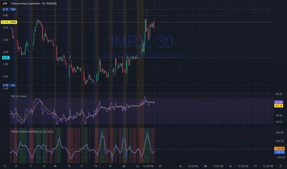
Biotech Volume Oscillator
This oscillator is percentage-based, not raw volume.
Key Levels (Rules of Thumb)
Above +25 → abnormal participation (real interest)
+10 to +25 → constructive, but not decisive
Around 0 → drift / float
Below –25 → participation drying up
These levels work well for:
Small-cap biotech
Catalyst setups
Pre-data ramps
How You’d Use This With RSI (Your Exact Setup)
Bullish / Valid Move
RSI above 50
RSI purple > yellow
Biotech Volume Osc above +10 and rising
➡️ Move has sponsorship
Fake / Suspect Move
Price up
RSI flat or diverging
Volume Osc near 0 or falling
➡️ Float + headline + thin liquidity
Distribution Signal (Very Useful)
Price makes higher high
RSI fails to confirm
Volume Osc rolls over from +25
➡️ Selling into strength
➡️ Excellent context for sell orders like your 7.75
Position Avg Line + P/L Table - SightLine LabsPosition Avg – SLL is a lightweight position-tracking indicator designed to display a persistent average price level on the chart along with a real-time position summary table.
This script is non-trading and does not generate signals, entries, or exits. It is intended strictly for position awareness and visual reference.
What this indicator does:
Plots a persistent horizontal average price line (dashed by default)
Displays a live position statistics table showing:
Shares owned
Average price
Current price
Unrealized profit/loss in dollars
Unrealized profit/loss in percent
Updates automatically as price changes
Works across all timeframes
Does not depend on broker integration or strategy logic
Key features:
Average Price Line:
User-defined average price input
Persistent across the entire chart
Adjustable color and width
Visibility toggle
Position Table:
Six selectable table positions:
Top Left, Top Center, Top Right, Bottom Left, Bottom Center, Bottom Right
Adjustable text size (Tiny through Huge)
Optional table background fill
Optional inner grid lines
Optional outer frame border
Independent color control for:
Header background
Header text
Value text
Positive and negative P/L values
Chart Overlay Options:
Optional chart background tint
Does not modify the global chart theme
Inputs overview:
Position Settings:
Shares Owned
Average Price
Visual Settings:
Show or hide average price line
Line color and width
Table Settings:
Table position
Table text size
Color Settings:
Header background and text colors
Value text color
Positive and negative P/L colors
Optional table background, grid, and frame colors
How to use:
Add the indicator to a chart
Open the settings panel
Enter the number of shares and the average price
Adjust table position, size, and colors as desired
Use the average price line and table as a visual reference for trade and risk management
Notes and limitations:
This indicator does not place trades
It does not connect to any broker
All values are manually entered
Unrealized P/L is calculated using the chart’s current price
Commissions, fees, and slippage are not included
Disclaimer:
This script is provided for educational and informational purposes only. It does not constitute financial advice, investment recommendations, or trade signals. All trading decisions are the sole responsibility of the user.
Developed by SightLine Labs.


DDDDD : EMA Pack (Matched Colors + MTF)📌 DDDDD : EMA Pack (Matched Colors + MTF)
🔹 Concept
DDDDD : EMA Pack is a clean and minimal Exponential Moving Average (EMA) overlay designed for trend structure analysis and multi-timeframe context.
This indicator focuses on visual clarity, consistent color mapping, and optional MTF EMA projection, allowing traders to read market structure without clutter or signal noise.
It is not an entry or signal generator, but a trend and regime visualization tool.
🔹 Logic
The script plots a fixed set of EMAs commonly used to define short-term momentum, intermediate trend, and long-term bias:
EMA 5
EMA 10
EMA 25
EMA 50
EMA 75
EMA 200
Each EMA is calculated using the standard exponential moving average formula.
If a higher timeframe is selected, the EMA is calculated on that timeframe and projected onto the current chart using request.security().
🔹 Methodology
Users may select:
Source price (default: close)
EMA timeframe
Empty = current chart timeframe
Any higher timeframe = true MTF EMA projection
All EMA colors are manually matched and fixed to maintain visual consistency across markets and timeframes.
Line thickness is kept uniform to avoid visual hierarchy bias.
This design ensures the indicator remains purely structural, without repainting logic, smoothing tricks, or adaptive parameters.
🔹 How to Use
Use EMA alignment and spacing to assess:
Trend direction
Trend strength
Compression vs expansion
Higher-timeframe EMA projection can be used as:
Dynamic support/resistance
Trend filter
Regime context for lower-timeframe execution
This indicator works best when combined with:
Price action
Market structure
Separate entry/exit logic of your own system
⚠️ This indicator does not provide buy/sell signals and should not be used alone for trade execution.
🔹 Notes
No repainting beyond standard MTF behavior
No performance or profitability claims
Designed for discretionary and systematic traders
Suitable for stocks, crypto, forex, and indices

Elite Net Cash by Mashrab🚀 Elite Net Cash Dashboard code by Mashrab
Stop switching tabs. Get the full fundamental picture instantly.
This dual-panel dashboard puts institutional-grade data right on your chart. It splits the "heavy math" from the "market context," giving you a clean, professional view of a company's true value and trading personality.
🔥 Why You’ll Love It
Two Smart Tables:
Financials: See the health check immediately—Net Cash, Cash Backed %, Free Cash Flow, and Revenue Growth.
Profile: Know who you are trading—Market Cap (with auto-class like "Mega" or "Small"), Volatility (ADR), and Sector.
Auto-ETF Mapping: It automatically tags the sector with its matching ETF (e.g., Technology (XLK)). Perfect for quickly checking relative strength!
Volatility Alerts: The ADR (Average Daily Range) turns Yellow if the stock moves more than 5% a day. Know the risk before you size your position.
Minimalist Mode: Want a clean chart? Uncheck the "Borders" box in settings for a sleek, text-only floating display.
🎯 How to Trade It
Check the Green: Look at the Financials table. Green numbers mean the company is cash-rich and growing.
Check the Moves: Look at the Profile table. High ADR means expect wild swings; Mega Cap means steady stability.
Check the Sector: Use the ETF tag to see if the whole industry is moving or just this stock.
⚙️ Make It Yours
Split the View: Put Financials top-right and Profile bottom-right (or anywhere else).
Style It: Toggle borders on/off and pick your colors.

debugginmsLibrary: debugginms
A utility library for Pine Script focused on time formatting, candle logic, and liquidity analysis.
Time & Session
oneBar(): Returns bar duration in milliseconds.
TF(t, timeOnly): Formats timestamp t into a readable string.
inSession(range): Checks if the current bar is within a specific time session.
enforceTimeLimit(limits): Validates time against a newline-separated list of restricted times.
getDuration(s, e): Calculates the difference between two timestamps.
formatTimeframe(): Returns the current chart timeframe as a formatted string.
Candle & Price Logic
isUp(i) / isDown(i): Returns true if the candle at index i is bullish or bearish.
barClose(price, up, strict): Checks if a candle closed above/below a level (includes "strict" equality toggle).
avg(a, b): Returns the average of two float values.
Liquidity & Sweeps
processSweep(L, price, up, leftB): Counts liquidity sweeps within an array based on price and direction.
nearestSwing(startTime, bullish, max_tp, min_p): Locates the closest swing point within defined price bounds.
UDT liquidity: Custom type storing price, time, original price/time, and sweep counts.
Formatting & Conversions
S(val): Overloaded function to convert float, int, or bool to a string.
S2(val): Alternative string formatting for float data.
lineStyleTextToVal(val): Converts string input to Pine line.style constants.
devToArray / getDev: Utilities for handling and calculating deviation levels.

Crypto Flow Index (CFI) - RS vs BTC/ETH ---
Crypto Flow Index, CFI
Crypto Flow Index, CFI, measures relative strength between an asset and Bitcoin or Ethereum.
You use CFI to judge whether capital favors your asset or the benchmark.
CFI does not give entry or exit signals.
You use CFI as a bias and context tool.
---
What CFI measures
Relative strength money flow on the BASE/BTC or BASE/ETH pair.
Volume weighted pressure, not price alone.
Momentum blended into flow to smooth rotations.
Optional USD trend filter using fast and slow EMAs.
---
How to read CFI
Above 50 means relative strength favors the asset.
Below 50 means relative strength favors BTC or ETH.
Rising CFI shows strengthening relative demand.
Falling CFI shows weakening relative demand.
---
Histogram
Green bars show positive relative flow.
Red bars show negative relative flow.
Larger bars signal stronger pressure.
---
Bias ribbon
Green ribbon shows bullish relative bias.
Red ribbon shows bearish relative bias.
Gray ribbon shows transition or balance.
---
How to use CFI
Favor long trades when CFI stays above 50.
Avoid longs when price rises but CFI falls.
Spot rotations before price reacts.
Combine with structure, entries, and risk rules.
---
Important limits
CFI compares assets only to BTC or ETH.
CFI does not represent the entire crypto market.
USD price and relative strength often diverge.
---
Core question CFI answers
Is your asset gaining or losing strength versus Bitcoin or Ethereum.
---

Relative Strength vs S&P 500 (SPX/ES) Relative Strength vs S&P 500
This indicator measures the relative performance of an asset compared to the S&P 500, helping traders and investors identify whether an asset is outperforming or underperforming the broader market.
The calculation is based on a price ratio between the selected asset and the S&P 500, optionally normalized to a base value (100) for easier interpretation.
How to read it:
Above the baseline (100) → the asset is outperforming the S&P 500
Below the baseline (100) → the asset is underperforming the S&P 500
Rising line → strengthening relative performance
Falling line → weakening relative performance
Why it’s useful:
Helps focus on market leaders, not just assets that “look cheap”
Filters trades and investments in the direction of relative strength
Useful for swing trading, long-term investing, and portfolio allocation
Widely used in institutional and professional asset management
This indicator is best used as a trend and selection filter, in combination with technical setups (support/resistance, VWAP, structure).


Strategy-Based Breakout Backtest by AlturoiThis educational strategy is designed to help active traders learn how to turn trading ideas into data-driven decisions by testing strategies against historical price action before risking real capital.
The script walks through the step-by-step backtesting workflow on TradingView, showing how strategy logic, entries, exits, and risk rules translate into measurable performance metrics such as win rate, drawdown, and expectancy.
What this script helps you learn:
How to backtest on TradingView using Pine Script strategies
How the Strategy Tester calculates performance results
How to interpret win rate, drawdowns, and consistency
How to validate breakout and support/resistance concepts
How to identify structural edge — or flaws — before going live
This is not a signal service or financial advice. It is an educational framework meant to help traders understand proper backtesting techniques and avoid common mistakes when evaluating trading strategies.
Use this script as a learning template to experiment, modify logic, and improve your understanding of how professional backtesting on TradingView works.

SETUP XANDAO ETFEste setap é usado para operar nos futuros, usamos essas métricas para poder achar entradas


50SMA bounceScans stocks that closed above Weekly 10SMA and previous week closing below the weekly 10SMA

Squeeze Momentum + MACD Balancedcombines Squeeze Momentum and MACD, scaling the MACD to visually match the Squeeze Momentum histogram. I went through your code and it looks mostly correct, but I can give you a few notes and potential improvements to make it cleaner and more robust:

RSI Swing + VWAP + EMA + Camarilla + PDH/PDL+CPRThis script provide the follwing -
1. Daily CPR level
2. Camarilla S3/R3
3. Previous Day High/Low (PDH/PDL)
4. Dynamic VWAP
5. Dynamic EMA 20/200
6. Dynamic RSi Swing
Dec 10
Release Notes
This script provide the follwing -
1. Daily CPR level
2. Camarilla S3/R3
3. Previous Day High/Low (PDH/PDL)
4. Dynamic VWAP
5. Dynamic EMA 20/200/36
6. Dynamic RSi Swing
Which is better: 36 EMA or 36 SMA for Support/Resistance?
✔ 36 EMA (Exponential Moving Average)
Better for intraday, short-term trading, scalping, and momentum trading.
Why?
Reacts faster to price.
Captures trend shifts early.
Works great when market is trending or volatile.
Most traders use EMA for dynamic support/resistance → works better because of crowd behavior.
Ideal for:
NIFTY, BANKNIFTY, FINNIFTY intraday | Options entries | Trend continuation trades.
Why 20 EMA is Important
The 20 EMA is one of the most widely used moving averages for intraday, swing, and positional trading because it captures short-term trend strength and momentum.
📌 20 EMA Works Best For
✔ Intraday trend identification
✔ Momentum continuation entries
✔ Dynamic support/resistance
✔ Quick reversal detection
✔ Options trading (NIFTY/BNF)
✔ Breakout & pullback trades
EMA 200 – Why It’s Extremely Important
The 200 EMA represents the long-term trend and is respected by:
Institutions
Algo systems
Big traders
Swing traders
Index traders
It acts like a major wall of support or resistance.
💡 What EMA 200 Tells You
✔ Long-term trend direction
Price above 200 EMA → Long-term uptrend
Price below 200 EMA → Long-term downtrend
✔ Strong trend reversal signals
When price crosses the 200 EMA on 15m/1h/1D charts → a deeper trend change is possible.
✔ Institutional support/resistance
Very powerful bounce/rejection zones
Many markets reverse exactly at 200 EMA
What is Previous Day High (PDH)?
The highest price the market reached in the previous trading session.
Why PDH is Important?
Acts as strong resistance
Breakout level for uptrend
Sellers often defend this zone
If broken with volume → strong bullish momentum
🔴 What is Previous Day Low (PDL)?
The lowest price the market reached in the previous trading session.
Why PDL is Important?
Acts as strong support
Breakdown level for downtrend
Buyers defend this level
If broken with volume → strong bearish trend
📌 How PDH/PDL Help in Intraday Trading
1️⃣ Range Breakout Trades
If price breaks PDH → bullish breakout (Buy CE)
If price breaks PDL → bearish breakdown (Buy PE)
What is Camarilla R3?
R3 = Resistance Level 3 in the Camarilla Pivot system.
Why R3 is important?
Acts as a major intraday resistance
Price often reverses from R3
If broken with force → strong uptrend starts
Many traders use R3 as a decision zone
Typical Market Behavior at R3
Rejection from R3 → Sell/PE opportunity
Break + Retest above R3 → CE opportunity
🔴 What is Camarilla S3?
S3 = Support Level 3 in the Camarilla Pivot system.
Why S3 is important?
Acts as a major intraday support
Buyers defend this zone
Breakdown of S3 → strong fall
S3 is often a bounce zone in the morning
Typical Market Behavior at S3
Bounce from S3 → Buy/CE opportunity
Break + Retest below S3 → PE opportunity
📌 Trader Logic: R3 & S3 Zones
⭐ 1. Range Reversal Strategy (Most Popular)
At R3 → Sell/PE
At S3 → Buy/CE
What is VWAP?
VWAP = Volume Weighted Average Price
It shows the average price at which most trading has happened during the day, based on both price and volume.
It resets every day at market open.
🔥 Why VWAP Is So Powerful?
VWAP is used by:
Institutions
Algo traders
Scalpers
Intraday traders
Dec 10
Release Notes
This script provide the follwing -
1. Daily CPR level
2. Camarilla S3/R3
3. Previous Day High/Low (PDH/PDL)
4. Dynamic VWAP
5. Dynamic EMA 20/200
6. Dynamic RSi Swing
3 hours ago
Release Notes
This script provide the follwing -
1. Daily CPR level
2. Camarilla S3/R3
3. Previous Day High/Low (PDH/PDL)
4. Dynamic VWAP
5. Dynamic EMA 20/200/36
6. Dynamic RSi Swing
Which is better: 36 EMA or 36 SMA for Support/Resistance?
✔ 36 EMA (Exponential Moving Average)
Better for intraday, short-term trading, scalping, and momentum trading.
Why?
Reacts faster to price.
Captures trend shifts early.
Works great when market is trending or volatile.
Most traders use EMA for dynamic support/resistance → works better because of crowd behavior.
Ideal for:
NIFTY, BANKNIFTY, FINNIFTY intraday | Options entries | Trend continuation trades.
Why 20 EMA is Important
The 20 EMA is one of the most widely used moving averages for intraday, swing, and positional trading because it captures short-term trend strength and momentum.
📌 20 EMA Works Best For
✔ Intraday trend identification
✔ Momentum continuation entries
✔ Dynamic support/resistance
✔ Quick reversal detection
✔ Options trading (NIFTY/BNF)
✔ Breakout & pullback trades
EMA 200 – Why It’s Extremely Important
The 200 EMA represents the long-term trend and is respected by:
Institutions
Algo systems
Big traders
Swing traders
Index traders
It acts like a major wall of support or resistance.
💡 What EMA 200 Tells You
✔ Long-term trend direction
Price above 200 EMA → Long-term uptrend
Price below 200 EMA → Long-term downtrend
✔ Strong trend reversal signals
When price crosses the 200 EMA on 15m/1h/1D charts → a deeper trend change is possible.
✔ Institutional support/resistance
Very powerful bounce/rejection zones
Many markets reverse exactly at 200 EMA
What is Previous Day High (PDH)?
The highest price the market reached in the previous trading session.
Why PDH is Important?
Acts as strong resistance
Breakout level for uptrend
Sellers often defend this zone
If broken with volume → strong bullish momentum
🔴 What is Previous Day Low (PDL)?
The lowest price the market reached in the previous trading session.
Why PDL is Important?
Acts as strong support
Breakdown level for downtrend
Buyers defend this level
If broken with volume → strong bearish trend
📌 How PDH/PDL Help in Intraday Trading
1️⃣ Range Breakout Trades
If price breaks PDH → bullish breakout (Buy CE)
If price breaks PDL → bearish breakdown (Buy PE)
What is Camarilla R3?
R3 = Resistance Level 3 in the Camarilla Pivot system.
Why R3 is important?
Acts as a major intraday resistance
Price often reverses from R3
If broken with force → strong uptrend starts
Many traders use R3 as a decision zone
Typical Market Behavior at R3
Rejection from R3 → Sell/PE opportunity
Break + Retest above R3 → CE opportunity
🔴 What is Camarilla S3?
S3 = Support Level 3 in the Camarilla Pivot system.
Why S3 is important?
Acts as a major intraday support
Buyers defend this zone
Breakdown of S3 → strong fall
S3 is often a bounce zone in the morning
Typical Market Behavior at S3
Bounce from S3 → Buy/CE opportunity
Break + Retest below S3 → PE opportunity
📌 Trader Logic: R3 & S3 Zones
⭐ 1. Range Reversal Strategy (Most Popular)
At R3 → Sell/PE
At S3 → Buy/CE
What is VWAP?
VWAP = Volume Weighted Average Price
It shows the average price at which most trading has happened during the day, based on both price and volume.
It resets every day at market open.
🔥 Why VWAP Is So Powerful?
VWAP is used by:
Institutions
Algo traders
Scalpers
Intraday traders

TSF - Rel Vol & Stop calcSimple swing data table showing:
1. Avg 20D dollar vol
2. Live dollar vol
3. Live % relative vol compared to avg 20d daily vol
4.Percent to LOD current price with color codes
5. Avg 20d ATR%

PyraTime FVG [Pro] | Smart Anchored Price ActionPyraTime FVG is a professional-grade institutional trading suite designed to declutter price action analysis. Unlike standard indicators that flood the chart with infinite zones, this tool uses a proprietary "Velcro" Anchoring Engine that physically snaps Fair Value Gaps (FVGs) and Order Blocks to the exact candle geometry.
This tool replaces 4 separate indicators (FVG, Market Structure, Order Blocks, and Trend Dashboard) with a single, performance-optimized Pine Script v6 script.
🎯 Key Features
1. The "Velcro" FVG Engine Most FVG indicators draw boxes that extend infinitely, making charts messy.
Smart Extension: Zones extend to the right but automatically "snap" and cut off the moment price mitigates (fills) them.
Precision Anchoring: Boxes are drawn from the exact wick/body limits of the originating candles—no floating pixels.
Mitigation Tracking: Mitigated zones are instantly dimmed and archived, keeping your chart clean for current price action.
2. Intelligent Structure Mapping (BOS & CHoCH) The script distinguishes between trend continuation and trend reversals:
BOS (Break of Structure): Marked with Dotted Lines. Signals that the current trend is healthy and continuing.
CHoCH (Change of Character): Marked with Solid Lines. Signals a potential major trend reversal (e.g., the first Lower Low after an uptrend).
3. Multi-Timeframe (MTF) Scanner A non-intrusive dashboard in the bottom-right corner scans the 1H, 4H, and Daily timeframes in real-time.
IN BULL GAP: Price is currently inside a Higher Timeframe Buying Zone.
IN BEAR GAP: Price is currently inside a Higher Timeframe Selling Zone.
CLEAR: No major HTF obstacles nearby.
📚 How to Trade With This Tool (Tutorial)
Step 1: Check the "Big Picture" Look at the MTF Scanner (Bottom Right).
If the 1H and 4H say "IN BEAR GAP" (Gold), you know the higher timeframe bias is Down. You should prioritize selling opportunities.
Step 2: Wait for Price to Visit a Zone On your current chart (e.g., 5m or 15m), wait for price to enter a Gold FVG (Resistance).
Note: The box will be bright gold. Once price touches it, the script will snap the box to that candle, confirming the test.
Step 3: Confirm with Structure Don't sell blindly. Wait for a CHoCH Label (Change of Character) to appear. This confirms that the short-term uptrend has broken and sellers are stepping in.
Step 4: Target the Opposing Zone Aim for the next unmitigated Teal FVG (Bullish Support) or Order Block below.
⚙️ Settings & Customization
Filter Small Gaps: Uses an ATR filter (default 0.5) to ignore insignificant noise. Increase to 1.0 for a cleaner "Swings Only" view.
Show Midpoint: Toggles a dotted 50% equilibrium line inside every active gap.
Visual Style: Fully customizable colors. Default scheme is PyraTime Desert Gold & Oasis Teal.

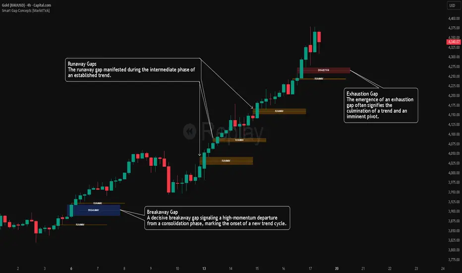
Smart Gap Concepts [MarkitTick]💡 This indicator automates the identification and classification of price gaps, commonly known as Fair Value Gaps (FVG) or Imbalances, by integrating market structure and volume analysis. Unlike standard gap detectors that simply highlight empty space on a chart, this script applies algorithmic filters to categorize gaps into three distinct phases of market movement: Breakaway, Runaway, and Exhaustion. This helps traders understand the potential context of a move rather than just seeing a support or resistance zone.
● Originality and Utility
The primary innovation of this tool is its dynamic classification system. It moves beyond visual detection by checking the "why" behind the gap. By referencing Swing Highs and Swing Lows (Market Structure) alongside Volume efficiency, it determines if a gap represents a breakout, a trend continuation, or a climatic end to a move. Additionally, the script features an automated mitigation tracking system that removes gaps from the chart once price has re-tested the midpoint, ensuring the visual workspace remains clean and relevant to current price action.
● Methodology
The script operates on a multi-stage logic engine:
• Gap Detection
It first identifies the core imbalance where the Low of the current bar does not overlap with the High of the bar two periods prior (for bullish gaps), ensuring the intervening candle represents a strong displacement.
• Structural Analysis (Breakaway Gaps)
The script monitors Pivot Highs and Lows. If a gap occurs simultaneously with a close beyond a key structural Pivot, it is classified as a "Breakaway Gap." This signals the potential start of a new trend.
• Volume and Time Analysis (Exhaustion Gaps)
To identify potential reversals, the script looks for "Trend Maturity." If a gap forms after a long duration since the last pivot and is accompanied by a volume spike (defined by the Volume Spike Multiplier), it is labeled as an "Exhaustion Gap."
• Continuation (Runaway Gaps)
If a gap is valid but meets neither the Breakaway nor Exhaustion criteria, it is considered a "Runaway Gap," typically found in the middle of an established trend.
• Dynamic Cleanup
The script tracks the midpoint of every active gap. If price creates a lower low (for bullish gaps) or higher high (for bearish gaps) beyond this midpoint, the gap is considered mitigated and is removed from the screen.
📖 How to Use
Traders can utilize the color-coded classifications to gauge market intent:
Breakaway (Default Blue): Watch these zones for potential trend initiations. These are often high-probability areas for a retest entry after a structure break.
Runaway (Default Orange): These indicate strong momentum. They can be used to trail stop-losses or add to winning positions, as price should ideally not close below these gaps in a healthy trend.
Exhaustion (Default Red): Be cautious when these appear. They suggest the current move is overextended and a reversal or complex pullback may be imminent.
• Exhaustion Gap : A Practical Case Study
• Breakaway Gap: A Practical Case Study
• Runaway Gap : A Practical Case Study
⚙️ Inputs and Settings
Min Gap Size (Points): Filters out insignificant gaps smaller than this threshold.
Structure Lookback: Defines the sensitivity of the Pivot detection (Swing High/Low).
Volume Avg Length & Multiplier: Determines what qualifies as a "Volume Spike" for exhaustion logic.
Trend Maturity: The minimum number of bars required to consider a trend "old" enough for an exhaustion signal.
Visual Settings: Custom colors for each gap type and box extension length.
● Disclaimer
All provided scripts and indicators are strictly for educational exploration and must not be interpreted as financial advice or a recommendation to execute trades. I expressly disclaim all liability for any financial losses or damages that may result, directly or indirectly, from the reliance on or application of these tools. Market participation carries inherent risk where past performance never guarantees future returns, leaving all investment decisions and due diligence solely at your own discretion.
Market Participation Gradient [Interakktive]Market Participation Gradient (MPG) is a diagnostic oscillator that measures the quality and intensity of market participation by combining price efficiency with activity (volume or a FX-safe proxy) into a single 0–100 score.
Most tools tell you "how much activity exists." MPG focuses on "how effective that activity is," helping you differentiate clean directional participation from absorbed / inefficient participation where effort produces limited directional progress.
█ WHAT IT DOES
- Produces a 0–100 participation score (higher = stronger participation environment)
- Uses color as state context (not buy/sell)
- Classifies participation into four tiers for quick readability
- Includes an optional status-line HUD for at-a-glance context without chart clutter
█ WHAT IT DOES NOT DO
- NO buy/sell signals
- NO entries/exits
- NO alerts by default
- NO repainting / no lookahead (diagnostic context only)
█ HOW TO READ MPG
Level (0–100)
- Higher values = stronger participation environment
- Lower values = thin, drifting participation environment
Color (state language, not direction)
- Teal = Clean participation (efficient movement)
- Magenta = Absorbed participation (high activity, low efficiency)
- Amber = Building / transition state
- Grey = Thin / neutral state
█ TIER SYSTEM
MPG uses four tiers:
- THIN (0–20): low participation environment
- BUILDING (20–40): participation emerging / transitional
- STRONG (40–65): solid participation environment (quality becomes more meaningful)
- EXTREME (65+): very high participation environment (contextually important during events or late-cycle pushes)
█ QUALITY ASSESSMENT (STRONG / EXTREME)
Within STRONG and EXTREME tiers, MPG evaluates participation quality:
- Clean (Teal): Efficiency > 55%
- Absorbed (Magenta): Efficiency < 30% AND Activity > 1.5×
- Neutral (Grey): otherwise (mixed quality)
█ STATUS LINE HUD
MPG can display key values in TradingView's status line:
- Minimal: MPG (0–100) + Tier (0–3)
- Full: adds Direction (-1/0/1) and Quality (-1/0/1)
This provides quick context without tables or on-chart panels.
█ HOW IT WORKS (METHODOLOGY)
MPG combines two independent measurements:
1. Efficiency (0–1)
Efficiency = |Net Displacement| / Total Path Length
- High efficiency = price moved more directly
- Low efficiency = price moved less directly (more back-and-forth)
2. Activity (centered at 1.0)
Activity = Current Volume / Average Volume
- Activity > 1 = above-average activity
- Activity < 1 = below-average activity
FX / indices fallback: If volume is unreliable/unavailable, MPG uses a range-based proxy: (High–Low) / ATR (capped) to prevent distortion.
3. Participation Score (0–100)
Participation = Efficiency × √Activity × 100
The square root applies diminishing returns so activity alone cannot dominate without efficiency support.
█ SETTINGS
Core
- ATR Length — normalization baseline
- Efficiency Lookback — bars used for efficiency
- Volume Average Length — baseline for activity
- Smoothing Length — EMA smoothing (1 = minimal smoothing)
Visuals
- Histogram / Line / Tier Bands toggles
- Optional pane background tint (default OFF)
- Theme: Cinematic (subtle) or Vivid (brighter)
HUD
- Status Line HUD toggle
- HUD Detail: Minimal or Full
█ SUITABLE MARKETS
Works on any market with price data. For symbols with unreliable volume (common in FX), MPG automatically uses the range/ATR activity proxy.
█ RELATED (INTERAKKTIVE)
- MER — Market Efficiency Ratio (pure efficiency)
- ERD — Effort–Result Divergence (effort vs outcome)
- VSI — Volatility State Index (expansion/contraction context)
█ DISCLAIMER
This indicator is for educational and informational purposes only and does not constitute financial advice. Always do your own research and use appropriate risk management.

GEMINI Advanced SMA with Trend & AlertsDescription:
This indicator is a professional Trend & Signal analysis tool designed to help traders identify market direction, entries, and momentum strength at a glance. It combines a customizable dual Moving Average system with an advanced real-time Information Dashboard.
The script is built to keep charts clean while providing maximum data through the on-screen panel.
📈 Key Features
1. Dual Moving Average System
Fast MA (Signal Line): Acts as the primary trigger for entries.
Slow MA (Trend Baseline): Filters the overall market direction.
Visual Cloud: The area between the two MAs is filled with color (Green/Red) to visualize the trend strength and potential support/resistance zones.
Flexibility: You can choose between SMA, EMA, HMA, WMA, or RMA for both lines independently.
2. Professional Data Dashboard A customizable table positioned on your chart provides real-time analytics:
Price Action: Immediate Bullish/Bearish status.
MA Status: Shows if the Fast and Slow MAs are currently Rising or Falling.
Exact Levels: Displays the precise price values of the MAs.
Spread Analysis: Monitors the gap between the Fast and Slow MA ("Expanding" vs "Squeezing") to help identify momentum acceleration or exhaustion.
3. Signals & Alerts
BUY Signal: Generated when the Price crosses OVER the Fast MA.
SELL Signal: Generated when the Price crosses UNDER the Fast MA.
Alerts: Fully compatible with TradingView alerts for automation.
4. Multi-Timeframe (MTF) Support You can calculate the Moving Averages based on a higher timeframe (e.g., viewing 4-hour MAs while trading on a 15-minute chart) to stay aligned with the macro trend.
🛠 How to Use
Trend Identification: Look at the "Cloud" color. Green indicates an uptrend context; Red indicates a downtrend context.
Entry Points: Use the "BUY" and "SELL" labels.
Pro Tip: Take BUY signals only when the Cloud is Green (trading with the trend).
Pro Tip: Take SELL signals only when the Cloud is Red.
Momentum Check: Use the Dashboard to see if the Spread is "EXPANDING" (strong momentum) or "SQUEEZING" (potential consolidation or reversal).
⚙️ Settings
Fast/Slow Length & Type: Fully customizable periods and MA types.
MTF: Enable/Disable higher timeframe calculations.
Dashboard: You can toggle the table visibility, change its size (Tiny, Small, Normal, Large), and move it to any corner of the screen.
Disclaimer: This tool is for informational purposes only and does not constitute financial advice.

VSA Persistent Zones with Arrows Purpose
This indicator is designed to analyze trading volume relative to price movement using the VSA (Volume Spread Analysis) methodology. It aims to:
Identify key price zones where there is strong price movement with high trading volume.
Plot arrows on high-volume candles for quick visual identification.
Keep these zones persistent until broken by price, helping traders make decisions based on real support and resistance levels.
