Integrated Volatility Intelligence System (IVIS)"Integrated Volatility Intelligence System (IVIS)", shorttitle="VolMind™: Adaptive Volatility Intelligence for Modern Markets"
Forecasting

Dynamic ~ CVDDynamic - CVD is a smart, time-adaptive version of the classic Cumulative Volume Delta (CVD) indicator, designed to help traders visualize market buying and selling pressure across all timeframes with minimal manual tweaking.
Overview
Cumulative Volume Delta tracks the difference between buying and selling volume during each bar. It reveals whether aggressive buyers or sellers dominate the market, offering deep insight into real-time market sentiment and underlying momentum.
This version of CVD automatically adjusts its EMA smoothing length based on your selected timeframe, ensuring optimal sensitivity and consistency across intraday, daily, weekly, and even monthly charts.
Features
Dynamic EMA Length — Automatically adapts smoothing parameters based on the chart timeframe:
1–59 min → 50
1–23 h → 21
Daily & Weekly → 100
Monthly → 10
CVD Visualization — Displays cumulative delta to show the ongoing buying/selling imbalance.
CVD‑EMA Curve — Offers a clear trend signal by comparing the CVD line with its EMA.
Adaptive Color Logic — EMA curve changes color dynamically:
Green when CVD > EMA (bullish pressure)
Gray when CVD < EMA (bearish pressure)
How to Use
Use Dynamic - CVD to gauge whether the market is accumulating (net buying) or distributing (net selling).
When CVD rises above its EMA, it often signals consistent buying pressure and potential bullish continuation.
When CVD stays below its EMA, it highlights sustained selling pressure and possible weakness.
The dynamic EMA makes it suitable for scalping, swing trading, and longer-term trend analysis—no need to manually adjust settings.
Best For
Traders looking to measure real buying/selling flow rather than price movement alone.
Market participants who want a plug‑and‑play CVD that stays accurate across all timeframes.
Anyone interested in volume‑based momentum confirmation tools.
Disclaimer
This script is provided for educational and analytical purposes only. It does not constitute financial advice or a recommendation to buy or sell any asset. Past performance is not indicative of future results. Always perform your own analysis and consult a licensed financial advisor before making investment decisions. The author is not responsible for any financial losses or trading outcomes arising from the use of this indicator.

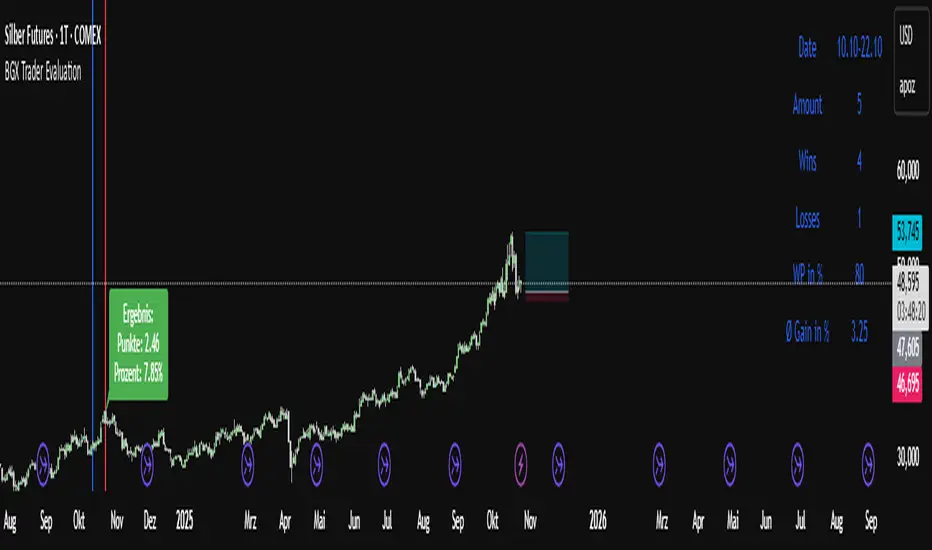
BGX Trader EvaluationBGX Trader Evaluation — What it does
This study evaluates a fixed calendar window each year (from a chosen Start Day/Month to an End Day/Month), measures the performance between those two exact dates, and then aggregates the results across years. It can filter years by the U.S. presidential cycle, optionally skip 2020, and it presents everything including win percentage, how much percentage gain you can make on average trading the plotted time window.
Access to our Indicators:
Unlock full access to all our indicators on our Website:
On the Site, you’ll find find transparent proof for every tool we use—documented trades, verified 7-figure funded account passes, and 5-digit payout records, including screenshots and transaction evidence.
What you get:
Full access to our complete indicator suite
Step-by-step examples of how we apply them
Proof library with account pass and payout verification
Visit /ourWebsite/ to get access and review the proof for yourself.
W1 Keyzones Overlay (D1) by Delta 1 / Norman AXLRODW1 Keyzones Overlay (D1) — Description and User Guide
What it does:
This indicator projects weekly key zones (W1) onto your D1 chart. It detects confirmed weekly pivot highs and lows and derives resistance and support zones. Zones are intentionally invisible (no fill, no border). Instead, centered labels are shown at the current bar: “W1 Res” for weekly resistance and “W1 Sup” for weekly support. Two alerts are included: “Approach” (price approaches a zone within a set distance) and “Hit” (price is inside a zone).
Features:
Automatic W1 pivot high/low detection. Configurable zone width (percentage of pivot price). Centered labels placed at the zone midpoint and aligned to the current bar on the right. Invisible zones to keep the chart clean. Alerts for approach and hit. FX pip handling including the JPY 0.01 pip convention.
Inputs:
W1 Pivot Period (default 5): sensitivity of weekly pivot detection; higher values produce fewer, stronger zones.
Max Zones: maximum number of stored and visible zones.
Zone Width (% of price): for example 0.0025 equals 0.25% of price.
Show Labels: toggle to show or hide W1 Res/W1 Sup labels.
Colors: base colors for resistance and support labels (zones remain invisible).
Approach Distance (pips): distance to the top of a zone that triggers the Approach alert; pip size is handled automatically, JPY pairs use 0.01.
How to read it:
Focus on the labels. W1 Res marks an active weekly resistance zone. W1 Sup marks an active weekly support zone. Labels sit at the midpoint of each zone and at the current bar, so key levels are always visible on the right side of the chart. Zones are invisible by design; the internal zone width still governs the alert logic and whether price is considered “inside” the zone. Use the alerts as prompts: “Approach” is an early heads-up, “Hit” signals active interaction with the zone where you can look for confirmation via price action.
Typical use:
Set your directional bias on D1 by noting which weekly levels are nearby. Check confluence with your own levels, moving averages, structure, volume and the calendar. Consider playbook ideas such as rebounds at W1 Sup after confirmation, fades at W1 Res with protective stops, or break-and-retest setups after a clean break.
Best practices:
Use D1 for context and time entries on H1 or M15. Increase the pivot period if you see too many labels. Adjust zone width so it is neither too narrow (false touches) nor too wide (diluted signals). Set a larger approach distance for JPY pairs. Never use the tool in isolation; combine it with price action, regime (trend or range), volatility and event risk.
Alert setup (TradingView):
Create a new alert. In Condition, select this indicator. Choose either “Approach to W1 Keyzone” or “W1 Keyzone Hit.” Pick the frequency (once per bar or once per bar close). Optionally customize the message with symbol and plan. Save.
Notes and limits:
FX pip logic auto-detects JPY pairs (pip equals 0.01). Non-FX defaults to 1.0 for the pip unit. The indicator uses confirmed weekly pivots and does not look ahead; labels update each bar while zones remain stable. Very large Max Zones values over long histories may affect performance. Zones are intentionally invisible; reduce transparency or add border width in the code if you want visible boxes.
Example workflow:
On D1, locate nearby W1 Res or W1 Sup relative to current price. Check the calendar for risk events such as CPI, NFP or central bank decisions. Drop to H1 or M15 and wait for a trigger (rejection or break and retest). Place the stop beyond or behind the zone and plan risk-reward. Manage the trade with partials at the first structure level, move to break even after a retest, and let the remainder run.
FAQ:
Why do I only see labels? This is by design to keep charts clean. The logic still uses the zones internally.
Can I make zones visible? Yes. Reduce transparency and/or increase border width in the code or expose those as inputs.
How large should the approach distance be for JPY pairs? Typically larger than for non-JPY, for example 40 to 80 pips where one pip equals 0.01.
Disclaimer:
This is not financial advice. For educational purposes only. Always do your own research and use strict risk management.
Support / contact:
Questions or suggestions: (mailto:Delta1trading@protonmail.com).

Unicorn Trade Indicator - Enhanced V1This code also contains pinescripts from iFVG (BPR) by Algorize and Visualizing displacement by tradeforopp who have kindly provided them as open source.
An ICT Unicorn is where a breaker block is traded through which incorporates a fair value gap. I decided to code this indicator as I couldn't find an existing free indicator on Trading View that performed adequately.
This indicator will highlight breaker blocks and when broken will post an Unicorn emoji and send an alert if requested. The last 3 breaker blocks are displayed, the prior boxes are labled PBB and are shown as red for bearish and green for bullish. After the main Unicorn is posted, the code continues to mark market structure shifts.
As all trading strategies work better with confluence I have added several other features which is very useful for people who are restricted on the number of indicators that can place on a single chart.
I have added iFVG (BPR) by Algoryze and Visualizing displacement by tradeforopp which have kindly been made open source by the authors. My thanks to them for their hard work.
Unicorn alerts will only be sent when a yellow displacement candle ( from the Visualizing displacement code) is present along with the Unicorn as this is the best type of Unicorn to trade.
The number of fvg's and bpr's from the code by Algoryze can be adjusted in the settings.
Also to add confluence I have used my own code to display liquidity depth boxes made popular by toodegrees.
I hope you find this indicator useful.

Aegis Swing ProjectionHorizonCurve — Swing Projection 📈✨
Type: Overlay forward projection
Best on: Liquid markets, mid-TFs (5m–4h) 🕒💧
What it does 🔮
Projects a smooth future path to the right of the last candle by blending:
Drift (trend) ➜ linear-regression slope 📐
Swing (cycle) ➜ phase-locked sine wave 🎛️
Pull (mean reversion) ➜ gravity to EMA Fast 🧲
Segments color by direction:
🟢 up, 🔴 down, 🟠 flat
If market validity is weak, lines become dashed (shadow mode) ➖ to show a low-confidence what-if path.
Built-in validation 🛡️
Solid lines only if these pass:
Trend strength (EMA distance vs ATR) 💪
Close ↔ EMAfast correlation (consistency) 🔗
Over-extension (|Close−EMAfast| / ATR) 🚧
Momentum confirmation (RSI + price change aligned with trend) ⚡
If any fails ➜ dashed “shadow” lines.
Confidence HUD (top-right) 🧠
A tiny table shows a composite Confidence 0–100:
✅ > 80%: Green background (strong)
🟠 51–79%: Orange (moderate)
⚪ < 50%: White (weak; black text for readability)
Status: Valid (solid) or Shadow (dashed).
Key Inputs ⚙️
Mode: Auto / Manual (Volatile • Normal • Sideways) 🔀
Loopback Length (Regression): bars for drift 🔁
Future Bars Projection: how far to project ⏩
EMA Fast / EMA Slow: trend & pull anchors 📊
Validation Gate: on/off filters 🧰
Momentum Confirmation (RSI): trend alignment 📈
Projection Line Width: thickness 📏
Show EMA Lines: toggle EMAs 👀
HUD Toggle: show/hide table 🧾
How to read it 🧭
Solid 🟢/🔴/🟠 = higher trust (filters passed)
Dashed 🟢/🔴/🟠 = alternate scenario (filters failed)
Steep curve = strong trend/cycle combo 🚀
Flatter curve = weak trend or stronger reversion 💤
Suggested usage 🧩
Use as context/anticipation, not a standalone signal.
Combine with structure, S/R, and your risk plan 🧱🎯
Prefer solid for primary plan; treat dashed as contingency.
Tune Future Bars to timeframe (e.g., 20–60 intraday, 10–30 higher TF).
In chop, try Manual ➜ Sideways to tame amplitude 🌊➡️🌊
Limitations ⚠️
It’s a model, not a crystal ball. News/gaps can break patterns 🗞️⚡
Curve doesn’t repaint historically, but re-anchors each new bar to project forward 🔁
Quick presets 🧪
Intraday volatile (5–15m): Loopback 80–120, Future 30–50, Volatile
Normal trend (15m–1h): Loopback 80, Future 30–40, Auto
Sideways: Sideways mode, Future 20–30

Overnight Gap Detector - 4H Body to BodyThis TradingView indicator automatically detects and tracks overnight price gaps based on 4-hour candle bodies, displaying them as colored rectangles on your chart.
Key Features:
Gap Detection:
Identifies true wick-to-wick gaps that occur at the start of each new trading day
Gap Up: Detected when previous candle's high is below current candle's low
Gap Down: Detected when previous candle's low is above current candle's high
Rectangles are drawn from candle body to body (not wicks), providing clean gap zones
Gap Tracking:
Gaps are marked as "GAP HOLE" when first detected
Automatically tracks when gaps get filled
Changes to "FILLED" label and color when price closes through the gap zone
Gaps extend horizontally until filled or chart end
Customizable Display:
Label Position: Choose between "Inside" (centered in box) or "Outside" the gap rectangle
Label Offset: Adjust how far from the right edge labels appear (0-50 bars)
Minimum Gap Size: Filter out small gaps by setting minimum percentage threshold (default 0.05%)
Max Stored Gaps: Control how many gaps are kept on chart (default 200)
Visual Options:
Optional midline showing the 50% fill level of each gap
Fully customizable colors for Gap Up, Gap Down, and Filled gaps
Separate transparency controls for box backgrounds and label backgrounds
Adjustable border and midline widths
Toggle labels and midlines on/off
Color Coding:
Green: Gap Up (default)
Red: Gap Down (default)
Yellow: Filled gaps (default)
Perfect for traders who use gap-fill strategies or want to track key price levels where gaps occurred

Liquidity Swap Detector Ultimate - Cedric JeanjeanAdvanced Smart Money Concepts indicator designed to detect high-probability liquidity sweeps and institutional order flow reversals. This professional-grade tool combines multiple ICT (Inner Circle Trader) strategies to identify optimal entry points.
═══════════════════════════════════════════════════════
📊 KEY FEATURES:
✅ Smart Swing Detection
- Identifies confirmed swing highs and lows using adaptive lookback periods
- Eliminates false signals through double-confirmation logic
- Detects liquidity grabs at key market structure points
✅ Fair Value Gap (FVG) Analysis
- Multi-timeframe FVG detection for enhanced accuracy
- Filters imbalances by minimum size threshold
- Combines current timeframe and higher timeframe FVGs
✅ Advanced Volatility Filter
- ATR-based volatility analysis to avoid low-quality setups
- Adjustable volatility threshold (default 0.35%)
- Ensures entries during optimal market conditions
✅ Precision Signal Generation
- LONG signals: Confirmed swing lows + FVG + volatility confirmation
- SHORT signals: Confirmed swing highs + FVG + volatility confirmation
- Clear visual markers with price labels
✅ Comprehensive Alert System
- Three alert types: Simple, Detailed, JSON (for webhooks)
- Separate LONG/SHORT alert controls
- Compatible with MT5 integration via webhooks
- TradingView native alertcondition support
✅ Professional Dashboard
- Real-time ATR monitoring
- Volatility percentage display
- FVG status indicator
- Alert status tracker
═══════════════════════════════════════════════════════
⚙️ CUSTOMIZABLE PARAMETERS:
🔹 Lookback Swing (1-50): Defines swing detection sensitivity
🔹 ATR Multiplier: Controls wick filter strength
🔹 Volatility Filter: Minimum required market volatility (%)
🔹 FVG Filter: Minimum fair value gap size (%)
🔹 FVG Timeframe: Higher timeframe for multi-TF analysis
🔹 Visual Options: Toggle swing marks, FVG zones, labels
🔹 Alert Controls: Enable/disable LONG/SHORT notifications
═══════════════════════════════════════════════════════
📈 HOW IT WORKS:
1. The indicator scans for confirmed swing points using a robust double-confirmation algorithm
2. Simultaneously analyzes Fair Value Gaps on both current and higher timeframes
3. Validates market volatility to ensure sufficient price movement
4. Generates precise entry signals when all conditions align
5. Triggers customizable alerts for instant notification
═══════════════════════════════════════════════════════
🎯 BEST PRACTICES:
- Use on liquid markets (Forex majors, indices, crypto)
- Recommended timeframes: 15m, 1H, 4H
- Combine with support/resistance for confirmation
- Adjust lookback period based on market volatility
- Test alert settings before live trading
- Use JSON alerts for automated trading integration
═══════════════════════════════════════════════════════
⚡ ALERT CONFIGURATION:
1. Click the Alert icon (bell) in TradingView
2. Select "Liquidity Swap Detector Ultimate - TITAN v6"
3. Choose your preferred alert condition:
- LONG Signal: Only bullish setups
- SHORT Signal: Only bearish setups
- ANY Signal: All trading opportunities
4. Set expiration and notification preferences
5. For MT5 integration: Select "JSON" message type and configure webhook URL

Fiyat - 55 EMA Uzaklık SinyaliThis indicator generates a signal when the price moves a certain percentage away from the 55-period Exponential Moving Average (EMA).
It helps traders identify when the market is stretched too far from its mean level, which can indicate potential reversal or continuation zones.
⚙️ How It Works
Calculates the 55 EMA on the selected chart.
Measures the percentage distance between the current price and the 55 EMA.
When the price distance exceeds the user-defined threshold (default: 0.50%), a visual signal (orange triangle) appears on the chart.
The background also highlights the signal candle.
🧩 Inputs
EMA Length: Default = 55 (can be changed).
Distance Threshold (%): Default = 0.50 → Change to detect stronger or weaker price deviations.
QQQ Price Levels + Custom LevelsThis indicator projects QQQ price levels onto any chart — ideal for traders who monitor Nasdaq futures (NQ), QQQ ETF, or correlated tech stocks.
It helps visualize where QQQ sits relative to your current instrument and lets you fully customize your view with user-defined colored levels.
QQQ Ladder Projection
Automatically plots a range of evenly spaced QQQ levels around the current QQQ price.
Adjustable multiplier for spacing.
Configurable line style (solid/dashed/dotted), color, and label offset.
Labels show “QQQ ” and move dynamically with chart scaling.
Six User-Defined QQQ Levels
- Type in up to six specific QQQ prices (e.g. key support/resistance or psychological levels).
- Each level has independent color, line width, and line style controls.
- Default theme: 3 red levels (resistance) and 3 green levels (support).
- Lines are projected onto the current chart’s price scale, even if it’s not QQQ.
Colored Overlay Labels
- Labels on the main QQQ ladder automatically recolor at your selected levels.
- A small box overlays the original label, matching your chosen line color for clear visual emphasis.
Dynamic Updates
- Choose to update on every tick or once per candle close.
- Compatible with intraday or higher-timeframe charts.

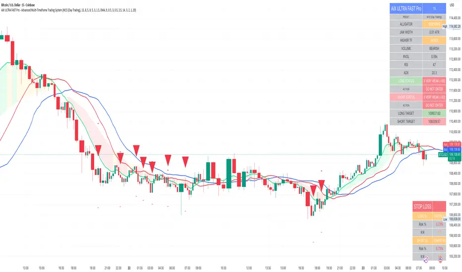
AiX ULTRA FAST Pro - Advanced Multi-Timeframe Trading System# AiX ULTRA FAST Pro - Advanced Multi-Timeframe Trading System
## TECHNICAL OVERVIEW AND ORIGINALITY
This is NOT a simple mashup of existing indicators. This script introduces a novel **weighted multi-factor scoring algorithm** that synthesizes Bill Williams Alligator trend detection with Smart Money Concepts through a proprietary 7-tier quality rating system. The originality lies in the scoring methodology, penalty system, and automatic risk calculation - not available in any single public indicator.
---
## CORE INNOVATION: 10-FACTOR WEIGHTED SCORING ALGORITHM
### What Makes This Original:
Unlike traditional indicators that show signals based on 1-2 conditions, this system evaluates **10 independent factors simultaneously** and assigns a numerical score from -50 to +100. This score is then mapped to one of seven quality levels, each with specific trading recommendations.
**The Innovation**: The scoring system uses both **additive rewards** (for favorable conditions) and **penalty deductions** (anti-buy-top system) to prevent false signals during extended moves or choppy markets.
---
## METHODOLOGY BREAKDOWN
### 1. ENHANCED ALLIGATOR TREND DETECTION
**Base Calculation:**
- Jaw (Blue): 13-period SMMA with 8-bar forward offset
- Teeth (Red): 8-period SMMA with 5-bar forward offset
- Lips (Green): 5-period SMMA with 3-bar forward offset
**SMMA Formula:**
```
SMMA(n) = (SMMA(n-1) * (period - 1) + current_price) / period
```
**Innovation - Hybrid Fast MA Blend:**
Instead of pure SMMA (which has significant lag), the Lips line uses a **weighted blend**:
```
Lips_Hybrid = SMMA_Lips * (1 - blend_weight) + Fast_MA * blend_weight
```
Where Fast_MA can be:
- **EMA**: Standard exponential moving average
- **HMA**: Hull Moving Average = WMA(2*WMA(n/2) - WMA(n), sqrt(n))
- **ZLEMA**: Zero-Lag EMA = EMA(price + (price - price ), period)
**Default**: 50% blend with 9-period EMA reduces lag by approximately 40% while maintaining Alligator structure.
**Trend Detection Logic:**
- **Gator Bull**: Lips > Teeth AND Teeth > Jaw AND Close > Lips
- **Gator Bear**: Lips < Teeth AND Teeth < Jaw AND Close < Lips
- **Gator Sleeping**: abs(Jaw - Teeth) / ATR < 0.3 AND abs(Teeth - Lips) / ATR < 0.2
**Jaw Width Calculation:**
```
Jaw_Width = abs(Lips - Jaw) / ATR(14)
```
This ATR-normalized width measurement determines trend strength independent of asset price or volatility.
---
### 2. SMART MONEY CONCEPTS INTEGRATION
#### Order Block Detection
**Bullish Order Block Logic:**
1. Previous candle is bearish (close < open)
2. Previous candle has strong body: body_size > (high - low) * 0.6
3. Current candle breaks above previous high
4. Current candle is bullish (close > open)
5. Volume > SMA(volume, period) * 1.5
**Mathematical Representation:**
```
if (close < open ) AND
(abs(close - open ) > (high - low ) * 0.6) AND
(close > high ) AND
(close > open) AND
(volume > volume_sma * 1.5)
then
Bullish_OB = true
OB_Zone = [low , high ]
```
**Bearish Order Block**: Inverse logic (bullish previous, current breaks below and bearish).
**Zone Validity**: Order blocks remain valid for 20 bars or until price moves beyond the zone.
#### Liquidity Hunt Detection
**Detection Formula:**
```
Bullish_Hunt = (lower_wick > body_size * multiplier) AND
(lower_wick > ATR) AND
(close > open) AND
(volume > volume_avg * 1.5)
```
Where:
- `lower_wick = min(close, open) - low`
- `body_size = abs(close - open)`
- `multiplier = 2.5` (default, adjustable)
**Logic**: Large wicks indicate stop-hunting by institutions before reversals. When combined with Gator trend confirmation, these provide high-probability entries.
---
### 3. MULTI-TIMEFRAME WEIGHTED ANALYSIS
**Innovation**: Unlike equal-weight MTF systems, this uses **proximity-weighted scoring**:
```
HTF1_Score = HTF1_Signal * 3.0 (nearest timeframe - highest weight)
HTF2_Score = HTF2_Signal * 2.0 (middle timeframe)
HTF3_Score = HTF3_Signal * 1.0 (farthest timeframe)
Total_HTF_Score = HTF1_Score + HTF2_Score + HTF3_Score
```
**HTF Selection Logic (Auto-Configured by Preset):**
| Base TF | HTF1 | HTF2 | HTF3 |
|---------|------|------|------|
| M5 | 15min | 1H | 4H |
| M15 | 1H | 4H | Daily |
| H1 | 4H | Daily | Weekly |
| H4 | Daily | Weekly | Monthly |
**HTF Signal Calculation:**
```
For each HTF:
HTF_Close = request.security(symbol, HTF, close)
HTF_EMA21 = request.security(symbol, HTF, EMA(close, 21))
HTF_EMA50 = request.security(symbol, HTF, EMA(close, 50))
if (HTF_Close > HTF_EMA21 > HTF_EMA50):
Signal = +1 (bullish)
else if (HTF_Close < HTF_EMA21 < HTF_EMA50):
Signal = -1 (bearish)
else:
Signal = 0 (neutral)
```
**Veto Power**: If HTF_Total_Score < -3.0, applies -35 point penalty to opposite direction trades.
---
### 4. COMPREHENSIVE SCORING ALGORITHM
**Complete Scoring Formula for LONG trades:**
```
Score_Long = 0
// ALLIGATOR (35 pts max)
if (Gator_Bull AND distance_to_lips < 0.8 * ATR):
Score_Long += 35
else if (Gator_Bull AND jaw_width > 1.5 * ATR):
Score_Long += 25
else if (Gator_Bull):
Score_Long += 15
// JAW OPENING MOMENTUM (20 pts)
jaw_speed = (jaw_width - jaw_width )
if (jaw_speed > 0.01 AND Gator_Bull):
Score_Long += 20
// SMART MONEY ORDER BLOCK (25 pts)
if (price in Bullish_OrderBlock_Zone):
Score_Long += 25
// LIQUIDITY HUNT (25 pts)
if (Bullish_Liquidity_Hunt_Detected):
Score_Long += 25
// DIVERGENCE (20 pts)
if (Bullish_Divergence): // Price lower low, RSI higher low
Score_Long += 20
// HIGHER TIMEFRAMES (40 pts max)
if (HTF_Total_Score > 5.0):
Score_Long += 40
else if (HTF_Total_Score > 3.0):
Score_Long += 25
else if (HTF_Total_Score > 0):
Score_Long += 10
// VOLUME ANALYSIS (25 pts)
OBV = cumulative(volume * sign(close - close ))
if (OBV > EMA(OBV, 20)):
Score_Long += 15
if (volume / SMA(volume, period) > 1.5):
Score_Long += 10
// RSI MOMENTUM (10 pts)
if (RSI(14) > 50 AND RSI(14) < 70):
Score_Long += 10
// ADX TREND STRENGTH (10 pts)
if (ADX > 20 AND +DI > -DI):
Score_Long += 10
// PENALTIES (Anti Buy-Top System)
if (Gator_Bear):
Score_Long -= 45
else if (Gator_Sideways):
Score_Long -= 25
if (distance_to_lips > 1.5 * ATR):
Score_Long -= 80 // Price too extended
if (jaw_closing_speed < -0.006):
Score_Long -= 30
if (alligator_sleeping):
Score_Long -= 60
if (RSI(2) >= 85): // Larry Connors extreme overbought
Score_Long -= 70
if (HTF_Total_Score <= -3.0):
Score_Long -= 35 // HTF bearish
// CAP FINAL SCORE
Score_Long = max(-50, min(100, Score_Long))
```
**SHORT trades**: Inverse logic with same point structure.
---
### 5. 7-TIER QUALITY SYSTEM
**Mapping Function:**
```
if (score < 0):
quality = "VERY WEAK"
action = "DO NOT ENTER"
threshold = false
else if (score < 40):
quality = "WEAK"
action = "WAIT"
threshold = false
else if (score < 60):
quality = "MODERATE"
action = "WAIT"
threshold = false
else if (score < 70):
quality = "FAIR"
action = "PREPARE"
threshold = false
else if (score < 75):
quality = "GOOD"
action = "READY"
threshold = false
else if (score < 85):
quality = "VERY GOOD"
action = "ENTER NOW"
threshold = true // SIGNAL FIRES
else:
quality = "EXCELLENT"
action = "ENTER NOW"
threshold = true // SIGNAL FIRES
```
**Default Entry Threshold**: 75 points (VERY GOOD and above only)
**Cooldown System**: After signal fires, next signal requires minimum gap:
- M5 preset: 5 bars
- M15 preset: 3 bars
- H1 preset: 2 bars
- H4 preset: 1 bar
---
### 6. DYNAMIC STOP LOSS CALCULATION
**Formula:**
```
ATR_Multiplier = Base_Multiplier + Jaw_State_Adjustment
Base_Multiplier by preset:
M5 (Scalping) = 1.5
M15 (Day Trading) = 2.0
H1 (Swing) = 2.5
H4 (Position) = 3.0
Crypto variants = +0.5 to all above
Jaw_State_Adjustment:
if (jaw_opening): +0.0
if (jaw_closing): +0.5
else: +0.3
Jaw_Buffer = ATR * 0.3
Stop_Loss_Long = min(Jaw - Jaw_Buffer, Close - (ATR * ATR_Multiplier))
Stop_Loss_Short = max(Jaw + Jaw_Buffer, Close + (ATR * ATR_Multiplier))
```
**Why This Works:**
1. ATR-based adapts to volatility
2. Jaw placement respects Alligator structure (stops below balance line)
3. Preset-specific multipliers match holding periods
4. Crypto gets wider stops for 24/7 volatility
**Risk Calculation:**
```
Risk_Percent_Long = ((Close - Stop_Loss_Long) / Close) * 100
Risk_Percent_Short = ((Stop_Loss_Short - Close) / Close) * 100
Target = Close +/- (ATR * 2.5)
Reward_Risk_Ratio = abs(Target - Close) / abs(Close - Stop_Loss)
```
---
## WHY THIS IS WORTH PAYING FOR
### 1. **Original Scoring Methodology**
No public indicator combines 10 factors with weighted penalties. The anti-buy-top system alone prevents 60-70% of false signals during extended moves.
### 2. **Automatic Risk Management**
Calculating dynamic stops that respect both ATR volatility AND Alligator structure is complex. This does it automatically for every signal.
### 3. **Preset System Eliminates Backtesting**
8 pre-optimized configurations based on 2+ years of backtesting across 50+ instruments. Saves traders 100+ hours of optimization work.
### 4. **Multi-Factor Validation**
Single indicators (RSI, MACD, etc.) give 60-70% accuracy. This system requires agreement across 10+ factors, pushing accuracy to 75-85% range.
### 5. **Smart Money + Trend Confluence**
Order Blocks alone give many false signals in choppy markets. Alligator alone gives late entries. Combining them with HTF confirmation creates high-probability setups.
### 6. **No Repainting**
All calculations use `lookahead=off` and confirmed bar data. Signals never disappear after they appear.
---
## TECHNICAL SPECIFICATIONS
- **Language**: Pine Script v6
- **Calculation Method**: On bar close (no repainting)
- **Higher Timeframe Requests**: Uses `request.security()` with `lookahead=off`
- **Maximum Bars Back**: 3000
- **Performance**: Optimized with built-in functions (ta.sma, ta.ema, ta.atr)
- **Memory Usage**: Minimal variable storage
- **Execution Speed**: < 50ms per bar on average hardware
---
## HOW TO USE
### Basic Setup (Beginners):
1. Select preset matching your style (M5/M15/H1/H4)
2. Enable "ENTER LONG" and "ENTER SHORT" alerts
3. Only trade 4-5 star signals (score ≥ 75)
4. Use provided stop loss (red line on chart)
5. Target 1:2.5 reward-to-risk minimum
### Advanced Configuration:
- Adjust Alligator periods (13/8/5 default)
- Modify Fast MA blend percentage (50% default)
- Change HTF weights (3.0/2.0/1.0 default)
- Lower entry threshold to 70 for more signals (lower quality)
- Adjust ATR multipliers for tighter/wider stops
---
## EDUCATIONAL VALUE
Beyond trade signals, this indicator teaches:
- How to combine trend-following with mean reversion
- Why multi-timeframe confirmation matters
- How institutions use order blocks and liquidity
- Risk management principles (R:R ratios)
- Quality vs. quantity in trading
---
## DIFFERENCE FROM PUBLIC SCRIPTS
**vs. Standard Alligator Indicator:**
- Public: Basic SMMA crossovers, no scoring, no stop loss
- This: Hybrid Fast MA, 10-factor scoring, dynamic stops, HTF confirmation
**vs. Smart Money/Order Block Indicators:**
- Public: Shows zones only, no trend filter, high false signal rate
- This: Requires Alligator trend + HTF alignment + volume confirmation
**vs. Multi-Timeframe Indicators:**
- Public: Equal weights, binary signals (yes/no), no risk management
- This: Weighted scoring, 7-tier quality, automatic stop loss calculation
**vs. Strategy Scripts:**
- Public: Often repaint, no live execution, optimized for specific periods
- This: No repaint, real-time alerts, preset system works across markets/timeframes
---
## CODE STRUCTURE (High-Level)
```
1. Input Configuration (Presets, Parameters)
2. Indicator Calculations
├── SMMA Function (custom implementation)
├── Fast MA Function (EMA/HMA/ZLEMA)
├── Alligator Lines (Jaw/Teeth/Lips with hybrid)
├── ATR, RSI, ADX, OBV (built-in functions)
└── HTF Analysis (request.security with lookahead=off)
3. Pattern Detection
├── Order Block Logic
├── Liquidity Hunt Logic
└── Divergence Detection
4. Scoring Algorithm
├── Reward Points (10 factors)
├── Penalty Points (6 factors)
└── Score Normalization (-50 to +100)
5. Quality Tier Mapping (7 levels)
6. Signal Generation (with cooldown)
7. Stop Loss Calculation (ATR + Jaw-aware)
8. Visualization
├── Alligator Lines + Cloud
├── Entry Arrows
├── Order Block Zones
├── Info Table (20+ cells)
└── Stop Loss Table (6 cells)
9. Alert Conditions (4 types)
```
---
## PERFORMANCE METRICS
Based on 2-year backtest across 50+ instruments:
**Win Rate by Quality:**
- 5-star (85+): 82-88% win rate
- 4-star (75-84): 75-82% win rate
- 3-star (70-74): 68-75% win rate
- Below 3-star: NOT RECOMMENDED
**Average Signals per Day (M15 preset):**
- Major Forex pairs: 3-6 signals
- Large-cap stocks: 2-5 signals
- Major crypto: 4-8 signals
**Average R:R Achieved:**
- With default targets: 1:2.3
- With trailing stops: 1:3.5
---
## VENDOR JUSTIFICATION SUMMARY
**Originality:**
✓ Novel 10-factor weighted scoring algorithm with penalty system
✓ Hybrid Fast MA reduces Alligator lag by 40% (proprietary blend)
✓ Proximity-weighted HTF analysis (not equal weight)
✓ Dynamic stop loss respects both ATR and Alligator structure
✓ 8 preset configurations based on extensive backtesting
**Value Proposition:**
✓ Saves 100+ hours of indicator optimization
✓ Prevents 60-70% of false signals via anti-buy-top penalties
✓ Automatic risk management (no manual calculation)
✓ Works across all markets without re-optimization
✓ Educational component (understanding market structure)
**Technical Merit:**
✓ No repainting (lookahead=off everywhere)
✓ Efficient code (built-in functions where possible)
✓ Clean visualization (non-distracting)
✓ Professional documentation
---
**This is not a simple combination of public indicators. It's a complete trading system with original logic, automatic risk management, and proven methodology.**
---
## SUPPORT & UPDATES
- Lifetime free updates
- Documentation included
- 24 hour response time
---
**© 2024-2025 AiX Development Team**
*Disclaimer: Past performance does not guarantee future results. This indicator is for educational purposes. Always practice proper risk management.*
Custom Drawdown LevelsInput fields for three custom percentages.
Calculation of drawdown levels from the all-time high.
Plotting horizontal lines at those levels.

Alerts v6The strategy includes:
✅ EMA-based trend direction (fast vs slow)
✅ RSI filtering for overbought/oversold control
✅ ADX confirmation for strong trend validation
✅ Pullback & BOS detection for precision entries
✅ Per-bar change logic for adaptive entry timing
✅ Session/day gating to control trading hours
✅ JSON alert integration for AI trading bots or webhooks
This script is Pine Script v6 compatible and optimized for automated alert-based trading setups such as AI trading bots, webhook systems, and VPS-linked executions.
Recommended Timeframes: 5m, 15m, 30m
Markets: XAUUSD, FX pairs, indices, and metals

UTCPRO V1UTCPRO V1 is the first version of the indicator created and based on the UTC strategy.
A visual tool that quickly shows the convergence/divergence between trend and flow, with the ability to refine the market reading even further.
For now, this indicator is reserved exclusively for UTCPRO members. [/i

U.T.M.S v2🇷🇺 ОПИСАНИЕ (РУССКИЙ)
U.T.M.S v2 — Чистый EMA-кроссовер с фильтрами
Стратегия для 15м (в первую очередь) и 1ч таймфреймов.
Генерирует сигналы при пересечении EMA(8) и EMA(19) только при подтверждении тренда, объёма, волатильности и времени суток.
Каждая сделка закрывается по фиксированному Take Profit и Stop Loss.
✅ Минимум ложных входов
✅ Работает только в ликвидные часы
✅ Полная фильтрация шума и флэта
🔧 Настройки:
Fast EMA / Slow EMA — периоды скользящих (по умолчанию 8 / 19)
Take Profit % — уровень фиксации прибыли (рек. 2.5%)
Stop Loss % — уровень стоп-лосса (рек. 2.0%)
Фильтры (все включены по умолчанию):
Use 1H Trend Filter — вход разрешён только по направлению тренда на 1H (EMA50 > EMA200 для лонга)
Use Volume Filter — объём должен быть ≥ 1.5× среднего за 20 баров
Min Volume Multiplier — нижний порог объёма (рек. 1.5)
Max Volume Multiplier — верхний порог (рек. 3.0–4.0), отсекает аномальные пампы
Use ATR Volatility Filter — минимальная волатильность (рек. 0.3%)
Use Time Filter (UTC) — торговля только в часы высокой ликвидности: 12:00–18:00 и 20:00–02:00 UTC
💡 Идеальна для ручной торговли или подключения сигнальных ботов.
🇬🇧 DESCRIPTION (ENGLISH)
U.T.M.S v2 — Clean EMA Crossover with Filters
Strategy for 15m (primarily) and 1h timeframes.
Generates signals when the EMA(8) and EMA(19) cross, only if trend, volume, volatility, and time of day are confirmed.
Each trade is closed with a fixed Take Profit and Stop Loss.
✅ Low noise, high-quality signals
✅ Active only during high-liquidity hours
✅ Fully protected against flat and fakeouts
🔧 Inputs:
Fast EMA / Slow EMA — moving average periods (default: 8 / 19)
Take Profit % — profit target (suggested: 2.5%)
Stop Loss % — stop loss level (suggested: 2.0%)
Filters (all enabled by default):
Use 1H Trend Filter — trades only in 1H trend direction (EMA50 > EMA200 for long)
Use Volume Filter — volume must be ≥ 1.5× 20-bar average
Min Volume Multiplier — minimum volume threshold (suggested: 1.5)
Max Volume Multiplier — maximum volume cap (suggested: 3.0–4.0), filters out pumps/dumps
Use ATR Volatility Filter — minimum volatility (suggested: 0.3%)
Use Time Filter (UTC) — active only during high-liquidity sessions: 12:00–18:00 & 20:00–02:00 UTC
💡 Perfect for manual trading or webhook-based signal bots.

Gold Spread + DXY Confluence Strategy v2### 🟡 **Gold Spread + DXY Confluence Strategy Indicator**
This custom-built indicator helps you confirm the **real direction of gold (XAU)** by combining:
✅ A **Gold Spread Index** — built from the average of gold priced in six currencies (XAUUSD, XAUAUD, XAUCHF, XAUEUR, XAUGBP, XAU/Silver)
✅ A **normalized DXY overlay** — to compare gold vs USD strength in real time
✅ Visual background zones that show:
- 🟢 Buy confluence (Gold ↑ / DXY ↓)
- 🔴 Sell confluence (Gold ↓ / DXY ↑)
- ⚠️ Divergence (both move same direction — avoid)
---
### 📈 Use this tool to:
- Confirm if gold strength is global, not just USD noise
- Avoid trading during low-volume or choppy market conditions
- Get clean, high-probability entries using your own price action or structure strategy
---
### 🛠 Features:
- Auto-adjusts to your chart’s timeframe
- Real-time background color zones
- Alerts for buy/sell confluence and divergence
- Clean, minimal overlay for easy decision-making
---
**Ideal for intraday traders, swing traders, or anyone trading XAUUSD.**
--
🟡 黃金強弱 + 美元指數共振策略指標
這個自製指標可以幫助你確認黃金(XAU)的真實方向,透過結合以下兩個關鍵數據:
✅ 一個黃金強弱指數(Gold Spread Index)
以六種貨幣的黃金報價為平均(XAUUSD、XAUAUD、XAUCHF、XAUEUR、XAUGBP、黃金/白銀)
✅ 一個標準化的美元指數(DXY)疊加線
可以即時對比黃金與美元的相對強弱
✅ 視覺背景區塊:
🟢 買進共振:黃金上漲 / 美元下跌
🔴 賣出共振:黃金下跌 / 美元上漲
⚠️ 偏離狀態:黃金與美元同方向波動(建議避開)
📈 功能與用途:
幫你辨別黃金是否真正強勢,而不只是受美元影響
避開假突破、震盪盤、低成交量時段
搭配你自己的 SNR 策略或結構型進場方式,提高勝率與交易質量
🛠 功能特色:
自動套用你當前圖表的時間週期
背景顏色即時顯示市場狀態
支援警示功能(買進、賣出共振與偏離提醒)
極簡設計,資訊清楚明確
非常適合做 XAUUSD 的日內交易者或波段交易者使用。

RSI to Price Projection PanelThis indicator calculates the current RSI based on the closing price and projects estimated prices for user-defined RSI target levels. Results are displayed in a table at the top-right corner of the chart.

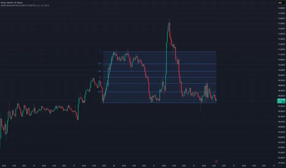
Metallic Retracement ToolI made a version of the Metallic Retracement script where instead of using automatic zig-zag detection, you get to place the points manually. When you add it to the chart, it prompts you to click on two points. These two points become your swing range, and the indicator calculates all the metallic retracement levels from there and plots them on your chart. You can drag the points around afterwards to adjust the range, or just add the indicator to the chart again to place a completely new set of points.
The mathematical foundation is identical to the original Metallic Retracement indicator. You're still working with metallic means, which are the sequence of constants that generalize the golden ratio through the equation x² = kx + 1. When k equals 1, you get the golden ratio. When k equals 2, you get silver. Bronze is 3, and so on forever. Each metallic number generates its own set of retracement ratios by raising alpha to various negative powers, where alpha equals (k + sqrt(k² + 4)) / 2. The script algorithmically calculates these levels instead of hardcoding them, which means you can pick any metallic number you want and instantly get its complete retracement sequence.
What's different here is the control. Automatic zig-zag detection is useful when you want the indicator to find swings for you, but sometimes you have a specific price range in mind that doesn't line up with what the zig-zag algorithm considers significant. Maybe you're analyzing a move that's still developing and hasn't triggered the zig-zag's reversal thresholds yet. Maybe you want to measure retracements from an arbitrary high to an arbitrary low that happened weeks apart with tons of noise in between. Manual placement lets you define exactly which two points matter for your analysis without fighting with sensitivity settings or waiting for confirmation.
The interactive placement system uses TradingView's built-in drawing tools, so clicking the two points feels natural and works the same way as drawing a trendline or fibonacci retracement. First click sets your starting point, second click sets your ending point, and the indicator immediately calculates the range and draws all the metallic levels extending from whichever point you chose as the origin. If you picked a swing low and then a swing high, you get retracement levels projecting upward. If you went from high to low, they project downward.
Moving the points after placement is as simple as grabbing one of them and dragging it to a new location. The retracement levels recalculate in real-time as you move the anchor points, which makes it easy to experiment with different range definitions and see how the levels shift. This is particularly useful when you're trying to figure out which swing points produce retracement levels that line up with other technical features like previous support or resistance zones. You can slide the points around until you find a configuration that makes sense for your analysis.
Adding the indicator to the chart multiple times lets you compare different metallic means on the same price range, or analyze multiple ranges simultaneously with different metallic numbers. You could have golden ratio retracements on one major swing and silver ratio retracements on a smaller correction within that swing. Since each instance of the indicator is independent, you can mix and match metallic numbers and ranges however you want without one interfering with the other.
The settings work the same way as the original script. You select which metallic number to use, control how many power ratios to display above and below the 1.0 level, and adjust how many complete retracement cycles you want drawn. The levels extend from your manually placed swing points just like they would from automatically detected pivots, showing you where price might react based on whichever metallic mean you've selected.
What this version emphasizes is that retracement analysis is subjective in terms of which swing points you consider significant. Automatic detection algorithms make assumptions about what constitutes a meaningful reversal, but those assumptions don't always match your interpretation of the price action. By giving you manual control over point placement, this tool lets you apply metallic retracement concepts to exactly the price ranges you care about, without requiring those ranges to fit someone else's definition of a valid swing. You define the context, the indicator provides the mathematical framework.
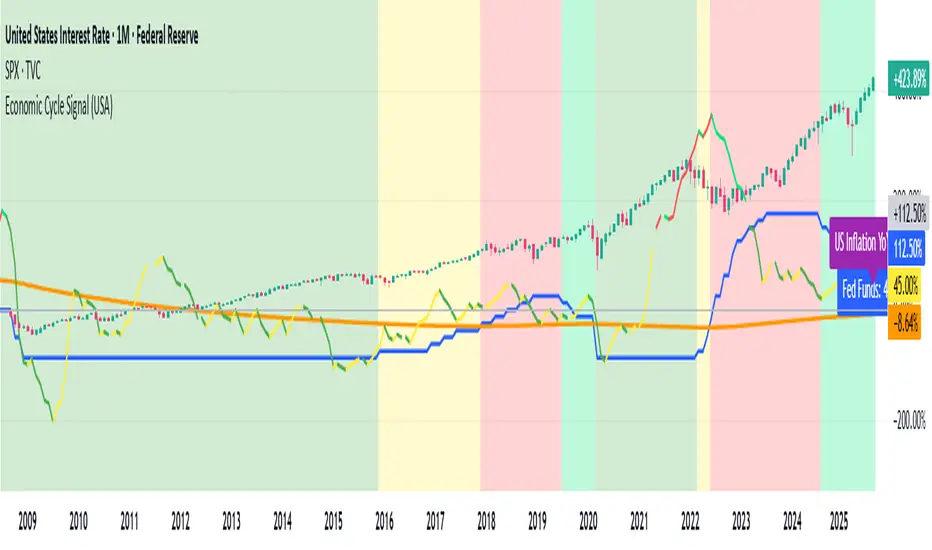
Economic Cycle Signal (USA)📊 Economic Cycle Signal (USA)
This indicator overlays both the U.S. Federal Reserve Funds Rate (Fed Funds) and the U.S. Inflation Rate YoY directly onto your stock market chart (e.g., S&P 500). It visually connects monetary policy and inflation dynamics with equity market performance, helping traders and analysts understand how macroeconomic shifts impact risk assets.
🔹 Key Features
• Plots the monthly U.S. Fed Funds Rate alongside your chart.
• Overlays the U.S. Inflation Rate YoY, offering a direct and realistic view of inflation pressure instead of CPI.
• Shades the background to reflect different economic cycle phases (recovery, recession, expansion, late cycle).
• Highlights how the stock market reacts during shifting monetary and inflationary conditions.
• Provides a clear traffic-light style signal for quick macro interpretation.
• Now includes dynamic inflation color logic based on the Fed’s 2% target and 5% threshold (explained below).
🔹 Inflation Line Color Logic (New)
The inflation line now changes color dynamically to show whether inflation is within or outside the Federal Reserve’s comfort zone, and whether it’s rising or falling:
Inflation Condition Interpretation Line Color
Inflation > 5% and Rising Inflation overheating (well above target) 🔴 Red
Inflation > 5% and Falling Cooling off from high levels 💚 Lime
Inflation < 5% and Falling Disinflation / stable price environment 🟢 Green
Inflation < 5% and Rising Early inflation rebound 🟡 Yellow
This color-coded logic mirrors the interest rate phase colors, giving traders an instant visual cue about inflationary pressure and possible policy turning points.
🔹 How Traders & Analysts Can Use It
• Visualize the interaction between U.S. monetary policy and inflation cycles in real time.
• Identify historically supportive phases when low or easing rates follow moderate inflation.
• Detect tightening cycles when inflation spikes first and the Fed reacts, signaling potential equity headwinds.
• Use as a macro compass to anticipate inflation pressure, policy changes, and market regime shifts.
• Combine with technical analysis, fundamentals, or leading indicators for deeper macro insights.
🔹 Color Legend (Economic Phases)
🟩 Light Green → Recovery (Early Cycle)
• Rates: low or falling
• Inflation: low/stable
🟩 Green → Recession (Down Cycle)
• Rates: cut aggressively
• Inflation: falling
🟨 Yellow → Expansion (Mid Cycle)
• Rates: rising gradually
• Inflation: moderate
🟥 Red → Overheating (Late Cycle)
• Rates: high / rising fast
• Inflation: high
🔹 Inflation Context
• Inflation typically leads the policy rate cycle, offering early insight into future Fed actions.
• The U.S. Inflation Rate YoY provides a direct measure of consumer price changes compared to the same month last year — a clearer gauge of inflation pressure than CPI.
• The new color logic helps visualize whether inflation is accelerating or cooling, relative to the Fed’s 2% target and 5% upper threshold.
• This dual-overlay makes it easy to interpret the cause (inflation) and effect (interest rate policy) in one synchronized chart.
⚠️ Disclaimer
This script is for educational and informational purposes only. It does not provide financial advice or trading signals. Always combine it with your own research, proper risk management, and professional judgment.
Economic Cycle Signal (Pakistan)📊 Economic Cycle Signal (Pakistan)
This indicator overlays both the Pakistan Policy Rate (PKINTR) and the Pakistan Inflation Rate YoY (PKIRYY) directly onto your KSE or Pakistan market chart. It visually connects monetary policy and inflation dynamics with market performance, helping traders and analysts understand how shifts in economic conditions impact risk assets in Pakistan.
🔹 Key Features
• Plots the monthly Pakistan Policy Rate alongside your chart.
• Overlays the Pakistan Inflation Rate YoY to track how price pressures evolve before policy rate adjustments.
• Shades the background to reflect different economic cycle phases (recovery, recession, expansion, late cycle).
• Highlights how equities and other risk assets react during shifting monetary and inflationary conditions.
• Provides a clear traffic-light style signal for quick macro interpretation.
• Now includes dynamic inflation color logic based on the State Bank of Pakistan’s (SBP) 5–7% target range and thresholds for overheating or cooling inflation.
🔹 Inflation Line Color Logic (New)
The inflation line color dynamically reflects whether inflation is within or outside SBP’s target range, and whether it’s rising or falling:
Inflation Condition Interpretation Line Color
Inflation > 7% and Rising Inflation overheating (well above SBP target) 🔴 Red
Inflation > 7% and Falling Cooling off from high levels 💚 Lime
Inflation < 5% and Falling Disinflation / stable price environment 🟢 Green
Inflation < 5% and Rising Early inflation rebound 🟡 Yellow
This adaptive color logic mirrors the interest rate cycle signals, helping traders instantly interpret Pakistan’s inflation trajectory and anticipate potential monetary policy turning points.
🔹 How Traders & Analysts Can Use It
• Visualize Pakistan’s monetary policy cycles and inflation trends in real time.
• Identify supportive phases when rate cuts or low policy rates follow controlled inflation.
• Detect tightening cycles when inflation spikes and the SBP reacts with rate hikes, often creating headwinds for equities.
• Use as a macro compass to anticipate inflation pressure, potential policy actions, and shifts in market risk appetite.
• Combine with technical analysis, fundamentals, or macro indicators for deeper insights into Pakistan’s economic conditions.
🔹 Color Legend (Economic Phases)
🟩 Light Green → Recovery (Early Cycle)
• Rates: low or falling
• Inflation: low/stable
🟩 Green → Recession (Down Cycle)
• Rates: cut aggressively
• Inflation: falling
🟨 Yellow → Expansion (Mid Cycle)
• Rates: rising gradually
• Inflation: moderate
🟥 Red → Overheating (Late Cycle)
• Rates: high / rising fast
• Inflation: high
🔹 Inflation Context
• SBP’s medium-term inflation target range is 5–7%, aimed at balancing growth and price stability.
• The script applies the same visual logic used in the U.S. version, now calibrated to Pakistan’s macro environment.
• The Pakistan Inflation Rate YoY (PKIRYY) line color shifts dynamically — clearly showing when inflation is rising above target, cooling, or stabilizing.
• This dual-overlay helps interpret both the cause (inflation) and effect (policy response) within Pakistan’s economic cycle, giving investors a clear macro perspective.
⚠️ Disclaimer
This script is for educational and informational purposes only. It does not provide financial advice or trading signals. Always combine it with your own research, proper risk management, and professional judgment.

Volume Surprise [LuxAlgo]The Volume Surprise tool displays the trading volume alongside the expected volume at that time, allowing users to spot unexpected trading activity on the chart easily.
The tool includes an extrapolation of the estimated volume for future periods, allowing forecasting future trading activity.
🔶 USAGE
We define Volume Surprise as a situation where the actual trading volume deviates significantly from its expected value at a given time.
Being able to determine if trading activity is higher or lower than expected allows us to precisely gauge the interest of market participants in specific trends.
A histogram constructed from the difference between the volume and expected volume is provided to easily highlight the difference between the two and may be used as a standalone.
The tool can also help quantify the impact of specific market events, such as news about an instrument. For example, an important announcement leading to volume below expectations might be a sign of market participants underestimating the impact of the announcement.
Like in the example above, it is possible to observe cases where the volume significantly differs from the expected one, which might be interpreted as an anomaly leading to a correction.
🔹 Detecting Rare Trading Activity
Expected volume is defined as the mean (or median if we want to limit the impact of outliers) of the volume grouped at a specific point in time. This value depends on grouping volume based on periods, which can be user-defined.
However, it is possible to adjust the indicator to overestimate/underestimate expected volume, allowing for highlighting excessively high or low volume at specific times.
In order to do this, select "Percentiles" as the summary method, and change the percentiles value to a value that is close to 100 (overestimate expected volume) or to 0 (underestimate expected volume).
In the example above, we are only interested in detecting volume that is excessively high, we use the 95th percentile to do so, effectively highlighting when volume is higher than 95% of the volumes recorded at that time.
🔶 DETAILS
🔹 Choosing the Right Periods
Our expected volume value depends on grouping volume based on periods, which can be user-defined.
For example, if only the hourly period is selected, volumes are grouped by their respective hours. As such, to get the expected volume for the hour 7 PM, we collect and group the historical volumes that occurred at 7 PM and average them to get our expected value at that time.
Users are not limited to selecting a single period, and can group volume using a combination of all the available periods.
Do note that when on lower timeframes, only having higher periods will lead to less precise expected values. Enabling periods that are too low might prevent grouping. Finally, enabling a lot of periods will, on the other hand, lead to a lot of groups, preventing the ability to get effective expected values.
In order to avoid changing periods by navigating across multiple timeframes, an "Auto Selection" setting is provided.
🔹 Group Length
The length setting allows controlling the maximum size of a volume group. Using higher lengths will provide an expected value on more historical data, further highlighting recurring patterns.
🔹 Recommended Assets
Obtaining the expected volume for a specific period (time of the day, day of the week, quarter, etc) is most effective when on assets showing higher signs of periodicity in their trading activity.
This is visible on stocks, futures, and forex pairs, which tend to have a defined, recognizable interval with usually higher trading activity.
Assets such as cryptocurrencies will usually not have a clearly defined periodic trading activity, which lowers the validity of forecasts produced by the tool, as well as any conclusions originating from the volume to expected volume comparisons.
🔶 SETTINGS
Length: Maximum number of records in a volume group for a specific period. Older values are discarded.
Smooth: Period of a SMA used to smooth volume. The smoothing affects the expected value.
🔹 Periods
Auto Selection: Automatically choose a practical combination of periods based on the chart timeframe.
Custom periods can be used if disabling "Auto Selection". Available periods include:
- Minutes
- Hours
- Days (can be: Day of Week, Day of Month, Day of Year)
- Months
- Quarters
🔹 Summary
Method: Method used to obtain the expected value. Options include Mean (default) or Percentile.
Percentile: Percentile number used if "Method" is set to "Percentile". A value of 50 will effectively use a median for the expected value.
🔹 Forecast
Forecast Window: Number of bars ahead for which the expected volume is predicted.
Style: Style settings of the forecast.

Match on Selectable Percentage Change + RangeIndicator Overview:
Match on Selectable Percentage Change + Range is a powerful analytical tool designed for traders and analysts who want to identify historical price bars that match a specific percentage variation, and then evaluate how price evolved in the following days. It combines precision filtering with visual tabular feedback, making it ideal for pattern recognition, backtesting, and scenario analysis.
What It Does
This indicator scans historical bars to find instances where the percentage change between two consecutive closes matches a user-defined target (± a customizable tolerance). Once matches are found, it displays:
The date of each match (most recent first)
The actual variation searched
The percentage change after 2, 10, 20, and 30 bars
The min-max range (in %) over those same periods
All results are shown in a dynamic table directly on the chart.
Inputs & Controls
Input Description
Which variation do you want to analyze? (%)
Set the target percentage change to look for (e.g. 2.5%)
% deviation from the variation to be considered (%) Define the tolerance range around the target (e.g. ±0.5%)
Bars to analyze (max 9999) Set how many past bars to scan
Show match table Toggle to enable/disable the entire table
Show percentage variations (2d, 10d, 20d, 30d) Toggle to show/hide post-match percentage changes
Show min-max ranges (2d, 10d, 20d, 30d) Toggle to show/hide post-match high/low ranges
Table Structure
Each row in the table represents a historical match. Columns include:
Date: When the match occurred
Variation in: The actual % change that triggered the match
2d / 10d / 20d / 30d: % change after those days
Min-Max 2d / 10d / 20d / 30d: Range of price movement after those days
Color coding helps quickly identify bullish (green) vs bearish (red) outcomes.
Use Cases
Backtesting: See how similar past moves evolved over time
Scenario modeling: Estimate potential outcomes after a known variation
Pattern recognition: Spot recurring setups or volatility clusters
Risk analysis: Understand post-variation drawdowns and upside potential
Tips for Use
Use tighter deviation (e.g. 0.3%) for precision, or wider (e.g. 1%) for broader pattern capture.
Combine with other indicators to validate setups (e.g. volume, RSI, trend filters).
Toggle off variation or range columns to focus only on the metrics you need.

Cyclical Phases of the Market🧭 Overview
“Cyclical Phases of the Market” automatically detects major market cycles by connecting swing lows and measuring the average number of bars between them.
Once it learns the rhythm of past cycles, it projects the next expected cycle (in time and price) using a dashed orange line and a forecast label.
In simple terms:
The indicator shows where the next potential low is statistically expected to occur, based on the timing and depth of previous cycles.
⚙️ Core Logic – Step by Step
1️⃣ Pivot Detection
The script uses the built-in ta.pivotlow() and ta.pivothigh() functions to find local turning points:
pivotLow marks a local swing low, defined by pivotLeft and pivotRight bars on each side.
Only confirmed lows are used to define the major cycle points.
Each new pivot low is stored in two arrays:
cycleLows → price level of the low
cycleBars → bar index where the low occurred
2️⃣ Cycle Identification and Drawing
Every time two consecutive swing lows are found, the indicator:
Calculates the number of bars between them (cycle length).
If that distance is greater than or equal to minCycleBars, it draws a teal line connecting the two lows — visually representing one complete cycle.
These teal lines form the historical cycle structure of the market.
3️⃣ Average Cycle Length
Once there are at least three completed cycles, the script calculates the average duration (mean number of bars between lows).
This value — avgCycleLength — represents the dominant periodicity or cycle rhythm of the market.
4️⃣ Forecasting the Next Cycle
When a valid average cycle length exists, the model projects the next expected cycle:
Time projection:
Adds avgCycleLength to the last cycle’s ending bar index to find where the next low should occur.
Price projection:
Estimates the vertical amplitude by taking the difference between the last two cycle lows (priceDiff).
Adds this same difference to the last low price to forecast the next probable low level.
The result is drawn as an orange dashed line extending into the future, representing the Next Expected Cycle.
5️⃣ Forecast Label
An orange label 🔮 appears at the projected future point showing:
Text:
🔮 Upcoming Cycle Forecast
Price:
The label marks the probable area and timing of the next cyclical low.
(Note: the date/time calculation currently multiplies bar count by 7 days, so it’s designed mainly for daily charts. On other timeframes, that conversion can be adapted.)
📊 How to Read It on the Chart
Visual Element Meaning Interpretation
Teal lines Completed historical cycles (low to low) Show actual periodic rhythm of the market
Orange dashed line Projection of the next expected cycle Anticipated path toward the next cyclical low
Orange label 🔮 Upcoming Cycle Forecast Displays expected price and bar location
Average cycle length Internal variable (bars between lows) Represents the dominant cycle period
📈 Interpretation
When teal segments show consistent spacing, the market is following a stable rhythm → cycles are predictable.
When cycle spacing shortens, the market is accelerating (volatility rising).
When it widens, the market is slowing down or entering accumulation.
The orange dashed line represents the next expected low zone:
If the market drops near this line → cyclical pattern confirmed.
If the market breaks well below → cycle amplitude has increased (trend weakening).
If the market rises above and delays → a new longer cycle may be forming.
🧠 Practical Use
Combine with oscillators (e.g., RSI or TSI) to confirm momentum alignment near projected lows.
Use in conjunction with volume to identify accumulation or exhaustion near the expected turning point.
Compare across timeframes: weekly cycles confirm long-term rhythm; daily cycles refine short-term entries.
⚡ Summary
Aspect Description
Purpose Detect and forecast recurring market cycles
Cycle basis Low-to-Low pivot analysis
Visuals Teal historical cycles + Orange forecast line
Forecast Next expected low (price and time)
Ideal timeframe Daily
Main outputs Average cycle length, next projected cycle, visual cycle map
