Trending RSI [ChartPrime]Trending RSI takes a new approach to RSI intended to provide all of the missing information that traditional RSI lacks. Questions such as "why does the price continue to decline even during an oversold period?" can be aided using the Trending RSI.
These types of movements are due to the market still trending and traditional RSI can not tell traders this. Trending RSI fixes this by introducing trend information back into the oscillator. By reverse engineering RSI we have been able to make a new indicator that is no longer bound between 0 and 100. Instead it provides the traditional 70 and 30 zones as bands, and 50 as a center line that still represent these zones perfectly. This transforms RSI into a centered oscillator instead of a normalized oscillator. When the market is trending our indicator represents this as the center line being below or above 0. Just like MACD the center line is colored to represent the market phases. This helps in identifying reversals more clearly by adding a layer of confluence to the already renowned RSI. We have also included a novel filtering technique that has a low lag to smoothing ratio. This is primarily used to smooth the bands by default but you can also utilize this on the RSI. Several alerts have been included to provide users with easy to configure signals.
You can use the center line as a directional filter for your trades by only picking trades in the direction of the center line. When the center line is above 0, the market is trending up. Conversely, when the center line is below 0 the market is trending down trend. Use the polarity of the center line to estimate the strength of retracements from the oversold and overbought zones. We have also included a special moving average to help you find the momentum of a move. The Binomial MA filter approximates a normal curve making it similar to a gaussian filter. We have also included standard divergences which are fully configurable in the settings. Finally, we have built this indicator to be compatible with the built in multi time frame option to allow users to freely pick the time frame they wish to use. It is worth noting that due to the limitations of the standard MTF implementation divergences will not plot as expected when using time frames outside of the charts time frame. This is standard and also affects the built in RSI.
All of the colors are fully adjustable with the option to enable or disable the glow effect. We have also designed this indicator to only display the information for plots that are enabled to reduce clutter and provide a cleaner charting experience. All alerts are built to work with the standard alert builder and do not have to be enabled or disabled inside of the indicator.
Included Alerts:
RSI Cross Over Center
RSI Cross Under Center
RSI Cross Under Upper Range
RSI Cross Over Upper Range
RSI Cross Over Lower Range
RSI Cross Under Lower Range
RSI Cross Over MA
RSI Cross Under MA
RSI Cross Over 0
RSI Cross Under 0
Center Cross Over 0
Center Cross Under 0
Center Bullish
Center Bearish
Bullish Divergence
Bearish Divergence
In wrapping up, the Trending RSI aims to enhance the conventional RSI by adding trend insights directly into the oscillator, addressing the gap that traditional RSI leaves regarding market trends. This version of RSI breaks away from the 0 to 100 range, offering bands and a center line that better represent market conditions. It includes a set of features like the Binomial MA for momentum analysis, configurable settings for divergence detection, and compatibility with multi-time frame analysis. The color customization and glow effects aim to improve visual clarity, and the inclusion of alerts is designed to streamline alert configuration. Overall, this indicator is designed to provide a more view of the markets, suitable for traders looking to incorporate trend analysis into their RSI-based strategies.
Enjoy
Cari skrip untuk "trend"

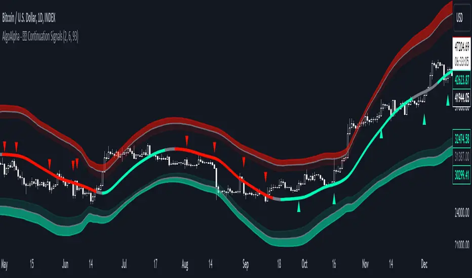
Trend Continuation Signals [AlgoAlpha]Introducing the Trend Continuation Signals by AlgoAlpha 🌟🚀
Elevate your trading game with this multipurpose indicator, designed to pinpoint trend continuation opportunities as well as highlight volatility and oversold/overbought conditions. Whether you're a trading novice or a seasoned market veteran, this tool offers intuitive visual cues to boost your decision-making and enhance your market analysis. Let's explore the key features, how to use it effectively, and delve into the operational mechanics that make this tool a game-changer in your trading arsenal:
Key Features:
🔥 Advanced Trend Detection : Leverages the Hull Moving Average (HMA) for superior trend tracking as compared to other MAs, offering unique insights into market momentum.
🌈 Volatility Bands : Implements adjustable bands around the trend line, which evolve with market conditions to highlight potential trading opportunities.
⚡ Trend Continuation Signals : Identifies bullish and bearish continuation signals, equipping you with actionable signals to exploit the prevailing market trend.
🎨 Intuitive Color Coding : Employs a vibrant color scheme to distinguish between uptrends, downtrends, and neutral phases, facilitating easy interpretation of the indicator's insights.
🛠 How to Use "Trend Continuation Signals ":
🔍 Setting Up : Incorporate the indicator onto your chart and customize the indicator to suite your preferences.
👀 Reading the Signals : Pay attention to the color-coded trend lines and volatility bands. Green indicates an uptrend, red signifies a downtrend, and gray denotes a neutral market condition.
📈 Identifying Entry Points : Look for bullish (▲) and bearish (▼) continuation icons below or above the price bars as signals for potential entry points for long or short positions, respectively.
🔄 Confirmation : Validate your trades with further analysis or other indicators. The Trend Continuation Signals are most effective when complemented by other technical analysis tools or fundamental insights.
📉 Risk Management : Implement stop-loss orders in line with your risk appetite and adjust them based on the volatility bands provided by the indicator to safeguard your investments.
How It Operates:
The essence of the indicator is captured through the hull moving averages for both the primary and secondary lines, set at periods of 93 and 50, respectively, to reflect market trends and pullbacks that trigger the continuation signals every time price recovers from a detected pullback.
Volatility is quantified through the standard deviation of the midline, magnified by a factor, establishing the upper and lower trend band boundaries.
Further volatility bands are plotted around the main volatility band, providing a granular view of market volatility and potential breakout or breakdown zones.
Market trend direction is determined by comparing the HMA line's current position to its previous value, enhanced by the secondary line to identify continuation patterns.
Embrace the power of the Trend Continuation Signals to enhance your trading strategy! It is important to note that all indicators are best used in confluence with other forms of analysis, happy trading! 📊💥
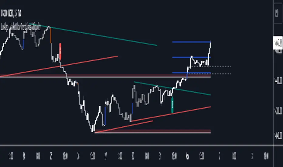
Market Flow Trend Lines & Liquidity [LuxAlgo]The Market Flow Trend Lines & Liquidity indicator is a script that aims to automate key insights such as trend lines, liquidity zones, opening ranges, & gaps on the chart. The aim of this script is to provide a functional breakout trader toolkit with various familiar tools as well as unique capabilities to further improve the user experience.
🔶 USAGE
There are various methods for using the features within this script, even with the included take profit levels users can pre-define.
The dotted lines represent an Opening Range with levels we can use as support & resistance. This opening range can be traded within the levels; however, it can also be used to tell the sentiment of price to see how it reacts to it.
In the image below, we can see after price was holding above the Opening Range whilst printing bullish trendline breakout signals, it made its way to the TP level we enabled from within the indicator to calculate a potential level for taking profits in a breakout trade.
The Market Flow Trend Lines & Liquidity indicator's key feature reside within its multi-timeframe capabilities for the main trendlines, as well as its key zones for potential entries.
In the image above we can see multiple areas where multi-timeframe (1H) trendlines on the 30m chart acted as support & resistance, alongside the Liquidity Zones & Opening Range as optimal points of interest for a breakout trader.
🔶 SETTINGS
🔹 Trendlines
Trendlines Lookback: Determines the frequency of detected tops/bottoms used to construct trendlines.
Slope: Trendlines slope, with higher values returning steeper trendlines.
Timeframe: Trendline timeframe.
🔹 Liquidity Zones
Liquidity Lookback: Determines the frequency of detected tops/bottoms used to construct liquidity zones.
🔹 Take Profits
Take profit settings. Up to 3 ATR based take profits can be enabled, with a numerical setting controlling the ATR multiplier.
🔹 Opening Range
From Time: 15min opening range starting time.
Extend: Extension length of Opening Range lines (in bars).
🔹 Gap Imbalance
Gap Up: Display upward gaps.
Gap Down: Display downward gaps.
🔹 EMA
Show EMA: Displays an EMA on the chart.
EMA Length: Length of the displayed EMA.
🔶 RELATED SCRIPTS
Liquidity Swings
Trendlines with Breaks
Harmonic Trend Fusion [kikfraben]📈 Harmonic Trend Fusion - Your Personal Trading Assistant
This versatile tool combines multiple indicators to provide a holistic view of market trends and potential signals.
🚀 Key Features:
Multi-Indicator Synergy: Benefit from the combined insights of Aroon, DMI, MACD, Parabolic SAR, RSI, Supertrend, and SMI Ergodic Oscillator, all in one powerful indicator.
Customizable Plot Options: Tailor your chart by choosing which signals to visualize. Whether you're interested in trendlines, histograms, or specific indicators, the choice is yours.
Color-Coded Trends: Quickly identify bullish and bearish trends with the color-coded visualizations. Stay ahead of market movements with clear and intuitive signals.
Table Display: Stay informed at a glance with the interactive table. It dynamically updates to reflect the current market sentiment, providing you with key information and trend direction.
Precision Control: Fine-tune your analysis with precision control over indicator parameters. Adjust lengths, colors, and other settings to align with your unique trading strategy.
🛠️ How to Use:
Customize Your View: Select which indicators to display and adjust plot options to suit your preferences.
Table Insights: Monitor the dynamic table for real-time updates on market sentiment and trend direction.
Indicator Parameters: Experiment with different lengths and settings to find the combination that aligns with your trading style.
Whether you're a seasoned trader or just starting, Harmonic Trend Fusion equips you with the tools you need to navigate the markets confidently. Take control of your trading journey and enhance your decision-making process with this comprehensive trading assistant.
Trended and BlendedWhat up guys and welcome to the CoffeeShop. This is your host and "baristo", Eric.
This is a simple little set of 3 moving averages. Smoothed moving averages that you can use in the 10 /28 strategy, or any other strategy you choose.
Among themselves there is nothing special about these moving averages, but because of their settings they will help you find entries for long and short positions and for divergence trading.
These moving averages have conditional colors built into the code, using the pinescript "color from gradient" feature.
All three moving averages, are green when they are all lined up in a bullish form.
All three are red when they're all lined up in a bearish form.
And they are colored Gray when price action and the moving averages are mixed up in any way.
But this is not enough to help you determine whether you have a true trend or not also it is not enough to tell you whether you have a strong or weak trend so there's more.
Add to this color command, the candles are colored ONLY when there is a true uptrend or downtrend.
If you believe for any reason that price action is telling you this is going to a a short term trend, you can
wait for your long or short color confirmations and then drop down to a lower timeframe to make your trades.
STRONG TREND:
for a strong uptrend you would look for the candles to close bullish above all three green moving averages that were already lined up. This would be a strong uptrend. If price action closed below all three downward lined up moving averages they were all red and your candle is red then you have a strong downtrend.
Week Trend
However if your candle closes bearish and it closes red below a mixed set of moving averages then you have a week downtrend.
The same applies if you have a bullish closing candle but your fast and medium moving average are facing up however they are below your slow moving average. You may have a green line up however if you're moving averages are mixed up then you have a weak trend.
Summary
In short a strong trend is when you close above or below moving averages that are lined up in the same direction and they are not mixed in any way. A weak trend is when you close above or below your fast and medium moving averages as they're lined up in that same direction however they are on the wrong side of your third moving average.
When you have a weak trend you should be scalping and when you have a strong trend you should be able to ride that trend more appropriately.

[tradinghook] - Renko Trend Reversal Strategy - Renko Trend Reversal Strategy
Short Title: - Renko TRS
Description:
The Renko Trend Reversal Strategy ( - Renko TRS) is a powerful and original trading approach designed to identify trend reversals in financial markets using Renko charts. Renko charts differ from traditional time-based charts, as they focus solely on price movements and ignore time, resulting in a clearer representation of market trends. This strategy leverages Renko charts in conjunction with the Average True Range (ATR) to capture trend reversals with high precision and effectiveness.
Key Concepts:
Renko Charts: Renko charts are unique chart types that only plot price movements beyond a predefined brick size, ignoring time and noise. By doing so, they provide a more straightforward depiction of market trends, eliminating insignificant price fluctuations and making it easier to spot trend reversals.
Average True Range (ATR): The strategy utilizes the ATR indicator, which measures market volatility and provides valuable insights into potential price movements. By setting the brick size of the Renko chart based on the ATR, the strategy adapts to changing market conditions, ensuring optimal performance across various instruments and timeframes.
How it Works:
The Renko Trend Reversal Strategy is designed to identify trend reversal points and generate buy or sell signals based on the following principles:
Renko Brick Generation: The strategy calculates the ATR over a user-defined period (ATR Length) and utilizes this value to determine the size of Renko bricks. Larger ATR values result in bigger bricks, capturing higher market volatility, while smaller ATR values create smaller bricks for calmer market conditions.
Buy and Sell Signals: The strategy generates buy signals when the Renko chart's open price crosses below the close price, indicating a potential bullish trend reversal. Conversely, sell signals are generated when the open price crosses above the close price, suggesting a bearish trend reversal. These signals help traders identify potential entry points to capitalize on market movements.
Stop Loss and Take Profit Management: To manage risk and protect profits, the strategy incorporates dynamic stop-loss and take-profit levels. The stop-loss level is calculated as a percentage of the Renko open price, ensuring a fixed risk amount for each trade. Similarly, the take-profit level is set as a percentage of the Renko open price to secure potential gains.
How to Use:
Inputs: Before using the strategy, traders can customize several parameters to suit their trading preferences. These inputs include the ATR Length, Stop Loss Percentage, Take Profit Percentage, Start Date, and End Date. Adjusting these settings allows users to optimize the strategy for different market conditions and risk tolerances.
Chart Setup: Apply the - Renko TRS script to your desired financial instrument and timeframe on TradingView. The Renko chart will dynamically adjust its brick size based on the ATR Length parameter.
Buy and Sell Signals: The strategy will generate green "Buy" labels below bullish reversal points and red "Sell" labels above bearish reversal points on the Renko chart. These labels indicate potential entry points for long and short trades, respectively.
Risk Management: The strategy automatically calculates stop-loss and take-profit levels based on the user-defined percentages. Traders can ensure proper risk management by using these levels to protect their capital and secure profits.
Backtesting and Optimization: Before implementing the strategy live, traders are encouraged to backtest it on historical data to assess its performance across various market conditions. Adjust the input parameters through optimization to find the most suitable settings for specific instruments and timeframes.
Conclusion:
The - Renko Trend Reversal Strategy is a unique and versatile tool for traders looking to identify trend reversals with greater accuracy. By combining Renko charts and the Average True Range (ATR) indicator, this strategy adapts to market dynamics and provides clear entry and exit signals. Traders can harness the power of Renko charts while effectively managing risk through stop-loss and take-profit levels. Before using the strategy in live trading, backtesting and optimization will help traders fine-tune the parameters for optimal performance. Start exploring trend reversals with the - Renko TRS and take your trading to the next level.
(Note: This description is for illustrative purposes only and does not constitute financial advice. Traders are advised to thoroughly test the strategy and exercise sound risk management practices when trading in real markets.)

DCA-Integrated Trend Continuation StrategyIntroducing the DCA-Integrated Trend Continuation Strategy 💼💰
The DCA-Integrated Trend Continuation Strategy represents a robust trading methodology that harnesses the potential of trend continuation opportunities while seamlessly incorporating the principles of Dollar Cost Averaging (DCA) as a risk management and backup mechanism. This strategy harmoniously blends these two concepts to potentially amplify profitability and optimize risk control across diverse market conditions.
This strategy is well-suited for both trending and ranging markets. During trending markets, it aims to capture and ride the momentum of the trend while optimizing entry points. In ranging markets or pullbacks, the DCA feature comes into play, allowing users to accumulate more assets at potentially lower prices and potentially increase profits when the market resumes its upward trend. This cohesive approach not only enhances the overall effectiveness of the strategy but also fosters a more resilient and adaptable trading approach in ever-changing market dynamics.
💎 How it Works:
▶️ The strategy incorporates a customizable entry signal based on candlestick patterns, enabling the identification of potential trend continuation opportunities. By focusing on consecutive bullish candles, it detects the presence of bullish momentum, indicating an optimal time to enter a long position.
To refine the precision of the signals, traders can set a specific percentage threshold for the closing price of the candle, ensuring it is above a certain percentage of its body. This condition verifies strong bullish momentum and confirms significant upward movement within the candle, thereby increasing the reliability of the signal.
In addition, the strategy offers further confirmation by examining the relationship between the closing price of the signal candle and its previous candles. If the closing price of the signal candle is higher than its preceding candles, it provides an additional layer of assurance before entering a position. This approach is particularly effective in detecting sharp movements and capturing significant price shifts, as it focuses on identifying instances where the closing price shows clear strength and outperforms the previous candle's price action. By prioritizing such occurrences, the strategy aims to capture robust trends and capitalize on notable market movements.
▶️ During market downturns, the strategy incorporates intelligent management of price drops, offering flexibility through fixed or customizable price drop percentages. This unique feature allows for additional entries at specified drop percentages, enabling traders to accumulate positions at more favorable prices.
By strategically adjusting the custom price drop percentages, you can optimize your entry points to potentially maximize profitability. Utilizing lower percentages for initial entries takes advantage of price fluctuations, potentially yielding higher returns. On the other hand, employing higher percentages for final entries adopts a more cautious approach during significant market downturns, emphasizing enhanced risk management. This adaptive approach ensures that the strategy effectively navigates challenging market conditions while seeking to optimize overall performance.
▶️ To enhance performance and mitigate risks, the strategy integrates average purchase price management. This feature dynamically adjusts the average buy price percentage decrease after each price drop, expediting the achievement of the target point even in challenging market conditions. By reducing recovery times and ensuring investment safety, this strategy optimizes outcomes for traders.
▶️ Risk management is at the core of this strategy, prioritizing the protection of capital. It incorporates an account balance validation mechanism that conducts automatic checks prior to each entry, ensuring alignment with available funds. This essential feature provides real-time insights into the affordability of price drops and the number of entries, enabling traders to make informed decisions and maintain optimal risk control.
▶️ Furthermore, the strategy offers take profit options, allowing traders to secure gains by setting fixed percentage profits from the average buy price or using a trailing target. Stop loss protection is also available, enabling traders to set a fixed percentage from the average purchase price to limit potential losses and preserve capital.
▶️ This strategy is fully compatible with third-party trading bots, allowing for easy connectivity to popular trading platforms. By leveraging the TradingView webhook functionality, you can effortlessly link the strategy to your preferred bot and receive accurate signals for position entry and exit. The strategy provides all the necessary alert message fields, ensuring a smooth and user-friendly trading experience. With this integration, you can automate the execution of trades, saving time and effort while enjoying the benefits of this powerful strategy.
🚀 How to Use:
To effectively utilize the DCA-Integrated Trend Continuation Strategy, follow these steps:
1. Choose your preferred DCA Mode - whether by quantity or by value - to determine how you want to size your positions.
2. Customize the entry conditions of the strategy to align with your trading preferences. Specify the number of consecutive bullish candles, set a desired percentage threshold for the close of the signal candle relative to its body, and determine the number of previous candles to compare with.
3. Adjust the pyramiding parameter to suit your risk tolerance and desired returns. Whether you prefer a more conservative approach with fewer pyramids or a more aggressive stance with multiple pyramids, this strategy offers flexibility.
4. Personalize the price drop percentages based on your risk appetite and trading strategy. Choose between fixed or custom percentages to optimize your entries in different market scenarios.
5. Configure the average purchase price management settings to control the percentage decrease in the average buy price after each price drop, ensuring it aligns with your risk tolerance and strategy.
6. Utilize the account balance validation feature to ensure the strategy's actions align with your available funds, enhancing risk management and preventing overexposure.
7. Set take profit options to secure your gains and implement stop loss protection to limit potential losses, providing an additional layer of risk management.
8. Use the date and time filtering feature to define the duration during which the strategy operates, allowing for specific backtesting periods or integration with a trading bot.
9. For automated trading, take advantage of the compatibility with third-party trading bots to seamlessly integrate the strategy with popular trading platforms.
By following these steps, traders can harness the power of the DCA-Integrated Trend Continuation Strategy to potentially maximize profitability and optimize their trading outcomes in both trending and ranging markets.
⚙️ User Settings:
To ensure the backtest result is representative of real-world trading conditions, particularly in the highly volatile Crypto market, the default strategy parameters have been carefully selected to produce realistic results with a conservative approach. However, you have the flexibility to customize these settings based on your risk tolerance and strategy preferences, whether you're focusing on short-term or long-term trading, allowing you to potentially achieve higher profits. The backtesting was conducted using the BTCUSDT pair in 15-minute timeframe on the Binance exchange. Users can configure the following options:
General Settings:
- Initial Capital (Default: $10,000)
- Currency (Default: USDT)
- Commission (Default: 0.1%)
- Slippage (Default: 5 ticks)
Order Size Management:
- DCA Mode (Default: Quantity)
- Order Size in Quantity (Default: 0.01)
- Order Size in Value (Default: $300)
Strategy's Entry Conditions:
- Number of Consecutive Bullish Candles (Default: 3)
- Close Over Candle Body % (Default: 50% - Disabled)
- Close Over Previous Candles Lookback (Default: 14 - Disabled)
- Pyramiding Number (Default: 30)
Price Drop Management:
- Enable Price Drop Calculations (Default: Enabled)
- Enable Current Balance Check (Default: Enabled)
- Price Drop Percentage Type (Default: Custom)
- Average Price Move Down Percentage % (Default: 50%)
- Fixed Price Drop Percentage % (Default: 0.5%)
- Custom Price Drop Percentage % (Defaults: 0.5, 0.5, 0.5, 1, 3, 5, 5, 10, 10, 10)
TP/SL:
- Take Profit % (Default: 3%)
- Stop Loss % (Default: 100%)
- Enable Trailing Target (Default: Enabled)
- Trailing Offset % (Default: 0.1%)
Backtest Table (Default: Enabled)
Date & Time:
- Date Range Filtering (Default: Disabled)
- Start Time
- End Time
Alert Message:
- Alert Message for Enter Long
- Alert Message for Exit Long
By providing these customizable settings, the strategy allows you to tailor it to your specific needs, enhancing the adaptability and effectiveness of your trading approach.
🔐 Source Code Protection:
The source code of the DCA-Integrated Trend Continuation Strategy is designed to be robust, reliable, and highly efficient. Its original and innovative implementation merits protecting the source code and limiting access, ensuring the exclusivity of this strategy. By safeguarding the code, the integrity and uniqueness of the strategy are preserved, giving users a competitive edge in their trading activities.

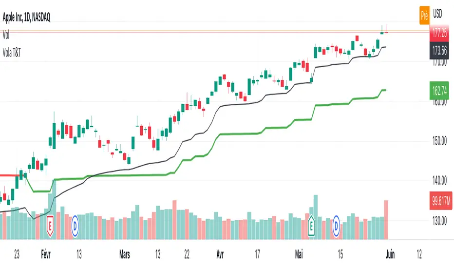
Vola2vola volatility Trade & TrendHello everyone!
For those who remember Vola2vola volatility Trade & Trend script, we are excited to bring it back within the Myfractalrange Tradingview account!
If you already chose to have access to Vola2vola volatility indicator, this one is using the same formula but instead of having a separate indicator to display Volatility, Volatility has now been converted into price values, which makes it possible to visualise it on the ticker chart directly.
It is more volatile than Myfractalrange Trend but it will give you a complementary view on the asset current situation: Bullish/Bearish with an additional timeframe view named Trade.
As you know, Volatility is very important to assets and many people use it to trade. This tool automate the calculation of the volatility of every asset as well as provide an estimated value of its "Trend" and "Trade" projected onto price.
The idea in this script is to allow users to have an idea of the current volatility regime of the asset he is monitoring: Is its volatility Bullish or Bearish Trend, Bearish or Bullish Trade?
What are the data provided by the script:
- Trade : Trade is generated using an arbitrary and fixed look back period, it acts as a short-term Trend. It will give the user the possibility to know if the asset is still trending up or down short-term. Default colour is black
- Trend: Trend is also generated using an arbitrary and fixed look back period (20 times the one used for Trade), it acts as a longer-term view of the asset trendiness. It works the same way as Trade and will give the user the possibility to know if the volatility of the asset is trending a longer-term basis or not. Default colours are: red when the Trend of the asset is Bearish and green when the Trend of the asset is Bullish
Here are some of the questions you need to know the answer to before using this script:
- How do you define a "Bullish/Bearish Trade"? Volatility is Bullish Trade when Price is above Trade and it is Bearish Trade when Price is below Trade
- How do you define a "Bullish/Bearish Trend"? Volatility is Bullish Trend when Price is above Trend and it is Bearish Trend when Price is below Trend
- On which time frame should i use this script? You want to use the Daily time frame. Although, for short term moves in the volatility space, users could monitor the Hourly timeframe
Understanding the volatility of an asset, along with the bullish or bearish nature of its Trade and Trend, is crucial for investors. Assets that are Bullish Trend and Trade tend to appreciate in value, while those that are Bearish Trend and Trade tend to depreciate. Therefore, we recommend investors be aware of the volatility Trend and Trade situation of the asset they are holding in their portfolio.
Here are the different scenarios that you will encounter on a Daily timeframe and how to interpret them:
- Price is above Trade & Trend: It is the most Bullish set up for the price of an asset
- Price is below Trade & Trend: It is the most Bearish set up for the price of an asset
- Any other set up suggests uncertainty, caution is therefore recommended
These are some cases that you could experience while using this script:
1) Bullish set up on a daily timeframe:
In this example using AAPL, when it is Bullish Trend and Trade on a daily timeframe, the price of AAPL tends to appreciate
2) Bearish set up on a daily timeframe:
In this example using IWM, when it is Bearish Trend and Trade on a daily timeframe, the price of IWM tends to depreciate
The idea of opening this script is to give you another layer of confidence when using our other scripts, especially when using Myfractalrange Trend.
We hope that you will find these explanations useful, please contact us by private message for access.
Enjoy!
DISCLAIMER: No sharing, copying, reselling, modifying, or any other forms of use are authorised. This script is strictly for individual use and educational purposes only. This is not financial or investment advice. Investments are always made at your own risk and are based on your personal judgement. Myfractalrange is not responsible for any losses you may incur. Please invest wisely.
Super Momentum Trend IndicatorThis is a trend momentum indicator that uses some of Ichimoku Cloud's core trading concepts and Supertrend, so before using this indicator, you can first understand Ichimoku Cloud, which is very helpful for understanding this indicator.
There are mainly the following ways to identify trends in Ichimoku Cloud.
1. The price is above or below the Tenkan-sen and the Kijun-sen
2. The Tenkan-sen crosses the Kijun-sen
3. The price breaks or falls below Leading Span B
4. Leading Span A crosses Leading Span B
I converted the above signal into the following expression (see chart):
1. Green dot: the price is above the Tenkan-sen and Kijun-sen
2. Red dot: the price is below Tenkan-sen and the Kijun-sen
3. Orange or blue dot: the price is between Tenkan-sen and Kijun-sen
4. Triangular symbol: the Tenkan-sen crosses the Kijun-sen, and the price continues to stand firmly above or below Kijun-sen by 2 candles (prevent fake moves)
5.B1 signal: the price breaks or falls below Leading Span B
6. B2 signal: Leading Span A crosses Leading Span B (this expresses whether the color of the cloud is green or red in Ichimoku cloud)
The default for this indicator is Ichimoku Cloud turned off so that the charts are simpler, but you can turn it on if you want to check Ichimoku Cloud.
When you use this indicator, you can observe the changes of the dots:
1. The upward trend reverses to a downward trend (see chart)
What you will see is: green dots, orange dots, red dots, unless the price suddenly falls below the Tenkan-sen and the Kijun-sen, then you will see red dots directly without orange dots .
2. The downward trend reverses to an upward trend (see chart)
What you will see is: red dots, blue dots, green dots, unless the price suddenly breaks through the Tenkan-sen and Kijun-sen, then you will see the green dots directly without the blue dots.
The dot is usually the signal on the left-hand side, the triangle is between the left-hand side and the right-hand side, and B1/B2 is the signal on the right-hand side.
I recommend entry trades separately , and using Supertrend to judge the trend. This is why this indicator also adds two Supertrends.
Why not just use the Super Trend indicator?
Because SuperTrend only provides a pure uptrend or downtrend, it does not show the upcoming reversal.
And with the momentum dots added, when you see orange or blue dots, the trend may be about to reverse.
Therefore, this indicator can better capture the changing process of the trend.
What if the momentum dots are not trending as indicated by the SuperTrend indicator?
If the Super Trend shows a downward trend, but you frequently see green and blue dots, it means that the trend is likely to reverse upwards.
On the contrary, if the Super Trend shows an upward trend, but you frequently see red or orange dots, it means that it is likely to reverse downward.
Please remember that when you want to open a position, the trend direction of SuperTrend should be consistent with the direction of the dots momentum and signals. If they are inconsistent, you need more patience to judge the trend direction.
Which signal is most important?
When using these signals, you must remember that the dot belongs to the left-hand side signal, the triangle belongs to the half left-hand side and half right-hand side signal, and B1/B2 is the right-hand side signal. So I think the B1/B2 signal is the most important because of the meaning of B1 It means that the price has broken through the support or resistance of the cloud layer, and the meaning of B2 in Ichimoku Cloud is that the cloud (kumo) has reversed.
I backtested COINBASE:BTCUSDT for several signals of this indicator, and the B2 signal has a higher win rate.
Why two SuperTrends are used?
Because I found that there are many fake moves in the market, using two SuperTrends with different ATR multipliers can effectively identify fake moves.
Most Important Reminder:
The dot display, triangle signal, and B1/B2 signals have a sequential relationship with the timing of their appearance. During the process of trend change, you will definitely see the change of the dot first, then the triangle, and finally B1/B2, this is why I suggest that you should add positions separately.
If the signals on the chart are not displayed in sequence, it means that the trend has not reversed. Then adding positions separately at the beginning can just reduce your loss.
In addition, it is strongly recommended that you must understand the formula of Ichimoku Cloud, otherwise you may misuse this indicator.
How do I use this indicator?
1. I will build positions in batches when I see the triangle, B1, and B2 signals.
2. When you see Supertrend changing trend, or reverse triangle, you can consider ending position.
3. Triangle/B1/B2 and other signals should be in the same direction as Supertrend before entering the market.
4. When you see the green dot, you don’t need to rush to get into the market, you can wait for a triangle signal, because the triangle means that the conversion line (Tenkan-sen) crosses the base line (Kijun-sen), and the price stands firm on the base line (Kijun-sen) two candles above or below
5. If you are not sure why there is a triangle/B1/B2 signal in a certain place, you can open Ichimoku Cloud in settings to confirm for yourself.
========== 中文說明 (Chinese Explanation) ==========
這是一隻趨勢動量指標,使用了部分 Ichimoku Cloud 的核心交易理念與Supertrend,所以在使用這支指標之前,您可以先搞懂 Ichimoku Cloud,對於理解這隻指標很有幫助。
在 Ichimoku Cloud 中主要有以下幾種方式來確定趨勢。
1.價格在轉換線(Tenkan-sen)與 基準線(Kijun-sen)上方或下方
2.轉換線(Tenkan-sen)與 基準線(Kijun-sen)交叉
3.價格突破或跌破 Leading Span B
4. Leading Span A 與 Leading Span B 交叉
我將上述訊號轉換成以下表達方式(看圖):
1.綠點:價格在轉換線(Tenkan-sen)與 基準線(Kijun-sen)之上
2.紅點:價格在轉換線(Tenkan-sen)與 基準線(Kijun-sen)之下
3.橘點或藍點:價格在轉換線(Tenkan-sen)與 基準線(Kijun-sen)之間
4.三角形符號:轉換線(Tenkan-sen)與 基準線(Kijun-sen)交叉,並且價格持續站穩 Kijun-sen 兩根K線(防止假突破)
5.B1 訊號:價格突破或跌破 Leading Span B
6.B2 訊號:Leading Span A 與 Leading Span B 交叉(這表達為雲的顏色是綠色還是紅色)
這隻指標的預設 Ichimoku Cloud 是關閉的,這樣圖表會更簡單,但如果你想檢查 Ichimoku Cloud ,可以隨時打開。
在你使用這支指標時,可以觀察圓點的變化:
1、向上趨勢反轉成向下趨勢(看圖)
你會看到的點順序是:綠點、橘點、紅點,除非價格突然跌破轉換線(Tenkan-sen)與 基準線(Kijun-sen),這時會直接看到紅點而沒有橘點。
2、向下趨勢反轉成向上趨勢(看圖)
你會看到的點順序是:紅點、藍點、綠點,除非價格突然突破轉換線(Tenkan-sen)與 基準線(Kijun-sen),這時會直接看到綠點而沒有藍點。
圓點通常是左側訊號,三角形介於左側與右側之間,而B1/B2則是右側訊號,我建議將倉位根據訊號顯示的前後順序分批下單,並且搭配 Supertrend來判斷趨勢,這也是為什麼這隻指標還加上了兩條 Supertrend 的原因。
為什麼不單純使用 Super Trend 指標?
因為 SuperTrend 只提供了單純的向上趨勢或向下趨勢,而不會顯示即將到來的反轉。
而加上動量圓點之後,當你看見橘點或藍點時,代表趨勢可能即將反轉。
因此這隻指標更能捕捉到趨勢的變化過程。
如果動量圓點跟 SuperTrend 指標顯示的趨勢不一樣怎麼辦?
如果 Super Trend 顯示向下趨勢,而你卻頻繁看到綠點跟藍點,代表趨勢很可能會向上反轉。
相反的,如果 Super Trend 顯示向上趨勢,而你卻頻繁看到紅點或橘點,代表很可能要向下反轉。
請記得,當你要建立倉位時,SuperTrend 的趨勢方向應該跟原點動量的方向是一致的,如果這兩個方向不一致,你需要更多的耐心來判別趨勢方向。
哪個訊號最重要?
使用這些訊號時必須記得,圓點屬於左側訊號,三角形屬於半左側半右側訊號,而B1/B2則是右側訊號,真的要我說的話,我認為B1/B2訊號最重要,因為B1的意義代表價格突破了雲層支撐或阻力,而B2在 Ichimoku Cloud 裡面的意義是雲朵(kumo)發生了反轉。
我針對這隻指標的幾個訊號對COINBASE:BTCUSDT進行了回測,B2訊號有較高的勝率。
為什麼使用了兩條 SuperTrend ?
因為我發現在市場經常會產生假突破,使用兩條 SuperTrend 並設置不同的 ATR 乘數,可以有效識別假突破。
最重要的提醒:
圓點的顯示、三角形訊號、B1/B2 這幾種訊號,它們出現的時間點是有順序關係的,趨勢轉變的過程,你一定會先看見圓點的變化,然後是出現三角形,最後出現B1/B2,這也是為什麼我建議你應該分批下單,如果圖表上的訊號沒有按照順序先後顯示,表示趨勢並沒有反轉,那麼一開始的分批下單,剛好可以降低你的虧損。
另外強烈建議,務必搞懂 Ichimoku Cloud 的公式,否則你可能會誤用這個指標。
我是如何使用這隻指標?
1.我會在看見三角形、B1、B2訊號時,分批建倉。
2.當你看到Supertrend改變趨勢,或是反向三角形時,可以考慮賣出。
3.三角形/B1/B2等訊號應該跟Supertrend是同一個方向時才可以進場。
4.當你看見綠點時,可以不用著急做多,可以再等一個三角形的訊號,因為三角形表示轉換線(Tenkan-sen)與 基準線(Kijun-sen)交叉,並且價格站穩在基準線(Kijun-sen)之上或之下兩天
5.如果你不確定某個地方為什麼會有三角形/B1/B2訊號,可以打在設定中打開Ichimoku Cloud自行確認。

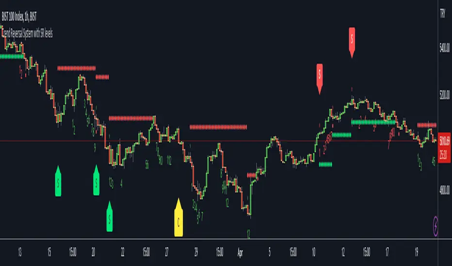
Trend Reversal System with SR levelsHello All,
This is the Trend Reversal System with Support/Resistance levels script. long time ago I published it as closed source but now I upgraded it and and published as open-source with a different name. I hope it would be useful for you all while trading/analyzing.
The script has some parts in it: Setup, Count, SR levels, Risk levels & Targets . Now lets check them:
Setup Part: it has two part, Buy or Sell Setup. one of them can be active only. Buy setup: if current close checks if current is lower/equal than the close of the 5. bar. if yes then the script increases number of buy setup. and if it reaches 9 then the script checks if current low is lower/equal than the lows of last 3. and 4. bars, or if the low of the last bar is lower/equal than the lows of last 3. and 4. bars. if yes then the script increases the buy setup by 1. if these conditions met then it puts the label 'S' , same for Sell setup. S labels on both setup are potential reversals.
Count Part: If buy or sell setup reaches the 9 then Count part starts from 1. lets see buy count: If current close is lower/equal than the low of the 3. bar and buy count is lower than 12 or low of the bar 13 is less than or equal to the close of bar 8 then buy count increase or it's completed. if it's completed then the script puts C label, and it's potential reversal. of course there are some conditions that can cancel the count buy/sell or recycle/restart.
By using Setup and Count levels the script can show Support/Resistance Levels, Risk levels & Targets. SR levels are potential reversal levels.
Lets see some example screenshots:
Support/Resistance levels:
Potential Reversal levels and how setup/counts are shown:
Count part can recycle and the script shows it as 'R' , ( you can see the conditions for Recycle in the script ):
Count can be cancelled and and it's shown as 'x'
If the scripts find 9 on Setup or 13 on Count then it checks if it's a good level to buy/sell and if it decides it's good level then it shows TRSSetup Buy/Sell or TRSCount Buy/Sell and also shows the target. in following example the script checks and decide it's a good level to take long position. it can be aggressive or conservative, Conservative is recommended.
Enjoy!
Trend Counter [theEccentricTrader]█ OVERVIEW
This indicator counts the number of confirmed trend scenarios on any given candlestick chart and displays the statistics in a table, which can be repositioned and resized at the user's discretion.
█ CONCEPTS
Green and Red Candles
• A green candle is one that closes with a high price equal to or above the price it opened.
• A red candle is one that closes with a low price that is lower than the price it opened.
Swing Highs and Swing Lows
• A swing high is a green candle or series of consecutive green candles followed by a single red candle to complete the swing and form the peak.
• A swing low is a red candle or series of consecutive red candles followed by a single green candle to complete the swing and form the trough.
Peak and Trough Prices (Basic)
• The peak price of a complete swing high is the high price of either the red candle that completes the swing high or the high price of the preceding green candle, depending on which is higher.
• The trough price of a complete swing low is the low price of either the green candle that completes the swing low or the low price of the preceding red candle, depending on which is lower.
Upper Trends
• A return line uptrend is formed when the current peak price is higher than the preceding peak price.
• A downtrend is formed when the current peak price is lower than the preceding peak price.
• A double-top is formed when the current peak price is equal to the preceding peak price.
Lower Trends
• An uptrend is formed when the current trough price is higher than the preceding trough price.
• A return line downtrend is formed when the current trough price is lower than the preceding trough price.
• A double-bottom is formed when the current trough price is equal to the preceding trough price.
Muti-Part Upper and Lower Trends
• A multi-part return line uptrend begins with the formation of a new return line uptrend, or higher peak, and continues until a new downtrend, or lower peak, completes the trend.
• A multi-part downtrend begins with the formation of a new downtrend, or lower peak, and continues until a new return line uptrend, or higher peak, completes the trend.
• A multi-part uptrend begins with the formation of a new uptrend, or higher trough, and continues until a new return line downtrend, or lower trough, completes the trend.
• A multi-part return line downtrend begins with the formation of a new return line downtrend, or lower trough, and continues until a new uptrend, or higher trough, completes the trend.
█ FEATURES
Inputs
Start Date
End Date
Position
Text Size
Show Sample Period
Table
The table is colour coded, consists of seven columns and, as many as, forty-one rows. Blue cells denote the multi-part trend scenarios, green cells denote the corresponding return line uptrend and uptrend scenarios and red cells denote the corresponding downtrend and return line downtrend scenarios.
The trend scenarios are listed in the first column with their corresponding total counts to the right, in the second and fifth columns. The last row in column one, displays the sample period which can be adjusted or hidden via indicator settings.
The third and sixth columns display the trend scenarios as percentage of total 1-part trends. And columns four and seven display the total trend scenarios as percentages of the, last, or preceding trend part. For example 4-part trends as a percentages of 3-part trends. This offers more insight into what might happen next at any given point in time.
Plots
For a visual aid to this indicator please use in conjunction with my Return Line Uptrends, Downtrends, Uptrends and Return Line Downtrends indicators which can all be found on my profile page under scripts, or in community scripts under the same names. Unfortunately, I could not fit all the plots with the correct offsets into one script so I had to make a separate indicator for each trend type. I decided against labels as this would limit the visual data points to 500.
Green up-arrows, with the number of the trend part, denote return line uptrends and uptrends. Red down-arrows, with the number of the trend part, denote downtrends and return line downtrends.
█ HOW TO USE
This is intended for research purposes, strategy development and strategy optimisation. I hope it will be useful in helping to gain a better understanding of the underlying dynamics at play on any given market and timeframe.
It can, for example, give you an idea of whether the current trend will continue or fail, based on the current trend scenario and what has happened in the past under similar circumstances. Such information can be very useful when conducting top down analysis across multiple timeframes and making strategic decisions.
What you do with these statistics and how far you decide to take your research is entirely up to you, the possibilities are endless.
█ LIMITATIONS
Some higher timeframe candles on tickers with larger lookbacks such as the DXY , do not actually contain all the open, high, low and close (OHLC) data at the beginning of the chart. Instead, they use the close price for open, high and low prices. So, while we can determine whether the close price is higher or lower than the preceding close price, there is no way of knowing what actually happened intra-bar for these candles. And by default candles that close at the same price as the open price, will be counted as green. You can avoid this problem by utilising the sample period filter.
The green and red candle calculations are based solely on differences between open and close prices, as such I have made no attempt to account for green candles that gap lower and close below the close price of the preceding candle, or red candles that gap higher and close above the close price of the preceding candle. I can only recommend using 24-hour markets, if and where possible, as there are far fewer gaps and, generally, more data to work with. Alternatively, you can replace the scenarios with your own logic to account for the gap anomalies, if you are feeling up to the challenge.
It is also worth noting that the sample size will be limited to your Trading View subscription plan. Premium users get 20,000 candles worth of data, pro+ and pro users get 10,000, and basic users get 5,000. If upgrading is currently not an option, you can always keep a rolling tally of the statistics in an excel spreadsheet or something of the like.

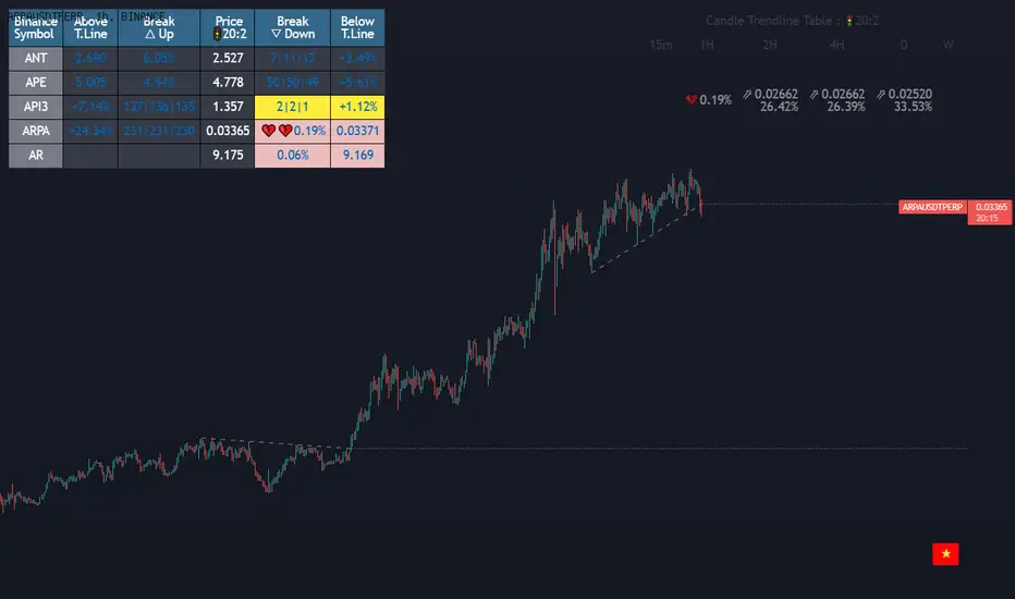
Dashboard trendlines Price(ichimoku14642)Happy new year 2023
Dedicated to traders, the trendline indicator of 5 trading pairs is automatically listed in this table. Wish success
-on each chart of a trading pair, there is only one trendline pair: 1 uptrendline and 1 downtrendline
-so when the statistics on the table also show the column of the uptrend and the column of the downtrend
-When the price approaches any trendline but the ratio is 1%, that trendline will be colored blue (downtrend), red (uptrend)
-the column above T.line(below T.line) is the value of the current trendline compared to the closing price of the candle
-The Break up (Break down) column when the price breaks will show the green heart (break up), the red heart break (break down) and the percentage value when breaking through the point of the trendline.
-price column is the current price of the candle
-SYMBOL is all taken from Binance in the perpetual contract
-especially when a candle has closed above the trendline (assuming an uptrend), then from the 2nd tree to the current , it will count according to memory so that traders know when the price broke, and how many candles already.
-The breakdown parameter is displayed (for example, 3|8|10), which means that the price has broken through 10 candles, of which 8 trees are closing above the breakout point, and the last 3 are closing above. break point
-In addition, when displaying 3 parameters as above, the next column (above/below T.line) will display the percentage from when the price breaks that point to the current price of the candle.
Thank you everyone for your interest and trust
Đây là script về bảng thống kê đường trendline .
-trên mỗi biểu đồ của cặp giao dịch chỉ tồn tại duy nhất 1 cặp trendline là: 1trendline tăng và 1 trendline giảm
-vì vậy khi thống kê trên bảng cũng hiển thị cột của trend tăng và cột của trend giảm
-khi giá tiến gần đến 1 đường trendline bất kì mà tỉ lệ còn 1% thì đường trendline đó tô màu xanh(trend giảm) ,màu đỏ(trend tăng)
-cột above T.line(below T.line) là giá trị của đường trendline hiện tại so với giá đóng cửa của nến
-cột Break up(Break down) khi giá phá vỡ sẽ thể thiện trái tim xanh(phá vỡ lên),trái tim đỏ vỡ(phá vỡ xuống) và giá trị phần trăm khi phá qua điểm của trendline.
-cột giá là giá hiện tại của nến
-SYMBOL là toàn bộ lấy của sàn Binance trong hợp đồng vĩnh cửu
-đặc biệt khi 1 cây nến đã đóng cửa trên đường trendline(giả sử trend tăng) thì từ cây thứ 2 đến hiện tại nó sẽ đếm theo bộ nhớ để các trader biết được giá đã phá khi nào,và qua bao nhiêu nến rồi.
-thông số khi phá vỡ hiển thị (ví dụ là 3|8|10) thì hiểu là giá đã phá vỡ qua 10 nến, trong đó có 8 cây đóng cửa trên điểm phá vỡ,và 3 cây gần nhất đang đóng cửa trên điểm phá vỡ
-ngoài ra khi hiện 3 thông số như trên thì cột bên cạnh (above/below T.line) sẽ hiển thị được số phần trăm tính từ khi giá phá vỡ điểm đó đến giá hiện tại của cây nến.
Cảm ơn mọi người đã quan tâm và tin dùng
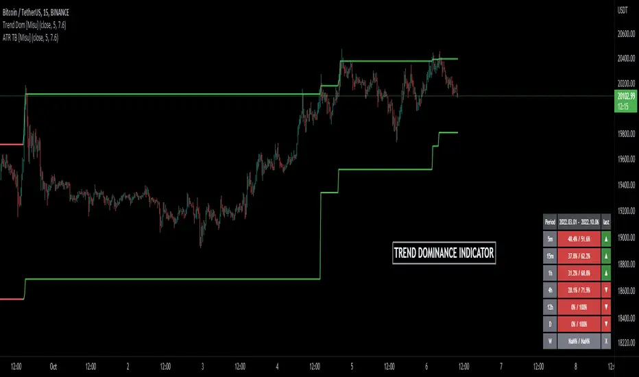
Trend Dominance Multi Timeframe [Misu]█ This indicator shows the repartition of bullish and bearish trends over a certain period in multiple timeframes. It's also showing the trending direction at the time.
█ Usages:
Trend dominance is expressed with two percentages: left is downtrend and right is uptrend. Cell colors turn green if dominance is up and red if it is down.
Knowing the trend dominance allows you to have a better overview of the market conditions.
You can use it to your advantage to favor long or short trades, reversal or breakout strategies, etc.
█ Features:
> Table colors
> Instant Trend Multitimeframe
> Trend Dominance Multitimeframe
█ Parameters:
> Length: Length is used to calculate ATR.
> Atr Multiplier: A factor used to balance the impact of the ATR on the Trend Bands calculation.
> UI Settings
Fractal-Dimension-Index-Adaptive Trend Cipher Candles [Loxx]Fractal-Dimension-Index-Adaptive Trend Cipher Candles is a candle coloring indicator that shows both trend and trend exhaustion using Fractal Dimension Index Adaptivity. To do this, we first calculate the dynamic period outputs from the FDI algorithm and then we injection those period inputs into a correlation function that correlates price input price to the candle index. The closer the correlation is to 1, the lighter the green color until the color turns yellow, sometimes, indicating upward price exhaustion. The closer the correlation is to -1, the lighter the red color until it reaches Fuchsia color indicating downward price exhaustion. Green means uptrend, red means downtrend, yellow means reversal from uptrend to downtrend, fuchsia means reversal from downtrend to uptrend.
What is the Fractal Dimension Index?
The goal of the fractal dimension index is to determine whether the market is trending or in a trading range. It does not measure the direction of the trend. A value less than 1.5 indicates that the price series is persistent or that the market is trending. Lower values of the FDI indicate a stronger trend. A value greater than 1.5 indicates that the market is in a trading range and is acting in a more random fashion.
Included
Loxx's Expanded Source Types
Related indicators:
Adaptive Trend Cipher loxx]
CFB-Adaptive Trend Cipher Candles
Dynamic Zones Polychromatic Momentum Candles
RSI Precision Trend Candles
Trend LinesHello Everyone.
This is my first script on TV, hope you find it useful.
How it works?
- On each bar it finds last x (depending on your settings) higher and lower Pivot Points ( PP ).
- It searches for possible trend line from oldest PP to newest, once found it stops and draws the line.
- The higher the time frame the lower the number of PP needed. Play around with the number of PP and left/right bars needed to confirm a PP and you get different results.
For suggestions don't hesitate to contact me
Trend Indicator (dow trending) - FontiramisuIndicator showing pivots and interpret a trend out of it.
Pivots are calculating with deviation parameter to validate with more precision.
Trending moves are calculated according to Dow Theory :
In an uptrend, if the price made a new high, the price must make a new high to confirm the trend, otherwise, it might signal a possible change in the trend.
In an uptrend, if the price made a new low, the price must make a new low to confirm the trend, otherwise, it might signal a possible change in the trend.
The indicator can show 2 trends with 2 different "Pivot Depth"
See indicator parameters.
Tab is display at the bottom right corner to show trend direction and if it is hesitating
Fontilab Library is used to code this indicator
BreathEasy TrendLine Scalping - Pro Dear Traders,
Trendlines are the one particular word ever trader would definitely know what it is. But the way it gets applied on to the chart is the one thing which needs to debated on. Traders definitely love to trade Trendline breaks like the way I do.
When it comes to Trendlines , we generally categorize them based on the Major Trendline and Minor Trendline, however concept of Breakout or Breakdown of trendline wouldn’t change whether it’s a Major or Minor Trendline. Trendline is by nature powerful and prices do respect the same. In order to add more power, I have combined the Trendlines with Fibonacci to time the entries correctly.
What you can expect from this Indicator?
This indicator is mainly designed to work on the lower time frames (Intraday Indicator), between 1 minute TF to 5-minute TF or max 10 minute.
It is necessary that you use this indicator on a highly liquid instruments such that calculations are smooth. since, price gaps may affect the accuracy of the results.
Script detects & plots Trendlines, based on the Pivot Points found on the chart and helps you take trading decisions wisely.
What is the scope or idea behind developing this indicator?
1. Its majorly build to identify the Trendline breaks (Break Out and Break Down)
2. Identify, Trend line False Break.
3. Identify the possible consolidation zone and intimate about the Consolidation Break
4. Peak Buying | Selling Possibility when Prices does cross levels based on the fib ratios.
Couple of Additional info | Points to Understand | Point of Comfort zone
1. Provides Alerts when the event happens such as (Important Trendline has Broken, Consolidation zone is broken etc.) and places a dummy entry indication that Indicator took a trade with the SL and Target if any.
Note: All the entries plotted by this indicator are just DUMMY for your educational purpose only. you may seek support from your financial advisor before placing similar trades in real market.
2. Indicator Can constantly notify you on ever time SL is updated, if necessary to keep you aware of. I have adopted volatility-based SL such that, if prices move too quick and too far SL also will move quick and gives enough room for the price to play its role. If the prices tend to go flat SL acts flat. It can also help you lock in some profits when your PNL reaches certain level either by price or by percentage. (All options are customizable)
3. It also takes HTF information wherever necessary if the indicator needs some additional confirmations like Trendline zone in higher timeframe or fib level in HTF zone. You can certainly advice indicator to direct which HTF to use.
4. If the Script need Volume confirmation there are possible options provided for you to direct the indicator to refer the volume source. Like if you are trading BNF you may direct the volume source to its related futures
5. Options are provided to customize to Qty and Lot and based on the suggested option it plots dummy entries with suggested Qty to trade with.
6. You may set the Max loss level for each of the trade which you would like to risk so that Indicator detects the setups which are in close proximity to that level. It so happens it detects setup with max loss level of 7K and due to price fluctuations dummy entry may lose bit more than what was capped.
There are many additional options | information’s | suitable Notifications via Alerts provided. To give you enough information for your trading decisions along with Dummy Trades info.
IMPORTANT POINT TO CONSIDER:
REPAINTING : I use the word “real time data” in my indicator tooltip in conjunction and help you understand what indicator does. By this you can understand the impacts of the same.
I strongly recommend you read the tooltips in order to understand the indicator better.
Enjoy!
DISCLAIMER : No sharing, copying, reselling, modifying, or any other forms of use are authorized for our documents, script / strategy, and the information published with them. This informational planning script / strategy is strictly for individual use and educational purposes only. This is not financial or investment advice. Investments are always made at your own risk and are based on your personal judgement. I am not responsible for any losses you may incur. Please invest wisely.
Happy to receive suggestions and feedback in order to improve the performance of the indicator better.
Trend Analysis Index [CC]The Trend Analysis Index was created by Adam White and not to be confused with the Trend Analysis Indicator that I also published. This indicator operates under the same idea but using a completely different calculation to achieve similar results. The idea behind this indicator is for a combination of volatility and trend confirmation. If the indicator is above it's signal line then the stock is very volatile and vice versa. If the stock is currently trending as in above a chosen moving average for example and the indicator falls below the signal line then there is a pretty good chance in a trend reversal. The recommended buy and sell system to use is to pair this indicator with a moving average crossover system which I have included in the script. Buy when the indicator is above it's signal and the shorter moving average crosses above the longer moving average. For selling you would do the same and sell when the indicator is above it's signal and the shorter moving average crosses below the longer moving average. I have included strong buy and sell signals in addition to the normal ones so stronger signals are darker in color and normal signals are lighter in color.
Let me know what other indicators or scripts you would like to see me publish!

TrendLineScalping-BasicDear Traders,
Here is the thought which came to my mind on the trendline break scalping. sometimes during the trade we do plot trendlines and we do anticipate for the line to break and take a trade. with the same thing in mind I had created this basic script to help you and other to create based on the logic used in the script.
This is just a logic based script and doesn't do any kind of wonders. Hence you may use it as necessary.
Regards....
8X Trend ATR SAR Dingue V58X Trend ATR SAR Dingue V5 - This is the updated version for Pine Script 5.
8x indicator into 1 :
2x ATR indicator - 3x Trend indicator - 3x SAR indicator
Trends are helpful to spot reversal and support resistance, especially on bigger time frames.
This indicator gives you a global view of various trends all at once. You can easily turn them On or Off as to not clog the screen.
Each trend is also color-coded to visualize quickly the position of the price compared to it.
You can customize lengths, adjust line sizes, have the start of a new trend marked with a circle, fill in colors.
'Tool tips' explain other settings and if you have any questions, feel free to ask in the comments below.
Thank you for the feedback and check all my ‘Dingue’ indicators.

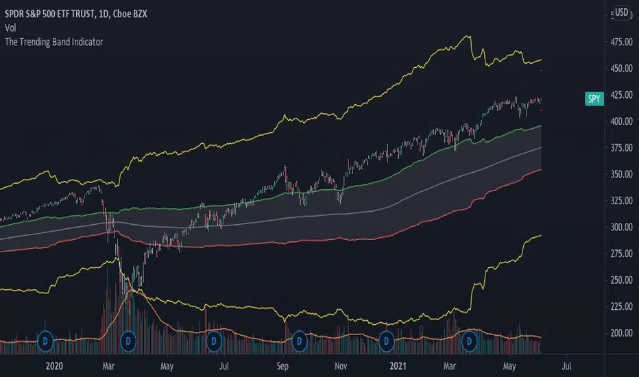
The Trending Band IndicatorThis indicator shows the trend of the market. The middle line is the 200-day moving average because it shows the long term trend of the market. However, since the market does give fake signals of going up and down through the 200-day moving average, I had to put a band on it to push through the fake signals. The first band around the middle line is 1 standard deviation of historical volatility which gives an area of cushion to prevent fake signals. The goal is if the stock is above the first top band, then the stock is in an uptrend. If the stock is below the first bottom band, then the stock is in a downtrend. If it is the middle of the first bands, then the stock is known to be rangebound.
The top most and bottom most yellow lines are 4 standard deviations of historical volatility which give an idea of where the floor and ceiling are. This helps investors and traders identify good buy and sell zones using the yellow lines to see overbought and oversold sides.
This is a great indicator for people who need help following the trend of a stock, etf , etc.
OGT Trend DashboardWhat Is The OGT Trend Dashboard?
The One Glance Trader (OGT) Trend Dashboard is a trend indicator that visualises if a stock, currency pair etc. is trending (up/down) on multiple time frames. The aim of the dashboard is to provide a "one glance" view for a custom list of symbols to show a clear trend bias. A green timeframe signals it is in a up trend, red for a down trend and grey for no clear trend direction. The indicator uses 3 EMAs (fast, medium slow) to define whether a symbol is trending or ranging. The 3 EMAs periods can be defined by the user.
Indicator Settings
- Fast, medium and slow EMA periods
- Symbols (up to 4 can be selected). First symbol will always be the chart the indicator is applied to
- Alerts - select for all symbols you want alerts so (historic alerts for the first symbol will be visually applied on the chart)
- Timeframes ( M1 to Monthly)
Alerts - You can create alerts for any of the 4 pairs when all timeframes selected are trending up (green) or down (red).
How To Use the OGT Trend Dashboard
- Entry Signal For Trends: When all desired timeframes are either trending up/down enter the market in the direction of the trend
- Determine Trend Bias: Use the dashboard to complement existing trend trading systems as added confirmation
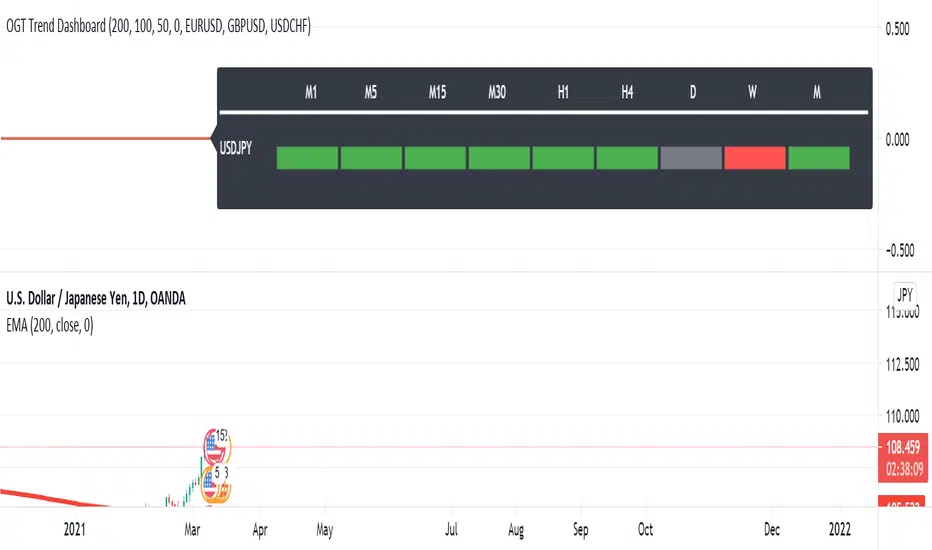
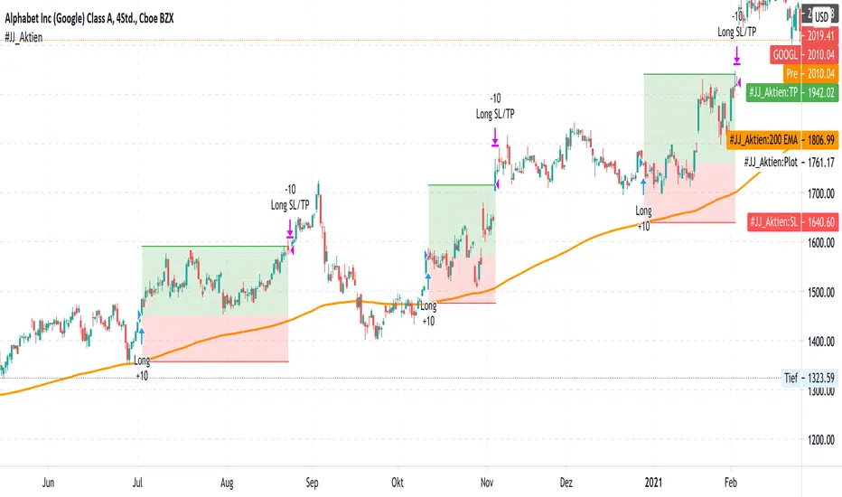
#JJ_Shares Trend Follower
-----------------
Hey there!
There are many reasons why this strategy has worked quite well over the past few years.
A very simple strategy in itself. The basis of this indicator is the trend following approach. "The trend is your friend." This strategy is based on individual separate indicators. A total of three EMA's (10.50 & 200) & the ATR are combined. The largest EMA shows the basic trend direction and thus also the preferred trade direction. The two smaller EMAs are used for the timing of the entrances at the intersection. The stop levels are placed with the help of the ATR and the large EMA. Profit areas are determined using a risk calculation.
Exact entry points can be identified using the indicator. In addition, a take profit is visualized based on a 3:1 CRV . The stop loss results from a long-term EMA .
Example for NASDAQ:GOOGL ! But can be used for all other trend following stocks!
The indicator can be used on all timeframes. However, the performance is significantly better in higher timeframes. In addition, the display can be adjusted using the options.
That's all. Due to the technical chart background, the strategy can be used without further chart analysis.
Attention: Before opening a position, always first check whether there is any strong news. In these cases it is better to be on the safe side.
Attention: With this strategy a SL is provided as standard. However, the risk must always be carefully calculated.
Past results do not guarantee future profits!
Use the link below to get access to this indicator or PM us to get access.
--------------------------------------------------------------------------------------------------------------
--------------------------------------------------------------------------------------------------------------
-----------------
Willkommen!
Es gibt viele Gründe, warum sich diese Strategie in den letzten Jahren ganz gut bewährt hat.
Eine sehr einfache Strategie für sich. Grundlage dieses Indikators ist der Trendfolgeansatz. "The trend is your friend." Diese Strategie basiert auf einzelnen seperaten Indikatoren. Insgesamt werden drei EMA's (10,50 & 200) & die ATR kombiniert. Der größte EMA zeigt die grundsätzliche Trendrichtung und somit auch die bevorzugte Traderichtung. Die beiden kleineren EMA werden bei Kreuzung für das Timing der Einstiege verwendet. Mit Hilfe der ATR und des großen EMA werden die Stop Level platziert. Gewinnzonen werden über eine Risikoberechnung ermittelt.
Anhand des Indikators können genaue Einstiege erkannt werden. Zusätzlich wird aufgrund eines 3:1 CRV ein Take Profit visualisiert. Der Stop Loss ergibt sich über einen langfristigen EMA .
Beispiel für NASDAQ:GOOGL ! Kann aber für alle weiteren Trendfolge Aktien verwendet werden!
Der Indikator kann auf allen Timeframes angewendet werden. Allerdings ist der Performance in höheren Timeframes deutlich besser. Zusätzlich kann die Anzeige über die Optionen angepasst werden.
Das ist alles. Aufgrund des charttechnischen Hintergrunds kann die Strategie ohne weitere Chartanalyse verwendet werden.
Achtung: Vor dem Öffnen einer Position immer zuerst prüfen ob starke News anstehen. In diesen Fällen lieber auf Nummer sicher gehen.
Achtung: Bei dieser Strategie ist standardmäßig ein SL vorgesehen. Das Risiko muss aber immer gut kalkuliert werden.
Vergangene Ergebnisse garantieren keine zukünftigen Gewinne!
Verwenden Sie den folgenden Link, um Zugriff auf diesen Indikator zu erhalten oder schreibe uns eine PM um Zugriff zu erhalten.