ICT Fair Value Gap (FVG) Detector │ Auto-Mitigated │ 2025Accurate ICT / Smart Money Concepts Fair Value Gap (FVG) detector
Features:
• Detects both Bullish (-FVG) and Bearish (+FVG) using strict 3-candle rule
• Boxes automatically extend right until price mitigates them
• Boxes auto-delete when price closes inside the gap (true mitigation)
• No repainting – 100% reliable
• Clean, lightweight, and works on all markets & timeframes
• Fully customizable colors and transparency
How to use:
– Bullish FVG (green) = potential support / buy zone in uptrend
– Bearish FVG (red) = potential resistance / sell zone in downtrend
Exactly matches The Inner Circle Trader (ICT) methodology used by thousands of SMC traders in 2024–2025.
Enjoy and trade safe!
Ict

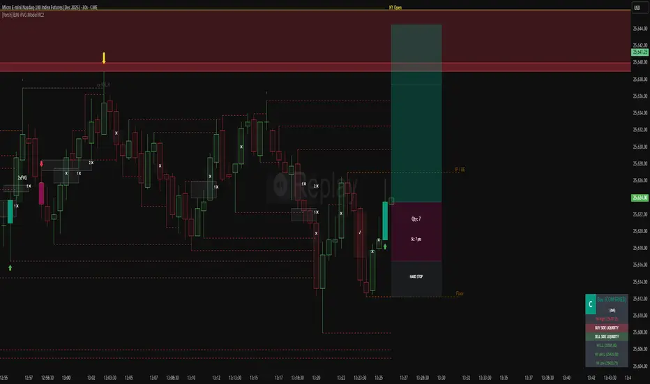
[Yorsh] BJN iFVG Model RC1 BJN iFVG Model - Mechanical Trading System
Description:
The BJN iFVG Model is not just an indicator; it is a full-scale, semi-automated trading architecture designed to mechanically execute the specific "BJN" Inverted FVG strategy.
Designed for precision traders operating on Lower Timeframes (1m to 5m), this script eliminates the cognitive load of manual analysis. It automates every single step of the mechanical model—from Higher Timeframe narrative building to tick-perfect structural validation and risk calculation.
This tool transforms your chart into a professional trading cockpit, split into three intelligent engines:
1. The Matrix (Context Engine)
Before looking for an entry, you must understand the narrative. The Matrix handles the heavy lifting of multi-timeframe analysis without cluttering your chart:
Real-Time Delivery State: Automatically detects if price is reacting from valid HTF PD Arrays (1H, 4H, Daily) to confirm a "Delivery" state.
Liquidity Sweeps: Tracks Fractals across three dimensions (1H, 15m, and Micro-Structure) to identify liquidity raids instantly.
Advanced SMT Divergence: A built-in, multi-mode SMT engine scans for correlation breaks (Pivot SMT, Adjacent Wick SMT, and FVG SMT) between NQ/ES (or custom tickers) in real-time.
Time & Macro Tracking: Automatically visualizes Killzones and highlights high-probability Macro windows.
2. The Executioner (Entry Engine)
Once the context is set, the Executioner handles the specific Inverted FVG (iFVG) entry model with strict mechanical rules:
Structural Integrity: Automatically identifies the Invalidation Point (IP), Floor/Ceiling, and Break-Even levels for every setup.
Hazard Detection: The script proactively scans the "Trading Leg" for opposing unmitigated FVGs (Hazards). If the path isn't clean, the trade is flagged or invalidated.
Composite Logic: Intelligently merges "noisy" price action into Composite FVGs to reduce false signals.
Integrated Position Sizer: When a trade is confirmed, a visual box appears showing your precise Entry, Stop Loss, Hard Stop, and Take Profit levels, along with a calculated Contract Quantity based on your risk tolerance.
3. The Ranking System (Quality Control)
Not all trades are created equal. This system grades every single confirmed setup in real-time based on confluence factors:
Grades: Ranges from A++ (Perfect Confluence) to C (Low Probability).
Confluence Check: Checks for Delivery, Sweeps (HTF/LTF), SMT, and Macro alignment at the exact moment of the trigger.
Live Status Panel: A dashboard on your chart displays the current live trade status (Armed, Triggered, Confirmed) and its Rank, so you never miss a beat.
Optimization & Performance
Trading on the 1-minute timeframe requires speed. This script has been rigorously optimized for high-frequency environments:
Smart Garbage Collection: The script manages its own memory, cleaning up old data arrays to prevent lag, ensuring the chart remains fluid even after days of data accumulation.
Tunnel Vision: Calculations are strictly focused on the relevant trading leg, ignoring historical noise to maximize execution speed.
Zero-Repaint: All historical analysis is strictly non-repainting to ensure backtesting reliability.
How to Use
Timeframes: Optimized for 1m, 2m, 3m, 4m, 5m execution.
Alerts: Configure the robust alert system to notify you only when setups meet your standards (e.g., "Alert only on Rank B+ or higher").
Strategy: Wait for the Status Panel to show a "CONFIRMED" signal. Use the on-screen Position Sizer to execute the trade with the displayed risk parameters.
Stop analyzing; start executing. Welcome to mechanical trading.
----------------------------------------------------------------------------------------------------------------
RISK DISCLAIMER:
The content, tools, and signals generated by this script are strictly for educational and informational purposes only. This script does not constitute financial advice, investment recommendations, or a solicitation to buy or sell any securities, futures, or other financial instruments.
Trading financial markets involves a high degree of risk and is not suitable for all investors. The "Position Sizer" and "Trade Setups" displayed are hypothetical simulations designed to demonstrate the mechanics of the BJN methodology; they do not guarantee future performance.
Use this tool at your own risk. The author assumes no responsibility or liability for any trading losses or damages incurred in connection with the use of this script. Always consult with a qualified financial advisor and practice proper risk management.
RUSSFEST SMC Strategy V1.4RUSSFEST SMC Strategy V1.4 is a multi-timeframe Smart Money Concepts framework that builds a clean, rule-based view of market structure and then trades directly off that structure. It’s designed for traders who want to systematize SMC logic, keep their charts readable, and automate their trading.
Instead of relying on lagging oscillators, the strategy continuously tracks the active price leg, labels strong/weak highs and lows, and reacts to structural shifts in real time. The current timeframe leg is always drawn on your chart with a clear high, low, and midpoint, so you can instantly see whether price is trading in a discount or premium relative to the leg. Trade entries are driven by confirmed events aligned with directional bias, not by single-candle patterns.
A higher-timeframe (HTF) structure engine runs in the background and can be overlaid on your execution timeframe (e.g., 4H structure on a 15m chart). This HTF leg provides the primary bias and defines HTF discount/premium zones so that longs can be constrained to discounted areas of a bullish leg and shorts to premium areas of a bearish leg. An optional additional HTF bias can be turned on for traders who want an extra top-down filter before any position is allowed.
Risk management is fully structure-based. Stops are always placed beyond the current structure high/low with an optional buffer, so every trade is anchored to a meaningful swing point instead of arbitrary points. Take-profit logic is configurable:
Fixed RR – simple R-multiple targeting off the structure-based stop.
HTF Weak High/Low – targets the opposing side of the active HTF leg.
Opposite CHoCH – dynamically exits when structure flips against the position, effectively using the next structural shift as an exit rule.
Key Features:
Full SMC-style price leg tracking with strong/weak highs & lows and midpoint.
Multi-timeframe structure: overlay HTF leg on your LTF execution chart.
Primary and optional secondary HTF bias filters.
Discount/premium gating relative to the HTF leg (no “chasing” in the wrong zone).
Structure-anchored stop loss with three exit modes (Fixed RR, HTF target, Opposite CHoCH).
Day-of-week filters for filtering out any days that don't prove to be profitable.
This script is a structured SMC framework, not financial advice. Markets are risky; always forward-test, adjust parameters for your instrument and timeframe, and use position sizing that fits your own risk tolerance.

ahax – CRT V0 ahax – CRT V0 is an enhanced CRT indicator that works on candlestick formations and generates BUY/SELL signals when certain conditions are met.
In this version, the classic CRT logic has been supplemented with additional controls for more stable operation, with a particular focus on reducing unnecessary signals. Each signal is generated based on the middle candlestick, and confirmation signals (+/-) can be displayed, if desired, based on the close of the next candle.
The indicator works based on the relationship between the left candlestick, the middle candlestick, and the right candlestick. It provides quick visual feedback on points such as trend reversals, potential manipulation, or reaction zones.
It is designed to be simple, clear, and clean, allowing you to adapt it to your own strategy.
It does not include any risk management or trading recommendations.

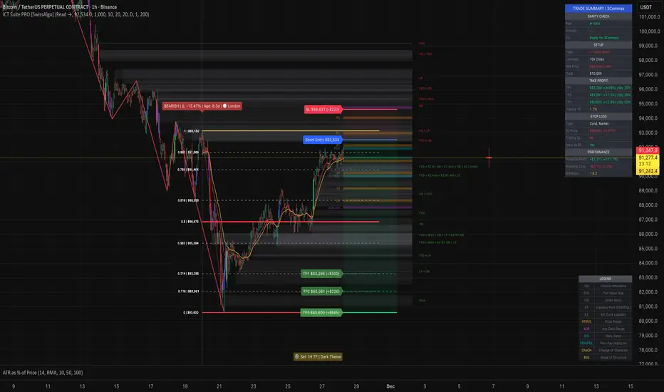
ICT Smart Money Trading Suite PRO [SwissAlgo]ICT SMC Trading Suite Pro
Structure Detection. Imbalance Tracking. Trade Planning. Contextual Alerts.
Why This Integrated System Was Built
The ICT/SMC methodology requires tracking multiple analytical components simultaneously - a process prone to manual errors, time inefficiency, and visual clutter . This indicator consolidates these elements into a single, unified system , providing rules-based validation for experienced ICT traders who may struggle with execution speed, consistency, and manual calculations.
-----------------------------------------------------------------
What This Indicator Does
ICT/SMC methodology involves tracking multiple analytical components simultaneously. This indicator consolidates them into a single system.
Common challenges when applying ICT manually:
1️⃣ Structure Identification
Determining which pivots qualify as external (macro) structure versus internal (micro) structure requires consistent rules. Inconsistent structure identification affects the detection of the relevant trading range for entries , Change of Character (ChoCH) , and Break of Structure (BoS) . Accurate structure identification is paramount ; a faulty reading invalidates the entire ICT thesis for the current swing. While no automated system can replace human judgment, the indicator provides you with a rules-based starting point for structural analysis. The key goal is to help you find and map the relevant structural leg to focus on.
2️⃣ Chart Organization
Drawing Fibonacci retracements, Fair Value Gaps, Order Blocks, and other imbalances manually creates visual complexity that can obscure the analysis. The indicator addresses this by striving to show all imbalances in a consistent, unified, and understandable visual way , using color coding and z-order layering to maintain clarity even when multiple components are active.
3️⃣ Imbalance Tracking
ICT methodology requires monitoring a vast array of institutional footprints : Fair Value Gaps (FVG), Order Blocks (OB), Breaker Blocks (BB), Liquidity Pools (LP), Volume Imbalances, Wick Imbalances, and Kill Zone ranges. Tracking all these simultaneously and manually monitoring their mitigation status is highly time-intensive and prone to oversight . The indicator constantly scans and tracks all key imbalance types for you, automatically updating their status and creating a dynamic, real-time visual heatmap of unmitigated institutional inefficiency.
4️⃣ Trade Calculation
Determining structure-based Stop Loss (SL) placement, calculating multiple Take Profit (TP) levels with accurate position-sizing splits, and computing the final blended Risk-to-Reward (R:R) ratio involves multiple time-sensitive, manual calculations per setup . The indicator automates this entire trade calculation process for you, instantly providing the necessary pricing (entry, SL, TP), sizing, and performance projections, and mitigating the risk of execution error .
5️⃣ Condition Monitoring
ICT setups often require specific technical conditions to align: price reaching discount Fibonacci levels (0.618-0.882 for shorts, 0.118-0.382 for longs), EMA crossovers confirming momentum, or structural shifts (ChoCH/BoS). Identifying these moments requires continuous chart observation across multiple assets and timeframes.
This indicator includes an alert system that monitors these technical conditions and sends notifications when they occur (real-time). The alert system is designed to minimize spam. This allows traders to review potential setups on demand rather than through continuous observation - particularly relevant for those monitoring multiple instruments or trading sessions outside their local timezone.
-----------------------------------------------------------------
Intended Use
This indicator is designed for traders who:
♦ Apply ICT/SMC methodology - Familiarity with concepts such as Fair Value Gaps, Order Blocks, Liquidity Pools, market structure, and discount/premium zones is assumed. The indicator does not teach these concepts but provides tools to apply them.
♦ Trade on intraday to swing timeframes - The structure detection and Fibonacci zone mapping work across multiple timeframes. Recommended primary timeframe: 1H (adjustable based on trading approach).
♦ Prefer systematic entry planning - The trade calculation feature computes stop loss, take profit levels, and risk-to-reward ratios based on structure and Fibonacci positioning. Suitable for traders who use defined entry criteria.
♦ Monitor multiple instruments or sessions - The alert functionality notifies when specific technical conditions occur (discount zone entries, EMA crossovers, structure changes), reducing the need for continuous manual monitoring.
♦ Use trade execution platforms - The trade summary table displays pre-formatted values (entry, SL, TP levels with quantity splits) that can be manually input into trading platforms or bot services like 3Commas.
-----------------------------------------------------------------
How To Use
Step 1: Structure Analysis
The indicator automatically detects external and internal market structure using pivot analysis. Structure lines are color-coded: red for bearish structure, green for bullish. External pivots are marked with larger triangles, internal pivots with smaller markers. The pivot length parameters (default: 20/20) can be adjusted in settings to align with your structural analysis approach and the asset you are analyzing.
Step 2: Define Your Trading Zone
Use the "Start Swing" and "End Swing" date inputs to mark the beginning and end of the (external) structural leg you wish to analyze. The indicator calculates Fibonacci retracement levels based on these points and color-codes the zones:
* Green zones: Discount area (0.618-0.882 for bearish / 0.118-0.382 for bullish)
* Yellow zones: Premium area (0.786-1.0 for bearish / 0.0-0.214 for bullish)
* Red zones: Extension area beyond structure (potential fake-out zones)
Step 3: Review Imbalances
The indicator identifies and displays multiple imbalance types:
🔥 Volume imbalances (from displacement candles based on PVSRA methodology)
🔥 Fair Value Gaps (FVG)
🔥 Order Blocks (OB) and Breaker Blocks (BB)
🔥 Liquidity Pools (LP) at equal highs/lows
🔥 Wick imbalances (exceptional wick formations)
🔥 Kill Zone liquidity from specific trading sessions (Asian, London, NY AM)
Volume Imbalances
Fair Value Gaps
Order Blocks
Liquidity Pools
Wick Imbalances
Kill Zone Imbalances
According to ICT methodology, imbalances act as price magnets - areas where price tends to return for mitigation. When multiple imbalances overlap at the same price level, this creates a confluence zone with a higher probability of price reaction .
Imbalances are displayed as gray boxes , creating a visual heatmap of institutional inefficiencies. When imbalances overlap, the zones appear darker due to layering, and labels combine to show confluence (e.g., "FVG + OB" or "Vol + LP").
Heatmap of Imbalances
User can view each type alone, or all together (heatmap)
Each imbalance type is tracked until mitigated by price according to ICT principles and can be toggled on/off independently in settings.
Step 4: Reference Levels & Sessions
The indicator displays additional reference data:
🔥 Daily Pivot Points (PP, R1-R3, S1-S3) calculated from previous day
🔥Average Daily Range (ADR) projected from the current day's extremes
🔥 Daily OHLC levels: Today's Open (DO), Previous Day High (PDH), Previous Day Low (PDL)
🔥Session backgrounds (optional): Color-coded boxes for Asian, London, NY AM, and NY PM sessions
Sessions
While these are not ICT-specific imbalances, they represent widely-watched price levels that often attract institutional activity and can act as additional reference points for support, resistance, and liquidity targeting.
All reference levels can be toggled independently in settings.
Step 5: Momentum Reference
EMA 14 and EMA 21 lines are displayed for momentum analysis. When EMA 14 enters discount zones and crosses EMA 21, a triangle marker appears on the chart. This indicates a potential alignment of structure and momentum conditions.
Step 6: Trade Planning
Input your intended entry price in the "Entry Price" field along with your margin and leverage parameters. The indicator automatically calculates all trade parameters:
* Stop loss level (based on Fibonacci structure - typically at 1.118 extension)
* Three take profit levels (TP1, TP2, TP3) with position quantity splits
* Risk-to-reward ratio (blended across all three targets)
* Projected profit/loss values in both dollars and percentage
All calculated values are displayed both visually on the chart (as horizontal lines with labels) and in a formatted Trade Summary table. The table organizes the information for quick reference: entry details, take profit levels with quantities, stop loss parameters, and performance projections.
This pre-calculated data can be manually copied into trading platforms or bot services (such as 3Commas Smart Trades) without requiring additional calculations.
Step 7: Alert Configuration
Create alerts using TradingView's alert system (select "Any alert() function call"). The indicator sends notifications when:
* Price reaches specific discount Fibonacci levels (0.618, 0.786, 0.882 for shorts / 0.382, 0.214, 0.118 for longs)
* EMA 14/21 crossovers occur within discount zones
* Change of Character (ChoCH) is detected
* Break of Structure (BoS) is detected
Note: Alerts require active TradingView alert functionality. Update alerts when changing your trading zone parameters.
-----------------------------------------------------------------
Key Features
Structure & Zone Analysis
* Automated structure detection with external/internal pivots and zig-zag visualization
* Fibonacci retracement mapping with color-coded discount/premium zones
* Visual zone classification: Green (optimal discount), Yellow (premium), Red (fake-out risk)
ICT Imbalances Heatmap
* Volume imbalances (PVSRA displacement candles)
* Fair Value Gaps (FVG)
* Order Blocks (OB) and Breaker Blocks (BB)
* Liquidity Pools (LP) at equal highs/lows
* Wick imbalances (exceptional wick formations)
* Kill Zone liquidity (Asian, London, NY AM sessions)
* Confluence detection with combined labels and visual layering
Reference Levels
* Daily Pivot Points (PP, R1-R3, S1-S3)
* Average Daily Range (ADR) projections
* Daily OHLC levels (DO, PDH, PDL)
* Session backgrounds for kill zones
Trade Planning Tools
* Automated stop loss calculation based on Fibonacci structure
* Three-tier take profit system with position quantity splits
* Risk-to-reward ratio calculation (blended across all targets)
* P&L projections in dollars and percentages
* Trade Summary table formatted for manual platform entry
Momentum & Signals
* EMA 14/21 overlay for momentum analysis
* Visual crossover markers (triangles) in discount zones
* Change of Character (ChoCH) detection and labels
* Break of Structure (BoS) detection and labels
Chart Enhancements
* Higher timeframe candle overlay (5m to Monthly)
* PVSRA candle coloring (volume-based)
* Symbol legend for quick reference
* Customizable visual elements (toggle all components independently)
Alert System
* Discount zone entry notifications (Fibonacci level monitoring)
* EMA crossover signals within discount zones
* Structure change alerts (ChoCH and BoS)
* Configurable via TradingView alert functionality
Alert Functionality
The indicator includes an alert system that monitors technical conditions continuously.
When configured, alerts notify users when specific events occur:
❗ Discount Zone Monitoring
When EMA 14 crosses into key Fibonacci levels (0.618, 0.786, 0.882 for bearish structure / 0.382, 0.214, 0.118 for bullish structure), an alert is triggered. Example: Trading BTC and ETH simultaneously - instead of monitoring both charts for zone entries, alerts notify when either asset reaches the specified level.
❗ Momentum Alignment
When EMA 14 crosses EMA 21 within discount zones, an alert is sent. Example: Monitoring setups across multiple timeframes (1H, 4H, Daily) - alerts indicate when momentum conditions align on any timeframe being tracked.
❗ Structure Changes
Change of Character (ChoCH) and Break of Structure (BoS) events trigger alerts. Example: Trading during the Asian session while located in a different timezone - alerts notify of structure changes occurring outside active monitoring hours.
Configuration
Alerts are set up through TradingView's native alert system. Select "Any alert() function call" when creating the alert.
⚠️ Note: Alert parameters are captured at creation time, so alerts must be updated when changing trading zone settings (Start/End Swing dates) or any other parameter.
How to Create Alerts
Step 1: Open Alert Creation
Click the "Alert" button (clock icon) in the top toolbar of TradingView, or right-click on the chart and select "Add Alert."
Step 2: Configure Alert Condition
* In the alert dialog, set the Condition dropdown to select this indicator
* Set the alert type to ⚠️ " Any alert() function call "
* This configuration allows the indicator to trigger alerts based on its internal logic
Step 3: Set Alert Timing
* Timeframe: Same as chart
* Expiration: Choose "Open-ended (when triggered)" to keep the alert active until conditions occur
* Message tab: choose a name for the alert
Step 4: Notification Settings
Configure how you want to receive notifications:
* Popup within TradingView
* Email notification
* Mobile app push notification (requires TradingView mobile app)
Step 5: Create
Important Notes:
* Alert parameters are captured at creation time . If you change your trading zone (Start/End Swing dates) or entry price, delete the old alert and create a new one .
* One alert per chart: Create separate alerts for each instrument and timeframe you're monitoring.
* TradingView alert limits apply based on your TradingView subscription tier.
What Triggers Alerts: This indicator sends alerts for four key event types:
1. Discount Zone Entry - EMA 14 crossing key Fibonacci levels
2. Momentum Crossover - EMA 14/21 crossovers within discount zones
3. Change of Character (ChoCH) - Structure reversal detected
4. Break of Structure (BoS) - Trend continuation confirmed
All four conditions are monitored by a single alert configuration .
-----------------------------------------------------------------
Recommended Settings
* Timeframe : 1H works well for most assets
* Theme : Dark mode recommended
* Structural Pivots : Default 20/20 captures reasonable structure; adjust to match your analysis
-----------------------------------------------------------------
Chart Elements Guide
♦ Structure Visualization
Zig-zag lines
Automated structure detection - green lines indicate bullish structure, red lines indicate bearish structure. Thick lines represent external structure , thin faded lines show internal structure .
Triangle markers
Large triangles mark external pivots (swing highs/lows), small triangles mark internal pivots.
Fibonacci Zones
* Green zones: Discount area - potential entry zones (0.618-0.882 for shorts / 0.118-0.382 for longs)
* Yellow zones: Premium area - higher extension zones (0.786-1.0 for shorts / 0.0-0.214 for longs)
* Red zones: Fake-out risk area - price beyond structural extremes (above 1.0 for shorts / below 0.0 for longs)
* White dashed lines: Individual Fibonacci levels (1.0, 0.882, 0.786, 0.618, 0.5, 0.382, 0.214, 0.118, 0.0)
♦ Imbalance Heatmap
Gray boxes with dotted midlines
Unmitigated imbalances create a visual heatmap. Overlapping imbalances appear darker due to layering.
Combined labels
When multiple imbalances overlap, labels show confluence (e.g., "FVG + OB", "Vol + LP + Wick")
Types displayed : Vol (Volume), FVG (Fair Value Gap), OB (Order Block), BB (Breaker Block), LP (Liquidity Pool), Wick, KZ (Kill Zone)
♦ Momentum Indicators
* Red line: EMA 14
* Yellow line: EMA 21
* Small triangles on price: Crossover signals - red triangle (bearish crossover), green triangle (bullish crossover) when occurring within discount zones
♦ Structure Change Markers
* Labels with checkmarks/crosses: ChoCH (Change of Character) and BoS (Break of Structure) events (Green label with ✓: Bullish ChoCH or BoS, Red label with ✗: Bearish ChoCH or BoS)
♦ Trade Planning Lines (when entry price is set)
* Blue horizontal line: Entry price
* Green dashed lines: TP1 and TP2
* Green solid line: TP3 (final target)
* Red horizontal line: Stop Loss level
TP levels and SL are calculated based on the structure range, entry price, and mapped trading zone, and aim to achieve a minimum risk: reward ratio of 1:1.5 (R:R)
♦ Colored background zones:
Green shading between entry and TP3 (profit zone), red shading between entry and SL (loss zone)
♦ Reference Levels
* Orange dotted lines with labels: Daily Pivot Points (PP, R1-R3, S1-S3)
* Purple dotted lines with labels: ADR High and ADR Low projections
* Cyan dotted lines with labels: DO (Daily Open), PDH (Previous Day High), PDL (Previous Day Low)
♦ Session Backgrounds (optional)
* Yellow shaded box: Asian session (19:00-00:00 NY time)
* Blue shaded box: London session (02:00-05:00 NY time)
* Green shaded box: NY AM session (09:30-11:00 NY time)
* Orange shaded box: NY PM session (13:30-16:00 NY time)
♦ Trade Summary Table (top-right corner)
Displays a complete trade plan with sections:
* Sanity Check: Plan validation status
* Setup: Trade type, leverage, entry price, position size
* Take Profit: TP1, TP2, TP3 with prices, percentages, and quantity splits
* Stop Loss: SL price and type
* Performance: Potential profit/loss, ROI, and risk-to-reward ratio
♦ HTF Candle Overlay (optional, displayed to the right of the current price)
* Larger candlesticks representing higher timeframe price action
* Green bodies: Bullish HTF candles
* Red bodies: Bearish HTF candles
* Label shows selected timeframe (e.g., "HTF→ D" for daily)
♦ Legend Table (bottom-right corner)
Quick reference guide explaining all symbol abbreviations and color codes used on the chart.
-----------------------------------------------------------------
Methodology & Calculation Details
This indicator consolidates multiple ICT/SMC analytical components into a single integrated system. While individual elements could be created separately, this integration provides automated coordination between components , consistency, and reduces chart complexity.
Structure Detection External and internal pivots
Are identified using fractal pivot analysis with configurable lookback periods (default: 20 bars for both). A pivot high is confirmed when the high at the pivot bar exceeds all highs within the lookback range on both sides. Pivot lows use inverse logic. Structure lines connect validated pivots, with color coding based on price direction (higher highs/higher lows = bullish, lower highs/lower lows = bearish).
Fibonacci Retracement Calculation
Users define two swing points via date/time inputs. The indicator calculates the price range between these points and applies standard Fibonacci ratios (0.0, 0.118, 0.214, 0.382, 0.5, 0.618, 0.786, 0.882, 1.0, plus extensions at 1.118, 1.272, -0.118, -0.272). Zone classification is based on ICT discount/premium principles: 0.618-1.0 range for bearish setups, 0.0-0.382 for bullish setups.
Imbalance Identification
Volume Imbalances : Detected using PVSRA (Price, Volume, Support, Resistance Analysis) methodology. Candles are classified based on the percentile ranking of volume and price range over a 1344-bar lookback period. Type 1 imbalances require ≥95th percentile in both volume and range; Type 2 requires ≥85th percentile. Additional filters include body-to-range ratio (≥50% for Type 1, ≥30% for Type 2) and ATR validation.
Fair Value Gaps (FVG) : Identified when a three-candle sequence shows a price gap: low > high for bullish FVG, high < low for bearish FVG. The middle candle must close beyond the gap edge. Mitigation occurs when the price retraces into the gap.
Order Blocks (OB) : Detected by identifying the last opposing candle before a significant price move. When price breaks a swing high/low, the algorithm scans backwards to find the candle with the highest high (bearish OB) or lowest low (bullish OB) before the breakout. When an OB is breached, it converts to a Breaker Block (BB).
Liquidity Pools (LP) : Identified by detecting equal highs or equal lows using a tolerance threshold based on ATR. Pivot highs/lows within this tolerance range are grouped. Equal highs create Buy-Side Liquidity (BSL) zones above the level; equal lows create Sell-Side Liquidity (SSL) zones below the level.
Wick Imbalances: Flagged when a candle's wick exceeds 1.0x ATR and comprises >50% of the total candle range. These represent rapid rejections or absorption events.
Kill Zone Liquidity: Tracks the high/low range during specific ICT-defined sessions (Asian: 19:00-00:00 NY, London: 02:00-05:00 NY, NY AM: 09:30-11:00 NY). At session close, BSL and SSL zones are created above/below the session range.
Change of Character (ChoCH) & Break of Structure (BoS)
ChoCH is detected when price breaks counter to the established structure (bearish structure broken upward = bullish ChoCH; bullish structure broken downward = bearish ChoCH). BoS occurs when price breaks in the direction of the established trend (bearish structure breaking lower = bearish BoS; bullish structure breaking higher = bullish BoS).
Trade Calculations
Stop Loss and Take Profit levels are calculated based on the entry position within the Fibonacci zone structure:
* Premium entries (0.786-1.0 for shorts / 0.0-0.214 for longs): SL at 1.118/-0.118 extension, TP structure weighted toward zone extremes
* Golden entries (0.618-0.786 for shorts / 0.214-0.382 for longs): SL at 1.0/0.0 boundary, TP structure balanced across range
Risk-to-reward ratios are calculated as blended values across all three take profit levels, weighted by position quantity splits.
Reference Level Calculations
* Pivot Points: Standard formula using previous day's high, low, and close: PP = (H + L + C) / 3
* Support/Resistance: R1 = 2×PP - L, S1 = 2×PP - H, with R2/S2 and R3/S3 calculated using range extensions
* ADR: 14-period simple moving average of daily high-low range, projected from current day's extremes
Momentum Analysis
EMA 14 and EMA 21 use standard exponential moving average calculations. Crossovers are detected when EMA 14 crosses EMA 21 within user-defined discount zones, with directional confirmation (cross under in bearish discount = short signal; cross over in bullish discount = long signal).
Why This Integration Matters
While components like EMA crossovers, pivot detection, or Fibonacci retracements exist as separate indicators, this system provides:
1. Coordinated Analysis : All components reference the same structural framework (user-defined trading zone)
2. Automated Mitigation Tracking : Imbalances are monitored continuously and removed when mitigated according to ICT principles
3. Contextual Alerts : Notifications are triggered only when conditions align within the defined structural context
4. Trade Parameter Automation : Stop loss and take profit calculations adjust dynamically based on entry positioning within the structure
5. Consistent Visual Display : All elements use a unified color scheme, labeling system, and z-order layering. This eliminates visual conflicts that occur when stacking multiple independent indicators (overlapping lines, label collisions, inconsistent transparency levels, conflicting color schemes).
This consolidation reduces the need to manually coordinate 8-10 separate indicators, eliminates redundant calculations across disconnected tools, and maintains visual clarity even when all components are displayed simultaneously.
-----------------------------------------------------------------
Disclaimer
1. Indicator Functionality and Purpose
This indicator is solely a technical analysis tool built upon established methodologies (Smart Money Concepts/ICT) and statistical calculations (Pivots, Fibonacci, EMAs). It is designed to assist experienced traders in visualizing complex data, streamlining the analytical workflow, and automating conditional alerting.
The indicator is NOT:
♦ Financial Advice: It does not provide personalized investment recommendations, solicited advice, or instruction on buying, selling, or holding any financial instrument.
♦ A Guarantee of Profit: The presence of a signal, alert, or trade plan output by this tool does not guarantee that any trade will be profitable.
♦ A Predictor of Future Prices: The tool calculates probabilities and potential scenarios based on historical data and current structure; it does not predict future market movements.
2. General Trading Risks and Capital Loss
♦ All trading involves substantial risk of loss. You may lose some or all of your initial capital. Leveraged products, such as futures, CFDs, and margin trading, carry a high degree of risk and are not suitable for all investors.
♦ Risk Acknowledgment: By using this indicator, you acknowledge and accept that you are solely responsible for all trading decisions, and you bear the full risk of any resulting profit or loss.
♦ Risk Management is Crucial: This indicator is an analytical tool only. You must employ independent risk management techniques (position sizing, stop-loss orders) tailored to your personal financial situation and risk tolerance.
3. Calculation Limitations and Non-Real-Time Data
The calculations performed by this indicator are based on the data provided by your charting platform (e.g., TradingView).
♦ Data Accuracy: The accuracy of the outputs (e.g., Price Delivery Arrays, Pivots, P&L projections) is dependent on the accuracy and real-time nature of the underlying market data feed.
♦ Latencies: Trade alerts and signals may be subject to minor delays due to server processing, internet connectivity, or charting platform performance. Do not rely solely on alerts for execution.
♦ Backtesting and Performance: Any depiction of past performance, including data visible on the chart, is not indicative of future results. Trading results will vary based on market conditions, liquidity, and execution speed.
4. Software and Platform Disclaimer
"As Is" Basis: The indicator is provided on an "as is" basis without warranties of any kind, whether express or implied. The author does not guarantee the script will be error-free or operate without interruption.
Third-Party Integration: This indicator is not affiliated with, endorsed by, or connected to TradingView, 3Commas, or any other broker or execution platform. All third-party names are trademarks of their respective owners. The formatting of the Trade Summary Table for 3Commas is for user convenience only.
5. Required Competency (User Responsibility)
This indicator is built on the assumption that the user is an experienced trader with a working understanding of the complex concepts being visualized (ICT/SMC, FVG, Order Blocks, Liquidity, etc.). The indicator does not teach these concepts.
You Must Always Do Your Own Research (DYOR) before making any trading decision based on signals or visualization provided by this tool.
By installing and using this indicator, you explicitly agree to these terms and assume full responsibility for all trading activity.
BOS and CHoCHThe market never moves in a straight line. It moves in waves.
It makes a High, comes down a bit (Low), then breaks the previous High to make a new High.
Similarly, It makes a Low, goes up a bit (High), then breaks the previous Low to make a new Low.
BOS (Break Of Structure) - Trend Continuation
BOS means the market is continuing its current trend. If the market is in an Uptrend and breaks the old "High" -> Bullish BOS. If the market is in a Downtrend and breaks the old "Low" -> Bearish BOS.
3. CHOCH (Change Of Character) - Trend Reversal
CHOCH means the mood of the market has changed. For the first time, the trend has shifted its nature.
Bullish to Bearish CHOCH: The market was making Higher Highs, but suddenly it broke its previous "Low". Now the market can fall.
Bearish to Bullish CHOCH: The market was falling (Lower Lows), but suddenly it broke its previous "High". Now the market can rise.
BOS: Confirms the trend (Breaking the ceiling to go higher).
CHOCH: Signals a trend change (Slipping and falling below the previous floor).

A+ Model - Cave EducationHere is a comprehensive and detailed explanation of the "A+ Model - Cave Education" Pine Script code.
This script is a sophisticated technical analysis tool designed for TradingView. It assists traders in identifying specific institutional time windows, price ranges (sessions), and "Macro" volatility periods based on the ICT (Inner Circle Trader) or similar time-based trading concepts.
Below is the breakdown of how the code functions, organized by its logic sections.
1. General Overview
The script is an overlay indicator (it sits directly on the price chart). Its primary purpose is to:
Highlight a specific trading session (The "A+ Box") and mark its High/Low.
Mark key institutional times (07:00 NY and 09:30 NY Open).
Identify "Macro" windows (specific 20-minute periods where algorithms are active) and draw dynamic ranges around them based on volatility (ATR).
Project future times onto the chart to help the trader prepare for the next day.
2. Settings & Inputs (User Configuration)
The code begins by defining a vast array of user inputs, grouped for better usability:
General Time & Box: Allows the user to define the "A+ Session" time (default 20:00-00:00) and the Time Zone (UTC-5/New York). It also handles the visual style (colors) of the session box.
Visibility: A crucial performance and visual clutter setting. boxDays limits how far back the A+ boxes and time lines are drawn (default 14 days). Macros are strictly limited to the current week to prevent chart lagging.
Line & Text Controls: Every visual element (A+ lines, NY markers, Macros) has toggles (input.bool) to show/hide the lines or the text labels separately.
Macro Settings: Defines the time windows for three separate macros and an ATR Multiplier. The ATR multiplier determines how wide the channel lines are drawn around the macro price action.
3. Logic Breakdown by Section
Section 1: The "A+ Draw" Box (Session Range)
This is the core of the A+ Model.
Logic: The script checks if the current bar is within the user-defined sessionTime.
Box Creation:
When the session starts, it initializes a new Box (box.new).
Throughout the session, it continuously updates the Box's Top (Highest High) and Bottom (Lowest Low) to encompass the full range of that time period.
Extension Lines (Support/Resistance):
Once the session ends, the script draws two horizontal lines: one from the Session High and one from the Session Low.
Smart Break Logic: These lines are active (highActive, lowActive). They extend to the right until the price breaks them (High line is broken by a higher price, Low line by a lower price). This helps traders see if the session range is being respected or broken later in the day.
Section 2: Time Lines (NY Midnight & Open)
This section marks vertical reference points.
It checks for specific times: 07:00 and 09:30 (in the user's timezone).
If the current bar matches these times, it draws a vertical line (line.new) covering the High/Low of that bar and places a label (e.g., "NY." or "09:30") above it.
This helps the trader orient themselves regarding the New York session Open and the "Killzone" start.
Section 3: Macros (Volatility Windows)
This is the most complex calculation in the script.
Definition: Macros are specific time windows (e.g., 09:50–10:10) where price delivery is often accelerated.
Visibility Rule: To keep the script fast, this only runs if isCurrentWeek is true.
ATR Offset: The script calculates the Average True Range (ATR). It uses this to create a "channel" around the price.
Drawing Logic:
When a Macro time starts, the script tracks the Highest High and Lowest Low inside that specific 20-minute window.
It draws parallel horizontal lines above and below these prices.
The Twist: The lines are not drawn at the High/Low. They are offset by ATR * Multiplier. This creates a wider "zone" around the macro price action, visually indicating a volatility range.
Section 4: Future Projection (Tomorrow)
This feature is for planning ahead.
It runs only on the last bar of the chart (barstate.islast).
It calculates the timestamps for the next occurrence of the key times (07:00, 09:30, and all three Macros).
It draws vertical lines into the future (empty space on the right of the chart).
Benefit: The trader can see exactly where 09:30 or the next Macro will occur on the timeline before the candles even print.
4. Helper Functions
The code uses custom functions to keep the logic clean:
f_drawFuture(...): A standardized function to draw the future vertical lines and labels so the code doesn't have to repeat itself for every single time marker.
isStartTime(...) & isInTime(...): Shorthand functions to check if the current candle belongs to a specific session string (like "0950-1010").
Summary of Improvements in this Version
Compared to a standard indicator, this script is highly optimized:
Text Control: You can turn off text labels while keeping the lines (or vice versa).
Performance: It limits historical drawing (only 14 days back for boxes, only this week for macros) to prevent "Maximum Line Count" errors in Pine Script.
Visual Clarity: It uses different colors for different Macros (Blue, Red, Orange) to make them instantly distinguishable.

Liquidity Sweep & FVG StrategyThis strategy combines higher-timeframe liquidity levels, stop-hunt (sweep) logic, Fair Value Gaps (FVGs) and structure-based take-profits into a single execution engine.
It is not a simple mash-up of indicators: every module (HTF levels, sweeps, FVGs, ZigZag, sessions) feeds the same entry/exit logic.
1. Core Idea
The script looks for situations where price:
Sweeps a higher-timeframe high/low (takes liquidity around obvious levels),
Then forms a displacement candle with a gap (FVG) in the opposite direction,
Then uses the edge of that FVG as a limit entry,
And manages exits using unswept structural levels (ZigZag swings or HTF levels) as targets.
The intent is to systematically trade failed breakouts / stop hunts with a defined structure and risk model.
It is a backtesting / study tool, not a signal service.
2. How the Logic Works (Conceptual)
a) Higher-Timeframe Liquidity Engine
Daily, Weekly and Monthly highs/lows are pulled via request.security() and stored as HTF liquidity levels.
Each level is drawn as a line with optional label (1D/1W/1M High/Low).
A level is marked as “swept” once price trades through it; swept levels may be removed or shortened depending on settings.
b) Sweep & Manipulation Filter
A low sweep occurs when the current low trades through a stored HTF low.
A high sweep occurs when the current high trades through a stored HTF high.
If both a high and a low are swept in the same bar, the script flags this as “manipulation” and blocks new entries around that noise.
The script also tracks the sweep wick, bar index and HTF timeframe for later use in SL placement and labels.
c) FVG Detection & Management
FVGs are defined using a 3-candle displacement model:
Bullish FVG: high < low
Bearish FVG: low > high
Only gaps larger than a minimum size (ATR-based if no manual value is set) are kept.
FVGs are stored in arrays as boxes with: top, bottom, mid (CE), direction, and state (filled / reclaimed).
Boxes are auto-extended and visually faded when price is far away, or deleted when filled.
d) Entry Conditions (Sweep + FVG)
For each recent sweep window:
After a low sweep, the script searches for the nearest bullish FVG below price and uses its top edge as a long limit entry.
After a high sweep, it searches for the nearest bearish FVG above price and uses its bottom edge as a short limit entry.
A “knife protection” check blocks trades where price is already trading through the proposed stop.
Only one entry per sweep is allowed; entries are only placed inside the configured NY trading sessions and only if no manipulation flag is active and EOD protection allows it.
e) Stop-Loss Placement (“Tick-Free” SL)
The stop is not placed directly on the HTF level; instead, the script scans a window around the sweep bar to find a local extreme:
Longs: lowest low in a configurable bar window around the sweep.
Shorts: highest high in that window.
This produces a structure-based SL that is generally outside the main sweep wick.
f) Take-Profit Logic (ZigZag + HTF Levels)
A lightweight ZigZag engine tracks swing highs/lows and removes levels that have already been broken.
For intraday timeframes (< 1h), TP candidates come from unswept ZigZag swings above/below the entry.
For higher timeframes (≥ 1h), TP candidates fall back to unswept HTF liquidity levels.
The script picks up to two targets:
TP1: nearest valid target in the trade direction (or a 2R fallback if none exists),
TP2: second target (or a 4R fallback if none exists).
A multi-TP model is used: typically 50% at TP1, remainder managed towards TP2 with breakeven plus offset once TP1 is hit.
g) Session & End-of-Day Filters
Three predefined NY sessions (Early, Open, Afternoon) are available; entries are only allowed inside active sessions.
An End-of-Day filter checks a user-defined NY close time and:
Blocks new entries close to the end of the day,
Optionally forces flat before the close.
3. Inputs Overview (Conceptual)
Liquidity settings: which HTF levels to track (1D/1W/1M), how many to show, and sweep priority (highest TF vs nearest vs any).
FVG settings: visibility radius, search window after a sweep, minimum FVG size.
ZigZag settings: swing length used for TP discovery.
Execution & protection: limit order timeout, breakeven offset, EOD protection.
Visuals: labels, sweep markers, manipulation warning, session highlighting, TP lines, etc.
For exact meaning of each input, please refer to the inline comments in the open-source code.
4. Strategy Properties & Backtesting Notes
Default strategy properties in this script:
Initial capital: 100,000
Order size: 10% of equity (strategy.percent_of_equity)
Commission: 0.01% per trade (adjust as needed for your broker/asset)
Slippage: must be set manually in the Strategy Tester (recommended: at least a few ticks on fast markets).
Even though the order size is 10% of equity, actual risk per trade depends on the SL distance and is typically much lower than 10% of the account. You should still adjust these values to keep risk within what you personally consider sustainable (e.g. somewhere in the 1–2% range per trade).
For more meaningful results:
Test on liquid instruments (e.g. major indices, FX, or liquid futures).
Use enough history to reach 100+ closed trades on your market/timeframe.
Always include realistic commission and slippage.
Do not assume that past performance will continue.
5. How to Use
Apply the strategy to your preferred symbol and timeframe.
Set broker-like commission and slippage in the Strategy Tester.
Adjust:
HTF levels (1D/1W/1M),
Sessions (NY windows),
FVG search window and minimum size,
ZigZag length and EOD filter.
Observe how entries only appear:
After a HTF sweep,
In the configured session,
At a FVG edge,
With TP lines anchored at unswept structure / liquidity.
Use this primarily as a research and backtesting tool to study how your own ICT / SMC ideas behave over a large sample of trades.
6. Disclaimer
This script is for educational and research purposes only.
It does not constitute financial advice, and it does not guarantee profitability. Always validate results with realistic assumptions and use your own judgment before trading live.

FVG [Stansbooth]Fair Value Gap (FVG) Indicator
Spot Institutional Imbalances. Trade the Rebalance.
Fair Value Gaps reveal where price moved so aggressively that it left behind untraded zones—areas where smart money is likely to return.
What It Detects
Bullish FVG : Gap between Candle 1's high and Candle 3's low — expect price to retrace here for longs
Bearish FVG : Gap between Candle 1's low and Candle 3's high — watch for shorts on the pullback
Why Traders Love It
Markets hate inefficiency. When price rockets through a zone without proper auction, it creates a magnet for future price action. This indicator automatically identifies these imbalances so you can anticipate high-probability reversal and continuation zones.
Features
Auto-detection of bullish and bearish FVGs
Customizable gap visualization
Works on all timeframes and instruments
Clean, non-repainting logic
Best Used With
Order blocks, liquidity sweeps, and market structure breaks for confluence-based entries aligned with ICT and smart money concepts.
Trade where institutions trade. Let price come to you.

QuantMotions - Smart Money BlocksSmart Money Blocks – Clean Edition is a minimalistic, high-precision Smart Money Concepts (SMC) tool designed for traders who want clean and reliable market structure signals without chart clutter.
This script detects and visualizes Order Blocks, Fair Value Gaps (FVGs), and Liquidity Levels using a strictly filtered, volume-based institutional logic.
Unlike many SMC indicators that overload the chart with noise, this version is built to stay fast, clean, and accurate — ideal for both scalpers and higher-timeframe traders.
🔍 Features
✔ Institutional Order Block Detection
• Identifies bullish and bearish order blocks
• Uses high-volume + price-displacement confirmation
• OBs extend forward and deactivate when broken
• Includes volume + tick range info-box
✔ Fair Value Gaps (FVG)
• Auto-detects bullish and bearish FVGs
• Marks imbalance zones until they are fully filled
• Clean, non-intrusive visualization
✔ Liquidity Levels
• Smart swing-high/swing-low liquidity detection
• Tracks touches to distinguish strong vs weak levels
• Marks support/resistance liquidity with labels only (no chart clutter)
⚙️ Clean & Minimal Design
This script is optimized for a clean workflow:
• No volume profile
• No BOS/CHOCH spam
• No unused SMC elements
• Only high-value SMC signals
• Clean color theme for dark charts
The goal is to provide only what matters, nothing more.
📈 Use Cases
• Smart Money / ICT style trading
• Scalping (1s – 1m)
• Intraday / London & New York session trading
• Swing trading
• Market structure analysis
• Liquidity and imbalance mapping
Whether you're identifying points of interest (POIs), building a bias, or mapping high-probability reaction zones — this tool helps you see structure clearly.
🔔 Alerts Included
• Order Block creation
• FVG creation
• Price touching an active Order Block
• Volume surge
• Institutional candle detection
• Structure break detection
Great for automation or bias confirmation.
🧠 Why This Script?
Many SMC indicators try to do everything — which often results in clutter, lag, and unreliable signals.
This edition focuses on precision, clarity, and real usability.
The logic is light, efficient, and suited for real-time execution on very fast charts.
📌 Note
This tool does not generate trade signals by itself.
It is designed as a market structure map for traders who already understand Smart Money principles such as:
• Displacement
• Imbalance
• Institutional candles
• OB mitigation
• Liquidity sweeps
Use it as part of your confluence system.

QuantMotions - FVG with Volume TrackingFair Value Gap Detector with Dynamic Shrinking & Volume Analysis
Overview
Advanced Fair Value Gap (FVG) detection indicator with real-time box shrinking and volume delta analysis. Automatically identifies price inefficiencies and tracks institutional volume flow within each gap.
What are Fair Value Gaps?
Fair Value Gaps occur when price moves so rapidly that a "gap" is left between three consecutive candles, creating an inefficiency where no trading occurred. These gaps often act as support/resistance zones that price tends to revisit.
Detection:
- Bullish FVG: When low > high (upward price inefficiency)
- Bearish FVG: When high < low (downward price inefficiency)
Key Features
Dynamic Box Shrinking
FVG boxes automatically shrink as price enters them:
- Bullish FVGs shrink from top as price moves down into the gap
- Bearish FVGs shrink from bottom as price moves up into the gap
- Provides precise visualization of remaining unfilled gap area
Volume Delta Analysis
Tracks volume characteristics for the 3-candle FVG formation:
- Total Volume: Sum of volume from all three FVG candles
- Up/Down Split: Separates buying vs selling pressure
- Delta %: Shows directional bias of volume flow
- Color Coding: Green/Red when volume confirms direction, Orange when it doesn't
Smart Filtering
- ATR-based minimum gap size - Filters out insignificant noise gaps
- Auto-cleanup - Removes fully filled FVGs automatically
- Maximum display limit - Keeps charts clean by limiting visible FVGs
Live Statistics
Real-time stats table showing:
- Active bullish/bearish FVG count
- Average volume delta for each direction
- Fill progress tracking
Settings
Min Gap Size (ATR): Minimum gap size as multiple of ATR(14). Default: 0.3
- Lower values (0.1-0.3): More sensitive, shows smaller gaps
- Higher values (0.5-1.0): More selective, only significant gaps
Max FVGs: Maximum number of FVG boxes to display (5-100)
Remove Fully Filled: Automatically remove FVGs when price completely fills them
Shrink on Partial Fill: Enable dynamic box shrinking as price enters gaps
Show Volume Info: Display volume delta labels at box edges
How to Use
1. Confluence Trading: Look for FVGs that align with your support/resistance levels
2. Volume Confirmation: Check volume delta - strong directional volume increases probability
3. Partial Fills: Watch for price reactions at shrinking FVG boundaries
4. Multiple Timeframes: Use on higher timeframes (4H+) for swing trading, lower timeframes for scalping
Best Practices
- Combine with trend analysis - FVGs in trend direction have higher fill rates
- Pay attention to volume delta - gaps with confirming volume are more reliable
- Use on liquid markets for accurate volume data
- Higher timeframe FVGs typically carry more significance
Notes
- Works on all timeframes and instruments
- Volume data accuracy depends on your data provider
- FVGs are not guaranteed support/resistance - use proper risk management
- This indicator shows historical inefficiencies, not future predictions
Disclaimer: This indicator is for educational purposes only. Past performance does not guarantee future results. Always use proper risk management.

Smart Money COTThis indicator implements the method of analysing COT data as defined by Michael Huddleston (I.E. The Inner Circle Trader). It removes all superfluous information contained in the standard COT reports and focusses only on Commercial speculators using the overall Long-Short positions.
Features
The unique feature of this indicator is its ability to look back over time and provide the following information:
Calculation of the range high and low of the specified lookback range.
Calculation of equilibrium of that range.
Automatic colour coding of net long and net short positions when the Long-Short COT calculation is above or below equilibrium of the lookback range.
Instructions
Use the Daily Timeframe only. You may get unexpected results on other timeframes.
Ensure the asset has COT data available. Script is mainly focused on commodity futures, such as ES, NQ, YM. It has not been tested against Forex.
You will need to define the "Lookback" setting in the script settings. Use the total number of trading days required for your analysis. E.g. if you want a 6 month COT analysis, use the measurement tool to count the quantity of daily candles between now and 6 months ago - use this as your Lookback setting. Adjust as needed for other lookback periods, e.g. 3 months, 12 months etc.
Other Info
The script provides the ability to customise colours in its settings.
Range High and Range Low plots can be disabled in settings.

(CRT) MTF Candle Range Theory Model# 🚀 **CASH Pro MTF – Candle Range Theory (CRT) Indicator**
**The Smart Money ICT Setup Detector** 🔥
Hey Traders!
Here is the **ultimate Pine Script indicator** that automatically detects one of the most powerful Smart Money / ICT setups: **Candle Range Theory (CRT)**
---
### What is Candle Range Theory – CRT?
**CRT** is a high-probability price action model based on **liquidity grabs** and **range expansion**.
Price loves to:
1️⃣ Raid the low/high of the previous candle (take stop-losses)
2️⃣ Then reverse and run to the opposite side of the range (or beyond)
When this happens near a **key higher-timeframe level**, magic happens!
### Bullish CRT Model
- Price touches a **strong HTF support**
- Previous candle closes near that support
- Next candle **sweeps the low** (grabs liquidity)
- Current candle **closes above the raided low AND breaks the high** of the sweep candle
**Result → Aggressive bullish move expected!**
**Entry:** On close above the high (or on retest + MSS)
**Stop Loss:** Below the swept low
**Take Profit:** CRT High or next liquidity pool
### Bearish CRT Model
- Price touches a **strong HTF resistance**
- Previous candle closes near resistance
- Next candle **sweeps the high** (grabs buy stops)
- Current candle **closes below the raided high AND breaks the low** of the sweep candle
**Result → Strong bearish expansion!**
**Entry:** On close below the low
**Stop Loss:** Above the swept high
**Take Profit:** CRT Low or next downside liquidity
This whole setup can form in **just 3 candles**… or sometimes more if price consolidates after the sweep.
---
### Why This Indicator is Special
This is **NOT** a simple 3-candle pattern scanner!
This is a **true CRT + MTF confluence beast** with:
- **Multi-Timeframe Confirmation** (default 4H – fully customizable)
- **Built-in RSI Filter** (avoid fake moves in overbought/oversold)
- **Day-2 High/Low Levels** automatically drawn (the exact CRT range!)
- **Clean “LONG” / “SHORT” labels** right on the candle (no ugly arrows or offset)
- **Background highlight** on signal
- **Fully grouped inputs** – super clean settings panel
---
### Features at a Glance
| Feature | Included |
|--------------------------------|----------|
| Higher Timeframe Confirmation | Yes |
| RSI Overbought/Oversold Filter | Yes |
| Day-2 High/Low Lines + Labels | Yes |
| Clean Text Signals (no offset) | Yes |
| Background Highlight | Yes |
| Fully Customizable Colors & Text| Yes |
| Works on All Markets & TFs | Yes |
---
### How to Use
1. Add the indicator to your chart
2. Wait for a **LONG** or **SHORT** label to appear
3. Confirm price is near a **key HTF level** (order block, FVG, etc.)
4. Enter on close or retest (your choice)
5. Manage risk with the drawn Day-2 levels
**Pro Tip:** Combine with ICT Market Structure Shift (MSS) or Fair Value Gaps for even higher accuracy!

30s Model IndicatorThe Model
The 30s model is a NASDAQ (NQ) scalping strategy based on entries within 30-second fair-value gaps (FVGs), formed after liquidity is taken on a higher timeframe.
What the Indicator Does
The indicator identifies liquidity sweeps: swing highs/lows with at least "Left Pivot" bars to the left, capturing at least one prior swing high/low.
It then detects if a 30s FVG formed within "FVG Distance from Swing" bars of the latest liquidity-taking swing high/low.
If found, it verifies the FVG meets the "Minimum FVG Size" and that forming candles didn't hit the take-profit level.
When conditions match, the FVG is highlighted with entry, take-profit, and stop-loss lines, plus optional price labels. The appearance of all the elements can be customized in the indicator settings.
You can also setup alerts on the indicator that will trigger whenever a valid 30s is formed.
Error Conditions
Not running on 30s time-frame
Not using NQ, or MNQ

Đại Ka 3 ATR BandsĐại Ka 3 ATR Bands – The ultimate single-slot indicator that replaces three separate ATR plots.
Designed specifically for ICT/SMC traders in 2025:
• Light red band (±0.5 ATR) → fake moves, Judas Swing, Turtle Soup zone
• Gray band (±1.0 ATR) → normal price action
• Light green band (±2.0 ATR) → real displacement zone → Silver Bullet, SFT, high-probability entries
How to use:
– Price stuck inside red band → expect reversal/fakeout
– Price breaks and closes outside green band + volume spike → enter aggressively in that direction (85%+ win-rate inside Killzones)
Default ATR(14), subtle fills for instant visual filtering of real vs fake moves.
Perfect companion for Order Blocks, FVG, Breaker Blocks and NY/London Killzones.
Free forever – coded with love by Đại Ka & Vietnamese ICT crew.
Change in State of Delivery CISD [AlgoAlpha]🟠 OVERVIEW
This script tracks how price “changes delivery” after failed attempts to push in one direction. It builds swing levels from pivots, watches for those levels to be wicked, and then checks if price delivers cleanly in the opposite direction. When the pattern meets the script’s tolerance rules, it marks a Change in State of Delivery (CISD). These CISD levels are drawn as origin lines and are used to spot shifts in intent, failed pushes, and continuation attempts. A CISD becomes stronger when it forms after opposing liquidity is swept within a defined lookback.
🟠 CONCEPTS
The script first defines structure using swing highs/lows. These levels act as potential liquidity points. When price wicks through a swing, the script registers a mitigation event. After this, it looks for a reversal-style candle sequence: a failed push, followed by a counter-move strong enough to pass a tolerance ratio. This ratio compares how far price expanded away from the failed attempt versus the counter-move that followed. If the ratio is high enough, this becomes a CISD. The idea is simple: liquidity interaction sets context , and the tolerance logic identifies actual intent . CISD levels and sweep markers combine these two ideas into a clean map of where delivery flipped.
🟠 FEATURES
Liquidity tracking: marks swing highs/lows and updates them until expiry
Liquidity sweep confirmation when CISD aligns with recent mitigations
Alert conditions for all key events: mitigations, CISDs, and strong CISDs
🟠 USAGE
Setup : Add the script to your chart. Use it on any timeframe where swing behavior matters. Set the Swing Period for how wide a pivot must be. Set Noise Filter to control how strict the CISD detection is. Liquidity Lookback defines how recent a wick must be to confirm a sweep.
Read the chart : Origin lines mark where the CISD began. A green line signals bullish intent; a red line signals bearish intent. ▲ and ▼ shapes show CISDs that form after liquidity is swept, these mark strong signals for potential entry. Swing dots show recent swing highs/lows. Candle colors follow the latest CISD trend.
Settings that matter : Increasing Swing Period produces fewer but stronger swings. Raising Noise Filter requires cleaner counter-moves and reduces false CISDs. Liquidity Lookback controls how strict the sweep confirmation is. Expiry Bars decides how long swing levels remain active.

ICT Macro w/ AlertsWhat it does :
- Highlights the exact 20-minute ICT Macro windows (09:50–10:10, 10:50–11:10, etc.) in real New York time
- One-click “ALL xx:50–xx:10 every hour” mode for London, Asian, or full-day trading
- Optional orange background + black “ICT MACRO” label
- Powerful alert functions that only fire from Sunday 6:00pm to Friday 5:00 PM EST.
How to use it as a perfect filter:
1) Add this script to your chart
2) Add your main strategy (FVG, Order Block, Silver Bullet, etc.)
3) Create alert on your main strategy → in the condition dropdown choose
“Inside Active ICT Macro”
Result: dramatically higher win rate because you only trade when institutions are most active.

Thiru 369 LabelsThiru 369 Labels
**Thiru 369 Labels** is a sophisticated time-based indicator that calculates the numerical sum of time digits and displays visual labels when the sum matches harmonic values (3, 6, or 9). Based on the mathematical principles popularized by Nikola Tesla, this indicator helps traders identify potential market timing opportunities during major trading sessions.
📊 What It Does
This indicator monitors the current time (hour and minute) and calculates the sum of all digits, reducing it to a single digit. When this final sum equals 3, 6, or 9, a label is displayed on the chart. The indicator specifically focuses on three major trading sessions:
- **London Session**: 02:30 - 07:00 (GMT-5)
- **NY AM Session**: 07:00 - 11:30 (GMT-5)
- **NY PM Session**: 11:30 - 16:00 (GMT-5)
🔢 How It Works
### Time Sum Calculation
The indicator uses a standard mathematical reduction method:
1. **Extract Digits**: Takes the hour and minute (e.g., 09:51)
2. **Sum All Digits**: Adds all digits together (0 + 9 + 5 + 1 = 15)
3. **Reduce to Single Digit**: Continues reducing until single digit (15 → 1 + 5 = 6)
4. **Check Match**: If result equals 3, 6, or 9, displays label
Examples:
- **03:30** → 0 + 3 + 3 + 0 = **6** ✅ (Perfect 6)
- **12:06** → 1 + 2 + 0 + 6 = **9** ✅ (Perfect 9)
- **09:51** → 0 + 9 + 5 + 1 = 15 → 1 + 5 = **6** ✅
- **14:22** → 1 + 4 + 2 + 2 = 9 ✅ (Perfect 9)
Session Detection
The indicator automatically detects when the current time falls within active trading sessions and only displays labels during these periods. This ensures you're only seeing relevant timing signals during market hours.
Cycle Detection
The indicator can also detect different time cycles within sessions:
- **90-minute cycles**: Major session periods
- **30-minute cycles**: Sub-cycles within sessions
- **10-minute cycles**: Detailed intervals
🎯 Key Features
✅ Time Sum Detection
- Calculates time sum using standard 369 method
- Displays labels when sum matches 3, 6, or 9
- Customizable target sums (default: 3, 6, 9)
✅ Session Monitoring
- London Session (02:30 - 07:00)
- NY AM Session (07:00 - 11:30)
- NY PM Session (11:30 - 16:00)
- Enable/disable individual sessions
✅ Cycle Detection
- 90-minute cycles
- 30-minute cycles
- 10-minute cycles
- Optional cycle information display
✅ Visual Customization
- Label size options (Auto, Tiny, Small, Normal, Large, Huge)
- Custom colors for each sum (3, 6, 9)
- Session-based colors (Purple=London, Green=NY AM, Blue=NY PM)
- Label transparency control
- Text-only labels (no background box)
✅ Display Options
- Show/hide time text
- Show/hide cycle information
- Drawing limit options (Current Day, Last 2/3/5 Days, All Days)
- Debug table for real-time monitoring
✅ Advanced Settings
- Timezone selection (27 timezone options)
- Swing sensitivity for label positioning
- Label offset control
- Confirmed bars only option
📖 How to Use
Step 1: Add Indicator to Chart
1. Open TradingView
2. Click "Indicators" button
3. Search for "Thiru 369 Labels"
4. Click to add to chart
Step 2: Configure Basic Settings
**Time Sum Settings:**
- Enable Time Sum Detection: ✅ (default: ON)
- Target Sums: "3,6,9" (default)
- Label Size: Choose your preferred size
- Drawing Limit: "All Days" (default) or limit to specific periods
**Session Settings:**
- Monitor London Session: ✅ (default: ON)
- Monitor NY AM Session: ✅ (default: ON)
- Monitor NY PM Session: ✅ (default: ON)
**Cycle Settings:**
- 90 Minute Cycles: ✅ (default: ON)
- 30 Minute Cycles: ✅ (default: ON)
- 10 Minute Cycles: ✅ (default: ON)
Step 3: Customize Appearance
**Label Colors:**
- Use Custom Sum Colors: OFF (default) - Uses session colors
- OR Enable to use: Blue (3), Red (6), Maroon (9)
**Display Settings:**
- Label Transparency: Adjust as needed
- Show Time Text: Optional
- Show Cycle Information: Optional
- Show Debug Table: ✅ (recommended for monitoring)
Step 4: Set Timezone
**General Settings:**
- Session Timezone: Select your timezone (default: GMT-5)
- Choose from 27 timezone options
Step 5: Monitor Labels
- Labels will automatically appear when:
- Time sum equals 3, 6, or 9
- Current time is within an active session
- Drawing limit allows it
💡 Use Cases
1. Market Timing Entries
Use 3, 6, 9 labels as potential entry signals when combined with other technical analysis:
- Wait for label to appear
- Confirm with price action
- Enter trade with proper risk management
2. Session Analysis
Identify optimal trading times within sessions:
- Monitor which sessions show most labels
- Track label frequency per session
- Plan trading around high-frequency periods
3. Cycle Recognition
Understand market rhythm patterns:
- 90-minute cycles for major moves
- 30-minute cycles for intermediate moves
- 10-minute cycles for precise timing
4. Time-Based Confirmation
Use labels to confirm other indicators:
- Combine with price action
- Use with support/resistance levels
- Confirm with volume analysis
⚙️ Settings Overview
Time Sum Settings
- **Enable Time Sum Detection**: Master switch for the indicator
- **Target Sums**: Comma-separated list of target values (default: "3,6,9")
- **Label Size**: Size of displayed labels
- **Show Time Text**: Display time along with sum
- **Show Cycle Information**: Display cycle type (90m, 30m, 10m)
- **Drawing Limit**: Limit labels to specific time periods
- **Show Debug Table**: Real-time monitoring table
- **Only Show on Confirmed Bars**: Wait for bar confirmation
Session Settings
- **Monitor London Session**: Enable/disable London session (02:30-07:00)
- **Monitor NY AM Session**: Enable/disable NY AM session (07:00-11:30)
- **Monitor NY PM Session**: Enable/disable NY PM session (11:30-16:00)
Cycle Settings
- **90 Minute Cycles**: Enable 90-minute cycle detection
- **30 Minute Cycles**: Enable 30-minute cycle detection
- **10 Minute Cycles**: Enable 10-minute cycle detection
Display Settings
- **Label Transparency**: Control label background transparency
Label Colors
- **Color for Sum 3**: Custom color for sum = 3
- **Color for Sum 6**: Custom color for sum = 6
- **Color for Sum 9**: Custom color for sum = 9
- **Use Custom Sum Colors**: Toggle between custom and session colors
General Settings
- **Session Timezone**: Select timezone for calculations (27 options)
- **Swing Sensitivity**: Bars for swing detection
- **Label Offset**: Vertical spacing for labels
🔍 Debug Table
The debug table provides real-time information:
- **Time**: Current time with seconds
- **Sum**: Calculated time sum
- **Session**: Active session (London, NY AM, NY PM, or None)
- **Cycle**: Active cycle (90min, 30min, 10min, or None)
- **Status**: Match status (MATCH! or No Match)
- **Targets**: Configured target sums
- **Next**: Next potential sum value
Enable the debug table to monitor the indicator's calculations in real-time.
📊 Examples
Example 1: Perfect 6
**Time**: 03:30
**Calculation**: 0 + 3 + 3 + 0 = 6
**Result**: Label "6" appears (if in active session)
Example 2: Perfect 9
**Time**: 12:06
**Calculation**: 1 + 2 + 0 + 6 = 9
**Result**: Label "9" appears (if in active session)
Example 3: Reduced to 6
**Time**: 09:51
**Calculation**: 0 + 9 + 5 + 1 = 15 → 1 + 5 = 6
**Result**: Label "6" appears (if in active session)
Example 4: Reduced to 3
**Time**: 11:10
**Calculation**: 1 + 1 + 1 + 0 = 3
**Result**: Label "3" appears (if in active session)
🎨 Visual Features
Label Display
- **Text Only**: Clean text labels without background boxes
- **Color Coded**: Different colors for different sums or sessions
- **Smart Positioning**: Labels positioned above/below candles based on swing detection
- **Adaptive Offset**: Automatic spacing to avoid overlap
Session Colors (Default)
- **London Session**: Purple labels
- **NY AM Session**: Green labels
- **NY PM Session**: Blue labels
Custom Colors (Optional)
- **Sum 3**: Blue
- **Sum 6**: Red
- **Sum 9**: Maroon
📜 License & Attribution
**Copyright**: © 2025 ThiruDinesh
**License**: Mozilla Public License 2.0
**Contact**: TradingView @ThiruDinesh
This indicator is based on mathematical principles of numerical reduction and harmonic numbers, concepts popularized by Nikola Tesla and used in various trading methodologies.

Thiru TOI TrackerThiru TOI Tracker - Time of Interest Trading Indicator
OVERVIEW
Thiru TOI Tracker identifies critical Time-of-Interest (TOI) windows during major trading sessions. This proprietary indicator automatically marks key institutional trading times with dynamic line extensions that adapt to price action, helping traders identify optimal entry and exit points.
KEY FEATURES
• Three Major Sessions: London (2:45-3:15 AM & 3:45-4:15 AM), NY AM (9:45-10:15 AM & 10:45-11:15 AM), NY PM (1:45-2:15 PM & 2:45-3:15 PM EST)
• Dynamic Line Extension: Lines automatically extend based on price action, creating adaptive support/resistance levels
• Multi-Session Tracking: Monitor multiple sessions simultaneously with independent customization
• Intelligent Memory Management: Automatic cleanup maintains optimal performance
• Customizable Visuals: Colors, line styles, labels, and timeframe filtering
HOW IT WORKS
The indicator uses proprietary time window detection to identify 30-minute TOI windows within major trading sessions. When a window becomes active, it draws vertical lines at start/end times with horizontal extensions. Lines dynamically extend upward when price breaks above them, creating adaptive support/resistance levels that respond to market conditions.
USAGE
1. Set "Draw Timing Limit" (recommended: "5" for 5m and below)
2. Enable sessions you trade in "Session Settings"
3. Customize colors and line styles in "Visual Settings"
4. Watch for vertical lines at TOI window start times
5. Use dynamic line extensions as support/resistance levels
BEST PRACTICES
• Use on lower timeframes (1m, 5m, 15m) for best results
• Enable only sessions you actively trade
• Combine with price action analysis for entry/exit decisions
• Monitor multiple sessions to identify confluence zones
• Adjust colors to match your chart theme
SETTINGS
Session Settings: Enable/disable individual time windows for London, NY AM, NY PM
Visual Settings: Customize colors, line styles (Solid/Dotted/Dashed), width (1-5), labels, and extension
Timeframe Filter: Control which timeframes display TOI lines (default: 5-minute and below)
TECHNICAL
• Pine Script v6
• Max Lines: 50 | Max Labels: 50
• Timezone: America/New_York
• Automatic memory management
• Works on all instruments and chart types
UNIQUE FEATURES
• Proprietary time window detection algorithm
• Dynamic line extension system (not static markers)
• Intelligent memory management
• Multi-session architecture with independent customization
• Adaptive support/resistance levels
© 2025 ThiruDinesh - Proprietary Algorithm - All Rights Reserved
Contact: TradingView @ThiruDinesh

Thiru Macro Time Cycles🕐 Thiru Macro Time Cycles - Advanced Multi-Session Trading Indicator
═══════════════════════════════════════════
📋 WHAT IT DOES:
Thiru Macro Time Cycles is a professional-grade trading indicator that automatically identifies and visualizes 10 critical macro trading sessions throughout the trading day. This indicator helps traders identify optimal entry windows during high-probability market periods across London and New York sessions.
The indicator displays horizontal lines and labels marking specific 30-minute time windows that are known for significant price movements and institutional trading activity. Perfect for traders who follow ICT (Inner Circle Trader) methodologies, session trading strategies, and time-based market analysis.
═══════════════════════════════════════════
✨ KEY FEATURES:
🕐 MULTI-SESSION COVERAGE
10 Distinct Macro Sessions:
- London Sessions: 2 sessions (2:45-3:15 AM & 3:45-4:15 AM EST)
- NY AM Sessions: 4 sessions (7:45-8:15 AM, 8:45-9:15 AM, 9:45-10:15 AM, 10:45-11:15 AM EST)
- NY PM Sessions: 4 sessions (11:45-12:15 PM, 12:45-1:15 PM, 1:45-2:15 PM, 2:45-3:15 PM EST)
• Each session is a precise 30-minute window optimized for institutional activity
🎨 FULLY CUSTOMIZABLE VISUALS
• Individual Color Control: Set unique colors for each of the 10 sessions
• Plain Text Labels: Clean labels without background boxes for better visibility
• Label Customization: Show/hide labels, adjust text alignment (Left/Center/Right), size (Tiny to Huge)
• Line Customization: Adjustable width (1-10px), style (Solid/Dotted/Dashed), transparency
• Professional Color Coding: Different colors for London vs NY sessions
• Clean Visual Design: Horizontal lines with optional plain text labels
⏰ INTELLIGENT TIME MANAGEMENT
• Days to Show: Control how many days of sessions to display (1-30 days, default: 5)
• Weekend Filtering: Option to skip Saturday and Sunday for cleaner weekly view
• Automatic Cleanup: Smart memory management prevents chart clutter
• Timezone Aware: Uses Eastern Time (EST/EDT) with automatic DST handling
• Historical Tracking: View past sessions for pattern analysis
📊 SESSION CONTROL SYSTEM
• Individual Session Control: Enable/disable each of the 10 sessions independently
• Session Group Toggles: Show/hide all London, NY AM, or NY PM sessions at once
• London Sessions: Marked as "LO 1" and "LO 2"
• NY AM Sessions: Marked as "AM 1", "AM 2", "AM 3", "AM 4"
• NY PM Sessions: Marked as "PM 1", "PM 2", "PM 3", "PM 4"
• Clear Label System: Easy to identify which session you're viewing
═══════════════════════════════════════════
🚀 HOW TO USE:
BASIC SETUP:
1️⃣ Add the indicator to your chart
2️⃣ The indicator will automatically display sessions for the current and past days
3️⃣ Sessions appear as horizontal lines at the bottom of the indicator pane
4️⃣ Labels show session names (LO 1, LO 2, AM 1-4, PM 1-4)
CUSTOMIZATION:
1️⃣ Open Settings (gear icon)
2️⃣ Adjust "Days to Show" to control historical display (1-30 days recommended)
3️⃣ Enable/disable individual sessions or entire session groups
4️⃣ Toggle "Show Labels" on/off based on your preference
5️⃣ Choose "Text Alignment" (Left/Center/Right) and label size
6️⃣ Customize line width, style, and transparency
7️⃣ Customize colors for each session in the "Colors" section
8️⃣ Enable "Skip Weekends" for cleaner weekly view
FOR SESSION TRADING:
• Monitor the horizontal lines to identify active macro sessions
• Watch for price reactions during these specific 30-minute windows
• Use session labels to quickly identify which macro period is active
• Track multiple days to see session patterns and consistency
FOR ICT/SMC TRADERS:
• London sessions (LO 1, LO 2) align with London Killzone periods
• NY AM sessions (AM 1-4) cover the New York morning session
• NY PM sessions (PM 1-4) cover the New York afternoon session
• Use these windows for optimal entry timing in your trading setups
FOR MULTI-TIMEFRAME ANALYSIS:
• Works on all timeframes (optimized for 15m, 30m, 1h, 4h)
• Adjust "Days to Show" based on your timeframe:
- Lower timeframes (15m, 30m): 3-5 days
- Higher timeframes (4h, Daily): 5-10 days
═══════════════════════════════════════════
⚙️ SETTINGS OVERVIEW:
📌 DISPLAY SETTINGS:
• Days to Show: Number of days to display (default: 5, range: 1-30)
• Skip Weekends: Toggle to skip Saturday and Sunday (default: ON)
• Line Y Position: Adjust vertical position of lines (-1.0 to 1.0)
📌 SESSION GROUPS:
• Show London Sessions: Toggle all London sessions on/off
• Show NY AM Sessions: Toggle all NY AM sessions on/off
• Show NY PM Sessions: Toggle all NY PM sessions on/off
📌 INDIVIDUAL SESSIONS:
• Enable/disable each of the 10 sessions independently
📌 LABEL SETTINGS:
• Show Labels: Toggle labels on/off (default: ON)
• Text Alignment: Left, Center, or Right positioning
• Label Size: Tiny, Small, Normal, Large, or Huge (default: Small)
• Label Y Position: Adjust vertical position (-1.0 to 1.0)
• Label Text Color: Customize text color
📌 LINE APPEARANCE:
• Line Width: 1-10 pixels (default: 7)
• Line Style: Solid, Dotted, or Dashed
• Line Transparency: 0-100% (default: 0 = fully opaque)
🎨 COLORS:
• London Macro 1 Line Color (2:45-3:15 AM): Default Blue
• London Macro 2 Line Color (3:45-4:15 AM): Default Blue
• NYAM Macro 1 Line Color (7:45-8:15 AM): Default Orange
• NYAM Macro 2 Line Color (8:45-9:15 AM): Default Orange
• NYAM Macro 3 Line Color (9:45-10:15 AM): Default Blue
• NYAM Macro 4 Line Color (10:45-11:15 AM): Default Blue
• NYPM Macro 1 Line Color (11:45-12:15 PM): Default Orange
• NYPM Macro 2 Line Color (12:45-1:15 PM): Default Orange
• NYPM Macro 3 Line Color (1:45-2:15 PM): Default Blue
• NYPM Macro 4 Line Color (2:45-3:15 PM): Default Blue
═══════════════════════════════════════════
💡 TIPS & BEST PRACTICES:
✅ RECOMMENDED SETTINGS:
• Days to Show: 5 days (good balance of history and clarity)
• Show Labels: ON (helps identify sessions quickly)
• Text Alignment: Center (best visibility)
✅ TRADING STRATEGIES:
• Combine with price action analysis during macro sessions
• Watch for breakouts or reversals at session boundaries
• Use in conjunction with other ICT/SMC indicators
• Track which sessions show highest volatility for your instrument
✅ CHART SETUP:
• Works best on clean charts (minimal other indicators)
• Recommended instruments: Forex pairs, indices, futures
• Optimal timeframes: 15m, 30m, 1h for intraday trading
• Can be used on 4h/Daily for swing trading context
✅ PERFORMANCE OPTIMIZATION:
• Reduce "Days to Show" if chart becomes cluttered
• Turn off labels if you prefer cleaner visual
• Use consistent colors to build visual memory
• Adjust based on your trading style and preferences
═══════════════════════════════════════════
📈 SESSION TIMES (Eastern Time):
🌍 LONDON SESSIONS:
• LO 1: 2:45 AM - 3:15 AM EST
• LO 2: 3:45 AM - 4:15 AM EST
🇺🇸 NEW YORK AM SESSIONS:
• AM 1: 7:45 AM - 8:15 AM EST
• AM 2: 8:45 AM - 9:15 AM EST
• AM 3: 9:45 AM - 10:15 AM EST
• AM 4: 10:45 AM - 11:15 AM EST
🇺🇸 NEW YORK PM SESSIONS:
• PM 1: 11:45 AM - 12:15 PM EST
• PM 2: 12:45 PM - 1:15 PM EST
• PM 3: 1:45 PM - 2:15 PM EST
• PM 4: 2:45 PM - 3:15 PM EST
═══════════════════════════════════════════
🔧 TECHNICAL DETAILS:
• Pine Script Version: v6
• Indicator Type: Non-overlay (separate pane)
• Timezone: America/New_York (Eastern Time)
• Automatic DST Handling: Yes
• Memory Management: Optimized with automatic cleanup
• Performance: Lightweight and efficient
═══════════════════════════════════════════
🎯 USE CASES:
1️⃣ SESSION TRADING
Identify optimal entry windows during high-probability trading sessions
2️⃣ ICT/SMC METHODOLOGY
Align with Inner Circle Trader and Smart Money Concepts time-based strategies
3️⃣ INSTITUTIONAL TIMING
Track when institutional traders are most active in the market
4️⃣ MULTI-SESSION ANALYSIS
Compare price action across different macro sessions to find patterns
5️⃣ TIME-BASED ENTRIES
Use macro sessions as timing filters for your trading setups
═══════════════════════════════════════════
📝 NOTES:
• All times are in Eastern Time (EST/EDT)
• The indicator automatically handles daylight saving time changes
• Sessions are displayed as horizontal lines in a separate indicator pane
• Works with all instruments: Forex, Stocks, Futures, Crypto
• Compatible with all timeframes, optimized for intraday trading
═══════════════════════════════════════════
👤 AUTHOR & SUPPORT:
Created by: ThiruDinesh
TradingView Profile: @ThiruDinesh
For questions, feedback, or support, please contact through TradingView.
═══════════════════════════════════════════
© 2025 ThiruDinesh - All Rights Reserved
Proprietary Algorithm - Do Not Redistribute
This indicator contains proprietary trading logic and methodology
developed exclusively by ThiruDinesh. Unauthorized copying,
distribution, or reverse engineering is strictly prohibited.
═══════════════════════════════════════════

QT Previous Micro Cycle Range + SSMT [bilal]Previous Micro Cycle Range + SMTs - Indicator Description
📊 Overview
This indicator tracks 22.5-minute micro cycles within ICT's Quarterly Theory framework and automatically detects Smart Money Technique (SMT) divergences across correlated indices (NQ, ES, YM). It visualizes previous cycle ranges and identifies high-probability manipulation completions for precise intraday entries.
🎯 What It Does
Micro Cycle Tracking:
Divides each 90-minute session into four 22.5-minute micro quarters
Plots the previous micro cycle's High, Low, Equilibrium (EQ), and Quarter levels
Updates automatically as new micro cycles form
Works on any timeframe (recommended: 1-5 minute charts)
SMT Detection:
Compares current micro cycle vs previous micro cycle across NQ, ES, and YM
Detects Bearish SMT: Divergence at highs (signals distribution down)
Detects Bullish SMT: Divergence at lows (signals distribution up)
Draws visual SMT lines with directional arrows showing correlation/divergence
Optional SMT table showing all three indices' movements
💡 How To Use It
For Scalpers & Day Traders:
Wait for a new micro cycle to begin (lines will refresh every 22.5 minutes)
Watch for SMT formation in the current cycle
Bullish SMT = Buy signal (previous low is confirmed, expect move to previous high)
Bearish SMT = Sell signal (previous high is confirmed, expect move to previous low)
Key Concepts:
Minimum Target: Opposite extreme of previous cycle
SMT Confirmation: One or two indices sweep a level while the other(s) fail to sweep
Best Results: Trade with higher timeframe bias aligned
⚙️ Features
Customizable Display:
Toggle High/Low lines with multiple label styles (Timeframe, Label, %, Fib)
Optional Equilibrium (50%) level
Optional Quarter levels (25% / 75%)
Optional extended range projections (±50% to ±400%)
Adjustable line colors, widths, and label sizes
SMT Options:
Enable/disable SMT detection
Show/hide SMT text labels
Custom colors for bullish/bearish SMTs
Option to delete previous cycle SMTs (keeps chart clean)
Real-time SMT table showing all three indices
Comparison Assets:
Default: ES1! and YM1! (customize to your preference)
Set correlation type for each asset (correlated vs inverse)
Disable individual assets if needed
🔍 Understanding The Visuals
Lines:
Solid lines = Previous cycle High/Low (where price came from)
Dotted lines = EQ and Quarter levels (internal cycle structure)
Green lines = SMT divergence detected (buy/sell signal)
Labels:
▲ = Asset made higher high/low vs previous cycle
▼ = Asset made lower high/low vs previous cycle
🔺 = Inverse correlation (up when others down)
🔻 = Inverse correlation (down when others up)
SMT Logic:
If indices diverge (move opposite directions), SMT is confirmed
Bearish SMT = Highs diverge → Sell
Bullish SMT = Lows diverge → Buy
📈 Best Practices
Use on 1-5 minute charts for optimal micro cycle visualization
Combine with higher timeframe bias (Daily Cycle SSMT, session bias, etc.)
Wait for SMT confirmation before entering trades
Target previous cycle's opposite extreme as minimum profit target
Exit when opposing SMT forms or price reaches target
🛠️ Settings Guide
Essential Settings:
Comparison Symbols: Set to the indices you trade (default: ES1!, YM1!)
Show Cycle SMT: Toggle SMT detection on/off
Delete Previous Cycles SMTs: Keep chart clean by removing old SMTs
Visual Preferences:
Line Color/Width: Customize previous cycle lines
Label Style: Choose between Timeframe (22.5m), Label (descriptive), % (percentage), or Fib (0-1)
Show High/Low: Toggle previous cycle extremes
Show EQ/Quarters/Extended Ranges: Add more reference levels as needed
⚠️ Important Notes
This indicator shows previous cycle ranges, not predictive future levels
SMTs are confirmation signals for manipulation completion
Always use proper risk management and combine with your trading plan
Best results when aligned with higher timeframe directional bias
🎓 Based On ICT Concepts
This indicator implements concepts from Inner Circle Trader (ICT):
Quarterly Theory (fractal time structure)
Micro cycles (22.5-minute quarters)
Sequential SMT (mechanical divergence confirmation)
Smart Money accumulation, manipulation, distribution (AMD)
Perfect for: Scalpers, day traders, and anyone using ICT's Quarterly Theory and SMT concepts for precise intraday entries.
Note: This is a study indicator (overlay=true). It does not generate buy/sell signals automatically - you must interpret SMT formations based on your trading strategy.RéessayerGu should know it only works on the 30s chart btwPrevious Micro Cycle Range + SMTs - Indicator Description
📊 Overview
This indicator tracks 22.5-minute micro cycles within ICT's Quarterly Theory framework and automatically detects Smart Money Technique (SMT) divergences across correlated indices (NQ, ES, YM). It visualizes previous cycle ranges and identifies high-probability manipulation completions for precise intraday entries.
⚠️ IMPORTANT: This indicator is designed to work on the 30-second chart only. The micro cycle calculations are optimized for 30s timeframe data.
🎯 What It Does
Micro Cycle Tracking:
Divides each 90-minute session into four 22.5-minute micro quarters
Plots the previous micro cycle's High, Low, Equilibrium (EQ), and Quarter levels
Updates automatically as new micro cycles form every 22.5 minutes
Precise timing based on New York timezone session structure
SMT Detection:
Compares current micro cycle vs previous micro cycle across NQ, ES, and YM
Detects Bearish SMT: Divergence at highs (signals distribution down)
Detects Bullish SMT: Divergence at lows (signals distribution up)
Draws visual SMT lines with directional arrows showing correlation/divergence
Optional SMT table showing all three indices' movements in real-time
💡 How To Use It
Setup:
Switch to 30-second chart (required for accurate cycle timing)
Add indicator to your chart
Ensure you're viewing NQ, ES, or YM (or correlated futures)
For Scalpers & Day Traders:
Wait for a new micro cycle to begin (lines will refresh every 22.5 minutes)
Watch for SMT formation in the current cycle
Bullish SMT = Buy signal (previous low is confirmed, expect move to previous high)
Bearish SMT = Sell signal (previous high is confirmed, expect move to previous low)
Key Concepts:
Minimum Target: Opposite extreme of previous cycle
SMT Confirmation: One or two indices sweep a level while the other(s) fail to sweep
Best Results: Trade with higher timeframe bias aligned (Daily Cycle SSMT, session bias)
⚙️ Features
Customizable Display:
Toggle High/Low lines with multiple label styles (Timeframe, Label, %, Fib)
Optional Equilibrium (50%) level
Optional Quarter levels (25% / 75%)
Optional extended range projections (±50% to ±400%)
Adjustable line colors, widths, and label sizes
Line extension length (default: 15 bars ahead)
SMT Options:
Enable/disable SMT detection
Show/hide SMT text labels with ticker symbols and directional arrows
Custom colors for bullish/bearish SMT lines
Option to delete previous cycle SMTs (keeps chart clean)
Real-time SMT table showing all three indices' current status
Comparison Assets:
Default: ES1! and YM1! (customize to your preference)
Set correlation type for each asset (correlated vs inverse)
Disable individual assets if needed
Works with any correlated futures contracts
Debug Mode:
Toggle debug info to see current NY time, session, and micro cycle timing
Helpful for understanding cycle structure and troubleshooting
🔍 Understanding The Visuals
Lines:
Solid lines = Previous cycle High/Low (where price came from)
Dotted lines = EQ and Quarter levels (internal cycle structure)
Green lines (default) = SMT divergence detected (buy/sell signal)
Gray dotted lines = Extended range projections (if enabled)
Labels:
▲ = Asset made higher high/low vs previous cycle (correlated)
▼ = Asset made lower high/low vs previous cycle (correlated)
🔺 = Inverse correlation (up when others down)
🔻 = Inverse correlation (down when others up)
SMT Logic:
If indices diverge (move opposite directions), SMT is confirmed
Bearish SMT = Highs diverge → High is set, expect distribution down
Bullish SMT = Lows diverge → Low is set, expect distribution up
📈 Best Practices
Must use 30-second chart - indicator timing is calibrated for this timeframe
Combine with higher timeframe bias (Daily Cycle SSMT, 90-min SSMT, session bias)
Wait for SMT confirmation before entering trades (don't front-run)
Target previous cycle's opposite extreme as minimum profit target
Exit when opposing SMT forms or price reaches target
Best windows: Q2→Q3 or Q3→Q4 transitions within 90-minute sessions
Volatility injection times: Watch 09:30, 10:00, and 14:00 ET for strongest moves
🛠️ Settings Guide
Essential Settings:
Comparison Symbols: Set to the indices you monitor (default: ES1!, YM1!)
Correlation Type: Toggle "Correlated" on/off for each asset based on expected relationship
Show Cycle SMT: Enable/disable SMT detection
Show SMT Text: Toggle labels showing ticker divergence details
Delete Previous Cycles SMTs: Keep chart clean by removing old SMTs
Visual Preferences:
Line Color/Width: Customize previous cycle lines (default: black, width 1)
Label Style: Choose between:
Timeframe (shows "22.5m")
Label (descriptive: "previous micro cycle high/low")
% (shows "100%/0%")
Fib (shows "1/0")
Show High/Low: Toggle previous cycle extremes (recommended: ON)
Show EQ/Quarters/Extended Ranges: Add more reference levels as needed
SMT Customization:
SMT Colors: Customize bearish/bullish SMT line colors (default: green for both)
SMT Label Colors: Background and text color for SMT labels
SMT Table: Toggle real-time comparison table (bottom right)
⚠️ Important Notes
30-second chart required - will not work accurately on other timeframes
This indicator shows previous cycle ranges, not predictive future levels
SMTs are confirmation signals for manipulation completion, not entry triggers alone
Always use proper risk management and position sizing
Best results when aligned with higher timeframe directional bias
Monitor all three indices (NQ, ES, YM) for complete SMT picture
Micro cycles are part of a fractal structure - align with 90-min and Daily Cycle SMTs
🎓 Based On ICT Concepts
This indicator implements concepts from Inner Circle Trader (ICT):
Quarterly Theory (fractal time structure - 22.5 min micro quarters)
Micro cycles (four quarters within each 90-minute session)
Sequential SMT (mechanical divergence confirmation across correlated indices)
Smart Money AMD (Accumulation, Manipulation, Distribution pattern)
New York session timing (based on ICT's 6-hour daily cycles)
🕐 Micro Cycle Structure
Each 90-minute session divides into four 22.5-minute micro quarters:
Micro Q1: 00:00 - 22:30
Micro Q2: 22:30 - 45:00
Micro Q3: 45:00 - 67:30
Micro Q4: 67:30 - 90:00
This pattern repeats across all 16 daily 90-minute sessions (Q1.1 through Q4.4).
Perfect for: Scalpers and day traders using ICT's Quarterly Theory and SMT concepts for precise micro-level entries on 30-second charts.
Chart Requirement: 30-second timeframe only.
Note: This is a study indicator. It does not generate automatic buy/sell signals - you must interpret SMT formations based on your trading strategy and higher timeframe bias.

ICT Sigma Hybrid FVGThis indicator combines three analytical components—statistical volatility modeling, ICT imbalance logic, and higher-timeframe bias filtering—to help traders interpret displacement-driven price inefficiencies. The goal is to reduce noise and highlight only meaningful FVGs that occur with sufficient volatility and directional context.
Sigma Volatility Zones
The script calculates statistically normalized deviation levels using a multi-regime standard deviation blended with ATR.
This produces adaptive volatility zones that:
Expand during trending or high-volatility periods
Contract during consolidation
Highlight extremes more accurately than fixed standard deviations
These zones help users identify where price is operating in premium/discount relative to recent volatility.
Fair Value Gaps With Displacement Scoring
Every potential FVG is evaluated using a displacement score based on candle body expansion, wick displacement, and relative move efficiency. FVGs that do not exceed the minimum score are filtered out. This ensures the script only displays gaps associated with meaningful movement, not minor pricing noise.
Optional Higher-Timeframe Bias Filter
The HTF bias engine evaluates structure using selected higher-timeframe EMAs.
When enabled, the indicator:
Shows bullish FVGs only in bullish higher-timeframe conditions
Shows bearish FVGs only in bearish conditions
Hides counter-trend FVGs that may have lower reliability
Users may disable this to see all qualifying gaps regardless of bias.
ATR-Adaptive Volatility Conditioning
ATR is blended into the model so the displacement score and sigma zones adjust automatically to sudden volatility changes such as:
Major economic releases
Earnings
High-impact market events
Overnight volatility shifts
This helps maintain consistent FVG quality during rapidly changing conditions.
How to Use the Indicator:
Use sigma levels to understand whether price is extended or discounted relative to recent volatility.
Monitor FVGs that appear within or near sigma extremes to identify potential exhaustion or continuation zones.
Combine HTF bias with LTF displacement gaps to align intraday entries with broader directional flow.
ATR-adjusted scoring helps distinguish between meaningful inefficiencies and low-quality gaps.
Example 1 — Intraday Sigma Expansion & Displacement FVG Reaction
Figure 1. Price collapses from a 4.5σ extreme during a volatility expansion event.
Only high-impact FVGs are shown due to the displacement filter, removing low-quality gaps.
Sigma bands expand dynamically as volatility increases, illustrating how the model adapts automatically.
Example 2 — Higher-Timeframe Sigma Compression After a Major Trend Leg
Figure 2. After a large macro move, sigma levels compress tightly, forming a volatility cluster.
These HTF sigma zones later act as reaction levels during continuation.
This demonstrates why the model blends HTF sigma structure with LTF displacement gaps for alignment.
Recommended Settings
Standard deviation lookback: 100
ATR length: 50
ATR blend weight: 0.5
Minimum Z-score: 1.8
Sigma levels: 1.5 / 3 / 4.5
HTF bias: Daily (optional)
FVG displacement filter: On

Thiru Time CyclesThiru Time Cycles - Advanced Time-Based Market Analysis System
WHAT IT DOES:
Automatically identifies and visualizes trading sessions, time cycles, and market structure elements. Helps traders identify optimal entry times, track session ranges, and monitor market structure through ICT/SMC methodologies.
KEY FEATURES:
1. SESSION KILLZONES
- Asia, London, NY AM, NY PM, Lunch, Power Hour sessions
- Customizable colors, transparency, and visual styles (Filled, Outline, TopLine, SideBars)
- Real-time high/low tracking within each session
2. 90-MINUTE TIME CYCLES
- Divides major sessions into three 90-minute cycles (A/M/D phases)
- London: LO A, LO M, LO D
- NY AM: AM A, AM M, AM D
- NY PM: PM A, PM M, PM D
3. 30-MINUTE SUB-CYCLES
- Granular 30-minute breakdowns (A1-A3, M1-M3, D1-D3)
- Precise entry timing within larger cycles
4. TOI (TIME OF INTEREST) TRACKER
- London: 2:45-3:15 AM, 3:45-4:15 AM
- NY AM: 9:45-10:15 AM, 10:45-11:15 AM
- NY PM: 1:45-2:15 PM, 2:45-3:15 PM
5. TRADE SETUP TIME WINDOWS
- London: 2:30-4:00 AM
- NY AM: 9:30-10:30 AM
- NY PM: 1:30-2:30 PM
6. TOI VERTICAL LINES
- 90-minute and 30-minute cycle boundary markers
- Customizable opacity, style, and height
7. PIVOT ANALYSIS
- High/Low pivot identification per session
- Pivot midpoints
- Customizable labels with price display
- Extension options (until mitigated/past mitigation)
8. SESSION RANGE TABLE
- Real-time range display
- Average range calculation
- Color-coded active sessions
9. OPENING PRICE LINES
- Daily Chart Open, hourly opens
- Customizable session opens
10. DAY/WEEK/MONTH FILTERS
- Filter by day of week
- Current week/last 4 weeks options
- D/W/M high/low tracking
HOW TO USE:
BASIC SETUP:
1. Add indicator to chart
2. Set timezone (default: America/New_York)
3. Enable desired sessions in Killzones section
4. Customize colors and styles
FOR SESSION TRADING:
- Enable session killzones you trade
- Monitor session boxes for high/low ranges
- Use range table for current/average ranges
FOR TIME CYCLE ANALYSIS:
- Enable 90-min or 30-min cycles
- Watch price action at cycle boundaries
- Use vertical lines for cycle transitions
FOR PIVOT TRADING:
- Enable "Show Pivots" in Killzone Pivots
- Use pivots as support/resistance
- Set alerts for pivot breaks
FOR TOI TRADING:
- Enable TOI Tracker
- Monitor specific time windows
- Use for precise entry timing
UNIQUE FEATURES:
✓ Custom visual system (Filled/Outline/TopLine/SideBars box styles)
✓ Proprietary color processing functions
✓ Dual cycle system (90-min + 30-min simultaneous tracking)
✓ Integrated TOI system with vertical line visualization
✓ Smart label positioning with collision detection
✓ Comprehensive range analysis with averaging
✓ Flexible session management with custom time windows
TECHNICAL:
- Pine Script v6
- 500 max labels/lines/boxes
- Full DST-aware timezone support
- Multi-timeframe compatible
- Customizable timeframe limits
BEST PRACTICES:
- Start with session killzones, add cycles gradually
- Set appropriate timeframe limits to avoid clutter
- Use consistent colors for clarity
- Enable only sessions you actively trade
- Monitor range table for session volatility
- Set pivot break alerts for your trading sessions
Compatible with all instruments (forex, stocks, futures, crypto). Works on all timeframes, optimized for intraday trading.
For support: @thirudinesh on TradingView
© 2025 thirudinesh - Advanced Time Cycle Analysis System
Proprietary Algorithm - All Rights Reserved
