SupercurveGives out top n bottom with the curve its very accurate in any time frame . Will be paid only in few weeks do try it .
Curve

Straightened Price CurveThis is another among zillions of attempts at a moving average of a security. More precisely, two attempts at one go). The zzoid function generates a zigzag-like MA that can adopt different forms. The stepline function creates, sure enough, a stepline.

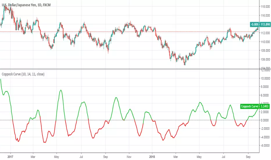
Coppock CurveThis indicator was originally developed by Edwin "Sedge" Coppock (Barron's Magazine, October 1962).
Specially for @AlexMayorov :
1) Buy when indicator crosses the zero line upside
2) Sell when indicator crosses the zero line downside
The Curve by Atilla YurtsevenThe Curve by Atilla Yurtseven
This indicator uses real empirical rule (68 - 95 - 99.7 rule). This is not a Bollinger Band indicator. I know BB is a very good indicator however it's unreliable.
First of all, I believe that price is not in a normal distribution. When you plot the histogram, you can not see a nice bell curved shape. It's know that bollinger bands simply uses a simple moving average and add standard deviation of closing price over it. TheCruve in the other hand, converts price to the nice bell shaped normal distribution and it never repaints. If it does, so there is a bug :)
The Curve indicator does not repaint. It's just there at the opening of the new bar! You can use The Curve with any time frame you like and any securities/pairs. Even for stocks. Longer look back periods, give better results.
Inputs:
Look Back Period: This is for calculating probability. Longer periods give better results.
Use Trend: When you enable Trend option, all lines will be calculated based on a Linear Regression trend
What do lines / ranges mean?
1st lines range is 68%. There is 68% probability that bar will close in this range.
2nd lines range is 95%. There is 95% probability that bar will close in this range.
3rd lines range is 99.7%: There is 99.7% probability that bar will close in this range.
FYI: This is an indicator that I have developed for myself. You can use it, apply or not to apply it to your trades. Keep in mind that, you are responsible for all your loses (or wins). Risk is 100% yours. Please use / try "The Curve" only if you accept this condition.
Have fun :)
Atilla Yurtseven
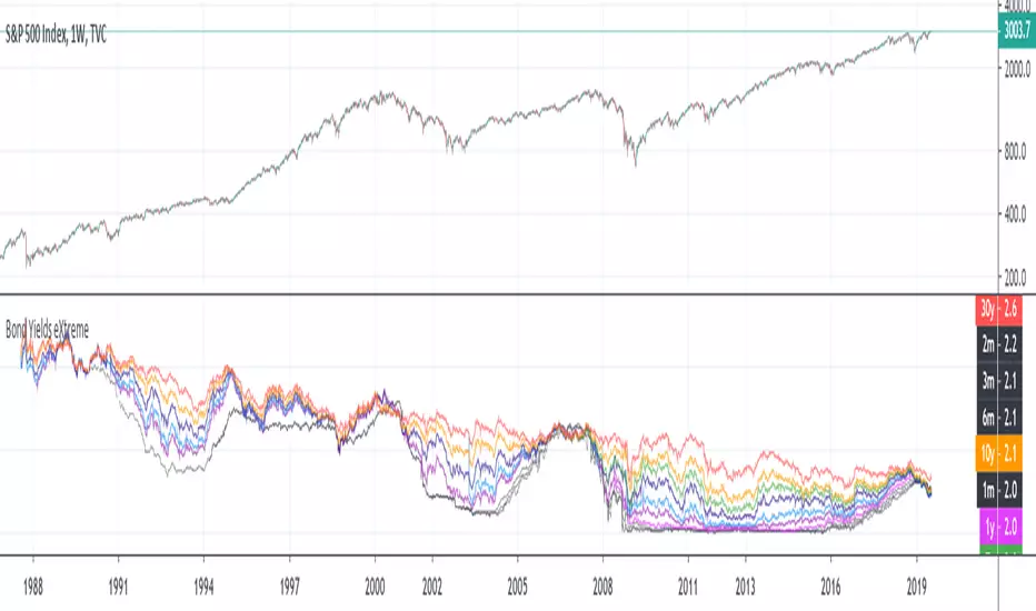
Inverted Yield Curve with VIX Fear IndexUS 2 year and US 10 year comparison, inverted yield curve with VIX. I use this on a weekly chart with 2 moving averages, the 40 week (ma200 daily) and the 520 week (10 year median).
The bottom histogram is the VIX and the plot is the yield curve. When the VIX is above a certain level (you can set it in settings) and the ýield curve is close to or at inversion the background goes red.
The last seven recessions were preceded by an inverted yield curve. Here I combined the two main fear indexes, the VIX and the run for safe US treasuries (Inverted Yield Curve).
This is preset to the 2 year and 10 year US bond, weekly, and the normal VIX ticker but you can set it to whatever you like.
Published with source code for anyone to modify. Please comment below if you do so! This is the second in a series of indicators I intend to publish as a package of economic recoverty/recession symptom indicators.
Follow me for updates, next one up is commodities with dr Copper and oil!

UCSgears_Linear Regression CurveThe Linear Regression Slope is based on the Curve.
List of All my Indicators - www.tradingview.com
