Market Structure & Supply-Demand EngineMarket Structure & Supply-Demand Engine (MSD-Engine) is a professional, non-repainting market structure and supply-demand analysis tool built purely on price action and volatility logic.
This indicator is designed for discretionary traders who want a clean, institutional-style view of market structure without lagging indicators or strategy automation.
🔍 What This Indicator Does
MSD-Engine identifies major structural reversals, plots price-action based supply & demand zones, and provides multi-timeframe confluence in a single, unified framework.
It is visual and analytical only — no strategy orders, no backtesting, and no repainting.
🚀 Core Features
• Non-Repainting Market Structure
Event-based swing reversal detection
ATR-adaptive displacement filtering
Confirmed pivots only (no future leaks)
• Pure Supply & Demand Zones
Candle-structure based zone detection
Volume-weighted zone strength
Automatic invalidation on breach
Configurable zone limits to maintain chart clarity
• Multi-Timeframe Context (MTF)
Chart timeframe structure
Two independent higher-timeframe supply & demand layers
Higher-timeframe directional bias visualization
HTF zones plotted only on confirmed HTF closes
• Volatility-Adaptive Logic
ATR normalized across timeframes
Dynamic reversal thresholds
Stable behavior from scalping to swing charts
• Trendline Lifecycle Tracking
Automatic major trendline construction
Single-fire break detection
Break validation / failure logic
HTF-aligned vs counter-trend classification
🧠 Designed For
• Discretionary price-action traders
• Supply & demand traders
• Market structure & smart-money style analysis
• Multi-timeframe confluence trading
• Futures, indices, forex, crypto, and equities
⚠️ Important Notes
This is NOT a strategy or auto-trading system
No buy/sell signals or performance metrics
No repainting (uses barmerge.lookahead_off)
Educational & analytical use only
📜 Disclaimer
This script is provided for educational and analytical purposes only.
It does not constitute financial advice. Trading financial markets involves risk.
Support-and-resistance

Liqudity Magnets [Zofesu]Liquidity Magnets is a high-precision institutional-grade tool designed to identify where large market participants place their orders. Instead of looking at basic support and resistance, this indicator focuses on Liquidation Levels and Stop-Loss cluster s, which act as "magnets" for price action.
🧠 The Concept
Markets move from one pocket of liquidity to another. Retail traders often place their stop-losses just above or below recent Swing Highs/Lows. Professional players and algorithms target these areas to fill their large orders (Stop-hunting) .
This indicator uses a Multi-Timeframe (MTF) approach to detect these critical zones based on leverage psychology:
🧲 Yellow Lines (4%) : Near-term liquidity/stop-loss clusters. Common targets for intraday sweeps.
💰 Red/Green Lines (10%): Major liquidation zones. These represent areas where high-leverage positions (10x) face forced liquidations, often leading to massive trend exhaustion and reversals.
🛠️ How it works
📊 MTF Liquidity Projection: The indicator automatically projects levels from a higher timeframe (Default: 4h) to ensure you are looking at significant market structure.
🎯 Filtered Stop-Run Signals (▲/▼): Grey triangles appear only when the price successfully "sweeps" a high/low AND penetrates deep enough into the liquidity pool. This filters out market noise.
🌑 Stealth Bar Coloring: Candles turn black/dark when a sweep is in progress, providing a clear visual cue that the market is currently "hunting" liquidity.
⚙️ Settings Guide
🕒 Select TF: Choose the anchor timeframe for magnets (Recommended: 240 for 4h).
🔍 Lookback: Sets the period for detecting the most relevant Swing Highs and Lows.
📏 Line Length: Controls how many bars the magnet lines extend into the future.
📈 Signal Sensitivity %: * 0%: Shows every minor sweep.
100%: Only triggers if price reaches the 4% magnet line exactly.
🎨 Color Settings: Fully customizable colors to fit any chart theme (Dark/Light).
💡 Trading Strategy
For the best results, look for the "Sweep & Reject" play:
1. Price enters a Magnet Line (Yellow or Red/Green).
2. A Stop-Run Triangle appears.
3. Wait for the price to reject the level and close back inside the previous range.
⚠️ Note
This script uses dark bar-coloring for sweep detection. If you are using a Dark Theme, ensure your candle borders are visible or adjust the Barcolor settings in the script inputs. On TF-H4 you can also use H1, you will see the channel in which the price moves and hits the lines, it is recommended to watch green and red there. Good use on titles like gold, silver - significant movements. Experiment.
For any questions or setup assistance, feel free to check my profile signature or better send me a private message here on TV!

RLPS -Simplified Long-Term Support/Resistance Levels (Shelters)// Introduction //
RLPS (Simplified Long-Term Shelters) is a streamlined indicator designed for traders who have already identified the preponderant long-term phase of their assets and want to efficiently track multiple assets using pre-calculated Fibonacci levels.
IMPORTANT: Before using this indicator, you need to have determined the date-price coordinates of the preponderant phase (i0→i1 pivots) for your asset(s). These coordinates can be obtained using our master RLP indicator (Long-Term Shelters), which automatically helps to calculates them, or through your own research and analysis.
// Theoretical Foundation //
Many traditional institutional investors use the latest higher-degree market phase that stands out from others (longest duration and greatest price change on daily timeframe) to base a Fibonacci retracement on whose levels they open long-term positions. These positions can remain open to be activated in the future even years in advance. The phase is considered valid until a new, more preponderant phase develops over time.
RLPS allows you to manually input these pre-identified phase coordinates and draw Fibonacci levels that serve as Long-Term Shelter Levels—marking future trading points (entries, exits, risk management) that remain valid for months and even years.
// Key Features //
• Supports up to 5 different assets with permanently stored phase coordinates
• Dropdown selector to quickly switch between configured assets
• No ZigZag calculation required—user provides pre-calculated coordinates
• Timeframe-agnostic: levels remain constant across all timeframes
• Works with any price source (exchange) regardless of historical data availability
• Asset Information table with visual validation (✅ Match / ❌ No Match)
• Long-Term Historical Prices (LTHP): add up to 5 psychological price levels per asset (historical highs/lows, annual opening prices, etc.)
• Customizable Fibonacci levels, colors, styles, and label formatting
• Logarithmic scale support for volatile assets like cryptocurrencies
// Quick Start Guide //
STEP 1: In TradingView, select "Bitcoin / U.S. dollar" from Bitstamp Exchange (BITSTAMP:BTCUSD).
STEP 2: Configure the chart to Daily (D) timeframe.
STEP 3: Load the RLPS indicator. Initially no drawing appears (fields are empty by default).
STEP 4: Open indicator settings and activate "Practice Asset Data Table" in the GENERAL section.
STEP 5: A table appears with sample data for 5 assets. Locate "Bitcoin on Bitstamp":
- i0 Date: 2020-03-13 18:00 | i0 Price: 3850.0
- i1 Date: 2021-11-10 18:00 | i1 Price: 69000.0
STEP 6: Copy this data to "ASSET 1 - IDENTIFICATION AND DATE-PRICE PIVOT COORDINATES".
STEP 7: Verify "Asset 1" is selected in the dropdown and close settings.
STEP 8: You should now see the yellow diagonal phase line, horizontal Fibonacci levels, and the validation table showing "✅ Match".
STEP 9: Navigate the chart to verify how Fibonacci levels align with historical support/resistance zones.
// Important Notes //
• The sample data in the Practice Table was validated in 02/2026 and serves as reference only.
• It is your responsibility to validate or update the preponderant phase of your assets over time.
• Use our master RLP indicator to automatically find and calculate preponderant phases, then transfer the coordinates here for permanent tracking.
• You can deactivate the Practice Table once you've copied the data you need.
// Shelter Indicators Ecosystem //
RLPS is part of a comprehensive ecosystem of indicators for price action analysis based on shelter levels:
RLPS (Simplified Long-Term Shelters): This indicator. Simplified version of RLP that allows manual input of previously identified preponderant phase coordinates. Ideal for permanent operations with multiple assets across different timeframes.
RLP (Long-Term Shelters): Automatically identifies the preponderant Zigzag phase that institutional investors use as a reference to project Fibonacci levels. These levels determine order placement over the following months and years.
RMP (Mid-Term Shelters): Provides the psychological shelter and resistance levels that institutional investors establish at the beginning of each year. These form the main framework that professionals use to plan entry and exit operations throughout the year.
RS (Weekly Shelters): Tactical structural analysis indicator designed to precisely track price action and manage positions during current weeks.
RID (Intra-Day Shelters): For intraday operations based on levels calculated from the daily opening price. Designed for 1H timeframes or lower, including scalping strategies.
By combining RLPS, RLP, RMP, RS, and RID, you obtain a multi-timeframe framework that provides certainty and clarity to apply strategies grounded in price action, across any time horizon: from scalping to long-term investments.
// Final Notes //
We sincerely regret to inform you that we have not included the Spanish translation previously provided in our indicators, due to our significant concern regarding the ambiguous rules on publication bans related to indicators.
Sharing motivates. Happy hunting in this great jungle!

RSI Momentum & Trend Suite - O59 Elite QuantRSI Momentum & Trend Suite – O59 Elite Quant
Professional Market Structure & Momentum Analysis Tool
RSI Momentum & Trend Suite – O59 Elite Quant is a comprehensive technical analysis indicator designed to help traders better understand market momentum, trend structure, price reactions, and key support & resistance zones directly on the chart.
This indicator combines RSI-based momentum analysis, dynamic bar coloring, price action signals, and automatic trend & support/resistance detection into a single, clean visual framework.
🔹 Momentum & Bar Coloring Logic
The indicator includes a custom RSI momentum engine that evaluates short-term price changes and momentum strength.
Candles are automatically colored when momentum reaches critical zones:
Above 70 → Strong bullish momentum
Below 30 → Strong bearish momentum
This candle coloring helps traders instantly recognize momentum extremes without switching to a separate RSI pane.
🔺 Buy & Sell Triangle Signals
The script generates triangle-based buy and sell signals based on a combination of:
RSI oversold / overbought conditions
Short-term price action behavior
Candle structure and confirmation logic
These signals are intended to highlight potential reaction zones, not to predict the market.
They work best when used together with trend direction and support/resistance levels.
📈 Automatic Trend Detection
The indicator automatically identifies ascending and descending trend structures using pivot-based swing analysis.
Trendlines are drawn dynamically based on higher lows and lower highs
Broken trendlines are automatically removed to keep the chart clean
Both bullish and bearish trends are visually distinguished
This allows traders to quickly assess whether the market is trending or losing structure.
🟦 Dynamic Support & Resistance Levels
Key support and resistance levels are detected using recent pivot points:
Levels extend forward in real time
Broken levels are removed automatically
Helps identify potential reaction, rejection, and liquidity zones
These levels are designed to adapt continuously as market structure evolves.
🧾 Information Table & Visual Themes
A customizable information table is displayed on the chart, showing:
Indicator name
Current symbol
Active timeframe
Author branding
Users can choose between multiple visual themes, allowing better readability and personal preference while maintaining a professional appearance.
⚠️ Important Notes & Risk Disclaimer
This indicator is designed as a technical analysis support tool only.
It does not provide financial advice
Signals and visual elements should not be used alone
Always confirm signals with your own strategy, risk management, and market context
⚠️ Special caution is advised during:
Low-volume sessions
Weekend price action
High-impact news events
Thin liquidity hours
Market conditions during these periods may produce false signals or reduced reliability.
📌 Final Disclaimer
This indicator is for educational and analytical purposes only.
It is not investment advice.
All trading decisions remain the sole responsibility of the use

RLP V4.3 -Long Term Support/Resistance Levels (Refuges-Shelters)// Introduction //
We have utilized the Zigzag library technology from ©Trendoscope Pty Ltd for Zigzag generation, allowing users the freedom to choose which of the different Zigzags calculated by Trendoscope as "Levels and Sub-Levels" is most suitable for generating ideal phases for evaluation and selection as "most preponderant phases" over long-term periods of any asset, according to its particular behavior based on its age, volatility, and price trend.
// Theoretical Foundation of the Indicator //
Many traditional institutional investors use the latest higher-degree market phase that stands out from others (longest duration and greatest price change on daily timeframe) to base a Fibonacci retracement on whose levels they open long-term positions. These positions can remain open to be activated in the future even years in advance. The phase is considered valid until a new, more preponderant phase develops over time, at which point the same strategy is repeated.
// Indicator Objectives //
1) Automatically find the latest most preponderant long-term phase of an asset, analyzing it on daily timeframe while considering whether the long-term market trend is bullish or bearish.
2) Draw a Fibonacci Retracement over the preponderant phase (reversed if the phase is bullish).
3) The indicator automatically numbers and locates the 3 most preponderant phases, selecting Top-1 for initial Fibo drawing.
4) If the user disagrees with the indicator's automatic selection, they have the freedom to choose any of the other 2 Top phases for the Fibo drawing and its levels.
5) If the user disagrees with the amplitude or frequency of the initially drawn Zigzag phases, they can modify the Zigzag calculation algorithm parameters until one of the Top-3 matches the phase they had in mind.
6) As an experimental bonus, the indicator runs a popularity contest (CP) of "bullseye" daily price (OHLC) matches, subject to user-defined tolerance ranges, against all Fibo levels of the Top 3 selected phases, to verify which phase the market prices are validating as the most popular for placing trades. Contest results are displayed in the POP. CONTEST column of the Top-3 phases table. If the contest detects a change in the winning phase, a switch can be enabled to activate an alert that the user can utilize with TradingView's alert creator to display an alarm, send an email, etc.
7) This indicator was designed for users to find the preponderant long-term phase of their assets and manually record the date-price coordinates of the i0-i1 anchors of the preponderant phase. The Top-1 phase coordinates are shown in the Top-3 phases table where they can be captured. The date-price coordinates of all HH and LL pivots, from all Zigzag phases, can be displayed via a switch. With the pivots, the user can select a different phase than those automatically found by the indicator, according to the conclusions of their own research. Subsequently, the user can forget about this RLP indicator for a while and move on to apply in their normal trading our RLPS indicator (Simplified Long-Term Shelters), in which they can draw and simultaneously track the long-term shelters of up to 5 different assets, simply by entering their corresponding date-price coordinates, previously located with this RLP indicator or through their own observation.
// Additional Notes //
1) As of the this V4.3 publication date (01/2026), the Zigzag generation parameters were adjusted by default to find the long-term preponderant phases for the following assets: Bitcoin, Ethereum, Bitcoin futures BTC1! (all generated due to the 2020-2021 pandemic). It also provides by default the confirmed preponderant phases for the following assets: Apple, Google, Amazon, Microsoft, PayPal, NQ1!, ES1! and SP500 Cash.
2) Prices, phases, and levels shown on the graphic chart correspond to results obtained using daily Bitcoin data from the Bitstamp exchange, BTCUSD:BITSTAMP (popular here in Europe).
3) Any error corrections or improvements that can be made to the phase selection algorithms or the CP phase popularity contest algorithm will be highly appreciated (statistics and mathematics, among many other sciences, are not particularly our strong suit).
4) We sincerely regret to inform you that we have not included the Spanish translation previously provided, due to our significant concern regarding the ambiguous rules on publication bans related to indicators.
4) Sharing motivates. Happy hunting in this great jungle!

Short-Term Weekly Refuges (Shelters)## // Introduction //
══════════════
Short-Term Weekly Refuges (Shelters) (WR or RS) is a structural analysis indicator designed to track price action during the current week. It combines a configurable ZigZag with Fibonacci retracements anchored to recent phases, using the Weekly Opening Price (W.O.P.) as a key reference level.
This indicator is optimized for 4H timeframe but also works on 1H and 15min charts.
## // Theoretical Foundation of the Indicator //
═══════════════════════════════
The WR (RS) indicator provides a structural framework for following price action during the current trading week.
The core concept: Recent ZigZag phases, combined with the Weekly Opening Price, create dynamic support and resistance levels that institutional traders often monitor and use for intraweek positioning. The indicator allows you to select which recent phase (1-10) serves as the Fibonacci anchor.
## // Indicator Objectives //
══════════════════
1) Display a configurable ZigZag showing recent price structure with numbered phases (1 = most recent). Users should configure the ZigZag parameters based on whether they are analyzing a Major Degree Pattern (larger swings, less noise) or a Minor Degree Pattern (smaller swings, more detail), following standard Elliott Wave terminology. Configure the ZigZag to match the degree of your analysis: use higher Depth values for Major Degree Patterns, or lower values for Minor Degree Patterns.
2) Draw Fibonacci retracements on a user-selected phase, with two modes:
• "On ZigZag": Traditional Fibonacci on the selected phase.
• "Relative to W.O.P.": Fibonacci from phase anchor (i0) to Weekly Opening Price.
3) Show Weekly Opening Price lines as horizontal references, with the current week's line extended into the future.
4) Provide Pivot Up/Down markers for additional confirmation of local highs and lows.
5) Support multiple simultaneous indicator loads with visual identifier labels to distinguish between different analysis degrees (e.g., "Major Degree Pattern" vs "Minor Degree Pattern").
6) Optional Embedded Indicator: Enable Intraday Shelters (RID) - percentage-based support/resistance levels calculated from the Daily Opening Price, useful for 1H and 15min trading.
## // Key Features //
══════════════
• **Flexible ZigZag**: Adjustable Depth, Deviation, and Backstep parameters to adapt to any asset's volatility.
• **Phase Selection**: Choose from the 10 most recent phases for Fibonacci anchoring.
• **Dual Fibonacci Modes**: Trace on the ZigZag phase itself, or relative to the Weekly Opening Price.
• **New Age Color Palette**: Professional Fibonacci color scheme used by old school experienced traders.
• **Weekly Opening Price (W.O.P.)**: Historical weekly opens plus current week projection.
• **"Show Only W.O.P." Mode**: Isolate just the Weekly Opening Price line for cleaner charts on non-4H timeframes.
• **Optional Intraday Shelters (RID)**: 11 percentage levels (±0.382%, ±1%, ±1.5%, ±2%, ±2.5%) based on Daily Opening Price.
• **Multi-Load Support**: Visual identifier tags and Large Label for running multiple indicator instances simultaneously.
## // Recommended Workflow //
═════════════════════
1) Load the indicator on a 4H chart.
2) Adjust ZigZag parameters (Depth, Deviation) until the phases match your visual analysis of recent price structure.
3) Select the phase you want to use as Fibonacci anchor (typically Phase 2, 3 or higher).
4) Choose Fibonacci mode: "On ZigZag" for phase analysis, or "Relative to W.O.P." for analysis based on weekly opening price context.
5) Monitor how price interacts with the Fibonacci levels and Weekly Opening Price throughout the week.
6) Optionally enable RID for intraday precision on 1H or 15min charts.
## // Integration with Other Refuge Indicators //
════════════════════════════════
WR (RS) is part of a complete refuge-based analysis ecosystem:
• LTR (RLP) (Long-Term Refuges): For automatic determination of the predominant phase of a ZigZag, which institutional investors choose as the basis for a Fibo whose levels calculate the projection for order placement over the following months and years.
• LTRS (RLPS) (Simple Long-Term Refuges): Simplified version of LTR in which the known coordinates of the predominant phases (obtained with the LTR indicator) of one or up to five assets are easily captured for permanent long-term operation.
• WR (RS) (Short-Term Weekly Refuges): (This indicator) For short-term tactical analysis (4H, 1H) based on chosen phases of a ZigZag that define Fibo levels generated during the near past week(s) and probably effective in the present week.
• IDR (RID) (Intra-Day Refuges): For daily operations relying on intraday levels on timeframes of 1H or less. Ideal for scalping traders.
By combining LTR, LTRS, WR and IDR, you obtain a multi-level framework that allows you to operate with clarity at any time horizon, from intraday positions to investments spanning months and years.
## // Additional Notes //
════════════════
1) Default parameters are optimized for volatile assets (crypto, tech stocks). For forex or less volatile instruments, consider reducing Deviation to 3-8%.
2) The "Phase in Development" (dashed line) shows the tentative current ZigZag segment that may still change as new bars form.
3) Bug reports, improvement proposals for the ZigZag generator, pattern determination, or Fibo composition, etc., will be greatly appreciated and taken into account for a future version. Best regards and happy hunting.
(Sorry: Spanish translation erased trying to avoid confusing publishing banning rules).


Quant Labs Edge Filter (Community Edition)A market-structure filter designed to identify when no real edge exists.
Edge Filter evaluates price location relative to structure to define market posture — long bias, short bias, or stand aside. It does not generate trade signals and is intentionally designed to reduce overtrading.
Clear Posture States
Near Highs — Short Bias
Near Lows — Long Bias
No Edge — Stand Aside
When edge is absent, patience is the strategy.
Why It Stands Out
Most indicators encourage action.
Edge Filter encourages restraint.
Its purpose is to protect capital, attention, and decision quality by filtering out low-quality environments.
Community Edition
This version publishes the core logic openly for transparency and education.
Private access versions may exist for traders seeking continuity and stewardship.
Bottom Line
Trade less.
Trade better.
Wait for edge.
— QuantLabs

Support & Resistance Automated📌 Support and Resistance Automated (Pivot-Based)
Support and Resistance Automated is a lightweight and fully automated indicator that plots key support and resistance levels using pivot highs and pivot lows. It helps traders quickly identify important price reaction zones without manual drawing.
This indicator is especially useful for price-action traders, swing traders, and intraday traders who rely on clean charts and objective levels.
🔍 How It Works
Pivot Highs → Resistance Levels
Pivot Lows → Support Levels
Each detected pivot creates a horizontal dotted line that extends forward, allowing you to observe how price reacts over time.
Once a level is formed, it is kept permanently on the chart — no repainting, no disappearing levels.
⚙️ Customizable Settings
You can easily adjust:
Left & Right Pivot Bars – control how strong a pivot must be
Line Extension Length
Line Width
Support & Resistance Colors
Show / Hide Pivot Highs and Pivot Lows independently
This flexibility allows the indicator to adapt to intraday, swing, or higher-timeframe analysis.
✅ Key Features
✔ Fully automatic support & resistance detection
✔ Based on proven pivot-point logic
✔ No repainting
✔ Clean, minimal chart appearance
✔ Unlimited support & resistance levels
✔ Works on all timeframes & instruments
📈 Best Use Cases
Identifying key demand and supply zones
Planning entries, targets, and stop-losses
Confluence with price action, RSI, moving averages
Breakout and rejection-based strategies

GSS V2 : Ultra Scalping [DoNotFollowMeGod] User Manual: GSS V2 Ultra Scalping No Repaint!
Perfect For:
Hardcore Scalpers (Ultra Short Term).
Traders who focus on quick entries & exits and high-frequency trading .
Mandatory Market Conditions:
✅ Low Volume Only: Best used during low activity periods or slow markets.
✅ Out-Session: Trade during market rests or session overlaps (avoid high-volatility session opens).
✅ Clear Sideway: The market must be ranging clearly , not aggressively making New Highs/New Lows.
❌ AVOID: High-impact news events (Red Folder) or strong trend breakouts .
Recommended Settings:
Timeframe: M1 / M3 / M5
Band Width (ATR): Adjust the setting to 3.0 - 5.0
(This widens the channel to ensure you only enter when the price is significantly overextended ).
Trade Execution Plan:
Entry: Enter only when a Signal Arrow appears AND the price touches the Band Edge (ATR 3-5).
TP 1 (First Target): "The Grey Dashed Line (Mid Band)"
Golden Rule: Once the price hits TP1, you must either take partial profits or move SL to Break Even (BE) immediately! Never let a winning trade turn into a loss.
TP 2 (Final Target): "The Dotted Line (Outer Band)"
Let the trade run ( Dynamic ) until it reaches the opposite band.
💡 Pro Tip: Since the TP lines are dynamic (moving in real-time with the price action), you should monitor the live price. If you are satisfied with the profit, "Bag it!" — don't wait for the perfect touch if the momentum is fading.

FVG Heatmap [Hash Capital Research]FVG Map
FVG Map is a visual Fair Value Gap (FVG) mapping tool built to make displacement imbalances easy to see and manage in real time. It detects 3-candle FVG zones, plots them as clean heatmap boxes, tracks partial mitigation (how much of the zone has been filled), and summarizes recent “fill speed” behavior in a small regime dashboard.
This is an indicator (not a strategy). It does not place trades and it does not publish performance claims. It is a market-structure visualization tool intended to support discretionary or systematic workflows.
What this script detects
Bullish FVG (gap below price)
A bullish FVG is detected when the candle from two bars ago has a high below the current candle’s low.
The zone spans from that prior high up to the current low.
Bearish FVG (gap above price)
A bearish FVG is detected when the candle from two bars ago has a low above the current candle’s high.
The zone spans from the current high up to that prior low.
What makes it useful
Heatmap zones (clean, readable FVG boxes)
Bullish zones plot below price. Bearish zones plot above price.
Partial fill tracking (mitigation progress)
As price trades back into a zone, the script visually shows how much of the zone has been filled.
Mitigation modes (your definition of “filled”)
• Full Fill: price fully trades through the zone
• 50% Fill: price reaches the midpoint of the zone
• First Touch: price touches the zone one time
Optional auto-cleanup
Optionally remove zones once they’re mitigated to keep the chart clean.
Fill-Speed Regime Dashboard
When zones get mitigated, the script records how many bars it took to fill and summarizes the recent environment:
• Average fill time
• Median fill time
• % fast fills vs % slow fills
• Regime label: choppy/mean-revert, trending/displacement, or mixed
How to use
Use FVG zones as structure, not guaranteed signals.
• Bullish zones are often watched as potential support on pullbacks.
• Bearish zones are often watched as potential resistance on rallies.
The fill-speed dashboard helps provide context: fast fills tend to appear in more rotational conditions, while slow fills tend to appear in stronger trend/displacement conditions.
Alerts
Bullish FVG Created
Bearish FVG Created
Notes
FVGs are not guaranteed reversal points. Fill-speed/regime is descriptive of recent behavior and should be treated as context, not prediction. On realtime candles, visuals may update as the bar forms.

Dynamic Pivot Point [MarkitTick]Title: Dynamic Pivot Point MarkitTick
Concept
Unlike traditional Pivot Points, which plot static horizontal levels based on the previous period's High, Low, and Close, this script introduces a dynamic element by applying an Exponential Moving Average (EMA) to the calculated pivot levels. This approach allows the Support and Resistance zones to adapt more fluidly to recent price action, reducing the jagged steps often seen in standard multi-timeframe pivot indicators.
How It Works
The script operates in two distinct phases of calculation:
1. Data Extraction and Core Math:
The indicator first requests the High, Low, and Close data from a user-defined timeframe (e.g., Daily, Weekly). Using this data, it calculates the standard Pivot Point (P) alongside three levels of Support (S1, S2, S3) and three levels of Resistance (R1, R2, R3) using standard geometric formulas:
Pivot = (High + Low + Close) / 3
R1 = 2 * Pivot - Low
S1 = 2 * Pivot - High
(Subsequent levels follow standard Floor Pivot logic).
2. Dynamic Smoothing:
Instead of plotting these raw values directly, the script processes each calculated level (P, S1-S3, R1-R3) through an Exponential Moving Average (EMA). The length of this EMA is controlled by the Pivot Length input. This smoothing process filters out minor volatility and creates curved, dynamic trajectories for the pivot levels rather than static straight lines.
How to Use
Traders can use this tool to identify dynamic areas of interest where price may react.
The White Line represents the Central Pivot. Price action relative to this line helps determine the immediate bias (above for bullish, below for bearish).
Green Lines (Support 1, 2, 3) indicate potential demand zones where price may bounce during a downtrend.
Red Lines (Resistance 1, 2, 3) indicate potential supply zones where price may reject during an uptrend.
Because the levels are smoothed, they can also act as dynamic trend followers, similar to moving averages, but derived from pivot geometry.
Settings
Show Pivot Points: Toggles the visibility of the plot lines on the chart.
Pivot Length: Defines the lookback period for the EMA smoothing applied to the pivot levels. A higher number results in smoother, slower-reacting lines.
Timeframe: Determines the timeframe used for the underlying High/Low/Close data (e.g., selecting "D" calculates pivots based on Daily data while viewing a lower timeframe chart).
Disclaimer This tool is for educational and technical analysis purposes only. Breakouts can fail (fake-outs), and past geometric patterns do not guarantee future price action. Always manage risk and use this tool in conjunction with other forms of analysis.

Session, Weekly, Daily LevelsScroll down for hungarian description!
Magyar leíráshoz görgess lejjebb!
Overview
This script provides a unified market structure mapping tool that automatically identifies and visualizes key intraday, daily, and weekly reference levels. It helps traders contextualize price action throughout the trading week by marking true session opens, previous day highs/lows, weekly highs/lows, and weekday opens, all with accurate historical anchoring and correct timezone handling.
What This Script Does
1. Intraday Session Opens (Tokyo, London, New York)
- Detects the exact candle where each session opens.
- Draws horizontal rays with labels.
- Automatically clears lines at the start of each new day.
- Uses a custom local-to-exchange timezone conversion system.
2. Weekly Levels
- Last week high and low (precise bar anchoring, not HTF aggregation)
- Current week open (also Monday open)
- Auto-reset on new week
- Levels are always drawn from the true candle where they formed.
3. Previous Day High & Low
- Continuously tracks intraday highs and lows.
- On a new day, stores yesterday’s values and anchors rays to the exact bars.
- Levels remain visible for the full current day and reset the next day.
4. Weekday Opens (Tue–Fri)
- Captures the exact opening price of Tuesday–Friday.
- Monday open = Week open, so it is not shown separately.
- Auto-reset on new week.
Timezone Logic (Original Feature)
The script converts:
local session times → exchange timezone → chart timestamps
It works correctly regardless of chart timezone or instrument exchange location.
Line Drawing Logic
- Finds the exact bar_index where each level forms.
- Draws rays extending to the right.
- Labels are placed ahead of price.
- Safe updating prevents “bar index too far” errors.
How to Use
- Identify daily/weekly structure.
- Track bias relative to session opens.
- Observe reactions around weekday opens.
- Compare price action to last week's range.
Originality
- Custom timezone conversion engine.
- True historical bar anchoring.
- Fully automated weekly/daily structural resets.
- Independent styling for each level type.
- Not a mashup; all components follow one unified logic.
Limitations
- Does not predict trend or direction.
- Structural tool only.
Summary
A precise and reliable market structure tool that unifies weekly, daily, and intraday reference levels with full timezone automation and true-candle anchoring.
MAGYAR LEÍRÁS
--------------
Áttekintés
Ez az indikátor egy összetett piaci szerkezet-feltérképező eszköz, amely automatikusan megjeleníti a legfontosabb intraday, napi és heti referenciaértékeket. A célja, hogy a kereskedő tisztán lássa a piac aktuális környezetét: hol nyíltak a főbb devizapiaci szekciók, hogyan alakult a tegnapi tartomány, hol volt a múlt heti csúcs/mélypont, és hogyan nyitottak az egyes hétköznapok.
Mit tud a script?
1. Szekciónyitások (Tokyo, London, New York)
- Megkeresi a pontos gyertyát, amely a szekciónyitáskori árat tartalmazza.
- Vízszintes vonalat és címkét rajzol.
- Minden nap elején automatikusan törli a korábbi nap szintjeit.
- Egyedi időzóna-konverziós rendszerrel működik (helyi idő → tőzsdei idő → chart idő).
2. Heti szintek
- Múlt heti maximum és minimum (pontos gyertyapontra horgonyozva)
- Aktuális heti nyitóár (egyben a hétfői nyitó is)
- Új hét kezdetekor automatikusan frissül.
- A múlt heti high/low nem fix időpontra, hanem a valódi gyertyára kerül.
3. Előző napi High és Low
- Folyamatosan követi a napi maximumot és minimumot.
- Napváltáskor elmenti és pontos gyertyáról indítja a ray-t.
- A szintek a teljes nap folyamán megmaradnak, majd a következő nap törlődnek.
4. Hétköznapok nyitóárai (Kedd–Péntek)
- A kedd, szerda, csütörtök és péntek nyitóárát rögzíti és megjeleníti.
- A hétfői nyitó a Week Open, ezért külön nem jelenik meg.
- Heti váltáskor automatikusan törlődnek.
Időzóna-kezelés (egyedi megoldás)
A script a felhasználó helyi idejét átszámítja az instrumentum tőzsdei időzónájára, majd a chartra vetíti.
Ez biztosítja, hogy minden szekciónyitás helyesen jelenik meg, bármely chart vagy instrumentum esetén.
Vonalrajzolási logika
- A szintek a valódi bar_index alapján kerülnek rögzítésre.
- Jobbra nyúló ray-eket rajzol.
- A címkék mindig a jobb oldalon, előre helyezve jelennek meg.
- Biztonságos frissítési rendszer akadályozza meg a hibákat (pl. “bar index too far”).
Használat
- Napi/heti szerkezet meghatározása.
- Bias követése a session openekhez viszonyítva.
- Reakciók figyelése a hétköznapok nyitóárai körül.
- Összevetés a múlt heti tartománnyal.
Eredetiség
- Egyedi időzóna-kezelő motor.
- Igazi gyertyapont-alapú horgonyzás.
- Automatikus napi/heti reset.
- Minden szint külön stílusban konfigurálható.
- Nem mashup; egységes rendszer.
Összegzés
Professzionális, pontos eszköz a piaci szerkezet feltérképezésére, amely egyesíti a heti, napi és intraday szinteket, teljes időzóna-automatizálással és gyertyapontra horgonyzott kijelölésekkel.

Trend Follow Line Point📌 Trend Follow Line Point
The Trend Follow Line Point indicator removes the confusing, repainting-based swing connections commonly found in traditional swing tools.
It maintains consistent swing-point calculation, keeps structural swing lines intact even when trend lines are broken, and integrates market structure + trend + volatility + volume into one intuitive, visual indicator.
This tool is designed for:
Trend Following
Swing Structure Analysis
Volatility-Based Entry & Exit
Market Strength Evaluation
📊 Component Explanation
🔹 1. Swing High / Swing Low Detection
Based on the user-defined sensitivity (swgLen):
A Swing High forms when the current high exceeds the previous swgLen highs.
A Swing Low forms when the current low falls below the previous swgLen lows.
🔹 2. Swing-Based Structure Lines
Connect Swing Highs → Structural visualization
Connect Swing Lows → Structural visualization
These lines reveal the underlying market structure without repainting or disappearing unexpectedly.
🔹 3. Dynamic ATR + Volume Weighting
ATR values combined with the volume ratio (vol / volMA) create a dynamic volatility channel that reflects real-time market pressure.
🔹 4. Enhanced SuperTrend Calculation
Uses ATR-based stability to produce more realistic and smoother trend lines, reducing noise and improving signal clarity.
🔹 5. Trend Color Mapping
Up Trend → User-selected color
Down Trend → User-selected color
Visual trend direction and strength can be identified immediately.
🧭 How to Use
When Swing Highs/Lows are detected, structure lines are automatically drawn between previous swings.
Use these lines to evaluate support/resistance breaks and overall structural direction.
Manage risk with volatility guidance:
Higher ATR (volume-weighted) → wider trend spacing → increased risk
Lower ATR → tighter spacing → reduced risk
This helps with position sizing, entry timing, and exit decisions.
+

Viprasol Elite Advanced Pattern Scanner# 🚀 Viprasol Elite Advanced Pattern Scanner
## Overview
The **Viprasol Elite Advanced Pattern Scanner** is a sophisticated technical analysis tool designed to identify high-probability double bottom (DISCOUNT) and double top (PREMIUM) patterns with unprecedented accuracy. Unlike basic pattern detectors, this elite scanner employs an AI-powered quality scoring system to filter out false signals and highlight only the most reliable trading opportunities.
## 🎯 Key Features
### Advanced Pattern Detection
- **DISCOUNT Patterns** (Double Bottoms): Identifies bullish reversal zones where price may bounce
- **PREMIUM Patterns** (Double Tops): Detects bearish reversal zones where price may decline
- Multi-point validation system (5-point structure)
- Symmetry analysis with customizable tolerance
### 🤖 AI Quality Scoring System
Each pattern receives a quality score (0-100) based on:
- **Symmetry Analysis** (32% weight): How closely the two bottoms/tops match
- **Trend Context** (22% weight): Strength of the preceding trend using ADX
- **Volume Profile** (22% weight): Volume confirmation at key points
- **Pattern Depth** (16% weight): Significance of the pattern's price range
- **Structure Quality** (16% weight): Overall pattern formation quality
Quality Grades:
- ⭐ **ELITE** (88-100): Highest probability setups
- ✨ **VERY STRONG** (77-87): Strong trade opportunities
- ✓ **STRONG** (67-76): Valid patterns with good potential
- ○ **VALID** (65-66): Acceptable patterns meeting minimum criteria
### 🎯 Intelligent Target System
Three target modes per pattern direction:
- **Conservative**: 0.618 Fibonacci extension (safer, closer targets)
- **Balanced**: 1.0 extension (moderate risk/reward)
- **Aggressive**: 1.618 extension (higher risk/reward)
Targets automatically adjust based on pattern quality score.
### 🔧 Advanced Filtering Options
- **Volatility Filter (ATR)**: Excludes patterns during extreme volatility
- **Momentum Filter (ADX)**: Ensures sufficient trend strength
- **Liquidity Filter (Volume)**: Confirms adequate trading volume
### 📊 Pattern Lifecycle Management
- Real-time neckline tracking with extension multiplier
- Pattern invalidation after extended wait period
- Breakout/breakdown confirmation
- Reversal detection (pattern failure scenarios)
- Target achievement tracking
### 🌈 Premium Visual System
- Color-coded quality levels
- Cyber-themed color scheme (Neon Green/Hot Pink/Purple/Cyan)
- Transparent fills for pattern zones
- Dynamic labels with pattern information
- Elite dashboard showing live pattern stats
## 📈 How To Use
### Basic Setup
1. Add indicator to your chart
2. Enable desired patterns (DISCOUNT and/or PREMIUM)
3. Adjust quality threshold (default: 65) - higher = fewer but better signals
4. Set your preferred target mode
### Trading DISCOUNT Patterns (Bullish)
1. Wait for pattern detection (labeled points 1-4)
2. Check quality score on dashboard
3. Entry on breakout above neckline (point 5)
4. Stop loss below the lowest bottom
5. Target shown automatically based on your mode
6. ⚠️ Watch for pattern failure (break below bottoms = SHORT signal)
### Trading PREMIUM Patterns (Bearish)
1. Wait for pattern detection (labeled points 1-4)
2. Check quality score on dashboard
3. Entry on breakdown below neckline (point 5)
4. Stop loss above the highest top
5. Target shown automatically based on your mode
6. ⚠️ Watch for pattern failure (break above tops = LONG signal)
## ⚙️ Input Settings Guide
### 🔍 Detection Engine
- **Left/Right Pivots**: Higher = fewer but cleaner patterns (default: 6/4)
- **Min Pattern Width**: Minimum bars between bottoms/tops (default: 12)
- **Symmetry Tolerance**: Max % difference allowed between levels (default: 1.8%)
- **Extension Multiplier**: How long to wait for breakout (default: 2.2x pattern width)
### ⭐ Quality AI
- **Min Quality Score**: Only show patterns above this score (default: 65)
- **Weight Distribution**: Customize what matters most (symmetry/trend/volume/depth/structure)
### 🔧 Filters
- **Volatility Filter**: Avoid choppy markets (recommended: ON)
- **Momentum Filter**: Ensure trend strength (recommended: ON)
- **Liquidity Filter**: Volume confirmation (recommended: ON)
### 💎 Target System
- Choose target aggression for each pattern type and direction
- Higher quality patterns get adjusted targets automatically
## 🎨 Visual Customization
- Adjust colors for DISCOUNT/PREMIUM patterns
- Set quality-based color coding
- Customize label sizes
- Toggle dashboard visibility and position
- Show/hide historical patterns
## 🚨 Alert System
Set up TradingView alerts for:
- 🚀 **LONG Signals**: DISCOUNT breakout, PREMIUM failure
- 📉 **SHORT Signals**: PREMIUM breakdown, DISCOUNT failure
- ✅ **Target Achievement**: When price hits your target
## 💡 Pro Tips
1. **Higher Timeframes = Better Signals**: Patterns on 4H, Daily, Weekly are more reliable
2. **Quality Over Quantity**: Focus on ELITE and VERY STRONG grades
3. **Combine with Trend**: DISCOUNT in uptrend, PREMIUM in downtrend = best results
4. **Watch Pattern Failures**: Failed patterns often provide strong counter-trend signals
5. **Adjust for Your Style**: Intraday traders use Conservative, swing traders use Aggressive
## 🔒 Pattern Invalidation
Patterns become invalid if:
- No breakout/breakdown within extension period
- Support/resistance levels are broken prematurely
- Pattern shown in faded colors = no longer active
## ⚠️ Risk Disclaimer
This indicator is a tool for technical analysis and does not guarantee profitable trades. Always:
- Use proper risk management
- Combine with other analysis methods
- Never risk more than you can afford to lose
- Past performance does not indicate future results

AG Pro Dynamic ChannelsAG Pro Dynamic Channels V2
Discover a new lens through which to view market structure with the AG Pro Dynamic Channels V2. This advanced indicator moves beyond simple trendlines, automatically identifying, classifying, and drawing eight distinct types of support and resistance channels directly on your chart.
Built on a sophisticated pivot-point detection engine, this script intelligently distinguishes between Major and Minor price structures, as well as Internal and External channels. This provides a comprehensive and multi-dimensional map of the market's flow, helping you identify trend continuations, corrections, and potential reversals.
The indicator is complete with a powerful, fully customizable alert system designed to notify you of the two most critical events: channel breakouts and price reactions.
Key Features
Fully Automatic Channels: The script automatically analyzes price action to find pivot highs and lows, using them to construct relevant channels without any manual drawing required.
8-Channel Classification: Gain deep market insight by viewing eight distinct channel types:
Major External (Up/Down)
Major Internal (Up/Down)
Minor External (Up/Down)
Minor Internal (Up/Down)
Advanced Pivot Engine: The core logic classifies pivots into categories like Higher Highs (MHH/mHH), Lower Lows (MLL/mLL), Higher Lows (MHL/mHL), and Lower Highs (MLH/mLH) to determine the precise start and end points for each channel.
Deep Customization: Take full control of your chart's appearance. You can individually toggle the visibility, color, line style (solid, dashed, dotted), and line width for all eight channel types.
Chart Clarity: A "Delete Previous" option is available for each channel type, allowing you to keep your chart clean and focused on only the most current and relevant market structures.
Comprehensive Alert System
Never miss a key price interaction. The AG Pro Dynamic Channels V2 features a robust, built-in alert module.
Dual-Alert Conditions: Get notifications for two distinct events:
Break Alert: Triggers when price confirms a close outside of a channel, signaling a potential breakout.
React Alert: Triggers when price touches or interacts with a channel line before closing back inside, signaling a test or rejection.
16 Unique Alerts: You have full control to enable or disable "Break" and "React" alerts for all 8 channel types individually, giving you 16 unique alert conditions to monitor.
Professional Alert Messages: The embedded alert sender provides detailed messages that include the asset, timeframe, and the specific event, such as "Break Major External Up Channel" or "React Minor Internal Down Channel".
Alert Configuration: Easily set your global Alert Name, Message Frequency (e.g., Once Per Bar, Once Per Bar Close), and Alert Time Zone from the script's settings.
How to Use
Trend Identification: Use the Major External Channels (drawn from MHH and MLL pivots) to identify the primary, long-term trend direction.
Pullback & Entry Zones: Use the Internal Channels (drawn from MHL and MLH pivots) to spot corrections and potential entry zones within an established trend.
Breakout Trading: Set Break Alerts on Major channels to be notified of significant, structure-shifting moves.
Short-Term & Counter-Trend: Utilize the Minor Channels to identify shorter-term price swings and potential reversal points.

Intraday Buy/Sell/Average Zones by Chaitu50cIntraday Buy/Sell/Average Zones by chaitu50c
Timeframe:
Tested on the 5-minute chart.
Recommended timeframe: 5-minute
What it does
This indicator marks intraday Buy (green) and Sell (red) zones made by strong close-confirmed breakouts. These zones act as support/resistance. If price later closes through a zone, the zone changes color from that bar forward (support ↔ resistance). It can flip more than once.
How zones form
Single breakout: an opposite-type candle closes beyond the previous candle’s high/low.
Double breakout: a base candle, then two opposite-type candles, and the second one closes beyond the base high/low.
Zone size
Buy zone: from the combo lowest low up to the nearest open/close of the combo.
Sell zone: from the combo highest high down to the nearest open/close of the combo.
Color shift (optional)
If price closes through a zone, it flips color at that bar and behaves as the other side (support ↔ resistance). Flips can happen again later.
Overlap control
When a new zone overlaps an existing same-color zone in the same session, choose:
Merge (combine), or
Suppress (ignore the new one).
Flipped zones use their current color for this.
Right edge & session
All zones extend to the right (your offset). Detection is limited to your chosen session, and you can show only the last N sessions.
---
How to trade (simple)
A) Initial breakout trade
When a new zone forms, that breakout itself can be a trade idea in the breakout direction, The stoploss will be the zone.
B) Zone breakout trade (flip)
If price later closes out of a zone and it changes color, that breakout is another trade opportunity in the new direction.
C) Retrace & average trade
When price retests a zone, wait for a confirmation candle in the zone’s favor
— bullish close for a green zone, bearish close for a red zone — then average entries inside/near the zone.
Place stops just beyond the opposite edge of the zone.
If the zone flips color, stop averaging; bias changed.
---
Key settings
Breakout type: Single and/or Double
Confirm on Close: strict mode (no intrabar preview) or allow intrabar preview that auto-removes if fail
Color Shift on Breaks: on/off
Same-Type Overlap: Merge/Suppress
Session, Sessions to Display, Right Offset, Colors, Max Zones
Reminder: Best results on the 5-minute timeframe (tested and recommended).

Chartlense Dashboard (Data, Trend & Levels)Chartlense Dashboard (Data, Trend & Levels)
Overview
This dashboard is designed to solve two common problems for traders: chart clutter and the manual drawing of support and resistance levels . It consolidates critical data from multiple indicators into a clean table overlay and automatically plots the most relevant S&R levels based on recent price action. The primary goal is to provide a clear, at-a-glance overview of the market's structure and data.
It offers both a vertical and horizontal layout to fit any trader's workspace.
Key Concepts & Calculations Explained
This indicator is more than a simple collection of values; it synthesizes data to provide unique insights. Here’s a conceptual look at how its core components work:
Automatic Support & Resistance (Pivot-Based):
The dashed support (green) and resistance (red) lines are not manually drawn. They are dynamically calculated based on the most recent confirmed pivot highs and pivot lows . A pivot is a foundational concept in technical analysis that identifies potential turning points in price action.
How it works: A pivot high is a candle whose `high` is higher than a specific number of candles to its left and right (the "Pivot Lookback" is set to 5 by default in the settings). A pivot low is the inverse. By automatically identifying these confirmed structural points, the script visualizes the most relevant levels of potential supply and demand on the chart.
Relative Volume (RVOL):
This value in the table is not the standard volume. It measures the current bar's volume against its recent average (specifically, `current volume / 10-period simple moving average of volume`).
Interpretation: A reading above 2.0 (indicated by green text) suggests that the current volume is more than double the recent average. This technique is used to identify significant volume spikes, which can add conviction to breakouts or signal potential market climaxes.
Consolidated Data for Context:
Other values displayed in the table, such as the EMAs (9, 20, 200) , Bollinger Bands (20, 2) , RSI (14) , MACD (12, 26, 9) , and VWAP (on intraday charts), use their standard industry calculations. They are included to provide a complete contextual picture without needing to load each indicator separately, saving valuable chart space.
How to Use This in Your Trading
This dashboard is designed as a tool for confluence and context , not as a standalone signal generator. Here are some ways to integrate it into your analysis workflow:
As a Trend Filter: Before considering a trade, quickly glance at the EMAs and the MACD values in the table. A price above the key EMAs and a positive MACD can serve as a quick confirmation that you are aligned with the dominant trend.
To Validate Breakouts: When the price is approaching a key Resistance level (red pivot line), watch the RVOL value . A reading above 2.0 on the breakout candle adds significant confirmation that the move is backed by strong interest. The same logic applies to breakdowns below a support level.
To Spot Potential Reversals: Confluence is key. For example, if the price is testing a Support level (green pivot line) AND the RSI in the table is approaching oversold levels (e.g., near 30), it can signal a higher probability reversal setup.
About This Indicator
This indicator was developed by the team at ChartLense to help traders declutter their charts and focus on the data that matters. We believe in making complex analysis more accessible and organized. We hope this free tool is a valuable addition to your trading process.

RB — Rejection Blocks (Price Structure)This indicator detects and visualizes Rejection Blocks (RBs) using pure price action logic.
A bullish RB occurs when a down candle forms a lower low than both its neighbors. A bearish RB occurs when an up candle forms a higher high than both its neighbors.
Validated RBs are displayed as boxes, optional lines, or labels. Blocks are automatically removed when invalidated (price closes through them), keeping the chart uncluttered and focused.
How to use
• Apply on any timeframe, from intraday to higher timeframes.
• Watch how price reacts when revisiting RB zones.
• Treat these zones as contextual areas, not entry signals.
• Combine with your own trading methods for confirmation.
Originality
Unlike generic support/resistance tools, this indicator isolates a specific structural pattern (rejection blocks) and renders it visually on the chart. This selective focus allows traders to study structural reactions with more clarity and precision.
⚠️ Disclaimer: This is not a trading system or a signal provider. It is a visual analysis tool designed for structural and educational purposes.

Smart Structure Breaks & Order BlocksOverview (What it does)
The indicator “Smart Structure Breaks & Order Blocks” detects market structure using swing highs and lows, identifies Break of Structure (BOS) events, and automatically draws order blocks (OBs) from the origin candle. These zones extend to the right and change color/outline when mitigated or invalidated. By formalizing and automating part of discretionary analysis, it provides consistent zone recognition.
Main Components
Swing Detection: ta.pivothigh/ta.pivotlow identify confirmed swing points.
BOS Detection: Determines if the recent swing high/low is broken by close (strict mode) or crossover.
OB Creation: After a BOS, the opposite candle (bearish for bullish BOS, bullish for bearish BOS) is used to generate an order block zone.
Zone Management: Limits the number of zones, extends them to the right, and tracks tagged (mitigated) or invalidated states.
Input Parameters
Left/Right Pivot (default 6/6): Number of bars required on each side to confirm a swing. Higher values = smoother swings.
Max Zones (default 4): Maximum zones stored per direction (bull/bear). Oldest zones are overwritten.
Zone Confirmation Lookback (default 3): Ensures OB origin candle validity by checking recent highs/lows.
Show Swing Points (default ON): Displays triangles on swing highs/lows.
Require close for BOS? (default ON): Strict BOS (close required) vs loose BOS (line crossover).
Use candle body for zones (default OFF): Zones drawn from candle body (ON) or wick (OFF).
Signal Definition & Logic
Swing Updates: Latest confirmed pivots update lastHighLevel / lastLowLevel.
BOS (Break of Structure):
Bullish – close breaks last swing high.
Bearish – close breaks last swing low.
Only one valid BOS per swing (avoids duplicates).
OB Detection:
Bullish BOS → previous bearish candle with lowest low forms the OB.
Bearish BOS → previous bullish candle with highest high forms the OB.
Zones: Bull = green, Bear = red, semi-transparent, extended to the right.
Zone States:
Mitigated: Price touches the zone → border highlighted.
Invalidated:
Bull zone → close below → turns red.
Bear zone → close above → turns green.
Chart Appearance
Swing High: red triangle above bar
Swing Low: green triangle below bar
Bull OB: green zone (border highlighted on touch)
Bear OB: red zone (border highlighted on touch)
Invalid Zones: Bull zones turn reddish, Bear zones turn greenish
Practical Use (Trading Assistance)
Trend Following Entries: Buy pullbacks into green OBs in uptrends, sell rallies into red OBs in downtrends.
Focus on First Touch: First mitigation after BOS often has higher reaction probability.
Confluence: Combine with higher timeframe trend, volume, session levels, key price levels (previous highs/lows, VWAP, etc.).
Stops/Targets:
Bull – stop below zone, partial take profit at swing high or resistance.
Bear – stop above zone, partial take profit at swing low or support.
Parameter Tuning (per market/timeframe)
Pivot (6/6 → 4/4/8/8): Lower for scalping (3–5), medium for day trading (5–8), higher for swing trading (8–14). Increase to reduce noise.
Strict Break: ON to reduce false breaks in ranging markets; OFF for earlier signals.
Body Zones: ON for assets with long wicks, OFF for cleaner OBs in liquid instruments.
Zone Confirmation (default 3): Increase for stricter OB origin, fewer zones.
Max Zones (default 4 → 6–10): Increase for higher volatility, decrease to avoid clutter.
Strengths
Standardizes BOS and OB detection that is usually subjective.
Tracks mitigation and invalidation automatically.
Adaptable: allows body/wick zone switching for different instruments.
Limitations
Pivot-based: Signals appear only after pivots confirm (slight lag).
Zones reflect past balance: Can fail after new events (news, earnings, macro data).
Range-heavy markets: More false BOS; consider stricter settings.
Backtesting: This script is for drawing/visual aid; trading rules must be defined separately.
Workflow Example
Identify higher timeframe trend (4H/Daily).
On lower TF (15–60m), wait for BOS and new OB.
Enter on first mitigation with confirmation candle.
Stop beyond zone; targets based on R multiples and swing points.
FAQ
Q: Why are zones invalidated quickly?
A: Flow reversal after BOS. Adjust pivots higher, enable Strict mode, or switch to Body zones to reduce noise.
Q: What does “tagged” mean?
A: Price touched the zone once = mitigated. Implies some orders in that zone may have been filled.
Q: Body or Wick zones?
A: Wick zones are fine in clean markets. For volatile pairs with long wicks, body zones provide more realistic areas.
Customization Tips (Code perspective)
Zone storage: Currently ring buffer ((idx+1) % zoneLimit). Could prioritize keeping unmitigated zones.
Automated testing: Add strategy.entry/exit for rule-based backtests.
Multi-timeframe: Use request.security() for higher timeframe swings/BOS.
Visualization: Add labels for BOS bars, tag zones with IDs, count touches.
Summary
This indicator formalizes the cycle Swing → BOS → OB creation → Mitigation/Invalidation, providing consistent structure analysis and zone tracking. By tuning sensitivity and strictness, and combining with higher timeframe context, it enhances pullback/continuation trading setups. Always combine with proper risk management.

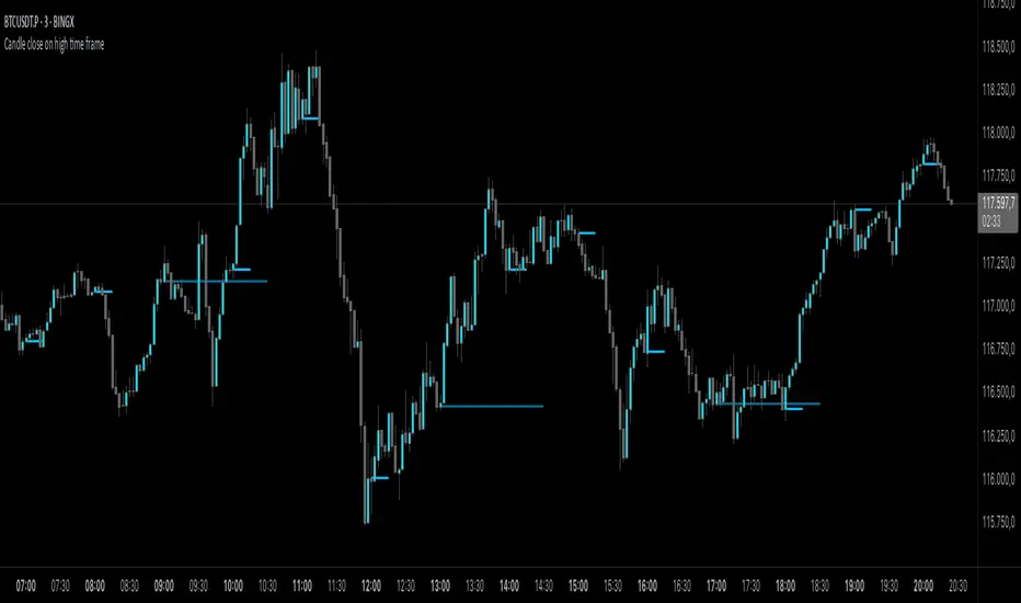
Candle close on high time frameOVERVIEW
This indicator plots persistent closing levels of higher time frame candles (H1, H4, and Daily) on the active intraday chart in real time. Unlike similar tools, it offers granular control over line projection length, fully independent toggles per timeframe, and a built-in mechanism that automatically limits the total number of historical levels to avoid chart clutter and performance issues.
CONCEPTS
Key levels from higher time frames often act as areas where price reacts or consolidates. By projecting each candle's exact closing price forward as a horizontal reference, traders can quickly identify dynamic support and resistance zones relevant to the current price action. This indicator enables seamless multi-timeframe analysis without the need to manually switch chart intervals or re-draw lines.
FEATURES
Independent Time Frame Selection: Enable or disable H1, H4, and Daily levels individually to tailor the analysis.
Custom Extension Length: Each timeframe's closing level can be projected forward for a user-defined number of bars.
Performance Optimization: The script maintains an internal limit (default: 100) on the number of active lines. When this threshold is exceeded, the oldest lines are removed automatically.
Visual Differentiation: Colors for each timeframe are fully customizable, enabling immediate recognition of level origin.
Immediate Update: New levels appear as soon as a higher timeframe candle closes, ensuring real-time reference.
USAGE
From the indicator inputs, select which timeframes you want to track.
Adjust the extension lengths to fit your trading style and time horizon.
Customize the line colors for clarity and personal preference.
Use these projected levels as part of your confluence criteria for entries, exits, or stop placement.
Combine with trend indicators or price action tools to enhance your multi-timeframe strategy.
ORIGINALITY AND ADDED VALUE
While similar scripts exist that plot higher timeframe levels, this implementation differs in:
Its efficient automatic cleanup of old lines to preserve chart performance.
The independent extension and color settings per timeframe.
Immediate reaction to new candle closes without repainting.
Simplicity of use combined with precise customization.
This combination makes it a practical and flexible tool for traders who rely on clear HTF level visualization without manual drawing or the limitations of built-in TradingView tools.
LICENSE
This script is published open-source under the Mozilla Public License 2.0.
Entropy Chart Analysis [PhenLabs]📊 Entropy Chart analysis -
Version: PineScript™ v6
📌 Description
The Entropy Chart indicator analysis applies Approximate Entropy (ApEn) to identify zones of potential support and resistance on your price chart. It is designed to locate changes in the market’s predictability, with a focus on zones near significant psychological price levels (e.g., multiples of 50). By quantifying entropy, the indicator aims to identify zones where price action might stabilize (potential support) or become randomized (potential resistance).
This tool automates the visualization of these key areas for traders, which may have the effect of revealing reversal levels or consolidation zones that would be hard to discern through traditional means. It also filters the signals by proximity to key levels in an attempt to reduce noise and highlight higher-probability setups. These dynamic zones adapt to changing market conditions by stretching, merging, and expiring based on user-inputted rules.
🚀 Points of Innovation
Combines Approximate Entropy (ApEn) calculation with price action near significant levels.
Filters zone signals based on proximity (in ticks) to predefined significant price levels (multiples of 50).
Dynamically merges overlapping or nearby zones to consolidate signals and reduce chart clutter.
Uses ApEn crossovers relative to its moving average as the core trigger mechanism.
Provides distinct visual coloring for bullish, bearish, and merged (mixed-signal) zones.
Offers comprehensive customization for entropy calculation, zone sensitivity, level filtering, and visual appearance.
🔧 Core Components
Approximate Entropy (ApEn) Calculation : Measures the regularity or randomness of price fluctuations over a specified window. Low ApEn suggests predictability, while high ApEn suggests randomness.
Zone Trigger Logic : Creates potential support zones when ApEn crosses below its average (indicating increasing predictability) and potential resistance zones when it crosses above (indicating increasing randomness).
Significant Level Filter : Validates zone triggers only if they occur within a user-defined tick distance from significant price levels (multiples of 50).
Dynamic Zone Management : Automatically creates, extends, merges nearby zones based on tick distance, and removes the oldest zones to maintain a maximum limit.
Zone Visualization : Draws and updates colored boxes on the chart to represent active support, resistance, or mixed zones.
🔥 Key Features
Entropy-Based S/R Detection : Uses ApEn to identify potential support (low entropy) and resistance (high entropy) areas.
Significant Level Filtering : Enhances signal quality by focusing on entropy changes near key psychological price points.
Automatic Zone Drawing & Merging : Visualizes zones dynamically, merging close signals for clearer interpretation.
Highly Customizable : Allows traders to adjust parameters for ApEn calculation, zone detection thresholds, level filter sensitivity, merging distance, and visual styles.
Integrated Alerts : Provides built-in alert conditions for the formation of new bullish or bearish zones near significant levels.
Clear Visual Output : Uses distinct, customizable colors for buy (support), sell (resistance), and mixed (merged) zones.
🎨 Visualization
Buy Zones : Represented by greenish boxes (default: #26a69a), indicating potential support areas formed during low entropy periods near significant levels.
Sell Zones : Represented by reddish boxes (default: #ef5350), indicating potential resistance areas formed during high entropy periods near significant levels.
Mixed Zones : Represented by bluish/purple boxes (default: #8894ff), formed when a buy zone and a sell zone merge, indicating areas of potential consolidation or conflict.
Dynamic Extension : Active zones are automatically extended to the right with each new bar.
📖 Usage Guidelines
Calculation Parameters
Window Length
Default: 15
Range: 10-100
Description: Lookback period for ApEn calculation. Shorter lengths are more responsive; longer lengths are smoother.
Embedding Dimension (m)
Default: 2
Range: 1-6
Description: Length of patterns compared in ApEn calculation. Higher values detect more complex patterns but require more data.
Tolerance (r)
Default: 0.5
Range: 0.1-1.0 (step 0.1)
Description: Sensitivity factor for pattern matching (as a multiple of standard deviation). Lower values require closer matches (more sensitive).
Zone Settings
Zone Lookback
Default: 5
Range: 5-50
Description: Lookback period for the moving average of ApEn used in threshold calculations.
Zone Threshold
Default: 0.5
Range: 0.5-3.0
Description: Multiplier for the ApEn average to set crossover trigger levels. Higher values require larger ApEn deviations to create zones.
Maximum Zones
Default: 5
Range: 1-10
Description: Maximum number of active zones displayed. The oldest zones are removed first when the limit is reached.
Zone Merge Distance (Ticks)
Default: 5
Range: 1-50
Description: Maximum distance in ticks for two separate zones to be merged into one.
Level Filter Settings
Tick Size
Default: 0.25
Description: The minimum price increment for the asset. Must be set correctly for the specific instrument to ensure accurate level filtering.
Max Ticks Distance from Levels
Default: 40
Description: Maximum allowed distance (in ticks) from a significant level (multiple of 50) for a zone trigger to be valid.
Visual Settings
Buy Zone Color : Default: color.new(#26a69a, 83). Sets the fill color for support zones.
Sell Zone Color : Default: color.new(#ef5350, 83). Sets the fill color for resistance zones.
Mixed Zone Color : Default: color.new(#8894ff, 83). Sets the fill color for merged zones.
Buy Border Color : Default: #26a69a. Sets the border color for support zones.
Sell Border Color : Default: #ef5350. Sets the border color for resistance zones.
Mixed Border Color : Default: color.new(#a288ff, 50). Sets the border color for mixed zones.
Border Width : Default: 1, Range: 1-3. Sets the thickness of zone borders.
✅ Best Use Cases
Identifying potential support/resistance near significant psychological price levels (e.g., $50, $100 increments).
Detecting potential market turning points or consolidation zones based on shifts in price predictability.
Filtering entries or exits by confirming signals occurring near significant levels identified by the indicator.
Adding context to other technical analysis approaches by highlighting entropy-derived zones.
⚠️ Limitations
Parameter Dependency : Indicator performance is sensitive to parameter settings ( Window Length , Tolerance , Zone Threshold , Max Ticks Distance ), which may need optimization for different assets and timeframes.
Volatility Sensitivity : High market volatility or erratic price action can affect ApEn calculations and potentially lead to less reliable zone signals.
Fixed Level Filter : The significant level filter is based on multiples of 50. While common, this may not capture all relevant levels for every asset or market condition. Accurate Tick Size input is essential.
Not Standalone : Should be used in conjunction with other analysis methods (price action, volume, other indicators) for confirmation, not as a sole basis for trading decisions.
💡 What Makes This Unique
Entropy + Level Context : Uniquely combines ApEn analysis with a specific filter for proximity to significant price levels (multiples of 50), adding locational context to entropy signals.
Intelligent Zone Merging : Automatically consolidates nearby buy/sell zones based on tick distance, simplifying visual analysis and highlighting stronger confluence areas.
Targeted Signal Generation : Focuses alerts and zone creation on specific market conditions (entropy shifts near key levels).
🔬 How It Works
Calculate Entropy : The script computes the Approximate Entropy (ApEn) of the closing prices over the defined Window Length to quantify price predictability.
Check Triggers : It monitors ApEn relative to its moving average. A crossunder below a calculated threshold (avg_apen / zone_threshold) indicates potential support; a crossover above (avg_apen * zone_threshold) indicates potential resistance.
Filter by Level : A potential zone trigger is confirmed only if the low (for support) or high (for resistance) of the trigger bar is within the Max Ticks Distance of a significant price level (multiple of 50).
Manage & Draw Zones : If a trigger is confirmed, a new zone box is created. The script checks for overlaps with existing zones within the Zone Merge Distance and merges them if necessary. Zones are extended forward, and the oldest are removed to respect the Maximum Zones limit. Active zones are drawn and updated on the chart.
💡 Note:
Crucially, set the Tick Size parameter correctly for your specific trading instrument in the “Level Filter Settings”. Incorrect Tick Size will make the significant level filter inaccurate.
Experiment with parameters, especially Window Length , Tolerance (r) , Zone Threshold , and Max Ticks Distance , to tailor the indicator’s sensitivity to your preferred asset and timeframe.
Always use this indicator as part of a comprehensive trading plan, incorporating risk management and seeking confirmation from other analysis techniques.

GRID EXTENSIONGRID EXTENSION
Overview
The GRID EXTENSION is a simple grid-based indicator for TradingView, built with Pine Script v6. It plots horizontal price levels starting from a user-defined anchor price, with spacing set by a tick increment. Use it to identify key support, resistance, or price zones on charts for Crypto, Forex, or Futures.
Key Features
Custom Grid Levels: Plot up to 22 levels (e.g., 0, 0.25, 1.25, -2.50) with options to show/hide, set values, and choose colors.
Market-Specific Tick Increments: Select your asset type (Crypto, Forex, Futures) and choose from a range of tick increments tailored for each market:
Crypto: 1 to 5000 ticks (e.g., 100 ticks = $0.001 on ADA/USD, 5000 ticks = $50 on BTC/USD).
Forex: 5 to 5000 ticks (e.g., 100 ticks = 1 pip on EUR/USD, 5000 ticks = 50 pips).
Futures: 1 to 2500 ticks (e.g., 25 ticks = 6.25 points on E-mini S&P 500, $312.50 per contract).
Visual Options:
Extend lines to the right.
Show price and level labels (as values or percentages).
Place labels on the left or right.
Adjust background transparency for filled areas between levels.
How to Use
Set Asset Type: Choose "Crypto," "Forex," or "Futures" to match your chart.
Set Anchor Price: Enter a starting price for the grid.
Pick Tick Increment: Select a tick increment from the dropdown, following the guidance for your asset type (see Key Features).
Customize Levels: Turn levels on/off, set values, and pick colors.
Add to Chart: Apply the indicator to see the grid on your chart.
Tips
Use levels to mark support/resistance zones for entries or exits.
Extend lines to project future price zones.
Choose smaller increments (e.g., 5 ticks) for scalping, or larger ones (e.g., 1000 ticks) for swing trading.
Combine with indicators like moving averages for better signals.
Settings
Asset Type: Select "Crypto," "Forex," or "Futures" (default: "Crypto").
Anchor Price: Starting price for the grid (default: 0.0).
Tick Increment: Space between levels (options: 1, 5, 10, 25, 50, 100, 250, 500, 1000, 2500, 5000). Choose based on asset type.
Extend Right: Extend lines to the right (default: true).
Show Prices: Show price labels (default: true).
Show Levels: Show level values or percentages (default: true).
Format: Display levels as "Values" or "Percent" (default: "Values").
Labels Position: Place labels on "Left" or "Right" (default: "Left").
Background Transparency: Set transparency for filled areas (default: 100, range 0-100).
Level Options: Enable/disable levels, set values, and choose colors.
Notes
Set the anchor price to a key level (like a recent high or low) for best results.
Check the tick increment tooltip to ensure the spacing suits your market type.
Works on any chart, best for clear price trends or ranges.
Acknowledgments
Made with Pine Script v6 for TradingView. This is v1.0—feedback welcome for future updates!