Oops!Oops! is based on an overemotional response, then a quick reversal of the concomitant overreaction of price. The overreaction we are looking for to give us a buy signal is an opening that is below the previous day's low. The entry comes when, following the lower open, price then rallies back to the previous day's low (selling pressures have been abated and a market rally should follow). A sell signal is just the opposite. We will be looking for an open greater than the prior day's high. Our entry then comes from price falling back to the prior high, giving us a strong short-term suggestion of lower prices to come.
Cari skrip untuk "williams"

[TTI] IBD Base Analysis (WEEKLY)📜 ––––HISTORY & CREDITS––––
This indicator, titled " IBD Base Analysis (WEEKLY)," is an original creation by TinTinTrading. It synthesises multiple metrics and visual cues to provide a comprehensive overview of market bases on a weekly timeframe. It is based on the teachings of Investors Business Daily (IBD) and William O'Neil. Mainly from attending all IBD Seminars, Courses and part of man IBD MeetUps. I have compiled most criteria and made it into indicator.
🦄 –––UNIQUENESS–––
What sets this indicator apart is its multi-faceted approach to base analysis. It doesn't just measure base depth or length, or plot a base structure with target (Cup with Handle, Double Bottoms, Flat Bases or other);
The IBD Base Analysis (WEEKLY) allows the user to pick the beginning and end of base and then runs through the criteria for a HEALTHY vs FAULTY Bases. The script is intended for a Weekly timeframe and is base agnostic - hence it can be used on any base pattern you want to analyse. By using the script you will be able to grab a quick visual if there are any faulty characteristics that you have be aware of. Furthermore, its user-friendly interface, complete with customisable color-coding and toggle-able advanced metrics, makes it a great tool for both novice and expert traders to incorporate into their trading.
🛠️ ––––WHAT IT DOES––––
👉 Analysis Table with customisable position. Each cell has additional information when you hover over it with a mouse to show what is required and what is faulty. The cells are color coordinated by user customisable color-coding. If the cell is green then it is bullish. If it is orange then it is soft violating condition and if it is red it is bearish.
Depth: First we look at the Depth of the base expressed in percent
Length: How many weeks long is the base
Number of Weeks under Accumulation (Acc Wks)
Number of Weeks under Distribution (Distrb Wks)
Number of Weeks showing Supporting action
Number of weeks which show wide and loose action (unfavorable), "10% WKs)
Number of weeks we close above the mid point
Grading of the close within the first 3 weeks after bottoming
Counting the Gap ups vs Gap down for the given period
👉 Base plots
+ plot under weeks where we have a tight action compared to previous week - this is considered favorable
▲ plot under down weeks where we show supporting action
⏺ appear under the 3 most important weeks in the base: The Week at the bottom, The week with the Largest Spread and the Week with the Largest Volume. Green means bullish action, Orange means soft violation. The tooltips on the circles show the Closing Range of the week.
- midpoint (in blue), this draws the midpoint within the base.
👉 18 month line - According to IBD the True Market Leaders Breakout and run for on average of 18 months before topping. For this reason I have included a customizable on/off line that plots 18 months back. What I want to see is if the stock has been in a strong uptrend (Stage 2 accumulation for those knowing the Stan Weinstein methodology) for the last18 months. If yes, you ought to consider the base higher risk than one that is just starting its move.
💡 ––––HOW TO USE IT––––
Add the indicator to your chart
Determine the beginning and the end of the base (use the settings in the indicator or drag the verical blue lines)
Read the price action based on the coloring and the criteria explained in the tooltips. Additionally familiarize yourself with the general tips for reading a base below.
💡 ––––GENERAL TIPS FOR READING THE ANALYSIS TABLE––––
Depth: IBD recommends bases to be under 30%. However, during a strong bear market some stocks can exhibit 1.5-2x the volatility. Yet, it is key within the IBD methodology to buy breakouts from proper Non-deep bases
Length: Many newer traders misinterpret small patterns for bases. This common misunderstanding is addressed by calculating the length of the base and determining if it is developed or immature.
Number of Weeks under Accumulation (Acc Wks): This is the first thing the late Market Wizard William O'neill looks into the base. How many weeks are showing signs of accumualtion and how many are showing signs of distribution (the cell below). Always look for Accumulation weeks to be more than distribution weeks.
Number of Weeks under Distribution (Dist Wks): See above
Number of Weeks showing Supporting action: New traders determine down week as bearish. However, within the methodology and extensive research IBD has given criteria of down weeks that are actually a bullish sign. Counting the number of weeks within the base that meet this criteria gives us this metric.
Number of weeks which show wide and loose action: If the base is not compact but it is wide and loose it is considered an unfavorable pattern. Generally, occurs within Stage 3 of a stock topping.
Wks > Mid: Utilizes a simple 'hack' of base reading. How many weeks have closed above the mid level of the base and how many have closed below the mid level of the base.
Grading of the close within the first 3 weeks of the bottom: The next cell looks at the price action subsequent of the 3 weeks after the bottom. These are very important as they show if accumulation is happening (strengthening the breakout hypothesis) or if it is not.
Counting the Gap ups vs Gap down for the given period: Lastly gaps are key footprint of institutional moves. We look for the number of DAILY gaps on the WEEKLY timeframe and compare the daily gap up vs the daily gap downs within the base.
REMEMBER, ALL TRADING INCLUDES RISK. NEVER RELY SOLELY ON A SINGLE INDICATOR. INCORPORATE IT INTO YOUR BROADER TRADING METHODOLOGY AS A COMPLEMENTING SOURCE OF INFORMATION.

[TTI] MarketSmith & IBD Style Model Stock Quarters 📜 ––––HISTORY & CREDITS––––
The MarketSmith & IBD Style Model Stock Quarters another Utility indicator is an original creation by TintinTrading inspired by Investor's Business Daily and William O'Neil style of presenting information. While going through the Model Stocks that IBD has been publishing, I realized that I wanted to see the exam same Quarterly presentation on the time axis in order to compare William O'Neil notes better with my own notes from Tradingview. The script is simple and could help you if you study the CANSLIM methodology.
🦄 –––UNIQUENESS–––
The distinctiveness of this indicator lies in its ability to visually delineate stock quarters directly on the price chart. It serves as a handy tool for traders who adopt a quarterly review of stock performance, in line with MarketSmith and IBD's analysis frameworks.
🛠️ ––––WHAT IT DOES––––
Quarter Marking : Draws a black line at the beginning of each financial quarter (January, April, July, and October).
Quarter Labeling : Places a label at the close of the last month in a quarter, indicating the upcoming quarter with its abbreviation and the last two digits of the year.
💡 ––––HOW TO USE IT––––
👉Installation: Add the indicator to your TradingView chart by searching for " MarketSmith & IBD Style Model Stock Quarters" in the indicator library.
👉Add to New Pane and squash the Pane Length: I add the indicator to a new pane under the price and volume charts and squash the height of the pane so that it looks exactly like the MarketSmith visuals.
👉Visual Cues:
Look for the black lines marking the start of a new quarter.
Observe the labels indicating the upcoming quarter and year, positioned at the close of the last month in a quarter.
👉Interpretation: Use these quarterly markers to align your trading strategies with quarterly performance metrics or to conduct seasonal analysis.
👉Settings: The indicator does not require any user-defined settings, making it straightforward to use.

[TTI] Price confirmation indicator📜 ––––HISTORY & CREDITS––––
The Price Confirmation Indicator is an innovative tool developed by TintinTrading to help his students learn to interpret Price + Volume moves. It is designed to provide traders with a visual cue for price movement confirmation based on both price direction and trading volume. I got the idea from watching Daivd Ryan, how he explains that he looks at volume first before looking at the price of a stock.
🦄 –––UNIQUENESS–––
What sets this indicator apart is its dual analysis approach and easy interpretation: it not only evaluates price movements but also takes trading volume into account. The indicator's color-coded bars are dynamically adjusted based on the volume difference from a 50-day Simple Moving Average (SMA) of the volume. This offers traders an intuitive way to gauge both the market's direction and its strength.
🛠️ ––––WHAT IT DOES––––
The Price Confirmation Indicator performs the following functions:
👉Price Movement: Determines whether each trading day is an 'Up Day' or a 'Down Day' based on the closing price.
👉Volume Analysis: Calculates the 50-day SMA of trading volume and identifies the volume difference in percentage terms.
👉Transparency Adjustment: Dynamically adjusts the transparency of colored bars based on the volume difference.
👉Bar Coloring: Colors the bars blue for 'Up Days' and purple for 'Down Days', with the transparency indicating the strength of the volume.
Transparency Tresholds:
Full color (no transparency 0%) - Volume is greater than 40% compared to the 50DSMA Volume
Strong color (little transparency 20%) - Volume is between 20% and 40% greater than the 50DSMA Volume
Noticable color (moderate transparency 40%) - Volume is between 0% and 20% greater than the 50DSMA Volume
Negligable color (strong transparency 60%) - Volume is light and is less than 50DSMA Volume with less than 20% lower.
Weak color (very strong transparency 80%) - Volume is below 50DSMA, with between 40% and 20% lower.
Very weak color (max transparency 90%) - Volume is below 50DSMA, with between -40% and -80% lower.
Alarming weak color (color is orange) - Volume is noticably light - this generally signals velocity contraction before a breakout.
💡 ––––HOW TO USE IT––––
Installation: Search for " Price Confirmation Indicator" in TradingView’s indicator library and add it to your chart.
Settings:
Price Up Color: Customize the color for 'Up Days'.
Price Down Color: Customize the color for 'Down Days'.
Interpretation:
Blue bars signify 'Up Days', and their transparency indicates the strength of the volume.
Purple bars represent 'Down Days', with transparency again indicating volume strength.
Orange bars signify extremely low volume days.
Volume Transparency: The less transparent the bar, the stronger the volume, aiding in confirming the price direction.
The indicator is a great tool for newer traders to get in the habit of reading Price & Volume together!

[TTI] Closing Range Indicator📜 ––––HISTORY & CREDITS––––
This Pine Script Utility indicator, titled " Closing Range Indicator," is designed and developed by TintinTrading but inspired by the teaching of Investor's Business Daily (IBD) and William O'Neil. It aims to help traders identify the closing range of a given timeframe, either daily or weekly.
🦄 –––UNIQUENESS–––
The unique feature of this indicator lies in its ability to simulate a functionality of Closing Range calculation based on hovering of the mouse over the close. It employs a conditional display that allows the user to set the indicator as 'invisible' without removing it from the chart and hence provides a numerical closing range value when hovering over the indicator.
🛠️ ––––WHAT IT DOES––––
The Closing Range Indicator calculates the closing range of a trading bar in terms of percentages. It computes the difference between the closing price and the low price of the bar, and then divides it by the range of the bar.
A stock that closes on the high would display 100%
A stock that closes on the low would display 0%
Generally, the higher the percentage the more bullish the close but there are exceptions to this rule.
The indicator can operate on two timeframes:
Daily : Computes the closing range based on the daily high, low, and closing prices.
Weekly : Computes the closing range based on the weekly high, low, and closing prices. If you enable the weekly it will show the weekly close on all daily timeframes. Meaning that if the week Closing range is 54.15% on Friday, it will show the value 54.15% for all days prior to Friday from the same week.
The indicator places a label at the close of each bar, with the label's tooltip showing the calculated closing range percentage. I generally hide the label and just reference the tooltip calculation with a a hoover on top of the bar.
💡 ––––HOW TO USE IT––––
Installation: Add the indicator to your TradingView chart by searching for " Closing Range Indicator" in the indicator library.
Reorder: Reorder the indicator so that it sits as the first indicator (even above the price) on the Pane. This will make sure that you always trigger the tooltip functionality.
Go to Settings:
Timeframe: Choose between daily ('D') and weekly ('W') timeframes from the settings.
Visibility: Enable the 'Make Invisible' option if you want the indicator to be hidden.
Interpretation:
A higher percentage indicates that the closing price is closer to the high of the range, signaling bullish sentiment.
A lower percentage indicates bearish sentiment.
Tooltip: Hover over the label to view the closing range in percentage terms.

[TTI] IBD's 3 (three) weeks tight close pattern––––HISTORY & CREDITS 🏦
The Three Weeks Tight Close pattern is a technical analysis pattern that occurs when a stock closes at nearly the same price for three consecutive weeks, suggesting a period of consolidation before the stock moves in a new direction. The concept of "line of least resistance" as mentioned by Jesse Livermore is closely related to this pattern. It indicates that there is a period of indecision in the market, with buyers and sellers fairly evenly matched. This pattern is often associated with stocks that have strong fundamentals and a solid business model. The pattern was first discovered by Investor's Business Daily founder William Bill O'Neill.
––––WHAT IT DOES 💡
The Three Weeks Tight Close pattern helps traders identify periods of consolidation in a stock's price movement. During these periods, the stock's closing price remains nearly unchanged for three consecutive weeks. This pattern can be a signal that the stock is under accumulation and potentially ready to make a significant move in either an upward or downward direction. By identifying these tight closes, traders can prepare to take advantage of the solid price run and make profitable trades.
The indicator plots 3 different dots/squares above the weekly bar on order to indicate which consecutive tight close wee have.
👉 Cyan color indicates 3 week tight closes
👉 Pink color indicates 4 week tight closes
👉 Red color indicates 5 week tight closes
––––HOW TO USE IT 🔧
• Focus on weekly charts for easier identification.
• Look for three consecutive weekly closes with nearly the same price, within 1-1.5% of each other. Using the indicator.
• Check for low volume during the tightening period.
• Once the pattern is confirmed, switch to the daily timeframe to find the exact buy point.
• Use other technical indicators to confirm a breakout before taking a position in the stock, such as breakouts, moving averages, and trend lines.
• Monitor the position regularly to ensure continued positive price movement.
• Be patient and wait for confirmation before buying in.
• Use stop-loss orders to limit losses if the stock does not move in the expected direction.
• Consider the overall market and its impact on individual stocks before making a trade.
• Keep in mind that not all three tight closes are created equal and use technical analysis to confirm your suspicions.
By following these steps, traders can use the Three Weeks Tight Close pattern to identify potential trading opportunities and increase their chances of making profitable trades.

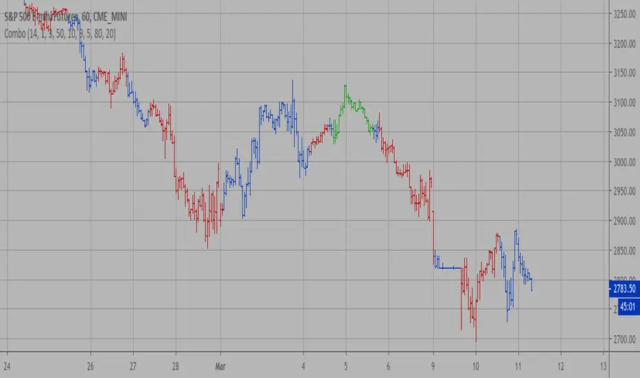
Candle Combo ScreenerThe Candle Combo Screener allows you to see candlestick combinations for up to 5 different tickers at the same time . If one of the candle combination is detected the corresponding cell will be highlighted to alert you.
Candle Combinations Detected
Bullish Kicker
Bullish & Bearish Oops Reversals
Open Equals High / Low
Inside Day
Select any 5 tickers. Colors and table settings are fully customizable to fit your style.
Bullish Kicker
The opening price of the current candle gaps up above the body of the prior day's candle AND the prior day's candle close was less than the open.
Oops Reversals
Bullish: Price opens below the prior day’s low and closes above.
Bearish: Price opens above the prior day's high and closes below.
Open Equals High / Low
The current candles opening price is equal to either the high or low of the day.
Inside Day
The current candles high and low are contained within the prior day's high and low.

WillyCycle Oscillator&DoubleMa/ErkOzi/version 2This oscillator can be customized by adjusting the length of the Willy period, the length of Willy's EMA, and the upper and lower bands. The upper and lower bands help traders identify overbought and oversold conditions.
The WillyCycle Oscillator is a technical analysis tool used to measure the momentum of an asset and identify overbought and oversold conditions based on the price range of a specific period and calculating the percentage of the closing price in that range. The WillyCycle Oscillator consists of two main components: Willy and Willy's EMA. The Willy component is the percentage calculation of the asset's price range, and Willy's EMA is the exponential moving average of the Willy component. Willy's EMA is used to smooth out the Willy component and make it easier to identify trends.
*** When the oscillator is above the 80 level, it indicates that the asset is overbought, and when it is below the 20 level, it indicates that the asset is oversold. Traders can use these levels as a guide for buying and selling signals.
***Traders can also use the WillyCycle Oscillator to identify trend reversals. When the oscillator rises above the 50 level, it signals a potential uptrend, and when it falls below the 50 level, it signals a potential downtrend.
***I have added a smoothed line option to the WillyCycle Oscillator, which allows traders to see a more smoothed version of the oscillator. This option can be enabled by setting the 'smoothed' input to true. The default value for the smoothed line is 15.
***We have also changed the value range of the WillyCycle Oscillator from -100 to 100 to 0 to 100. This change was made to make the oscillator more user-friendly and easier to read.
In conclusion, the WillyCycle Oscillator is a versatile tool that can help traders identify potential trading opportunities and trend reversals. Traders can customize the oscillator to fit their trading style and preferences. Adding a smoothed line and changing the value range can enhance the user experience and make the oscillator easier to use.

WillyCycle Oscillator&DoubleMa/ErkOzi/"This code creates a technical analysis indicator used to calculate and visualize the WillyCycle oscillator and double moving average indicators on the price of a financial asset. The functionality can be summarized as follows:
*Calculate the WillyCycle oscillator: The WillyCycle is an oscillator calculated based on the highest and lowest values of an asset. This oscillator is used to measure overbought or oversold conditions of the asset.
*Calculate the double moving average: The double moving average helps determine trends by calculating the short-term and long-term moving averages of asset prices.
*Use the WillyCycle oscillator and double moving average indicators together: The WillyCycle oscillator is combined with the double moving averages to provide a clearer indication of overbought and oversold conditions.
*Visualize the indicator with color coding: The indicator is color-coded to show overbought and oversold conditions. Additionally, line and background colors are changed to make the indicator more readable.
Many parameters can be adjusted on the indicator: The indicator can be customized and modified by the user. For example, the period of the WillyCycle oscillator and the lengths of the double moving averages can be adjusted."
The strategy is based on two indicators - the WillyCycle oscillator and the double moving average. The WillyCycle oscillator measures overbought and oversold conditions of the asset based on its highest and lowest values. The double moving average calculates short-term and long-term moving averages of the asset's price, which can help identify trends.
The WillyCycle oscillator and the double moving average are combined in this strategy to provide a clearer indication of overbought and oversold conditions. When the WillyCycle oscillator indicates that the asset is oversold and the short-term moving average crosses above the long-term moving average, it may signal a buy opportunity. Conversely, when the WillyCycle oscillator indicates that the asset is overbought and the short-term moving average crosses below the long-term moving average, it may signal a sell opportunity.
To make it easier for traders to read and interpret the indicator, color-coding is used to indicate overbought and oversold conditions. The user can also customize the indicator by adjusting parameters such as the period of the WillyCycle oscillator and the lengths of the double moving averages.
*ıt provides successful buy and sell signals for price reversals.
*You can open counter trades in overbought and oversold areas by following the averages.
FOREX Master Pattern Trend Finder by nnamdertWhat does this Indicator do?
This indicator works by identifying Trends and "potential" shifts in trends before they happen. It is technically a momentum indicator that watches for specific Bullish or Bearish momentum (i.e. Bull Runs, and Crashes).
How does it do this?
It uses a custom script that takes into account extremes in price and certain moving averages and other accurate forward looking indicators. Once it finds a Bull run, signals are triggered in the form of PLUS signs. It does the same for strong Bearish trends. Based on how the script is configured, the Indicator is able to spot (in advance) unique movement in the trend that can predict a change in momentum prior to the change occurring.
These momentum changes can be configured as alerts.
As seen in the screenshot below the indicator triggers "early warning" signals when it detects a specific movement that is indicative of a potential change in momentum or trend. It does this IN ADVANCE of any change - it is ONLY A PREDICTION but allows the trader to look at the asset to determine if the potential change in trend is valid and gives the trader enough time to set up a trade and stop-loss.
As seen in the screenshot below color-coded candles allow the trader to visually SEE the change on the chart making it easier to get a quick glance at the current trend. In addition, Green and Red Crosses were added to the oscillator to help easily identify trends if the color coded candle feature is turned OFF. These Red and Green Crosses are not located at every highlighted bar location, rather, at the first bar that the alert was triggered on. If there was a gap in the trend, the alert triggers, and plots again when a new trend starts.
As seen in the screenshot below, when a strong trend is present in either direction, small red or green dots are plotted on the oscillator. This makes spotting past and current trends much easier. Even if the price is not moving up or down, this indicates strong underlying buying or selling pressure.
Some traders like using indicators as a reversal finder. Although this indicator is NOT A REVERSAL INDICATOR, I added a signal that can be used as a "potential" reversal finder. You can see this in the screenshot below.
These "reversal" signals typically appear prior to a move in the opposite direction (but not always). A stop-loss can be set at the high or low of the previous bar depending on direction.
At times, multiple "conflicting" warning signals appear back-to-back. This is indicative of a "crab" in the market. Basically, indecision is present in the market. These "early warning" signals are smaller and either BLUE or ORANGE . Once a trend is recognized, the signal will be either RED or GREEN and a bit larger.
Viewing a higher timeframe will allow Forex Master Pattern traders to easily spot contraction zones. I manually draw the lines in at these zones. These "Value Lines" are typically respected in the future. As shown in the screenshot below, the level acted as support in the future and a newer value line was created at a "higher level" - this indicates a Bullish momentum in price as buyers and sellers have agreed upon the higher price as a true value area.
As seen in the screenshot below, multiple potential reversal signals plotted on the chart indicate a "weakening' in the strength of the current trend. This allows the trader to strategically move their stop-loss or simply take some profits off the table at this level.
This Indicator does NOT overlay on the current chart but allows the trader to see color coded bars. Simply double clicking within the indicator will expand the indicator to full screen, and double clicking within the chart itself will hide the secondary pane but keep the candles visible on the chart.
Happy Trading and GOOD LUCK!
[TTI] IBD Power Trend🏛️ History & Credit
IBD Power Trend is an indicator created by TintinTrading inspired by the Investor's Business Daily and William O'Neil's investment philosophy. It is part of the Market School methodology.. It's built on the principle that the market's Power Trend is the best time to get aggressive.
💪 What it does
IBD Power Trend helps traders identify when the market's Power Trend starts and finishes. The indicator uses rules about the position of the price relative to the 21EMA and 50SMA, as well as the relationship between the two moving averages, to give traders an edge.
👨🏫 How to use it
IBD Power Trend can be used as an additional criteria to decide when to get more aggressive in the market. It can also be used to assess when to be a pig/tiger. With IBD Power Trend, traders can have more confidence in their trades and make better investment decisions.

Quick and Simple - WPR+RSI+CCITake a look.
Couple of confluencial reversal signals from popular indicators (W%R, RSI & CCI). I can only say this shows how random the "stanard tools" are and how the market makers "play" these kind of tools to their advantage.
That said. It's better tha average, but not top-class, so expect to have to take signals with other confluence. DON'T take the plots or signals as buy / sell signals, they are just confluencial movements from these indicators based on how they should be "traditionally" used. Instead, use it as a guide as to what other traders may be thinking, or as a pull-back identifier.
Included 100 period ema as basic trend filter.
Not my normal type of script + been away for some time so be kind, lol :)
You might find it useful however so sharing.
More stuff to follow :)

[TTI] IBD Eureka / Phoenix Thrusts––––History & Credit
The indicator was taught to me by an advanced IBD Masterclass that I attended about 8 years ago. When it happens it is noteworthy.
–––––What it does
It shows when there is a positive breadth thrust. It calculates, based on IBD's backtested criteria a strong breadth thrust in either direction. Up or down. The IBD guidelines is to use the NYSE market for this but I have made it so that you can choose between NYSE, AMEX, NASDAQ. The best signals happen within 2 weeks of Follow Through Day.
The indicator prints 2 signals only in a form of an arrow.
1. Eureka Thrust - this is the positive breadth thrust, prints under the bar pointing up
2. Phoenix Thrust - this is the negative breadth, prints over the bar pointing down
–––––How to use it
The arrows show positive or negative environment for trading. The results happen close to the turn of the trend. It should be used as part of the general market assessment.
I use the indicator on the S&P500 or NASDAQ Composite Daily timeframe. I take into consideration this indicator to determine my market exposure.

[TTI] Fundamentals TableHISTORY AND CREDITS –––––––––––––––––––––––––––––––––––––––––––––––––––––––
I trade using TECHNICAL(70%) and FUNDAMENTAL(30%) Analysis. The table is inspired from my friend TED from BOOM traders who understands fundamentals very deeply. The structure and measures are inspired from the work of William O'Neil and Mark Minervini - recommending all their books.
WHAT IT DOES ––––––––––––––––––––––––––––––––––––––––––––––––––––––––––––––
The table is there to show the most important fundamentals we use for trading.
The indicator can be customised as to the position of the table and its coloring.
Measures:
Revenue
EPS
Net Profit Margin
IPO
Inventories
Receivable
All headers have tooltip to give idea how to use the indicator.
HOW TO USE IT –––––––––––––––––––––––––––––––––––––––––––––––––––––––––––––
Use the 3 dot system to determine if all things fall in place.
🟢 🟢 🟢 - this is the highest rating for a measure.
First dot = Increase from previous period
Second dot = Increase from 2 periods before
Third dot = Growth is accelerating.
EPS>20% = EPS have grown over 20% in last period
TDSG = Triple Digit Sales Growth
Code 33 = Mark Minervini rule
B/O EPS = Year with breakout of EPS
2Q AVG = 2 Quarters with growth over 20%
INV vs SAL = green means sales grow faster than inventories
REC vs SAL = green means sales grow faster than receivables
EST vs SAL = green means that estimates are higher than last period

Defu_RSIThis is a composite indicator, a collection of multiple indicators.
Includes:
1. in the simple RSI oversold and overbought area, I rewritten the RSI index of pine, which is more in line with the change of the relative intensity of rise and fall.
2. the red and green column line to the top is rewritten by William w% index. The red and green column indicates the top of the stage. When the column line disappears, it indicates the top of the stage. It is very reliable.
3. CCI green line: calculate CCI index through EMA weighting, smooth CCI curve and reflect trend change.
4. the j-link of KDJ variant indicates the real-time change of trend, which is used in conjunction with CCI index. Please observe carefully
5. the intra day fluctuation indicator is represented by a red orange column line below the 0 axis, and a simple filter is added to indicate the turning point of the trend.
I will continue to update when I have time
//==============The above is translated by Google , please pass the administrator
这是个复合指标,是多个指标的集合。
包含有 1. 简单RSI超卖超买区,我改写了pine自带的rsi指标,这个更加符合涨跌相对强度的变化。
2.到顶红绿柱线,由威廉W%指标改写,红绿柱表示阶段的顶部,当柱线消失时,表示阶段顶部,非常可靠。
3. CCI 绿色线,通过ema加权计算CCI指标,平滑CCI曲线,反应趋势变化。
4.用KDJ变种的J线连表示趋势的即时变化,这个配合CCI指标使用。请仔细观察
5.日内波动指示器,在0轴下方用红橙柱线表示,加了简单的过滤器,表示趋势的转折点。

Shotoki Force IndexHi,
I publish my private indicator.
The colored line is called SFI
When it turns blue, it's bullish (enter with a dot)
When it turns purple, it's bearish (enter with dot)
The SFI is "followed" by he bollinger bands.
I use the RV²I as factor
Do not use it allow to trade
I added a RSI option to see when to exit early
Shotoki
Thank's Muxxy for the idea (BB bands)

[TTI] Volume Rulesibb.co
👆 Look at how the script looks when you hover with the mouse
––––History & Credit
Volume and Price action have been the sole foundation to technical traders since technical analysis has been around. This indicator includes some of the important volume rules that I have collected over the years and the ones I have seen that work. In general credit for the methods used in this indicators has to go to William O'Neil, Stockbee and Mark Minervini.
–––––What it does
There are 3 functions of the Volume rules indicator. The top line, the bottom line and the label.
1️⃣. The top line looks at a few basic volume patterns that are important to pay attention too.
🔵 Higher volume than yesterday and day closes up
🟣 Higher volume than yesterday and day closes down
🟡 Volume X times higher (defined in settings) over the last Y (defined in settings) days. Default is 2x higher compared to yesterday.
2️⃣ The bottom line looks at StockBee Labels
L4 custom criteria + 100k minimum trading day (bearish)
H4 custom criteria + 100k minimum trading day (bullish)
L9 custom criteria + 9M minimum trading day (bearish)
H9 custom criteria + 9M minimum trading day (bullish)
L49 custom criteria + 49M minimum trading day (bearish)
H49 custom criteria + 49M minimum trading day (bullish)
StockBee Labels:
ibb.co
3️⃣ The label looks wether the picked ticker meets the minimum requirement for trading (as per methodology) and how is the price action performing.
TDV = total dollar trading volume
Trading Volume = #stocks
If the above 2 meet the criteria in the settings pannel the label is green if both do not meet the label is red and if one is met and the other is not the label is yellow.
Additional comparison of the trading volume to the 10D, 20D and 50D MA of the volume and two custom indicators:
1. Volume Signature = whereby the indicator looks that the highest down volume over the last 10days and compares it to todays volume
2. Vol in vs Vol out = whereby the indicator looks at the volume of the breakout compared to the average down volume over the last 10 days
–––––How to use it
When trading always look for volume confirmation in the direction of your trend. The volume footprints are one of the ways to shadow institutional support. Bearish and Bullish signals are described above.

ICT index correlated market indicatorThis is not a real indicator, but is what ICT use as indicator for trading futures indexes.
it can only display SP500, Dow Jon Industrial Average and Nasdaq, if someone want other market can copy the code and change some parameters (is more easy than it can appear)
A good idea is using this other market on backtest to confirm the divergence idea of Linda Raske, than use it to spot quickly in real market.
Another idea published by ICT is the "hidden entry pattern", the entry signal appear in ES or YM but I trade NQ for volatility, so I use the trigger of SP500 or Dow to enter in Nasdaq.
Rember always don't trust anybody, do your own backtest and research!
Original Wave AnalyzerThis can be applied to Forex, Stocks, and Crypto.
Understanding it
When the buy or sell signal align with the wave, it means the price is heading in the direction of alignment.
This indicator is intended to be used as a confirmation indicator for other algorithms for the best result.
Indicators with specifically tested and chosen settings have been shown to work on a number of timeframes.
How to use on a buy
When you receive a buy signal if it's within the wave or above the wave, it's an indication the market is about to continue that direction. You could aim for 20-50 pips depending on the pair.
When to sell
When you receive a sell signal if it's within the wave or below the wave, it's an indication the market is about to continue that direction. You could aim for 20-50 pips depending on the pair.
When to exit
You can set our indicator to alert you when it's a good time to exit the trade.
How to Access
Gain access to FX Social Entry Finder for your TradingView account by being a active member of FX Social.

FX Social Entry FinderThis can be applied to Forex, Stocks and Crypto.
Understanding it
When the buy or sell signal align with the wave, it means the price is heading in the direction of alignment.
This indicator is intended to be used as a confirmation indicator for other algorithms for best result.
Indicators with specifically tested and chosen settings that have shown to work on a number of timeframes.
How to use on a buy
When you receive a buy signal if it's within the wave or above the wave, its an indication the market about to continue that direction. You could aim for 20-50 pips depending on the pair.
When to sell
When you receive a sell signal if it's within the wave or below the wave, its an indication the market about to continue that direction. You could aim for 20-50 pips depending on the pair.
When to exit
You can set our indicator to alert you when its a good time to exit the trade.
How to Access
Gain access to FX Social Entry Finder for your TradingView account by being a active member of FX Social.

Improved WillyThis is an improved version of Brian Beamish's Willy21Ma13 indicator.
Embedded conditions (overbought / oversold) come with a highlighted background (red for overbought / lime for oversold)
It will also provide buy / sell signals when the indicator moves from embedded to unembedded.
Enjoy

Combo Strategy 123 Reversal & DSS Bressert This is combo strategies for get a cumulative signal.
First strategy
This System was created from the Book "How I Tripled My Money In The
Futures Market" by Ulf Jensen, Page 183. This is reverse type of strategies.
The strategy buys at market, if close price is higher than the previous close
during 2 days and the meaning of 9-days Stochastic Slow Oscillator is lower than 50.
The strategy sells at market, if close price is lower than the previous close price
during 2 days and the meaning of 9-days Stochastic Fast Oscillator is higher than 50.
Second strategy
Double Smoothed Stochastics (DSS) is designed by William Blaw.
It attempts to combine moving average methods with oscillator principles.
WARNING:
- For purpose educate only
- This script to change bars colors.