Bias Finder [UAlgo]The "Bias Finder " indicator is a tool designed to help traders identify market bias and trends effectively. This indicator leverages smoothed Heikin Ashi candles and oscillators to provide a clear visual representation of market trends and potential reversals. By utilizing higher timeframes and smoothing techniques, the indicator aims to filter out market noise and offer a more reliable signal for trading decisions.
🔶 Key Features
Heikin Ashi Candles: The indicator uses Heikin Ashi candles, a special type of candlestick that incorporates information from the previous candle to potentially provide smoother visuals and highlight potential trend direction.
Oscillator: The indicator calculates an oscillator based on the difference between the smoothed opening and closing prices of a higher timeframe. This oscillator helps visualize the strength of the bias.
Light Teal: Strong bullish trend.
Dark Teal: Weakening bullish trend.
Light Red: Strong bearish trend.
Dark Red: Weakening bearish trend.
Standard Deviation: The indicator can optionally display upper and lower standard deviation bands based on the Heikin Ashi high and low prices. These bands can help identify potential breakout areas.
Oscillator Period: Adjust the sensitivity of the oscillator.
Higher Timeframe: Select a timeframe for the Heikin Ashi candles and oscillator calculations (must be equal to or greater than the chart's timeframe).
Display Options: Choose whether to display Heikin Ashi candles, market bias fill, standard deviation bands, and HA candle colors based on the bias.
Alerts: Enable/disable specific alerts and customize their messages.
🔶 Disclaimer
Use with Caution: This indicator is provided for educational and informational purposes only and should not be considered as financial advice. Users should exercise caution and perform their own analysis before making trading decisions based on the indicator's signals.
Not Financial Advice: The information provided by this indicator does not constitute financial advice, and the creator (UAlgo) shall not be held responsible for any trading losses incurred as a result of using this indicator.
Backtesting Recommended: Traders are encouraged to backtest the indicator thoroughly on historical data before using it in live trading to assess its performance and suitability for their trading strategies.
Risk Management: Trading involves inherent risks, and users should implement proper risk management strategies, including but not limited to stop-loss orders and position sizing, to mitigate potential losses.
No Guarantees: The accuracy and reliability of the indicator's signals cannot be guaranteed, as they are based on historical price data and past performance may not be indicative of future results.
Cari skrip untuk "sentiment"

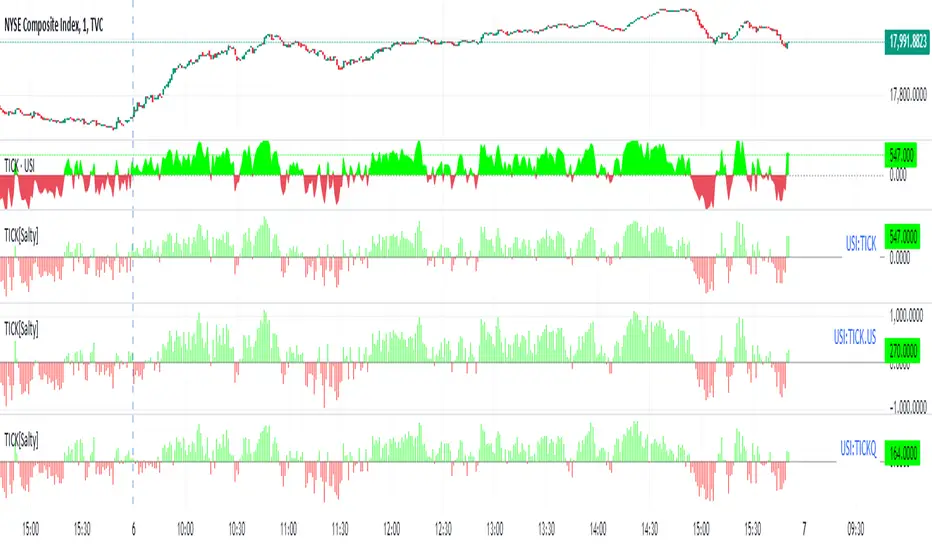
TICK Price Label Colors[Salty]The ticker symbol for the NYSE CUMULATIVE Tick Index is TICK. The Tick Index is a short-term indicator that shows the number of stocks trading up minus the number of stocks trading down. Traders can use this ratio to make quick trading decisions based on market movement. For example, a positive tick index can indicate market optimism, while readings of +1,000 and -1,000 can indicate overbought or oversold conditions.
This script is used to color code the price label of the Symbol values zero or above in Green(default), and values below zero in red(default). For a dynamic symbol like the TICK this tells me the market is bullish when Green or Bearish when Red. I was previously using the baseline style with a Base level of 50 to accomplish this view of the symbol, but it was always difficult to maintain the zero level at the zero TICK value. This indicator is always able to color code the price label properly. Also, it has the benefit of setting the timeframe to 1 second(default) that is maintained even when the chart timeframe is changed.
Update: Added the ability to show the TICK Symbol to support viewing multiple TICK tickers at once as shown.
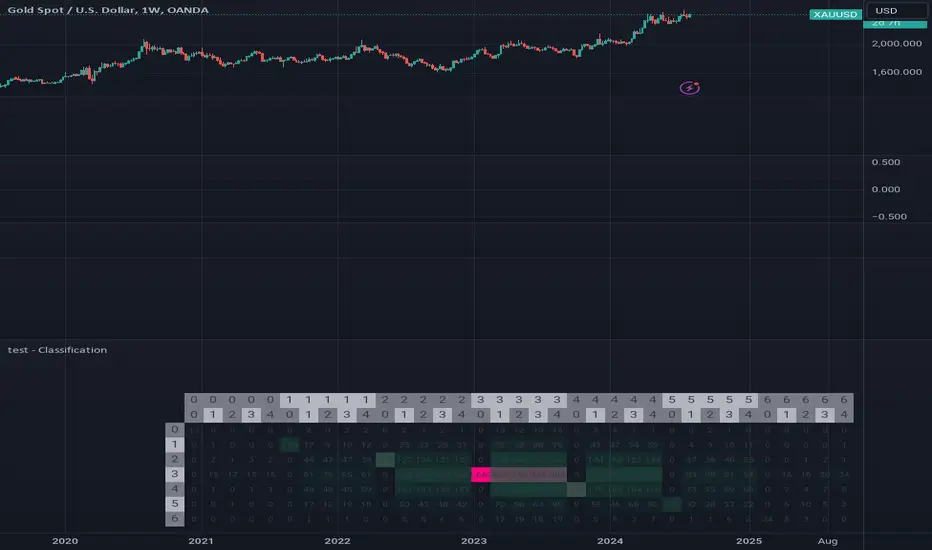
test - ClassificationTensor-Based Classification Experiment
This innovative script represents an experimental foray into classification techniques, specifically designed to analyze returns within a compact time frame. By leveraging tensor-based analytics, it generates a comprehensive table that visually illustrates the distribution of counts across both current and historical bars, providing valuable insights into market patterns.
The script's primary objective is to classify returns over a small window, using this information to inform trading decisions. The output table showcases a normal distribution of count values for each bar in the lookback period, allowing traders to gain a deeper understanding of market behavior and identify potential opportunities.
Key Features:
Experimental classification approach utilizing tensor-based analytics
Compact time frame analysis (small window)
Comprehensive table displaying return counts across current and historical bars
Normal distribution visualization for better insight into market patterns
By exploring this script, traders can gain a deeper understanding of the underlying dynamics driving market movements and develop more effective trading strategies.
Momentum with ATR and Volatility [ST]Momentum with ATR and Volatility
Description in English:
This indicator combines price momentum with market volatility to identify entry and exit points in trades.
It utilizes the difference in closing prices (momentum) and the Average True Range (ATR) to measure volatility. Buy and sell signals are generated based on the combination of these two components.
Detailed Explanation:
Configuration:
Momentum Length: This input defines the period for calculating the momentum, which is the difference between the closing prices. The default value is 10.
ATR Length: This input defines the period for calculating the Average True Range (ATR), which measures market volatility. The default value is 14.
ATR Threshold: This input defines the threshold multiplier for the ATR to generate buy and sell signals. The default value is 3.5.
Momentum Calculation:
Momentum is calculated as the difference between the current closing price and the closing price momentum_length periods ago.
ATR Calculation:
The ATR is calculated based on the specified length and is used to measure market volatility.
Buy and Sell Signals:
Buy Signal: Generated when momentum is positive, the current close is higher than the previous close, and momentum is greater than ATR * threshold.
Sell Signal: Generated when momentum is negative, the current close is lower than the previous close, and momentum is less than -ATR * threshold.
Plotting:
Buy signals are plotted as green triangles below the bars.
Sell signals are plotted as red triangles above the bars.
Momentum and ATR thresholds are plotted in a separate panel below the main chart.
Momentum is plotted as a blue line.
The ATR threshold lines are plotted as solid orange lines.
Indicator Benefits:
Momentum Measurement: Helps traders gauge the momentum of price movements.
Volatility Measurement: Utilizes ATR to measure market volatility, providing a more comprehensive analysis.
Visual Cues: Provides clear visual signals for buy and sell points, aiding in making informed trading decisions.
Justification of Component Combination:
Combining momentum with ATR provides a more robust measure of potential entry and exit points by considering both price movement and market volatility.
How Components Work Together:
The script calculates momentum and ATR for the specified periods.
It generates buy and sell signals based on the conditions of momentum and ATR.
The signals and values are plotted on the chart to provide a visual representation, helping traders identify potential trading opportunities.
Título: Indicador de Momentum com ATR e Volatilidade
Descrição em Português:
Este indicador combina o momentum do preço com a volatilidade do mercado para identificar pontos de entrada e saída em operações.
Utiliza a diferença entre os preços de fechamento (momentum) e o Average True Range (ATR) para medir a volatilidade. Sinais de compra e venda são gerados com base na combinação desses dois componentes.
Explicação Detalhada:
Configuração:
Comprimento do Momentum: Este parâmetro define o período para calcular o momentum, que é a diferença entre os preços de fechamento. O valor padrão é 10.
Comprimento do ATR: Este parâmetro define o período para calcular o Average True Range (ATR), que mede a volatilidade do mercado. O valor padrão é 14.
Limite do ATR: Este parâmetro define o multiplicador de limite para o ATR para gerar sinais de compra e venda. O valor padrão é 3.5.
Cálculo do Momentum:
O momentum é calculado como a diferença entre o preço de fechamento atual e o preço de fechamento momentum_length períodos atrás.
Cálculo do ATR:
O ATR é calculado com base no comprimento especificado e é usado para medir a volatilidade do mercado.
Sinais de Compra e Venda:
Sinal de Compra: Gerado quando o momentum é positivo, o fechamento atual é maior que o fechamento anterior, e o momentum é maior que ATR * threshold.
Sinal de Venda: Gerado quando o momentum é negativo, o fechamento atual é menor que o fechamento anterior, e o momentum é menor que -ATR * threshold.
Plotagem:
Sinais de compra são plotados como triângulos verdes abaixo das barras.
Sinais de venda são plotados como triângulos vermelhos acima das barras.
O momentum e os limites do ATR são plotados em um painel separado abaixo do gráfico principal.
O momentum é plotado como uma linha azul.
As linhas de limite do ATR são plotadas como linhas laranjas sólidas.
Benefícios do Indicador:
Medição do Momentum: Ajuda os traders a avaliar o momentum dos movimentos de preços.
Medição da Volatilidade: Utiliza o ATR para medir a volatilidade do mercado, proporcionando uma análise mais abrangente.
Sinais Visuais: Fornece sinais visuais claros para pontos de compra e venda, auxiliando na tomada de decisões informadas.
Justificação da Combinação de Componentes:
Combinar o momentum com o ATR fornece uma medida mais robusta de potenciais pontos de entrada e saída ao considerar tanto o movimento dos preços quanto a volatilidade do mercado.
Como os Componentes Funcionam Juntos:
O script calcula o momentum e o ATR para os períodos especificados.
Gera sinais de compra e venda com base nas condições de momentum e ATR.
Os sinais e valores são plotados no gráfico para fornecer uma representação visual, ajudando os traders a identificar oportunidades de negociação potenciais.

CoT Trend Change MomentumI discovered that whenever there's huge change in long IO or short IO there will be a momentum shift. So, I created this indicator to spot massive explosive volume changes for commercials and non commercials activity. Using standard deviation 2 and -2 as extreme point. Whatever crossing above standard deviation 2 indicating positions are added regardless whether it is long or shorts, whatever crossing below standard deviation -2 means positions are closed.
This is how I use this indicator:
1) In this example , i use only the commercials long and shorts. Whenever the longs exceed stdeviation +2, means that long volume flow in massively, for me this can be indicating potential to the upside. Whenever longs fall below stdeviation-2, for me this can be indicating that commercials are either taking profits for the short positions or accumulating for another bull price.
2) For shorts same logic applied here, when it exceeds stdeviation +2, mean commercials shorts position increase massively, when it exceeds stdeviation-2, means that commercials closed their short positions.
For this script, I use 13 weeks period as lookback, u guys may directly modify the period in the script to set the period that u want.
I've added for non-commercials as well, to ease people who emphasizes on non-commercials positioning analysis process.
I'm still trying to incorporate this with Open Interest Analysis. Hopefully u guys find this indicator useful. Feel free to modify it, to understand it more, my suggestions are u compare date by date the positions, to see the extreme points. The indicator only works in weekly chart, it is non repainted only in weekly chart, meaning that the indicator shows the histogram just as the week open.

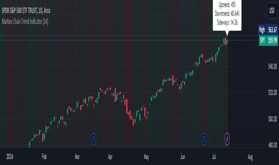
Markov Chain Trend IndicatorOverview
The Markov Chain Trend Indicator utilizes the principles of Markov Chain processes to analyze stock price movements and predict future trends. By calculating the probabilities of transitioning between different market states (Uptrend, Downtrend, and Sideways), this indicator provides traders with valuable insights into market dynamics.
Key Features
State Identification: Differentiates between Uptrend, Downtrend, and Sideways states based on price movements.
Transition Probability Calculation: Calculates the probability of transitioning from one state to another using historical data.
Real-time Dashboard: Displays the probabilities of each state on the chart, helping traders make informed decisions.
Background Color Coding: Visually represents the current market state with background colors for easy interpretation.
Concepts Underlying the Calculations
Markov Chains: A stochastic process where the probability of moving to the next state depends only on the current state, not on the sequence of events that preceded it.
Logarithmic Returns: Used to normalize price changes and identify states based on significant movements.
Transition Matrices: Utilized to store and calculate the probabilities of moving from one state to another.
How It Works
The indicator first calculates the logarithmic returns of the stock price to identify significant movements. Based on these returns, it determines the current state (Uptrend, Downtrend, or Sideways). It then updates the transition matrices to keep track of how often the price moves from one state to another. Using these matrices, the indicator calculates the probabilities of transitioning to each state and displays this information on the chart.
How Traders Can Use It
Traders can use the Markov Chain Trend Indicator to:
Identify Market Trends: Quickly determine if the market is in an uptrend, downtrend, or sideways state.
Predict Future Movements: Use the transition probabilities to forecast potential market movements and make informed trading decisions.
Enhance Trading Strategies: Combine with other technical indicators to refine entry and exit points based on predicted trends.
Example Usage Instructions
Add the Markov Chain Trend Indicator to your TradingView chart.
Observe the background color to quickly identify the current market state:
Green for Uptrend, Red for Downtrend, Gray for Sideways
Check the dashboard label to see the probabilities of transitioning to each state.
Use these probabilities to anticipate market movements and adjust your trading strategy accordingly.
Combine the indicator with other technical analysis tools for more robust decision-making.
Precise Gap FinderPrecise Gap Finder
This indicator identifies Fair Value Gaps (FVGs) in price action and it is perfect for traders looking to exploit price imbalances and capitalize on trading opportunities.
How It Works:
The Precise Gap Finder detects Fair Value Gaps by analyzing three consecutive candles. A gap is identified when the middle candle’s price range (open to close) is not overlapped by the high and low prices of the surrounding candles. This indicates a price imbalance, which can be a strong signal for potential market moves.
How to Use for Trading:
Identify Entry Points: Use the highlighted Fair Value Gaps to spot potential entry points. An upward FVG can indicate a potential buying opportunity, while a downward FVG can signal a potential selling opportunity.
Confirm Trends: Combine the FVG signals with other technical indicators to confirm trends and enhance the accuracy of your trades.
Risk Management: Use FVGs to identify potential stop-loss and take-profit levels. Gaps can serve as natural support and resistance levels.
Backtesting: Analyze historical data to understand how FVGs have impacted price movements in the past, helping you refine your trading strategy

Normalized Z-ScoreThe Normalized Z-Score indicator is designed to help traders identify overbought or oversold conditions in a security's price. This indicator can provide valuable signals for potential buy or sell opportunities by analyzing price deviations from their average values.
How It Works :
-- Z-Score Calculation:
---- The indicator calculates the Z-Score for both high and low prices over a user-defined period (default is 14 periods).
---- The Z-Score measures how far a price deviates from its average in terms of standard deviations.
-- Average Z-Score:
---- The average Z-Score is derived by taking the mean of the high and low Z-Scores.
-- Normalization:
---- The average Z-Score is then normalized to a range between -1 and 1. This helps in standardizing the indicator's values, making it easier to interpret.
-- Signal Line:
---- A signal line, which is the simple moving average (SMA) of the normalized Z-Score, is calculated to smooth out the data and highlight trends.
-- Color-Coding:
---- The signal line changes color based on its value: green when it is positive (indicating a potential buy signal) and red when it is negative (indicating a potential sell signal). This coloration is also used for the candle/bar coloration.
How to Use It:
-- Adding the Indicator:
---- Add the Normalized Z-Score indicator to your TradingView chart. It will appear in a separate pane below the price chart.
-- Interpreting the Histogram:
---- The histogram represents the normalized Z-Score. High positive values suggest overbought conditions, while low negative values suggest oversold conditions.
-- Using the Signal Line:
---- The signal line helps to confirm the conditions indicated by the histogram. A green signal line suggests a potential buying opportunity, while a red signal line suggests a potential selling opportunity.
-- Adjusting the Period:
---- You can adjust the period for the Z-Score calculation to suit your trading strategy. The default period is 14, but you can change this based on your preference.
Example Scenario:
-- Overbought Condition: If the histogram shows a high positive value and the signal line is green, the security may be overbought. This could indicate that it is a good time to consider selling.
-- Oversold Condition: If the histogram shows a low negative value and the signal line is red, the security may be oversold. This could indicate that it is a good time to consider buying.
By using the Normalized Z-Score indicator, traders can gain insights into price deviations and potential market reversals, aiding in making more informed trading decisions.

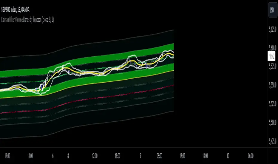
Kalman Filter Volume Bands by TenozenHello there! I am excited to introduce a new original indicator, the Kalman Filter Volume Bands. This indicator is calculated using the Kalman Filter, which is an adaptive-based smoothing quantitative tool. The Kalman Filter Volume Bands have two components that support the calculation, namely VWAP and VaR.
VWAP is used to determine the weight of the Kalman Filter Returns, but it doesn't have a significant impact on the calculation. On the other hand, VaR or Value at risk is calculated using the 99th percentile, which means that there is a 1% chance for the returns to exceed the 99th percentile level. After getting the VaR value, I manually adjust the bands based on the current market I'm trading on. I take the highest point (VaR*2) and the lowest point (-(VaR*2)) from the Kalman Filter, and then divide them into segments manually based on my preference.
This process results in 8 segments, where 2 segments near the Kalman Filter are further divided, making a total of 12 segments. These segments classify the current state of the price based on code-based coloring. The five states are very bullish, bullish, very bearish, bearish, and neutral.
I created this indicator to have an adaptive band that is not biased toward the volatility of the market. Most band-based indicators don't capture reversals that well, but the Kalman Filter Volume Bands can capture both trends and reversals. This makes it suitable for both trend-following and reversal trading approaches.
That's all for the explanation! Ciao!
Additional Reminder:
- Please use hourly timeframes or higher as lower timeframes are too noisy for reliable readings of this indicator.
Crypto Liquidation Heatmap [LuxAlgo]The Crypto Liquidation Heatmap tool offers real-time insights into the liquidations of the top cryptocurrencies by market capitalization, presenting the current state of the market in a visually accessible format. Assets are sorted in descending order, with those experiencing the highest liquidation values placed at the top of the heatmap.
Additional details, such as the breakdown of long and short liquidation values and the current price of each asset, can be accessed by hovering over individual boxes.
🔶 USAGE
The crypto liquidation heatmap tool provides real-time insights into liquidations across all timeframes for the top 29 cryptocurrencies by market capitalization. The assets are visually represented in descending order, prioritizing assets with the highest liquidation values at the top of the heatmap.
Different colors are used to indicate whether long or short liquidations are dominant for each asset. Green boxes indicate that long liquidations surpass short liquidations, while red boxes indicate the opposite, with short liquidations exceeding long liquidations.
Hovering over each box provides additional details, such as the current price of the asset, the breakdown of long and short liquidation values, and the duration for the calculated liquidation values.
🔶 DETAILS
🔹Crypto Liquidation
Crypto liquidation refers to the process of forcibly closing a trader's positions in the cryptocurrency market. It occurs when a trader's margin account can no longer support their open positions due to significant losses or a lack of sufficient margin to meet the maintenance requirements. Liquidations can be categorized as either a long liquidation or a short liquidation.
A long liquidation occurs when long positions are being liquidated, typically due to a sudden drop in the price of the asset being traded. Traders who were bullish on the asset and had opened long positions will face losses as the market moves against them.
On the other hand, a short liquidation occurs when short positions are being liquidated, often triggered by a sudden spike in the price of the asset. Traders who were bearish on the asset and had opened short positions will face losses as the market moves against them.
🔹Liquidation Data
It's worth noting that liquidation data is not readily available on TradingView. However, we recognize the close correlation between liquidation data, trading volumes, and asset price movements. Therefore, this script analyzes accessible data sources, extracts necessary information, and offers an educated estimation of liquidation data. It's important to emphasize that the presented data doesn't reflect precise quantitative values of liquidations. Traders and analysts should instead focus on observing changes over time and identifying correlations between liquidation data and price movements.
🔶 SETTINGS
🔹Cryptocurrency Asset List
It is highly recommended to select instruments from the same exchange with the same currency to maintain proportional integrity among the chosen assets, as different exchanges may have varying trading volumes.
Supported currencies include USD, USDT, USDC, USDP, and USDD. Remember to use the same currency when selecting assets.
List of Crypto Assets: The default options feature the top 29 cryptocurrencies by market capitalization, currently listed on the Binance Exchange. Please note that only crypto assets are supported; any other asset type will not be processed or displayed. To maximize the utility of this tool, it is crucial to heed the warning message displayed above.
🔹Liquidation Heatmap Settings
Position: Specifies the placement of the liquidation heatmap on the chart.
Size: Determines the size of the liquidation heatmap displayed on the chart.
🔶 RELATED SCRIPTS
Liquidations-Meter
Liquidation-Estimates
Liquidation-Levels

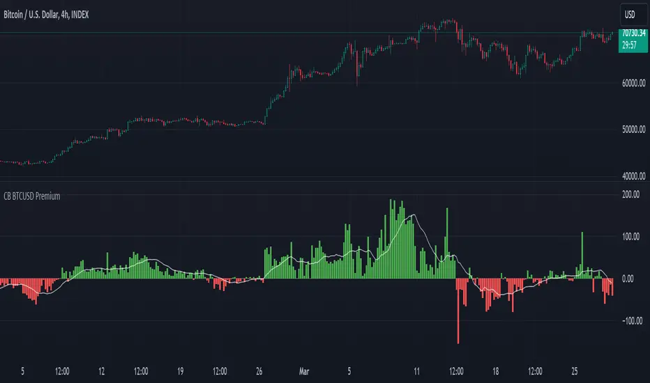
CB BTCUSD PremiumThis indicator is designed for cryptocurrency traders and analysts who wish to compare the spot price of Bitcoin (BTC) on Coinbase (BTC/USD) against Binance (BTC/USDT), highlighting the premium or discount between these two major exchanges in real-time. Additionally, it incorporates a moving average of the premium, allowing users to identify trends over their selected timeframe.
Features:
Spot Price Comparison: Calculates the real-time difference (premium or discount) between the BTC/USD spot price on Coinbase and the BTC/USDT spot price on Binance.
Premium Indicator: Displays the premium as columns on the chart, using green to indicate a premium (Coinbase > Binance) and red to indicate a discount (Coinbase < Binance).
Moving Average Trend: Includes a simple moving average (SMA) of the premium over a user-defined period, plotted as a blue line, to help users identify trends in the premium over time.
Customizable MA Period: Users can adjust the moving average period to suit their analysis needs, with a default setting of 14 periods.
Usage Instructions:
Adding the Indicator: Search for "Coinbase to Binance BTC Spot Premium with Moving Average" in the TradingView indicators and strategies library and add it to your chart.
Customizing the MA Period: To adjust the moving average period, click on the indicator's settings (gear icon) and navigate to the "Inputs" tab. Enter your desired period for the moving average.
Ideal for: Traders and analysts focusing on arbitrage opportunities, market depth analysis, and those interested in the comparative performance of BTC across different exchanges.
Note: This indicator does not constitute financial advice. It's a tool designed to provide analytical insights. Users should conduct their own research and consult with financial advisors before making investment decisions.
Open Intrest / Volume / Liquidations (Suite) [BigBeluga]This indicator is a suite of tools that aims to provide traders with efficient metrics to analyze the market in a different way, such as various types of Open Interest, Intraday Volume, and Liquidations.
This indicator can both save time and also provide a different approach to the usual price action trading style.
🔶 FEATURES
The indicator contains the following features:
Open Interest Suite
- Delta OI
- Net longs and shorts
- OI Relative Strength Index
Intraday Volume Suite
- Bullish and Bearish LTF Volume
- CVD
- Delta Volume
Liquidations Suite
- Long and Short Liquidations
- Cumulative Liquidations
🔶 EXAMPLE OF SUITE
In the example above, we can see how we can plot long and short positions, both opening and closing out.
This can give a unique way to view which side is the strongest but also which side has the most resting liquidity.
For example, if more longs are entering the market, it also means more liquidity for longs and vice versa.
Or, for example, plotting the delta OI will allow the user to see big percentages in change and spot big areas of position closing out.
This presents a fascinating method for observing numerous positions closing out in conjunction with a surge of liquidations, which could indicate a potential reversal in price.
Here, we can see a basic example of using intraday volume on a 1m LTF.
With this, we are able to see both bullish and bearish volume of the same candle, very useful to see both volumes traded in the same candle.
Using the CVD to see the overall direction based purely on the volume and spot divergence, for example, the price in an uptrend but CVD going down, indicating weak shorts in the market or trapped shorts.
Or simply view liquidations happening in the market in a very different way, both long and short liquidation at the same time + the option to use multi-timeframe liquidations.
🔶 CONCLUSION
The idea of this script is to provide a set of tools in a unique script to optimize time and analyze the market in both a quick way and in a different way than usual.

Market Activity Risk"Market Activity Risk" (MAR) - Is a dynamic tool designed to structurize the competitive landscape of blockchain transaction blocks, offering traders a strategic edge in anticipating market movements.
By capturing where market participants are actively buying and selling, the MAR indicator provides insights into areas of high competition, allowing traders to make informed decisions and potentially front-run transactions.
At the heart of this tool are blockchain transaction fees , they can represent daily shifts in transaction fee pressures.
By measuring momentum in fees, we can analyze the urgency and competition among traders to have their transactions processed first. This indicator is particularly good at revealing potential support or resistance zones, areas where traders are likely to defend their positions or increase their stakes, thus serving as critical junctures for strategic decision-making.
Key Features:
Adaptable Standard Deviation Settings: Users have the flexibility to adjust the length of the standard deviation and its multipliers, managing the risk bands to their individual risk tolerance.
Color-Coded Risk Levels: The MAR indicator employs an intuitive color scheme, making it easy to interpret the data at a glance.
Multi-Currency Compatibility: While designed with Bitcoin in mind, the MAR indicator is versatile, functioning effectively across various cryptocurrencies including Ethereum, XRP, and several other major altcoins. This broad compatibility ensures that traders across different market segments can leverage the insights provided by this tool.
Customizable Moving Average: The 730-day moving average setting is thoughtfully chosen to reflect the nuances of a typical cryptocurrency cycle, capturing long-term trends and fluctuations. However, recognizing the diverse needs and perspectives of traders, the indicator allows for the moving average period to be modified.
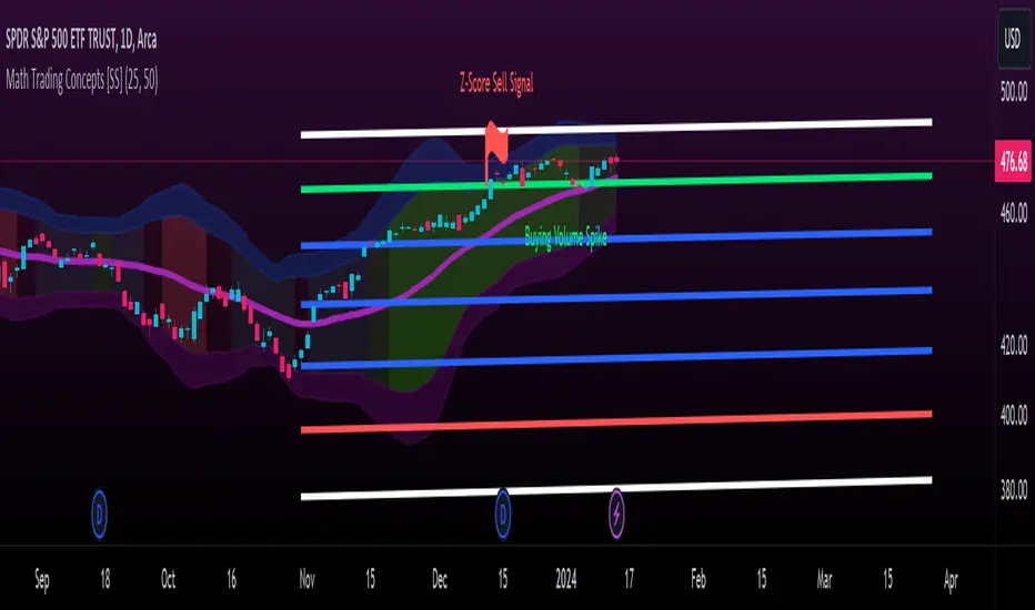
Math Trading Concepts [SS]Presenting a mashup of the key elements I use for day-to-day trading: Volume, Z-Score, Autoregressive Forecasting, and a new addition, ANOVA analysis of variance.
I've aptly named it "Math Trading Concepts" in a nod to established trading concepts like "Smart Money" and "liquidity," but it's also fitting because these elements are fundamental to most quantitative/mathematical trading strategies.
What does it do?
The indicator visualizes Z-Score bands over a user-selected lookback period (defaulted to 14), akin to Bollinger Bands. Within these bands, it provides additional data, including trend identification. Uptrends are displayed in varying shades of green (brighter for stronger trends), while downtrends appear in red (with intensity reflecting strength).
Now, let's delve into each point individually:
Volume:
The indicator converts volume into a Z-Score over the specified lookback period. It distinguishes between buying and selling volume, calculating separate Z-Scores for each. A signal is triggered when the Z-Score exceeds 2 (for buying) or falls below -2 (for selling).
Z-Score:
The Z-Score clouds represent the outer parameters of the standard deviation over the lookback period (set at 2 and 3). Users can adjust the lookback time, and the indicator analyzes previous Z-Score reversal areas over the last 75 candles, signaling buy or sell based on historical reversals.
If you want to make it like BB, select the lookback length for the Z-Score at 25.
Autoregressive Forecasting:
This unique approach to autoregressive forecasting involves regressing a lagged variable while incorporating a time element. The time length is auto-determined based on the strongest trend. The indicator plots both autoregressed highs and lows.
ANOVA:
ANOVA, a discovery of mine, is introduced here. It reliably triggers significant readings before a pivot or breakout by measuring variance between means. When a statistically significant ANOVA occurs using the high, low, and close lagged values, it indicates an impending significant market move. While ANOVA alerts are not specific about the nature of the move, complementary tools like Volume, trend analysis, and Z-Bands provide additional insights.
Expect more educational content on ANOVA in the future, given its unique discovery. I was hoping to do one before releasing anything ANOVA based but alas, I haven't had the time!
The remainder of the indicator is self-explanatory. Feel free to ask any questions that arise or were not addressed in this description.
Special thanks to @Trendoscope for his arrays library which has made it possible for you to use the autoregression forecast while actively trading without it intruding on the chart :-).
Safe trades, everyone!
FlexiSuperTrend - Strategy [presentTrading]█ Introduction and How it is Different
The "FlexiSuperTrend - Strategy" by PresentTrading is a cutting-edge trading strategy that redefines market analysis through the integration of the SuperTrend indicator and advanced variance tracking.
BTC 6H L/S
This strategy stands apart from conventional methods by its dynamic adaptability, capturing market trends and momentum shifts with increased sensitivity. It's designed for traders seeking a more responsive tool to navigate complex market movements.
Local
█ Strategy, How It Works: Detailed Explanation
The "FlexiSuperTrend - Strategy" employs a multifaceted approach, combining the adaptability of the SuperTrend indicator with variance tracking. The strategy's core lies in its unique formulation and application of these components:
🔶 SuperTrend Polyfactor Oscillator:
- Basic Concept: The oscillator is a series of SuperTrend calculations with varying ATR lengths and multipliers. This approach provides a broader and more nuanced perspective of market trends.
- Calculation:
- For each iteration, `i`, the SuperTrend is calculated using:
- `ATR Length = indicatorLength * (startingFactor + i * incrementFactor)`.
- `Multiplier = dynamically adjusted based on market conditions`.
- The SuperTrend output for each iteration is compared with the indicator source (like hlc3), and the deviation is recorded.
SuperTrend Calculation:
- `Upper Band (UB) = hl2 + (ATR Length * Multiplier)`
- `Lower Band (LB) = hl2 - (ATR Length * Multiplier)`
- Where `hl2` is the average of high and low prices.
Deviation Calculation:
- `Deviation = indicatorSource - SuperTrend Value`
- This value is calculated for each SuperTrend setting in the oscillator series.
🔶 Indicator Source (`hlc3`):
- **Usage:** The strategy uses the average of high, low, and close prices, providing a balanced representation of market activity.
🔶 Adaptive ATR Lengths and Factors:
- Dynamic Adjustment: The strategy adjusts the ATR length and multiplier based on the `startingFactor` and `incrementFactor`. This adaptability is key in responding to changing market volatilities.
- Equation: ATR Length at each iteration `i` is given by `len = indicatorLength * (startingFactor + i * incrementFactor)`.
incrementFactor - 1
incrementFactor - 2
🔶 Normalization Methods:
Purpose: To standardize the deviations for comparability.
- Methods:
- 'Max-Min': Scales the deviation based on the range of values.
- 'Absolute Sum': Uses the sum of absolute deviations for normalization.
Normalization 'Absolute Sum'
- For 'Max-Min': `Normalized Deviation = (Deviation - Min(Deviations)) / (Max(Deviations) - Min(Deviations))`
- For 'Absolute Sum': `Normalized Deviation = Deviation / Sum(Absolute(Deviations))`
🔶 Trading Logic:
The strategy integrates the SuperTrend indicator, renowned for its effectiveness in identifying trend direction and reversals. The SuperTrend's incorporation enhances the strategy's ability to filter out false signals and confirm genuine market trends. * The SuperTrend Toolkit is made by @QuantiLuxe
- Long Entry Conditions: A buy signal is generated when the current trend, as indicated by the SuperTrend Polyfactor Oscillator, turns positive.
- Short Entry Conditions: A sell signal is triggered when the current trend turns negative.
- Entry and Exit Strategy: The strategy opens or closes positions based on these signals, aligning with the selected trade direction (long, short, or both).
█ Trade Direction
The strategy is versatile, allowing traders to choose their preferred trading direction: long, short, or both. This flexibility enables traders to tailor their strategies to their market outlook and risk appetite.
█ Usage
The FlexiSuperTrend strategy is suitable for various market conditions and can be adapted to different asset classes and time frames. Traders should set the strategy parameters according to their risk tolerance and trading goals. It's particularly useful for capturing long-term movements, ideal for swing traders, yet adaptable for short-term trading strategies.
█ Default Settings
1. Trading Direction: Choose from "Long", "Short", or "Both" to define the trade type.
2. Indicator Source (HLC3): Utilizes the HLC3 as the primary price reference.
3. Indicator Length (Default: 10): Influences the moving average calculation and trend sensitivity.
4. Starting Factor (0.618): Initiates the ATR length, influenced by Fibonacci ratios.
5. Increment Factor (0.382): Adjusts the ATR length incrementally for dynamic trend tracking.
6. Normalization Method: Options include "None", "Max-Min", and "Absolute Sum" for scaling deviations.
7. SuperTrend Settings: Varied ATR lengths and multipliers tailor the indicator's responsiveness.
8. Additional Settings: Features mesh style plotting and customizable colors for visual distinction.
The default settings provide a balanced approach, but users are encouraged to adjust them based on their individual trading style and market analysis.

Pairs strategyHello, Tradingview community,
I am been playing with this idea that nowadays trading instruments are interconnected and when one goes too far "out of order" it should return to the mean.
So, here's a relatively simple idea.
This is a LONG-ONLY strategy.
Buy when your traded instrument's last bar closes down, and the comparing instrument closes up.
Sell when close is higher than the previous bar's high.
Best results I found with medium timeframes: 45min, 120min, 180min.
Also, feel free to test non-typical timeframes such as 59min, 119min, 179min, etc.
My reasoning for medium timeframes would be, that they are big enough to avoid "market noise"
of smaller timeframes + commissions & slippage is less negligible, and small enough to avoid exposure of higher timeframes, although, I haven't tested D timeframe and above.
The best results, I found were with instruments that aren't directly correlated. I mostly tested equities and equity futures, so for equity indexes, equity index futures, or large-cap stocks, NASDAQ:SMH , NASDAQ:NVDA , EURUSD, and Crude Oil would be a good candidate for comparing symbols.
When testing either futures or stocks, please adjust the commission for each asset, for stocks I use % equity, so it compounds over time, whereas, for futures, I use 1 contract all the time.
Here's NASDAQ:MSFT on 119min chart
Here's AMEX:SPY on 59min chart using NASDAQ:NVDA as comparison
Here's CME_MINI:ES1! on 179min chart using NYMEX:CL1! as comparison
To change comparison symbol just insert your symbol between the brackets on both fields down here.
SymbolClose = request.security("YOUR SYMBOL HERE", timeframe.period, close)
SymbolOpen = request.security("YOUR SYMBOL HERE", timeframe.period, open)
Since I am still relatively new to testing, hence, I am publishing this idea, so you can point out some crucial things I may have missed.
Thanks,
Enjoy the strategy!

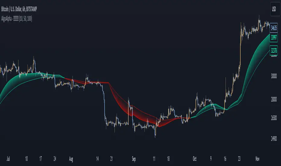
Liquidity Weighted Moving Averages [AlgoAlpha]Description:
The Liquidity Weighted Moving Averages by AlgoAlpha is a unique approach to identifying underlying trends in the market by looking at candle bars with the highest level of liquidity. This script offers a modified version of the classical MA crossover indicator that aims to be less noisy by using liquidity to determine the true fair value of price and where it should place more emphasis on when calculating the average.
Rationale:
It is common knowledge that liquidity makes it harder for market participants to move the price of assets, using this logic, we can determine the coincident liquidity of each bar by looking at the volume divided by the distance between the opening and closing price of that bar. If there is a higher volume but the opening and closing prices are near each other, this means that there was a high level of liquidity in that bar. We then use standard deviations to filter out high spikes of liquidity and record the closing prices on those bars. An average is then applied to these recorded prices only instead of taking the average of every single bar to avoid including outliers in the data processing.
Key features:
Customizable:
Fast Length - the period of the fast-moving average
Slow Length - the period of the slow-moving average
Outlier Threshold Length - the period of the outlier processing algorithm to detect spikes in liquidity
Significant Noise reduction from outliers:
Logarithmic CVD [IkkeOmar]The LCVD is another Mean-Reversion Indicator. it doesn't detect trends and does not give a signal per se. However the logarithmic transformation is made to visualize the direction of the trend for the volume. This allows you to see if money is flowing in or out of an asset.
What it does is tell you if we have a flashcrash based on the difference in volume.
Think of this indicator like a form of a volatility index.
Smoothing input:
The only input is an input for the smoothing length of the logDelta.
Volume Calculation:
// @IkkeOmar
//@version=5
indicator('Logarithmic CVD', shorttitle='CVD', overlay=false)
smooth = input.int(defval = 25, title = "Smoothing Distance")
// Calculate buying and selling volume
askVolume = volume * (close > open ? 1 : 0) // Assuming higher close than open indicates buying
bidVolume = volume * (close < open ? 1 : 0) // Assuming lower close than open indicates selling
// Delta is the difference between buying and selling volume
delta = askVolume - bidVolume
// Apply logarithmic transformation to delta
// Adding a check to ensure delta is not zero as log(0) is undefined
logDelta = delta > 0 ? math.log(math.abs(delta)) * math.sign(delta) : - math.log(math.abs(delta)) * math.sign(delta)
// use the the ta lib for calculating the sma of the logDelta
smoothLogDelta = ta.sma(logDelta, smooth)
// Create candlestick plot
plot(logDelta, color= color.green, title='Logarithmic CVD')
plot(smoothLogDelta, color= color.rgb(145, 37, 1), title='Smooth CVD')
These lines calculate the buying and selling volumes. askVolume is calculated as the total volume when the closing price is higher than the opening price, assuming this indicates buying pressure. bidVolume is calculated as the total volume when the closing price is lower than the opening price, assuming selling pressure.
The Delta is simply the difference between buying and selling volumes.
Logarithmic Transformation:
logDelta = delta > 0 ? math.log(math.abs(delta)) * math.sign(delta) : - math.log(math.abs(delta)) * math.sign(delta)
Applies a logarithmic transformation to delta. The math.log function is used to calculate the natural logarithm of the absolute value of delta. The sign of delta is preserved to differentiate between positive and negative values. This transformation helps in scaling the delta values, especially useful when dealing with large numbers.
This script essentially provides a visual representation of the buying and selling pressures in a market, transformed logarithmically for better scaling and smoothed for trend analysis.
Hope it makes sense!
Stay safe everyone!
Don't hesitate to ask any questions if you have any!

PhantomFlow TrendDetectorThe TrendDetector calculates waves on the chart using the built-in ZigZag indicator and detects a trend change after the last high/low update occurs in a minimum sequence of non-updated highs/lows. This assumes a continuation of the trend for the subsequent update of the remaining high/low.
For trend determination:
When you see a pink or light yellow trend color, it means that a new trend may potentially be emerging right now, and you can join it almost at the beginning. So, if you see patterns from your trading system aligning with the TrendDetector indicator and they have the same direction, it further increases the likelihood of your plan working out.
In the case where the trend phase has a red or green color, it may indicate that the primary market impulse has already occurred, and therefore, joining the trend at this time may not be advisable.
For trade entry:
Additionally, you can use the indicator specifically for entering the market using market orders. Depending on the timeframe (the smaller the timeframe, the more confirmation candles are needed), you can open a trade when one trend replaces another at the close, for example, the second candle in the case of a 10-minute timeframe. Stop-loss can be placed under the signal candle, a local peak, or a reversal trend valley, a global peak, or a reversal trend valley. In the example above, the second option was used.
Settings
You cannot technically adjust anything in this indicator because all the logic is hardcoded. However, for a better chart visualization, after adding it to the chart, click on the three dots next to the indicator name, select "Visual order," and then "Bring to front".

Opposite Side Liquidity Dominance NJROpposite Side Liquidity Dominance Indicator Explanation :
Imagine you're trading in the financial markets, and you want to understand who's in control - the buyers or the sellers. The "Opposite Side Liquidity Dominance" indicator is here to help you do just that in a simple and visual way.
1. **Lookback Period**: This indicator looks at historical data to make its assessments. You can choose how far back it should look by adjusting the "lookback period." For example, setting it to 50 means it'll consider the last 50 days.
2. **Opposite Side Volume**: It calculates the total trading volume on the side opposite to the current market price. This helps us understand how strong the trading activity is from traders who have a different view than the current market price.
3. **Dominance Calculation**: We determine the "Opposite Side Liquidity Dominance" by comparing the current trading volume to the historical average. If the current volume is larger than what's typical, it suggests dominance, and we color the background of the chart green. If it's smaller, we color it red to indicate a lack of dominance.
4. **Visual Representation**: In addition to the background color, we also provide a line on the chart. This line shows the Opposite Side Liquidity Dominance over time. When it goes up, it means that traders who disagree with the market are in control; when it goes down, it means the market price is dominating.
So, in a nutshell, this indicator helps you see at a glance whether the buyers or sellers who disagree with the current market price are taking control. When the background is green, it suggests they are, and when it's red, it suggests the market price is holding sway. The line on the chart provides a more detailed view of how this dominance changes over time.
You can easily customize this indicator to fit your specific trading needs by adjusting the lookback period and colors to match your preferences.
For better trading compare 30 minutes time frame in forex

Crypto Open InterestPlots a crypto's open interest on Binance.
You can choose to see OI as asset-denominated (e.g. 1000 BTC), USD-denominated, or both.
How I usually interpret OI:
Price up, OI up = longs opened = bullish
Price up, OI down = shorts closed = bullish on HTF, or counter-trade on LTF
Price down, OI up = shorted opened = bearish
Price down, OI down = longs closed = bearish on HTF, or counter-trade on LTF
I find the indicator useful on 1-minute charts to identify liquidations and compare perp v.s. spot patterns.

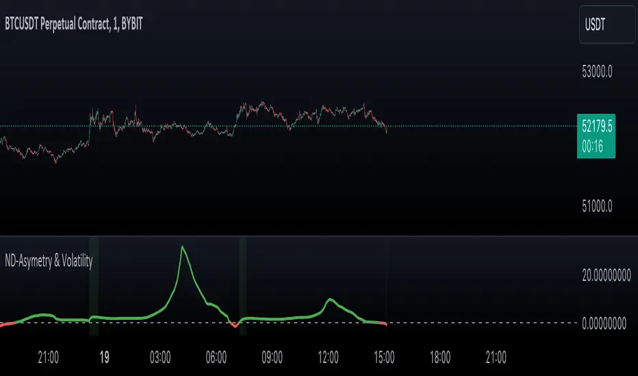
Normal Distribution Asymmetry & Volatility ZonesNormal Distribution Asymmetry & Volatility Zones Indicator provides insights into the skewness of a price distribution and identifies potential volatility zones in the market. The indicator calculates the skewness coefficient, indicating the asymmetry of the price distribution, and combines it with a measure of volatility to define buy and sell zones.
The key features of this indicator include :
Skewness Calculation : It calculates the skewness coefficient, a statistical measure that reveals whether the price distribution is skewed to the left (negative skewness) or right (positive skewness).
Volatility Zones : Based on the skewness and a user-defined volatility threshold, the indicator identifies buy and sell zones where potential price movements may occur. Buy zones are marked when skewness is negative and prices are below a volatility threshold. Sell zones are marked when skewness is positive and prices are above the threshold.
Signal Source Selection : Traders can select the source of price data for analysis, allowing flexibility in their trading strategy.
Customizable Parameters : Users can adjust the length of the distribution, the volatility threshold, and other parameters to tailor the indicator to their specific trading preferences and market conditions.
Visual Signals : Buy and sell zones are visually displayed on the chart, making it easy to identify potential trade opportunities.
Background Color : The indicator changes the background color of the chart to highlight significant zones, providing a clear visual cue for traders.
By combining skewness analysis and volatility thresholds, this indicator offers traders a unique perspective on potential market movements, helping them make informed trading decisions. Please note that trading involves risks, and this indicator should be used in conjunction with other analysis and risk management techniques.
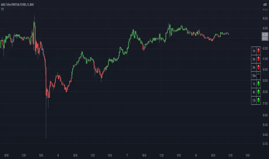
Traders Trend DashboardThe Traders Trend Dashboard (TTD) is a comprehensive trend analysis tool designed to assist traders in making informed trading decisions across various markets and timeframes. Unlike conventional trend-following scripts, TTD goes beyond simple trend detection by incorporating a unique combination of moving averages and a visual dashboard, providing traders with a clear and actionable overview of market trends. Here's how TTD stands out from the crowd:
Originality and Uniqueness:
TTD doesn't rely on just one moving average crossover to detect trends. Instead, it employs a dynamic approach by comparing two moving averages of distinct periods across multiple timeframes. This innovative methodology enhances trend detection accuracy and reduces false signals commonly associated with single moving average systems.
Market Applicability:
TTD is versatile and adaptable to various financial markets, including forex, stocks, cryptocurrencies, and commodities. Its flexibility ensures that traders can utilize it across different asset classes and capitalize on market opportunities.
Optimal Timeframe Utilization:
Unlike many trend indicators that work best on specific timeframes, TTD caters to traders with diverse trading preferences. It offers support for intraday trading (1m, 3m, 5m), short-term trading (15m, 30m, 1h), and swing trading (4h, D, W, M), making it suitable for a wide range of trading styles.
Underlying Conditions and Interpretation:
TTD is particularly effective during trending markets, where its multi-timeframe approach helps identify consistent trends across various time horizons. In ranging markets, TTD can indicate potential reversals or areas of uncertainty when moving averages converge or cross frequently.
How to Use TTD:
1. Timeframe Selection: Choose the relevant timeframes based on your trading style and preferences. Enable or disable timeframes in the settings to focus on the most relevant ones for your strategy.
2. Dashboard Interpretation: The TTD dashboard displays green (🟢) and red (🔴) symbols to indicate the relationship between two moving averages. A green symbol suggests that the shorter moving average is above the longer one, indicating a potential bullish trend. A red symbol suggests the opposite, indicating a potential bearish trend.
3. Confirmation and Strategy: Consider TTD signals as confirmation for your trading strategy. For instance, in an uptrend, look for long opportunities when the dashboard displays consistent green symbols. Conversely, in a downtrend, focus on short opportunities when red symbols dominate.
4. Risk Management: As with any indicator, use TTD in conjunction with proper risk management techniques. Avoid trading solely based on indicator signals; instead, integrate them into a comprehensive trading plan.
Conclusion:
The Traders Trend Dashboard (TTD) offers traders a powerful edge in trend analysis, combining innovation, versatility, and clarity. By understanding its unique methodology and integrating its signals with your trading strategy, you can make more informed trading decisions across various markets and timeframes. Elevate your trading with TTD and unlock a new level of trend analysis precision.