Cast ForwardThis indicator will not forecast price action. It will not predict price movement nor will it in any way predict the outcome of any trade you may take. This is not a signal for buying or selling. You must do your own back testing and analysis for trading.
Time and price are the two most important components of market data. Where was price at what time? To help visualize this question I created this indicator. It allows for the previous session data to be overlayed onto the chart offset forward 24 hours. What this means is that you have the high, (high/low)/2, and low of each candle plotted on top of your chart for the time frame of the current chart, but offset so that the data from the current candle has the data from the corresponding candle 24 hours prior lined up on the x-axis.
SMA Logic: I used the SMA (Simple Moving Average) function with a length of 1 to plot the data points without any smoothing to give the true values of the data.
For Intraday Charting
For Electronic Trading Hours:
In order to line up the data correctly, for intraday charts, I used the current chart timeframe and divided it into 1380 (number of minutes in the 23 hour futures market trading day) to set the data offset. Using the same math logic, this indicator also gives the correct correlated data on the 30 second time frame. If the chart time frame that is currently being used does not allow for correct data correlation (not a factor of 1380) it will not plot the data.
For Regular Trading Hours:
In order to line up the data correctly, for intraday charts, I used the current chart timeframe and divided it into 405 (number of minutes in the 6 hour 45 minutes New York regular session trading day, including the 15 minute settlement time) to set the data offset. This indicator also gives the correct correlated data on the 30 second time frame. If the chart time frame that is currently being used does not allow for correct data correlation (not a factor of 405) it will not plot the data.
For the Daily Chart:
This indicator plots a visualization of the 20-40-60 day IPDA data range; (The IPDA data range helps traders identify liquidity, price gaps, and equilibrium points in the market, providing insights for optimal trade entries and market structure shifts). It does this using the same SMA logic as the intraday plot. What this means is it offsets the historical data of the daily chart 20, 40, or 60 bars forward. You can plot any combination of the three on the chart at one time, but these will not show on the intraday chart. This allows for visualization of where the market will possibly seek liquidity, seek to rebalance, or seek equilibrium in the future.
Cari skrip untuk "market structure"

Candlestick Patterns [NAS Algo]Candlestick Patterns plots most commonly used chart patterns to help and understand the market structure.
Bullish Reversal Patterns:
Hammer:
Appearance: Small body near the high, long lower shadow.
Interpretation: Indicates potential bullish reversal after a downtrend.
Inverted Hammer:
Appearance: Small body near the low, long upper shadow.
Interpretation: Signals potential bullish reversal, especially when the preceding trend is bearish.
Three White Soldiers:
Appearance: Three consecutive long bullish candles with higher closes.
Interpretation: Suggests a strong reversal of a downtrend.
Bullish Harami:
Appearance: Small candle (body) within the range of the previous large bearish candle.
Interpretation: Implies potential bullish reversal.
Bearish Reversal Patterns:
Hanging Man:
Appearance: Small body near the high, long lower shadow.
Interpretation: Suggests potential bearish reversal after an uptrend.
Shooting Star:
Appearance: Small body near the low, long upper shadow.
Interpretation: Indicates potential bearish reversal, especially after an uptrend.
Three Black Crows:
Appearance: Three consecutive long bearish candles with lower closes.
Interpretation: Signals a strong reversal of an uptrend.
Bearish Harami:
Appearance: Small candle (body) within the range of the previous large bullish candle.
Interpretation: Implies potential bearish reversal.
Dark Cloud Cover:
Appearance: Bearish reversal pattern where a bullish candle is followed by a bearish candle that opens above the high of the previous candle and closes below its midpoint.
Continuation Patterns:
Rising Three Methods:
Appearance: Consists of a long bullish candle followed by three small bearish candles and another bullish candle.
Interpretation: Indicates the continuation of an uptrend.
Falling Three Methods:
Appearance: Consists of a long bearish candle followed by three small bullish candles and another bearish candle.
Interpretation: Suggests the continuation of a downtrend.
Gravestone Doji:
Appearance: Doji candle with a long upper shadow, little or no lower shadow, and an opening/closing price near the low.
Interpretation: Signals potential reversal, particularly in an uptrend.
Long-Legged Doji:
Appearance: Doji with long upper and lower shadows and a small real body.
Interpretation: Indicates indecision in the market and potential reversal.
Dragonfly Doji:
Appearance: Doji with a long lower shadow and little or no upper shadow.
Interpretation: Suggests potential reversal, especially in a downtrend.

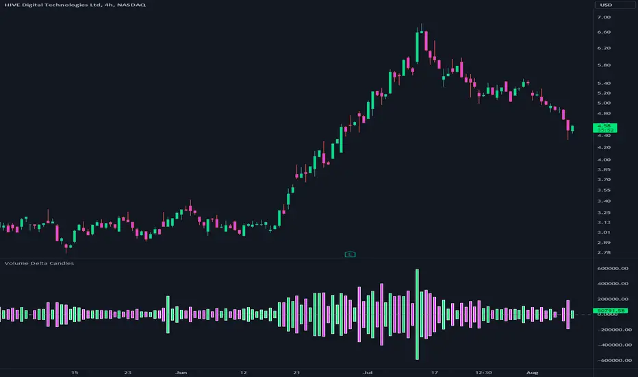
Volume Delta CandlesThis indicator is designed to visualize the volume delta, which represents the difference between buying and selling volumes during each candle period. The indicator plots custom candlesticks on the chart, with OHLC values calculated based on the volume delta.
Calculations:
To calculate the volume delta, the indicator first determines the buying and selling volumes. If the closing price is higher than the opening price (close > open), the volume is considered as buying volume. If the closing price is lower than the opening price (close < open), the volume is considered as selling volume. Otherwise, the volume is set to zero. The volume delta is then calculated as the difference between the buying volume and the selling volume.
The custom OHLC values are derived from the volume delta. The custom open is obtained by subtracting the volume delta from the closing price. The custom close is obtained by adding the volume delta to the closing price. The custom high is set as the maximum value between the closing price and the custom open, ensuring that the candle represents the highest value within the range. The custom low is set as the minimum value between the closing price and the custom open, ensuring that the candle represents the lowest value within the range.
Interpretation:
The indicator's custom candles provide visual insights into the volume delta. Each candlestick's color (lime for positive volume delta, fuchsia for negative volume delta) indicates the dominance of buying or selling pressure during that period. When the volume delta is positive, it suggests that buying volume exceeded selling volume, possibly indicating a bullish sentiment. Conversely, when the volume delta is negative, it indicates that selling volume was higher, potentially signaling a bearish sentiment. The indicator also plots a zero line to represent the equilibrium point, where buying and selling volumes are equal.
Potential Uses and Limitations:
Traders can use the indicator to gain insights into the strength and direction of buying and selling pressures. Positive volume delta during an uptrend could suggest the presence of strong buying interest, potentially supporting further bullish moves. On the other hand, negative volume delta during a downtrend could indicate intensified selling pressure, hinting at potential further declines. Traders might use the indicator in conjunction with other technical analysis tools, such as support and resistance levels, trendlines, or oscillators, to confirm potential reversal points or trend continuations.
It's essential to interpret the indicator in the context of the overall market environment. While volume delta can provide valuable insights into short-term buying and selling imbalances, it is just one aspect of market analysis. Traders should consider other factors, such as market structure, fundamental events, and overall sentiment, to make informed trading decisions. Additionally, the indicator's efficacy might vary across different market conditions, and it may produce false signals during low-volume periods or choppy markets.
Conclusion:
By visualizing volume delta through custom candlesticks, traders can gauge market sentiment and potentially identify key reversal or continuation points. As with any technical indicator, it is advisable to use the Volume Delta Candles in combination with other tools to gain a comprehensive understanding of market conditions and make well-informed trading choices. Additionally, traders should practice proper risk management techniques to protect their capital while using the indicator in their trading strategy.
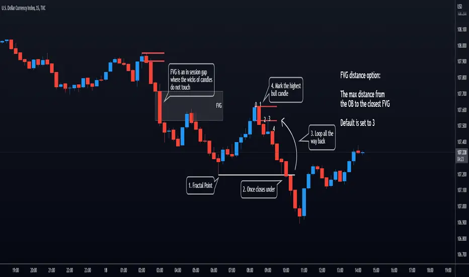
Opening Range Gap + Std Dev [starclique]The ICT Opening Range Gap is a concept taught by Inner Circle Trader and is discussed in the videos: 'One Trading Setup For Life' and 2023 ICT Mentorship - Opening Range Gap Repricing Macro
ORGs, or Opening Range Gaps, are gaps that form only on the Regular Trading Hours chart.
The Regular Trading Hours gap occurs between 16:15 PM - 9:29 AM EST (UTC-4)
These times are considered overnight trading, so it is useful to filter the PA (price action) formed there.
The RTH option is only available for futures contracts and continuous futures from CME Group.
To change your chart to RTH, first things first, make sure you’re looking at a futures contract for an asset class, then on the bottom right of your chart, you’ll see ETH (by default) - Click on that, and change it to RTH.
Now your charts are filtering the price action that happened overnight.
To draw out your gap, use the Close of the 4:14 PM candle and the open of the 9:30 AM candle.
How is this concept useful?
Well, It can be used in many ways.
---
How To Use The ORG
One of the ways you can use the opening range gap is simply as support and resistance
If we extend out the ORG from the example above, we can see that there is a clean retest of the opening range gap high after breaking structure to the upside and showing acceptance outside of the gap after consolidating within it.
The ORG High (4:14 Candle Close in this case) was used as support.
We then see an expansion to the upside.
Another way to implement the ORG is by using it as a draw on liquidity (magnet for price)
In this example, if we looked to the left, there was a huge ORG to the downside, leaving a massive gap.
The market will want to rebalance that gap during the regular trading hours.
The market rallies higher, rejects, comes down to clear the current days ORG low, then closes.
That is one example of how you can combine liquidity & ICT market structure concepts with Opening Range Gaps to create a story in the charts.
Now let’s discuss standard deviations.
---
Standard Deviations
Standard Deviations are essentially projection levels for ranges / POIs (Point of Interests)
By this I mean, if you have a range, and you would like to see where it could potentially expand to, you’d place your fibonacci retracement tool on and high and low of the range, then use extension levels to find specific price points where price might reject from.
Since 0 and 1 are your Range High and Low respectively, your projection levels would be something like 1.5, 2, 2.5, and 3, for the extension from your 1 Fib Level, and -0.5, -1, -1.5, and -2 for your 0 Fib level.
The -1 and 2 level produce a 1:1 projection of your range low and high, meaning, if you expect price to expand as much as it did from the range low to range high, then you can project a -1 and 2 on your Fib, and it would show you what ICT calls “symmetrical price”
Now, how are standard deviations relevant here?
Well, if you’ve been paying attention to ICT’s recent videos, you would’ve caught that he’s recently started using Standard Deviation levels on breakers.
So my brain got going while watching his video on ORGs, and I decided to place the fib on the ORG high and low and see what it’d produce.
The results were very interesting.
Using this same example, if we place our fib on the ORG High and Low, and add some projection levels, we can see that we rejected right at the -2 Standard Deviation Level.
---
You can see that I also marked out the EQ (Equilibrium, 50%, 0.5 of Fib) of the ORG. This is because we can use this level as a take profit level if we’re using an old ORG as our draw.
In days like these, where the gap formed was within a consolidation, and it continued to consolidate within the ORG zone that we extended, we can use the EQ in the same way we’d use an EQ for a range.
If it’s showing acceptance above the EQ, we are bullish, and expect the high of the ORG to be tapped, and vice versa.
---
Using The Indicator
Here’s where our indicator comes in play.
To avoid having to do all this work of zooming in and marking out the close and open of the respective ORG candles, we created the Opening Range Gap + Standard Deviations Indicator, with the help of our dedicated Star Clique coder, a1tmaniac.
With the ORG + STD DEV indicator, you will be able to view ORG’s and their projections on the ETH (Electronic Trading Hours) chart.
---
Features
Range Box
- Change the color of your Opening Range Gap to your liking
- Enable or disable the box from appearing using the checkbox
Range Midline
- Change the color of your Opening Range Gap Equilibrium
- Enable or disable the midline from appearing using the checkbox
Std. Dev
- Add whichever standard deviation levels you’d like.
- By default, the indicator comes with 0.5, 1, 1.5, and 2 standard deviation levels.
- Ensure that you add a comma ( , ) in between each standard deviation level
- Enable or disable the standard deviations from appearing using the opacity of the color (change to 0%)
Labels / Offset
- Adjust the offset of the label for the Standard Deviations
- Enable or disable the Labels from appearing using the checkbox
Time
- Adjust the time used for the indicators range
- If you’d like to use this for a Session or ICT Killzone instead, adjust the time
- Adjust the timezone used for the time referenced
- Options are UTC, US (UTC-4, New York Local Time) or UK (UTC+1, London Time)
- By default, the indicator is set to US

Faytterro Market Structerethis indicator creates the market structure with a little delay but perfectly. each zigzag is always drawn from highest to lowest. It also signals when the market structure is broken. signals fade over time.
The table above shows the percentage distance of the price from the last high and the last low.
zigzags are painted green when making higher peaks, while lower peaks are considered downtrends and are painted red. In fact, the indicator is quite simple to understand and use.
"length" is used to change the frequency of the signal.
"go to past" is used to see historical data.
Please review the examples:

Orderblocks (Nephew_Sam_) - Open sourceHighlights orderblocks based on fractal market structure.
Whenever a new fractal high/low is created, it will search for the Orderblock and plot lines and labels
Options:
1. Select 3/5 bar fractal
2. Plot lines and labels on OB's
- Ability to filter OB only when a candle is fully engulfed
3. Change bar color of engulfed candles
4. Option to filter OB that follows with an FVG
View the published chart for more details on how this indicator works
Disclaimer: You have the permissions to use this code however make sure you give me the credits when you do and make it open source or grant me access to the code.
CANDLE FILTER Todays scripts is based on my Pullback And Rally Candles with other meaningful candles such as Hammers and Dojis.
You can choose which Candles to show on the cart and if you want to candles to appear above or below a moving average.
If you follow my work, you may recognise some of these candles which I'm about to show you however these candles are 1) more refined and 2) has moving average filters.
Ive included a D,6H,1H Candle in this script as on different timeframes - each swing low on average has a different amount of bars within the swing low / swing high so the DPB and RD will only work on the Daily
//Pullback candle
This candle is very powerful when used with simple Price Action such as Market Structure//Demand zones and support zones. (((((WORKS BEST IN UPTRENDS AND BOTTOM OF RANGES)))))
Ive included a D,6H,1H Pullback Candle in this script as on different timeframes - each swing low on average has a different amount of bars within the swing low so the DPB will only work on the Daily
//DAILY PULLBACK (Swing Traders)
snapshot
//4H PULLBACK (Swing Traders)
snapshot
- this signal will produce more signals due to the swing low filter on the 4H
//1H PULLBACK
snapshot
- this signal has been refined due to too many candle displaying in weak areas
!!!IF YOU DONT WANT TO USE PULLBACKS DURING DOWNTRENDS THEN USE THE EMA FILTER TO TURN OFF THE PULLBACKS WHEN PRICE IS BELOW THE MOVING AVERAGE!!!
//Rally candle (My personal Favourite) (((((WORKS BEST IN DOWNTRENDS AND TOP OF RANGES)))))
This candle is very powerful when used with simple Price Action such as Market Structure//Supply zones and Resistance zones.
//DAILY RALLY(Swing Traders)
snapshot
//4H RALLY(Swing Traders)
snapshot
- this signal will produce more signals due to the swing high filter on the 4H
!!!IF YOU DONT WANT TO USE RALLIES DURING UPTRENDSTHEN USE THE EMA FILTER TO TURN OFF THE RALLIES WHEN PRICE IS ABOVE THE MOVING AVERAGE!!!
//POWERFUL DOJIS (INDECISION)
snapshot
We look for indecision in key areas to see if momentum is shifting. When combined with Pullbacks or Rallys - this will enhance the odds of a probably area.
//HAMMERS
snapshot
//MOVING AVERAGES
snapshot
Short EMA = 50
Long EMA = 200
This filter can be used when the market is trending - look out for rejections off the moving averages
Also you can chance the Short And Long EMA to choose which MA cross you want to use
snapshot
ALSO ALL THE CANDLES HAVE A ALERT CONDITIONS WHICH YOU CAN ACCESS - THIS WILL ALERT ANY CANDLE YOU CHOOSE
Please leave a like/comment on this post as this is much appreciated....

Rolling Heikin Ashi Candles█ OVERVIEW
This indicator displays a Rolling Heikin Ashi Candles for a given timeframe Multiplier. Contrary to Heikin Ashi Candles Charts, if the timeframe Multiplier is "5", this indicator plots Heikin Ashi Candles OHLC of the last 5 Candles.
█ WHAT IS THE NEED FOR IT
Let's see if we want to use a Higher timeframe OHLC Data using security function or resolution options. The indicator repaints until the higher timeframe Heikin Ashi Candles closes, leading to a repainting strategy or indicator using higher-timeframe data. So we can use Rolling Heikin Ashi Candles in these cases.
█ USES
To Pull out higher timeframe Heikin Ashi Candles OHLC Data to build a non-repainting strategy or indicator.
█ WHY I AM BUILDING THIS SIMPLE INDICATOR
There is no doubt higher timeframe analysis is a critical study to mastering the markets.
I found a necessity for an indicator that analyses multiple higher timeframes and gives us a cumulative or average trend direction. I already built the indicator; I will release it soon. The Indicator I am building is wholly based on my understanding and perspective of Market Structure. Please use this indicator idea to remove the repainting issue when you make an indicator that utilises higher timeframe data.
I am using this in my upcoming indicators. Felt to share before head.
Stay Tuned...
If you have any recommendations or alternative ideas, then please drop a comment under the script ;)

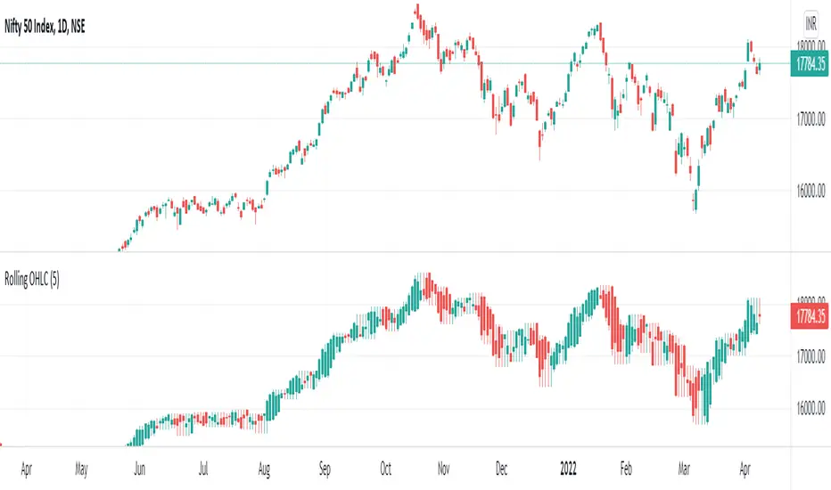
Rolling OHLC Candles█ OVERVIEW
This indicator displays a Rolling OHLC Bars for a given timeframe Multiplier. Contrary to OHLC Charts, if the timeframe Multiplier is "5", this indicator plot OHLC of the last 5 Candles.
█ WHAT IS THE NEED FOR IT
Let's see if we want to use a Higher timeframe OHLC Data using security function or resolution options. The indicator repaints until the higher timeframe OHLC Candle closes, leading to a repainting strategy or indicator using higher-timeframe data. So we can use Rolling OHLC Candles in these cases.
█ USES
To Pull out higher timeframe OHLC Data to build a non-repainting strategy or indicator.
Prominently, traders use Heikin Ashi Candles to locate trends or trading opportunities easier than traditional candlesticks. But the OHLC in those Heikin Ashi candles doesn't match with conventional candlesticks. We can use these Rolling OHLC Candles as an alternative for Heikin Ashi Candles because Here we can locate trends or trading opportunities easier than traditional candlesticks, and also close of these candles matches the close of the standard candlesticks, which can help us to take trades based on the close of the candles.
█ WHY I AM BUILDING THIS SIMPLE INDICATOR
There is no doubt higher timeframe analysis is a critical study to mastering the markets.
I found a necessity for an indicator that analyses multiple higher timeframes and gives us a cumulative or average trend direction. I already built the indicator; I will release it soon. The Indicator I am building is wholly based on my understanding and perspective of Market Structure. Please use this indicator idea to remove the repainting issue when you make an indicator that utilises higher timeframe data.
I am using this in my upcoming indicators. Felt to share before head.
Stay Tuned...
If you have any recommendations or alternative ideas, then please drop a comment under the script ;)
Makuchaku's Trade Tools - Pivots/Fractals & CrossoversPivots/Fractals are at minimum a 3 candlestick pattern.
Bearish pivot/fractal is formed when a candle is flanked by 2 lower candles on either side
Bullish pivot/fractal is formed when a candle is flanked by 2 higher candles on either side
They are great to determine market structure.
This indicator also prints boxes when those pivots/fractals are crossed over, printing bearish & bullish boxes.

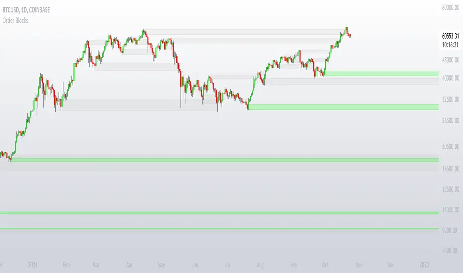
Order BlocksThis is experimental Indicator is to help identifying Order Blocks.
It uses not confirmed higher order pivots as Higher Highs (HH) and Lower Lows (LL), finds high/lows that created most recent LL/HH and in case if this high/low are broken it notes candle that broke structure, market structure broke line (MSB) and demand box (candle that created liquidity for the move that broke structure).
Concepts and parts of code used in this study:
1) @rumpypumpydumpy - Higher Order Pivots
2) @MarkMiddleton2020 - Order Blocks
Broken Fractal : Someone's broken dream is your profit!Idea
The idea is simple : when market turns around, it traps a bunch of traders off guard. We trade with them, in the same direction of their exit!
Method
We let the market first create a fractal
We then let the market create an opposite fractal
We then let the market break the first fractal it created, thereby trapping lots of trades in the process
We then patiently wait till the market gives these trapped traders a chance to exit - and we trade in the same direction
How to use?
Green boxes are for long entry, red boxes are for short.
Whenever a box appears, that's the risk criteria - setup limit orders and trade along!
Works on all timeframes
If you like this script, please leave a note on how you are using it.
I personally use it with Higher Timeframe bias.
PS1 : some traders call this Break of market structure, some call it Breaker, I just call it "Broken Fractal"
PS2 : Break of a broken fractal is also very potent. Watch out for those!
Bollinger Bands Bar ColoringThis is a simple script that colors bars/candles based on where price is relative to the basis, and the upper and lower bands of the Bollinger Bands.
If price is above the basis, candles will be colored green, and if price is below the basis, candles will be colored red.
If price is outside of the bands on either side, the candles will be colored a darker shade of either color depending on if it is above or below.
I created this indicator because I like that at a glance I can have an idea of the bullishness or bearishness of price action based on the Bollinger Bands, without actually having the Bands overlayed on my charts.
It's also quite nice because I find that the areas where there is a shift in candle color (especially from green to red and vice versa) aid in identifying levels of support and resistance, and shifts in market structure.
I have another indicator that is a huge modification of the Bollinger Bands %B, which includes the candle coloring (and MAs), but this frees up space on my chart while still providing me with the primary information I'm looking for.

+ BB %B: MA selection, bar coloring, multi-timeframe, and alerts+ %B is, at its simplest, the classic Bollinger Bands %B indicator with a few added bells and whistles.
However, the right combination of bells and whistles will often improve and make a more adaptable indicator.
Classically, Bollinger Bands %B is an indicator that measures volatility, and the momentum and strength of a trend, and/or price movements.
It shows "overbought" and "oversold" spots on a chart, and is also useful for identifying divergences between price and trend (similar to RSI).
With + %B I've added the options to select one or two moving averages, candle coloring, and a host of others.
Let's start with the moving averages:
There are options for two: one faster and one slower. Or combine them how you will, or omit one or both of them entirely.
Here you will find options for SMA, EMA (as well as double and triple), Hull MA, Jurik MA, Least Squares MA, Triangular MA, Volatility Adjusted MA, and Weighted MA.
A moving average essentially helps to define trend by smoothing the noise of movements of the underlying asset, or, in this case, the output of the indicator.
All of these MAs available track this in a different way, and it's up to the trader to figure out which makes most sense to him/her.
MA's, in my opinion, improve the basic %B by providing a clearer picture of what the indicator is actually "seeing", and may be useful for providing entries and exits.
Next up is candle coloring:
I've added the option for this indicator to color candles on the chart based on where the %B is in relation to its upper and lower bounds, and median line.
If the %B is above the median but below the upper bound, candles will be green (showing bullish market structure). If %B is below the median but above the lower bound, candles will be red (denoting bearish market structure).
Overbought and oversold candles will also be colored on the chart, so that a quick glance will tell you whether price action is bullish/bearish or "oversold"/"overbought".
I've also added functionality that enables candles to be colored based on if the %B has crossed up or crossed down the primary moving average.
One example as a way to potentially use these features is if the candles are showing oversold coloration followed by the %B crossing up your moving average coloration. You might consider a long there (or exit a short position if you are short).
And the last couple of tweaks:
You may set the timeframe to whatever you wish, so maybe you're trading on the hourly, but you want to know where the %B is on the 4h chart. You can do that.
The background fill for the indicator is split into bullish and bearish halves. Obviously you may turn the background off, or make it all one color as well.
I've also added alerts, so you may set alerts for "overbought" and "oversold" conditions.
You may also set alerts for %B crossing over or under the primary moving average, or for crossing the median line.
All of these things may be turned on and off. You can pretty much customize this to your heart's delight. I see no reason why anyone would use the standard %B after playing with this.
I am no coder. I had this idea in my head, though, and I made it happen through referencing another indicator I was familiar with, and watching tutorials on YouTube.
Credits:
Firstly, thanks to www.tradingview.com for his brilliant, free tutorials on YouTube.
Secondly, thanks to www.tradingview.com for his beautiful SSL Hybrid indicator (and his clean code) from which I obtained the MAs.
Please enjoy this indicator, and I hope that it serves you well. :)
MA, MATR, ChEx | All in One - 4CR CUPIn trade position setup, we always need to determine the market structure and manage the position sizing in a short period of decision time. Indicators such as moving average, initial stop loss and trailing stop loss are always helpful.
This indicator put all these handy tools into a single toolkit, which includes the following price action and risk management indicators:
MA - Moving Average
MATR - Moving Average less Average True Range
ChEx - Chandelier Exit
This script further enhances the setting so that you can easily customize the indicators.
For both the Moving Averages and the Moving Average less Average True Range , you can pick a type of moving average which suits your analysis style from a list of commonly used moving average formulations: namely, EMA , HMA , RMA, SMA and WMA , where EMA is selected as default.
The Moving Average less Average True Range , MATR, is usually applied as a reference to set the initial stop loss whenever opening a new position.
The abbreviation, MATR, is picked, so that this can serve as a handy reminder of a very good trading framework as elaborates as below:
M – Market Structure
A – Area of Value
T – Trigger
R – Risk Management (aka. Exit Strategy)
Bitcoin Bulls and Bears by @dbtrBitcoin 🔥 Bulls & Bears 🔥
v1.0
This free-of-charge BTC market analysis indicator helps you better understand what's going with Bitcoin from a high-level perspective. At a glance, it will give you an immediate understanding of Bitcoin’s historic price channel dating back to 2011, past and current market cycles, as well as current key support levels.
Usage
Use this indicator with any BTCUSD pairs , ideally with a long price history (such as BNC:BLX )
We recommend to use this indicator in log mode, combined with Weekly or Monthly timeframe.
Features
🕵🏻♂️ Historic price channel curve since 2011
🚨 Bull & bear market cycles (dynamic)
🔥 All-time highs (dynamic)
🌟 Weekly support (dynamic, based on 20 SMA )
💪 Long-term support (channel bottom)
🔝 Potential future price targets (dynamic)
❎ Overbought RSI coloring
📏 Log/non-log support
🌚 Dark mode support
Remarks
With exception of the price channel curve, anything in this indicator is calculated dynamically , including bull/bear market cycles (based on a tweaked 20SMA), ATHs, and so on. As a result, historic market cycles may not be 100% accurately reflected and may also differ slightly in between various time-frames (closest result: Monthly). The indicator may even consider periods of heavy ups/downs as their own market cycles, even though they weren’t. Due to its dynamic nature, this indicator can however adapt to the future and helps you quickly identify potential changes in market structure, even if the indicator is no longer updated.
On top of that bullmarket cycles (colored in green) feature an ingrained RSI: the darker the green color, the more the RSI is overbought and close to a correction (darkest color in the chart = 90 Weekly RSI). In comparison with past bull cycles, it helps you easily spot potential reversal zones.
Thanks
Thanks to @quantadelic and @mabonyi which both have worked on the BTC "growth zones" indicator including the price channel, of which I have used parts of the code as well as the actual price channel data.
Follow me
Follow me here on TradingView to be notified as soon as new free and premium indicators and trading strategies are published. Inquire me for any other requests.
Enjoy & happy trading!

Ichimoku Kinko Hyo and moreI am publishing my updated Ichimoku ++ study with a more suitable title. Future updates will take place with this version.
Description:
The intention of this script is to build/provide a kind of work station / work bench for analysing markets and especially Bitcoin . Another goal is to get maximum market information while maintaining a good chart overview. A chart overloaded with indicators is useless because the structure of the chart is more difficult to see. The chart should be clear and market structure should be easy to see. The script allows you to add indicators and signals in different visualizations to better assess the quality of signals and the sentiment of the market.
A general advise:
Use the included indicators and signals in a confluent way to get stoploss, buy and sell entry points. SR clusters can be identified for use in conjunction with Fractals and other indicators as entry and exit pints. My other scripts can also help. Prefer 4 hours, daily and a longer time frame. There is no "Holy Grail" :).

Ichimoku ++ public v0.9Description:
The intention of this script is to build/provide a kind of work station / work bench for analysing markets and especially Bitcoin . Another goal is to get maximum market information while maintaining a good chart overview. A chart overloaded with indicators is useless because it obscures the view of the chart as the most important indicator. The chart should be clear and market structure should be easy to see. In addition, some indicator signals can be activated to better assess the quality of signals from the past. The chart environment or the chart context is important for the quality of a signal.
The intention of this script is not to teach someone how to trade or how to use these Indicators but to provide a tool to analyse markets better and to help to draw conclusions of market behaviour in a higher quality.
A general advise:
Use the included indicators and signals in a confluent way to get stoploss, buy and sell entry points. SR clusters can be identified for use in conjunction with fractals as entry and exit pints. My other scripts can also help. Prefer 4 hours, daily and a longer time frame. There is no "Holy Grail" :).
If someone is new to trading you should learn about the indicators first. Definitely learn about Ichimoku Cloud Indicator.
Integrated indicators are:
Ichimoku Cloud and signals
Parabolic SAR and signal
ATR stop
Bollinger Bands
EMA / SMA and background color as signal
Williams Fractals and signal
Puell Multiple signal

SVE Pivot PointsSVE Pivot Points are a modified variation of traditional pivot points created by Sylvain Vervoort (SVE). They are designed to adapt more dynamically to price volatility and short-term market structure, giving traders more responsive support and resistance levels.
Unlike standard floor pivots that rely only on the previous period’s high/low/close, SVE Pivot Points incorporate volatility-based smoothing, making the levels more stable during choppy markets and more reactive when volatility expands.
1. Volatility-Adaptive Formulas
SVE uses smoothing techniques (often EMA-based or Vervoort’s proprietary volatility filters) that adjust to current market noise.
This reduces false levels and gives clearer reaction zones.
2. Dynamic Support & Resistance
You still get:
• Pivot (P)
• Support levels (S1, S2, S3)
• Resistance levels (R1, R2, R3)
But they update based on volatility-weighted highs/lows instead of raw numbers.
3. More Reliable in Intraday Trading
SVE pivot points were designed to:
• Improve accuracy
• Reduce whipsaw
• Give better intraday turning points
This is why they’re popular among futures, forex, and index traders.

BTC – VERI - Valuation & Entity Ratio IndexVERI: Valuation & Entity Ratio IndexObservation-only.
Data: IntoTheBlock.
Overview & Philosophy
The name VERI is derived from the Latin Veritas (Truth). In a crypto market often driven by deceptive speculative noise, this indicator seeks to establish the "On-Chain Truth" of a price trend.
It operates on the thesis that price action is only sustainable when verified by high-conviction capital flows.VERI is a fundamental composite oscillator that fuses Entity Behavior (Who is holding?) with Network Valuation (Is the price fair?) to identify Bitcoin market cycle extremes.
The "Alpha"
Why this Composite stands out: on-chain metrics often tell only half the story.
MVRV tells you if the price is cheap, but not if anyone is actually buying.
Whale Activity tells you if large players are moving, but not if they are accumulating at a value discount.
VERI fuses these two dimensions into a single Z-Score. It identifies the rare, high-probability moments where Smart Money Conviction intersects with Deep Value.
Methodology
The Mathematics of VERI: The indicator constructs a composite index using three fundamental metrics from IntoTheBlock:
The "Who" (Entity Ratio) : We calculate the flow ratio between Whales (>1% supply holders) and Retail (<0.1% supply holders). A rising ratio indicates supply is transferring from weak hands to strong hands.
The "Why" (Valuation Multiplier) : We utilize the MVRV (Market Value to Realized Value) ratio. To isolate value opportunities, we use the inverse (1 / MVRV).
The Fusion : These factors are multiplied to create the raw VERI index.
Normalization & Inversion
We apply a rolling Z-Score (standard deviation from the mean) and invert the result.
How to Interpret the Indicator
Because the output is inverted, the visual logic matches price action intuitively:
🟥 Distribution Zone (High Values > 1.5):
The Signal: "Low Conviction Overvaluation."
Context: The price is historically expensive relative to the cost basis (High MVRV), and Whales are distributing coins to Retail.Implication: Historically precedes macro tops or deep corrections.
🟩 Accumulation Zone (Low Values < -1.5):
The Signal: "High Conviction Undervaluation."Context: The price is historically cheap (Low MVRV), and Whales are aggressively accumulating relative to Retail.
Implication: Historically precedes macro bottoms and generational entry points.
Zero Line : Represents the historical baseline. A crossover of the zero line often confirms a regime shift (e.g., from Bear to Bull).
Visual Guide & Features
Dynamic Coloring: The line turns Red in the Distribution Zone, Blue in the Accumulation Zone, and Orange during neutral trends.
Zone Labels: Static labels are pinned to the left side of the chart for immediate context.
The "Data Check" Monitor (Status Table): Since this indicator relies on third-party fundamental data, we have included a diagnostic table in the bottom-right corner.
Data Check Monitor Guide
STATUS: LIVE (Green): The indicator is functioning correctly. All data feeds (Whales, Retail, MVRV) are being retrieved successfully.
STATUS: WAIT (Red): The indicator cannot retrieve data. This might happen for some reasons, e.g. your TradingView plan may not support IntoTheBlock integration.
Settings
Lookback Period (Default: 365): The window used for Z-Score normalization. We use a full year to smooth out seasonal volatility.
Smoothing (Default: 7): A 7-day smoothing is applied to the signal to filter out daily noise.
Zone Thresholds: Users can customize the specific Z-Score levels for the Distribution and Accumulation bands.
Disclaimer
This script is for research and educational purposes only. It uses historical on-chain data to visualize market structure and does not constitute financial advice. Past performance of whale entities does not guarantee future results.
Tags
bitcoin, btc, on-chain, mvrv, whales, valuation, fundamentals, cycle, oscillator, veri

Fresh Algo | Signals & Overlays™ v25//@version=5
indicator("Fresh Algo | Signals & Overlays™ v25", overlay=true, max_lines_count=500, max_labels_count=500, max_boxes_count=350)
// Telegram Join Us >> t.me
//...................../´¯¯/)
//...................,/¯.../
//.................../..../
//.............../´¯/'..'/´¯¯`·¸
//.........../'/.../..../....../¨¯\
//..........('(....´...´... ¯~/'..')
//...........\..............'...../
//............\....\.........._.·´
//.............\..............(
//..............\..............\
//----
//---------
// Telegram Join Us >> t.me
bullcolor = #00dbff
bearcolor = #b2b5be
ema150 = ta.ema(close, 150)
ema250 = ta.ema(close, 250)
gr_customalert = "Custom Alerts"
gr_signal = "General Configurations"
gr_PullBacksignal = "Trading Assistants"
gr_RiskManage = "Risk Management"
gr_dash = "Dashboard Configurations"
//symbol info
symInfoCheck = false
symInfo = syminfo.ticker + ' | ' + timeframe.period + (timeframe.isminutes ? 'M' : na)
date = str.tostring(dayofmonth(time_close)) + '/' + str.tostring(month(time_close)) + '/' + str.tostring(year(time_close))
//text positioning
textVPosition = 'middle'
textHPosition = 'center'
//symbol info positioning
symVPosition = 'top'
symHPosition = 'left'
//cell size
width = 0
height = 0
//title settings
c_title = #b2b5be80
s_title = 'large'
a_title = 'center'
//subtitle settings
c_subtitle = #b2b5be80
s_subtitle = 'normal'
a_subtitle = 'center'
c_bg = color.new(color.blue, 100)
// Get user input
showSignals = textVPosition == 'middle' and textHPosition == 'center' and c_title == #b2b5be80 and s_title == 'large' and a_title == 'center' and c_subtitle == #b2b5be80 and s_subtitle == 'normal' and a_subtitle == 'center' ? input(true, "Show Signal's", group=gr_signal) : na
//showSignals = true
sensitivity = textVPosition == 'middle' and textHPosition == 'center' and c_title == #b2b5be80 and s_title == 'large' and a_title == 'center' and c_subtitle == #b2b5be80 and s_subtitle == 'normal' and a_subtitle == 'center' ? input.float(2.4, "Sensitivity", 0.1, step=0.1, group=gr_signal): na
STuner = textVPosition == 'middle' and textHPosition == 'center' and c_title == #b2b5be80 and s_title == 'large' and a_title == 'center' and c_subtitle == #b2b5be80 and s_subtitle == 'normal' and a_subtitle == 'center' ? input.int(10, "Signal Tuner(1-25)", minval = 1, maxval = 25, group=gr_signal): na
Presets = "All Signals"
//Presets = input.string("All Signals", "Presets", , group=gr_signal)
filterstyle = textVPosition == 'middle' and textHPosition == 'center' and c_title == #b2b5be80 and s_title == 'large' and a_title == 'center' and c_subtitle == #b2b5be80 and s_subtitle == 'normal' and a_subtitle == 'center' ? input.string("Trending Signals ", "Signal Mode / Filters", ["Trending Signals ", "Contrarian Signals ", "High Volume ", "Strong ", "Swing ", "Smooth ", "Scalping ", "Scalping+ "], group=gr_signal): na
//TextStyle = input.string("Minimal", "Signal Style", , group=gr_signal)
//periodTrendCloud = input.string("Smooth", "Trend Cloud Style", , group=gr_Other_Settings)
TextStyle = "Minimal"
consSignalsFilter = filterstyle == "Trending Signals " ? true : false
StrongSignalsOnly = filterstyle == "Strong " ? true : false
highVolSignals = filterstyle == "High Volume " ? true : false
signalsTrendCloud = (filterstyle == "Smooth ") ? true : (filterstyle == "Scalping ") ? true : (filterstyle == "Scalping+ ") ? true : (filterstyle == "Swing ") ? true : false
ContrarianOnly = filterstyle == "Contrarian Signals " ? true : false
TrendMap = 'Trend Gradient'
momentumCandles = false
assistantenable = textVPosition == 'middle' and textHPosition == 'center' and c_title == #b2b5be80 and s_title == 'large' and a_title == 'center' and c_subtitle == #b2b5be80 and s_subtitle == 'normal' and a_subtitle == 'center' ? input(true,'', group=gr_PullBacksignal, inline = 'sexyshit'): na
assistantmode = textVPosition == 'middle' and textHPosition == 'center' and c_title == #b2b5be80 and s_title == 'large' and a_title == 'center' and c_subtitle == #b2b5be80 and s_subtitle == 'normal' and a_subtitle == 'center' ? input.string('Trend Assistant', 'Assistant | Mode', , group = gr_PullBacksignal, inline = 'sexyshit'): na
Show_PR = textVPosition == 'middle' and textHPosition == 'center' and c_title == #b2b5be80 and s_title == 'large' and a_title == 'center' and c_subtitle == #b2b5be80 and s_subtitle == 'normal' and a_subtitle == 'center' ? input.bool(true, title="", group = gr_PullBacksignal , inline = "Features1"): na
MSTuner = textVPosition == 'middle' and textHPosition == 'center' and c_title == #b2b5be80 and s_title == 'large' and a_title == 'center' and c_subtitle == #b2b5be80 and s_subtitle == 'normal' and a_subtitle == 'center' ? input.int(8, "Reversal Dot | Tuner(2-30)", minval = 2, maxval = 30, group=gr_PullBacksignal, inline = "Features1"): na
LongTrendAverage = assistantmode == 'Trend Tracker' and assistantenable == true ? true : false
analyscloud = assistantmode == 'Trend Assistant' and assistantenable == true ? true : false
showTrendCloud = (filterstyle == "Smooth ") ? true : (filterstyle == "Scalping ") ? true : (filterstyle == "Scalping+ ") ? true : (filterstyle == "Swing ") ? true : false
periodTrendCloud = (filterstyle == "Smooth ") ? "Smooth" : (filterstyle == "Scalping ") ? "Scalping" : (filterstyle == "Scalping+ ") ? "Scalping+" : (filterstyle == "Swing ") ? "Swing" : na
//ScalpingPlus = input(false, "Fast trend cloud", group=gr_Other_Settings)
//fastTrendCloudLen = input.int(55, "Fast trend cloud", 2, group=gr_Other_Settings)
fill(plot(showTrendCloud and periodTrendCloud == "Smooth" ? na : assistantenable == true and assistantmode == 'Trend Tracker' ? ema150 : na, "", na, editable=false), plot(showTrendCloud and periodTrendCloud == "Smooth" ? na : assistantenable == true and assistantmode == 'Trend Tracker' ? ema250 : na, "", na, editable=false), ema150 > ema250 ? color.new(bullcolor, 70) : ema150 < ema250 ? color.new(bearcolor, 70) : na)
showDashboard = textVPosition == 'middle' and textHPosition == 'center' and c_title == #b2b5be80 and s_title == 'large' and a_title == 'center' and c_subtitle == #b2b5be80 and s_subtitle == 'normal' and a_subtitle == 'center' ? input(true, "Smart Panel", group = gr_dash , inline = "Features1"): na
locationDashboard = textVPosition == 'middle' and textHPosition == 'center' and c_title == #b2b5be80 and s_title == 'large' and a_title == 'center' and c_subtitle == #b2b5be80 and s_subtitle == 'normal' and a_subtitle == 'center' ? input.string("Bottom Right", "Dashboard Location", , group = gr_dash , tooltip="Smart Panel"): na
sizeDashboard = textVPosition == 'middle' and textHPosition == 'center' and c_title == #b2b5be80 and s_title == 'large' and a_title == 'center' and c_subtitle == #b2b5be80 and s_subtitle == 'normal' and a_subtitle == 'center' ? input.string("Small", "Dashboard Size", , group = gr_dash , tooltip="Smart Panel"): na
tpLabels = textVPosition == 'middle' and textHPosition == 'center' and c_title == #b2b5be80 and s_title == 'large' and a_title == 'center' and c_subtitle == #b2b5be80 and s_subtitle == 'normal' and a_subtitle == 'center' ? input(true, "Dynamic Take Profit Lables", group=gr_RiskManage): na
ShowTpSlAreas = textVPosition == 'middle' and textHPosition == 'center' and c_title == #b2b5be80 and s_title == 'large' and a_title == 'center' and c_subtitle == #b2b5be80 and s_subtitle == 'normal' and a_subtitle == 'center' ? input(true, "Show take Profit/Stop-loss Area", group=gr_RiskManage): na
ShowTrailingSL = textVPosition == 'middle' and textHPosition == 'center' and c_title == #b2b5be80 and s_title == 'large' and a_title == 'center' and c_subtitle == #b2b5be80 and s_subtitle == 'normal' and a_subtitle == 'center' ? input(false, "Show trailing Stop-loss", group=gr_RiskManage): na
usePercSL = textVPosition == 'middle' and textHPosition == 'center' and c_title == #b2b5be80 and s_title == 'large' and a_title == 'center' and c_subtitle == #b2b5be80 and s_subtitle == 'normal' and a_subtitle == 'center' ? input(false, "SL/TRAILING", inline="1", group=gr_RiskManage): na
percTrailingSL = textVPosition == 'middle' and textHPosition == 'center' and c_title == #b2b5be80 and s_title == 'large' and a_title == 'center' and c_subtitle == #b2b5be80 and s_subtitle == 'normal' and a_subtitle == 'center' ? input.float(1, "", 0, step=0.1, inline="1", group=gr_RiskManage): na
useTP1 = textVPosition == 'middle' and textHPosition == 'center' and c_title == #b2b5be80 and s_title == 'large' and a_title == 'center' and c_subtitle == #b2b5be80 and s_subtitle == 'normal' and a_subtitle == 'center' ? input(true, "", inline="1", group=gr_RiskManage): na
multTP1 = textVPosition == 'middle' and textHPosition == 'center' and c_title == #b2b5be80 and s_title == 'large' and a_title == 'center' and c_subtitle == #b2b5be80 and s_subtitle == 'normal' and a_subtitle == 'center' ? input.float(1, "TP 1", 0, inline="1", group=gr_RiskManage): na
useTP2 = textVPosition == 'middle' and textHPosition == 'center' and c_title == #b2b5be80 and s_title == 'large' and a_title == 'center' and c_subtitle == #b2b5be80 and s_subtitle == 'normal' and a_subtitle == 'center' ? input(true, "", inline="4", group=gr_RiskManage): na
multTP2 = textVPosition == 'middle' and textHPosition == 'center' and c_title == #b2b5be80 and s_title == 'large' and a_title == 'center' and c_subtitle == #b2b5be80 and s_subtitle == 'normal' and a_subtitle == 'center' ? input.float(2, "TP 2 ", 0, inline="4", group=gr_RiskManage): na
useTP3 = textVPosition == 'middle' and textHPosition == 'center' and c_title == #b2b5be80 and s_title == 'large' and a_title == 'center' and c_subtitle == #b2b5be80 and s_subtitle == 'normal' and a_subtitle == 'center' ? input(true, "", inline="4", group=gr_RiskManage): na
multTP3 = textVPosition == 'middle' and textHPosition == 'center' and c_title == #b2b5be80 and s_title == 'large' and a_title == 'center' and c_subtitle == #b2b5be80 and s_subtitle == 'normal' and a_subtitle == 'center' ? input.float(3, "TP 3", 0, inline="4", group=gr_RiskManage): na
ShowSwings = textVPosition == 'middle' and textHPosition == 'center' and c_title == #b2b5be80 and s_title == 'large' and a_title == 'center' and c_subtitle == #b2b5be80 and s_subtitle == 'normal' and a_subtitle == 'center' ? input(false, "Show Market Structure ", inline="3", group=gr_RiskManage): na
periodSwings = textVPosition == 'middle' and textHPosition == 'center' and c_title == #b2b5be80 and s_title == 'large' and a_title == 'center' and c_subtitle == #b2b5be80 and s_subtitle == 'normal' and a_subtitle == 'center' ? input.int(10, " ", 2, inline="3", group=gr_RiskManage): na
//showTS = input(title='Show Trend Shifter', defval=false, group='Contrarian SIGNALS')
// showsignals = input(title='Show Signals', defval=false, group='Contrarian SIGNALS')
// Alerts Managemnt
Normalbuy_alert = textVPosition == 'middle' and textHPosition == 'center' and c_title == #b2b5be80 and s_title == 'large' and a_title == 'center' and c_subtitle == #b2b5be80 and s_subtitle == 'normal' and a_subtitle == 'center' ? input.bool(title='Buy Signal ', defval=false, inline = "NB", group=gr_customalert): na
Strongbuy_alert = textVPosition == 'middle' and textHPosition == 'center' and c_title == #b2b5be80 and s_title == 'large' and a_title == 'center' and c_subtitle == #b2b5be80 and s_subtitle == 'normal' and a_subtitle == 'center' ? input.bool(title='Strong Buy', defval=false, inline = "NB", group=gr_customalert): na
Normalsell_alert = textVPosition == 'middle' and textHPosition == 'center' and c_title == #b2b5be80 and s_title == 'large' and a_title == 'center' and c_subtitle == #b2b5be80 and s_subtitle == 'normal' and a_subtitle == 'center' ? input.bool(title='Sell Signal ', defval=false , inline = "NS", group=gr_customalert): na
Strongsell_alert = textVPosition == 'middle' and textHPosition == 'center' and c_title == #b2b5be80 and s_title == 'large' and a_title == 'center' and c_subtitle == #b2b5be80 and s_subtitle == 'normal' and a_subtitle == 'center' ? input.bool(title='Strong Sell', defval=false , inline = "NS", group=gr_customalert): na
slalert = textVPosition == 'middle' and textHPosition == 'center' and c_title == #b2b5be80 and s_title == 'large' and a_title == 'center' and c_subtitle == #b2b5be80 and s_subtitle == 'normal' and a_subtitle == 'center' ? input.bool(title='Stop-Loss ', defval=false , inline = "SLTP1", group=gr_customalert): na
tp1alert = textVPosition == 'middle' and textHPosition == 'center' and c_title == #b2b5be80 and s_title == 'large' and a_title == 'center' and c_subtitle == #b2b5be80 and s_subtitle == 'normal' and a_subtitle == 'center' ? input.bool(title='Target 1', defval=false , inline = "SLTP1", group=gr_customalert): na
tp2alert = textVPosition == 'middle' and textHPosition == 'center' and c_title == #b2b5be80 and s_title == 'large' and a_title == 'center' and c_subtitle == #b2b5be80 and s_subtitle == 'normal' and a_subtitle == 'center' ? input.bool(title='Target 2 ', defval=false , inline = "TP2TP3", group=gr_customalert): na
tp3alert = textVPosition == 'middle' and textHPosition == 'center' and c_title == #b2b5be80 and s_title == 'large' and a_title == 'center' and c_subtitle == #b2b5be80 and s_subtitle == 'normal' and a_subtitle == 'center' ? input.bool(title='Target 3', defval=false , inline = "TP2TP3", group=gr_customalert): na
bullcrosscloud_alert = textVPosition == 'middle' and textHPosition == 'center' and c_title == #b2b5be80 and s_title == 'large' and a_title == 'center' and c_subtitle == #b2b5be80 and s_subtitle == 'normal' and a_subtitle == 'center' ? input.bool(title='Bullish Cloud', defval=false, inline = "CD", group=gr_customalert): na
bearcrosscloud_alert = textVPosition == 'middle' and textHPosition == 'center' and c_title == #b2b5be80 and s_title == 'large' and a_title == 'center' and c_subtitle == #b2b5be80 and s_subtitle == 'normal' and a_subtitle == 'center' ? input.bool(title='Bearish Cloud', defval=false, inline = "CD", group=gr_customalert): na
showCons = false
paintCons = false
// Signal Text
SimpleBuy = "Buy"
StrongB = "Strong\nBuy"
SimpleSell = "Sell"
StrongS = "Strong\nSell"
if TextStyle == "Normal"
SimpleBuy := "Buy"
StrongB := "Strong\nBuy"
SimpleSell:= "Sell"
StrongS := "Strong\nSell"
if TextStyle == "Minimal"
SimpleBuy := "▲"
StrongB := "▲+"
SimpleSell:= "▼"
StrongS := "▼+"
// Signal Text Color
// bullsignalcolor = #000000
// bearsignalcolor = color.rgb(0, 0, 0)
// if TextStyle == "Normal"
// bullsignalcolor := color.rgb(0, 0, 0)
// bearsignalcolor := color.rgb(0, 0, 0)
// if TextStyle == "Minimal"
// bullsignalcolor := color.rgb(0, 0, 0)
// bearsignalcolor := color.rgb(0, 0, 0)
src = close
RSII = ta.ema(ta.rsi(src, 50), 30)
TR = math.abs(RSII - RSII )
wwalpha = 1 / 50
WWMA = 0.0
WWMA := wwalpha * TR + (1 - wwalpha) * nz(WWMA )
ATRRSI = 0.0
ATRRSI := wwalpha * WWMA + (1 - wwalpha) * nz(ATRRSI )
TsFast = ta.ema(ta.rsi(src, 50), 30)
TsUP = TsFast + ATRRSI * 4.236
TsDN = TsFast - ATRRSI * 4.236
textWatermark = table.new(textVPosition + '_' + textHPosition, 1, 3)
TsSlow = 0.0
TsSlow := TsUP < nz(TsSlow ) ? TsUP : TsFast > nz(TsSlow ) and TsFast < nz(TsSlow ) ? TsDN : TsDN > nz(TsSlow ) ? TsDN : TsFast < nz(TsSlow ) and TsFast > nz(TsSlow ) ? TsUP : nz(TsSlow )
Colorh = TsFast > 55 ? color.rgb(255, 0, 0) : TsFast < 45 ? color.rgb(0, 255, 8) : #ffffff
//QQF = plot(TsFast, 'TS FAST', color=color.new(color.maroon, 100), linewidth=2, display=display.none, editable = false)
//QQS = plot(TsSlow, 'TS SLOW', color=color.new(color.white, 100), linewidth=2, display=display.none , editable = false)
//plot(TsFast, color=Colorh, linewidth=2, style=plot.style_area, histbase=50)
//BearLimit = hline(60, color=color.gray, linestyle=hline.style_dashed)
//BullLimt = hline(40, color=color.gray, linestyle=hline.style_dashed)
bulllim = 45
bearlim = 55
BullSignalr = ta.crossover(TsFast, TsSlow) and TsFast < bulllim
BearSignallr = ta.crossunder(TsFast, TsSlow) and TsFast > bearlim
/////////////////////////////////////////////////////////
// Trap Detector
////////////////////////////////////////////////////////
// Functions
wavetrend(src, chlLen, avgLen) =>
esa = ta.ema(src, chlLen)
d = ta.ema(math.abs(src - esa), chlLen)
ci = (src - esa) / (0.015 * d)
wt1 = ta.ema(ci, avgLen)
wt2 = ta.sma(wt1, 3)
f_top_fractal(src) => src < src and src < src and src > src and src > src
f_bot_fractal(src) => src > src and src > src and src < src and src < src
f_fractalize (src) => f_top_fractal(src) ? 1 : f_bot_fractal(src) ? -1 : 0
f_findDivs(src, topLimit, botLimit) =>
fractalTop = f_fractalize(src) > 0 and src >= topLimit ? src : na
fractalBot = f_fractalize(src) < 0 and src <= botLimit ? src : na
highPrev = ta.valuewhen(fractalTop, src , 0)
highPrice = ta.valuewhen(fractalTop, high , 0)
lowPrev = ta.valuewhen(fractalBot, src , 0)
lowPrice = ta.valuewhen(fractalBot, low , 0)
bearSignal = fractalTop and high > highPrice and src < highPrev
bullSignal = fractalBot and low < lowPrice and src > lowPrev
// Get components
= wavetrend(close, 5*MSTuner, 10*MSTuner)
= f_findDivs(wt2, 10, -35)
= f_findDivs(wt2, 40, -70)
wtDivBull = wtDivBull1 or wtDivBull2
wtDivBear = wtDivBear1 or wtDivBear2
plotshape(ta.crossover(wt1, wt2) and Show_PR and wt2 <= -60 and textVPosition == 'middle' and textHPosition == 'center' and c_title == #b2b5be80 and s_title == 'large' and a_title == 'center' and c_subtitle == #b2b5be80 and s_subtitle == 'normal' and a_subtitle == 'center', "Reversal Dot Buy" , shape.circle, location.belowbar, color.new(bullcolor,60), size=size.tiny)
plotshape(ta.crossunder(wt1, wt2) and Show_PR and wt2 >= 60 and textVPosition == 'middle' and textHPosition == 'center' and c_title == #b2b5be80 and s_title == 'large' and a_title == 'center' and c_subtitle == #b2b5be80 and s_subtitle == 'normal' and a_subtitle == 'center', "Reversal Dot Sell", shape.circle, location.abovebar, color.new(bearcolor,60), size=size.tiny)
rsi = ta.rsi(close ,14)
// Functions
f_chartTfInMinutes() =>
float _resInMinutes = timeframe.multiplier * (
timeframe.isseconds ? 1. / 60 :
timeframe.isminutes ? 1. :
timeframe.isdaily ? 60. * 24 :
timeframe.isweekly ? 60. * 24 * 7 :
timeframe.ismonthly ? 60. * 24 * 30.4375 : na)
atr(len) =>
tr = ta.tr
atr = 0.0
atr := nz(atr + (tr - atr ) / len, tr)
supertrend(src, factor, len) =>
atr = ta.atr(len)
upperBand = src + factor * atr
lowerBand = src - factor * atr
prevLowerBand = nz(lowerBand )
prevUpperBand = nz(upperBand )
lowerBand := lowerBand > prevLowerBand or close < prevLowerBand ? lowerBand : prevLowerBand
upperBand := upperBand < prevUpperBand or close > prevUpperBand ? upperBand : prevUpperBand
int direction = na
float superTrend = na
prevSuperTrend = superTrend
if prevSuperTrend == prevUpperBand
direction := close > upperBand ? 1 : -1
else
direction := close < lowerBand ? -1 : 1
superTrend := direction == 1 ? lowerBand : direction == -1 ? upperBand : na
dchannel(len)=>
hh = ta.highest(len)
ll = ta.lowest (len)
trend = 0
trend := close > hh ? 1 : close < ll ? -1 : nz(trend )
trendScalper(show, len1, len2, len3, colorBull, colorBear, colorBarBull, colorBarBear) =>
avgOC = math.avg(open, close)
ha_o = 0.0, ha_o := na(ha_o ) ? avgOC : (ha_o + ohlc4 ) / 2
ema1 = ta.ema(ha_o, len1), ema2 = ta.ema(ha_o, len2), ema3 = ta.ema(ha_o, len3)
ris1 = ema1 > ema1 , ris2 = ema2 > ema2 , ris3 = ema3 > ema3
fal1 = ema1 < ema1 , fal2 = ema2 < ema2 , fal3 = ema3 < ema3
colorEma1 = ris1 ? colorBull : fal1 ? colorBear : na, colorEma2 = ris2 ? colorBull : fal2 ? colorBear : na, colorEma3 = ris3 ? colorBull : fal3 ? colorBear : na
fillEma1 = avgOC > ema1 ? colorBull : avgOC < ema1 ? colorBear : na, fillEma2 = ema1 > ema2 ? colorBull : ema1 < ema2 ? colorBear : na, fillEma3 = ema2 > ema3 ? colorBull : ema2 < ema3 ? colorBear : na
colorBar = close < ema1 and close < ema2 ? colorBarBear : colorBarBull
candlesMom() =>
= ta.macd(close, 2, 4, 3)
(macd > 10 and macd > macd ) or (macd < 10 and macd < macd )
trailingSL(buy, sell, factor, len, usePerc, perc) =>
atr = atr(len)
upperBand = high + (usePerc ? high * (perc / 100) : factor * atr)
lowerBand = low - (usePerc ? low * (perc / 100) : factor * atr)
prevLowerBand = nz(lowerBand )
prevUpperBand = nz(upperBand )
lowerBand := lowerBand > prevLowerBand or buy ? lowerBand : prevLowerBand
upperBand := upperBand < prevUpperBand or sell ? upperBand : prevUpperBand
int direction = na
float stop = na
prevSuperTrend = stop
if prevSuperTrend == prevUpperBand
direction := buy ? 1 : -1
else
direction := sell ? -1 : 1
stop := direction == 1 ? lowerBand : direction == -1 ? upperBand : na
add_to_zz(zz, val, bi) =>
array.unshift(zz, bi)
array.unshift(zz, val)
if array.size(zz) > 12
array.pop(zz)
update_zz(zz, val, bi, dir) =>
if array.size(zz) == 0
add_to_zz(zz, val, bi)
else
if dir == 1 and val > array.get(zz, 0) or dir == -1 and val < array.get(zz, 0)
array.set(zz, 0, val)
array.set(zz, 1, bi)
0
// Get components
vosc = ta.obv - ta.ema(ta.obv, 20)
bs = ta.ema(nz(math.abs((open - close) / (high - low) * 100)), 3)
ema = ta.ema(close, 200)
emaBull = close > ema
equal_tf(res) => str.tonumber(res) == f_chartTfInMinutes()
higher_tf(res) => str.tonumber(res) > f_chartTfInMinutes()
too_small_tf(res) => (timeframe.isweekly and res=="1") or (timeframe.ismonthly and str.tonumber(res) < 10)
securityNoRep(sym, res, src) =>
bool bull = na
bull := equal_tf(res) ? src : bull
bull := higher_tf(res) ? request.security(sym, res, src, barmerge.gaps_off, barmerge.lookahead_on) : bull
bull_array = request.security_lower_tf(syminfo.tickerid, higher_tf(res) ? str.tostring(f_chartTfInMinutes()) : too_small_tf(res) ? (timeframe.isweekly ? "3" : "10") : res, src)
if array.size(bull_array) > 1 and not equal_tf(res) and not higher_tf(res)
bull := array.pop(bull_array)
array.clear(bull_array)
bull
//TF1Bull = securityNoRep(syminfo.tickerid, "1" , emaBull)
//TF3Bull = securityNoRep(syminfo.tickerid, "3" , emaBull)
TF5Bull = securityNoRep(syminfo.tickerid, "5" , emaBull)
//TF10Bull = securityNoRep(syminfo.tickerid, "10" , emaBull)
TF15Bull = securityNoRep(syminfo.tickerid, "15" , emaBull)
TF30Bull = securityNoRep(syminfo.tickerid, "30" , emaBull)
TF60Bull = securityNoRep(syminfo.tickerid, "60" , emaBull)
//TF120Bull = securityNoRep(syminfo.tickerid, "120" , emaBull)
TF240Bull = securityNoRep(syminfo.tickerid, "240" , emaBull)
//TF720Bull = securityNoRep(syminfo.tickerid, "720" , emaBull)
//TFDBull = securityNoRep(syminfo.tickerid, "1440", emaBull)
hma55 = ta.hma(close, 55 )
= ta.macd(close, 12, 26, 9)
supertrend = supertrend(close, sensitivity, STuner)
maintrend = dchannel(30)
confBull = (ta.crossover (close, supertrend) or (ta.crossover (close, supertrend) and maintrend < 0)) and macd > 0 and macd > macd and ema150 > ema250 and hma55 > hma55 and maintrend > 0 and textVPosition == 'middle' and textHPosition == 'center' and c_title == #b2b5be80 and s_title == 'large' and a_title == 'center' and c_subtitle == #b2b5be80 and s_subtitle == 'normal' and a_subtitle == 'center'
confBear = (ta.crossunder(close, supertrend) or (ta.crossunder(close, supertrend) and maintrend > 0)) and macd < 0 and macd < macd and ema150 < ema250 and hma55 < hma55 and maintrend < 0 and textVPosition == 'middle' and textHPosition == 'center' and c_title == #b2b5be80 and s_title == 'large' and a_title == 'center' and c_subtitle == #b2b5be80 and s_subtitle == 'normal' and a_subtitle == 'center'
trendcloud = supertrend(ohlc4, periodTrendCloud == "Swing" ? 7 : 4, 10)
hma = periodTrendCloud == "Scalping+" ? ta.hma(close, 55) : na
none = close > 0
= ta.dmi(14, 14)
consFilter = adx > 20
ContBear = TsFast > 65
ContBull = TsFast < 35
StrongFilter = ta.ema(close, 200)
//volFilter = (ta.ema(volume, 25) - ta.ema(volume, 26)) / ta.ema(volume, 26) > 0
volFilter = (ta.ema(volume, 15) - ta.ema(volume, 20)) / ta.ema(volume, 25) > 0
trendFilter = trendcloud
bull = (Presets == "All Signals" ? ta.crossover (close, supertrend) : confBull and not confBull ) and Presets != "Trend Scalper" and (StrongSignalsOnly ? close > StrongFilter : none) and (ContrarianOnly ? ContBull : none) and (consSignalsFilter ? consFilter : none) and (highVolSignals ? volFilter : none) and (signalsTrendCloud ? (periodTrendCloud == "Smooth" ? ema150 > ema250 : close > trendFilter) : none)
bear = (Presets == "All Signals" ? ta.crossunder(close, supertrend) : confBear and not confBear ) and Presets != "Trend Scalper" and (StrongSignalsOnly ? close < StrongFilter : none) and (ContrarianOnly ? ContBear : none) and (consSignalsFilter ? consFilter : none) and (highVolSignals ? volFilter : none) and (signalsTrendCloud ? (periodTrendCloud == "Smooth" ? ema150 < ema250 : close < trendFilter) : none)
countBull = ta.barssince(bull)
countBear = ta.barssince(bear)
trigger = nz(countBull, bar_index) < nz(countBear, bar_index) ? 1 : 0
= trendScalper(Presets == "Trend Scalper" ? true : false, 5, 9, 21, bullcolor, bearcolor, bullcolor, bearcolor)
trailingStop = trailingSL(bull, bear, 2.2, 14, usePercSL, percTrailingSL)
float _ph = ta.highestbars(high, periodSwings) == 0 ? high : na
float _pl = ta.lowestbars (low, periodSwings) == 0 ? low : na
var _dir = 0, dir_ = _pl and na(_ph) ? -1 : _dir, _dir := _ph and na(_pl) ? 1 : dir_, dirChg = ta.change(_dir)
var zz = array.new_float(0), zzOld = array.copy(zz)
float zzLive = _ph or _pl ? (dirChg ? add_to_zz(zz, _dir == 1 ? _ph : _pl, bar_index) : update_zz(zz, _dir == 1 ? _ph : _pl, bar_index, _dir)) : na
float hb_ = ta.highestbars(10) == 0 ? high : na
float lb_ = ta.lowestbars (10) == 0 ? low : na
var int dir = 0
float zz_ = na
float pp = na
var int consCnt = 0
var float condHi = na
var float condLo = na
float H_ = ta.highest(5)
float L_ = ta.lowest (5)
var line lineUp = na
var line lineDn = na
bool breakUp = false
bool breakDn = false
var float pvh1_price = array.new_float(1000, na)
var int pvh1_time = array.new_int (1000, na)
var float pvl1_price = array.new_float(1000, na)
var int pvl1_time = array.new_int (1000, na)
var float pvh2_price = array.new_float(1000, na)
var int pvh2_time = array.new_int (1000, na)
var float pvl2_price = array.new_float(1000, na)
var int pvl2_time = array.new_int (1000, na)
var float htcmrll_price = na
var int htcmrll_time = na
var float ltcmrhh_price = na
var int ltcmrhh_time = na
var box long_boxes = array.new_box()
var box short_boxes = array.new_box()
var float temp_pv_0 = na
var float temp_pv_1 = na
var float temp_pv_2 = na
bool pvh = high < high and high > high
bool pvl = low > low and low < low
int pv1_time = bar_index
float pv1_high = high
float pv1_low = low
var buyBars = array.new_box(365, na)
for i = 0 to 364
box.delete(array.get(buyBars, i))
var sellBars = array.new_box(365, na)
for i = 0 to 364
box.delete(array.get(sellBars, i))
// Colors
green = bullcolor, green50 = color.new(green, 50), green20 = color.new(green, 80)
red = bearcolor, red50 = color.new(red, 50), red20 = color.new(red, 80)
silver = #B2B5BE, silver50 = color.new(silver, 50), silver20 = color.new(silver, 80)
// Plots
atrBand = usePercSL ? (trigger ? low : high) * (percTrailingSL / 100) : ta.atr(14) * 2.2
atrStop = trigger ? low - atrBand : high + atrBand
lastTrade(src) => ta.valuewhen(bull or bear, src, 0)
entry_y = lastTrade(close)
stop_y = lastTrade(atrStop)
tp1_y = (entry_y-lastTrade(atrStop))*multTP1 + entry_y
tp2_y = (entry_y-lastTrade(atrStop))*multTP2 + entry_y
tp3_y = (entry_y-lastTrade(atrStop))*multTP3 + entry_y
labelTpSl(cond, y, txt, color) =>
label labelTpSl = ShowTpSlAreas and cond ? label.new(bar_index + 1, y, txt, xloc.bar_index, yloc.price, color, label.style_label_left, color.white, size.normal) : na
label.delete(labelTpSl )
labelTpSl(none, entry_y, "Entry : " + str.tostring(math.round_to_mintick(entry_y)), color.orange)
labelTpSl(none, stop_y , "Stop loss : " + str.tostring(math.round_to_mintick(atrStop)), bearcolor)
labelTpSl(useTP1 and multTP1 != 0, tp1_y, "TP 1 : " + str.tostring(math.round_to_mintick(tp1_y)), bullcolor)
labelTpSl(useTP2 and multTP2 != 0, tp2_y, "TP 2 : " + str.tostring(math.round_to_mintick(tp2_y)), bullcolor)
labelTpSl(useTP3 and multTP3 != 0, tp3_y, "TP 3 : " + str.tostring(math.round_to_mintick(tp3_y)), bullcolor)
lineTpSl(cond, y, color, style) =>
line lineTpSl = ShowTpSlAreas and cond ? line.new(bar_index - (trigger ? countBull : countBear), y, bar_index + 1, y, xloc.bar_index, extend.none, color, style) : na
line.delete(lineTpSl )
lineTpSl(none, entry_y, color.orange, line.style_dashed)
lineTpSl(none, stop_y , bearcolor , line.style_solid )
lineTpSl(useTP1 and multTP1 != 0, tp1_y, bullcolor, line.style_dotted)
lineTpSl(useTP2 and multTP2 != 0, tp2_y, bullcolor, line.style_dotted)
lineTpSl(useTP3 and multTP3 != 0, tp3_y, bullcolor, line.style_dotted)
buy = showSignals and bull ? label.new(bar_index, low , close > StrongFilter ? StrongB : SimpleBuy , xloc.bar_index, yloc.belowbar, bullcolor, label.style_label_up , #000000, size.normal) : na
sell = showSignals and bear ? label.new(bar_index, high, close < StrongFilter ? StrongS : SimpleSell , xloc.bar_index, yloc.abovebar, bearcolor , label.style_label_down, #000000, size.normal) : na
tpLabels(tp) =>
tp1Bull = ta.crossover (rsi, 70), tp2Bull = ta.crossover (rsi, 75), tp3Bull = ta.crossover (rsi, 80)
tp1Bear = ta.crossunder(rsi, 30), tp2Bear = ta.crossunder(rsi, 25), tp3Bear = ta.crossunder(rsi, 20)
tp1Bull := tp1Bull and (nz(ta.barssince(tp1Bull) , 9999) > countBull), tp2Bull := tp2Bull and (ta.barssince(tp1Bull) <= countBull), tp2Bull := tp2Bull and (nz(ta.barssince(tp2Bull) , 9999) > countBull), tp3Bull := tp3Bull and (ta.barssince(tp2Bull) <= countBull), tp3Bull := tp3Bull and (nz(ta.barssince(tp3Bull) , 9999) > countBull)
tp1Bear := tp1Bear and (nz(ta.barssince(tp1Bear) , 9999) > countBear), tp2Bear := tp2Bear and (ta.barssince(tp1Bear) <= countBear), tp2Bear := tp2Bear and (nz(ta.barssince(tp2Bear) , 9999) > countBear), tp3Bear := tp3Bear and (ta.barssince(tp2Bear) <= countBear), tp3Bear := tp3Bear and (nz(ta.barssince(tp3Bear) , 9999) > countBear)
if Presets != "Trend Scalper" and tpLabels
trigger ? (tp == 1 ? tp1Bull : tp == 2 ? tp2Bull : tp3Bull) : (tp == 1 ? tp1Bear : tp == 2 ? tp2Bear : tp3Bear)
plotshape(tpLabels(1), "", shape.xcross, location.abovebar, trigger ? green : na , 0, "TP 1", trigger ? green : na , false)
plotshape(tpLabels(2), "", shape.xcross, location.abovebar, trigger ? green : na , 0, "TP 2", trigger ? green : na , false)
plotshape(tpLabels(3), "", shape.xcross, location.abovebar, trigger ? green : na , 0, "TP 3", trigger ? green : na , false)
plotshape(tpLabels(1), "", shape.xcross, location.belowbar, trigger ? na : red, 0, "TP 1", trigger ? na : red, false)
plotshape(tpLabels(2), "", shape.xcross, location.belowbar, trigger ? na : red, 0, "TP 2", trigger ? na : red, false)
plotshape(tpLabels(3), "", shape.xcross, location.belowbar, trigger ? na : red, 0, "TP 3", trigger ? na : red, false)
var label zzLabel = na
if array.size(zz) > 12 and ShowSwings
if array.get(zz, 0) != array.get(zzOld, 0) or array.get(zz, 1) != array.get(zzOld, 1)
if array.get(zz, 2) == array.get(zzOld, 2) and array.get(zz, 3) == array.get(zzOld, 3)
label.delete(zzLabel)
zzLabel := label.new(math.round(array.get(zz, 1)), array.get(zz, 0), _dir == 1 ? array.get(zz, 0) > array.get(zz, 4) ? ((array.get(zz, 4) < array.get(zz, 8)) ? "High" : "HH") : "LH" : array.get(zz, 0) < array.get(zz, 4) ? ((array.get(zz, 4) > array.get(zz, 8)) ? "Low" : "LL") : "HL", xloc.bar_index, yloc.price, color.new(color.white, 100), _dir == 1 ? label.style_label_down : label.style_label_up, _dir == 1 ? bullcolor : bearcolor)
if showCons and barstate.isconfirmed
dir := hb_ and na(lb_) ? 1 : lb_ and na(hb_) ? -1 : dir
if hb_ and lb_
if dir == 1
zz_ := hb_
else
zz_ := lb_
else
zz_ := hb_ ? hb_ : lb_ ? lb_ : na
for x = 0 to 1000
if na(close) or dir != dir
break
if zz_
if na(pp)
pp := zz_
else
if dir == 1 and zz_ > pp
pp := zz_
if dir == -1 and zz_ < pp
pp := zz_
if pp != pp
if consCnt > 5
if pp > condHi
breakUp := true
if pp < condLo
breakDn := true
if consCnt > 0 and pp <= condHi and pp >= condLo
consCnt += 1
else
consCnt := 0
else
consCnt += 1
if consCnt >= 5
if consCnt == 5
condHi := H_
condLo := L_
else
line.delete(lineUp)
line.delete(lineDn)
condHi := math.max(condHi, high)
condLo := math.min(condLo, low )
lineUp := line.new(bar_index, condHi , bar_index - consCnt, condHi , color=bearcolor , style=line.style_dashed)
lineDn := line.new(bar_index, condLo , bar_index - consCnt, condLo , color=color.lime, style=line.style_dashed)
fill(plot(condHi, "", na, 1, plot.style_stepline, editable=false), plot(condLo, "", na, 1, plot.style_stepline, editable=false), paintCons and consCnt > 5 ? color.white : na, "", false)
//buy_col = color.new(#0ac20a,0)
//sell_col = color.new(#fd1605,0)
//text_col = color.new(#FFFFFF,0)
// -------- Bearish trend (blue) color selection --------
// getSellColor(count) =>
// if count == 1
// color.new(#11e7f2,0)
// else
// if count == 2
// color.new(#11d9f2,0)
// else
// if count == 3
// color.new(#11cbf2,0)
// else
// if count == 4
// color.new(#11aff2,0)
// else
// if count == 5
// color.new(#1193f2,0)
// else
// if count == 6
// color.new(#1176f2,0)
// else
// if count == 7
// color.new(#105df4,0)
// else
// if count == 8
// color.new(#1051f5,0)
// else
// if count == 9
// color.new(#0f44f5,0)
// else
// if count == 10
// color.new(#0c3de0,0)
// else
// if count == 11
// color.new(#0935ca,0)
// else
// if count == 12
// color.new(#062eb4,0)
// else
// if count == 13
// color.new(#02269e,0)
// -------- Bullish trend (blue) color selection --------
// getBuyColor(count) =>
// if count == 1
// color.new(#eef211,0)
// else
// if count == 2
// color.new(#efdc11,0)
// else
// if count == 3
// color.new(#f0c511,0)
// else
// if count == 4
// color.new(#f1af11,0)
// else
// if count == 5
// color.new(#f29811,0)
// else
// if count == 6
// color.new(#f28811,0)
// else
// if count == 7
// color.new(#f27811,0)
// else
// if count == 8
// color.new(#f26811,0)
// else
// if count == 9
// color.new(#f25811,0)
// else
// if count == 10
// color.new(#ea420d,0)
// else
// if count == 11
// color.new(#e12c09,0)
// else
// if count == 12
// color.new(#d81605,0)
// else
// if count == 13
// color.new(#cf0000,0)
// -------- Calculate bearish trend sequence --------
buySetup = 0
buySetup := close < close ? buySetup == 13 ? 1 : buySetup + 1 : 0
// -------- Calculate bullish trend sequence --------
sellSetup = 0
sellSetup := close > close ? sellSetup == 13 ? 1 : sellSetup + 1 : 0
// -------- Paint bars --------
//barColour = buySetup >= 1 ? getBuyColor(buySetup) : sellSetup >= 1 ? getSellColor(sellSetup) : na
// Candle Coloring
// Input
FastteyLength = 12
SjlowLeyLength = 26
srrrc = close
signalXLength = 9
// Data reference
= ta.macd(srrrc, FastteyLength, SjlowLeyLength, signalXLength)
// 4 level of green
// greenHigh = #eeff00
// greenMidHigh = #c7ca00
// greenMidLow = #ddb500
// greenLow = #8635ff
// // Yellow
// yellowLow = #8635ff
// // 4 level of red
// redHigh = #ffffff
// redMidHigh = #cecece
// redMidLow = #dbdbdb
// redLow = #8635ff
// // Default color
// candleBody = yellowLow
// // Ranging trend
// if histX > 0
// if histX > histX and histX > 0
// candleBody := greenLow
// if histX < 0
// if histX < histX and histX < 0
// candleBody := redLow
// // Bullish trend
// if MacdX > 0 and histX > 0
// candleBody := greenMidLow
// if histX > histX and MacdX > 0 and histX > 0
// candleBody := greenMidHigh
// if histX > histX and MacdX > 0 and histX > 0
// candleBody := greenHigh
// // Bearish trend
// if MacdX < 0 and histX < 0
// candleBody := redMidLow
// if histX < histX and MacdX < 0 and histX < 0
// candleBody := redMidHigh
// if histX < histX and MacdX < 0 and histX < 0
// candleBody := redHigh
//barcolor(candleBody)
//barcolor(TrendMap == 'RSI Gradient' ? barColour : na, title='Bar colors (heatmap)',editable=false)
//barcolor(momentumCandles and candlesMom() ? color.rgb(187, 187, 187) : TrendMap == 'Signal Based' ? (Presets == "Trend Scalper" ? colorBar : na(countBull) and na(countBear) ? color.gray : trigger ? bullcolor : bearcolor) : TrendMap == 'RSI Gradient' ? barColour : TrendMap == 'Trend Gradient' ? candleBody : na , editable=false)
//plotcandle(open, high, low, close , color = momentumCandles and candlesMom() ? color.rgb(187, 187, 187) : TrendMap == 'Signal Based' ? (Presets == "Trend Scalper" ? colorBar : na(countBull) and na(countBear) ? color.gray : trigger ? bullcolor : bearcolor) : TrendMap == 'RSI Gradient' ? barColour : TrendMap == 'Trend Gradient' ? candleBody : na , editable=false , wickcolor = momentumCandles and candlesMom() ? color.rgb(187, 187, 187) : TrendMap == 'Signal Based' ? (Presets == "Trend Scalper" ? colorBar : na(countBull) and na(countBear) ? color.gray : trigger ? bullcolor : bearcolor) : TrendMap == 'RSI Gradient' ? barColour : TrendMap == 'Trend Gradient' ? candleBody : na , editable=false , bordercolor = momentumCandles and candlesMom() ? color.rgb(187, 187, 187) : TrendMap == 'Signal Based' ? (Presets == "Trend Scalper" ? colorBar : na(countBull) and na(countBear) ? color.gray : trigger ? bullcolor : bearcolor) : TrendMap == 'RSI Gradient' ? barColour : TrendMap == 'Trend Gradient' ? candleBody : na , editable=false , editable = false)
fill(plot(showTrendCloud and periodTrendCloud == "Smooth" ? ema150 : na, "", na, editable=false), plot(showTrendCloud and periodTrendCloud == "Smooth" ? ema250 : na, "", na, editable=false), ema150 > ema250 ? color.new(bullcolor, 70) : ema150 < ema250 ? color.new(bearcolor, 70) : na)
plot(ShowTrailingSL and trigger and nz(ta.barssince(low < trailingStop), bar_index) > countBull ? trailingStop : na, "", green, 1, plot.style_linebr, editable=false)
plot(ShowTrailingSL and not trigger and nz(ta.barssince(high > trailingStop), bar_index) > countBear ? trailingStop : na, "", red , 1, plot.style_linebr, editable=false)
p0 = plot(avgOC, "", na , editable=false)
p1 = plot(ema5 , "", colorEma5 , editable=false)
p2 = plot(ema9 , "", colorEma9 , editable=false)
p3 = plot(ema21, "", colorEma21, editable=false)
plot(LongTrendAverage ? ta.ema(close, 250) : na, 'Trend Tracer', linewidth=2, color=close > ta.ema(close, 250) ? color.new(bullcolor, 45) : color.new(bearcolor, 45))
fill(p0, p1, fillEma5 )
fill(p1, p2, fillEma9 )
fill(p2, p3, fillEma21)
fill(plot(showTrendCloud and periodTrendCloud != "Smooth" and periodTrendCloud != "Scalping+" and trendcloud != 0 and close > trendcloud ? trendcloud : na, "", bullcolor, 1, plot.style_linebr, editable=false), p0, color.new(bullcolor, 90))
fill(plot(showTrendCloud and periodTrendCloud != "Smooth" and periodTrendCloud != "Scalping+" and trendcloud != 0 and close < trendcloud ? trendcloud : na, "", bearcolor , 1, plot.style_linebr, editable=false), p0, color.new(bearcolor , 90))
//fill(plot(hma, "", hma > hma ? green : hma < hma ? red : na, editable=false), plot(hma , "", hma > hma ? green : hma < hma ? red : na, editable=false), hma > hma ? green : hma < hma ? red : na)
////////////////////////////////////////////////////////////////////////////////////////////////
// Get user input
indicatorTF = "Chart"
// Functions
sqz(bbLen, bbMult, kcLen, kcMult, source) =>
upperBB = ta.sma(source, bbLen) + ta.stdev(source, bbLen) * bbMult
lowerBB = ta.sma(source, bbLen) - ta.stdev(source, bbLen) * bbMult
upperKC = ta.sma(source, kcLen) + ta.sma(ta.tr, kcLen) * kcMult
lowerKC = ta.sma(source, kcLen) - ta.sma(ta.tr, kcLen) * kcMult
sqzOn = lowerBB > lowerKC and upperBB < upperKC
sqzOff = lowerBB < lowerKC and upperBB > upperKC
qqe(rsiLen, rsiSmooth, factor, source, bbLen, bbMult) =>
rsiMa = ta.ema(ta.rsi(source, rsiLen), rsiSmooth)
delta = ta.ema(ta.ema(math.abs(ta.mom(rsiMa, 1)), rsiLen * 2 - 1), rsiLen * 2 - 1) * factor
longBand = 0.0, longBand := rsiMa > longBand and rsiMa > longBand ? math.max(longBand , rsiMa - delta) : rsiMa - delta
shortBand = 0.0, shortBand := rsiMa < shortBand and rsiMa < shortBand ? math.min(shortBand , rsiMa + delta) : rsiMa + delta
cross1 = ta.cross(rsiMa, shortBand )
cross2 = ta.cross(rsiMa, longBand )
trend = 0.0, trend := cross1 ? 1 : cross2 ? -1 : nz(trend , 1)
fastDelta = trend == 1 ? longBand : shortBand
_hist = rsiMa - 50
_line = fastDelta - 50
= ta.bb(_line, bbLen, bbMult)
// Get components
cond(_offset) =>
top = ta.highest(high, 10)
bot = ta.lowest(low, 10)
osc = ta.ema(hlc3, 5) - ta.ema(ohlc4, 20)
oscRis = osc > osc
oscFal = osc < osc
oscA0 = osc > 0
oscB0 = osc < 0
oscTop = oscFal and oscRis
oscBot = oscRis and oscFal
bullR = oscB0 and oscBot and ((osc > ta.valuewhen(oscB0 and oscBot, osc, 1) and bot < ta.valuewhen(oscB0 and oscBot, bot, 1)))
bearR = oscA0 and oscTop and ((osc < ta.valuewhen(oscA0 and oscTop, osc, 1) and top > ta.valuewhen(oscA0 and oscTop, top, 1)))
bullH = oscB0 and oscBot and ((osc < ta.valuewhen(oscB0 and oscBot, osc, 1) and bot > ta.valuewhen(oscB0 and oscBot, bot, 1)))
bearH = oscA0 and oscTop and ((osc > ta.valuewhen(oscA0 and oscTop, osc, 1) and top < ta.valuewhen(oscA0 and oscTop, top, 1)))
= sqz(20, 2, 20, 2, close)
= qqe(6, 6, 3, close, 50, 0.001)
= qqe(6, 5, 1.618, close, 50, 1)
= ta.dmi(14, 14)
[osc , oscRis , oscFal , oscA0 , oscB0 , oscTop , oscBot , bullR , bearR , bullH , bearH , sqzOn , sqzOff , _hist1 , upper1 , lower1 , _hist2 , _line2 , tvr ]
tf = indicatorTF == "Chart" ? timeframe.period : indicatorTF == "1 minute" ? "1" : indicatorTF == "3 minutes" ? "3" : indicatorTF == "5 minutes" ? "5" : indicatorTF == "10 minutes" ? "10" : indicatorTF == "15 minutes" ? "15" : indicatorTF == "30 minutes" ? "30" : indicatorTF == "45 minutes" ? "45" : indicatorTF == "1 hour" ? "60" : indicatorTF == "2 hours" ? "120" : indicatorTF == "3 hours" ? "180" : indicatorTF == "4 hours" ? "240" : indicatorTF == "12 hours" ? "720" : indicatorTF == "1 day" ? "1D" : indicatorTF == "1 week" ? "1W" : indicatorTF == "1 month" ? "1M" : na
= request.security(syminfo.tickerid, tf, cond(indicatorTF != "Chart" and barstate.isrealtime ? 1 : 0))
//colorTVR = tvr < 15 ? #F6525F : tvr > 15 and tvr < 25 ? #B2B5BE : #66BB6A
// Plots
//plot(Presets == "Money Moves TrendVR" ? tvr : na, "", colorTVR, editable=false)
TrendText = "Trending"
if tvr < 15 and tvr < 25
TrendText := "No trend"
if tvr > 15 and tvr < 25
TrendText := "Ranging"
//------------------------------------------------------------------------------------------------------- Volatitiry
//Calculates Volatility for Dashboard
atrr = 3 * ta.atr(10)
stdAtr = 2 * ta.stdev(atrr, 20)
smaAtr = ta.sma(atrr, 20)
topAtrDev = smaAtr + stdAtr
bottomAtrDev = smaAtr - stdAtr
calcDev = (atrr - bottomAtrDev) / (topAtrDev - bottomAtrDev)
percentVol = 40 * calcDev + 30
AvrLength = 21
PercentFilter = 144
xAavrVolume = ta.rma(volume, AvrLength)
nResLess = volume * 100 / xAavrVolume < PercentFilter ? 0 : volume
nRes = nResLess
clr = close < open ? #b2b5be : #00dbff
//plot(nRes, color=clr, style=plot.style_columns, title='Volume Filter', transp=20)
VolitiText = "Inactive"
if nRes
VolitiText := "Active"
//////////////////////////////////////////
ema69 = ta.ema(close, 9)
totalSentTxt = ema69 > ema69 ? 'Bullish' : ema69 < ema69 ? 'Bearish' : 'Flat'
// INputs
//Timezones
tz_incr = 0
use_exchange = false
//------------------------------------------------------------------------------
//Settings
//-----------------------------------------------------------------------------{
//Session A
NYSes = true
NYTxt = 'New York'
NYTime = '1300-2200'
//Session B
LDSes = true
sesb_txt = 'London'
sesb_ses = '0700-1600'
//Session C
show_sesc = true
sesc_txt = 'Tokyo'
sesc_ses = '0000-0900'
//Session D
show_sesd = true
sesd_txt = 'Sydney'
sesd_ses = '2100-0600'
//-----------------------------------------------------------------------------}
//Sessions
//-----------------------------------------------------------------------------{
tff = timeframe.period
var tz = use_exchange ? syminfo.timezone :
str.format('UTC{0}{1}', tz_incr >= 0 ? '+' : '-', math.abs(tz_incr))
is_sesa = math.sign(nz(time(tff, NYTime, tz)))
is_sesb = math.sign(nz(time(tff, sesb_ses, tz)))
is_sesc = math.sign(nz(time(tff, sesc_ses, tz)))
is_sesd = math.sign(nz(time(tff, sesd_ses, tz)))
////////////////////////////////////////////
SessionText = "Default"
if is_sesd
SessionText := sesd_txt
if is_sesc
SessionText := sesc_txt
if is_sesb
SessionText := sesb_txt
if is_sesa
SessionText := NYTxt
if is_sesd and is_sesc
SessionText := "Sydney/Tokyo"
if is_sesb and is_sesc
SessionText := "Tokyo/London"
if is_sesb and is_sesa
SessionText := "London/Newyork"
if is_sesa and is_sesd
SessionText := "Newyork/Sydney"
//-----------------------------------------------------------------------------}
//Overlays color.green : color.red
//
var dashboard_loc = locationDashboard == "Top Right" ? position.top_right : locationDashboard == "Middle Right" ? position.middle_right : locationDashboard == "Bottom Right" ? position.bottom_right : locationDashboard == "Top Center" ? position.top_center : locationDashboard == "Middle Center" ? position.middle_center : locationDashboard == "Bottom Center" ? position.bottom_center : locationDashboard == "Top Left" ? position.top_left : locationDashboard == "Middle Left" ? position.middle_left : position.bottom_left
var dashboard_size = sizeDashboard == "Large" ? size.large : sizeDashboard == "Normal" ? size.normal : sizeDashboard == "Small" ? size.small : size.tiny
var dashboard = showDashboard ? table.new(dashboard_loc, 3, 7, color.rgb(30, 34, 45 , 60), #3d384300, 2, color.rgb(30, 34, 45 , 60), 1) : na
dashboard_cell(column, row, txt, signal=false) => table.cell(dashboard, column, row, txt, 0, 0, signal ? #000000 : color.white, text_size=dashboard_size)
dashboard_cell_bg(column, row, col) => table.cell_set_bgcolor(dashboard, column, row, col)
if barstate.islast and showDashboard
// MTF Trend
dashboard_cell(0, 0 , "MTF")
dashboard_cell(0, 2 , "M5") , dashboard_cell_bg(0, 2 , TF5Bull ? #00dbff : #b2b5be)
dashboard_cell(0, 3 , "M15") , dashboard_cell_bg(0, 3 , TF15Bull ? #00dbff : #b2b5be)
dashboard_cell(0, 4 , "M30") , dashboard_cell_bg(0, 4 , TF30Bull ? #00dbff : #b2b5be)
dashboard_cell(0, 5 , "1H") , dashboard_cell_bg(0, 5 , TF60Bull ? #00dbff : #b2b5be)
dashboard_cell(0, 6 , "4H") , dashboard_cell_bg(0, 6 , TF240Bull ? #00dbff : #b2b5be)
// Middel part
dashboard_cell(1, 0 , "Fresh Algo | Signals & Overlays™")
dashboard_cell(1, 2 , "🔥 Market State ")
dashboard_cell(1, 3 , "⚠️ Volatility ")
dashboard_cell(1, 4 , "🏦 Institutional Activity ")
dashboard_cell(1, 5 , "🕒 Current Session (UTC) ")
dashboard_cell(1, 6 , "🌊 Trend Pressure ")
// End part
dashboard_cell(2, 0 , "")
dashboard_cell(2, 2 , TrendText)
dashboard_cell(2, 3 , str.tostring(percentVol, '##.##') + '%')
dashboard_cell(2, 4 , VolitiText)
dashboard_cell(2, 5 , SessionText)
dashboard_cell(2, 6 , totalSentTxt)
// Alerts
f_sl_crossed() =>
ret = false
stop = ShowTrailingSL ? trailingStop : stop_y
crossBull = low >= stop and low < stop and ta.barssince(low >= stop and low < stop ) >= countBull - 1
crossBear = high <= stop and high > stop and ta.barssince(high <= stop and high > stop ) >= countBear - 1
ret := trigger ? crossBull : crossBear
f_tp_crossed(tp) =>
ret = false
profit = tp
crossBull = high <= profit and high > profit and ta.barssince(high <= profit and high > profit ) >= countBull - 1
crossBear = low >= profit and low < profit and ta.barssince(low >= profit and low < profit ) >= countBear - 1
ret := trigger ? crossBull : crossBear
alert01 = (bull and close <= StrongFilter) or (bear and close >= StrongFilter)
alert02 = bull or bear
alert03 = (bull and close > StrongFilter) or (bear and close < StrongFilter)
alert04 = bull and close <= StrongFilter
alert06 = bear and close >= StrongFilter
alert07 = bull and close > StrongFilter
alert08 = bear and close < StrongFilter
alert09 = f_sl_crossed()
alert11 = f_tp_crossed(tp1_y)
alert12 = f_tp_crossed(tp2_y)
alert13 = f_tp_crossed(tp3_y)
alert14 = periodTrendCloud == "Smooth" ? ta.crossunder(ema150, ema250) : (close < trendcloud) and (close > trendcloud)
alert15 = periodTrendCloud == "Smooth" ? ta.crossover (ema150, ema250) : (close > trendcloud) and (close < trendcloud)
// Signal Alerts
if alert04 and Normalbuy_alert
alert('Buy Signal Alert !!!' , alert.freq_once_per_bar_close)
alert(syminfo.tickerid)
if alert07 and Strongbuy_alert
alert('Strong Buy Signal Alert !!!', alert.freq_once_per_bar_close)
alert(syminfo.tickerid)
if (bear and close >= StrongFilter) and Normalsell_alert
alert('Sell Signal Alert !!!', alert.freq_once_per_bar_close)
alert(syminfo.tickerid)
if (bear and close < StrongFilter) and Strongsell_alert
alert('Strong Sell Signal Alert !!!', alert.freq_once_per_bar_close)
alert(syminfo.tickerid)
// Risk Management Alerts
if alert09 and slalert
alert('SL Alert !!!', alert.freq_once_per_bar_close)
alert(syminfo.tickerid)
if alert11 and tp1alert
alert('Target 1 Alert !!!', alert.freq_once_per_bar_close)
alert(syminfo.tickerid)
if alert12 and tp2alert
alert('Target 2 Alert !!!', alert.freq_once_per_bar_close)
alert(syminfo.tickerid)
if alert13 and tp3alert
alert('Target 3 Alert !!!', alert.freq_once_per_bar_close)
alert(syminfo.tickerid)
// Cloud Alert
if alert15 and bullcrosscloud_alert
alert('Cloud Turned Bullish !!!', alert.freq_once_per_bar_close)
alert(syminfo.tickerid)
if alert14 and bearcrosscloud_alert
alert('Cloud Turned Bearish !!!', alert.freq_once_per_bar_close)
alert(syminfo.tickerid)
alertcondition(alert01, "Any Signal Contrarian Buy / Contrarian sell", "Buy or Sell")
alertcondition(alert04, "Contrarian Buy alert", "Buy")
alertcondition(alert06, "Contrarian Sell alert", "Sell")
// Bar Coloring
// Input
fastLength = 12
slowLength = 26
srcceed = close
signalLength = 9
// Data reference
= ta.macd(srcceed, fastLength, slowLength, signalLength)
// 4 level of green
greenHighh = #00dbff
greenMidHighh = #61eaff
greenMidLowh = #40e6ff
greenLowh = #61eaff
// Yellow
yellowLowh = #80eeff
// 4 level of red
redHighh = #a1f3ff
redMidHighh = #c0f7ff
redMidLowh = #e0fbff
redLowh = #FFFFFF
// Default color
candleBodyd = yellowLowh
// Ranging trend
if hist > 0
if hist > hist and hist > 0
candleBodyd := greenLowh
if hist < 0
if hist < hist and hist < 0
candleBodyd := redLowh
// Bullish trend
if macdda > 0 and hist > 0
candleBodyd := greenMidLowh
if hist > hist and macd > 0 and hist > 0
candleBodyd := greenMidHighh
if hist > hist and macd > 0 and hist > 0
candleBodyd := greenHighh
// Bearish trend
if macdda < 0 and hist < 0
candleBodyd := redMidLowh
if hist < hist and macd < 0 and hist < 0
candleBodyd := redMidHighh
if hist < hist and macd < 0 and hist < 0
candleBodyd := redHighh
barcolor(candleBodyd) // Include suggestion by Shaheen204
//
tenkan_len = 365
tenkan_mult = 3
kijun_len = 365
kijun_mult = 7
spanB_len = 365
spanB_mult = 10
offset = 1
//------------------------------------------------------------------------------
avg(src,length,mult)=>
atr = ta.atr(50)*mult
up = hl2 + atr
dn = hl2 - atr
upper = 0.,lower = 0.
upper := src < upper ? math.min(up,upper ) : up
lower := src > lower ? math.max(dn,lower ) : dn
os = 0,max = 0.,min = 0.
os := src > upper ? 1 : src < lower ? 0 : os
spt = os == 1 ? lower : upper
max := ta.cross(src,spt) ? math.max(src,max ) : os == 1 ? math.max(src,max ) : spt
min := ta.cross(src,spt) ? math.min(src,min ) : os == 0 ? math.min(src,min ) : spt
math.avg(max,min)
//------------------------------------------------------------------------------
tenkan = avg(close,tenkan_len,tenkan_mult)
kijun = avg(close,kijun_len,kijun_mult)
senkouA = math.avg(kijun,tenkan)
senkouB = avg(close,spanB_len,spanB_mult)
//------------------------------------------------------------------------------
cloud_a = color.new(#00dbff, 80)
cloud_b = color.new(#b2b5be, 80)
A = plot(senkouA,'Senkou Span A',na,offset=offset-1, editable = false)
B = plot(senkouB,'Senkou Span B',na,offset=offset-1, editable = false)
fill(A,B,senkouA > senkouB and textVPosition == 'middle' and textHPosition == 'center' and c_title == #b2b5be80 and s_title == 'large' and a_title == 'center' and c_subtitle == #b2b5be80 and s_subtitle == 'normal' and a_subtitle == 'center' and analyscloud == true ? cloud_a : analyscloud == true ? cloud_b : na)
// Telegram Join Us >> t.me
//...................../´¯¯/)
//...................,/¯.../
//.................../..../
//.............../´¯/'..'/´¯¯`·¸
//.........../'/.../..../....../¨¯\
//..........('(....´...´... ¯~/'..')
//...........\..............'...../
//............\....\.........._.·´
//.............\..............(
//..............\..............\
//----
//---------
// Telegram Join Us >> t.me

MM Wash Detector (Fool-Proof)MM Wash Detector (Stealth) is a market-structure tool designed to identify wash candles created during liquidity hunts.
These candles typically show unusually long wicks with tiny bodies, signalling where market makers have swept stop-losses before reversing price.
The indicator marks:
Bear Wash → Long bottom wick (stop-hunt down, reversal up)
Bull Wash → Long top wick (stop-hunt up, reversal down)
This helps traders spot manipulation areas, liquidity grabs, and potential reversal zones with simple, discreet chart labels.

V-CORE SMA Matrix LiteV-CORE SMA Matrix Lite
A clean, lightweight 5-SMA structure tool built using Pine Script v6.
This open-source Lite edition provides a simple visual framework for identifying market structure using the most commonly used moving averages:
21 SMA
50 SMA
80 SMA
100 SMA
200 SMA
Each line is individually adjustable and colour-coded for easy trend reading.
No signals, no alerts, no automation — purely a visual tool for traders who prefer clarity over complexity.
This Lite version exposes only basic, non-proprietary logic.
Advanced regime systems, multi-stage confirmation models, and automation features are available only in the full V-CORE Engine suite.
Part of the V-CORE Lite Series
Free open-source tools designed for education, research, and clean charting.
Follow our work:
TradingView: VectorCoresAI
X (Twitter): vectorcoresai
Telegram: vectorcoresai
