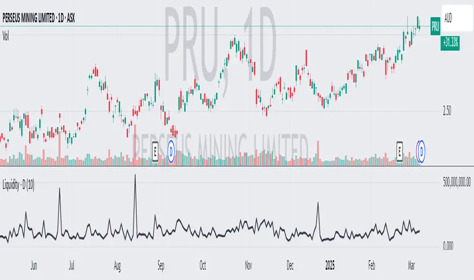
Estimated Manipulation Movement Signal [AlgoPoint]Follow the Footprints of Whale Movements That Drive the Market
Overview
The market is not always driven by natural supply and demand. Large players—often called "whales" or institutions—can create artificial price movements to trigger stop-losses, induce panic or FOMO, and build their large positions at favorable prices. These events are known as "stop hunts" or "liquidity grabs."
The EMMS indicator is a specialized tool designed to detect these specific moments of potential market manipulation. It does not follow trends in a traditional sense; instead, it identifies high-probability reversal points created by the calculated actions of Smart Money trapping other market participants.
How It Works: The 3-Module Logic
The indicator uses a multi-stage confirmation process to identify a potential stop hunt:
1. Anomaly Detection: The engine first scans the chart for "Anomaly Candles." These are candles with unusually high volume and a very long wick relative to their body. This combination signals a sudden, forceful, and potentially unnatural price push.
2. Liquidity Zone Detection: The indicator automatically identifies and tracks recent significant swing highs and lows. These levels are considered "Liquidity Zones" because they are areas where a large number of stop-loss orders are likely clustered. These are the "hunting grounds" for whales.
3. The Stop Hunt Signal: A final signal is generated only when these two events align in a specific sequence:
An Anomaly Candle (high volume, long wick) spikes through a previously identified Liquidity Zone.
The same candle then reverses, closing back inside the previous price range.
This sequence confirms that the move was likely a "trap" designed to engineer liquidity, and a reversal in the opposite direction is now highly probable.
How to Interpret & Use This Indicator
BUY Signal: A BUY signal appears after a sharp price drop that pierces a recent swing low (taking out the stops of long positions) and then aggressively reverses to close higher. This suggests that Smart Money has absorbed the panic selling they just induced. The signal indicates a potential move UP.
SELL Signal: A SELL signal appears after a sharp price spike that pierces a recent swing high (taking out the stops of short positions) and then aggressively reverses to close lower. This suggests that Smart Money has sold into the FOMO buying they just created. The signal indicates a potential move DOWN.
This indicator is best used as a high-probability confirmation tool, ideally in conjunction with your understanding of the overall market trend and structure.
Cari skrip untuk "liquidity"

[Shoshi] Liquidity SuiteChatGPT řekl:
Přemýšlení po dobu 24s
Liquidity Suite
A powerful, modular toolkit for liquidity-based trading — now with level merging, per-TF/global label offsets, and a master Liquidity toggle.
• Highs/Lows from Custom, 4H, D, W, M, Y
• Previous/Current candle anchoring (wick-anchored)
• Per-TF horizontal offsets + a global right-edge offset for tidy columns
• Optional “Merging levels” with % tolerance (e.g., 0.03%) — clusters nearby levels into one label (Y / pM / …) using the highest-TF color
• Custom line style/width/color and label mode (name/price/both), auto visibility by chart TF
• Buyside/Sellside inducements and FVG/Voids (visible count cap)
• NEW: Global “Show Liquidity” switch — instantly hides and clears all liquidity graphics regardless of other settings
• Asia, London, NY, Custom sessions
• Top/Mid/Bottom + open markers/labels
• Horizontal zones and optional vertical markers (Start/Start+End), extendable lines/background
• Killzones/Day/Week/Month opens
• Optional vertical shading; configurable line + label
• Daily/Weekly/Monthly VWAP with styles Line/Step/Area/Circles/Cross
• Right-edge labels (name/price/both), theme-aware colors
• Dark/White theme
• Separate configs per session/VWAP, per-TF level offsets, and merge tolerance
• Optimized for performance with object limits (lines/labels/boxes)
• Clean, uncluttered visuals for focused execution

CHoCH + BOS + LQ Sweep v6.3.8 PRO+The CHoCH + BOS + LQ Sweep PRO indicator is a comprehensive Smart Money Concepts (SMC) tool designed to identify market structure shifts, liquidity sweeps, and key supply-demand zones across multiple timeframes. It helps traders visualize crucial price action patterns like Change of Character (CHoCH), Break of Structure (BOS), and liquidity grabs that often precede significant market reversals or continuations.
This tool is especially suited for traders applying multi-timeframe analysis and liquidity-based trading strategies on Forex, crypto, indices, or commodities.
1. Liquidity Sweeps (LQ Sweeps)
Identifies when price sweeps previous highs/lows (stop hunts/liquidity grabs).
Configurable strength setting to filter minor vs. major sweeps.
Optional stop at wick or stop at close logic for more precise entries.
Old sweeps can be displayed or hidden, with user-defined limits for historical sweeps.
2. Multi-Timeframe (HTF) Sweeps
Displays liquidity sweeps from higher timeframes (M15, H1, H4, D1, W1).
Individual checkboxes allow flexible combinations (e.g., show only H1 & H4 sweeps).
Unique colors for each timeframe to differentiate visually on the chart.
3. Supply/Demand Zones
Automatically plots zones around swing highs and lows.
Zones are dynamically updated and locked once price interacts with them.
Configurable view: Show both bullish/bearish zones or filter for one side only.
Option to display/hide old zones and limit the number of zones shown.
4. Historical Sweep Management
Stores up to 5000 sweeps internally, while adhering to TradingView’s rendering limits (max 500 drawn).
Ensures chart clarity by prioritizing the most recent sweeps.

Time-based LiquidityThis TradingView indicator identifies key liquidity zones based on previous highs and lows across multiple timeframes:
Monthly High/Low: Shows the previous month’s high and low levels, often acting as strong liquidity points where price may reverse or sweep before continuation.
Weekly High/Low: Highlights the previous week’s high and low, useful for short- to medium-term traders tracking breakout or fakeout zones.
Daily High/Low: Marks the high and low of the previous day, commonly targeted during intraday moves or liquidity grabs.
Session Zones (London & New York): Plots real-time highs and lows during the London and New York trading sessions. These zones are critical for identifying short-term liquidity sweeps and intraday volatility.
Traders use this tool to spot potential liquidity grabs, displacement entries, and reversal or continuation setups around institutional levels.

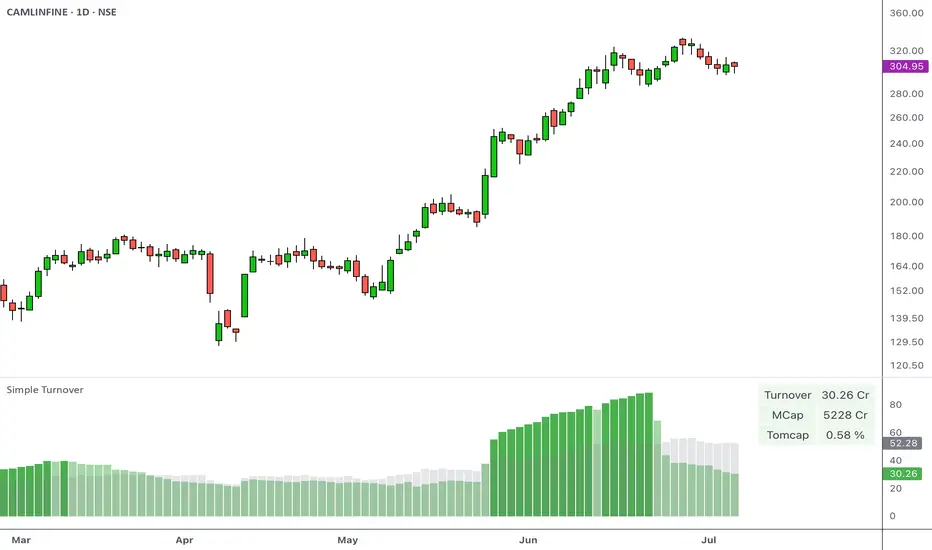
Simple Turnover with TOMCAPOverview
Turnover, or the total value traded over a given period, helps you gauge whether there’s enough liquidity in the instrument being traded. This indicator calculates the average turnover and presents it as a bar-by-bar plot. It also calculates the turnover-to-market capitalization (Tomcap) ratio, and presents this in a configurable table or text summary.
Introduction
Volume indicates the total number of shares that have been bought or sold in a specific period or during the trading day.
A company's market capitalization at any given time can be determined by multiplying its stock price by the number of shares outstanding.
Share turnover is a measure of stock liquidity, calculated by dividing the total number of shares traded during some period by the average number of shares outstanding for the same period. The higher the share turnover, the more liquid company shares are.
Compared to traditional volumes, potting the change in turnover can provide a better representation of the flow of money.
At its simplest, the daily turnover on each bar is computed as the closing price for a stock multiplied by its average volume:
turnover = volume * close / 10000000
The script calculates this by using average prices for both:
turnover = sma_volume * sma_close / 10000000
Script Basics
The script computes & plots the n-period average turnover by multiplying the moving average of price and volume.
By default, the market cap is plotted bar by bar as a background behind the turnover bars.
Every time the turnover reaches a new high in a quarter, the color of the turnover bars turns dark green. This represents the HTQ (Highest Turnover in a Quarter) , and multiple consecutive HTQs indicate a significant influx of funds into that stock.
Uses
The primary purpose of the script is to assist traders in making more informed decisions regarding stock selection.
1. Screen out non-tradable stocks
Quickly spot low-turnover names (illiquid stocks) to avoid wide spreads. Filter out any stocks whose average daily turnover is below, say, ₹5 Cr. This helps in eliminating tickers whose average turnover never clears your minimum threshold.
Example of a high-turnover stock:
Example of a low-turnover stock:
2. Turnover expansion
Observe when the average turnover suddenly expands from its previously subdued values. This occurs when money begins to flow in due to a catalyst, sectoral push, news flow, or any institutional activity.
Example:
3. Relative liquidity comparison
Even average turnover can sometimes overlook the context if we don’t know the company's size. That’s why the script also measures:
Turnover vs. Market cap (TOMCAP) , answering “What percent of the company’s value trades each day?”
Turnover vs. Free Float (TOFF) , showing liquidity against shares actually available for trading.
For example:
A small-cap stock with ₹1 Cr turnover but only ₹50 Cr market cap (Tomcap = 2 %)
vs. a large-cap with ₹10 Cr turnover and ₹20,000 Cr cap (Tomcap = 0.05 %)
Customization
A. Appearance
Dark Mode toggle switches colors to match your dark layout
Show turnover in Crores or Millions
B. What to show
Select the table size and position (e.g., top-left, bottom-center)
Under Table Settings, enable or disable any row:
Turnover
Mcap (market capitalization)
FF (free float)
1-Min liquidity (average turnover on 1-min bars)
Tomcap (Turnover to market capitalization) or Toff (Turnover to Free Float) ratio
C. Display mode
Table: a multi-row grid with colored cells
Text: a single summary string
Swing High/Low with Liquidity Sweeps🧠 Overview
This indicator identifies swing highs and swing lows based on user-defined candle lengths and checks for liquidity sweeps—situations where the price breaks a previous swing level but then closes back inside, indicating a potential false breakout or stop hunt. It also supports visual labeling and alerts for these events.
⚙️ Inputs
Swing Length (must be odd number ≥ 3):
Determines how many candles are used to identify swing highs/lows. The central candle must be higher or lower than all neighbors within the range.
Example: If swingLength = 5, the central candle must be higher/lower than the 2 candles on both sides.
Sweep Lookback (bars):
Defines how many bars to look back for possible liquidity sweeps.
Show Swing Labels (checkbox):
Optionally display labels on the chart when a swing high or low is detected.
Show Sweep Labels (checkbox):
Optionally display labels on the chart when a liquidity sweep occurs.
🕯️ Swing Detection Logic
A Swing High is detected when the high of the central candle is greater than the highs of all candles around it (as per the defined length).
A Swing Low is detected when the low of the central candle is lower than the lows of surrounding candles.
Swing labels are placed slightly above (for highs) or below (for lows) the candle.
💧 Liquidity Sweep Logic
A Sweep High is triggered if:
The current high breaks above a previously detected swing high,
And then the candle closes below that swing high,
Within the configured lookback window.
A Sweep Low is triggered if:
The current low breaks below a previous swing low,
And then closes above it,
Within the lookback window.
These are often seen as stop hunts or fake breakouts.
🔔 Alerts
Sweep High Alert: Triggered when a sweep above a swing high occurs.
Sweep Low Alert: Triggered when a sweep below a swing low occurs.
You can use these to set up TradingView alerts to notify you of potential liquidity grabs.
📊 Use Cases
Identifying market structure shifts.
Spotting fake breakouts and potential reversals.
Assisting in smart money concepts and liquidity-based trading.
Supporting entry timing in trend continuation or reversal strategies.

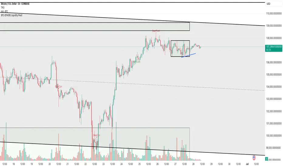
BTC-OTHERS Liquidity PivotBTC-OTHERS Liquidity Map – 1-hour Multi-Asset Pivot Scanner
WHAT IT DOES
This script tracks liquidity shifts between Bitcoin (BTC) and the broader alt-coin market (the OTHERS market-cap index that excludes the top-10 coins). It labels every confirmed 1-hour swing high or low on both assets, then flags four states:
BearPivot – BTC prints a new swing High while OTHERS does not; liquidity crowds into BTC and alts are weak.
BullPivot – BTC prints a swing Low and OTHERS forms a Higher Low; fresh liquidity starts flowing into stronger alts.
BearCon – BTC prints a swing Low and OTHERS forms a Lower Low; down-trend continuation.
BullCon – No new BTC Low while OTHERS makes a Higher High; up-trend continuation.
Signals appear on the actual pivot bar (offset back by the look-back length), so they never repaint after confirmation.
HOW THE PIVOTS ARE FOUND
• Symmetrical window: “Pivot Len” bars to the left and right (default 21).
• Full confirmation on both sides delivers stable, non-repainting pivots at the cost of about Pivot Len bars’ delay.
• Labels are offset –Pivot Len so they sit on the genuine extreme.
INPUTS
Symbols: BTC symbol and an OTHERS symbol so you can switch exchanges or choose another alt index.
Pivot Len: tighten for faster but noisier signals; widen for cleaner pivots.
Style: customise shape and text colours.
PLOTS AND ALERTS
Four labelled shapes (BearPivot, BullPivot, BearCon, BullCon) plot above or below price. Each label is linked to an alertcondition, so you can create one-click alerts and stay informed without watching the screen.
TYPICAL WORKFLOW
1. Attach the script to any 1-hour BTC chart (or leave the script’s timeframe empty to follow your current chart TF).
2. Turn on alerts to receive push/email notifications.
3. Use the labels as a liquidity compass, combining them with volume, funding or your own strategy for actual entries and exits.
Enjoy and trade safe.
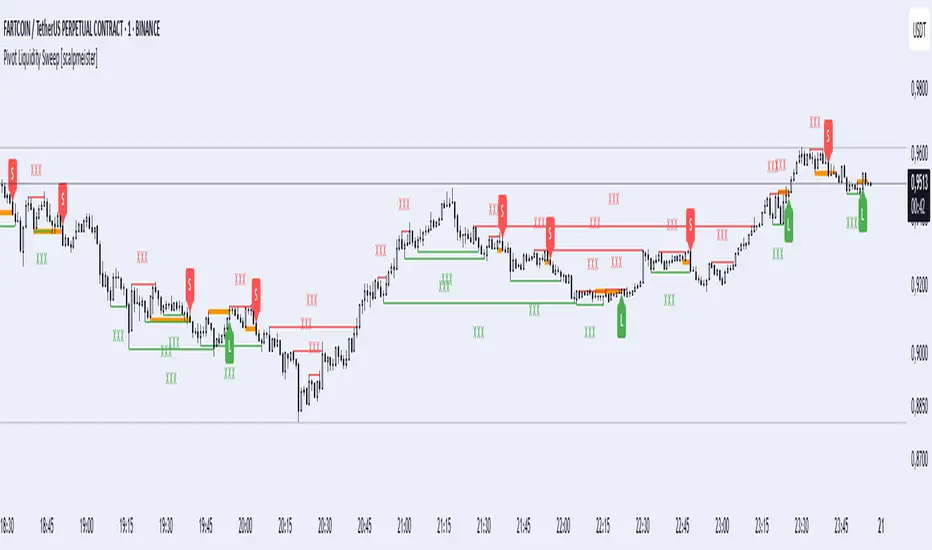
Pivot Liquidity Sweep [scalpmeister]📌 Pivot Liquidity Sweep
Scalp-oriented, liquidity sweep-based advanced signal and strategy indicator.
This indicator analyzes the price's sweeping of significant pivot levels and the subsequent breakouts to generate long/short signals based on different logics. It is sensitive to both classic sweep logic and strong reversal candles. Additionally, it visually marks liquidity gathering zones, offering excellent opportunities especially for scalp and intraday traders.
⚙️ Features and Strategy Types
🟢 Automatic Pivot Detection:
Pivot high/low levels are detected and stored based on the number of left and right bars.
🔴 Sweep Detection (Stop Hunt):
If the price violates a pivot level with a wick and closes inside, it is considered a sweep (liquidity cleaning). Strategies activate after this sweep.
🧠 5 Different Signal Styles:
SweepBreak:
It is expected that the extreme (high/low) level of the sweeping candle is broken with a close.
PivotBreak:
After the sweep, the first newly formed pivot in the trend direction is expected to break. (It is dynamically determined and drawn on the chart.)
StrongSweep:
It is sufficient if the candle following the sweep surpasses the previous candle with a single candle. No additional breakout is expected.
StrongCandle:
Strong momentum candles measured with a special RSI calculation are taken into account. It considers strong opposite-direction candles formed shortly after a pivot sweep.
ReversalCandleSweep:
Reversal candles that close in the opposite direction after a sweep (e.g., a red close on a sweep candle formed at the top or a green close at the bottom) are directly considered as signals.
📐 Technical Details:
Signals are triggered only once (triggered control).
Sweep lines (green/red), Long and Short lines (Orange)
Strong candles are filtered using an RSI-momentum-based measurement system (StrongCandle).
Sweep and breakout zones are dynamically invalidated. That is, if the zones are violated by the price, the signals and lines are automatically canceled.
🎯 Who Should Use It?
Professional traders working with liquidity zones
Scalp and intraday strategy practitioners
Those focused on stop hunts, sweeps, and reversal zones
🔔 Alert Support:
Sweep High / Low Alert
Long / Short Signal Alert
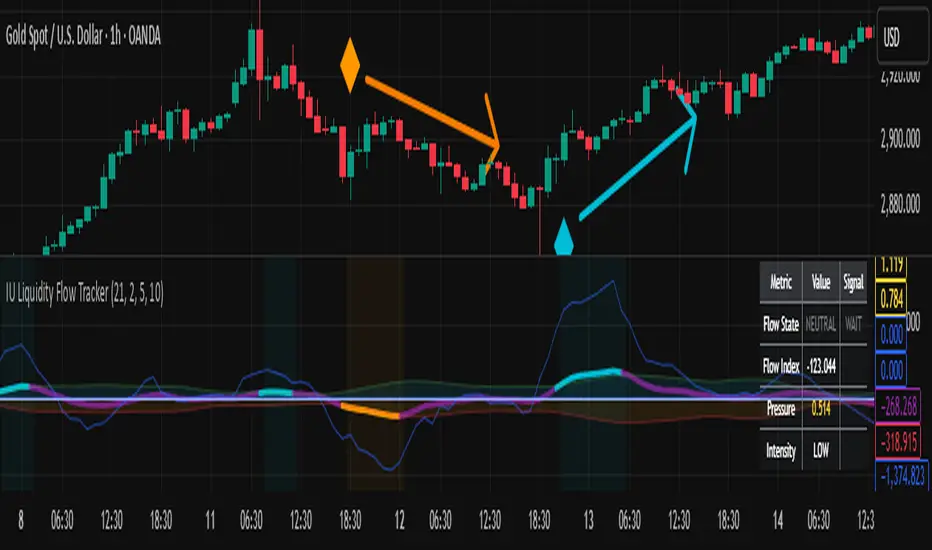
IU Liquidity Flow TrackerDESCRIPTION
The IU Liquidity Flow Tracker is a powerful market analysis tool designed to visualize hidden buying and selling activity by analyzing price action, volume behavior, market pressure, and depth. It provides a composite view of liquidity dynamics to help traders identify accumulation, distribution, and neutral phases with high clarity.
This indicator is ideal for traders who want to gauge the flow of market participants and make informed entry/exit decisions based on the underlying liquidity structure.
USER INPUTS:
* Flow Analysis Period: Length used for analyzing price spread and volume flow.
* Pressure Sensitivity: Adjusts the sensitivity of threshold detection for flow classification.
* Flow Smoothing: Controls the smoothing applied to raw flow data.
* Market Depth Analysis: Sets the depth range for rejection and wick analysis.
* Colors: Customize colors for accumulation, distribution, neutral zones, and pressure visualization.
INDICATOR LOGIC:
The IU Liquidity Flow Tracker uses a multi-factor model to evaluate market behavior:
1. Liquidity Pressure: Combines price spread, price efficiency, and volume imbalance.
2. Flow Direction: Weighted momentum using short, medium, and long-term price changes adjusted for volume.
3. Market Depth: Wick-based rejection scoring to estimate buying/selling aggressiveness at price extremes.
4. Composite Flow Index: Blended value of flow direction, pressure, and depth—smoothed for clarity.
5. Dynamic Thresholds: Automatically adjusts based on volatility to classify the market into:
* Accumulation: Strong buying signals.
* Distribution: Strong selling signals.
* Neutral: No significant flow dominance.
6. Entry Signals: Long/Short signals are generated when flow state shifts, supported by momentum, volume surge, and depth strength.
WHY IT IS UNIQUE:
Unlike typical indicators that rely solely on price or volume, this tool combines spread behavior, volume polarity, momentum weighting, and price rejection zones into a single visual interface. It dynamically adjusts sensitivity based on market volatility, helping avoid false signals during sideways or low-volume periods.
It is not based on any traditional indicator (RSI, MACD, etc.), making it ideal for traders looking for an original and data-driven market read.
HOW USER CAN BENEFIT FROM IT:
* Understand Market Context: Know whether the market is being accumulated, distributed, or ranging.
* Improve Entries/Exits: Use flow transitions combined with volume confirmation for high-probability setups.
* Spot Institutional Activity: Detect subtle shifts in liquidity that precede major price moves.
* Reduce Whipsaws: Dynamic thresholds and multi-factor confirmation help filter noise.
* Use with Any Style: Whether you're a swing trader, day trader, or scalper, this tool adapts to different timeframes and strategies.
DISCLAIMER:
This indicator is created for educational and informational purposes only. It does not constitute financial advice or a recommendation to buy or sell any asset. All trading involves risk, and users should conduct their own analysis or consult with a qualified financial advisor before making any trading decisions. The creator is not responsible for any losses incurred through the use of this tool. Use at your own discretion.
Stop Hunt Indicator ║ BullVision 🧠 Overview
The Stop Hunt Indicator (SmartTrap Radar) is an original tool designed to identify potential liquidity traps caused by institutional stop hunts. It visually maps out historically significant levels where price has repeatedly reversed or rejected — and dynamically detects real-time sweep patterns based on volume, structure, and candle rejection behavior.
This script does not repurpose existing public indicators, nor does it use default TradingView built-ins such as RSI, MACD, or MAs. Its core logic is fully proprietary and was developed from scratch to support discretionary and data-driven traders in visualizing volatility risks and manipulation zones.
🔍 What the Indicator Does
This indicator identifies and visualizes potential stop hunt zones using:
Historical structure analysis: Swing highs/lows are identified via a configurable lookback period.
Liquidity level tracking: Once detected, levels are monitored for touches, age, and volume strength.
Proprietary scoring model: Each level receives a real-time significance score based on:
Age (how long the level has held)
Number of rejections (touches)
Relative volume strength
Proximity to current price
The glow intensity of plotted levels is dynamically mapped based on this score. Bright glow = higher institutional interest probability.
⚙️ Stop Hunt Detection Logic
A stop hunt is flagged when all of the following are met:
Price sweeps through a high/low beyond a user-defined penetration threshold
Wick rejection occurs (i.e., candle closes back inside the level)
Volume spikes above the average in a recent window
The script automatically:
Detects bullish stop hunts (below support) and bearish ones (above resistance)
Marks detected sweeps on-chart with optional 🔰/🚨 signals
Adjusts glow visuals based on score even after the sweep occurs
These sweeps often precede local reversals or high-volatility zones — this is not predictive, but rather a reactive mapping of market manipulation behavior.
📌 Why This Is Not Just Another Liquidity Tool
Unlike typical liquidity heatmaps or S/R indicators, this script includes:
A proprietary significance score instead of fixed rules
Multi-layer glow rendering to reflect level importance visually
Real-time scoring updates as new volume and touches occur
Combined volume × rejection × structure logic to validate stop hunts
Fully customizable detection logic (lookback, wick %, volume filters, max bars, etc.)
This indicator provides a specialized view focused solely on visualizing trap setups — not generic trend signals.
🧪 Usage Recommendations
To get started:
Add the indicator to your chart (volume-enabled instruments only)
Customize detection:
Lookback Period for structure
Penetration % for how far price must sweep
Volume Spike Multiplier
Wick rejection strength
Enable/disable features:
Glow effects
Hunt markers
Score labels
Volume highlights
Watch for:
🔰 Bullish Sweeps (below support)
🚨 Bearish Sweeps (above resistance)
Bright glowing zones = high-liquidity targets
This tool can be used for both confluence and risk assessment, especially around high-impact sessions, liquidation events, or range extremes.
📊 Volume Dependency Notice
⚠️ This indicator requires real volume data to function correctly. On instruments without volume (e.g., synthetic pairs), certain features like spike detection and scoring will be disabled or inaccurate.
🔐 Closed-Source Disclosure
This script is published as invite-only to protect its proprietary scoring, glow mapping, and detection logic. While the full implementation remains confidential, this description outlines all key mechanics and configurable logic for user transparency.

(ICT)Liquidity Grab + FVG + MSS/BOSThis script is a comprehensive educational indicator that combines and enhances several well-known trading concepts:
Liquidity Grabs (Swing Failure Patterns)
Fair Value Gaps (FVG)
Market Structure Shifts / Break of Structure (MSS/BOS)
Alerts
It identifies potential bullish and bearish liquidity grabs, confirms them optionally using volume validation on a lower timeframe, and tracks subsequent price structure changes. The indicator visually marks key swing highs/lows, FVG zones, and BOS/MSS levels—allowing traders to observe how price reacts to liquidity and imbalance zones.
🔍 Features:
Swing Failure Patterns (SFP):
Highlights possible liquidity grabs based on recent highs/lows and candle structure.
Volume Validation (Optional):
Filter signals using relative volume outside the swing on a lower timeframe. Adjustable threshold.
Fair Value Gaps (FVG):
Detects imbalance gaps and extends them for easy visualization.
Market Structure (MSS/BOS):
Displays Break of Structure (BOS) and Market Structure Shift (MSS) based on pivot highs/lows and closing conditions.
Dashboard:
A compact info panel displaying lower timeframe settings and validation status.
Custom Styling:
Adjustable colors, line styles, and label visibility for clean charting.
🧠 Ideal For:
Traders studying ICT concepts, smart money theories, and price-action-based strategies who want a visual tool for analysis and backtesting.
How to Use:
Wait for a Liquidity Grab (SFP) to form
The first condition for a potential entry is the formation of a Stop Hunt / Swing Failure Pattern (SFP).
This indicates that liquidity has been taken above or below a key level (e.g., previous high/low), and the market may be ready to reverse.
Confirmation with Fair Value Gap (FVG) and Market Structure Shift (MSS)
After the SFP, do not enter immediately. Wait for confirmation:
FVG : A Fair Value Gap (an imbalance in price action) must appear, signaling potential institutional activity.
MSS : A Market Structure Shift (break in the current trend) confirms a possible trend reversal or strong corrective move.
Enter the trade
Once both the FVG and MSS are confirmed after the SFP, you can safely enter a trade in the direction of the shift.
Alert Feature
The indicator includes an alert system to notify you when all conditions are met (SFP + FVG + MSS), so you can react quickly without constantly watching the chart.
AMD Liquidity Sweep with AlertsAMD Liquidity Sweep with Alerts
Identify key liquidity levels from the Asian trading session with visual markers and alerts.
📌 Key Features:
Asia Session Detection
Customizable start/end hours (0-23) to match your trading timezone
Automatically calculates session high/low
Smart Swing Level Identification
Finds the closest significant swing high ≥ Asia high
Finds the closest significant swing low ≤ Asia low
Adjustable pivot sensitivity (# of left/right bars)
Professional Visuals
Dashed reference lines extending into the future
Blue-highlighted key levels
Clean label formatting with precise price levels
Trading Alerts
Price-cross alerts for liquidity breaks
Visual markers (triangles) when levels are breached
Separate alerts for buy-side/sell-side liquidity
Customization Options
Toggle intermediate swing highlights
Adjust label sizes
💡 Trading Applications:
Institutional Levels: Identify zones where Asian session liquidity pools exist
Breakout Trading: Get alerted when price breaches Asian session ranges
S/R Flip Zones: Watch how price reacts at these key reference levels
London/NY Open: Use Asian levels for early European session trades
🔧 How to Use:
Set your preferred Asia session hours
Adjust pivot sensitivity (default 1 bar works for most timeframes)
Enable alerts for breakouts if desired
Watch for reactions at the plotted levels

Enhanced Volume w/ Pocket Pivots, Milestones & LiquiditySure! Here’s a professional and clear **description** you can use when saving or publishing the script on TradingView:
---
## 📄 Script Description: *Enhanced Volume w/ Pocket Pivots, Milestones & Liquidity*
This custom volume indicator enhances the default volume view by combining key institutional-level insights into a single tool. It highlights meaningful volume activity, liquidity conditions, and milestone events to help traders better understand accumulation/distribution and smart money participation.
### 🔍 Features:
* **Color-coded volume bars**:
* 🔵 **Pocket Pivot Volume (PPV)**: Up-day with volume > highest down-day volume of last 10 bars.
* 🟢 **Up Volume**: Up-day with volume > 50-day average.
* 🔴 **Down Volume**: Down-day with volume > 50-day average.
* 🟠 **Dry Volume**: Low-volume bars < 20% of 50-day average.
* ⚫ **Neutral/Other bars**: No significant signal.
* **Volume Milestones**:
* **HVE**: Highest volume ever (20 years lookback).
* **HVY**: Highest volume in the past 1 year (252 bars).
* **HVQ**: Highest volume in the past quarter (63 bars).
* **Projected Volume**:
* Real-time estimate of end-of-day volume based on elapsed session time.
* **Liquidity Metrics**:
* Displays current and 50-day average dollar volume.
* Estimates 1-minute liquidity for large-position feasibility.
* **Relative Volume Label**:
* Displays how today’s volume compares to the 50-day average.
* **Alerts Included**:
* Set alerts for HVE, HVY, and HVQ to catch key breakout or climactic volume events.
---
### 🧠 Ideal For:
* Growth stock traders
* Volume/price analysts
* Intraday & swing traders
* Institutions or prop traders needing liquidity benchmarks
---
Let me know if you'd like a short or promotional version (for sharing with others).

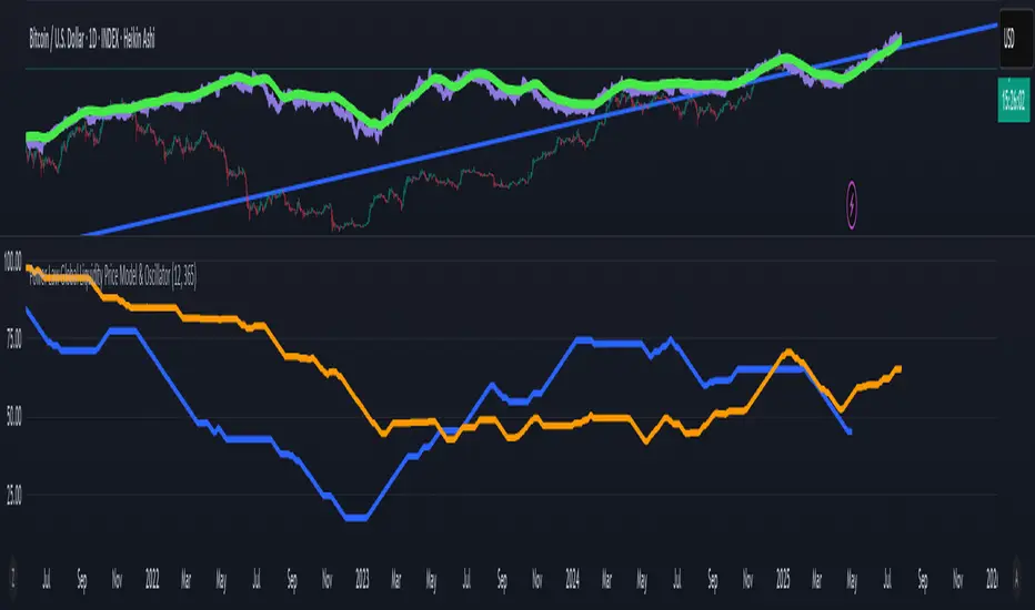
Power Law Global Liquidity Price Model & OscillatorDescription:
This Pine Script implements a predictive Bitcoin (BTC) price model derived from an observed power-law relationship between BTC price and Global Liquidity (specifically Global M2).
To clarify, the indicator doesn't show M2 directly as many indicators do, but uses an empirical observed relationship between BTC price and M2. This is an important difference from other Global Liquidity indicators and makes it very useful because it allows for making predictions on the future of Bitcoin price.
The model is based on the relationship BTC ~ GL^9.3, where GL represents Global M2, and the best correlation is achieved with an 85-period lead in GL, making it a leading indicator for BTC price movements. The observed correlation is higher than 0.92, giving high confidence in the model's validity. The 85-day lead was chosen by calculating the predictive rate of the model (how many times a positive/negative return in the model correlates with the price) with a given lead. The relationship between a chosen delay and predictive power has a maximum at 85 days.
Features:
BTC Price Model:
Calculates a BTC price model using the power-law relationship (BTC ~ GL^9.3) with an 85-period lead in Global Liquidity data.
The model is superimposed on the chart using forced overlay for clear visualization of the predicted BTC price trend relative to actual price.
Directional Oscillator:
Displayed in a lower panel, the oscillator compares the structural similarity between the actual BTC price and the GL-based price model.
Computes the win rate of the averaged BTC price (over a 1-year period) versus the price model to highlight structural alignment.
Projects future oscillator values based on the 85-period lead in the GL model, providing insight into potential price direction.
This feature is also very unique, and it is not present in most Global Liquidity indicators. The reason to choose the win rate is that this parameter doesn't depend on a precise scaling
between the BTC price and GL. This allows for better identification of changes in features between the 2 time series (for example, a downturn, a run up, peaks, bottoms, and similar).
Purpose:
This script serves as a predictive tool for traders and analysts by leveraging the leading relationship between Global Liquidity and BTC price. The overlay model and oscillator provide both a visual and quantitative framework to anticipate BTC price trends and assess structural alignment with global economic indicators.
The indicator allows for early identification of bottoms, peaks, and possible local bull or bear runs.
Usage Notes:
This indicator works best when used with the "All Time History" BTCUSD index.
The 85-period lead in GL allows for forward-looking projections, making this tool suitable for strategic planning.
The oscillator aids in confirming the structural validity of the model, enhancing confidence in its projections.
Quantify [Trading Model] | FractalystNote: In this description, "TM" refers to Trading Model (not trademark) and "EM" refers to Entry Model
What’s the indicator’s purpose and functionality?
You know how to identify market bias but always struggle with figuring out the best exit method, or even hesitating to take your trades?
I've been there. That's why I built this solution—once and for all—to help traders who know the market bias but need a systematic and quantitative approach for their entries and trade management.
A model that shows you real-time market probabilities and insights, so you can focus on execution with confidence—not doubt or FOMO.
How does this Quantify differentiate from Quantify ?
Have you managed to code or even found an indicator that identifies the market bias for you, so you don’t have to manually spend time analyzing the market and trend?
Then that’s exactly why you might need the Quantify Trading Model.
With the Trading Model (TM) version, the script automatically uses your given bias identification method to determine the trend (bull vs bear and neutral), detect the bias, and provide instant insight into the trades you could’ve taken.
To avoid complications from consecutive signals, it uses a kNN machine learning algorithm that processes market structure and probabilities to predict the best future patterns.
(You don’t have to deal with any complexity—it’s all taken care of for you.)
Quantify TM uses the k-Nearest Neighbors (kNN) machine learning algorithm to learn from historical market patterns and adapt to changing market structures. This means it can recognize similar market conditions from the past and apply those lessons to current trading decisions.
On the other hand, Quantify EM requires you to manually select your directional bias. It then focuses solely on generating entry signals based on that pre-determined bias.
While the entry model version (EM) uses your manual bias selection to determine the trend, it then provides insights into trades you could’ve taken and should be taking.
Trading Model (TM)
- Uses `input.source()` to incorporate your personal methodology for identifying market bias
- Automates everything—from bias detection to entry and exit decisions
- Adapts to market bias changes through kNN machine learning optimization
- Reduces human intervention in trading decisions, limiting emotional interference
Entry Model (EM)
- Focuses specifically on optimizing entry points within your pre-selected directional bias
- Requires manual input for determining market bias
- Provides entry signals without automating alerts or bias rules
Can the indicator be applied to any market approach/trading strategy?
Yes, if you have clear rules for identifying the market bias, then you can code your bias detection and then use the input.source() user input to retrieve the direction from your own indicator, then the Quantify uses machine-learning identify the best setups for you.
Here's an example:
//@version=6
indicator('Moving Averages Bias', overlay = true)
// Input lengths for moving averages
ma10_length = input.int(10, title = 'MA 10 Length')
ma20_length = input.int(20, title = 'MA 20 Length')
ma50_length = input.int(50, title = 'MA 50 Length')
// Calculate moving averages
ma10 = ta.sma(close, ma10_length)
ma20 = ta.sma(close, ma20_length)
ma50 = ta.sma(close, ma50_length)
// Identify bias
var bias = 0
if close > ma10 and close > ma20 and close > ma50 and ma10 > ma20 and ma20 > ma50
bias := 1 // Bullish
bias
else if close < ma10 and close < ma20 and close < ma50 and ma10 < ma20 and ma20 < ma50
bias := -1 // Bearish
bias
else
bias := 0 // Neutral
bias
// Plot the bias
plot(bias, title = 'Identified Bias', color = color.blue,display = display.none)
Once you've created your custom bias indicator, you can integrate it with Quantify :
- Add your bias indicator to your chart
- Open the Quantify settings
- Set the Bias option to "Auto"
- Select your custom indicator as the bias source
The machine learning algorithms will then analyze historical price action and identify optimal setups based on your defined bias parameters. Performance statistics are displayed in summary tables, allowing you to evaluate effectiveness across different timeframes.
Can the indicator be used for different timeframes or trading styles?
Yes, regardless of the timeframe you’d like to take your entries, the indicator adapts to your trading style.
Whether you’re a swing trader, scalper, or even a position trader, the algorithm dynamically evaluates market conditions across your chosen timeframe.
How Quantify Helps You Trade Profitably?
The Quantify Trading Model offers several powerful features that can significantly improve your trading profitability when used correctly:
Real-Time Edge Assessment
It displays real-time probability of price moving in your favor versus hitting your stoploss
This gives you immediate insight into risk/reward dynamics before entering trades
You can make more informed decisions by knowing the statistical likelihood of success
Historical Edge Validation
Instantly shows whether your trading approach has demonstrated an edge in historical data
Prevents you from trading setups that historically haven't performed well
Gives confidence when entering trades that have proven statistical advantages
Optimized Position Sizing
Analyzes each setup's success rate to determine the adjusted Kelly criterion formula
Customizes position sizing based on your selected maximum drawdown tolerance
Helps prevent account-destroying losses while maximizing growth potential
Advanced Exit Management
Utilizes market structure-based trailing stop-loss mechanisms
Maximizes the average risk-reward ratio profit per winning trade
Helps capture larger moves while protecting gains during market reversals
Emotional Discipline Enforcement
Eliminates emotional bias by adhering to your pre-defined rules for market direction
Prevents impulsive decisions by providing objective entry and exit signals
Creates psychological distance between your emotions and trading decisions
Overtrading Prevention
Highlights only setups that demonstrate positive expectancy
Reduces frequency of low-probability trades
Conserves capital for higher-quality opportunities
Systematic Approach Benefits
By combining machine learning algorithms with your personal bias identification methods, Quantify helps transform discretionary trading approaches into more systematic, probability-based strategies.
What Entry Models are used in Quantify Trading Model version?
The Quantify Trading Model utilizes two primary entry models to identify high-probability trade setups:
Breakout Entry Model
- Identifies potential trade entries when price breaks through significant swing highs and swing lows
- Captures momentum as price moves beyond established trading ranges
- Particularly effective in trending markets when combined with the appropriate bias detection
- Optimized by machine learning to filter false breakouts based on historical performance
Fractals Entry Model
- Utilizes fractal patterns to identify potential reversal or continuation points
- Also uses swing levels to determine optimal entry locations
- Based on the concept that market structure repeats across different timeframes
- Identifies local highs and lows that form natural entry points
- Enhanced by machine learning to recognize the most profitable fractal formations
- These entry models work in conjunction with your custom bias indicator to ensure trades are taken in the direction of the overall market trend. The machine learning component analyzes historical performance of these entry types across different market conditions to optimize entry timing and signal quality.
How Does This Indicator Identify Market Structure?
1. Swing Detection
• The indicator identifies key swing points on the chart. These are local highs or lows where the price reverses direction, forming the foundation of market structure.
2. Structural Break Validation
• A structural break is flagged when a candle closes above a previous swing high (bullish) or below a previous swing low (bearish).
• Break Confirmation Process:
To confirm the break, the indicator applies the following rules:
• Valid Swing Preceding the Break: There must be at least one valid swing point before the break.
3. Numeric Labeling
• Each confirmed structural break is assigned a unique numeric ID starting from 1.
• This helps traders track breaks sequentially and analyze how the market structure evolves over time.
4. Liquidity and Invalidation Zones
• For every confirmed structural break, the indicator highlights two critical zones:
1. Liquidity Zone (LIQ): Represents the structural liquidity level.
2. Invalidation Zone (INV): Acts as Invalidation point if the structure fails to hold.
How does the trailing stop-loss work? what are the underlying calculations?
A trailing stoploss is a dynamic risk management tool that moves with the price as the market trend continues in the trader’s favor. Unlike a fixed take profit, which stays at a set level, the trailing stoploss automatically adjusts itself as the market moves, locking in profits as the price advances.
In Quantify, the trailing stoploss is enhanced by incorporating market structure liquidity levels (explain above). This ensures that the stoploss adjusts intelligently based on key price levels, allowing the trader to stay in the trade as long as the trend remains intact, while also protecting profits if the market reverses.
What is the Kelly Criterion, and how does it work in Quantify?
The Kelly Criterion is a mathematical formula used to determine the optimal position size for each trade, maximizing long-term growth while minimizing the risk of large drawdowns. It calculates the percentage of your portfolio to risk on a trade based on the probability of winning and the expected payoff.
Quantify integrates this with user-defined inputs to dynamically calculate the most effective position size in percentage, aligning with the trader’s risk tolerance and desired exposure.
How does Quantify use the Kelly Criterion in practice?
Quantify uses the Kelly Criterion to optimize position sizing based on the following factors:
1. Confidence Level: The model assesses the confidence level in the trade setup based on historical data and sample size. A higher confidence level increases the suggested position size because the trade has a higher probability of success.
2. Max Allowed Drawdown (User-Defined): Traders can set their preferred maximum allowed drawdown, which dictates how much loss is acceptable before reducing position size or stopping trading. Quantify uses this input to ensure that risk exposure aligns with the trader’s risk tolerance.
3. Probabilities: Quantify calculates the probabilities of success for each trade setup. The higher the probability of a successful trade (based on historical price action and liquidity levels), the larger the position size suggested by the Kelly Criterion.
How can I get started to use the indicator?
1. Set Your Market Bias
• Choose Auto.
• Select the source you want Quantify to use as for bias identification method (explained above)
2. Choose Your Entry Timeframes
• Specify the timeframes you want to focus on for trade entries.
• The indicator will dynamically analyze these timeframes to provide optimal setups.
3. Choose Your Entry Model and BE/TP Levels
• Choose a model that suits your personality
• Choose a level where you'd like the script to take profit or move stop-loss to BE
4. Set and activate the alerts
What tables are used in the Quantify?
• Quarterly
• Monthly
• Weekly
Terms and Conditions | Disclaimer
Our charting tools are provided for informational and educational purposes only and should not be construed as financial, investment, or trading advice. They are not intended to forecast market movements or offer specific recommendations. Users should understand that past performance does not guarantee future results and should not base financial decisions solely on historical data.
Built-in components, features, and functionalities of our charting tools are the intellectual property of @Fractalyst Unauthorized use, reproduction, or distribution of these proprietary elements is prohibited.
- By continuing to use our charting tools, the user acknowledges and accepts the Terms and Conditions outlined in this legal disclaimer and agrees to respect our intellectual property rights and comply with all applicable laws and regulations.
Global Liquidity Index with Editable DEMA + 107 Day OffsetGlobal Liquidity DEMA (107-Day Lead)
This indicator visualizes a smoothed version of global central bank liquidity with a forward time shift of 107 days. The concept is based on the macroeconomic observation that markets tend to lag changes in global liquidity — particularly from central banks like the Federal Reserve, ECB, BOJ, and PBOC.
The script uses a Double Exponential Moving Average (DEMA) to smooth the combined balance sheets and money supply inputs. It then offsets the result into the future by 107 days, allowing you to visually align liquidity trends with delayed market reactions. A second plot (ROC SMA) is included to help identify liquidity momentum shifts.
🔍 How to Use:
Add this indicator to any chart (S&P 500, BTC, Gold, etc.)
Compare price action to the forward-shifted liquidity trend
Look for divergence, confirmation, or crossovers with price
Use as a macro timing tool for long-term entries/exits
📌 Included Features:
Editable DEMA smoothing length
ROC + SMA overlay for momentum signals
Fixed 107-day forward projection
Includes main DEMA and ROC SMA both real-time and shifted

Master Global Liquidity Shifted 75 DaysThe Global Liquidity Index is a Pine Script (version 5) technical indicator designed to measure and visualize global financial liquidity by aggregating data from various central bank balance sheets and money supply metrics. The indicator is plotted as an overlay on the price chart using the left scale, with the entire line shifted left by 75 days.
Key features:
Data Sources: Incorporates balance sheet data from major central banks including the Federal Reserve (FED), European Central Bank (ECB), People's Bank of China (PBC), Bank of Japan (BOJ), and other central banks, along with optional M2 money supply data from various countries.
Components: Includes options to toggle specific liquidity factors such as FED balance sheet, Treasury General Account (TGA), Reverse Repurchase Agreements (RRP), and regional M2 money supplies, all converted to USD.
75-Day Shift: The indicator's output is shifted left by 75 days on the chart, aligning historical liquidity data with earlier price action, with this shift period adjustable via the "Shift Days Left" input.
Calculations:
Computes a total liquidity value by summing enabled central bank and M2 data (adjusted for RRP and TGA as drains)
Scales the total by dividing by 1 trillion (10^12)
Applies a Simple Moving Average (SMA) and Rate of Change (ROC) with user-defined periods
Final output is either the SMA of ROC or SMA alone, depending on ROC length
Visualization: Plots the shifted result as a yellow line with a linewidth of 2.

Average Daily LiquidityIt is important to ensure sufficient stock trading liquidity so that you have sufficient volume to enter the trade and most importantly sufficient liquidity to exit the trade. Because daily trading liquidity can jump around so much by price changes and volume changes, it is important to smooth out the liquidity by using a moving average. Some use a 5 days (trading week) moving average, others use 10 day (2 weeks), 20 day ("month") and some use 65 day (quarter). The default is 10 days based upon the work of Colin Nicholson (The Aggressive Investor and Building Wealth in the Stock Market). Liquidity line changes color dependent upon the chart background luminescence. The amount you are planning to invest in a stock should have a liquidity of 10 (default) times that amount.
Uptrick: Portfolio Allocation DiversificationIntro
The Uptrick: Portfolio Allocation Diversification script is designed to help traders and investors manage multiple assets simultaneously. It generates signals based on various trading systems, allocates capital using different diversification methods, and displays real-time metrics and performance tables on the chart. The indicator compares active trading strategies with a separate long-term holding (HODL) simulation, allowing you to see how a systematic trading approach stacks up against a simple buy-and-hold strategy.
------------------------------------------------------------------------
Trading System Selection
1. No signals (none)
In this mode, the script does not produce bullish or bearish indicators; every asset stays in a neutral stance. This setup is useful if you prefer to observe how capital might be distributed based solely on the chosen diversification method, with no influence from directional signals.
2. rsi – neutral
This mode uses an index-based measure of whether an asset appears overbought or oversold. It generates a bearish signal if market conditions point to overbought territory, and a bullish signal if they indicate oversold territory. If neither extreme surfaces, it remains neutral. Some traders apply this in sideways or range-bound conditions, where overbought and oversold levels often hint at possible turning points. It does not specifically account for divergence patterns.
3. rsi – long only
In this setting, the system watches for instances where momentum readings strengthen even if the asset’s price is still under pressure or setting new lows. It also considers oversold levels as potential signals for a bullish setup. When such conditions emerge, the script flags a possible move to the upside, ignoring indications that might otherwise suggest a bearish trend. This approach is generally favored by those who want to concentrate exclusively on identifying price recoveries.
4. rsi – short only
Here, the script focuses on spotting signs of deteriorating momentum while an asset’s price remains relatively high or attempts further gains. It also checks whether the market is drifting into overbought territory, suggesting a potential decline. Under such conditions, it issues a bearish signal. It provides no bullish alerts, making it particularly suitable for traders who look to take advantage of overvalued scenarios or protect themselves against sudden downward moves.
5. Deviation from fair value
Under this system, the script judges how far the current price may have strayed from what is considered typical, taking into account normal fluctuations. If the asset appears to be trading at an unusually low level compared to that reference, it is flagged as bullish. If it seems abnormally high, a bearish signal is issued. This can be applied in various market environments to seek opportunities that arise from perceived mispricing.
6. Percentile channel valuation
In this mode, the script determines where an asset's price stands within a historical distribution, highlighting whether it has reached unusually high or low territory compared to its recent past. When the price reaches what is deemed an extreme reading, it may indicate that a reversal is more likely. This approach is often used by traders who watch for statistical outliers and potential reversion to a more typical trading range.
7. ATH valuation
This technique involves comparing an asset's current price with its previously recorded peak values. The script then interprets whether the price is positioned so far below the all-time high that it looks discounted, or so close to that high that it could be overextended. Such perspective is favored by market participants who want to see if an asset still has ample room to climb before matching historic extremes, or if it is nearing a possible ceiling.
8. Z-score system
Here, the script measures how far above or below a standard reference average an asset's price may be, translated into standardized units. Substantial negative readings can suggest a price that might be unusually weak, prompting a bullish indication, while large positive readings could signal overextension and lead to a bearish call. This method is useful for traders watching for abrupt deviations from a norm that often invite a reversion to more balanced levels.
RSI Divergence Period
This input is particularly relevant for the RSI - Long Only and RSI - Short Only modes. The period determines how many bars in the past you compare RSI values to detect any divergences.
------------------------------------------------------------------------
Diversification Method
Once the script has determined a bullish, bearish, or neutral stance for each asset, it then calculates how to distribute capital among all included assets. The diversification method sets the weighting logic.
1. None
Gives each asset an equal weight. For example, if you have five included assets, each might get 20 percent. This is a simple baseline.
2. Risk-Adjusted Expected Return Using Volatility Clustering
Emphasizes each asset’s average returns relative to its observed risk or volatility tendencies. Assets that exhibit good risk-adjusted returns combined with moderate or lower volatility may receive higher weights than more volatile or less appealing assets. This helps steer capital toward assets that have historically provided a better ratio of return to risk.
3. Relative Strength
Allocates more capital to assets that show stronger price strength compared to a reference (for example, price above a long-term moving average plus a higher RSI). Assets in clear uptrends may be given higher allocations.
4. Trend-Following Indicators
Examines trend-based signals, like positive momentum measurements or upward-trending strength indicators, to assign more weight to assets demonstrating strong directional moves. This suits those who prefer to latch onto trending markets.
5. Volatility-Adjusted Momentum
Looks for assets that have strong price momentum but relatively subdued volatility. The script tends to reward assets that are trending well yet are not too volatile, aiming for stable upward performance rather than massive swings.
6. Correlation-Based Risk Parity
Attempts to weight assets in such a way that the overall portfolio risk is more balanced. Although it is not an advanced correlation matrix approach in a strict sense, it conceptually scales each asset’s weight so no single outlier heavily dominates.
7. Omega Ratio Maximization
Gives preference to assets with higher omega ratios. This ratio can be interpreted as the probability-weighted gains versus losses. Assets with a favorable skew are given more capital.
8. Liquidity-Weighted Valuation
Considers each asset’s average trading liquidity, such as the combination of volume and price. More liquid assets typically receive a higher allocation because they can be entered or exited with lower slippage. If the trading system signals bullishness, that can further boost the allocation, and if it signals bearishness, the allocation might be set to zero or reduced drastically.
9. Drawdown-Controlled Allocation (DCA)
Examines each asset’s maximum drawdown over a recent window. Assets experiencing lighter drawdowns (thus indicating somewhat less downside volatility) receive higher allocations, aiming for a smoother overall equity curve.
------------------------------------------------------------------------
Portfolio and Allocation Settings
Portfolio Value
Defines how much total capital is available for the strategy-based investment portion. For example, if set to 10,000, then each asset’s monetary allocation is determined by the percentage weighting times 10,000.
Use Fixed Allocation
When enabled, the script calculates the initial allocation percentages after 50 bars of data have passed. It then locks those percentages for the remainder of the backtest or real-time session. This feature allows traders to test a static weighting scenario to see how it differs from recalculating weights at each bar.
------------------------------------------------------------------------
HODL Simulator
The script has a separate simulation that accumulates positions in an asset whenever it appears to be recovering from an undervalued state. This parallel tracking is intended to contrast a simple buy-and-hold approach with the more adaptive allocation methods used elsewhere in the script.
HODL Buy Quantity
Each time an asset transitions from an undervalued state to a recovery phase, the simulator executes a purchase of a predefined quantity. For example, if set to 0.5 units, the system will accumulate this amount whenever conditions indicate a shift away from undervaluation.
HODL Buy Threshold
This parameter determines the level at which the simulation identifies an asset as transitioning out of an undervalued state. When the asset moves above this threshold after previously being classified as undervalued, a buy order is triggered. Over time, the performance of these accumulated positions is tracked, allowing for a comparison between this passive accumulation method and the more dynamic allocation strategy.
------------------------------------------------------------------------
Asset Table and Display Settings
The script displays data in multiple tables directly on your chart. You can toggle these tables on or off and position them in various corners of your TradingView screen.
Asset Info Table Position
This table provides key details for each included asset, displaying:
Symbol – Identifies the trading pair being monitored. This helps users keep track of which assets are included in the portfolio allocation process.
Current Trading Signal – Indicates whether the asset is in a bullish, bearish, or neutral state based on the selected trading system. This assists in quickly identifying which assets are showing potential trade opportunities.
Volatility Approximation – Represents the asset’s historical price fluctuations. Higher volatility suggests greater price swings, which can impact risk management and position sizing.
Liquidity Estimate – Reflects the asset’s market liquidity, often based on trading volume and price activity. More liquid assets tend to have lower transaction costs and reduced slippage, making them more favorable for active strategies.
Risk-Adjusted Return Value – Measures the asset’s returns relative to its risk level. This helps in determining whether an asset is generating efficient returns for the level of volatility it experiences, which is useful when making allocation decisions.
2. Strategy Allocation Table Position
Displays how your selected diversification method converts each asset into an allocation percentage. It also shows how much capital is being invested per asset, the cumulative return, standard performance metrics (for example, Sharpe ratio), and the separate HODL return percentage.
Symbol – Displays the asset being analyzed, ensuring clarity in allocation distribution.
Allocation Percentage – Represents the proportion of total capital assigned to each asset. This value is determined by the selected diversification method and helps traders understand how funds are distributed within the portfolio.
Investment Amount – Converts the allocation percentage into a dollar value based on the total portfolio size. This shows the exact amount being invested in each asset.
Cumulative Return – Tracks the total return of each asset over time, reflecting how well it has performed since the strategy began.
Sharpe Ratio – Evaluates the asset’s return in relation to its risk by comparing excess returns to volatility. A higher Sharpe ratio suggests a more favorable risk-adjusted performance.
Sortino Ratio – Similar to the Sharpe ratio, but focuses only on downside risk, making it more relevant for traders who prioritize minimizing losses.
Omega Ratio – Compares the probability of achieving gains versus losses, helping to assess whether an asset provides an attractive risk-reward balance.
Maximum Drawdown – Measures the largest percentage decline from an asset’s peak value to its lowest point. This metric helps traders understand the worst-case loss scenario.
HODL Return Percentage – Displays the hypothetical return if the asset had been bought and held instead of traded actively, offering a direct comparison between passive accumulation and the active strategy.
3. Profit Table
If the Profit Table is activated, it provides a summary of the actual dollar-based gains or losses for each asset and calculates the overall profit of the system. This table includes separate columns for profit excluding HODL and the combined total when HODL gains are included. As seen in the image below, this allows users to compare the performance of the active strategy against a passive buy-and-hold approach. The HODL profit percentage is derived from the Portfolio Value input, ensuring a clear comparison of accumulated returns.
4. Best Performing Asset Table
Focuses on the single highest-returning or highest-profit asset at that moment. It highlights the symbol, the asset’s cumulative returns, risk metrics, and other relevant stats. This helps identify which asset is currently outperforming the rest.
5. Most Profitable Asset
A simpler table that underscores the asset producing the highest absolute dollar profit across the portfolio.
------------------------------------------------------------------------
Multi Asset Selection
You can include up to ten different assets (such as BTCUSDT, ETHUSDT, ADAUSDT, and so on) in this script. Each asset has two inputs: one to enable or disable its inclusion, and another to select its trading pair symbol. Once you enable an asset, the script requests the relevant market data from TradingView.
------------------------------------------------------------------------
Uniqness and Features
1. Multiple Data Fetches
Each asset is pulled from the chart’s timeframe, along with various metrics such as RSI, volatility approximations, and trend indicators.
2. Various Risk and Performance Metrics
The script internally keeps track of different measures, like Sharpe ratio (a measure of average return adjusted for risk), Sortino ratio (which focuses on downside volatility), Omega ratio, and maximum drawdown. These metrics feed into the strategy allocation table, helping you quickly assess the risk-and-return profile of each asset.
3. Real-Time Tables
Instead of having to set up complex spreadsheets or external dashboards, the script updates all tables on every new bar. The color schemes in these tables are designed to draw attention to bullish or bearish signals, positive or negative returns, and so forth.
4. HODL Comparison
You can visually compare the active strategy’s results to a separate continuous buy-on-dips accumulation strategy. This allows for insight into whether your dynamic approach truly beats a simpler, more patient method.
5. Locking Allocations
The Use Fixed Allocation input is convenient for those who want to see how holding a fixed distribution of capital performs over time. It helps in distinguishing between constant rebalancing vs a fixed, set-and-forget style.
------------------------------------------------------------------------
How to use
1. Add the Script to Your Chart
Once added, open the settings panel to configure your asset list, choose a trading system, and select the diversification approach.
2. Select Assets
Pick up to ten symbols to monitor. Disable any you do not want included. Each included asset is then handled for signals, diversification, and performance metrics.
3. Choose Trading System
Decide if you prefer RSI-based signals, a fair-value approach, or a percentile-based method, among others. The script will then flag assets as bullish, bearish, or neutral according to that selection.
4. Pick a Diversification Method
For example, you might choose Trend-Following Indicators if you believe momentum stocks or cryptocurrencies will continue their trends. Or you could use the Omega Ratio approach if you want to reward assets that have had a favorable upside probability.
5. Set Portfolio Value and HODL Parameters
Enter how much capital you want to allocate in total (for the dynamic strategy) and adjust HODL buy quantities and thresholds as desired. (HODL Profit % is calculated from the Portfolio Value)
6. Inspect the Tables
On the chart, the script can display multiple tables showing your allocations, returns, risk metrics, and which assets are leading or lagging. Monitor these to make decisions about capital distribution or see how the strategy evolves.
------------------------------------------------------------------------
Additional Remarks
This script aims to simplify multi-asset portfolio management in a single tool. It emphasizes user-friendliness by color-coding the data in tables, so you do not need extra spreadsheets. The script is also flexible in letting you lock allocations or compare dynamic updates.
Always remember that no script can guarantee profitable outcomes. Real markets involve unpredictability, and real trading includes fees, slippage, and liquidity constraints not fully accounted for here. The script uses real-time and historical data for demonstration and educational purposes, providing a testing environment for various systematic strategies.
Performance Considerations
Due to the complexity of this script, users may experience longer loading times, especially when handling multiple assets or using advanced allocation methods. In some cases, calculations may time out if too many settings are adjusted simultaneously. If this occurs, removing and reapplying the indicator to the chart can help reset the process. Additionally, it is recommended to configure inputs gradually instead of adjusting all parameters at once, as excessive changes can extend the script’s loading duration beyond TradingView’s processing limits.
------------------------------------------------------------------------
Originality
This script stands out by integrating multiple asset management techniques within a single indicator, eliminating the need for multiple scripts or external portfolio tools. Unlike traditional single-asset strategies, it simultaneously evaluates multiple assets, applies systematic allocation logic, and tracks risk-adjusted performance in real time. The script is designed to function within TradingView’s script limitations while still allowing for complex portfolio simulations, making it an efficient tool for traders managing diverse holdings. Additionally, its combination of systematic trading signals with allocation-based diversification provides a structured approach to balancing exposure across different market conditions. The dynamic interplay between adaptive trading strategies and passive accumulation further differentiates it from conventional strategy indicators that focus solely on directional signals without considering capital allocation.
Conclusion
Uptrick: Portfolio Allocation Diversification pulls multiple assets into one efficient workflow, where each asset’s signal, volatility, and performance is measured, then assigned a share of capital according to your selected diversification method. The script accommodates both dynamic rebalancing and a locked allocation style, plus an ongoing HODL simulation for passive accumulation comparison. It neatly visualizes the entire process through on-chart tables that are updated every bar.
Traders and investors looking for ways to manage multiple assets under one unified framework can explore the different modules within this script to find what suits their style. Users can quickly switch among trading systems, vary the allocation approach, or review side-by-side performance metrics to see which method aligns best with their risk tolerance and market perspective.

Hidden LiquidityHidden Liquidity Indicator: Detecting Breaker Blocks and Hidden Order Blocks (HOBs)
The Hidden Liquidity Indicator is a powerful tool designed to assist traders in identifying breaker blocks and hidden order blocks (HOBs). By analyzing untouched candle bodies within order blocks, it provides a systematic approach to evaluating fair value gaps (FVGs) and order blocks based on engulfing candles.
Features of the Hidden Liquidity Indicator
This indicator effectively differentiates between complete HOBs, partial HOBs and partially mitigated HOBs (PMHOBs), allowing traders to assess market structure with precision. The key classifications include:
HOB (Hidden Order Block): The candle body fully aligns within the FVGs without being touched by wicks, establishing a strong and reliable breaker block.
PMHOB (Partial Mitigated Hidden Order Block) : The candle body is mitigated by less than 50%, making it a weaker version of the Hidden OB.
PHOBs (Partial Hidden Orderblock) : The candle body fits at least by 50% in the FVG making it also weaker than a common HOB
For an HOB to be considered valid, its equilibrium must be crossed by the FVGs, ensuring a focused and high-quality analysis of market structure.
Visualization and Market Structure Analysis
The Hidden Liquidity Indicator utilizes distinct color codes to enhance readability and clarity:
Bullish HOBs – Green
Bearish HOBs – Red
PMHOBs – Orange
PHOBs - Blue
Multi-Timeframe Analysis (MTF)
The indicator is capable of identifying HOBs,PHOBS and PMHOBs across all timeframes. Traders can seamlessly integrate their preferred timeframes by configuring the settings in TradingView.
Settings
You can choose wether you want the indicator to show PHOBs and PMHOBs
Why Use the Hidden Liquidity Indicator?
This indicator provides a structured and precise methodology for analyzing order blocks and breaker blocks. By focusing on untouched candle bodies and equilibrium levels, it offers a unique perspective on market structure that is often overlooked by traditional order block indicators. Its multi-timeframe analysis capability makes it an indispensable tool for traders seeking to refine their market strategy and enhance decision-making.
This guide serves as a comprehensive reference for optimizing the Hidden Liquidity Indicator, enabling traders to leverage its full potential for effective market analys
Continuous Multi-Factor Trend Oscillator with Rolling Liquidity
// **Overview**
This script generates a *Continuous Multi-Factor Trend Oscillator* that integrates multiple market dynamics, including **long-term trends**, **short-term trends**, **volume adjustments**, **volatility factors**, **ADX trend strength**, and **rolling liquidity**. The result is a smooth, dynamic oscillator that reflects comprehensive market conditions.
### **Key Features**
1. **Long-Term Trend Score (LT Score)**: Measures the deviation of price from its EMA, normalized by standard deviation. Captures broad trend direction.
2. **Short-Term Trend Score (ST Score)**: Evaluates the slope of a short-period EMA, normalized by ATR, to reflect shorter-term momentum.
3. **Volume Adjustment**: Adjusts trend scores based on the relative volume compared to its moving average.
4. **Volatility Adjustment**: Incorporates ATR into the scoring system, penalizing or boosting scores based on current volatility compared to historical norms.
5. **ADX Trend Strength**: Uses ADX to identify trend strength, scaling scores positively or negatively depending on whether the market is trending or ranging.
6. **Rolling Liquidity**: Analyzes persistent buying or selling pressure by aggregating net buy/sell liquidity over a rolling lookback period.
### **Calculation Workflow**
- **Inputs**: Configurable parameters like long/short periods, ATR period, ADX smoothing, and volume lookback.
- **Trend Scores**: LT and ST scores are computed separately to capture trend dynamics across different timeframes.
- **Adjustments**: Volume, volatility, ADX, and rolling liquidity adjustments are calculated and scaled appropriately.
- **Final Oscillator**: Combines all scores into a single value and applies smoothing for clarity.
### **How It Works**
1. *Long-Term and Short-Term Trends*: Trend scores are calculated based on EMAs and normalized using standard deviation or ATR.
2. *Volume and Liquidity Factors*: Incorporates net up/down volume and liquidity to reflect market participation levels.
3. *ADX Strength*: Distinguishes trending vs. ranging markets, influencing the oscillator direction accordingly.
4. *Final Output*: All factors are combined into a single oscillator, smoothed using an EMA.
### **Visualization**
- The oscillator is plotted as a continuous line with dynamic scaling:
- **Above 75**: *Very Bullish*
- **Below -75**: *Very Bearish*
- **Threshold Levels (50/-50, 10/-10)**: Provide additional interpretative guidance.
- **Labels**: Displays sentiment at the last bar for quick reference (e.g., *Strongly Bullish*, *Neutral*).
### **Use Cases**
- Ideal for identifying market conditions (bullish, bearish, neutral) based on multiple factors.
- Can serve as a confirmation tool alongside price action or other indicators.
### **Customizable Parameters**
- All periods (e.g., long-term, short-term, ATR, ADX) and lookbacks are adjustable, allowing fine-tuning based on market behavior and trading preferences.
How to use:

Global Net Liquidity (TG fork)Worldwide net liquidity, with trend coloring.
Global Net Liquidity attempts to represent worldwide net liquidity, and is defined as: Fed + Japan + China + UK + ECB - RRP - TGA , Where the first five components are central bank assets.
On TradingView, the indicator can be reproduced with the following equations: Global Net Liquidity = FRED:WALCL + FRED:JPNASSETS * FX_IDC:JPYUSD + CNCBBS * FX_IDC:CNYUSD + GBCBBS * FX:GBPUSD + ECBASSETSW * FX:EURUSD + RRPONTSYD + WTREGEN
However, this indicator adds a moving average cloud, and margin coloring, which eases historical trend assessment at a glance.
This indicator can be seen as an alternative representation of the accumulation/distribution indicator (and hence the same terms can be used in this description).
The Moving Average Cloud is simply the filling between the moving average (by default an EMA) and the current value. This feature was inspired by D7R ACC/DIST closed-source indicator, kudos to D7R for making such neat visual indicators.
Usage instructions:
Blue is more likely a phase of accumulation because the current value is above its historical price as defined by the moving average,
red is when this is more likely a phase of distribution.
Yellow is when the difference is below the margin, so we consider it is insignificant and that the trend is undecided. This can be disabled by setting the margin to 0.
While the color indicates if it's more likely an accumulation (blue) or distribution (red) phase or undecided (yellow), the cloud's vertical size allows to assess the strength of this tendency and the horizontal size the momentum, so that the bigger the cloud, the stronger the accumulation (if cloud is blue) or distribution (if cloud is red).
Why is that so? This is because the cloud represents the difference between the current tendency and the moving averaged past one, so a bigger cloud represents a bigger departure from recently observed tendencies. In practice, when there is accumulation, a pump in price can be expected soon, or if it already happened then it means it is indeed supported by volume, whereas if distribution, either a dump is to be expected soon, or if it already happened it means it's supported by volume.
Or maybe not necessarily a dump, but if there is a move upward in price, but the indicator indicates a strong distribution, then it means that the price movement is not supported and may not be sustainable (reversal may happen at anytime), whereas if price is going upward AND there is an accumulation (blue coloring) then it is more sustainable. This can be used to adapt strategies accordingly (risk on/risk off depending on whether there is concordance of both price and accumulation/distribution).
This indicator also includes sentiment signals that can be used to trigger alarms.
This indicator is a remix of Dharmatech's, who authored the first this Global Net Liquidity equation, kudos to them! Please show them some love if you like this indicator!
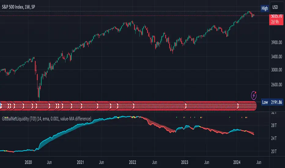
NZTLevelDESCRIPTION IN ENGLISH
🔶 INTRODUCTION
NZTLevel is an advanced indicator for TradingView, inspired by mentor Almaz , and designed to provide traders with in-depth analysis of market liquidity and the movements of key players.
🔶 CONTENT
Based on an analysis based on liquidity and tracking a key player , the indicator identifies Breaker levels and UPM (MarketMaker Position Level in RU), which help determine potential pivot points and market direction (trend) , and also shows a direction line , giving information about the state in which each candle is located on the chart (effort, consolidation or normal trend movement without effort), as well as the transparency of the candles , made specifically so that the direction line is clearly and clearly visible.
🔶 LOGIC
🔹Breaker Levels (Local and Global)
Breaker levels , divided into local and global , are identified through a detailed algorithm that takes into account the penetration of levels with high liquidity and the expected subsequent reaction of the market. These levels are visualized on the chart as lines, the color and thickness of which are customizable by the user, providing a clear understanding of the current market situation. Breaker levels allow us to determine the direction of the market , these are the levels from which we can expect a reaction, and after breaking through this level we receive valuable information
🔹UPM (Sell Stop and Buy Stop)
UPM monitors the activity of market makers and helps predict significant market movements . For example, if the last UPM indicates a buy stop, this signals the possibility of long positions, which is extremely valuable for traders looking to optimize their entries and manage risk.
🔹Directional line (Линия направленности)
The Indicator also includes a directional line that changes color depending on the strength and direction of the current movement , providing a visual representation of market trends and consolidation.
🔶 SETTINGS
🔹Text (Текст)
Allows you to configure or turn off/on the display of level text, specifying their type with text at the beginning of the level drawing (labels), as well as its size, the color of the level text at the top or bottom separately.
🔹Levels (Уровни)
Allows you to configure or turn off/on the display of the levels themselves, their color, thickness. As well as the number of penetrations of the level to remove it, as well as the number of candles for consideration and analysis by the indicator on the chart.
🔹Directional Line (Линия направленности)
Allows you to adjust the thickness of this line; you can disable it in the style tab.
🔹Graph and Candle Settings (Настройки графика и свечей)
Allows you to configure how many candles to extend the level to the right, the transparency of candles (can be disabled in styles), default colors of candles (for setting transparency)
🔶 RECOMMENDATIONS FOR USE
Customize the visual display of the indicator through the built-in settings, including the colors of the liquidity lines and their thickness.
NZTLevel surpasses basic indicators such as moving averages, Bollinger Bands, RSI, and others with a unique approach to analyzing liquidity and positioning of major players, providing traders with a comprehensive tool for making informed decisions in the market.
The indicator was developed by Temirlan Tolegenov for NZT Trader Community , March 2024, Prague, Czech Republic
ОПИСАНИЕ НА РУССКОМ ЯЗЫКЕ
🔶 ВСТУПЛЕНИЕ
NZTLevel — это продвинутый индикатор для TradingView, вдохновленный ментором Алмазом , и разработанный с целью предоставить трейдерам глубокий анализ рыночной ликвидности и движения крупных игроков.
🔶 СОДЕРЖАНИЕ
На основе анализа, основанном на ликвидности и отслеживании крупного игрока , индикатор выявляет Брейкер уровни и УПМ (Уровень Позиции МаркетМейкера) , которые помогают определить потенциальные точки разворота и направленность рынка , а так же показывает линию направленности , дающую информацию о состоянии в которой находится каждая свеча на графике (усилие, консолидация или обычное трендовое движения без усилия), а так же прозрачность свечей , сделанная специально для того, чтобы линия направленности была ясно и четко видима.
🔶 ЛОГИКА
🔹Брейкер Уровни (Локальные, Глобальные)
Брейкер уровни , подразделяются на локальные и глобальные , идентифицируются через детализированный алгоритм, учитывающий пробитие уровней с высокой ликвидностью и ожидаемую последующую реакцию рынка. Эти уровни визуализируются на графике в виде линий, цвет и толщина которых настраиваются пользователем, предоставляя четкое понимание текущей рыночной ситуации . Брейкер уровни позволяют нам определить настроение и направлениедвижения рынка , это уровни, от которых мы можем ожидать реакции, и после пробития которых мы получаем ценную информацию .
🔹УПМ (Бай стоп, Селл стоп)
УПМ отслеживает активность МаркетМейкеров и помогает проанализировать значительные рыночные движения . К примеру если последний УПМ указывает на бай стоп, это сигнализирует о возможности длинных позиций, что чрезвычайно ценно для трейдеров, стремящихся к оптимизации своих входов и управлению рисками.
🔹Линия направленности
Так же Индикатор включает линию направленности , которая изменяет цвет в зависимости от силы и направления текущего движения , предоставляя наглядное представление о трендах и консолидации рынка.
🔶 НАСТРОЙКИ
🔹Текст
Позволяет настроить или выключить/включить отображение текста уровней, уточняющий их тип текстом у начала отрисовки уровня (labels), так же его размер, цвет текста уровня сверху, или снизу отдельно.
🔹Уровни
Позволяет настроить или выключить/включить отображение самих уровней, их цвет, толщину. А так же количество пробитий уровня для его удаления, как и количество свеч для рассмотрения и анализа индикатором на графике.
🔹Линия направленности
Позволяет настроить толщину этой линии, отключить ее можно во вкладке style (стиль)
🔹Настройки графика и свечей
Позволяют настроить то, на сколько свеч протягивать уровень направо, прозрачность свечей (можно отключить в стилях (style)), цвета свечей по умолчанию (для настройки прозрачности)
🔶 РЕКОМЕНДАЦИИ К ИСПОЛЬЗОВАНИЮ
Настроить визуальное отображение индикатора через встроенные настройки, включая цвета линий ликвидности и их толщину.
NZTLevel превосходит базовые индикаторы, такие как скользящие средние, Bollinger Bands, RSI, и другие, благодаря уникальному подходу к анализу ликвидности и позиционирования крупных игроков, предоставляя трейдерам комплексный инструмент для принятия обоснованных решений на рынке.
Индикатор разработан Темирланом Толегеновым для международного сообщества NZT Trader , Март 2024, Прага, Чешская Республика
The indicator is published in accordance and respect to all House Rules of the TradingView platform.
Индикатор опубликован в соответствии и уважением ко всем внутренним правилами платформы TradingView.