Previous Cycle Range + SMTs [bilal x shpat]Inspired by ICT (Inner Circle Trader) concepts
Description made by ChatGPT
Thank you shpat.a for making the SMT option
📝 Overview
The Previous Cycle Range + SMTs indicator is a multi-timeframe tool designed to visualize key market structure levels derived from the previous trading cycle’s range — a concept heavily utilized in ICT-style analysis.
In addition to the traditional range levels, this indicator adds Smart Money Tool (SMT) detection, allowing traders to identify bullish or bearish divergences across multiple correlated assets, giving an edge in spotting potential turning points and liquidity imbalances.
It helps traders identify equilibrium levels, liquidity zones, and potential premium/discount areas based on the prior day (or any chosen period) high and low — now with intermarket divergence insights.
⚙️ Features
Custom Cycle Length: Define your own cycle in minutes (e.g., 1440 = 1 day, 10080 = 1 week).
Previous High/Low: Automatically plots the previous cycle’s high and low levels.
Equilibrium (EQ): Optional 50% midpoint line to highlight the market’s equilibrium.
Quarter Levels: Adds 25% and 75% range lines for refined premium/discount analysis.
Extended Ranges: Optional extended levels (e.g., -100%, +200%) to identify continuation or retracement targets.
Fib Levels (1.272 & 1.618): Adds ICT-style Fibonacci extension levels for confluence zones.
Smart Money Tool (SMT) Detection:
Detects bullish or bearish divergences between your main asset and up to two comparison symbols.
Highlights potential SMT zones with optional text labels for quick visualization.
Optional SMT summary table displays divergence status for all three assets.
Custom Styling: Full control over colors, line width, label style, and extension distance.
💡 How It Helps
This indicator aligns with ICT principles by making the previous day’s range visible and actionable, now with SMT divergence insights:
The previous day’s high/low often act as liquidity pools.
The equilibrium (EQ) represents fair value — useful for spotting premium/discount zones.
Quarter levels and Fibonacci extensions add precision when mapping market structure and potential reaction points.
SMT detection helps traders identify early divergence signals that may indicate upcoming bullish or bearish moves across correlated markets.
🔍 Example Uses
Identify where price is trading relative to the previous session’s range.
Use EQ and quarter levels to gauge premium vs. discount conditions.
Spot intermarket divergences using SMTs to anticipate potential reversal or continuation points.
Combine with other ICT-based tools (e.g., PD arrays, dealing ranges, or kill zones) for refined trade setups.
Cari skrip untuk "imbalance"

Volume Profile, Pivot Anchored by DGT - reviewedVolume Profile, Pivot Anchored by DGT - reviewed
This indicator, “Volume Profile, Pivot Anchored”, builds a volume profile between swing highs and lows (pivot points) to show where trading activity is concentrated.
It highlights:
Value Area (VAH / VAL) and Point of Control (POC)
Volume distribution by price level
Pivot-based labels showing price, % change, and volume
Optional colored candles based on volume strength relative to the average
Essentially, it visualizes how volume is distributed between market pivots to reveal key price zones and volume imbalances.
Basic FVG (Zuki)This indicator identifies and displays Fair Value Gaps (FVGs) to highlight market imbalances.
FEATURES:
- Detects classic bullish and bearish FVGs.
- Option to automatically delete FVGs once filled by a wick.
- Customize FVG colors and box length.
- Use Lookback Period and Max FVG settings to keep the chart clean.
Simple

Delta Volume Heatmap🔥 Delta Volume Heatmap
The Delta Volume Heatmap visualizes the real-time strength of per-bar delta volume — highlighting the imbalance between buying and selling pressure.
Each column’s color intensity reflects how strong the delta volume deviates from its moving average and standard deviation.
🟩 Green tones = Buy-dominant activity (bullish imbalance)
🟥 Red tones = Sell-dominant activity (bearish imbalance)
This tool helps traders quickly identify:
Abnormal volume spikes
Absorption or exhaustion zones
Potential reversal or continuation signals
Delta Volume Heatmap Delta Volume Heatmap
The Delta Volume Heatmap visualizes the real-time strength of per-bar delta volume — highlighting the imbalance between buying and selling pressure.
Each column’s color intensity reflects how strong the delta volume deviates from its moving average and standard deviation.
🟩 Green tones = Buy-dominant activity (bullish imbalance)
🟥 Red tones = Sell-dominant activity (bearish imbalance)
This tool helps traders quickly identify:
Abnormal volume spikes
Absorption or exhaustion zones
Potential reversal or continuation signals

Delta Volume Heatmap Delta Volume Heatmap
The Delta Volume Heatmap visualizes the real-time strength of per-bar delta volume — highlighting the imbalance between buying and selling pressure.
Each column’s color intensity reflects how strong the delta volume deviates from its moving average and standard deviation.
Green tones = Buy-dominant activity (bullish imbalance)
Red tones = Sell-dominant activity (bearish imbalance)
This tool helps traders quickly identify:
Abnormal volume spikes
Absorption or exhaustion zones
Potential reversal or continuation signals
Advanced Institucional Trading IndicatorThe Advanced Institutional Trading Indicator is a comprehensive technical analysis tool that combines four institutional trading concepts to identify where large market participants hunt liquidity, establish positions, and create supply/demand imbalances. The indicator integrates pivot-based reversal signals, liquidity sweep detection, volumetric order blocks, and equal highs/lows identification into a unified framework for analyzing institutional footprints in the market.
What It Detects
Pivot-Based Reversal Signals: Swing highs/lows marking potential trend reversals
Liquidity Sweeps: False breakouts indicating institutional stop-hunting
Volumetric Order Blocks: Supply/demand zones with buying vs selling pressure ratios
Equal Highs/Lows (EQH/EQL): Liquidity pools where stops cluster
In Practice
Traders can watch for equal highs/lows near order blocks, wait for sweeps of these levels as confirmation of liquidity capture, then look for reversal signals to time entries with the expectation that institutions have now positioned themselves and the true directional move can begin.
Logic used
Pivots: Standard functions with configurable periods, signals when swing type alternates
Sweeps: Detects brief violations of swing levels with cooldown filter
Order Blocks: Three-candle volume split into buying/selling pressure, filtered by ATR
Equal Levels: Compares consecutive pivots within ATR-based threshold
Visual representation
Reversal Signals: Green "Buy-point"/red "Sell-point" labels.
Sweeps: Dashed lines with "Sweep" text and swing markers.
Order Blocks: Colored boxes with volumetric bars and percentages.
Equal Levels: Golden lines with $ symbols.
Customization options
Pivot Length, Cooldown Period, Swing Length, Zone Count (1/3/5/10), ATR Multiplier, Threshold, customizable colors and styles.
Recommendations for use: Lower timeframes use smaller parameters (5-15 pivot, 20-35 swing). Higher timeframes use larger (20-50 pivot, 50-100 swing). Adjust for volatility.
Originality and value
While this indicator utilizes established concepts from institutional trading methodology (particularly Smart Money Concepts and ICT principles), its value proposition includes:
- Integration: Combines four complementary analysis tools into a single cohesive framework rather than requiring multiple separate indicators
- Volumetric Enhancement: Adds quantitative volume analysis to order blocks, showing not just where institutions positioned but how much buying vs selling pressure existed
- Automated Zone Management: Intelligently combines overlapping order blocks to reduce visual noise while preserving essential information
- Intelligent Filtering: Uses ATR-based thresholds for equal highs/lows and maximum order block size, adapting to market volatility
- Coordinated Signaling: All components reference similar swing detection logic, creating alignment between different institutional footprint indicators
Disclaimer
This indicator is a technical analysis tool and does not constitute financial advice.
/////Descripcion en español/////
El Advanced Institutional Trading Indicator combina cuatro conceptos institucionales—reversiones por pivotes, barridos de liquidez, bloques volumétricos y niveles iguales—para identificar dónde grandes participantes cazan liquidez y establecen posiciones.
Qué detecta
1. Reversiones por Pivotes: Máximos/mínimos marcando cambios de tendencia
2. Barridos de Liquidez: Falsas roturas indicando caza de stops institucional
3. Bloques Volumétricos: Zonas oferta/demanda con ratios presión compradora/vendedora
4. Niveles Iguales (EQH/EQL): Pools de liquidez donde se agrupan stops
Cómo usarlo
Observar niveles iguales cerca de bloques, esperar barridos como confirmación de captura de liquidez, entrar con señales de reversión cuando instituciones se han posicionado.
Lógica utilizada
- Pivotes: Funciones estándar configurables, señaliza cuando alternan
- Barridos: Detecta violaciones breves con filtro de enfriamiento
- Bloques: Volumen de tres velas dividido en presión compradora/vendedora, filtrado por ATR
- Niveles Iguales: Compara pivotes consecutivos dentro de umbral ATR
Representación visual
Señales: Etiquetas "Buy/Sell-point" verdes/rojas. Barridos: Líneas punteadas con "Sweep" y marcadores swing. Bloques: Cajas con barras volumétricas y porcentajes. Niveles: Líneas doradas con símbolo $.
Configuraciones clave
Pivot Length, Cooldown Period, Swing Length, Zone Count (1/3/5/10), ATR Multiplier, Threshold, colores y estilos personalizables.
Consejos: Marcos menores usan parámetros pequeños (5-15 pivot, 20-35 swing). Marcos mayores usan grandes (20-50 pivot, 50-100 swing). Ajustar según volatilidad.
Originalidad
Integra cuatro herramientas en un marco. Añade análisis volumétrico a bloques. Combina automáticamente zonas superpuestas. Usa filtrado adaptativo basado en ATR. Alinea componentes con lógica unificada basada en Smart Money/ICT.
Descargo
Herramienta de análisis técnico, no asesoramiento financiero.

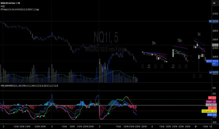
Multi-TF 👀### Multi-Timeframe Analysis (MTF-Analysis)
**Overview**
The Multi-Timeframe Analysis indicator is a powerful visualization tool designed for traders who incorporate multi-timeframe (MTF) strategies into their decision-making process. It overlays compact, customizable candle representations from up to four higher timeframes directly on your chart, positioned to the right of the last bar for quick reference. This allows you to monitor price action, momentum via EMAs, and key levels like Fair Value Gaps (FVGs) across multiple resolutions without switching charts. Built with efficiency in mind, it supports automatic timeframe detection, real-time updates, and a clean, non-intrusive design that enhances your trading workflow.
Ideal for day traders, swing traders, and scalpers, this indicator helps identify alignments between timeframes, spot potential reversals or continuations, and validate entries/exits based on higher-timeframe context. It leverages Pine Script v6 for smooth performance, with optimizations to handle up to 5000 bars back and extensive drawing limits.
**Key Features**
- **Multi-Timeframe Candle Display**: Renders recent candles (configurable from 5 to 100 per timeframe) from selected higher timeframes (e.g., 5m, 15m, 1H, 4H) as compact bars with customizable width, spacing, and padding. Bullish and bearish candles are color-coded for instant recognition.
- **Automatic Timeframe Adaptation**: When enabled, the indicator intelligently selects complementary timeframes based on your chart's resolution (e.g., on a 1m chart, it might show 5m, 15m, and 1H). Manual overrides are available for full control.
- **EMA Overlays**: Plots EMA9, EMA21, and EMA50 on each MTF section using a user-defined source (e.g., OHLC/4, close). EMAs can be dashed for clarity and enabled/disabled per timeframe, helping to gauge momentum and trend strength.
- **Fair Value Gaps (FVGs)**: Detects bullish (+FVG) and bearish (-FVG) gaps with a configurable lookback length (5-50 bars). Gaps are visualized as dotted boxes extending from the candle, highlighting potential support/resistance zones or imbalances.
- **Time Labels and Debugging**: Displays timestamp labels under every fourth candle for chronological context. A debug mode expands spacing and adds detailed labels (e.g., OHLC, volume, EMA values) for testing and verification.
- **Customization Options**: Extensive inputs for colors (bodies, wicks, EMAs, FVGs), label sizes/styles, and layout ensure seamless integration with your chart theme. Supports futures symbols with a time offset adjustment.
- **Performance Optimizations**: Uses arrays for efficient data management, clears drawings on realtime updates or timeframe changes, and limits buffer sizes to prevent overload.
**How to Use**
1. Add the indicator to your chart via TradingView's "Indicators" menu.
2. Configure timeframes: Enable/disable up to four TFs and set the number of candles to display. Use "Auto Timeframe" for smart defaults.
3. Adjust EMAs: Select the source type and toggle per TF to focus on relevant momentum signals (e.g., EMA9 crossovers for short-term trades).
4. Enable FVGs: Activate per TF and tweak the length to suit your market (shorter for volatile assets, longer for trends).
5. Fine-tune appearance: Modify padding, candle width, and colors to avoid clutter. Use debug mode during setup.
6. Interpret: Align your chart's price action with MTF candles—look for confluence in trends, FVGs filling as support/resistance, or EMA alignments for high-probability setups.
**Input Settings**
- **General**: Hour offset for time adjustments (useful for futures).
- **Timeframes**: Enable TFs 1-4, select resolutions (e.g., "5m"), and set candle counts. Auto mode simplifies this.
- **FVG/iFVG**: Toggle per TF, customize colors and detection length.
- **EMA**: Enable per TF, choose source, colors, and dashed style.
- **Candle Appearance**: Bull/bear colors for bodies/wicks, width/spacing/padding, label size/color.
- **Debug**: Expands view for detailed inspection.
**Notes**
- This indicator is non-repainting and updates in realtime, but performance may vary on lower timeframes with many candles—reduce counts if needed.
- FVGs are calculated locally on recent bars for efficiency; historical gaps beyond the buffer aren't shown.
- Compatible with all symbols, but best on volatile markets like forex, crypto, or indices.
- Feedback welcome—updates may include more MA types or advanced FVG filters.
Enhance your edge with multi-timeframe insights—try MTF-Analysis today!
Volume Spread Analysis — Educational (VSA Study)Volume Spread Analysis — Educational (VSA Study)
Overview
This study is an educational tool built around classic Volume Spread Analysis (VSA), the methodology introduced by Tom Williams.
VSA looks at the relationship between volume, price spread, and closing position to highlight potential supply and demand imbalances.
The script is designed for learning and visual study, not for trade signals. It highlights well-known VSA events directly on the chart and adds reference lines and a colored moving average to help contextualize strength and weakness.
What It Shows
Major VSA Events: Stopping Volume (SV), Selling Climax (SC), Shakeout (SO), No Supply (NS), No Demand (ND), Buying Climax (BC), Upthrust (UT), Supply Coming In (SCI), End of Rising Market (EoRM), and Test Bars.
Trigger Lines: When a strong VSA bar appears, the script draws horizontal levels at the bar’s high and low. These act as educational “zones” where future price reactions can be studied.
Context Moving Average: A dotted MA changes color with price context (black or green when strength is confirmed, red when weakness dominates).
How It Works
Each event is identified using a blend of conditions:
Volume vs. its average
Spread vs. its average
Close location within the bar
Wick analysis (upper/lower shadows)
Short-term trend filters (5- and 10-period SMAs)
By combining these elements, the script maps chart activity to classical VSA definitions.
How to Study With It
Signs of Strength
Look for SC, SV, or SO bars.
Wait until price trades above the blue trigger line drawn from those bars.
Watch for a No Supply (NS) test bar in that zone.
Confirmation comes when the immediate next bar closes up and strong, with higher volume than the prior two bars.
The dotted MA should shift to black or green, showing supportive background strength.
Signs of Weakness
Watch for Supply Coming In, BC, or UT events.
Wait until price trades below the red trigger line.
Look for a No Demand (ND) bar in that area.
Confirmation comes when the following bar closes down and weak, with higher volume than the prior two bars.
The dotted MA should be red, reinforcing weakness.
Originality
This script was written from scratch with a focus on education and clarity. While VSA concepts themselves are public domain, the implementation here is unique:
It combines event detection, trigger zones, and a contextual MA in one framework.
It avoids acting as a trading system and instead provides a practical study workflow that traders can follow step by step.
Disclaimer
This indicator is for educational purposes only.
It does not generate buy or sell signals and should not be used as financial advice.
Trading involves risk; always perform your own analysis and risk management.

Funding Rate Aggregated (Lite)Funding Rate Aggregated (Lite) provides traders with a consolidated view of perpetual futures funding rates across multiple major exchanges. Instead of monitoring each market individually, the script aggregates the available data into a single, average funding rate series—streamlining analysis and helping identify market-wide positioning imbalances.
The indicator supports Binance, Bybit, OKX, Bitget, and Coinbase, with user-controlled toggles to enable or disable specific venues. For exchanges offering multiple quote currencies (e.g., USDT, USD, or USDC pairs) inclusion is based on whether their trading activity (volume) is relevant (determined manually, not via code). Each available rate is checked and included in the calculation only if valid, ensuring the average reflects actual market conditions.
From a technical standpoint, the script:
Retrieves real-time funding rate data directly via request.security for the current symbol’s base currency.
Applies standard formatting similar to TradingView's official indicator.
Visualizes the average funding rate with color-coded plotting (green for positive, red for negative), alongside a neutral zero reference line.
Why it is useful:
Funding rates are a direct measure of long/short market bias in perpetual swaps. Persistently high positive rates often indicate overcrowded longs, while negative rates can reveal excessive shorting.
By combining multiple exchanges into one metric, traders gain a more robust signal, reducing noise from isolated exchange-specific anomalies.
This aggregated perspective can assist in timing contrarian trades, spotting funding-driven inefficiencies, and gauging overall market sentiment.
Applications in trading include:
Sentiment analysis: Assess whether perpetual futures traders are leaning heavily long or short.
Cross-exchange confirmation: Ensure that extreme funding isn’t confined to a single venue.
Risk management: Identify periods of elevated funding costs that may erode profitability in longer-term positions.
Strategy filters: Integrate the aggregated rate as a condition for entries/exits, or to adjust position sizing during extremes.
The Lite designation emphasizes simplicity and efficiency: the indicator avoids unnecessary visual and data-driven clutter and focuses on delivering one clear, aggregated signal that can be adapted to a wide range of trading styles.

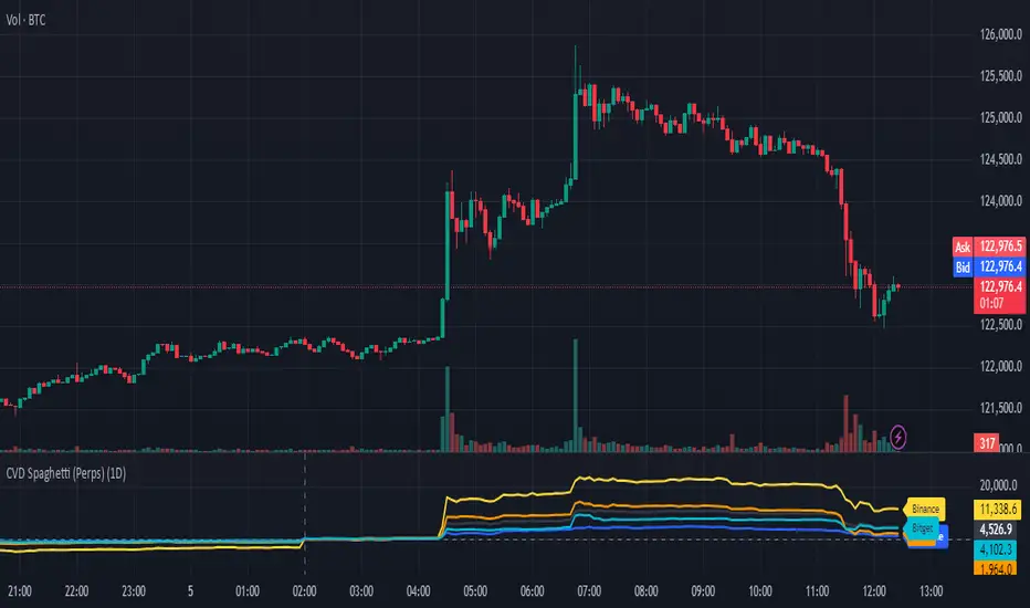
CVD Spaghetti - Multi-Exchange (Perpetuals)CVD Spaghetti – Multi-Exchange (Perpetuals) is designed to track and visualize Cumulative Volume Delta (CVD) across multiple cryptocurrency perpetual futures exchanges in one consolidated view. This indicator provides traders with a clearer perspective on buying and selling pressure by monitoring how order flow develops on different venues simultaneously.
What it does
The script calculates the CVD for each enabled exchange and plots them as separate lines on a single chart, creating a “spaghetti” style visualization. This allows traders to identify relative strength or weakness between major exchanges, which can often hint at institutional positioning, liquidity shifts, and potential market imbalances.
Why it’s useful
Order flow and liquidity dynamics can differ significantly between exchanges. By aggregating and comparing these flows, traders can:
Detect which venue is leading during trend development.
Spot divergences between exchanges, which may indicate inefficiencies or arbitrage-driven movements.
Gauge overall sentiment strength by comparing multiple sources instead of relying on a single dataset.
Technical details
Anchor Period Reset: The cumulative calculation resets based on the user-defined Anchor Period (default: daily), keeping data relevant for the chosen trading horizon.
Dynamic Resolution: The script automatically selects an appropriate lower timeframe for data requests based on the chart timeframe to maintain responsiveness and accuracy.
Normalization: Not all exchanges report volume in the same way—some use quote currency (USD), others in contracts or ticks. To ensure comparability, this indicator normalizes volumes where necessary:
Bybit USD and OKX contracts are divided by price to approximate base-coin terms.
Single-contract venues (e.g., Deribit) are normalized similarly.
Exchanges already reporting in the base currency remain unchanged.
Multi-Exchange Coverage: Supports major venues including Binance, Bybit, OKX, Bitget, Coinbase, and optional secondary exchanges like Blofin, Whitebit, and Deribit.
Visual Aids:
Zero baseline for directional reference.
Vertical session markers at each reset point.
Optional exchange labels positioned dynamically on the last bar for quick identification.
How traders might use it
Trend confirmation: Strong synchronized CVD across all major exchanges supports continuation; fragmentation may suggest weakening conviction.
Cross-exchange divergence: When one exchange’s CVD diverges from others, it can signal localized liquidity shocks or large player activity.
High-frequency strategies: On lower timeframes, the spaghetti view can highlight which venue is absorbing or providing liquidity fastest, aiding short-term decision-making.
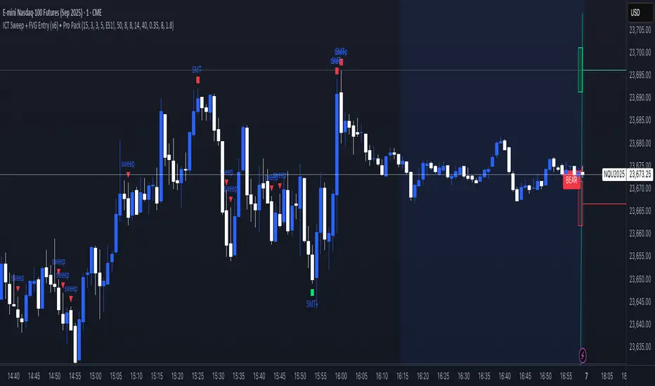
ICT Sweep + FVG Entry (v6) • Pro Pack 📌 ICT Sweep + FVG Entry Pro Pack
This indicator combines key ICT price action concepts with practical execution tools to help traders spot high-probability setups faster and more objectively. It’s designed for scalpers and intraday traders who want to keep their chart clean but never miss critical market structure events.
🔑 Features
Liquidity Pools (HTF)
• Auto-detects recent swing highs/lows from higher timeframes (5m/15m).
• Draws both lines and optional rectangles/zones for clear liquidity areas.
Liquidity Sweeps (BSL/SSL)
• Identifies when price sweeps above/below liquidity pools and rejects back.
• Optional Grade-A sweep filter (wick size + strong re-entry).
Fair Value Gaps (FVGs)
• Highlights bullish/bearish imbalances.
• Optional midline (50%) entry for precision.
• Auto-invalidation when price fully closes inside the gap.
Killzones (New York)
• Highlights AM (9:30–11:30) and PM (14:00–15:30) killzones.
• Option to block signals outside killzones for higher strike rate.
Bias Badge (DR50)
• Displays if price is trading in a Bull, Bear, or Range context based on displacement range midpoint.
SMT Assist (NQ vs ES)
• Detects simple divergences between indices:
Bearish SMT → NQ makes HH while ES doesn’t.
Bullish SMT → NQ makes LL while ES doesn’t.
SL/TP Helper & R:R Label
• Automatically draws stop loss (at sweep extreme) and target (opposite pool or recent swing).
• Displays expected Risk:Reward ratio and blocks entries if below your chosen minimum.
Filters
• ATR filter ensures signals only appear in sufficient volatility.
• Sweep quality filter avoids weak wicks and fake-outs.
🎯 How to Use
Start on HTF (5m/15m) → Identify liquidity zones and bias.
Drop to LTF (1m) → Wait for a liquidity sweep confirmation.
Check for FVG in the sweep’s direction → Look for retest entry.
Use the SL/TP helper to validate your risk/reward before taking the trade.
Focus entries during NY Killzones for maximum effectiveness.
✅ Why this helps
This tool reduces screen time and hesitation by automating repetitive ICT concepts:
Liquidity pools, sweeps, and FVGs are marked automatically.
Killzone timing and SMT divergence are simplified.
Clear visual signals for entries with built-in RR filter help keep your trading mechanical.
⚠️ Disclaimer: This script is for educational purposes only. It does not provide financial advice or guarantee results. Always use proper risk management.
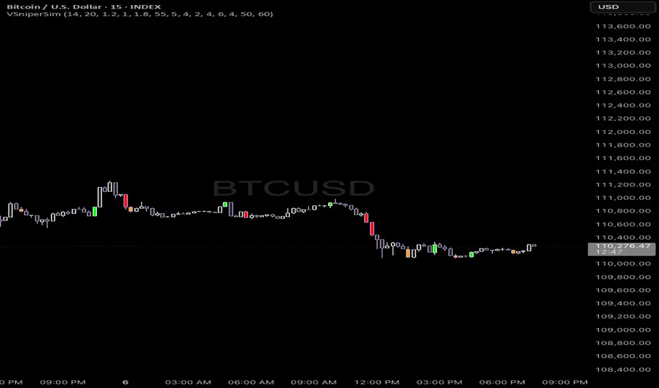
Vector Sniper Pro What it is
Vector Sniper (Simplified) is a single, original algorithm that flags impulsive “vector” moves only when volatility, volume, and structure align. It is not a mashup of other indicators; everything below is computed from raw OHLCV with a small, transparent ruleset.
⸻
Core idea (signal = force × participation × context)
1. Force (Volatility):
• We z-score true range: trZ = (ATR(1) - SMA(ATR(1), N)) / StDev(ATR(1), N).
• A move must exceed a user-set Volatility Z-Score.
2. Participation (Volume):
• We z-score raw volume: volZ = (Vol - SMA(Vol, N)) / StDev(Vol, N).
• Volume must also exceed a Volume Z-Score.
3. Context (Structure, Body, Imbalance, Traps):
• Body% filter: real body / range ≥ Min Body %.
• Delta-volume proxy: (bullVol − bearVol) / volume, where bullVol = volume*(close−low)/range and bearVol = volume*(high−close)/range. We require positive imbalance for bulls, negative for bears.
• Structure break (optional): price must take out the prior N-bar high/low.
• Trap detection (optional): spring/upthrust patterns defined by lower-low/upper-high followed by a close back inside.
If the above align, you get a Bull Vector (green) or Bear Vector (red). “Extreme” vectors require the same conditions at a higher multiple (Ext Mult).
⸻
Noise control (pre-signal gate)
Before a vector is allowed, a pre-signal score (0–7) must pass:
• Checks include spring/upthrust, no-supply/no-demand, imbalance, volume > average, VWAP side alignment, EMA trend alignment, proximity to structure break, and candle direction.
• You choose a minimum score, persistence (must occur ≥N times inside last M bars), cooldown after a pass, and hysteresis vs the opposite side.
This prevents one-off blips and keeps signals directional.
⸻
Optional confluence
• VWAP alignment: require price on the correct side and VWAP slope with it.
• EMA filter: require EMA trend agreement.
• HTF bias (optional): compare HTF close vs HTF EMA on a selected timeframe.
• Implemented with request.security and no look-ahead; bias updates when the higher timeframe bar closes.
⸻
Visuals & alerts
• Candle colors (5 total):
• Green = Bull Vector, Red = Bear Vector.
• Blue = Pre-Bull, Orange = Pre-Bear.
• Gray = Neutral.
• Markers (optional): diamonds = “Extreme” vectors; small triangles = pre-signals.
• Built-in alerts: Bull Vector, Bear Vector, Extreme Bull/Bear, Pre-Bull, Pre-Bear.
• Add from: Alerts → Condition → this script → choose event.
⸻
How to use (practical)
1. Start with defaults. Turn on VWAP and EMA filters; add HTF bias if you want fewer but cleaner signals.
2. Hunt for alignment: Pre-signal (blue/orange) → Vector (green/red) in the same direction.
3. Use your own risk model for entries/exits; the script does not place orders or compute stops/targets.
⸻
Inputs (plain English)
• ATR/Volume Periods & Z-Scores: sensitivity to volatility/participation.
• Extreme Multiplier: threshold for “Extreme” vectors.
• Structure Break (bars) & Traps: contextual confirms.
• Pre-signal gate: Min Score, Persistence (N in last M), Cooldown, Opposite-side lockout.
• Confluence: VWAP side, EMA trend, optional HTF bias (timeframe + EMA length).
• Visuals: candle painting and markers.
⸻
Design notes / limitations
• Signals evaluate on bar close. Intrabar they can form and cancel; for consistency, trade on closed bars.
• HTF bias is derived from closed HTF bars; no future data is used.
• This is an indicator, not financial advice. Backtest forward and manage risk.
⸻
Why this isn’t a “mashup”:
All components are purposeful and documented: z-score volatility + z-score volume (force & participation), body% and delta-volume (quality), structure & traps (context), and a scored, persistent pre-filter with VWAP/EMA/HTF alignment (noise control).
Wick Pressure Zones [BigBeluga]
The Wick Pressure Zones indicator highlights areas where extreme wick activity occurred, signaling strong buy or sell pressure. By measuring unusually long upper or lower wicks and mapping them into gradient volume zones , the tool helps traders identify levels where liquidity was absorbed, leaving behind footprints of supply and demand imbalances. These zones often act as support, resistance, or liquidity sweep magnets .
🔵 CONCEPTS
Extreme Wicks : Large upper or lower shadows indicate aggressive rejection — upper wicks suggest selling pressure, lower wicks suggest buying pressure.
Volumatic Gradient Zones : From each detected wick, the indicator projects a layered gradient zone, proportional to the wick’s size, showing where most pressure occurred.
Liquidity Footprints : These zones mark levels where significant buy/sell volume was executed, often becoming reaction points on future retests.
Automatic Expiration : Zones persist until price decisively trades through them, after which they are cleared to keep the chart clean.
🔵 FEATURES
Automatic Wick Detection : Identifies extreme upper and lower wick events using percentile filtering and Realative Strength Index.
Gradient Zone Visualization : Builds a 10-layer zone from the wick top/bottom, shading intensity according to pressure strength.
Volume Labels : Each zone is annotated with the bar’s volume at the origin point for added context.
Dynamic Zone Extension : Zones extend to the right as long as they remain relevant; once price closes through them, they are removed.
Support & Resistance Mapping : Upper wick zones (red) behave like supply/resistance, lower wick zones (green) like demand/support.
Clutter Control : Limits the number of active zones (default 10) to keep charts responsive.
Background Highlighting : Optional background shading when new wick zones appear (red for sell, green for buy).
🔵 HOW TO USE
Look for Upper Wick Zones (red) : Indicate strong selling pressure; watch for resistance, reversals, or liquidity sweeps above.
Look for Lower Wick Zones (green) : Indicate strong buying pressure; watch for support or liquidity sweeps below.
Trade Retests : When price returns to a zone, expect a reaction (bounce or rejection) due to leftover liquidity.
Combine with Context : Align wick pressure zones with HTF support/resistance, order blocks, or volume profile for stronger signals.
Use Volume Labels : High-volume wicks indicate more significant liquidity events, making the zone more likely to act as a strong reaction point.
🔵 CONCLUSION
The Wick Pressure Zones is a powerful way to visualize hidden liquidity and aggressive rejections. By mapping extreme wick events into dynamic, volume-annotated zones, it shows traders where the market absorbed heavy buy/sell pressure. These levels frequently act as magnets or turning points, making them valuable for timing entries, stop placement, or fade strategies.

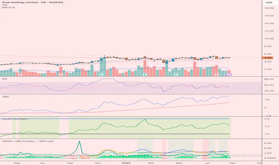
UDVR + OBV Combo — MTF (v6)The UDVR + OBV Combo is a multi-timeframe volume analysis tool that blends the Up/Down Volume Ratio with a normalized On-Balance Volume signal. It highlights when accumulation or distribution truly supports price action, adds higher-timeframe context, and shades the background when both indicators align. Use it to confirm breakouts, spot divergences, and filter trades with the backing of real volume flows.
1.Up/Down Volume Ratio (UDVR)
•Compares the rolling sum of up-volume (bars where price closed higher) vs down-volume (bars where price closed lower).
•A ratio > 1.0 = more accumulation (bullish pressure).
•A ratio < 1.0 = more distribution (bearish pressure).
•Optional histogram shows deviations from the 1.0 baseline.
•Customizable handling of equal closes (count as up, down, split, or ignore).
•Configurable lookback length and optional EMA smoothing.
2. On-Balance Volume (OBV)
•Classic cumulative OBV implemented natively (adds volume on up-bars, subtracts on down-bars).
•Normalized with a z-score so it can be compared across different symbols/timeframes.
•Includes an EMA signal line for slope detection.
•Alignment of OBV vs its EMA highlights rising or waning participation.
3. Multi-Timeframe Support
•Both UDVR and OBV can be plotted from a higher timeframe (HTF) (e.g. Daily UDVR shown on a 1h chart).
•Lets you see big-money accumulation/distribution while trading intraday.
•Shaded background when current TF and HTF agree (both bullish or both bearish).
How to read it
• Bullish confirmation = UDVR > 1 (accumulation) and OBV above EMA (rising participation).
• Bearish confirmation = UDVR < 1 (distribution) and OBV below EMA (falling participation).
• Mixed signals (e.g. UDVR > 1 but OBV falling) = caution; price may lack conviction.
• Divergences : If price makes a new high but OBV or UDVR does not, it’s a warning of weakening trend.
• Higher timeframe context : set HTF = Daily or Weekly and watch how short-term signals align with institutional flows. A long trade on the 15m chart is stronger when Daily UDVR is also above 1.
Inputs
•UDVR Lookback: number of bars for rolling volume sums.
•Smoothing EMA: smooths UDVR for stability.
•Equal Close Handling: decide how equal closes affect UDVR.
•Signal Band: optional UDVR extreme thresholds.
•Show Histogram: toggle UDVR histogram around baseline.
•Higher Timeframe UDVR: overlay Daily/Weekly UDVR on lower timeframe charts.
•OBV EMA length: slope proxy for normalized OBV.
•OBV Normalization window: controls z-score sensitivity.
•Higher Timeframe OBV: overlay higher timeframe OBV.
Alerts
•UDVR Bullish/Bearish cross at the 1.0 baseline.
•OBV slope up/down when OBV crosses its EMA.
•Alignment signals when UDVR and OBV agree (both confirm bullish or bearish conditions).
Why it’s useful
•Combines trend, momentum, and participation in one place.
•Helps avoid false breakouts by checking if volume supports the move.
•Lets you spot accumulation/distribution shifts before they show up in price.
•Gives a higher timeframe context so you’re not trading against the “big picture.”
Once applied, the indicator creates a dedicated pane below price with the following components:
UDVR Line (green/red)
• Green when UDVR > 1.0 (more up-volume than down-volume → accumulation).
• Red when UDVR < 1.0 (more down-volume → distribution).
UDVR Baseline and Bands
• Grey baseline at 1.0 = balance between buying and selling volume.
• Optional upper/lower bands (default 1.5 and 0.67) highlight extreme imbalances.
• Shaded areas between baseline and bands provide visual context for strength/weakness.
UDVR Histogram (optional)
• Columns around the baseline showing (UDVR – 1.0).
• Quick way to gauge how far above/below balance the ratio is.
Higher-Timeframe UDVR (teal line)
• Overlays the UDVR from a higher timeframe (e.g. Daily) on your intraday chart.
• Lets you see whether institutional flows support your shorter-term signals.
OBV Normalized (blue/orange line)
• Classic OBV, but normalized with a z-score so it stays readable across assets.
• Blue when OBV is above its EMA (rising participation).
• Orange when below its EMA (waning participation).
OBV EMA (grey line)
• Signal line showing the slope of OBV.
• Crosses between OBV and this line mark shifts in participation.
Higher-Timeframe OBV (purple line, optional)
• Plots OBV from a higher timeframe for additional context.
Background Shading
• Light green = both UDVR > 1 and OBV > OBV-EMA (bullish alignment).
• Light red = both UDVR < 1 and OBV < OBV-EMA (bearish alignment).
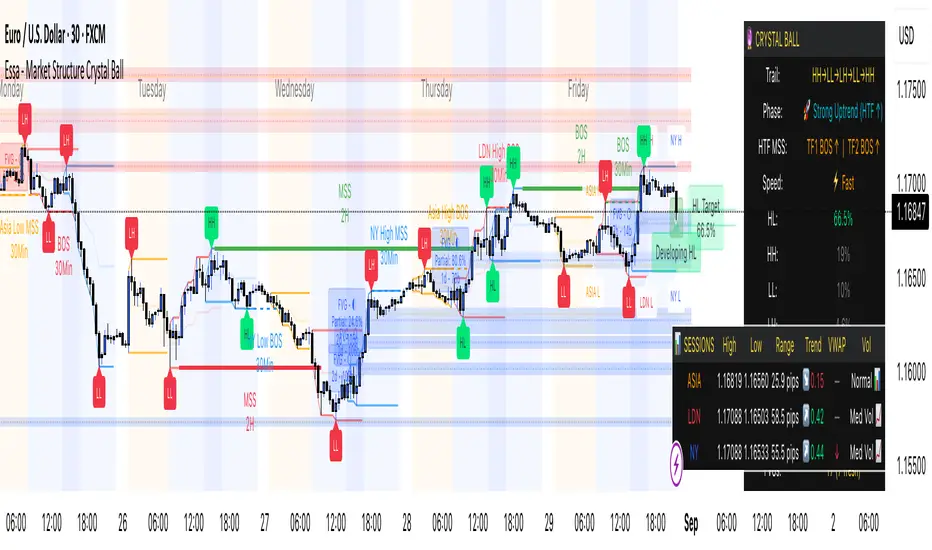
Essa - Market Structure Crystal Ball SystemEssa - Market Structure Crystal Ball V2.0
Ever wished you had a glimpse into the market's next move? Stop guessing and start anticipating with the Market Structure Crystal Ball!
This isn't just another indicator that tells you what has happened. This is a comprehensive analysis tool that learns from historical price action to forecast the most probable future structure. It combines advanced pattern recognition with essential trading concepts to give you a unique analytical edge.
Key Features
The Predictive Engine (The Crystal Ball)
This is the core of the indicator. It doesn't just identify market structure; it predicts it.
Know the Odds: Get a real-time probability score (%) for the next structural point: Higher High (HH), Higher Low (HL), Lower Low (LL), or Lower High (LH).
Advanced Analysis: The engine considers the pattern sequence, the speed (velocity) of the move, and its size to find the most accurate historical matches.
Dynamic Learning: The indicator constantly updates its analysis as new price data comes in.
The All-in-One Dashboard
Your command center for at-a-glance information. No need to clutter your screen!
Market Phase: Instantly know if the market is in a "🚀 Strong Uptrend," "📉 Steady Downtrend," or "↔️ Consolidation."
Live Probabilities: See the updated forecasts for HH, HL, LL, and LH in a clean, easy-to-read format.
Confidence Level: The dashboard tells you how confident the algorithm is in its current prediction (Low, Medium, or High).
🎯 Dynamic Prediction Zones
Turn probabilities into actionable price areas.
Visual Targets: Based on the highest probability outcome, the indicator draws a target zone on your chart where the next structure point is likely to form.
Context-Aware: These zones are calculated using recent volatility and average swing sizes, making them adaptive to the current market conditions.
🔍 Fair Value Gap (FVG) Detector
Automatically identify and track key price imbalances.
Price Magnets: FVGs are automatically detected and drawn, acting as potential targets for price.
Smart Tracking: The indicator tracks the status of each FVG (Fresh, Partially Filled, or Filled) and uses this data to refine its predictions.
🌍 Trading Session Analysis
Never lose track of key session levels again.
Visualize Sessions: See the Asia, London, and New York sessions highlighted with colored backgrounds.
Key Levels: Automatically plots the high and low of each session, which are often critical support and resistance levels.
Breakout Alerts: Get notified when price breaks a session high or low.
📈 Multi-Timeframe (MTF) Context
Understand the bigger picture by integrating higher timeframe analysis directly onto your chart.
BOS & MSS: Automatically identifies Breaks of Structure (trend continuation) and Market Structure Shifts (potential reversals) from up to two higher timeframes.
Trade with the Trend: Align your intraday trades with the dominant trend for higher probability setups.
⚙️ How It Works in Simple Terms
1️⃣ It Learns: The indicator first identifies all the past swing points (HH, HL, LL, LH) and analyzes their characteristics (speed, size, etc.).
2️⃣ It Finds a Match: It looks at the most recent price action and searches through hundreds of historical bars to find moments that were almost identical.
3️⃣ It Analyzes the Outcome: It checks what happened next in those similar historical scenarios.
4️⃣ It Predicts: Based on that historical data, it calculates the probability of each potential outcome and presents it to you.
🚀 How to Use This Indicator in Your Trading
Confirmation Tool: Use a high probability score (e.g., >60% for a HH) to confirm your own bullish analysis before entering a trade.
Finding High-Probability Zones: Use the Prediction Zones as potential areas to take profit, or as reversal zones to watch for entries in the opposite direction.
Gauging Market Sentiment: Check the "Market Phase" on the dashboard. Avoid forcing trades when the indicator shows "😴 Low Volatility."
Confluence is Key: This indicator is incredibly powerful when combined with your existing strategy. Use it alongside supply/demand zones, moving averages, or RSI for ultimate confirmation.
We hope this tool gives you a powerful new perspective on the market. Dive into the settings to customize it to your liking!
If you find this indicator helpful, please give it a Boost 👍 and leave a comment with your feedback below! Happy trading!
Disclaimer: All predictions are probabilistic and based on historical data. Past performance is not indicative of future results. Always use proper risk management.
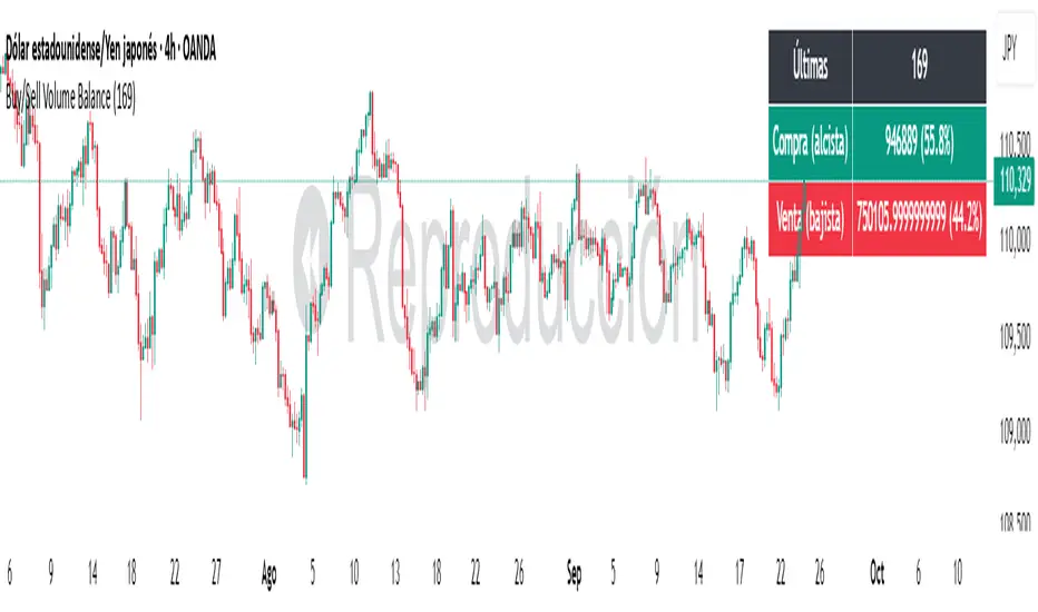
Buy/Sell Volume BalanceDESCRIPTION
Buy/Sell Volume Balance is a simple yet powerful indicator designed to measure and visualize the balance between buying and selling volume over a customizable number of recent candles. It helps traders quickly assess market pressure during consolidation phases or ranges, in order to anticipate the most likely breakout direction.
How it works
The indicator analyzes the last N candles (default = 100, user-editable).
Each candle’s total volume is classified as:
Bullish volume (Buy volume): if the candle closes above or equal to its open.
Bearish volume (Sell volume): if the candle closes below its open.
The volumes are summed separately to calculate:
Total Buy Volume
Total Sell Volume
The percentage of each side relative to the total is also displayed.
All results are shown in a fixed table at the top of the chart for quick interpretation.
Purpose
This tool is specifically designed to help traders evaluate the internal battle between buyers and sellers during a range or sideways market. By understanding which side is accumulating more volume within the range, traders can anticipate which direction is more likely when the price breaks out.
If Buy volume dominates → potential bullish breakout.
If Sell volume dominates → potential bearish breakout.
If both sides are nearly balanced, it signals indecision and a higher chance of false breakouts.
Imbalance Threshold
In practice, traders often consider a clear imbalance when one side reaches at least 55–60% of the total volume.
Above this threshold, the dominant side is more likely to dictate the breakout direction.
Below this threshold, the market is usually in indecision and further confirmation is needed before acting.
How to use it
Add the indicator to your chart and choose the lookback period (number of candles).
Focus on ranges or consolidation zones where price is moving sideways.
Observe the balance of Buy vs Sell volume in the top-right box:
A clear imbalance (>55–60%) suggests the stronger side is more likely to push the breakout.
A balanced ratio (<55–60%) indicates indecision and possible false breakouts.
Use it in combination with support/resistance zones, breakout patterns, or volume spikes for best results.
✅ In summary: This indicator does not give direct buy/sell signals, but it provides valuable context about market pressure, helping you to align your trades with the most probable breakout direction.
Trapped Traders [ScorsoneEnterprises]This indicator identifies and visualizes trapped traders - market participants caught on the wrong side of price movements with significant volume imbalances. By analyzing volume delta at specific price levels, it reveals where traders are likely experiencing unrealized losses and may be forced to exit their positions.
The point of this tool is to identify where the liquidity in a trend may be.
var lowerTimeframe = switch
useCustomTimeframeInput => lowerTimeframeInput
timeframe.isseconds => "1S"
timeframe.isintraday => "1"
timeframe.isdaily => "5"
=> "60"
= ta.requestVolumeDelta(lowerTimeframe)
price_quantity = map.new()
is_red_candle = close < open
is_green_candle = close > open
for i=0 to lkb-1 by 1
current_vol = price_quantity.get(close)
new_vol = na(current_vol) ? lastVolume : current_vol + lastVolume
price_quantity.put(close, new_vol)
if is_green_candle and new_vol < 0
price_quantity.put(close, new_vol)
else if is_red_candle and new_vol > 0
price_quantity.put(close, new_vol)
We see in this snippet, the lastVolume variable is the most recent volume delta we can receive from the lower timeframe, we keep updating the price level we're keeping track of with that lastVolume from the lower timeframe.
This is the bulk of the concept as this level and size gives us the idea of how many traders were on the wrong side of the trend, and acting as liquidity for the profitable entries. The more, the stronger.
There are 3 ways to visualize this. A basic label, that will display the size and if positive or negative next to the bar, a gradient line that goes 10 bars to the future to be used as a support or resistance line that includes the quantity, and a bubble chart with the quantity. The larger the quantity, the bigger the bubble.
We see in this example on NYMEX:CL1! that there are lines plotted throughout this price action that price interacts with in meaningful way. There are consistently many levels for us.
Here on CME_MINI:ES1! we see the labels on the chart, and the size set to large. It is the same concept just another way to view it.
This chart of CME_MINI:RTY1! shows the bubble chart visualization. It is a way to view it that is pretty non invasive on the chart.
Every timeframe is supported including daily, weekly, and monthly.
The included settings are the display style, like mentioned above. If the user would like to see the volume numbers on the chart. The text size along with the transparency percentage. Following that is the settings for which lower timeframe to calculate the volume delta on. Finally, if you would like to see your inputs in the status line.
No indicator is 100% accurate, use "Trapped Traders" along with your own discretion.

Volume Profile Grid [Alpha Extract]A sophisticated volume distribution analysis system that transforms market activity into institutional-grade visual profiles, revealing hidden support/resistance zones and market participant behavior. Utilizing advanced price level segmentation, bullish/bearish volume separation, and dynamic range analysis, the Volume Profile Grid delivers comprehensive market structure insights with Point of Control (POC) identification, Value Area boundaries, and volume delta analysis. The system features intelligent visualization modes, real-time sentiment analysis, and flexible range selection to provide traders with clear, actionable volume-based market context.
🔶 Dynamic Range Analysis Engine
Implements dual-mode range selection with visible chart analysis and fixed period lookback, automatically adjusting to current market view or analyzing specified historical periods. The system intelligently calculates optimal bar counts while maintaining performance through configurable maximum limits, ensuring responsive profile generation across all timeframes with institutional-grade precision.
// Dynamic period calculation with intelligent caching
get_analysis_period() =>
if i_use_visible_range
chart_start_time = chart.left_visible_bar_time
current_time = last_bar_time
time_span = current_time - chart_start_time
tf_seconds = timeframe.in_seconds()
estimated_bars = time_span / (tf_seconds * 1000)
range_bars = math.floor(estimated_bars)
final_bars = math.min(range_bars, i_max_visible_bars)
math.max(final_bars, 50) // Minimum threshold
else
math.max(i_periods, 50)
🔶 Advanced Bull/Bear Volume Separation
Employs sophisticated candle classification algorithms to separate bullish and bearish volume at each price level, with weighted distribution based on bar intersection ratios. The system analyzes open/close relationships to determine volume direction, applying proportional allocation for doji patterns and ensuring accurate representation of buying versus selling pressure across the entire price spectrum.
🔶 Multi-Mode Volume Visualization
Features three distinct display modes for bull/bear volume representation: Split mode creates mirrored profiles from a central axis, Side by Side mode displays sequential bull/bear segments, and Stacked mode separates volumes vertically. Each mode offers unique insights into market participant behavior with customizable width, thickness, and color parameters for optimal visual clarity.
// Bull/Bear volume calculation with weighted distribution
for bar_offset = 0 to actual_periods - 1
bar_high = high
bar_low = low
bar_volume = volume
// Calculate intersection weight
weight = math.min(bar_high, next_level) - math.max(bar_low, current_level)
weight := weight / (bar_high - bar_low)
weighted_volume = bar_volume * weight
// Classify volume direction
if bar_close > bar_open
level_bull_volume += weighted_volume
else if bar_close < bar_open
level_bear_volume += weighted_volume
else // Doji handling
level_bull_volume += weighted_volume * 0.5
level_bear_volume += weighted_volume * 0.5
🔶 Point of Control & Value Area Detection
Implements institutional-standard POC identification by locating the price level with maximum volume accumulation, providing critical support/resistance zones. The Value Area calculation uses sophisticated sorting algorithms to identify the price range containing 70% of trading volume, revealing the market's accepted value zone where institutional participants concentrate their activity.
🔶 Volume Delta Analysis System
Incorporates real-time volume delta calculation with configurable dominance thresholds to identify significant bull/bear imbalances. The system visually highlights price levels where buying or selling pressure exceeds threshold percentages, providing immediate insight into directional volume flow and potential reversal zones through color-coded delta indicators.
// Value Area calculation using 70% volume accumulation
total_volume_sum = array.sum(total_volumes)
target_volume = total_volume_sum * 0.70
// Sort volumes to find highest activity zones
for i = 0 to array.size(sorted_volumes) - 2
for j = i + 1 to array.size(sorted_volumes) - 1
if array.get(sorted_volumes, j) > array.get(sorted_volumes, i)
// Swap and track indices for value area boundaries
// Accumulate until 70% threshold reached
for i = 0 to array.size(sorted_indices) - 1
accumulated_volume += vol
array.push(va_levels, array.get(volume_levels, idx))
if accumulated_volume >= target_volume
break
❓How It Works
🔶 Weighted Volume Distribution
Implements proportional volume allocation based on the percentage of each bar that intersects with price levels. When a bar spans multiple levels, volume is distributed proportionally based on the intersection ratio, ensuring precise representation of trading activity across the entire price spectrum without double-counting or volume loss.
🔶 Real-Time Profile Generation
Profiles regenerate on each bar close when in visible range mode, automatically adapting to chart zoom and scroll actions. The system maintains optimal performance through intelligent caching mechanisms and selective line updates, ensuring smooth operation even with maximum resolution settings and extended analysis periods.
🔶 Market Sentiment Analysis
Features comprehensive volume analysis table displaying total volume metrics, bullish/bearish percentages, and overall market sentiment classification. The system calculates volume dominance ratios in real-time, providing immediate insight into whether buyers or sellers control the current price structure with percentage-based sentiment thresholds.
🔶 Visual Profile Mapping
Provides multi-layered visual feedback through colored volume bars, POC line highlighting, Value Area boundaries, and optional delta indicators. The system supports profile mirroring for alternative perspectives, line extension for future reference, and customizable label positioning with detailed price information at critical levels.
Why Choose Volume Profile Grid
The Volume Profile Grid represents the evolution of volume analysis tools, combining traditional volume profile concepts with modern visualization techniques and intelligent analysis algorithms. By integrating dynamic range selection, sophisticated bull/bear separation, and multi-mode visualization with POC/Value Area detection, it provides traders with institutional-quality market structure analysis that adapts to any trading style. The comprehensive delta analysis and sentiment monitoring system eliminates guesswork while the flexible visualization options ensure optimal clarity across all market conditions, making it an essential tool for traders seeking to understand true market dynamics through volume-based price discovery.

Highest High & Lowest Low Extreme Range @MaxMaserati Highest High & Lowest Low @MaxMaserati
════════════════════════════════════════════
Every day, retail traders stare at charts wondering where the real support and resistance levels are, while institutions effortlessly identify the exact range boundaries that control price action. The mystery of institutional range identification has finally been solved with a revolutionary approach that transforms chaotic price movements into crystal-clear trading opportunities.
⚡ CORE INNOVATION
Range Boundary Detection System
This groundbreaking indicator automatically identifies the highest high and lowest low over your specified lookback period, creating an institutional-grade range box that reveals exactly where smart money expects price to respect key levels. No more guessing where the real boundaries are.
Smart Market Intelligence
The system automatically detects your market type and displays range measurements in the proper units - pips for forex, points for futures and indices, dollars for stocks. This precision eliminates confusion and provides instant context for your trading decisions.
Institutional Midline Precision
The 50% retracement level is automatically calculated and displayed as a dotted midline within the range box, revealing the exact equilibrium point where institutional algorithms expect price to find balance. This is where the smart money often makes their move.
Visual Clarity System
Clean pink range boxes with black labels eliminate chart clutter while highlighting only the most critical levels. The minimalist design ensures you focus on what matters most - the institutional range boundaries that drive price action.
Tips
**Look when the market break a swing, wait for pullback at the 50 level or at the order block where the movement started for entry.
**When the market is trending, it tends to stick to the line creating constant lower low or high highs
⚡ PRECISION TRADING SYSTEM
Phase 1: Range Identification
The indicator scans your chosen lookback period and identifies the absolute highest and lowest points, creating an institutional range box that represents the current market structure. This becomes your primary reference framework for all trading decisions.
Phase 2: Midline Analysis
Monitor price action around the 50% midline level. Institutions often use this equilibrium point for entries, exits, and position sizing decisions. When price approaches this level, heightened attention is required.
Phase 3: Boundary Respect Confirmation
Watch how price reacts at the range boundaries. Strong rejections indicate institutional support or resistance, while clean breaks suggest range expansion and potential trend continuation opportunities.
Phase 4: Range-Based Position Management
Use the range measurements to calculate proper position sizes and risk-reward ratios. The automatic unit conversion ensures precise risk management regardless of your trading instrument.
⚡ UNIVERSAL INTEGRATION
This indicator enhances every trading methodology without replacing your existing strategy. ICT traders use it to identify premium and discount ranges. SMC analysts leverage it for market structure confirmation. Supply and demand traders utilize it for zone validation. Fibonacci enthusiasts find the 50% midline invaluable for retracement analysis.
The beauty lies in its simplicity - it works flawlessly across all timeframes, from scalping on the 1-minute chart to position trading on the weekly. Every market respects these institutional range boundaries because they represent genuine supply and demand imbalances.
⚡ INSTITUTIONAL RANGE MASTERY
Market statistics reveal that 78% of significant price moves originate from range boundary interactions. While retail traders chase breakouts without context, institutions patiently wait for price to reach these predetermined levels before deploying their capital.
Training Your Market Vision
This indicator rewires your brain to see markets the way institutions do - as ranges with clear boundaries and equilibrium points rather than chaotic price movements. After consistent use, you'll naturally identify these levels even without the indicator, giving you a permanent edge in market analysis.
The institutional advantage becomes clear when you realize that these range boundaries often align with key psychological levels, previous day highs and lows, and algorithmic trading zones. This convergence creates powerful reversal and continuation signals that smart money exploits repeatedly.
Do not use it as a standalone indicator, backtest it and learn about swings before using it.
Compatible with: Forex | Stocks | Crypto | Futures | Indices
No Repainting | Real-Time Alerts | Multi-Timeframe Analysis

Ema With Buy/Sell Signals Pro This advanced multi-tool indicator combines Exponential Moving Averages (EMAs), dynamic buy/sell signal logic, ATR-based trailing stops, and a custom volume profile heatmap, delivering a complete solution for identifying trend direction, momentum shifts, and high-activity price zones.
Core Components & Features
📊 1. Triple EMA Overlay
Plots 20, 50, and 200 EMA lines on the chart.
Visualizes short-term, medium-term, and long-term trend directions.
Acts as dynamic support/resistance levels and trend confirmation tools.
💡 2. Smart Buy/Sell Signal System (ATR-Based)
Utilizes an ATR Trailing Stop to detect trend reversals.
Generates Buy signals when price breaks above the ATR stop and confirms strength.
Generates Sell signals when price breaks below the ATR stop and confirms weakness.
Optionally triggers alerts on crossover signals to capture momentum moves early.
📈 3. ATR Extension Signal
Highlights strong momentum bursts using a price/ATR divergence logic.
Filters conditions where price is significantly extended from the 50 EMA.
Plots blue circles above bars to indicate potential breakout continuation.
🧮 4. Volume Profile Heatmap (Custom Coded)
Plots a horizontal Volume Distribution Profile over a customizable lookback window.
Visualizes buy vs sell volume density across price levels using colored boxes:
Green = Buy Dominant
Red = Sell Dominant
5. Fully Customizable Inputs
Adjustable EMAs, ATR period, multipliers, and signal sensitivity.
Fine-tune volume profile resolution, scale, and transparency.
Turn ON/OFF heatmap and lookback visualization for cleaner charts.
✅ Best Use-Cases
Trend-following strategies with reliable momentum confirmation.
Entry/exit signals based on volatility-adjusted stop loss logic.
Spotting key liquidity zones, support/resistance bands, and volume imbalances.
Works for intraday, swing, and position trading.
Smart Money Breakout Channels [AlgoAlpha]🟠 OVERVIEW
This script draws breakout detection zones called “Smart Money Breakout Channels” based on volatility-normalized price movement and visualizes them as dynamic boxes with volume overlays. It identifies temporary accumulation or distribution ranges using a custom normalized volatility metric and tracks when price breaks out of those zones—either upward or downward. Each channel represents a structured range where smart money may be active, helping traders anticipate key breakouts with added context from volume delta, up/down volume, and a visual gradient gauge for momentum bias.
🟠 CONCEPTS
The script calculates normalized price volatility by measuring the standard deviation of price mapped to a scale using the highest and lowest prices over a set lookback period. When normalized volatility reaches a local low and flips upward, a boxed channel is drawn between the highest and lowest prices in that zone. These boxes persist until price breaks out, either with a strong candle close (configurable) or by touching the boundary. Volume analysis enhances interpretation by rendering delta bars inside the box, showing volume distribution during the channel. Additionally, a real-time visual “gauge” shows where volume delta sits within the channel range, helping users spot pressure imbalances.
🟠 FEATURES
Automatic detection and drawing of breakout channels based on volatility-normalized price pivots.
Optional nested channels to allow multiple simultaneous zones or a clean single-zone view.
Gradient-filled volume gauge with dynamic pointer to show current delta pressure within the box.
Three volume visualization modes: raw volume, comparative up/down volume, and delta.
Alerts for new channel creation and confirmed bullish or bearish breakouts.
🟠 USAGE
Apply the indicator to any chart. Wait for a new breakout box to form—this occurs when volatility behavior shifts and a stable range emerges. Once a box appears, monitor price relative to its boundaries. A breakout above suggests bullish continuation, below suggests bearish continuation; signals are stronger when “Strong Closes Only” is enabled.
Watch the internal volume candles to understand where buy/sell pressure is concentrated during the box. Use the gauge on the right to interpret whether net pressure is building upward or downward before breakout to anticipate the direction.
Use alerts to catch breakout events without needing to monitor the chart constantly 🚨.

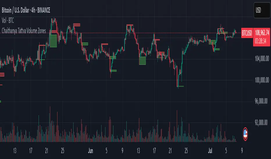
Chaithanya Tattva Volume Zones📜 "Chaitanya Tattva" Volume Zones:-
A Sacred Framework of Supply, Demand & Market Energy
In the world of financial markets, price is said to reflect all information. But the true pulse of the market — its life force, its intent, and its moment of truth — is most vividly expressed not in price itself, but in volume.
Chaitanya Tattva Volume Zones is a spiritually inspired volume-based tool that transforms your chart into a canvas of market consciousness, revealing moments where supply and demand engage in visible energetic spikes. These moments are often disguised as ordinary candles, but with this tool, you uncover zones of intent — footprints left by the market’s deeper intelligence.
🌟 Why “Chaitanya Tattva”?
Chaitanya (चैतन्य) is a Sanskrit word meaning consciousness, awareness, or the spark of life energy. It is that which animates — the subtle intelligence behind all movement.
Tattva (तत्त्व) refers to essence, truth, or the underlying principle of a thing. In classical yogic philosophy, the tattvas are the elemental building blocks of reality.
Together, Chaitanya Tattva represents the conscious essence — the living pulse that animates the market through volume surges and imbalances.
This tool is not just a technical indicator — it is a spiritual observation device that aligns with the rhythm of volume and price action. It doesn't predict the market. It reveals when the market has already spoken — loudly, clearly, and energetically.
📈 What Does the Tool Do?
Chaitanya Tattva Volume Zones identifies exceptional volume spikes within the recent price history and visually marks the areas where market intent has been most active.
Specifically, the tool:
Scans for volume spikes that exceed all the volume of the last N bars (default is 20)
Confirms whether the spike happened on a bullish candle (close > open) or bearish candle (close < open)
For a bullish spike, it marks a Supply Zone — the area between the high and close of the candle
For a bearish spike, it marks a Demand Zone — the area between the low and close
Visually paints these zones with soft translucent boxes (red for supply, green for demand) that extend forward across multiple bars
🧘♂️ The Spiritual Framework
🔴 Supply = "Agni" — The Fire of Expansion
When a bullish candle erupts with historically high volume, it symbolizes the fire (Agni) of market optimism and upward expansion. It means that buyers have absorbed available supply at that level and established dominance — but such fire may also signal exhaustion, making it a potential supply barrier if price returns.
These Supply Zones are areas where:
Sellers are likely to re-engage
Smart money may be unloading
Future resistance can be anticipated
But unlike traditional indicators, this tool doesn’t guess. It reacts only to a clear volume-based event — when market energy surges — and locks in that awareness through zone marking.
🟢 Demand = "Prithvi" — The Grounding of Price
On the other hand, a bearish candle with extremely high volume represents the Earth (Prithvi) — grounding the price with firm hands. A strong volume drop often means buyers are stepping in, absorbing the selling pressure.
These Demand Zones are areas where:
Buying interest is proven
Market memory is stored
Future support can be expected
By respecting these zones, you're aligning your trading with natural market boundaries — not theoretical ones.
🧠 How Is It Different from Regular Volume Tools?
While most volume indicators show bars on a lower panel, they leave interpretation up to the trader. “High” or “low” becomes subjective.
Chaitanya Tattva Volume Zones is different:
It quantifies "spike": a bar must exceed all previous N volumes
It qualifies the intent: was the spike bullish or bearish?
It marks zones on the price chart: no need to guess levels
It preserves market memory: the zones persist visually for easy reference
In essence, this tool doesn’t just report volume — it interprets volume’s context and visually encodes it into the chart.
🧘 How to Use
1. Support/Resistance Mapping
Use the tool to understand where volume proved itself. If price revisits a red zone, expect possible rejection (resistance). If price revisits a green zone, expect possible absorption (support).
2. Entry Triggers
You may enter:
Long near demand zones if bullish confirmation appears
Short near supply zones if bearish confirmation appears
3. Stop Placement
Stops can be placed just beyond the zone boundary to align with areas where smart money historically defended.
4. Breakout Confidence
When price breaks through one of these zones with momentum, it often signals a new energetic wave — the old balance has been overcome.
🔔 Key Features
Volume spike detection across any timeframe
Clear visual zones — no clutter, no lag
Highly customizable: zone width, volume lookback, colors
Philosophy-aligned with supply and demand theory, Wyckoff, and Order Flow
🌌 A Metaphysical View of Volume
In yogic science, volume is akin to Prana — life-force energy. A market is not moved by price alone but by intent, force, and participation — all encoded in volume.
Just as a human body pulses with blood when action intensifies, the market pulses with volume when institutional decisions are made.
These pulses become sacred footprints — and Chaitanya Tattva Volume Zones helps you walk mindfully among them.
🔮 Final Thoughts
In a sea of indicators that shout at you with every tick, Chaitanya Tattva is calm. It speaks only when energy concentrates, only when the market sends a signal born of intent.
It doesn’t predict.
It doesn’t repaint.
It simply shows the truth, when the truth becomes undeniable.
Like a sage that speaks only when needed, it waits for volume to prove itself — then draws a memory into space, a zone where traders can re-align their actions with what the market has already honored.
Use it not just to trade —
But to listen.
To observe.
To follow the Chaitanya — the conscious pulse of the market’s own breath.