VAMA Volume Adjusted Moving AverageRichard Arms' Volume Adjusted Moving Average
Settings:
• Inp Avg Vol: Input - Purist method but not intended for live analysis, to retroactively alter MA curve enter Avg Vol from value shown on label into Use Avg Vol field.
• Inp Avg Vol: Current - Live method using current volume , to retroactively alter past MA curve toggle any setting back and forth to force recalculation.
• Inp Avg Vol: Subset - Similar to Current, but uses a subset rather than all bars for avg vol.
• Use Avg Vol - Used for Inp Avg Vol: Input mode. Enter volume from Avg Vol label here after each new bar closes, label will turn green, else red.
• Subset Data - Lookback length used for Inp Avg Vol: Subset mode.
• VAMA Length - Specified number of volume ratio buckets to be reached.
• Volume Incr - Size of volume ratio buckets.
• VAMA Source - Price used for volume weighted calculations.
• VAMA Strict - Must meet desired volume requirements, even if N bars has to exceed VAMA Length to do it.
• Show Avg Vol Label - Displays label on chart of total chart volume.
Notes: VAMA was created by Richard Arms. It utilizes a period length that is based on volume increments rather than time. It is an unusual indicator in that it cannot be used in some platforms in realtime mode as Arms had originally intended. VAMA requires that the average volume first be calculated for the entire chart duration, then that average volume is used to derive the variable adaptive length of the moving average. The consequence of this is that with each new bar, the new average volume alters the moving average period for the entire history. Since Pine scripts evaluate all historical bars only once upon initial script execution, there is no way to automatically shift the previous moving average values retroactively once a new bar has formed. Thus the historical plot of the moving average cannot be updated in realtime, but instead can only plot through previous bar that existed upon load or reinitialization through changing some setting.
Setting Use Avg Vol to Input mode the average volume through previous bar shown in label can be entered (input) into the Inp Avg Vol setting after each new bar closes. Entering this total chart volume forces the script to reevaluate historical bars which in turn allows the historical moving average to update the plot. When using Input mode the color of the label is green when Inp Avg Vol value matches current label value, the label color red signifies Inp Avg Vol value has not been entered or is stale.
Setting Use Avg Vol to Current mode allows the script to correctly calculate and plot the correct moving average upon initial load and the realtime moving average moving forward, but can not retroactively alter the plot of the past moving average unless some change is made in the script settings, such as toggling the Use Avg Vol from Current to some other choice and then back to Current .
Setting Use Avg Vol to Subset mode uses a rolling window of volume data to calculate the average volume and can be used in realtime, but should be noted it is a deviation from Richard Arms' original specification.
VAMA info: "Trading Without Fear" by Richard W Arms, Jr, www.fidelity.com
NOTICE: This is an example script and not meant to be used as an actual strategy. By using this script or any portion thereof, you acknowledge that you have read and understood that this is for research purposes only and I am not responsible for any financial losses you may incur by using this script!
Cari skrip untuk "curve"

Shapeshifting Moving Average - Switching From Low-Lag To SmoothThe term "shapeshifting" is more appropriate when used with something with a shape that isn't supposed to change, this is not the case of a moving average whose shape can be altered by the length setting or even by an external factor in the case of adaptive moving averages, but i'll stick with it since it describe the purpose of the proposed moving average pretty well.
In the case of moving averages based on convolution, their properties are fully described by the moving average kernel ( set of weights ), smooth moving averages tend to have a symmetrical bell shaped kernel, while low lag moving averages have negative weights. One of the few moving averages that would let the user alter the shape of its kernel is the Arnaud Legoux moving average, which convolve the input signal with a parametric gaussian function in which the center and width can be changed by the user, however this moving average is not a low-lagging one, as the weights don't include negative values.
Other moving averages where the user can change the kernel from user settings where already presented, i posted a lot of them, but they only focused on letting the user decrease or increase the lag of the moving average, and didn't included specific parameters controlling its smoothness. This is why the shapeshifting moving average is proposed, this parametric moving average will let the user switch from a smooth moving average to a low-lagging one while controlling the amount of lag of the moving average.
Settings/Kernel Interaction
Note that it could be possible to design a specific kernel function in order to provide a more efficient approach to today goal, but the original indicator was a simple low-lag moving average based on a modification of the second derivative of the arc tangent function and because i judged the indicator a bit boring i decided to include this parametric particularity.
As said the moving average "kernel", who refer to the set of weights used by the moving average, is based on a modification of the second derivative of the arc tangent function, the arc tangent function has a "S" shaped curve, "S" shaped functions are called sigmoid functions, the first derivative of a sigmoid function is bell shaped, which is extremely nice in order to design smooth moving averages, the second derivative of a sigmoid function produce a "sinusoid" like shape ( i don't have english words to describe such shape, let me know if you have an idea ) and is great to design bandpass filters.
We modify this 2nd derivative in order to have a decreasing function with negative values near the end, and we end up with:
The function is parametric, and the user can change it ( thus changing the properties of the moving average ) by using the settings, for example an higher power value would reduce the lag of the moving average while increasing overshoots. When power < 3 the moving average can act as a slow moving average in a moving average crossover system, as weights would not include negative values.
Here power = 0 and length = 50. The shapeshifting moving average can approximate a simple moving average with very low power values, as this would make the kernel approximate a rectangular function, however this is only a curiosity and not something you should do.
As A Smooth Moving Average
“So smooth, and so tranquil. It doesn't get any quieter than this”
A smooth moving average kernel should be : symmetrical, not to width and not to sharp, bell shaped curve are often appropriates, the proposed moving average kernel can be symmetrical and can return extremely smooth results. I will use the Blackman filter as comparison.
The smooth version of the moving average can be used when the "smooth" setting is selected. Here power can only be an even number, if power is odd, power will be equal to the nearest lowest even number. When power = 0, the kernel is simply a parabola:
More smoothness can be achieved by using power = 2
In red the shapeshifting moving average, in green a Blackman filter of both length = 100. Higher values of power will create lower negative values near the border of the kernel shape, this often allow to retain information about the peaks and valleys in the input signal. Power = 6 approximate the Blackman filter pretty well.
Conclusion
A moving average using a modification of the 2nd derivative of the arc tangent function as kernel has been presented, the kernel is parametric and allow the user to switch from a low-lag moving average where the lag can be increased/decreased to a really smooth moving average.
As you can see once you get familiar with a function shape, you can know what would be the characteristics of a moving average using it as kernel, this is where you start getting intimate with moving averages.
On a side note, have you noticed that the views counter in posted ideas/indicators has been removed ? This is truly a marvelous idea don't you think ?
Thanks for reading !

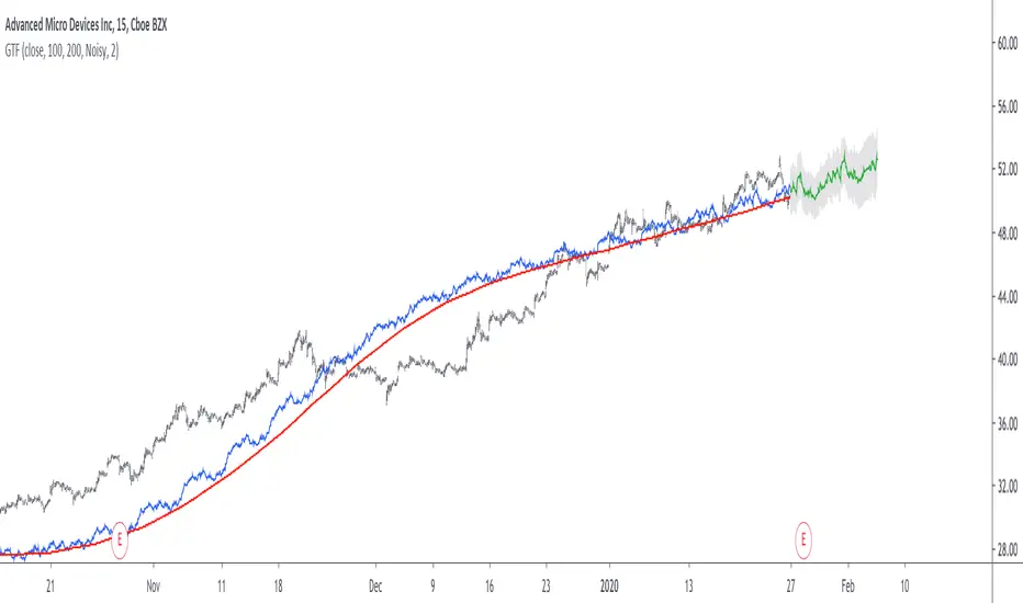
Grand Trend Forecasting - A Simple And Original Approach Today we'll link time series forecasting with signal processing in order to provide an original and funny trend forecasting method, the post share lot of information, if you just want to see how to use the indicator then go to the section "Using The Indicator".
Time series forecasting is an area dealing with the prediction of future values of a series by using a specific model, the model is the main tool that is used for forecasting, and is often an expression based on a set of predictor terms and parameters, for example the linear regression (model) is a 1st order polynomial (expression) using 2 parameters and a predictor variable ax + b . Today we won't be using the linear regression nor the LSMA.
In time series analysis we can describe the time series with a model, in the case of the closing price a simple model could be as follows :
Price = Trend + Cycles + Noise
The variables of the model are the components, such model is additive since we add the component with each others, we should be familiar with each components of the model, the trend represent a simple long term variation of high amplitude, the cycles are periodic fluctuations centered around 0 of varying period and amplitude, the noise component represent shorter term irregular variations with mean 0.
As a trader we are mostly interested by the cycles and the trend, altho the cycles are relatively more technical to trade and can constitute parasitic fluctuations (think about retracements in a trend affecting your trend indicator, causing potential false signals).
If you are curious, in signal processing combining components has a specific name, "synthesis" , here we are dealing with additive synthesis, other type of synthesis are more specific to audio processing and are relatively more complex, but could be used in technical analysis.
So what to do with our components ? If we want to trade the trend, we should estimate right ? Estimating the trend component involve removing the cycle and noise component from the price, if you have read stuff about filters you should know where i'am going, yep, we should use filters, in the case of keeping the trend we can use a simple moving average of relatively high period, and here we go.
However the lag problem, which is recurrent, come back again, we end up with information easier to interpret (here the trend, which is a simple fluctuation such as a line or other smooth curve) at the cost of decision timing, that is unfortunate but as i said the information, here the moving average output, is relatively simple, and could be easily forecasted right ? If you plot a moving average of high period it would be easier for you to forecast its future values. And thats what we aim to do today, provide an estimate of the trend that should be easy to forecast, and should fit to the price relatively well in order to produce forecast that could determine the position of future closing prices observations.
Estimating And Forecasting The Trend
The parameter of the indicator dealing with the estimation of the trend is length , with higher values of length attenuating the cycle and noise component in the price, note however that high values of length can return a really long term trend unlike a simple moving average, so a small value of length, 14 for example can still produce relatively correct estimate of trend.
here length = 14.
The rough estimate of the trend is t in the code, and is an IIR filter, that is, it is based on recursion. Now i'll pass on the filter design explanation but in short, weights are constants, with higher weights allocated to the previous length values of the filter, you can see on the code that the first part of t is similar to an exponential moving average with :
t(n) = 0.9t(n-length) + 0.1*Price
However while the EMA only use the precedent value for the recursion, here we use the precedent length value, this would just output a noisy and really slow output, therefore in order to create a better fit we add : 0.9*(t(n-length) - t(n-2length)) , and this create the rough trend estimate that you can see in blue. On the parameters, 0.9 is used since it gives the best estimate in my opinion, higher values would create more periodic output and lower values would just create a rougher output.
The blue line still contain a residual of the cycle/noise component, this is why it is smoothed with a simple moving average of period length. If you are curious, a filter estimating the trend but still containing noisy fluctuations is called "Notch" filter, such filter would depending on the cutoff remove/attenuate mid term cyclic fluctuations while preserving the trend and the noise, its the opposite of a bandpass filter.
In order to forecast values, we simply sum our trend estimate with the trend estimate change with period equal to the forecasting horizon period, this is a really really simple forecasting method, but it can produce decent results, it can also allows the forecast to start from the last point of the trend estimate.
Using The Indicator
We explained the length parameter in the precedent section, src is the input series which the trend is estimated, forecast determine the forecasting horizon, recommend values for forecast should be equal to length, length/2 or length*2, altho i strongly recommend length.
here length and forecast are both equal to 14 .
The corrective parameter affect the trend estimate, it reduce the overshoot and can led to a curve that might fit better to the price.
The indicator with the non corrective version above, and the corrective one below.
The source parameter determine the source of the forecast, when "Noisy" is selected the source is the blue line, and produce a noisy forecast, when "Smooth" is selected the source is the moving average of t , this create a smoother forecast.
The width interval control...the width of the intervals, they can be seen above and under the forecast plot, they are constructed by adding/subtracting the forecast with the forecast moving average absolute error with respect to the price. Prediction intervals are often associated with a probability (determining the probability of future values being between the interval) here we can't determine such probability with accuracy, this require (i think) an analysis of the forecasting distribution as well as assumptions on the distribution of the forecasting error.
Finally it is possible to see historical forecasts, that is, forecasts previously generated by checking the "Show Historical Forecasts" option.
Examples
Good forecasts mostly occur when the price is close to the trend estimate, this include the following highlighted periods on AMD 15TF with default settings :
We can see the same thing at the end of EURUSD :
However we can't always obtain suitable fits, here it is isn't sufficient on BTCUSD :
We can see wide intervals, we could change length or use the corrective option to get better results, another option is to use a log scale.
We will end the examples with the log SPX, who posses a linear trend, so for example a linear model such as a linear regression would be really adapted, lets see how the indicator perform :
Not a great fit, we could try to use an higher length value and use "Smooth" :
Most recent fits are quite decent.
Conclusions
A forecasting indicator has been presented in this post. The indicator use an original approach toward estimating the trend component in the closing price. Of course i should have given statistics related to the forecasting error, however such analysis is worth doing with better methods and in more advanced environment allowing for optimization.
But we have learned some stuff related to signal processing as well as time series analysis, seeing a time series as the sum of various components is really helpful when it comes to make sense of chaotic and noisy series and is a basic topic in time series analysis.
You can see that in this new year i work harder on the visual of my indicators without trying to fall in the label addict trap, something that i wasn't really doing before, let me know what do you think of it.
Thanks for reading !
Trend Following or Mean RevertingThe strategy checks nature of the instruments. It Buys if the close is greater than yesterday's high, reverse the position if the close is lower than yesterday's low and repeat the process.
1. If it is trend following then the equity curve will be in uptrend
2. If it is mean reverting then the equity curve will be downtrend
Thanks to Rayner Teo.
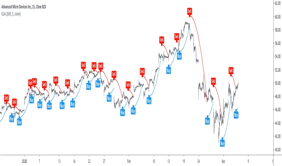
Grover Llorens Activator [alexgrover & Lucía Llorens] Trailing stops play a key role in technical analysis and are extremely popular trend following indicators. Their main strength lie in their ability to minimize whipsaws while conserving a decent reactivity, the most popular ones include the Supertrend, Parabolic SAR and Gann Hilo activator. However, and like many indicators, most trailing stops assume an infinitely long trend, which penalize their ability to provide early exit points, this isn't the case of the parabolic SAR who take this into account and thus converge toward the price at an increasing speed the longer a trend last.
Today a similar indicator is proposed. From an original idea of alexgrover & Lucía Llorens who wanted to revisit the classic parabolic SAR indicator, the Llorens activator aim to converge toward the price the longer a trend persist, thus allowing for potential early and accurate exit points. The code make use of the idea behind the price curve channel that you can find here :
I tried to make the code as concise as possible.
The Indicator
The indicator posses 2 user settings, length and mult , length control the rate of convergence of the indicator, with higher values of length making the indicator output converge more slowly toward the price. Mult is also related with the rate of convergence, basically once the price cross the trailing stop its value will become equal to the previous trailing stop value plus/minus mult*atr depending on the previous trailing stop value, therefore higher values of mult will require more time for the trailing stop to reach the closing price, use higher values of mult if you want to avoid potential whipsaws.
Above the indicator with slow convergence time (high length) and low mult.
Points with early exit points are highlighted.
Usage For Oscillators
The difference between the closing price and an overlay indicator can provide an oscillator with characteristics depending on the indicators used for differencing, Lucía Llorens stated that we should find indicators for differencing that highlight the cycles in the price, in other terms : Price - Signal , where we want to find Signal such that we maximize the visibility of the cycles, it can be demonstrated that in the case where the closing price is an additive model : Trend + Cycles + Noise , the zero lag estimation of the Trend component can allow for the conservation of the cycle and noise component, that is : Price - Estimate(Trend) , for example the difference between the price and moving average isn't optimal because of the moving average lag, instead the use of zero lag moving averages is more suitable, however the proposed indicator allow for a surprisingly good representation of the cycles when using differencing.
The normalization of this oscillator (via the RSI) allow to make the peak amplitude of the cycles more constant. Note however that such method can return an output with a sign inverse to the one of the original cycle component.
Conclusion
We proposed an indicator which share the logic of the SAR indicator, that is using convergence toward the price in order to provide early exit points detection. We have seen that this indicator can be used to highlight cycles when used for differencing and i don't exclude publishing more indicators based on this method.
Lucía Llorens has been a great person to work with, and provided enormous feedback and support while i was coding the indicator, this is why i include her in the indicator name as well as copyright notice. I hope we can make more indicators togethers in the future.
(altho i was against using buy/sells labels xD !)
Thanks for reading !
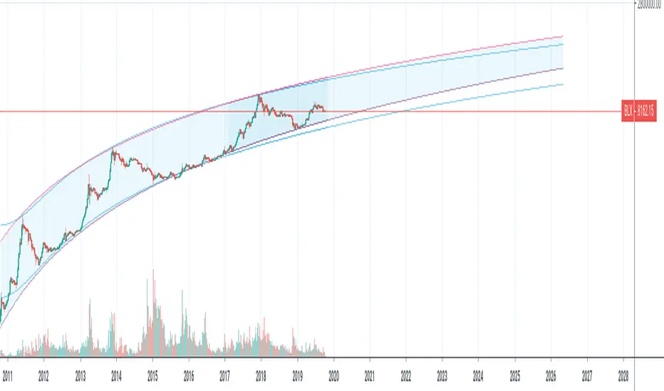
Yope BTC PL channelThis is a new version of the old "Yope BTC tops channel", but modified to reflect a power-law curve fitted, similar to the model proposed by Harold Christopher Burger in his medium article "Bitcoin’s natural long-term power-law corridor of growth".
My original tops channel fitting is still there for comparison. In fact, it looks like the old tops channel was a bit too pessimistic.
Note that these channels are still pure naive curve-fitting, and do not represent an underlying model that explains it, like is the case for PlanB's "Modeling Bitcoin's Value with Scarcity" which uses Stock-to-Flow.
The motivation for this exercise is to observe how long this empirical extrapolation is valid. Will the price of bitcoin stay in either of both channels?
Note on usage: This script _only_ works with the BLX "BraveNewCoin Liquid Index for Bitcoin" in the 1D, 3D and 1W time-frames!
It may be necessary to zoom in and out a few times to overcome drawing glitches caused by the extreme time-shifting of plots in order to draw the extrapolated part.
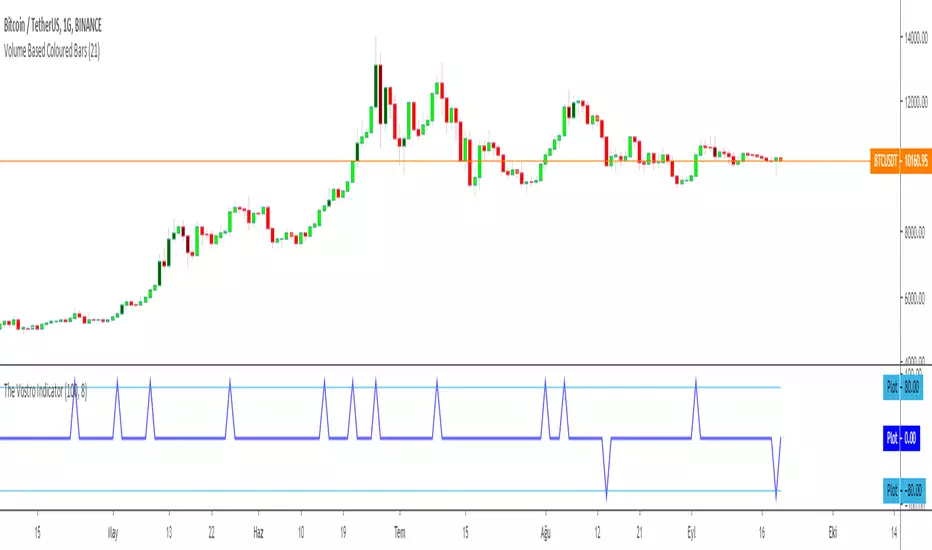
The Vostro Indicator by KIVANÇ fr3762The VOSTRO indicator is a trend indicator that automatically provides buying and selling signals. The indicator marks in a window the potential turning points. The indicator is recommended for scalping.
The Vostro indicator determines the overbought zones (value greater than +80) and the oversold zones (less than the -80 level)
BUY signal: The Vostro curve moves below the -80 level and forms a trough – Turnaround of the upward trend
SELL signal: The Vostro curve moves above the +80 level and forms a peak – Downward trend
further info:
www.prorealcode.com
Here's the link to a complete list of all my indicators:
t.co
Yazar: KıvanÇ @fr3762 twitter
Şimdiye kadar paylaştığım indikatörlerin tam listesi için: t.co
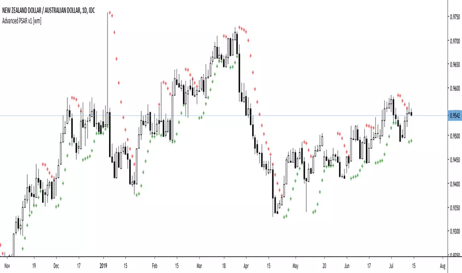
Advanced PSAR v1 [wm]A port off Dennis Meyers Advance PSAR outlined in Stocks and Commodities V13:4
The shape, slope and speed of the SAR is controlled by three parameters: the starting acceleration factor (AF), the increment that the AF can change when a new price high or low is made, and the maximum AF. Because of the way the SAR is calculated, the shape of the SAR curve resembles a parabola - hence its name.
Most software packages only allow the user to vary the AF increment and the AF maximum, fixing the starting AF at 0.02. This restriction hampers the trend-following abilities of the parabolic.
Frequently as the SAR hugs the price curve, it is penetrated by a price bar by a minuscule amount, causing the SAR to generate an opposite signal. The price then immediately turns around and resumes going in the direction it was going before this penetration occurred, causing a costly whipsaw loss.
Many of the whipsaw losses are caused by noise or randomness in the price series. Thus, if the SAR is to represent the trend of a real price series, it must have the capability to ignore penetrations of noise level amounts. To this end, I have modified the parabolic SAR formula to include a variable that allows the SAR not to reverse unless penetrated by a defined amount. This new parameter is defined as ‘XO Increment’ for crossover increment
This version is configured for pips. If using on other assets with much larger values should be used. Also note the starting values have not been optimised. Should users of this script find good values please comment and share with the community if you could
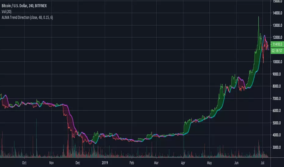
ALMA Trend DirectionHere is a very simple tool that uses the Arnaud Legoux Moving Average(ALMA). The ALMA is based on a normal distribution and is a reliable moving average due to its ability to reduce lag while still keeping a high degree of smoothness.
Input Options:
-Offset : Value in range {0,1} that adjusts the curve of the Gaussian Distribution. A higher value will result in higher responsiveness but lower smoothness. A lower value will mean higher smoothness but less responsiveness.
-Length : The lookback window for the ALMA calculation.
-Sigma : Defines the sharpe of the curve coefficients.
I find that this indicator is best used with a longer length and a 4 Hour timeframe. Overall, its purpose is to help identify the direction of a trend and determine whether a security is in an uptrend or a downtrend. For this purpose, it is best to use a lower offset value since we are looking to identify long-term, significant price movement rather than small fluctuations.
The Chart:
The ALMA is plotted as the aqua and pink alternating line. It is aqua when bullish and pink when bearish.
The low price for each candle is then compared to the ALMA. If the low is greater than the ALMA, then there is a bullish trend and the area between the candles and ALMA is filled green. The area between the ALMA and candles is filled red when the low price is less than the ALMA.
The difference between the slow ALMA and candles can reveal a lot about the current market state. If there is a significant green gap between the two, then we know that there is a significant uptrend taking place. On the other hand, a large red gap would indicate a significant downtrend. Similarly, if the gap between the two is narrowing and the ALMA line switches from aqua to pink, then we know that a reversal could be coming shortly.
~Happy Trading~
Double ALMAIncludes fast and slow Arnaud Legoux Moving Averages (ALMA). ALMA is a moving average based on a Gaussian(normal) distribution that reduces lag while still retaining smoothness.
Input Options:
-Offset : Value in range {0,1} that adjusts the curve of the Gaussian Distribution. A higher value will result in higher responsiveness but lower smoothness. A lower value will mean higher smoothness but less responsiveness.
-Lengths : The lookback for each ALMA calculation.
-Sigma : Defines the sharpe of the curve coefficients.
The slow ALMA is the thickest red and green alternating line that indicates bullish or bearish movement. When slow ALMA is bullish, the graph's background changes to green. When the slow ALMA is bearish, the background is red.
The fast ALMA uses a smaller lookback and is more responsive than the slow ALMA as a result of the shorter length and higher default offset parameter.
The two dotted lines represent (slowALMA +/- 1.25 * stdev(slowALMA, slowALMA period *2)).
The indicator bases its buy and sell signals based on the trend identified by the slow ALMA and the fast ALMA's crossings of the standard deviation bands.
Comes with pre-set buy and sell alerts.

Modified Gann HiLo ActivatorIntroduction
The gann hilo activator is a trend indicator developed by Robert Krausz published into W. D. Gann Treasure Discovered: Simple Trading Plans for Stocks & Commodities . This indicator crate a trailing stop aiming to show the direction of the trend.
This indicator is fairly easy to compute and dont require lot of skills to understand. First we calculate the simple moving average of both price high and price low, when the close price is higher than the moving average of the price high the indicator return the moving average of the price low, else the indicator return the moving average of the price high if the close price is lower than the moving average of the price low.
My indicator add a different calculation method in order to avoid whipsaw trades as well as adding significance to the moving average length. A Median method has been added to provide more robustness.
The Indicator
The indicator is a simple trailing stop aiming to show the direction of the trend. The indicator use a different source instead of the price high/low for its calculation. The first method is the "SMA" method which like the classic hilo indicator use a simple moving average for the calculation of the indicator.
Sma Method with length = 25
The "Median" use a moving median instead of a simple moving average, this provide more robustness.
Median Method with length = 25
The shape is less curved and the indicator can sometimes avoid whipsaw with high's length periods.
Mult Parameter
The mult parameter is a parameter set to be lower or equal to 1 and greater or equal to 0. High values allow the indicator to be far from the price thus avoiding whipsaw trades, lower ones lower the distance from the price. A mult parameter of 0.1 approximate the original hilo indicator.
In blue the indicator with mult = 0.1 and in radical red the original hilo activator.
Conclusion
The modifications allow more control over the indicator as well as adding more robustness while the original one is destined to fail when market price is more complex.
Thanks for reading :)
For any questions/suggestions feel free to pm me

Quadratic Regression Slope [DW]This is a study geared toward identifying price trends using Quadratic regression.
Quadratic regression is the process of finding the equation of a parabola that best fits the set of data being analyzed.
In this study, first a quadratic regression curve is calculated, then the slope of the curve is calculated and plotted.
Custom bar colors are included. The color scheme is based on whether the slope is positive or negative, and whether it is increasing or decreasing.

XPloRR MA-Trailing-Stop StrategyXPloRR MA-Trailing-Stop Strategy
Long term MA-Trailing-Stop strategy with Adjustable Signal Strength to beat Buy&Hold strategy
None of the strategies that I tested can beat the long term Buy&Hold strategy. That's the reason why I wrote this strategy.
Purpose: beat Buy&Hold strategy with around 10 trades. 100% capitalize sold trade into new trade.
My buy strategy is triggered by the fast buy EMA (blue) crossing over the slow buy SMA curve (orange) and the fast buy EMA has a certain up strength.
My sell strategy is triggered by either one of these conditions:
the EMA(6) of the close value is crossing under the trailing stop value (green) or
the fast sell EMA (navy) is crossing under the slow sell SMA curve (red) and the fast sell EMA has a certain down strength.
The trailing stop value (green) is set to a multiple of the ATR(15) value.
ATR(15) is the SMA(15) value of the difference between the high and low values.
The scripts shows a lot of graphical information:
The close value is shown in light-green. When the close value is lower then the buy value, the close value is shown in light-red. This way it is possible to evaluate the virtual losses during the trade.
the trailing stop value is shown in dark-green. When the sell value is lower then the buy value, the last color of the trade will be red (best viewed when zoomed)(in the example, there are 2 trades that end in gain and 2 in loss (red line at end))
the EMA and SMA values for both buy and sell signals are shown as a line
the buy and sell(close) signals are labeled in blue
How to use this strategy?
Every stock has it's own "DNA", so first thing to do is tune the right parameters to get the best strategy values voor EMA , SMA, Strength for both buy and sell and the Trailing Stop (#ATR).
Look in the strategy tester overview to optimize the values Percent Profitable and Net Profit (using the strategy settings icon, you can increase/decrease the parameters)
Then keep using these parameters for future buy/sell signals only for that particular stock.
Do the same for other stocks.
Important : optimizing these parameters is no guarantee for future winning trades!
Here are the parameters:
Fast EMA Buy: buy trigger when Fast EMA Buy crosses over the Slow SMA Buy value (use values between 10-20)
Slow SMA Buy: buy trigger when Fast EMA Buy crosses over the Slow SMA Buy value (use values between 30-100)
Minimum Buy Strength: minimum upward trend value of the Fast SMA Buy value (directional coefficient)(use values between 0-120)
Fast EMA Sell: sell trigger when Fast EMA Sell crosses under the Slow SMA Sell value (use values between 10-20)
Slow SMA Sell: sell trigger when Fast EMA Sell crosses under the Slow SMA Sell value (use values between 30-100)
Minimum Sell Strength: minimum downward trend value of the Fast SMA Sell value (directional coefficient)(use values between 0-120)
Trailing Stop (#ATR): the trailing stop value as a multiple of the ATR(15) value (use values between 2-20)
Example parameters for different stocks (Start capital: 1000, Order=100% of equity, Period 1/1/2005 to now) compared to the Buy&Hold Strategy(=do nothing):
BEKB(Bekaert): EMA-Buy=12, SMA-Buy=44, Strength-Buy=65, EMA-Sell=12, SMA-Sell=55, Strength-Sell=120, Stop#ATR=20
NetProfit: 996%, #Trades: 6, %Profitable: 83%, Buy&HoldProfit: 78%
BAR(Barco): EMA-Buy=16, SMA-Buy=80, Strength-Buy=44, EMA-Sell=12, SMA-Sell=45, Strength-Sell=82, Stop#ATR=9
NetProfit: 385%, #Trades: 7, %Profitable: 71%, Buy&HoldProfit: 55%
AAPL(Apple): EMA-Buy=12, SMA-Buy=45, Strength-Buy=40, EMA-Sell=19, SMA-Sell=45, Strength-Sell=106, Stop#ATR=8
NetProfit: 6900%, #Trades: 7, %Profitable: 71%, Buy&HoldProfit: 2938%
TNET(Telenet): EMA-Buy=12, SMA-Buy=45, Strength-Buy=27, EMA-Sell=19, SMA-Sell=45, Strength-Sell=70, Stop#ATR=14
NetProfit: 129%, #Trade

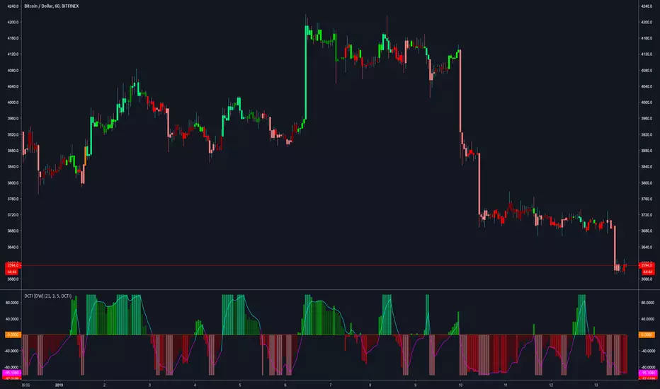
Donchian Channel Trend Intensity [DW]This is an experimental study designed to analyze trend intensity using two Donchian Channels.
The DCTI curve is calculated by comparing the differences between Donchian highs and lows over a major an minor period, and expressing them as a positive and negative percentage.
The curve is then smoothed with an exponential moving average to provide a signal line.
Custom bar colors included with two coloring methods to choose from.
AWESOME OSCILLATOR V2 by KIVANCfr3762AWESOME OSCILLATOR V2 by KIVANC @fr3762
CONVERTING THE OSCILLATOR to a curved line and added a 7 period SMA as a signal line,
crosses are BUY or SELL signals like in MACD
Buy: when AO line crosses above signal line
Sell: when Signal line crosses above AO line
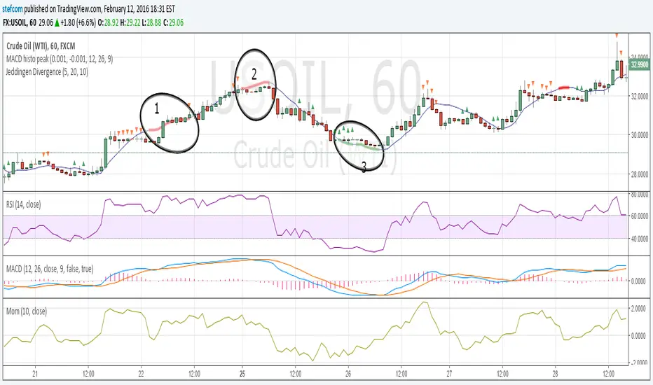
Stefan Krecher: Jeddingen DivergenceThe main idea is to identify a divergence between momentum and price movement. E.g. if the momentum is rising but price is going down - this is what we call a divergence. The divergence will be calculated by comparing the direction of the linear regression curve of the price with the linear regression curve of momentum.
A bearish divergence can be identified by a thick red line, a bullish divergence by a green line.
When there is a divergence, it is likeley that the current trend will change it's direction.
Looking at the chart, there are three divergences that need to get interpreted:
1) bearish divergence, RSI is overbought but MACD does not clearly indicate a trend change. Right after the divergence, price and momentum are going up. No clear signal for a sell trade
2) bearish divergence, RSI still overbought, MACD histogram peaked, MACD crossed the signal line, price and momentum are going down. Very clear constellation for a sell trade.
3) two bullish diverences, RSI is oversold, MACD crossover near the end of the second divergence, price and momentum started rising. Good constellation for a buy trade. Could act as exit signal for the beforementioned sell trade.
More information on the Jeddingen Divergence is available here: www.forexpython.com
Power Law Correlation Indicator 2.0 The Power Law Correlation Indicator is an attempt to chart when a stock/currency/futures contract goes parabolic forming a upward or downward curve that accelerates according to power laws.
I've read about power laws from Sornette Diedler ( www.marketcalls.in ). And I think the theory is a good one.
The idea behind this indicator is that it will rise to 1.0 as the curve resembles a parabolic up or down swing. When it is below zero, the stock will flatten out.
There are many ways to use this indicator. One way I am testing it out is in trading Strangles or Straddle option trades. When this indicator goes below zero and starts to turn around, it means that it has flattened out. This is like a squeeze indicator. (see the TTM squeeze indicator).
Since this indicator goes below zero and the squeeze plays tend to be mean-reverting; then its a great time to put on a straddle/strangle.
Another way to use it is to think of it in terms of trend strength. Think of it as a kind of ADX, that measures the trend strength. When it is rising, the trend is strong; when it is dropping, the trend is weak.
Lastly I think this indicator needs some work. I tried to put the power (x^n) function into it but my coding skill is limited. I am hoping that Lazy Bear or Ricardo Santos can do it some justice.
Also I think that if we can figure out how to do other power law graphs, perhaps we can plot them together on one indicator.
So far I really like this one for finding Strangle spots. So check it out.
Peace
SpreadEagle71

ChunkbrAI-NN INDIChunkbrAI-NN INDI: The Neural Network Odyssey
A Native Pine Script Neural Network Research Engine
Welcome to ChunkbrAI-NN 5.3. This is not a standard technical indicator; it is a proof-of-concept Artificial Intelligence engine built entirely from scratch within Pine Script.
Neural Networks typically require iterating over massive datasets, a task that usually times out on TradingView. ChunkbrAI solves this by introducing a novel "Chunking Architecture"—a system that breaks history into digestible learning blocks and trains a Multilayer Perceptron (MLP) using a "Chunking" approach.
It features a living ecosystem where neurons have "genes," grow mature, and adapt to market regimes using a highly sophisticated Context-Aware normalization engine.
-----------------------------------------------------------
The Core Concept: "The Time Wheel"
To bypass Pine Script's execution limits, this script does not train linearly from the beginning of time. Instead, it operates like a spinning wheel of experience.
* The Chunk System: On every bar update, the engine reaches back into history (up to 5000 bars) and grabs random or sequential "Chunks" of data. It treats these chunks as isolated training samples.
* Experience Replay: By constantly revisiting past market scenarios (Chunks), the network slowly converges its weights, learning to recognize patterns across different eras of price action.
-----------------------------------------------------------
Architecture & Modules
A. The Neural Core (MLP)
At the heart is a raw neural network built with arrays:
* Topology: A dense network with a customizable Hidden Layer (Default: 60 Neurons).
* Timewarp (Stride): When enabled, the network uses "dilated" inputs (skipping bars, e.g., 1, 3, 5...). This increases the network's Field of View without increasing computational load.
* Forecasting: The network outputs a standardized prediction which is then de-normalized to project the future price path on your chart.
B. The Context System (The "Eyes")
Raw prices confuse neural networks. A $1000 move in Bitcoin is massive in 2016 but noise in 2024. ChunkbrAI uses a relativistic Context System:
* Regime Detection: It uses a Zero-Lag Moving Average (ZLMA) and Non-Linear Regression to measure the current market "Vibe" (Volatility & Trend).
* Dynamic Normalization: The inputs are scaled based on this context. If the market is volatile, the data is compressed; if calm, it is expanded. This ensures the brain receives consistent signal patterns regardless of the absolute price.
C. The Gene System (Neuro-Plasticity)
This is the experimental "biology" layer. Neurons are not just static math; they have life cycles.
* Maturity: Neurons start "Young" (highly plastic, high mutation rate). As they successfully reduce error, they become "Wise" (stable, low mutation).
* Mutation: If a "Wise" neuron begins failing (high error), it is demoted and forced to mutate. This allows the brain to "forget" obsolete behaviors and adapt to new market paradigms automatically.
* Profiles: You can initialize the brain with different personalities (e.g., Dreamer, Young Chaos, Zen Monk).
D. The Brain Scheduler (Adaptive Learning)
A static Learning Rate (LR) is inefficient. The Brain Scheduler acts as the heartbeat:
* Panic vs. Flow: It monitors the derivative of the error. If the error spikes (Panic), the Scheduler slows down learning to prevent the model from exploding. If the error smooths out (Flow), it accelerates learning (Infinite LR Mode).
-----------------------------------------------------------
Forecasting Modes
The script provides two distinct ways to visualize the future:
1. Direct Projection (Green Line):
The network takes the current window of price action and predicts the immediate next step. If Timewarp is active, it interpolates the result to draw a smooth curve.
2. Autoregression (Cyan Line):
Available in "Auto" mode. The network feeds its *own* predictions back into itself as inputs to generate multi-step forecasts.
* Wave Segmentation: The script intelligently guesses the current market cycle length and attempts to project that specific duration forward.
-----------------------------------------------------------
Operation Manual
The script has two distinct training loops: first, when you add it to a chart, Pine runs through the available historical bars once, and this initial history pass is the main training phase where the network iterates chunk-by-chunk using your configured chunk count/iterations (e.g., if chunk count is 3, it performs 3 chunk updates per step), but pushing chunk count, iterations, or model sizing too high can hit Pine’s execution limits; after that, once real-time candles start printing, the script can either keep training (weights continue updating) or freeze the weights and run inference only, producing predictions from the learned parameters, and if live training is enabled it can also simulate “bars-back” style training during live mode by iterating across prior bars as if doing another history pass—which again can run into limits if chunks/iterations/sizing are too heavy—so when changing parameters to evaluate behavior you change them carefully and individually, because multiple simultaneous increases make it hard to attribute effects and can more easily trigger those execution constraints.
Weight Persistence (Save/Load):
Pine Script can’t write files or persist weights directly, so ChunkbrAI uses a library-based workaround that’s honestly tricky and kind of a pain: you enable the weight-export alerts so the script emits the weights (W1/W2/biases etc.) as text, and those payloads are chunked as well; then, outside TradingView, I use a separate Python script to parse the alert emails, reconstruct and format the chunked weights properly, and generate the corresponding library code files; after that, the libraries have to be published/updated, and only then can the main script “restore” by reading the published lib constants on chart load, effectively starting with the pre-trained weights instead of relying purely on the fresh history-run training pass. I don’t recommend this process unless you really have to—it’s fragile and high-effort—but until TradingView implements some simple built-in data storage for scripts, it’s basically the only practical way to save and reload your models.
-----------------------------------------------------------
Limitations & Notes
* Calculation Limits: This script pushes Pine Script to its absolute edge. If you increase Chunk Size or Hidden Size too much, you WILL hit execution limits. Use the defaults as a baseline.
* Non-Deterministic: Because the "Wheel" picks random chunks for training, two instances of this script might evolve slightly different brains unless you use the Restore Weights feature.
* Experimental: This is a research tool designed to explore Neural Networks and Genetic Algorithms on the chart. Treat it as an educational engine, not financial advice.
Credits: Concept and Engineering by funkybrown.

Stabilized HMA ScalperStabilized HMA Scalper / Stab. HMA 2.0
Stabilized HMA Scalper is a visual trend-structure overlay indicator designed to highlight directional momentum, trend alignment, and market state through a combination of adaptive moving averages and contextual visual cues.
The indicator blends a Hull Moving Average (HMA) for responsiveness with an ALMA-based baseline filter to stabilize trend interpretation and reduce noise. The result is a clean, visually expressive framework for reading market structure directly on the price chart.
Core Design Philosophy
This script is built around trend confirmation and state visualization, not prediction or automation.
All elements are calculated on confirmed bar closes and do not repaint.
The indicator focuses on three analytical dimensions:
1. Dual Moving Average Structure
Hull Moving Average (HMA)
Acts as the primary momentum curve.
Designed for fast reaction to directional changes.
Slope behavior is used to infer momentum expansion or contraction.
ALMA Baseline Filter
Provides a stabilizing reference for broader trend context.
Helps distinguish directional movement from short-term fluctuations.
Used as a structural filter rather than a trigger mechanism.
2. Trend State Visualization
When HMA slope and price position relative to the ALMA baseline align, the indicator visually highlights the active market state:
Bullish alignment: upward momentum with supportive structure
Bearish alignment: downward momentum with confirming structure
Neutral / range: mixed conditions or transitional phases
A dynamic gradient fill between HMA and ALMA visually reinforces this alignment, offering an immediate understanding of trend strength and continuity.
3. Visual Markers & Labels
Discrete chart markers may appear at moments when momentum structure transitions into a new aligned state.
These markers are contextual annotations, intended to draw attention to changes in trend conditions rather than to provide standalone decisions.
They are based solely on historical price data and are fully non-repainting.
Dashboard
An optional on-chart dashboard summarizes the current market state classification (Bullish / Bearish / Range) based on the internal trend logic.
Position and size are fully configurable.
Designed for at-a-glance situational awareness.
Reflects the same logic used in the chart visuals.
Usage Disclaimer
This indicator is provided for technical analysis and educational purposes only.
It does not generate financial advice or guarantee outcomes and should be used as part of a broader analytical workflow.

Macro 6-PackMacro 6-Pack dashboard: SPX momentum, VIX, HY credit spread, 10Y yield shifts, DXY trend, and 2s10s curve.

[CT] D&W PPO + RBF + DivergenceThis indicator combines two separate ideas into one tool so you can read trend context from your price chart while timing momentum shifts from a clean oscillator panel. The first component is the Daily and Weekly Percentage Price Oscillator (D&W PPO), which measures the relationship between two EMA spreads that are intentionally built to reflect two “speeds” of market structure. The “weekly” leg is calculated as the percentage distance between a slower and faster EMA pair (L1 and L2), and the “daily” leg is calculated as the percentage distance between a shorter EMA pair (L3 and L4), but both are normalized by the same long EMA (e2) so the values behave like a percent-based oscillator rather than raw points. The script then combines those two legs by creating R = W + D, and it plots the histogram as R − W, which simplifies to D. That is not a mistake, it is the point of the design. By setting the baseline at “R equals W,” the zero line becomes a very intuitive threshold that tells you whether the shorter-term push is adding to the longer-term bias or subtracting from it. When the histogram is above zero, the daily component is supportive of the larger trend pressure, and when it is below zero, the daily component is opposing it. The histogram color is intentionally binary and stable, green when the histogram is at or above zero and red when it is below, so the panel reads like a momentum confirmation tool rather than a noisy oscillator that constantly shifts shades.
The second component is the RBF Price Trail, which is drawn on the upper price chart even though the indicator itself lives in a lower panel. This line is not a moving average in the traditional sense. It is a Radial Basis Function kernel smoother that weights recent prices based on their similarity rather than only their recency. In plain terms, the kernel attempts to build a smoother “baseline” that adapts to the shape of price action, and then the script optionally wraps that baseline inside an ATR band and applies a Supertrend-like trailing clamp. When the ATR band is enabled, the line will not simply track the kernel value, it will trail price and hold its position until price forces it to ratchet. This behavior is what makes it useful as a structure-aligned trend line rather than just another smoothing curve. When the adaptive band boost is enabled, the band width is multiplied by a factor that grows when recent price change is large relative to a lookback normalization window. That means the trailing mechanism can adapt to fast markets by changing the effective band behavior, which helps reduce whipsaws in choppy conditions while still allowing the line to respond when volatility expands. The line color is determined by where price closes relative to the trail, bullish when price is above the trail and bearish when price is below it, and you can optionally color your actual chart candles from either the PPO state or the RBF state depending on what you want your eyes to follow.
The settings are organized so you can control each module without changing how the core PPO trend logic behaves. The PPO settings L1, L2, L3, and L4 define the EMA lengths used to compute the weekly leg W and the daily leg D. Increasing these values makes the oscillator slower and smoother, while decreasing them makes it react faster to recent movement. “Show W line” is simply a visual aid, it plots the W line in the oscillator panel so you can see the longer-term component, but it does not change the histogram logic. “Histogram thickness” is purely visual and controls how thick the column bars are. The PPO colors are the two base colors used for the histogram state, green when the daily component is supportive and red when it is opposing.
The RBF settings control what you see on the upper chart. “Show RBF on Price Chart” turns the trail line on or off. “Source” chooses which price series feeds the kernel, and close is usually the cleanest choice. “Kernel Length” determines how many bars the kernel uses; a larger value makes the baseline smoother and slower, and a smaller value makes it more reactive. “Gamma Adj” controls how quickly the kernel’s weights decay as price becomes dissimilar, so higher gamma tends to make the kernel react more sharply to changes while lower gamma produces a broader smoothing effect. “Use ATR Trail Band” is the switch that turns the kernel baseline into a trailing band line, and it is the reason the line can “hold” and then ratchet instead of moving continuously like a normal moving average. “ATR Length” and “ATR Factor” control the width of that band, and widening the band will generally reduce flips and noise at the cost of later signals. “Use Adaptive Band Boost” turns on the volatility normalization idea, “Boost Normalization Lookback” defines how far back the script looks to determine what counts as a large price change, and “Boost Multiplier” controls how strongly the band behavior is adjusted during those periods. The line width and bull/bear colors are visual controls only.
Price bar coloring is intentionally handled with a single selector so you do not end up with two modules fighting to color candles differently. If you choose “Off,” nothing on the main chart is recolored. If you choose “PPO,” your price candles reflect whether the PPO histogram is above or below zero. If you choose “RBF,” your price candles reflect whether price is above or below the RBF trail. Most traders will pick one and stick with it so the chart communicates a single bias at a glance.
The divergence module is optional and is designed to be a confirmation layer rather than a primary trigger. When enabled, it can mark regular divergence and hidden divergence, and it lets you decide what the pivots should be based on. The divergence source can be the PPO histogram or the R line, depending on whether you want divergence measured on the cleaner momentum component or on the combined series. “Key off pivots” determines whether pivot detection is driven by oscillator pivots or by price pivots. If you choose oscillator pivots, divergence anchors are found where the oscillator makes pivot highs or lows and those are compared against price at the same points. If you choose price pivots, the pivots are taken from price first and the oscillator value at those pivot bars is used for the comparison, which can feel more intuitive when you want divergence to respect obvious swing structure on the chart. Pivot Left and Pivot Right control how strict the swing definition is, larger values create fewer but more meaningful pivots and smaller values create more frequent signals. “Mark on Price Chart” adds tiny markers on the candles at the pivot location so you can see where the divergence event was confirmed, while the oscillator panel uses lines and labels to make the divergence relationship obvious.
For trading, the cleanest way to use this tool is to separate “bias” from “timing.” The RBF Price Trail is your bias filter because it is structure-like and tends to hold and ratchet rather than constantly drifting. When price is closing above the trail and the trail is colored bullish, you treat the market as long-biased and you focus on long setups, pullbacks, and continuation entries. When price is closing below the trail and the trail is bearish, you treat the market as short-biased and you focus on short setups, rallies, and continuation shorts. The PPO histogram is then your timing and pressure confirmation. In an up-bias, the highest quality continuation conditions are when the histogram is above zero and stays above zero through pullbacks, because that means the shorter-term pressure is still supporting the longer-term drift. When the histogram dips below zero during an up-bias, it is a warning that the daily component is now opposing, which often corresponds to a deeper pullback, a rotation, or a period of consolidation, so you either wait for the histogram to recover above zero or you tighten expectations and manage risk more aggressively. In a down-bias, the mirror logic applies: the best continuation conditions are when the histogram is below zero, and pushes above zero tend to represent countertrend rotations or pauses inside the bearish condition.
Divergence is best used as an early warning and a location filter, not as a standalone entry button. Regular bullish divergence, where price makes a lower low but the oscillator makes a higher low, can signal bearish pressure is weakening and is most useful when it appears while price is below the RBF trail but failing to continue downward, because it often precedes a reclaim of the trail or at least a meaningful rotation. Regular bearish divergence, where price makes a higher high but the oscillator makes a lower high, can signal bullish pressure is weakening and is most useful when it appears while price is above the trail but extension is failing, because it often precedes a drop back to the trail or a full flip. Hidden divergence is a continuation concept. Hidden bullish divergence, where price makes a higher low while the oscillator makes a lower low, often shows up during pullbacks in an uptrend and can help you confirm continuation as long as the RBF bias remains bullish. Hidden bearish divergence, where price makes a lower high while the oscillator makes a higher high, often shows up during rallies in a downtrend and can help you confirm continuation as long as the RBF bias remains bearish. In practice, you’ll get the best results when you only act on divergence that aligns with the RBF bias for hidden divergence continuation, and you treat regular divergence as a caution or reversal setup only when it occurs near a meaningful swing and is followed by a bias change or a strong momentum shift on the PPO.
The most practical workflow is to keep the RBF trail visible on the price chart as your regime guide, keep the PPO histogram as your momentum confirmation, and decide in advance whether you want candle coloring to represent the PPO state or the RBF state so your eyes are not reading two different meanings at once. if you want the cleanest “trend-following” behavior, color candles by the RBF trail and use the PPO histogram as the timing trigger. If you want the cleanest “momentum-first” behavior, color candles by PPO and treat the RBF trail as the higher-level filter for whether you should press a move or fade it.

Strategy Battle: Lump Sum vs. DCA vs. Dip BuyingSummary This indicator is a "Strategy Battle" simulator designed to answer the ultimate investing question: Is it better to invest immediately, Dollar Cost Average (DCA), or wait for a market crash?
Unlike standard back-testers, this script simulates a realistic "High-Yield Savings" environment. It acknowledges that cash sitting on the sidelines is not dead money—it earns interest (e.g., 3-5%) while waiting for a buying opportunity. This levels the playing field and allows for a fair comparison between being fully invested vs. keeping "dry powder" for a crash.
The script compares 4 distinct strategies simultaneously on your chart, starting with a fresh yearly budget every January 1st.
he 4 Strategies
🔵 Option 1: Lump Sum (The "Set & Forget")
Takes the entire yearly budget and invests it all on the first trading day of the year.
Pros: Maximizes "time in the market."
Cons: vulnerable to buying at immediate peaks.
🟠 Option 2: DCA (The "Steady Earner")
Splits the yearly budget into 12 equal parts.
Invests monthly regardless of price.
The "Fairness" Twist: The money waiting to be spent sits in the cash pile and accumulates interest until it is deployed.
🟢 Option 3: Regression Sniper (The "Math Hunter")
Keeps the entire budget in cash (earning interest).
Watches a dynamic Linear Regression Channel.
Trigger: If the price drops below the channel, it goes "All-In," deploying all accumulated cash and interest immediately to buy the dip.
🔴 Option 4: Manual Sniper (The "Trend Hunter")
Keeps the entire budget in cash (earning interest).
Watches a User-Defined Growth Line (e.g., a straight line growing at 10% per year).
Trigger: If the price drops below this specific valuation line, it goes "All-In."
Detailed Settings & Options
💰 Money Settings
Yearly Budget ($): The amount of fresh capital injected into the simulation every January 1st.
Cash Interest Rate (%): The annual interest rate earned on uninvested cash (compounded monthly). This is crucial for accurately simulating the "opportunity cost" of holding cash.
⚙️ Sniper Settings (Option 3)
Channel Baseline Length: How far back the math looks to determine the "fair value" curve.
Vertical Shift (%): Move the buy zone up or down. Negative numbers (e.g., -5) make the strategy more conservative, waiting for deeper crashes.
Source: Defaults to Low to catch market wicks and intraday crashes.
📈 Manual Line Settings (Option 4)
Start Price ($): The valuation of the asset at the start of the simulation (Jan 1, Start Year).
Yearly Growth (%): The expected "fair" growth rate of the asset (e.g., S&P 500 average is ~10%).
Vertical Shift (%): Slide the manual line up or down to fine-tune your buy signal.
👁️ Visual Settings
Show Buy Price: Displays the exact dollar amount invested and the stock price at the moment of the buy on the chart labels.
Show Lump Sum Markers: Adds a Blue label at the start of every year to visualize the Lump Sum entry.
Show DCA Markers: Adds small Orange labels for every monthly buy.

VWAP-Anchored MACD [BOSWaves]VWAP-Anchored MACD - Volume-Weighted Momentum Mapping With Zero-Line Filtering
Overview
The VWAP-Anchored MACD delivers a refined momentum model built on volume-weighted price rather than raw closes, giving you a more grounded view of trend strength during sessions, weeks, or months.
Instead of tracking two EMAs of price like a standard MACD, this tool reconstructs the MACD engine using anchored VWAP as the core input. The result is a momentum structure that reacts to real liquidity flow, filters out weak crossovers near the zero line, and visualizes acceleration shifts with clear, high-contrast gradients.
This indicator acts as a precise momentum map that adapts in real time. You see how weighted price is accelerating, where valid crossovers form, and when trend conviction is strong enough to justify execution.
It uses gradient line coloring to show bullish or bearish momentum, histogram shading to highlight energy shifts, cross dots to mark valid crossovers, optional buy/sell diamonds for execution cues, and candle coloring to display trend strength at a glance.
Theoretical Foundation
Traditional MACD compares the difference between two exponential moving averages of price.
This variant replaces price with anchored VWAP, making the calculation sensitive to actual traded volume across your chosen period (Session, Week, or Month).
Three principles drive the logic:
Anchored VWAP Momentum : Price is weighted by volume and aggregated across the selected anchor. The fast and slow VWAP-EMAs then expose how liquidity-corrected momentum is expanding or contracting.
Zero-Line Distance Filtering : Crossover signals that occur too close to the zero line are removed. This eliminates the common MACD problem of generating weak, directionless signals in choppy phases.
Directional Visualization : MACD line, signal line, histogram, candle colors, and optional diamond markers all react to shifts in VWAP-momentum, giving you a clean structural read on market pressure.
Anchoring VWAP to session, weekly, or monthly resets creates a systematic framework for tracking how capital flow is driving momentum throughout each trading cycle.
How It Works
The core engine processes momentum through several mapped layers:
VWAP Aggregation : Price × volume is accumulated until the anchor resets. This creates a continuous, liquidity-corrected VWAP curve.
MACD Construction : Fast and slow VWAP-EMAs define the MACD line, while a smoothed signal line identifies edges where momentum shifts.
Zero-Line Distance Filter : MACD and signal must both exceed a threshold distance from zero for a crossover to count as valid. This prevents fake crossovers during compression.
Visual Momentum Layers : It uses gradient line coloring to show bullish or bearish momentum, histogram shading to highlight energy shifts, cross dots to mark valid crossovers, optional buy/sell diamonds for execution cues, and candle coloring to display trend strength at a glance.
This layered structure ensures you always know whether momentum is strengthening, fading, or transitioning.
Interpretation
You get a clean, structural understanding of VWAP-based momentum:
Bullish Phases : MACD > Signal, histogram expands, candles turn bullish, and crossovers occur above the threshold.
Bearish Phases : MACD < Signal, histogram drives lower, candles shift bearish, and downward crossovers trigger below the threshold.
Neutral/Compression : Both lines remain near the zero boundary, histogram flattens, and signals are suppressed to avoid noise.
This creates a more disciplined version of MACD momentum reading - less noise, more conviction, and better alignment with liquidity.
Strategy Integration
Trend Continuation : Use VWAP-MACD crossovers that occur far from the zero line as higher-conviction entries.
Zero-Line Rejection : Watch for histogram contractions near zero to anticipate flattening momentum and potential reversal setups.
Session/Week/Month Anchors : Session anchor works best for intraday flows. Weekly or monthly anchor structures create cleaner macro momentum reads for swing trading.
Signal-Only Execution : Optional buy/sell diamonds give you direct points to trigger trades without overanalyzing the chart.
This indicator slots cleanly into any momentum-following system and offers higher signal quality than classic MACD variants due to the volume-weighted core.
Technical Implementation Details
VWAP Reset Logic : Session (D), Week (W), or Month (M)
Dynamic Fast/Slow VWAP EMAs : Fully configurable lengths, smoothing and anchor settings
MACD/Signal Line Framework : Traditional structure with volume-anchored input
Zero-Line Filtering : Adjustable threshold for structural confirmation
Dual Visualization Layers : MACD body + histogram + crosses + candle coloring
Optimized Performance : Lightweight, fast rendering across all timeframes
Optimal Application Parameters
Timeframes:
1- 15 min : Short-term momentum scalping and rapid trend shifts
30- 240 min : Balanced momentum mapping with clear structural filtering
Daily : Macro VWAP regime identification
Suggested Configuration:
Fast Length : 12
Slow Length : 26
Signal Length : 9
Zero Threshold : 200 - 500 depending on asset range
These suggested parameters should be used as a baseline; their effectiveness depends on the asset volatility, liquidity, and preferred entry frequency, so fine-tuning is expected for optimal performance.
Performance Characteristics
High Effectiveness:
Assets with strong intraday or session-based volume cycles
Markets where volume-weighted momentum leads price swings
Trend environments with strong acceleration
Reduced Effectiveness:
Ultra-choppy markets hugging the VWAP axis
Sessions with abnormally low volume
Ranges where MACD naturally compresses
Disclaimer
The VWAP-Anchored MACD is a structural momentum tool designed to enhance directional clarity - not a guaranteed predictor. Performance depends on market regime, volatility, and disciplined execution. Use it alongside broader trend, volume, and structural analysis for optimal results.
