Market Structure V3Indicator Description:
The Market Structure indicator is a unique and innovative tool for identifying and visualizing key market structures based on dynamic swing highs and lows. This indicator stands apart from similar tools by utilizing a distinct methodology for updating levels and identifying trends, ensuring precision and flexibility in market analysis.
Key Features of Uniqueness:
1. No Fixed Lookback Periods for Extremum Detection:
- Unlike most indicators that rely on a predefined number of candles (lookback period) to determine highs or lows, this script dynamically updates levels based solely on price action.
- A new high (resistance) or low (support) is confirmed only when the closing price breaks above the previous high or below the previous low, representing the last significant extremums .
- This approach eliminates arbitrary lookback-based restrictions, allowing the indicator to adapt seamlessly to different market conditions and timeframes.
2. Dynamic Level Adjustments:
- Levels are recalculated and adjusted in real time as new price action unfolds, providing traders with highly accurate and relevant support and resistance levels.
- The upper and lower bounds serve as dynamic anchors for trend analysis, updating only when a confirmed breakout occurs.
3. Fractal and Trend-Driven Logic:
- The script inherently respects the fractal nature of price movements by focusing on confirmed breakouts of previous significant extremums , avoiding reliance on shorter-term noise.
- This makes the indicator particularly effective for identifying true trend reversals and continuations.
4. Visual Clarity and Structure Mapping:
- The indicator labels the following structural points directly on the chart:
- **Higher Highs (HH)** for uptrend confirmation.
- **Lower Highs (LH)** for potential trend weakening.
- **Lower Lows (LL)** for downtrend confirmation.
- **Higher Lows (HL)** for potential trend reversals.
- Levels and labels are updated dynamically and accurately reflect the market's structural evolution.
5. Clean and Noise-Free Analysis:
- The absence of arbitrary inputs (e.g., lookback periods) ensures the indicator focuses only on meaningful price action, reducing false signals.
- Works seamlessly across all instruments and timeframes without requiring constant parameter adjustments.
6. Highly Adaptable:
- Suitable for any financial market, including stocks, forex, and cryptocurrencies.
- Performs equally well on all timeframes, from intraday to long-term analysis.
How the Indicator Works:
1. Dynamic Level Updates :
- The indicator evaluates price action in real time and identifies significant levels based on breakouts above previous highs or below previous lows.
- Upper Bound (Resistance) : Updated only when the closing price exceeds the previous significant high.
- Lower Bound (Support) : Updated only when the closing price falls below the previous significant low.
2. Trend Determination:
- Identifies and marks structural points (HH, LH, LL, HL) as trends develop.
- Swing points are updated dynamically without relying on fixed lookback parameters, ensuring that levels reflect the true market structure.
3. Confirmation Logic:
- The script uses a user-configurable parameter `Extremum confirmation bars count` to refine the process of confirming significant swing points.
- This ensures flexibility in adapting to different market conditions while maintaining precision in level detection.
Unique Advantages Over Similar Indicators:
1. No Arbitrary Inputs:
- Unlike other indicators that require users to set the number of candles for extremum detection, this script eliminates the need for such settings, relying solely on actual price breakouts.
2. Dynamic Real-Time Adjustments:
- The logic of level updates is event-driven (based on closing prices crossing key levels), making it more reactive and precise compared to static lookback-based calculations.
3. Enhanced Structural Clarity:
- Focuses exclusively on confirmed significant levels , avoiding clutter and ambiguity often seen in lookback-based indicators.
4. Fractal and Self-Adaptive Nature:
- The script inherently respects market fractality, making it effective across all timeframes and market conditions.
Practical Applications:
- Trend Identification:
Helps identify whether the market is in an uptrend, downtrend, or consolidation phase.
- Entry and Exit Points:
Use swing highs and lows as references for entering or exiting positions.
- Support and Resistance Levels:
Dynamic levels provide actionable areas for placing stop-losses and take-profits.
Input Parameters:
- Extremum Confirmation Bars Count:
Adjusts the sensitivity of extremum detection. The higher the value, the more conservative the indicator becomes in confirming levels. Default is `3`.
Chart Setup and Usage Notes:
1. Clean Visualization:
- Ensure a clean chart for better visibility of structural points and levels.
- Do not overlay with additional indicators unless explicitly required.
2. User Guidance:
- Combine this indicator with volume analysis or other confirmation tools to enhance decision-making.
Disclaimer:
This indicator is for educational purposes only and does not constitute financial advice. Always perform your own analysis and trade responsibly.
Cari skrip untuk "chart"

Custom ChoCH Indicator (10m) - SayajeeCustom ChoCH Indicator (10m) - Sayajee
This custom Pine Script indicator identifies and marks Change of Character (ChoCH) events on a 10-minute chart. ChoCH is a price action concept that highlights potential market reversals. The indicator detects bullish and bearish Change of Character points and displays them as labels and background color highlights on the chart.
Features:
Bullish & Bearish ChoCH Signals: Detects price reversals and trends based on the relationship between recent highs and lows.
Bullish ChoCH: When the close price is greater than the previous swing high and the previous low is lower than the previous swing low.
Bearish ChoCH: When the close price is lower than the previous swing low and the previous high is greater than the previous swing high.
Visual Indicators:
Labels ("ChoCH↑" for bullish, "ChoCH↓" for bearish) are displayed at the high or low of the bar where the signal occurs.
Background highlights in green for bullish and red for bearish conditions to make the signals easily recognizable.
Customization:
Option to toggle the visibility of labels.
Option to customize the colors for bullish and bearish signals.
Alerts: Configured alert conditions to notify you when a Bullish ChoCH or Bearish ChoCH occurs.
Inputs:
Show Labels for ChoCH: Toggle to display ChoCH labels on the chart.
Bullish ChoCH Color: Choose the color for bullish signals.
Bearish ChoCH Color: Choose the color for bearish signals.
Usage:
This indicator is useful for detecting potential trend reversals and market shifts, especially when combined with other technical analysis tools. It's designed for traders who rely on price action and prefer visual cues to make informed decisions.

Forecast Daily BIAS**Indicator Name:** Forecast Daily BIAS
**Description:**
The Forecast Daily BIAS indicator is designed to predict the expected price direction (BIAS) for the current trading day. It analyzes key price levels from the previous day (high, low, and close) and compares them to the opening price of the current day. The indicator provides a simple forecast for the day's price movement: **Bullish**, **Bearish**, or **Neutral**.
Key Features:
- Bullish Prediction: When the opening price is higher than the previous day's close and above the average of the previous day's high and low.
- Bearish Prediction: When the opening price is lower than the previous day's close and below the average of the previous day's high and low.
- Neutral Prediction: If the price does not meet the conditions for bullish or bearish bias.
- Visual Indicators:
- Displays the BIAS forecast directly on the chart with labels.
- Highlights the chart background with colors (green for bullish, red for bearish) for easy interpretation.
Use Case:
This indicator is ideal for traders looking to identify the probable direction of the market for the day and plan their intraday trading strategies accordingly. It is particularly useful for day traders who rely on prior price levels to make informed decisions.
How to Use:
1. Add the indicator to your chart.
2. Observe the daily BIAS prediction:
- Green Background: Likely bullish trend.
- Red Background: Likely bearish trend.
- No Highlight: Neutral trend.
3. Use the forecast in conjunction with other indicators or strategies to confirm your trades.
Note: The indicator provides a basic directional bias and should not be used as a standalone trading signal. Always consider additional market factors and risk management.

Linear Regression ChannelLinear Regression Channel Indicator
Overview:
The Linear Regression Channel Indicator is a versatile tool designed for TradingView to help traders visualize price trends and potential reversal points. By calculating and plotting linear regression channels, bands, and future projections, this indicator provides comprehensive insights into market dynamics. It can highlight overbought and oversold conditions, identify trend direction, and offer visual cues for future price movements.
Key Features:
Linear Regression Bands:
Input: Plot Linear Regression Bands
Description: Draws bands based on linear regression calculations, representing overbought and oversold levels.
Customizable Parameters:
Length: Defines the look-back period for the regression calculation.
Deviation: Determines the width of the bands based on standard deviations.
Linear Regression Channel:
Input: Plot Linear Regression Channel
Description: Plots a channel using linear regression to visualize the main trend.
Customizable Parameters:
Channel Length: Defines the look-back period for the channel calculation.
Deviation: Determines the channel's width.
Future Projection Channel:
Input: Plot Future Projection of Linear Regression
Description: Projects a linear regression channel into the future, aiding in forecasting potential price movements.
Customizable Parameters:
Length: Defines the look-back period for the projection calculation.
Deviation: Determines the width of the projected channel.
Arrow Direction Indicator:
Input: Plot Arrow Direction
Description: Displays directional arrows based on future projection, indicating expected price movement direction.
Color-Coded Price Bars:
Description: Colors the price bars based on their position within the regression bands or channel, providing a heatmap-like visualization.
Dynamic Visualization:
Colors: Uses a gradient color scheme to highlight different conditions, such as uptrend, downtrend, and mid-levels.
Labels and Markers: Plots visual markers for significant price levels and conditions, enhancing interpretability.
Usage Notes
Setting the Length:
Adjust the look-back period (Length) to suit the timeframe you are analyzing. Shorter lengths are responsive to recent price changes, while longer lengths provide a broader view of the trend.
Interpreting Bands and Channels:
The bands and channels help identify overbought and oversold conditions. Price moving above the upper band or channel suggests overbought conditions, while moving below the lower band or channel indicates oversold conditions.
Using the Future Projection:
Enable the future projection channel to anticipate potential price movements. This can be particularly useful for setting target prices or stop-loss levels based on expected trends.
Arrow Direction Indicator:
Use the arrow direction indicator to quickly grasp the expected price movement direction. An upward arrow indicates a potential uptrend, while a downward arrow suggests a potential downtrend.
Color-Coded Price Bars:
The color of the price bars changes based on their relative position within the regression bands or channel. This heatmap visualization helps quickly identify bullish, bearish, and neutral conditions.
Dynamic Adjustments:
The indicator dynamically adjusts its visual elements based on user settings and market conditions, ensuring that the most relevant information is always displayed.
Visual Alerts:
Pay attention to the labels and markers on the chart indicating significant events, such as crossovers and breakouts. These visual alerts help in making informed trading decisions.
The Linear Regression Channel Indicator is a powerful tool for traders looking to enhance their technical analysis. By offering multiple regression-based visualizations and customizable parameters, it helps identify key market conditions, trends, and potential reversal points. Whether you are a day trader or a long-term investor, this indicator can provide valuable insights to improve your trading strategy.

Gold Option Signals with EMA and RSIIndicators:
Exponential Moving Averages (EMAs): Faster to respond to recent price changes compared to simple moving averages.
RSI: Measures the magnitude of recent price changes to evaluate overbought or oversold conditions.
Signal Generation:
Buy Call Signal: Generated when the short EMA crosses above the long EMA and the RSI is not overbought (below 70).
Buy Put Signal: Generated when the short EMA crosses below the long EMA and the RSI is not oversold (above 30).
Plotting:
EMAs: Plotted on the chart to visualize trend directions.
Signals: Plotted as shapes on the chart where conditions are met.
RSI Background Color: Changes to red for overbought and green for oversold conditions.
Steps to Use:
Add the Script to TradingView:
Open TradingView, go to the Pine Script editor, paste the script, save it, and add it to your chart.
Interpret the Signals:
Buy Call Signal: Look for green labels below the price bars.
Buy Put Signal: Look for red labels above the price bars.
Customize Parameters:
Adjust the input parameters (e.g., lengths of EMAs, RSI levels) to better fit your trading strategy and market conditions.
Testing and Validation
To ensure that the script works as expected, you can test it on historical data and validate the signals against known price movements. Adjust the parameters if necessary to improve the accuracy of the signals.
JDT Support & Resistance LevelsJDT Support & Resistance Levels
This Pine Script indicator identifies and dynamically plots pivot-based support and resistance levels on your chart. Unlike traditional pivot point calculations, this script uses a user-defined lookback period to identify swing highs and lows, providing a more adaptable approach to identifying potential price reversal zones.
Originality
This script stands out due to its flexible approach to pivot identification. Instead of relying on fixed periods like daily, weekly, or monthly pivots, it allows users to customize the lookback period. This is particularly useful for traders who analyze different timeframes or markets, as the optimal lookback period may vary.
How it works
* Pivot Calculation: The script utilizes the ta.pivothigh and ta.pivotlow functions to identify swing highs and lows within the specified lookback period.
* Line Plotting: Horizontal lines are plotted at these pivot levels, extending to the right edge of the chart.
* Dynamic Updates: As new swing highs and lows form, the lines automatically update, ensuring the levels remain relevant to the current price action.
How to use it
* Add the script to your chart.
* Adjust the "Lookback Period" input parameter. A higher value will result in fewer but more significant levels, while a lower value will produce more frequent but potentially less reliable levels.
* Use the levels to identify potential support and resistance zones. Observe how price interacts with these levels. A break above a resistance level could signal a bullish move, while a break below a support level could indicate a bearish move.
Additional Considerations
* This script is most effective when used in conjunction with other technical analysis tools and indicators.
* The accuracy of the levels depends on the chosen lookback period and the specific market conditions.
* Always backtest your strategies before implementing them in live trading.
Let me know if you'd like any further clarification or have additional questions.

Support and Resistance (High Volume Boxes) [ChartPrime]Support and Resistance (High Volume Boxes)
◆ Overview:
The "Support and Resistance" indicator identifies key support and resistance levels using pivot points and volume analysis. It visually represents these levels with dynamically colored boxes, indicating the strength of the volume. This helps traders recognize potential price reversals and key zones for buy and sell opportunities.
◆ Key Features:
Dynamic Support and Resistance Boxes:
The indicator plots support and resistance boxes based on pivot points and volume above threshold for positive volume boxes and below lower threshold for negative volume boxes.
Box colors change from transparent to more intense based on volume, reflecting the strength of support or resistance.
Boxes expands until a new box of the same type appears.
Volume-Based Color Coding:
Boxes are color-coded based on the amount of volume:
Green boxes indicate support levels with positive volume.
Red boxes indicate resistance levels with negative volume.
Hold Signals:
Green diamonds (◆) indicate when support holds, signaling potential buy opportunities.
Red diamonds (◆) indicate when resistance holds, signaling potential sell opportunities.
Breakout Labels:
If the price falls below a support level, that level will become resistance. If the price rises above a resistance level, it will often become support. As the price moves past a level of support or resistance, it is thought that supply and demand has shifted, causing the breached level to reverse its role.
Labels "Break Sup" and "Break Res" are displayed when support or resistance levels are broken, indicating significant market movements.
◆ Break Resistance:
◆Break Support:
◆ Usage Notes:
This indicator helps traders identify strong support and resistance levels, offering visual cues for potential price reversals.
By analyzing volume at these levels, traders can gauge the strength of these zones and make more informed trading decisions.
◆ Settings:
Lookback Period: The number of bars to look back for pivot points.
Delta Volume Filter Length: The length of the volume filter for more accurate volume analysis. (Higher input, will filter low volume boxes)
Adjust Box Width: Adjusts the width of the support and resistance boxes.
This indicator is designed to enhance your trading by providing clear visual cues for support and resistance levels based on volume, making it easier to spot potential price reversals and key trading opportunities.

HH LL HL LH MarkerHH LL HL LH Marker
The "HH LL HL LH Marker" is a versatile technical analysis tool designed to help traders identify and visualize key pivot points in price action. It highlights four types of pivot points: Higher High (HH), Lower Low (LL), Higher Low (HL), and Lower High (LH), aiding in spotting potential trend reversals or continuations.
Features:
Customizable Inputs: Adjust the number of bars to look back on for pivot calculation, and choose which pivot types to display.
ZigZag Line: Optionally display a ZigZag line connecting the identified pivot points for a clearer visualization of price swings.
Visual Marker: Each pivot point type is marked with a distinct label, making it easy to identify on the chart.
How to Use:
Higher High (HH): Indicates when the current high is higher than the previous two highs, suggesting potential upward momentum.
Lower Low (LL): Signals when the current low is lower than the previous two lows, indicating potential downward momentum.
Higher Low (HL): Marks a higher low compared to the two previous lows, potentially signaling a bullish trend reversal.
Lower High (LH): Identifies a lower high compared to the two previous highs, potentially indicating a bearish trend reversal.
Usage Tips:
Combine with other technical indicators or chart patterns for comprehensive analysis.
Adjust input parameters according to the timeframe and asset being traded for optimal performance.
Note: This indicator is for educational purposes only and should be used alongside other tools and analysis techniques for making informed trading decisions.

Multi-Timeframe Trend Following with 200 EMA Filter - Longs OnlyOverview
This strategy is designed to trade long positions based on multiple timeframe Exponential Moving Averages (EMAs) and a 200 EMA filter. The strategy ensures that trades are only entered in strong uptrends and aims to capitalize on sustained upward movements while minimizing risk with a defined stop-loss and take-profit mechanism.
Key Components
Initial Capital and Position Sizing
Initial Capital: $1000.
Lot Size: 1 unit per trade.
Inputs
Fast EMA Length (fast_length): The period for the fast EMA.
Slow EMA Length (slow_length): The period for the slow EMA.
200 EMA Length (filter_length_200): Set to 200 periods for the primary trend filter.
Stop Loss Percentage (stop_loss_perc): Set to 1% of the entry price.
Take Profit Percentage (take_profit_perc): Set to 3% of the entry price.
Timeframes and EMAs
EMAs are calculated for the following timeframes using the request.security function:
5-minute: Short-term trend detection.
15-minute: Intermediate-term trend detection.
30-minute: Long-term trend detection.
The strategy also calculates a 200-period EMA on the 5-minute timeframe to serve as a primary trend filter.
Trend Calculation
The strategy determines the trend for each timeframe by comparing the fast and slow EMAs:
If the fast EMA is above the slow EMA, the trend is considered positive (1).
If the fast EMA is below the slow EMA, the trend is considered negative (-1).
Combined Trend Signal
The combined trend signal is derived by summing the individual trends from the 5-minute, 15-minute, and 30-minute timeframes.
A combined trend value of 3 indicates a strong uptrend across all timeframes.
Any combined trend value less than 3 indicates a weakening or negative trend.
Entry and Exit Conditions
Entry Condition:
A long position is entered if:
The combined trend signal is 3 (indicating a strong uptrend across all timeframes).
The current close price is above the 200 EMA on the 5-minute timeframe.
Exit Condition:
The long position is exited if:
The combined trend signal is less than 3 (indicating a weakening trend).
The current close price falls below the 200 EMA on the 5-minute timeframe.
Stop Loss and Take Profit
Stop Loss: Set at 1% below the entry price.
Take Profit: Set at 3% above the entry price.
These levels are automatically set when entering a trade using the strategy.entry function with stop and limit parameters.
Plotting
The strategy plots the fast and slow EMAs for the 5-minute timeframe and the 200 EMA for visual reference on the chart:
Fast EMA (5-min): Plotted in blue.
Slow EMA (5-min): Plotted in red.
200 EMA (5-min): Plotted in green.
Morning & Evening Star This Pine Script code is designed to identify Morning Star and Evening Star candlestick patterns on a chart. Here's how it works:
Calculate Candle Body and Wick Sizes: The script calculates the size of the candle body and wick based on the difference between the close and open prices, as well as the difference between the high and the maximum of the close and open prices.
Determine if the Candle is a Doji: It checks if the candle is a doji by comparing the size of the body to a fraction of the wick size. If the body size is less than or equal to 20% of the wick size, it is considered a doji.
Determine if the Current Candle is Bullish or Bearish: It checks if the current candle is bullish (close price is higher than open price) or bearish (close price is lower than open price).
Plot Shapes for Doji and Candles: It plots shapes on the chart to indicate buy and sell signals based on the presence of a doji and the formation of Morning Star or Evening Star patterns. These shapes are displayed below (for buy signals) or above (for sell signals) the respective candlesticks.
Combine this indicator with my support and resistance zones indicator for better results
Osmosis [ChartPrime]Osmosis is a multi indicator, multi period heatmap. Lookback periods can be mysterious as it can tend to seem very arbitrary. This tool allows users to see how price/volume reacts to short to long periods by visualizing all of the periods at the same time. This is useful because small periods are only good for short term movements while long periods are useful for long term movements. This more detailed view of market trends is analogues of multi time frame analysis. The lookback periods are arranged from bottom up, where the bottom of the indicator is the shortest period while the top is the longest period.
One major feature of this indicator is its ability to signal potential trend reversals. For example, a shift in the direction at the lower end of the heatmap can indicate a weakening of the current trend, suggesting a possible reversal. On the other hand, when the heatmap is fully saturated at all levels, it may indicate a strong trend that could be nearing a reversal point.
Another important and unique aspect of the Osmosis indicator is its automatic highlighting feature. This feature emphasizes regions within the heatmap that score exceptionally high or low, drawing attention to significant market movements or potential anomalies.
All of the indicators are normalized using min/max scaling driven by the highest highs and lows. The period of this scaling is adjustable by changing the "Lookback" parameter under settings. Delta length changes the lookback for "MA Delta" and "Volume Delta". A longer period corresponds to a smoother output. Fast Mode scales back the range of the indicator, literally halving the increment.
Here is a short description of what each input does:
Alternate Source: A choice to use a different data source for the indicator.
Source: An option to turn on or off the alternate data source.
Style: A selection menu to choose the visual style of the indicator.
Lookback: Adjusts how far back in time the indicator looks for its calculations.
Delta Length: Changes the length of time over which changes are measured.
Fast Mode: A setting that adjusts the range of the indicator for quicker analysis.
Enable Smoothing: A choice to smooth out the data for a cleaner look.
Smooth: Activates the smoothing feature.
Max Region: Highlights the highest value regions in the heatmap.
Max Threshold: Sets the threshold for what counts as a 'max' region.
Minimum Max Width: Determines the smallest size for a 'max' region to be highlighted.
Max Region Color: Chooses the color for the maximum value regions.
Max Top Line Alpha: Adjusts the transparency of the top line in max regions.
Max Bottom Line Alpha: Adjusts the transparency of the bottom line in max regions.
Line Width: Sets the thickness of the lines in the max regions.
Region Start Indication: Specifies where the max region starts.
Fill Max: Decides if the max regions should be filled with color and sets the transparency level for the color fill in max regions.
Minimum Region: Highlights the lowest value regions in the heatmap.
Minimum Threshold: Sets the threshold for what counts as a 'min' region.
Minimum Minimum Width: Determines the smallest size for a 'min' region to be highlighted.
Minimum Region Color: Chooses the color for the minimum value regions.
Minimum Top Line Alpha: Adjusts the transparency of the top line in min regions.
Minimum Bottom Line Alpha: Adjusts the transparency of the bottom line in min regions.
Minimum Line Width: Sets the thickness of the lines in the min regions.
Minimum Region Start Indication: Specifies where the min region starts.
Fill Minimum: Decides if the min regions should be filled with color and sets the transparency level for the color fill in min regions.
Color Presets: Provides pre-set color schemes.
Invert Color Scale: Flips the color scale.
Gradient Colors: Customizes individual colors for the gradient scale.
Available styles include:
'MACD Histogram'
'Normalized MACD'
'Slow MACD'
'MACD Percent Rank'
'MA Delta' (Delta Length set to 2)
'BB Width'
'BB Width Percentile'
'Stochastic'
'RSI'
'True Range OSC'
'Normalized Volume'
'Volume Delta'
'True Range'
'Rate of Change' (Smoothing set to 1)
'OBV' (Smoothing set to 1)
'MFI' (Smoothing set to 1)
'Trend Angle' (Smoothing set to 2 and fast mode off)

Vertical and Horizontal Lines on given DatesThis simple indicator is to show the impact of given dates on the chart:
The dates need to be entered in a yyyy-MM-dd format, separated by comma (,) or space+comma ( ,).
The event can be shown on the chart with a vertical highlighting.
The midpoint of the price action that day can be shown as a vertical line.
Hint: If you load a lot of dates into it, best disable the "Indicator Arguments" in "Chart Settings" -> "Status line" to not have the chart littered with these date arguments.
Linear Reg CandlesThe provided Pine Script is a TradingView script for creating a technical analysis indicator called "Humble LinReg Candles." This script includes features such as linear regression for open, high, low, and close prices, signal smoothing with simple or exponential moving averages, and a trailing stop based on Average True Range (ATR). Additionally, the script contains a screener section to display signals for a list of specified symbols.
Here is a breakdown of the script:
Indicator Settings:
It defines various input parameters such as signal smoothing length, linear regression settings, and options for using simple moving averages.
Linear regression is applied to open, high, low, and close prices based on user-defined settings.
ATR Trailing Stop:
It calculates the Average True Range (ATR) and uses it to determine a trailing stop for buy and sell signals.
Signals are generated based on whether the close price is above or below the ATR trailing stop.
Plotting:
The script plots the calculated signal on the chart using the plot function.
Buy and Sell Conditions:
Buy and sell conditions are defined based on the relationship between the close price and the ATR trailing stop.
Plot shapes and bar colors are used to visually represent buy and sell signals on the chart.
Alerts:
Alerts are triggered when buy or sell conditions are met.
Screener Section:
The script defines a screener section to display a watchlist of symbols with long and short signals.
The watchlist includes a set of predefined symbols with corresponding long and short signals.
Table Theme Settings:
The script allows customization of the table theme, including background color, frame color, and text color.
The size and location of the table on the chart can also be customized.
Screener Function:
A function getSignal is defined to determine long and short signals for each symbol in the watchlist.
The getSym function is used to extract the symbol name from the symbol string.
Dashboard Creation:
The script creates a table (dashboard) to display long and short signals for the symbols in the watchlist.
The table includes headers for "Long Signal" and "Short Signal" and lists the symbols with corresponding signals.
Overall, the script combines technical analysis indicators and a screener to help traders identify potential buy and sell signals for a set of specified symbols.
41-80 F&O MA ScreenerThis Pine Script is a TradingView indicator named "41-80-F&O EMA Screener." It calculates and displays four moving averages (MA1, MA2, MA3, and MA4) and the Relative Strength Index (RSI) on a chart. The script generates buy and short signals based on certain conditions involving the moving averages and RSI. Additionally, it includes a screener section that displays a table of symbols with buy and short signals.
Here's a breakdown of the key components:
Moving Averages (MAs):
MA1: Simple Moving Average with length len1 (green line).
MA2: Simple Moving Average with length len2 (red line).
MA3: Simple Moving Average with length len3 (orange line).
MA4: Simple Moving Average with length len4 (black line).
Relative Strength Index (RSI):
The RSI is calculated with a length of rsiLengthInput and a source specified by rsiSourceInput.
Conditions for Buy and Short Signals:
Buy Signal: When MA1 is above MA2 and MA3, and RSI is above 50.
Short Signal: When MA1 is below MA2 and MA3, and RSI is below 50.
Signal Plots:
Buy signals are plotted as "B" below the corresponding bars.
Short signals are plotted as "S" above the corresponding bars.
Background Coloring:
Bars are colored based on their opening and closing prices.
Screener Section:
The script defines a watchlist (gticker) with 40 predefined symbols.
It then calls the getSignal function for each symbol to identify buy and short signals.
The results are displayed in a table with long signals in green and short signals in red.
Table Theming:
The script allows customization of the table's background, frame, and text colors, as well as the text size.
The table's location on the chart can also be customized.
Please note that the script uses the Mozilla Public License 2.0. Make sure to review and comply with the terms of this license if you plan to use or modify the script.
1-40-F&O EMA ScreenerThis Pine Script is a TradingView indicator named "1-40-F&O EMA Screener." It calculates and displays four moving averages (MA1, MA2, MA3, and MA4) and the Relative Strength Index (RSI) on a chart. The script generates buy and short signals based on certain conditions involving the moving averages and RSI. Additionally, it includes a screener section that displays a table of symbols with buy and short signals.
Here's a breakdown of the key components:
Moving Averages (MAs):
MA1: Simple Moving Average with length len1 (green line).
MA2: Simple Moving Average with length len2 (red line).
MA3: Simple Moving Average with length len3 (orange line).
MA4: Simple Moving Average with length len4 (black line).
Relative Strength Index (RSI):
The RSI is calculated with a length of rsiLengthInput and a source specified by rsiSourceInput.
Conditions for Buy and Short Signals:
Buy Signal: When MA1 is above MA2 and MA3, and RSI is above 50.
Short Signal: When MA1 is below MA2 and MA3, and RSI is below 50.
Signal Plots:
Buy signals are plotted as "B" below the corresponding bars.
Short signals are plotted as "S" above the corresponding bars.
Background Coloring:
Bars are colored based on their opening and closing prices.
Screener Section:
The script defines a watchlist (gticker) with 40 predefined symbols.
It then calls the getSignal function for each symbol to identify buy and short signals.
The results are displayed in a table with long signals in green and short signals in red.
Table Theming:
The script allows customization of the table's background, frame, and text colors, as well as the text size.
The table's location on the chart can also be customized.
RSI Heatmap Screener [ChartPrime]The RSI Heatmap Screener is a versatile trading indicator designed to provide traders and investors with a deep understanding of their selected assets' market dynamics. It offers several key features to facilitate informed decision-making:
█ Custom Asset Selection:
The user can choose up to 30 assets that you want to analyze, allowing for a tailored experience.
█ Adjustable RSI Length:
Customize your analysis by adjusting the RSI length to align with your trading strategy.
█ RSI Heatmap:
The heatmap feature uses various colors to represent RSI values:
█ Color coding for labels:
Grey: Signifies a neutral RSI, indicating a balanced market.
Yellow: Suggests overbought conditions, advising caution.
Pale Red: Indicates mild overbought conditions in a strong area.
Bright Red: Represents strong overbought conditions, hinting at a potential downturn.
Pale Green: Signals mild oversold conditions with signs of recovery.
Dark Green: Denotes full oversold conditions, with potential for a bounce.
Purple: Highlights extremely oversold conditions, pointing to an opportunity for a relief bounce.
█ Levels:
Central Plot and Zones: The central plot displays the average RSI of the selected assets, offering an overview of market sentiment. Overbought and oversold zones in red and green provide clear reference points.
█ Hover Labels:
Hover over an asset to access details on various indicators like VWAP, Stochastic, SMA, TradingView ranking, and Volume Rating. Bullish and bearish indicators are marked with ticks and crosses, and a fire emoji denotes heavily overextended assets.
█ TradingView Ranking:
Utilize the TradingView ranking metric to assess an asset's performance and popularity.
Thank you to @tradingview for this ranking metric.
█ Volume Rating:
Gain insights into trading volumes for more informed decision-making.
█ Oscillator at the Bottom:
The RSI average for the entire market, presented in a normalized format, offers a broader market perspective. Green indicates a favorable buying area, while red suggests market overextension and potential short or sell opportunities.
█ Heatmap Visualization:
Historical RSI values for each selected asset are displayed. Red indicates overbought conditions, while green signals oversold conditions, helping you spot trends and potential turning points.
This screener is designed to make entering the market simpler and more comprehensive for all traders and investors.

Ichimoku Oscillator With Divergences [ChartPrime]The Ichimoku Oscillator is a trading indicator designed to streamline the interpretation of Ichimoku clouds. It aims to refine and condense the complexities of the Chikou (the lag line), presenting its implications in real-time through an oscillator format, beneficial for those familiar with Ichimoku components but to have a new interpretation of their indicators.
The basics of an Ichimoku:
Conversion Line (Tenkan-Sen): It represents a midpoint of the highest and lowest prices over a specific period, usually 9 periods, reflecting short-term price movements.
Base Line (Kijun-Sen): It acts similarly to the Conversion Line but over a longer period, typically 26 periods, representing medium-term price movements.
Leading Span A & B (Kumo): Span A is the average of the Conversion Line and Base Line, and Span B is the midpoint of the highest and lowest prices over a usually longer period, typically 52 periods. Their interaction denotes trend direction, and the cloud color changes depending on whether Span A is above or below Span B, indicating bullish or bearish market conditions, respectively.
Lagging Span (Chikou Span): It is the current closing price plotted 26 periods behind, assisting in confirming the trend direction and potential momentum.
Advantage of an Oscillator:
Utilizing the oscillator format allows traders to interpret market dynamics more efficiently by visualizing the momentum and trend strength in a bounded range, enabling quick assessments of overbought or oversold conditions. Creating this oscillator provides multiple advantageous; particularly in sideway markets, helping to identify potential reversal points and offering insights on market entries and exits. When building this oscillator we've put a focus on unique interpretations such as overbought and sold areas and divergences; otherwise not found in traditional Ichimoku techniques. It is important to note these divergences are naturally not 100% real time.
When the oscillator turns green; the market is in an uptrend, red for downtrend and yellow for a transitioning market. The center line and the inner most cloud represent a balanced market state.
Key Features & Input Parameters:
Signal Source: Allows the selection of the price data source for signal generation, such as closing prices, and it’s the foundational parameter upon which the oscillator functions.
Normalization Settings: Users can select the normalization mode (“All”, “Window”, or “Disabled”), influencing how the oscillator scales its values. When enabled, it will scale from 100 to -100, allowing the user to understand better the relative positioning of price data.
Smoothing: This indicator offers advanced smoothing features, with options for additional smoothing, allowing traders to adjust the signal's sensitivity to price movements.
Kumo & Chikou Visibility: Traders can customize the visibility settings of Kumo and Chikou, tailoring the display of each component to their preference, enabling a cleaner and more intuitive view of market conditions.
Color Coding: Each component and condition, like bullish or bearish states, can be color-coded, providing visual cues to enhance the interpretability of market trends and states.
Color on Conversion: The oscillator provides an option to color the signal based on the crossover of the conversion and base lines.
Divergence: The oscillator can detect and highlight regular and hidden bullish and bearish divergences between the signal and price, aiding traders in identifying potential trend reversals or continuations.
Alerts:
The list of inbuilt alerts are provided below:
Inside Cloud: The signal line is inside the cloud.
Up Out of Cloud: The signal line crossed above the cloud.
Down Out of Cloud: The signal line crossed below the cloud.
Future Kumo Cross Bullish: The future Kumo lines have crossed in a bullish manner.
Future Kumo Cross Bearish: The future Kumo lines have crossed in a bearish manner.
Current Kumo Cross Bullish: The current Kumo lines have crossed in a bullish manner.
Current Kumo Cross Bearish: The current Kumo lines have crossed in a bearish manner.
Conversion Base Bullish: The conversion line crossed above the base line.
Conversion Base Bearish: The conversion line crossed below the base line.
Signal Bullish on Conversion Base: The signal line crossed above the maximum of conversion and base lines.
Signal Bearish on Conversion Base: The signal line crossed below the minimum of conversion and base lines.
Chikou Bullish: The Chikou line crossed above zero.
Chikou Bearish: The Chikou line crossed below zero.
Signal Over Max: The signal line crossed above the max level.
Signal Over High: The signal line crossed above the high level.
Signal Under Min: The signal line crossed below the min level.
Signal Under Low: The signal line crossed below the low level.
Chikou Over Max: The Chikou line crossed above the max level.
Chikou Over High: The Chikou line crossed above the high level.
Chikou Under Min: The Chikou line crossed below the min level.
Chikou Under Low: The Chikou line crossed below the low level.
Signal Crossover MA: The signal line crossed over the moving average.
Signal Crossunder MA: The signal line crossed under the moving average.
Regular Bullish Divergence: Regular bullish divergence detected.
Hidden Bullish Divergence: Hidden bullish divergence detected.
Regular Bearish Divergence: Regular bearish divergence detected.
Hidden Bearish Divergence: Hidden bearish divergence detected.
Bounce off of Kumo Up: Bullish Bounce off of Kumo.
Bounce off of Kumo Down: Bearish Bounce off of Kumo.
By providing a cohesive visualization of the Ichimoku elements and market momentum within a bounded range, this oscillator is a unique tool and insight into markets.
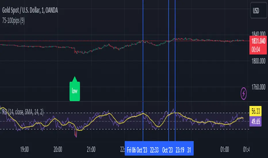
75-100pipsGreen/Red Arrowed Buy/Sell signals are just simple buy sell signals based on SuperTrend, VWAP, Bollinger, Linear Regression
Purple Arrowed Buy/Sell Signals happen when the price/candle cross over or under the yellow outer lines (4.236 fib lines) It's extremely rare and hard for price to stay above these lines therefore we can usually and comfortably buy/sell it, a key information here though when price pumps or dumps super fast and hard to the point of crossing these borders, the trend might also be extremely strong and continous so even if the price temporarily goes back inside the borders as the lines expand over time price can continue riding or crossing these lines back again and continue the uptrend/downtrend, therefore crossing these outer borders doesn't necessarilly and always mean a reversal is due.
When analyzing the instrument you're trading the important factors for support/resistance areas are usually the outer lines like i said previously it's super hard for price to be outside these and will almost always get back inside quickly. The Middle thicker green/red line which is Variable Index Dynamic Average should also be a nice pivot line for major support and resistance . All the other lines are also important dynamic support/resistance lines.
Their Importance Order
1- Outer Yellow Line (4.236 Fibs)
2- Thicker Middle Green/Red Line (VIDYA)
3- Thinner Upper/Lower Green/Red Line (VIDYA +3, VIDYA -3)
4- The Rest Of The Lines (Fib Lines)
You can use this indicator in any market condition in any market to determine key support/resistance levels, use it for mean reversion through price expanding to outside of the most outer line therefore being overbought/oversold basically using the purple buy/sell signals or only follow the normal buy/sell signals or use it in confluence with each other. You can also use this indicator in confluence with your own manual technical analysis or other indicators/strategies you are already using and are comfortable with.
A good part is the support/resistance lines from timeframe to timeframe pictures the whole situation quite well, you can use lower timeframe to find your entry/exit positions and higher timeframe to find your key support/resistance points, they all should be somewhat in confluence from timeframe to timeframe anyways. My recommendation would be to look at 1HR, 4HR and 1D charts for swing trading and 5-15 Min for quick scalping/day trading
You should still probably at least take a look to higher timeframes so that you don't get burned when you realize there is a huge resistance line at price XXXXX on the 4 hour chart but you're expecting it to go above it on the 5 minute chart, it can go above it temporarily but we analyze everything on a closing basis so it most likely won't close above it. Again don't take a position or FOMO when price breaks a support/resistance line, we're looking for a CLOSE above/below them and a retest to see if S/R flip happened would even be better.
Sometimes the most outer line won't be the 4.236 (Yellow) lines as when it gets quite volatile the Thinner Upper/Lower Green/Red Lines (VIDYA +3, VIDYA-3) might cross them to be the most outer line, in this case i have observed that the trend is extremely strong this time price almost always doesn't go above or below the VIDYA line but can stay outside of the Yellow 4.236 Fib line for an extended amount of time (price will still get back inside the channel relatively quickly, just not as fast as the normal condition)
With Proper Risk Management and Discipline this indicator can be of great use to you as it's surprisingly successful especially at mean reversion and pointing out the support/resistance lines, they are so much more successful than your average MA/EMA lines.
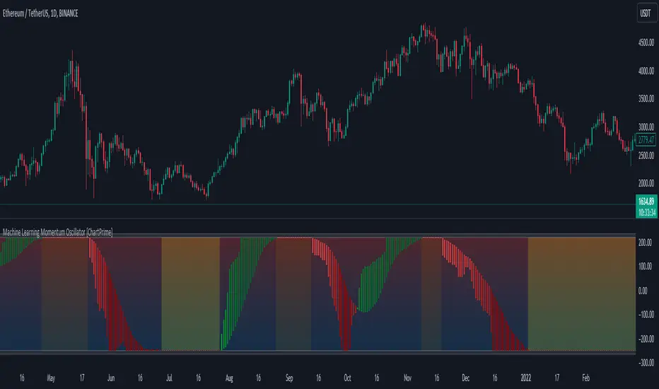
Machine Learning Momentum Oscillator [ChartPrime]The Machine Learning Momentum Oscillator brings together the K-Nearest Neighbors (KNN) algorithm and the predictive strength of the Tactical Sector Indicator (TSI) Momentum. This unique oscillator not only uses the insights from TSI Momentum but also taps into the power of machine learning therefore being designed to give traders a more comprehensive view of market momentum.
At its core, the Machine Learning Momentum Oscillator blends TSI Momentum with the capabilities of the KNN algorithm. Introducing KNN logic allows for better handling of noise in the data set. The TSI Momentum is known for understanding how strong trends are and which direction they're headed, and now, with the added layer of machine learning, we're able to offer a deeper perspective on market trends. This is a fairly classical when it comes to visuals and trading.
Green bars show the trader when the asset is in an uptrend. On the flip side, red bars mean things are heading down, signaling a bearish movement driven by selling pressure. These color cues make it easier to catch the sentiment and direction of the market in a glance.
Yellow boxes are also displayed by the oscillator. These boxes highlight potential turning points or peaks. When the market comes close to these points, they can provide a heads-up about the possibility of changes in momentum or even a trend reversal, helping a trader make informed choices quickly. These can be looked at as possible reversal areas simply put.
Settings:
Users can adjust the number of neighbours in the KNN algorithm and choose the periods they prefer for analysis. This way, the tool becomes a part of a trader's strategy, adapting to different market conditions as they see fit. Users can also adjust the smoothing used by the oscillator via the smoothing input.
Smart Money Range [ChartPrime]The Smart Money Range indicator is designed to provide traders with a holistic view of market structure, emphasizing potential key support and resistance levels within a predefined range. This indicator is not just a visually pleasing, but also a comprehensive guide to understanding the market’s dynamics at a given level.
Key Features:
Defined Range: The indicator demarcates a clear range, highlighting support and resistance levels within it. This aids in identifying potential areas of buying and selling pressure. These are derived from highly significant areas that have been touched many times before.
Touches Counter: Underneath the support and resistance lines, there are numerical values that show the number of times price has interacted with these levels. This can provide insights into the strength or weakness of a particular level.
Zig-Zag Projections: Within the range, there's a zig-zag pattern indicating possible future touches, helping traders anticipate future price movements.
Double-Sided Profile: To the right of the range, a dual-profile is showcased. One side of the profile displays the volume traded at specific price levels, giving insights into where significant buying or selling has occurred. On the other side, it reflects the number of touches at that given price level, reinforcing the importance of particular price points.
Customizability: Users have the option to adjust the period setting, allowing them to cater the indicator to their specific trading style and configuration. Additionally, with volume levels settings, traders can adjust the number of bins in the profile for a tailored view.

Fibo Levels with Volume Profile and Targets [ChartPrime]The Fib Levels With Volume Profile and Targets (FIVP) is a trading tool designed to provide traders with a unique understanding of price movement and trading volume through the lens of Fibonacci levels. This dynamic indicator merges the concepts of Fibonacci retracement levels with trading volume analytics to offer predictive insights into potential price trajectories.
Features:
1. Fibonacci Levels: The FPI showcases three prominent Fibonacci levels on both sides of the current price, offering an intricate picture of potential support and resistance levels.
2. Support and Resistance Recognition: Harnessing the power of Fibonacci levels, the FPI provides traders with potential areas of support and resistance, aiding in informed decision-making for entries, exits, and stop placements.
3. Customizable Timeframe Settings: In order to cater to different trading strategies and styles, users can manually select their preferred timeframe for the Fibonacci calculations, ensuring optimal relevance and accuracy for their trading approach.
4. Volume Analytics: One of the standout features of the FIVP is its ability to calculate trading volume for every bar that is sandwiched between the top and lower Fibonacci levels. This ensures traders have a clear vision of where the majority of trading activity is occurring, lending weight to the credibility of the displayed support and resistance zones.
5. Volume-Derived Price Targeting: The Possible Target Arrow function is an innovative feature. By analyzing and comparing the trading volume in the bearish and bullish zones, it provides an arrow indicating the potential direction the market might take. If the bull volume surpasses the bear volume, the market is likely skewing bullish and vice versa.
Usage
Ideal for both novice and seasoned traders, the FPI offers a rich tapestry of information. It allows for refined technical analysis, more precise entries and exits, and a holistic view of the interplay between price and trading volume. Whether you're scalping, day trading, or swing trading, the Fibonacci Profile Indicator is designed to enhance your trading strategy, providing a comprehensive perspective of the market's potential movements.

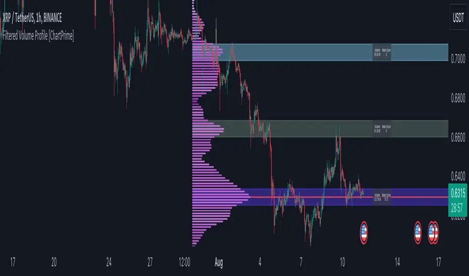
Filtered Volume Profile [ChartPrime]The "Filtered Volume Profile" is a powerful tool that offers insights into market activity. It's a technical analysis tool used to understand the behavior of financial markets. It uses a fixed range volume profile to provide a histogram representing how much volume occurred at distinct price levels.
Profile in action with various significant levels displayed
How to Use
The script is designed to analyze cumulative trading volumes in different price bins over a certain period, also known as `'lookback'`. This lookback period can be defined by the user and it represents the number of bars to look back for calculating levels of support and resistance.
The `'Smoothing'` input determines the degree to which the output is smoothed. Higher values lead to smoother results but may impede the responsiveness of the indicator to rapid changes in volatility.
The `'Peak Sensitivity'` input is used to adjust the sensitivity of the script's peak detection algorithm. Setting this to a lower value makes the algorithm more sensitive to local changes in trading volume and may result in "noisier" outputs.
The `'Peak Threshold'` input specifies the number of bins that the peak detection mechanism should account for. Larger numbers imply that more volume bins are taken into account, and the resultant peaks are based on wider intervals.
The `'Mean Score Length'` input is used for scaling the mean score range. This is particularly important in defining the length of lookback bars that will be used to calculate the average close price.
Sinc Filter
The application of the sinc-filter to the Filtered Volume Profile reduces the risk of viewing artefacts that may misrepresent the underlying market behavior. Sinc filtering is a high-quality and sharp filter that doesn't manifest any ringing effects, making it an optimal choice for such volume profiling.
Histogram
On the histogram, the volume profile is colored based on the balance of bullish to bearish volume. If a particular bar is more intense in color, it represents a larger than usual volume during a single price bar. This is a clear signal of a strong buying or selling pressure at a particular price level.
Threshold for Peaks
The `peak_thresh` input determines the number of bins the algorithm takes in account for the peak detection feature. The 'peak' represents the level where a significant amount of volume trading has occurred, and usually is of interest as an indicative of support or resistance level.
By increasing the `peak_thresh`, you're raising the bar for what the algorithm perceives as a peak. This could result in fewer, but more significant peaks being identified.
History of Volume Profiles and Evolution into Sinc Filtering
Volume profiling has a rich history in market analysis, dating back to the 1950s when Richard D. Wyckoff, a legendary trader, introduced the concept of volume studies. He understood the critical significance of volume and its relationship with market price movement. The core of Wyckoff's technical analysis suite was the relationship between prices and volume, often termed as "Effort vs Results".
Moving forward, in the early 1800s, the esteemed mathematician J. R. Carson made key improvements to the sinc function, which formed the basis for sinc filtering application in time series data. Following these contributions, trading studies continued to create and integrate more advanced statistical measures into market analysis.
This culminated in the 1980s with J. Peter Steidlmayer’s introduction of Market Profile. He suggested that markets were a function of continuous two-way auction processes thus introducing the concept of viewing markets in price/time continuum and price distribution forms. Steidlmayer's Market Profile was the first wide-scale operation of organized volume and price data.
However, despite the introduction of such features, challenges in the analysis persisted, especially due to noise that could misinform trading decisions. This gap has given rise to the need for smoothing functions to help eliminate the noise and better interpret the data. Among such techniques, the sinc filter has become widely recognized within the trading community.
The sinc filter, because of its properties of constructing a smooth passing through all data points precisely and its ability to eliminate high-frequency noise, has been considered a natural transition in the evolution of volume profile strategies. The superior ability of the sinc filter to reduce noise and shield against over-fitting makes it an ideal choice for smoothing purposes in trading scripts, particularly where volume profiling forms the crux of the market analysis strategy, such as in Filtered Volume Profile.
Moving ahead, the use of volume-based studies seems likely to remain a core part of technical analysis. As long as markets operate based on supply and demand principles, understanding volume will remain key to discerning the intent behind price movements. And with the incorporation of advanced methods like sinc filtering, the accuracy and insight provided by these methodologies will only improve.
Mean Score
The mean score in the Filtered Volume Profile script plays an important role in probabilistic inferences regarding future price direction. This score essentially characterizes the statistical likelihood of price trends based on historical data.
The mean score is calculated over a configurable `'Mean Score Length'`. This variable sets the window or the timeframe for calculation of the mean score of the closing prices.
Statistically, this score takes advantage of the concept of z-scores and probabilities associated with the t-distribution (a type of probability distribution that is symmetric and bell-shaped, just like the standard normal distribution, but has heavier tails).
The z-score represents how many standard deviations an element is from the mean. In this case, the "element" is the price level (Point of Control).
The mean score section of the script calculates standard errors for the root mean squared error (RMSE) and addresses the uncertainty in the prediction of the future value of a random variable.
The RMSE of a model prediction concerning observed values is used to measure the differences between values predicted by a model and the values observed.
The lower the RMSE, the better the model is able to predict. A zero RMSE means a perfect fit to the data. In essence, it's a measure of how concentrated the data is around the line of best fit.
Through the mean score, the script effectively predicts the likelihood of the future close price being above or below our identified price level.
Summary
Filtered Volume Profile is a comprehensive trading view indicator which utilizes volume profiling, peak detection, mean score computations, and sinc-filter smoothing, altogether providing the finer details of market behavior.
It offers a customizable look back period, smoothing options, and peak sensitivity setting along with a uniquely set peak threshold. The application of the Sinc Filter ensures a high level of accuracy and noise reduction in volume profiling, making this script a reliable tool for gaining market insights.
Furthermore, the use of mean score calculations provides probabilistic insights into price movements, thus providing traders with a statistically sound foundation for their trading decisions. As trading markets advance, the use of such methodologies plays a pivotal role in formulating effective trading strategies and the Filtered Volume Profile is a successful embodiment of such advancements in the field of market analysis.
Pattern Probability with EMA FilterThe provided code is a custom indicator that identifies specific price patterns on a chart and uses a 14-period Exponential Moving Average (EMA) as a filter to display only certain patterns based on the EMA trend direction. These code identifies patterns display them as upward and downward arrows indicates potential price corrections and short term trend reversals in the direction of the arrow. Use with indicators such as RSI that inform overbought and oversold condition to add reliability and confluence.
Code Explanation:
The code first calculates three values 'a', 'b', and 'c' based on the difference between the current high, low, and close prices, respectively, and their respective previous moving average values.
Binary values are then assigned to 'a', 'b', and 'c', where each value is set to 1 if it's greater than 0, and 0 otherwise.
The 'pattern_type' is determined based on the binary values of 'a', 'b', and 'c', combining them into a single number (ranging from 0 to 7) to represent different price patterns.
The code calculates a 14-period Exponential Moving Average (EMA) of the closing price.
It determines the EMA trend direction by comparing the current EMA value with the previous EMA value, setting 'ema_going_up' to true if the EMA is going up and 'ema_going_down' to true if the EMA is going down.
The indicator then plots arrows on the chart for specific pattern_type values while considering the EMA trend direction as a filter. It displays different colored arrows for each pattern_type.
The 14-period EMA is also plotted on the chart, with the color changing to green when the EMA is going up and red when the EMA is going down.
Concept:
pattern_type = 0: H- L- C- (Downward trend continuation) - Indicates a continuation of the downward trend, suggesting further losses ahead.
pattern_type = 1: H- L- C+ (Likely trend change: Downwards to upwards) - Implies the upward trend or price movement change.
pattern_type = 2: H- L+ C- (Likely trend change: Upwards to downwards) - Suggests a potential reversal from an uptrend to a downtrend, but further confirmation is needed.
pattern_type = 3: H- L+ C+ (Trend uncertainty: Potential reversal) - Indicates uncertainty in the trend, potential for a reversal, but further price action confirmation is required.
pattern_type = 4: H+ L- C- (Downward trend continuation with lower volatility) - Suggests the downward trend may continue, but with reduced price swings or lower volatility.
pattern_type = 5: H+ L- C+ (Likely trend change: Downwards to upwards) - Implies a potential reversal from a downtrend to an uptrend, with buying interest increasing.
(pattern_type = 6: H+ L+ C- (Likely trend change: Upwards to downwards) - Suggests a potential reversal from an uptrend to a downtrend, with selling pressure increasing.
pattern_type = 7: H+ L+ C+ (Upward trend continuation) - Indicates a continuation of the upward trend, suggesting further gains ahead.
In the US market, when analyzing a 15-minute chart, we observe the following proportions of the different pattern_type occurrences: The code will plot the low frequency patterns (P1 - P6)
P0 (H- L- C-): 37.60%
P1 (H- L- C+): 3.60%
P2 (H- L+ C-): 3.10%
P3 (H- L+ C+): 3.40%
P4 (H+ L- C-): 2.90%
P5 (H+ L- C+): 2.70%
P6 (H+ L+ C-): 3.50%
P7 (H+ L+ C+): 43.50%
When analyzing higher time frames, such as daily or weekly charts, the occurrence of these patterns is expected to be even lower, but they may carry more significant implications due to their rarity and potential impact on longer-term trends.
