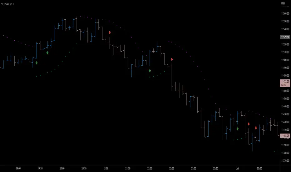
Parabolic SAR breakout [SugarTrader77]Parabolic SAR with:
- On chart visuals
- Alarms
to notify when price breaks up/down the SAR flipping point level
Created only for community testing only. Trade at your own risk.
Cari skrip untuk "breakout"
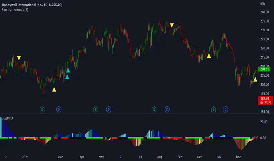
LNL Squeeze ArrowsIf you struggle with the entries, low % win rate or trading the squeeze setup overall, this indicator is for you!
If you look closely at your losing trades, chances are the losers have one thing in common = inverse momentum. I created this tool after I found out that Stacked EMAs and picture perfect trend is not the only thing you need for a squeeze setup. Squeeze arrows pinpoint the exact moment where the squeeze momentum change happens (momentum change is absolutely crucial for the squeeze setup). These arrows will help you stay out of "everything was aligned but still failed" type of setups.
Squeeze Arrows:
1. Momentum Arrows (cyan blue/red) - Showing the best possible moment for an entry during the squeeze (after you see one, you can expect the squeeze to fire soon).
2. Slingshot Arrows (yellow) - Even though you can trade off of them, these arrows work mostly as a confirmation & caution tool. If an inverse slingshot arrow is plotted during a squeeze that means caution = you should wait because momentum is not on your side thus there there is a quite high probability that the squeeze can fire the other direction.
Squeeze Dots Trigger:
Represents the number of red dots (squeeze) after which the arrows should plot. Default = 5 (only after 5 red dots, arrows will appear), some traders like to set it on 3 or even 1.
Tips & Tricks:
1.Breakout or Bailout Mentality
- The big advantage of the arrows is the fact that they either work straight away or they don't. This is where you can apply the breakout or bailout mentality and really focus exclusively on the breakout part of the whole squeeze move. You can minimize the risk by putting mental stops just a few points below the last low of the candle where the arrows appeared. That way you can be stopped out even during the squeeze = won't hurt as much as when the squeeze fire the opposite direction. Reward may be the same but the risk is lower.
2. Yellow Flags
- Use the slingshot arrows as a caution tool. Even if all your squeeze criteria are met. Yellow inverse arrow = caution (wait for the true momentum change). Once the slingshot arrow appears in the conext of the trend, you are good to go.
3. Last Arrow Rule
- Sometimes you will see a lot of arrows during the longer squeezes. This is where the last arrow rule come in handy. The last arrow you see on chart can be canceled anytime by a new one. The last arrow is the valid one!
Hope you can squeeze from these squeeze arrows as much as there is to squeeze so you can finally trade the squeeze with ease.
Hope it helps.
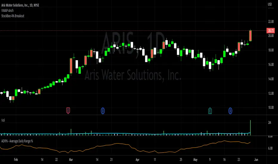
StockBee 4% BreakoutThe Stockbee 4% Breakout script is a study tool for users who wants to do a deep dive on StockBee's 4% Breakout momentum burst method. This script will assist a specific group of traders who trade this method easily find historical momentum bursts. This script finds and colors red any candle body that meets the following criteria:
1. Volume of the candle is greater than the previous candle volume.
2. The percent change of candle's price is greater than 4% from the previous candle close.
3. Current candle close is less than 30% from candle's high.
This script also filters out any candle that gaps up and breaks down with a close above 4% the previous candle (Eliminates gap-ups that fade). This tool is meant to find and filter possible candidates. Not every marked candle is a great momentum burst trade.
This is very helpful for Trading View users trading this specific setup.
[TTI] Volume Rulesibb.co
👆 Look at how the script looks when you hover with the mouse
––––History & Credit
Volume and Price action have been the sole foundation to technical traders since technical analysis has been around. This indicator includes some of the important volume rules that I have collected over the years and the ones I have seen that work. In general credit for the methods used in this indicators has to go to William O'Neil, Stockbee and Mark Minervini.
–––––What it does
There are 3 functions of the Volume rules indicator. The top line, the bottom line and the label.
1️⃣. The top line looks at a few basic volume patterns that are important to pay attention too.
🔵 Higher volume than yesterday and day closes up
🟣 Higher volume than yesterday and day closes down
🟡 Volume X times higher (defined in settings) over the last Y (defined in settings) days. Default is 2x higher compared to yesterday.
2️⃣ The bottom line looks at StockBee Labels
L4 custom criteria + 100k minimum trading day (bearish)
H4 custom criteria + 100k minimum trading day (bullish)
L9 custom criteria + 9M minimum trading day (bearish)
H9 custom criteria + 9M minimum trading day (bullish)
L49 custom criteria + 49M minimum trading day (bearish)
H49 custom criteria + 49M minimum trading day (bullish)
StockBee Labels:
ibb.co
3️⃣ The label looks wether the picked ticker meets the minimum requirement for trading (as per methodology) and how is the price action performing.
TDV = total dollar trading volume
Trading Volume = #stocks
If the above 2 meet the criteria in the settings pannel the label is green if both do not meet the label is red and if one is met and the other is not the label is yellow.
Additional comparison of the trading volume to the 10D, 20D and 50D MA of the volume and two custom indicators:
1. Volume Signature = whereby the indicator looks that the highest down volume over the last 10days and compares it to todays volume
2. Vol in vs Vol out = whereby the indicator looks at the volume of the breakout compared to the average down volume over the last 10 days
–––––How to use it
When trading always look for volume confirmation in the direction of your trend. The volume footprints are one of the ways to shadow institutional support. Bearish and Bullish signals are described above.

[TTI] Pinch AVWAPs––––History & Credit
This indicator came from studying Alpha trends and the concept from CMT Brian Shannon
–––––What it does
Upon uploading choose two dates from which the script will calculate Anchored VWAP from both dates. The dates can be easily moved for faster adjustment and re-calculation.
–––––How to use it
If you are trading a breakout methodology like myself, look for the "pinch" of the AVWAPs. Preferably, a bottom AVWAP moving up and a top AVWAP moving down. Choose important dates (this is rather subjective) for the AVWAP dates. These can be important events like Earnings or Divident Announcements. Or places where there is a change of structure of the Supply and Demand dynamic.

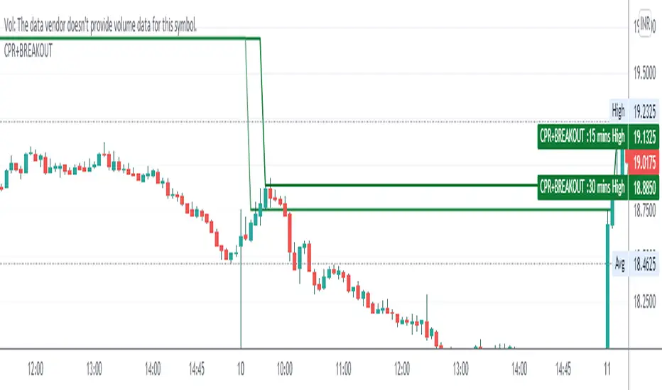
CPR WITH BREAKOUTCPR with 10-30 mins Breakout
This indicator includes CPR with 15-30 mins breakout, resistance, support, previous day low, previous day high, day low and day high etc,
please backtest before use
regards
The Malayali Trader
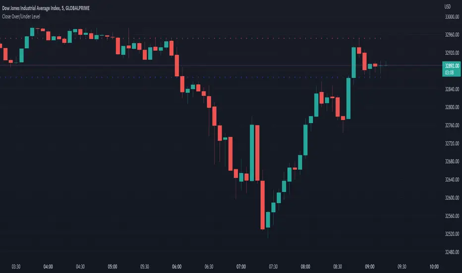
Close Over/Under LevelIf you want to be alerted when a price closes above or below a given level(s), then this indicator is for you! 😁 Whether you're looking for a breakout, or some change of structure, etc, this should come in handy.
Usage:
Just add a level(s) (anything above 0).
Optionally plot lines.
Set alerts as normal.
Enjoy!

Inside Breakout - inside bar - PerQuantumCoin Premium IndicatorHOW IT WORKS:
- The Inside Breakout gives signals on the chart on the breakout of inside bar chart pattern;
- It allows to trade trend or counter-trend signals;
- Computes intrinsic values to access the strength of the Buy/Sell signal;
- Allows users to adjust their own settings, adapting the signals produced;
- These signals can be also set up as Alerts;
- The indicator has a few custom features that allows users to filter out signals using multi-timeframe trend indicator and to keep tracking positions so that one can only get new signals when they reserve position;
This Script is meant to help traders easily identify great entry opportunities.
The Script does NOT repaint signals.

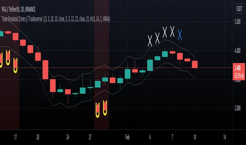
// Tradeaverse \ False Breakout Zones Indicator Similar to the false breakout indicator this spots false break outs using 2 stochastic rsi's. This one is a chart overlay showing you the exact candles the false break out happens on.
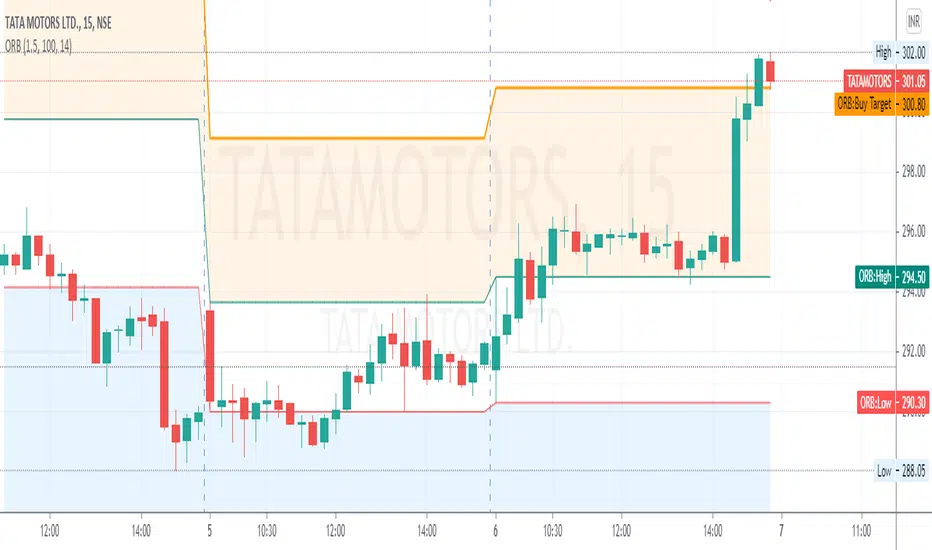
RLT Opening Range Breakout (ORB)Use this on TSLA 3-min chart
ORB strategy
STRATEGY
3-min chart / TSLA
SETUP
1) R = Risk Unit
2) OCO/Bracket trade long/short the opening range breakout of 1st candle of the day.
3) On the 2nd candle, If the price action goes ABOVE HIGH of the first candle high (thick green line), then the BULLISH trade is entered.
4) On the 2nd candle, If the price action goes BELOW LOW of the first candle high (thick red line), then the BEARISH trade is entered.
5) Once the order is filled, copy/paste the OCO order for +1 or -1r.
6) Ok to re-enter a trade using the same levels for a 2nd trade -- only after a win.
MANAGE TRADE
Expect to lose 1 day out of the week.
Always exit at 1R or -1R
Track your trade vs the house strategy win/loss (add a new column to your trading log). If you cannot beat the house/vanilla strategy, use the house/vanilla strategy.

SMART4TRADER - BREAKOUTThis indicator shows the breakthrough of extremes for the selected period. The default period is set = 3
The indicator checks on the current bar whether the maximum or minimum prices for the selected period are broken
----------------
Данный индикатор показывает прорыв экстремумов за выбранный период. По-умолчанию выставлен период = 3
Индикатор проверяет на текущем баре пробиты ли максимальные или минимальные значения цен за выбранный период

Opening Range Breakout Lines-nagaBased on Range breakout on opening sessions, you can change your opening according to your time . by default it set for London opens.

Pivot Support & ResistanceHere signals are based on the pivot high and pivot lows. Factors taken into account in understanding the breakout or breakdown are:
volume
candle bar is not opening candle
must be near pivot high or low
Recommendation:
Use once candle closes else you might get trapped in certain cases so be careful

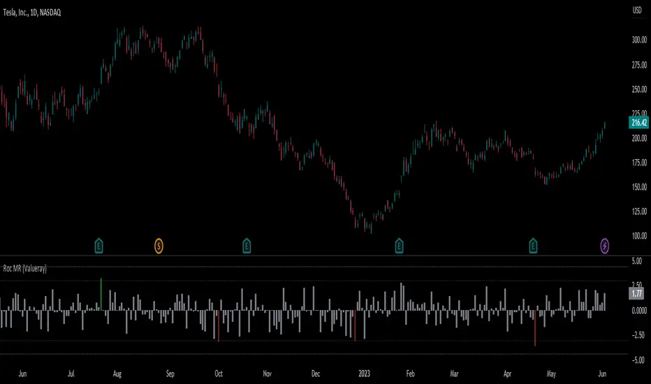
Roc Mean Reversion (ValueRay)This Indicator shows the Absolute Rate of Change in correlation to its Moving Average.
Values over 3 (gray dotted line) can savely be considered as a breakout; values over 4.5 got a high mean-reverting chance (red dotted line).
This Indicator can be used in all timeframes, however, i recommend to use it <30m, when you want search for meaningful Mean-Reverting Signals.
Please like, share and subscribe. With your love, im encouraged to write and publish more Indicators.
SMART4TRADER-INDEX PATTERN BREAKOUT MULTIThis indicator is designed to analyze the breakdown of previous values of the candles, not only on the selected tool, but also on others. The indicator is well used on the indices of the stock market. In the default indicator, recommended indexes are configured.
The indicator summarizes the results of the analysis of all tools and shows in the form of columns that are above and \ or below the zero line. Additionally, the indicator has two horizontal lines above zero (green) and two horizontal lines below zero (red). The breakdown of these nearest to zero lines signals the possible beginning of the move towards which the column is directed. If the column reached the left line, this means that a very strong trend is noticeable on all the tools selected in the settings.
Additionally, the indicator has a blue line that shows the average value of the columns both above and below the zero line. And also added Hull Moving Average Period (9).
BUY signal:
HIGH > HIGH(1) и LOW > LOW(1)
SELL signal:
HIGH < HIGH(1) и LOW < LOW(1) и LOW < LOW(2)
--------------------------------------------------------
Этот индикатор предназначен для анализа пробития предыдущих значений свечей, не только на выбранном инструменте, но и на других. Индикатор хорошо использовать на индексах фондового рынка. В индикаторе по умолчанию настроены рекомендуемые индексы для анализа.
Индикатор суммирует результаты анализа всех инструментов и показывает в виде столбиков, которые находиться выше и\или ниже нулевой линии. Дополнительно на индикаторе есть две горизонтальные линии выше нуля (зеленый) и две горизонтальные линии ниже нуля (красный). Пробитие этих ближайших к нулю линий сигнализирует о возможном начале движения в сторону, в которую направлен столбик. Если столбик достиг крайней линии, то это значит, что очень сильный тренд заметен на всех инструментах выбранных в настройках.
Дополнительно в индикаторе есть синяя линия, которая показывает среднее значение столбиков как выше, так и ниже нулевой линии. А также добавлена HULL MOVING AVERAGE период (9).
Сигнал на покупку:
HIGH > HIGH(1) и LOW > LOW(1)
Сигнал на продажу:
HIGH < HIGH(1) и LOW < LOW(1) и LOW < LOW(2)

Volume Level with AlertThis script is made by Bollinger Bands and Volume , BB is using customize setting to filter the surge volume.
Good to use in Cryptocurrency
When Volume Breakout and price is drop, chance to collect at lower price
Try to find out Price * Volume Divergence , a best entry point with low risk

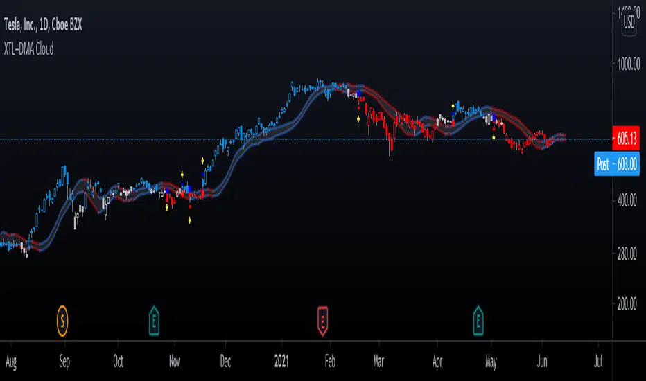
Advanced GET: Tom Joseph's XTL, DMA Cloud & Breakout SignalsThe Expert Trend Locator ( XTL ) was developed by Tom Joseph to identify major trends, similar to elliott wave 3 type swings.
Blue bars are bullish and indicate a potential upwards impulse.
Red bars are bearish and indicate a potential downwards impulse.
White bars indicate no trend is detected at the moment.
Added to the indicator is the recommended use to enter a position, as explained by Tom Joseph in his book Applying Technical Analysis:
Once a blue or red bar appears, the indicator signals an entry level, a stop loss level and two target levels (2nd is optional).
The levels can be shown until a new signal emerges or just above/below the breakout bar.
Finally, a cloud formed by two displaced moving averages (DMA) is included, which allow the trend to continue its momentum. During an uptrend the lower moving average could serve as a trailing stop, and during a downtrend the upper moving average could serve as the trailing stop.
Enjoy!
Bar colour BreakoutIndicator that changes the colour of the bars depending on the breakout of the high or the low of the previous bar. A lime bar indicates a bar that has a higher high than the previous one. A fuchsia bar indicates a bar that has a lower low than the previous bar. A yellow bar indicates an outside bar (higher high and lower low than the previous one). A blue bar indicates an inside bar (lower high and higher low).

ORB Current Timeframe + ATRThis is Indicator
1. Opening Range Breakout for Selected Time frame
2. You can fix your Risk Reward and also Risk Amount
3. It will calculate the Position size based on Open Range ATR and your Risk Amount
4. Display's the Daily ATR for Given Input
5. It Gives Opening ATR Percentage to take a trade or not
6. It Calculates the Target on Either Side Based on the Risk Reward
A Better Fractal (Williams)DESCRIPTION:
This is a more advanced version of the classic Williams Fractal algo, using a looped barindex iterator to examine highs/lows.
You may choose ideal or regular fractals, along with the amount of bars (periods) used to calculate; the minimum being 3. Oddnums only.
Ideal fractals = fractals with each bar needing to be lower/higher than the preceding bar, with the midbar at the apex.
Regular fractals = the typical Williams fractal, wherein each bar only has to be lower/higher than the midbar (apex) only.
How to trade? Combine with other indicators and use breakout or reversal strategies, typically. Set buy/sell stops at the high/low of a fractal, for instance
... to trade the breakout when it occurs. Or, track momentum when a fractal prints and trade accordingly. Or perhaps trade with the alligator or 3 EMA.
Experiment with different types of fractals to achieve the desired result, with higher period fractals obviously offering more solid indication though with higher lag.
Note: A fractal does not print until n/2 (rounded down) bars after, where n = the period you chose.

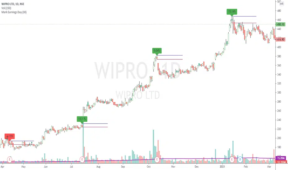
Mark Earnings DayThe idea for today is to plot high / low prices on the Earnings day. (use only on Daily timeframe)
And as we all know, most of the times, price is unidirectional after the earnings are declared.
A target of 1:2 or even 1:5 can be easily achieved in these cases, within few days.
Green label indicates, reported earnings are higher than estimated. Red indicates the other way.
But 1, this does not necessarily indicate the trend direction.
But 2, a breakout / breakdown of this day's candle mostly does. The other serving as a Stop Loss.
Optionally, the scripts can also plot splits and dividends on the charts.
The difference between this indicator and readily available default markings on the chart is,
these figures are directly available on the chart itself, that saves multiple clicks.
Trend ResumptionWe again keep it really simple.
This indicator just plots the combination of RGRR and GRGG candlesticks. (R = Red / Bearish, G = Green / Bullish)
When either pattern occurs, trade the combined high and combined low of recent 2 RR or recent 2 GG candles. I.e.,
Buy above GG's high with SL at GG's low.
Sell below RR's low with SL at RR's high.
Refer the shared chart for example. The signals were plotted on both the sides, and wherever triggered - gave rewards.
Only 1 at 05-Apr, 10:50 a.m. did not trigger, but that must then be ignored. Do not hurry to enter the trade, wait for breakout / breakdown above combined high / low.
