FOTSI - Open sourceI WOULD LIKE TO SPECIFY TWO THINGS:
- The indicator was absolutely not designed by me, I do not take any credit and much less I want them, I am just making this fantastic indicator open source and accessible to all
- The script code was not recycled from other indicators, but was created from 0 following the theory behind it to the letter, thus avoiding copyright infringement
- Advices and improvements are accepted, as having very little programming experience in Pine Script I consider this work still rough and slow
WHAT IS THE FOTSI?
The FOTSI is an oscillator that measures the relative strength of the individual currencies that make up the 28 major Forex exchanges.
By identifying the currencies that are in the overbought (+50) and oversold (-50) areas, it is possible to anticipate the correction of a currency pair following a strong trend.
THE THEORY BEHIND
1) At the base of everything is the 1-period momentum (close-open) of the single currency pairs that contain a certain currency. For example, the momentum of the USD currency is composed of all the exchange rates that contain the US dollar inside it: mom_usd = - mom_eurusd - mom_gbpusd + mom_usdchf + mom_usdjpy - mom_audusd + mom_usdcad - mom_nzdusd. Where the base currency is in second position, the momentum is subtracted instead of adding it.
2) The IST formula is applied to the momentum of the individual currencies obtained. In this way we get an oscillator that oscillates between 0 and its overbought and oversold areas. The area between +25 and -25 is an area in which we can consider the movements of individual currencies to be neutral.
3) The TSI is nothing more than a double smoothing on the momentum of individual currencies. This particularity makes the indicator very reactive, minimizing the delays of the trend reversal.
HOW TO USE
1) A currency is identified that is in the overbought (+50) or oversold (-50) area. Example GBP = 50
2) The second currency is identified as the one most opposite to the first. Example USD = -25
3) The currency pair consisting of the two currencies opens. So GBP / USD
4) Considering that GBP is oversold, we anticipate its future devaluation. So in this case we are short on GBP / SUD. Otherwise if GBP had been oversold (-50) we expect its future valuation and therefore we enter long.
5) It is used on the H1, H4 and D1 timeframes
6) Closing conditions: the position on the 50-period exponential moving average is split / the position at target on the 100-period exponential moving average is closed
7) Stoploss: it is recommended not to use it, if you want to use it it is equivalent to 5 times the ATR on the reference timeframe
8) Position sizing: go very slow! Being a counter-trend strategy, it is very risky to position yourself heavily. Use common sense in everything!
9) To insert the alerts that warn you of an overbought and oversold condition, it is necessary to enter the signals called "Overbought Signal" and "Oversold Signal" for each chart used, in the specific Trading View window. like me using multiple charts in the same window.
I hope you enjoy my work. For any questions write in the comments.
Thanks <3
//--------------------------------------------------------------------------------------------------------------------------------------------------------------------------------------------------------------
TENGO A PRECISARE DUE COSE:
- L'indicatore non è stato assolutamente ideato da me, non mi assumo nessun merito e tanto meno li voglio, io sto solo rendendo questo fantastico indicatore open source ed accessibile a tutti
- Il codice dello script non è stato riciclato da altri indicatori, ma è stato creato da 0 seguendo alla lettere la teoria che sta alla sua base, evitando così di violare il copyright
- Si accettano consigli e migliorie, visto che avendo pochissima esperienza di programmazione in Pine Script considero questo lavoro ancora grezzo e lento
COS'È IL FOTSI?
Il FOTSI è un oscillatore che misura la forza relativa delle singole valute che compongono i 28 cambi major del Forex.
Individuando le valute che si trovano nelle aree di ipercomprato (+50) ed ipervenduto (-50) , è possibile anticipare la correzione di una coppia valutaria al seguito di un forte trend.
LA TEORIA ALLA BASE
1) Alla base di tutto c'è il momentum ad 1 periodo (close-open) delle singole coppie valutarie che contengono una determinata valuta. Ad esempio il momentum della valuta USD è composto da tutti i cambi che contengono il dollaro americano al suo interno: mom_usd = - mom_eurusd - mom_gbpusd + mom_usdchf + mom_usdjpy - mom_audusd + mom_usdcad - mom_nzdusd . Ove la valuta base si trova in seconda posizione si sottrae il momentum al posto che sommarlo.
2) Si applica la formula del TSI ai momentum delle singole valute ottenute. In questo modo otteniamo un oscillatore che oscilla tra lo 0 e le sue aree di ipercomprato ed ipervenduto. L'area compresa tra +25 e -25 è un area in cui possiamo considerare neutri i movimenti delle singole valute.
3) Il TSI non è altro che un doppio smoothing sul momentum delle singole valute. Questa particolarità rende l'indicatore molto reattivo, minimizzando i ritardi dell'inversione del trend.
COME SI USA
1) Si individua una valuta che si trova nell'area di ipercomprato (+50) o ipervenduto (-50) . Esempio GBP = 50
2) Si individua come seconda valuta quella più opposta alla prima. Esempio USD = -25
3) Si apre la coppia di valuta composta dalle due valute. Quindi GBP/USD
4) Considerando che GBP è in fase di ipervenduto prevediamo una sua futura svalutazione. Quindi in questo caso entriamo short su GBP/SUD. Diversamente se GBP fosse stato in fase di ipervenduto (-50) ci aspettiamo una sua futura valutazione e quindi entriamo long.
5) Si usa sui timeframe H1, H4 e D1
6) Condizioni di chiusura: si smezza la posizione sulla media mobile esponenziale a 50 periodi / si chiude la posizione a target sulla media mobile esponenziale a 100 periodi
7) Stoploss: è consigliato non usarlo, nel caso lo si voglia utilizzare esso equivale a 5 volte l'ATR sul timeframe di riferimento
8) Position sizing: andateci molto piano! Essendo una strategia contro trend è molto rischioso posizionarsi in modo pesante. Usate il buonsenso in tutto!
9) Per inserire gli allert che ti avvertono di una condizione di ipercomprato ed ipervenduto, è necessario inserire dall'apposita finestra di Trading View i segnali denominati "Segnale di ipercomprato" ed "Segnale di ipervenduto" per ogni grafico che si usa, nel caso come me che si utilizzano più grafici nella stessa finestra.
Spero che possiate apprezzare il mio lavoro. Per qualsiasi domanda scrivete nei commenti.
Grazie<3
Cari skrip untuk "英国央行降息25个基点"

CT Reverse True Strength Indicator On ChartIntroducing the Caretakers “On Chart” Reverse True Strength Index.
According to Wikipedia….
“The True Strength Index (TSI) is a technical indicator used in the analysis of financial markets that attempts to show both trend direction and overbought/oversold conditions. It was first published William Blau in 1991.
The indicator uses moving averages of the underlying momentum of a financial instrument.
Momentum is considered a leading indicator of price movements, and a moving average characteristically lags behind price.
The TSI combines these characteristics to create an indication of price and direction more in sync with market turns than either momentum or moving average.”
The TSI has a normal range of values between +100 and -100.
Traditionally traders and analysts will consider:
Positives values above 25 to indicate an “overbought” condition
Negative values below -25 to indicate an “oversold” condition
I have reverse engineered the True Strength Index formula to derive 2 new functions.
1) The reverse TSI function is dual purpose which can be used to calculate….
The chart price at which the TSI will reach a particular TSI scale value.
The chart price at which the TSI will equal its previous value.
2) The reverse TSI signal cross function can be used to calculate the chart price at which the TSI will cross its signal line.
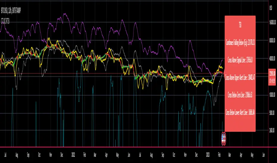
I have employed these functions here to return the price levels where the True Strength Index would equal :
Upper alert level ( default 25 )
Zero-Line
Lower alert level ( default -25 )
Previous TSI (eq) value
TSI signal line
In this “On Chart” version of the reverse True Strength Index the crossover levels are displayed both as lines on the chart and via an optional info-box with choice of user selected info.
Chart Line Colors
Upper alert level... ( Fuchsia )
Zero-Line............ ( White )
Lower alert level... ( Aqua )
TSI (eq)...............( TSI (eq) > close..Orange, TSI (eq) < close..Lime )
TSI signal line........( Signal Cross Line > Close..Aqua, Signal Cross Line < Close..Fuchsia )
How to interpret the displayed prices returned from the TSI scale zero line and upper and lower alert levels.
Closing exactly at the given price will cause the True Strength Index value to equal the scale value.
Closing above the given price will cause the True Strength Index to cross above the scale value.
Closing below the given price will cause the True Strength Index to cross below the scale value.
How to interpret the displayed price returned from the TSI (eq)
Closing exactly at the price will cause the True Strength Index value to equal the previous TSI value.
Closing above the price will cause the True Strength Index value to increase.
Closing below the price will cause the True Strength Index value to decrease.
How to interpret the displayed price returned from the TSI signal line crossover.
Closing exactly at the given price will cause the True Strength Index value to equal the signal line.
Closing above the given price will cause the True Strength Index to cross above the signal line.
Closing below the given price will cause the True Strength Index to cross below the signal line.
Common methods to derive signals from the TSI :
Zero-line crossovers
When the CMO crosses above the zero-line, a buy signal is generated.
When the CMO crosses below the zero-line, a sell signal is generated.
“Overbought” and “Oversold” crossovers
When the SMI crosses below -25 and then moves back above it, a buy signal is generated.
When the SMI crosses above +25 and then moves back below it, a sell signal is generated.
What Does the True Strength Index (TSI) Tell You?
The indicator is primarily used to identify overbought and oversold conditions in an asset's price, spot divergence, identify trend direction and changes via the zero-line, and highlight short-term price momentum with signal line crossovers.
Since the TSI is based on price movements, oversold and overbought levels will vary by the asset being traded. Some stocks may reach +30 and -30 before tending to see price reversals, while another stock may reverse near +20 and -20.
Mark extreme TSI levels, on the asset being traded, to see where overbought and oversold is. Being oversold doesn't necessarily mean it is time to buy, and when an asset is overbought it doesn't necessarily mean it is time to sell. Traders will typically watch for other signals to trigger a trade decision. For example, they may wait for the price or TSI to start dropping before selling in overbought territory. Alternatively, they may wait for a signal line crossover.
Signal Line Crossovers
The true strength index has a signal line, which is usually a seven- to 13-period EMA of the TSI line. A signal line crossover occurs when the TSI line crosses the signal line. When the TSI crosses above the signal line from below, that may warrant a long position. When the TSI crosses below the signal line from above, that may warrant selling or short selling.
Signal line crossovers occur frequently, so should be utilized only in conjunction with other signals from the TSI. For example, buy signals may be favoured when the TSI is above the zero-line. Or sell signals may be favoured when the TSI is in overbought territory.
Zero-line Crossovers
The zero-line crossover is another signal the TSI generates. Price momentum is positive when the indicator is above zero and negative when it is below zero. Some traders use the zero-line for a directional bias. For example, a trader may decide only to enter a long position if the indicator is above its zero-line. Conversely, the trader would be bearish and only consider short positions if the indicator's value is below zero.
Breakouts and Divergence
Traders can use support and resistance levels created by the true strength index to identify breakouts and price momentum shifts. For instance, if the indicator breaks below a trendline, the price may see continued selling.
Divergence is another tool the TSI provides. If the price of an asset is moving higher, while the TSI is dropping, that is called bearish divergence and could result in a downside price move. If the TSI is rising while the price is falling, that could signal higher prices to come. This is called bullish divergence.
Divergence is a poor timing signal, so it should only be used in conjunction with other signals generated by the TSI or other technical indicators.
The Difference Between the True Strength Index (TSI) and the Moving Average Convergence Divergence (MACD) Indicator.
The TSI is smoothing price changes to create a technical oscillator. The moving average convergence divergence (MACD) indicator is measuring the separation between two moving averages. Both indicators are used in similar ways for trading purposes, yet they are not calculated the same and will provide different signals at different times.
The Limitations of Using the True Strength Index (TSI)
Many of the signals provided by the TSI will be false signals. That means the price action will be different than expected following a trade signal. For example, during an uptrend, the TSI may cross below the zero-line several times, but then the price proceeds higher even though the TSI indicates momentum has shifted down.
Signal line crossovers also occur so frequently that they may not provide a lot of trading benefit. Such signals need to be heavily filtered based on other elements of the indicator or through other forms of analysis. The TSI will also sometimes change direction without price changing direction, resulting in trade signals that look good on the TSI but continue to lose money based on price.
Divergence also tends to unreliable on the indicator. Divergence can last so long that it provides little insight into when a reversal will actually occur. Also, divergence isn't always present when price reversals actually do occur.
The TSI should only be used in conjunction with other forms of analysis, such as price action analysis and other technical indicators.
This is not financial advice, use at your own risk.
CT Reverse True Strength IndicatorIntroducing the Caretakers Reverse True Strength Index.
According to Wikipedia….
“The True Strength Index (TSI) is a technical indicator used in the analysis of financial markets that attempts to show both trend direction and overbought/oversold conditions. It was first published William Blau in 1991.
The indicator uses moving averages of the underlying momentum of a financial instrument.
Momentum is considered a leading indicator of price movements, and a moving average characteristically lags behind price.
The TSI combines these characteristics to create an indication of price and direction more in sync with market turns than either momentum or moving average.”
The TSI has a normal range of values between +100 and -100.
Traditionally traders and analysts will consider:
Positives values above 25 to indicate an “overbought” condition
Negative values below -25 to indicate an “oversold” condition
I have reverse engineered the True Strength Index formula to derive 2 new functions.
The reverse TSI function is dual purpose which can be used to calculate….
The chart price at which the TSI will reach a particular TSI scale value.
The chart price at which the TSI will equal its previous value.
The reverse TSI signal cross function can be used to calculate the chart price at which the TSI will cross its signal line.
I have employed these functions here to return the price levels where the True Strength Index would equal :
Upper alert level ( default 25 )
Zero-Line
Lower alert level ( default -25 )
Previous TSI (eq) value.
TSI signal line
These crossover levels are displayed via an optional info-box with choice of user selected info.
How to interpret the displayed prices returned from the TSI scale zero line and upper and lower alert levels.
Closing exactly at the given price will cause the True Strength Index value to equal the scale value.
Closing above the given price will cause the True Strength Index to cross above the scale value.
Closing below the given price will cause the True Strength Index to cross below the scale value.
How to interpret the displayed price returned from the TSI (eq)
Closing exactly at the price will cause the True Strength Index value to equal the previous TSI value.
Closing above the price will cause the True Strength Index value to increase.
Closing below the price will cause the True Strength Index value to decrease.
How to interpret the displayed price returned from the TSI signal line crossover.
Closing exactly at the given price will cause the True Strength Index value to equal the signal line.
Closing above the given price will cause the True Strength Index to cross above the signal line.
Closing below the given price will cause the True Strength Index to cross below the signal line.
Common methods to derive signals from the TSI :
Zero-line crossovers
When the CMO crosses above the zero-line, a buy signal is generated.
When the CMO crosses below the zero-line, a sell signal is generated.
“Overbought” and “Oversold” crossover
When the SMI crosses below -25 and then moves back above it, a buy signal is generated.
When the SMI crosses above +25 and then moves back below it, a sell signal is generated.
What Does the True Strength Index (TSI) Tell You?
The indicator is primarily used to identify overbought and oversold conditions in an asset's price, spot divergence, identify trend direction and changes via the zero-line, and highlight short-term price momentum with signal line crossovers.
Since the TSI is based on price movements, oversold and overbought levels will vary by the asset being traded. Some stocks may reach +30 and -30 before tending to see price reversals, while another stock may reverse near +20 and -20.
Mark extreme TSI levels, on the asset being traded, to see where overbought and oversold is. Being oversold doesn't necessarily mean it is time to buy, and when an asset is overbought it doesn't necessarily mean it is time to sell. Traders will typically watch for other signals to trigger a trade decision. For example, they may wait for the price or TSI to start dropping before selling in overbought territory. Alternatively, they may wait for a signal line crossover.
Signal Line Crossovers
The true strength index has a signal line, which is usually a seven- to 13-period EMA of the TSI line. A signal line crossover occurs when the TSI line crosses the signal line. When the TSI crosses above the signal line from below, that may warrant a long position. When the TSI crosses below the signal line from above, that may warrant selling or short selling.
Signal line crossovers occur frequently, so should be utilized only in conjunction with other signals from the TSI. For example, buy signals may be favoured when the TSI is above the zero-line. Or sell signals may be favoured when the TSI is in overbought territory.
Zero-line Crossovers
The zero-line crossover is another signal the TSI generates. Price momentum is positive when the indicator is above zero and negative when it is below zero. Some traders use the zero-line for a directional bias. For example, a trader may decide only to enter a long position if the indicator is above its zero-line. Conversely, the trader would be bearish and only consider short positions if the indicator's value is below zero.
Breakouts and Divergence
Traders can use support and resistance levels created by the true strength index to identify breakouts and price momentum shifts. For instance, if the indicator breaks below a trendline, the price may see continued selling.
Divergence is another tool the TSI provides. If the price of an asset is moving higher, while the TSI is dropping, that is called bearish divergence and could result in a downside price move. If the TSI is rising while the price is falling, that could signal higher prices to come. This is called bullish divergence.
Divergence is a poor timing signal, so it should only be used in conjunction with other signals generated by the TSI or other technical indicators.
The Difference Between the True Strength Index (TSI) and the Moving Average Convergence Divergence (MACD) Indicator.
The TSI is smoothing price changes to create a technical oscillator. The moving average convergence divergence (MACD) indicator is measuring the separation between two moving averages. Both indicators are used in similar ways for trading purposes, yet they are not calculated the same and will provide different signals at different times.
The Limitations of Using the True Strength Index (TSI)
Many of the signals provided by the TSI will be false signals. That means the price action will be different than expected following a trade signal. For example, during an uptrend, the TSI may cross below the zero-line several times, but then the price proceeds higher even though the TSI indicates momentum has shifted down.
Signal line crossovers also occur so frequently that they may not provide a lot of trading benefit. Such signals need to be heavily filtered based on other elements of the indicator or through other forms of analysis. The TSI will also sometimes change direction without price changing direction, resulting in trade signals that look good on the TSI but continue to lose money based on price.
Divergence also tends to unreliable on the indicator. Divergence can last so long that it provides little insight into when a reversal will actually occur. Also, divergence isn't always present when price reversals actually do occur.
The TSI should only be used in conjunction with other forms of analysis, such as price action analysis and other technical indicators.
This is not financial advice, use at your own risk.
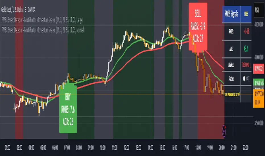
RMBS Smart Detector - Multi-Factor Momentum System v2# RMBS Smart Detector - Multi-Factor Momentum System
## Overview
RMBS (Smart Detector - Multi-Factor Momentum System) is a proprietary scoring method developed by Ario, combining normalized RSI and Bollinger band positioning into a single composite metric.
---
## Core Methodology
### Buy/Sell Logic
Marker (green or red )appear when **all four filters** pass:
**1. RMBS Score (Momentum Strength)**
From the formula Bellow
Combined Range: -10 (extreme bearish) to +10 (extreme bullish)
Signal Thresholds:
• BUY: Score > +3.0
• SELL: Score < -3.0
2. EMA Trend Filter
BUY: EMA(21) > EMA(55) → Uptrend confirmed
SELL: EMA(21) < EMA(55) → Downtrend confirmed
3. ADX Strength Filter
Minimum ADX: 25 (adjustable 20-30)
ADX > 25: Trending market → Signal allowed
ADX < 25: Range-bound → Signal blocked
4. Alternating Logic
Prevents signal spam by requiring alternation:
✓ BUY → SELL → BUY (allowed)
✗ BUY → BUY → BUY (blocked)
________________________________________
Mathematical Foundation
RMBS Formula: scoring method developed by Ario
RMBS = (RSI – 50) / 10 + ((BB_pos – 50) / 10)
where:
• RSI = Relative Strength Index (close, L)
• BB_pos = (Close – (SMA – 2 σ)) / ((SMA + 2 σ) – (SMA – 2 σ)) × 100
• σ = standard deviation of close over lookback L
• SMA = simple moving average of close over lookback L
• L = rmbs_length (period setting)
This produces a normalized composite score around zero:
• Positive → bullish momentum and upper band dominance
• Negative → bearish momentum and lower band pressure
• Near 0 → neutral or transitional zone
Input Parameters
ADX Threshold (default: 25)
• Lower (20-23): More signals, less filtering
• Higher (28-30): Fewer signals, stronger trends
• Recommended: 25 for balanced filtering
Signal Thresholds
• BUY: +3.0 (adjustable)
• SELL: -3.0 (adjustable)
Visual Options
• Marker colors
• Background highlights
• Alert settings
________________________________________
Usage Guidelines
How to Interpret
• 🟢 Green Marker: All conditions met for Bull condition
• 🔴 Red Marker: All conditions met for Bear condition
• No Marker: Waiting for confirmation
________________________________________
Important Disclaimers
⚠️ Educational Purpose Only
• This tool demonstrates multi-factor technical analysis concepts
• Not financial advice or trade recommendations
• No guarantee of profitability
⚠️ Known Limitations
• Less effective in ranging/choppy markets
• Requires proper risk management (stop-loss, position sizing)
• Should be combined with fundamental analysis
⚠️ Risk Warning
Trading involves substantial risk of loss. Past performance does not indicate future results. Always conduct your own research and consult professionals before trading.
________________________________________
Open Source
Full Pine Script code available for educational study and modification. Feedback and improvement suggestions welcome.
“All logic is presented for research and educational visualization.”
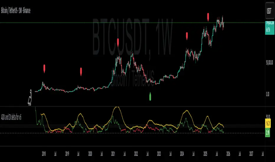
ADX and DI deltaJust a small adjustment to a well known indicator, the ADX with +DI and -DI.
I've always been annoyed of how cluttered this indicator is, specially do to the increasing gap between +DI and -DI, so I changed it up a bit.
ADX line has not been adjusted
+DI and -DI have now merged into deltaDI
deltaDI changes color depending on which value is higher (+DI > -DI = green line, else red line)
Plots a dashed 0 line (not editable)
Plots a two dotted lines at value 20 and 25 (editable)
Plots a label above/below price on the chart if the trend is exhausted and might end. (can be disabled)
Now you only have the ADX line together with a delta line.
The delta line is the gap between +DI and -DI and will change color depending on which one is highest and controlling the trend.
+DI = green line
-DI = red line
I've also added both a 20 and 25 horizontal dotted line.
Normally ADX should be 25 or higher to start a trend, but I do know a lot of people like to be greedy and jump in early in the trend build-up.
A dashed 0 line has been added, just because I felt like it. If either the ADX or delta ever cross below it without you editing the script yourself, just delete the script as it clearly doesn't do its job.
A red label_down will be plotted above the price when the ADX starts curling down and +DI > -DI. This indicates at best a breather for a bullish up trend or a possible reversal.
A red label_down will be plotted above the price if the ADX is above 25 and starts curling down while +DI > -DI. This indicates at best a breather for a bullish up trend or a possible reversal.
A green label_up will be plotted below the price if the ADX is above 25 and starts curling down while -DI > +DI. This indicates at best a breather for a bearish down trend or a possible reversal.
Enjoy my take on the indicator.
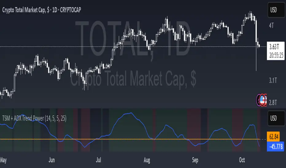
TSM + ADX Trend PowerLogic Behind This Indicator
This indicator combines two momentum/trend tools to identify strong, reliable trends in price movement:
1. TSM (Time Series Momentum)
What it does: Measures the difference between the current price and a smoothed average of past prices.
Formula: EMA(close - EMA(close, 14), 14)
Logic:
If TSM > 0 → Price is above its recent average = upward momentum
If TSM < 0 → Price is below its recent average = downward momentum
2. ADX (Average Directional Index)
What it does: Measures trend strength (not direction).
Logic:
ADX > 25 → Strong trend (either up or down)
ADX < 25 → Weak or no trend (choppy/sideways market)
Combined Logic (TSM + ADX)
The indicator only signals a trend when both conditions are met:
Condition Meaning
Uptrend TSM > 0 AND ADX > 25 → Strong upward momentum
Downtrend TSM < 0 AND ADX > 25 → Strong downward momentum
No signal ADX < 25 → Trend is too weak to trust
What It Aims to Detect
Strong, sustained trends (not just noise or small moves)
Filters out weak/choppy markets where momentum indicators often give false signals
Entry/exit points:
Green background = Strong uptrend (consider buying/holding)
Red background = Strong downtrend (consider selling/shorting)
No color = Weak trend (stay out or wait)
KD The ScalperWe have to take the trade when all three EMAs are pointing in the same direction (no criss-cross, no up/down, sideways). All 3 EMAs should be cleanly separated from each other with strong spacing between them; they are not tangled, sideways, or messy. This is our first filter before entering the trade. Are the EMAs stacked neatly, and is the price outside of the 25 EMA? If price pulls back and closes near or below the 25 or 50 EMA and breaks the 100 EMA, we don't trade. Use the 100 EMA as a safety net and refrain from trading if the price touches or falls below the 100 EMA.
1. Confirm the trend- All 3 EMAs must align, and they must spread
2. Watch price pull back to the 25th or the 50 EMA
3. Wait for the price to bounce - And re-approach the 25 EMA
Why is this powerful?
Removes 80% of the low-probability Trades
It keeps you out of choppy markets
Avoids Reversal Traps
Anchors us to momentum
We take the entry when the price moves up again and touches the 25 EMA from below, and then when it breaks above the 25 EMA, or even better, when a lovely green bullish candle forms. A bullish candle indicates good momentum. When a bullish candle closes in green, it means the momentum has increased significantly. This is when we enter a long trade, with the stop-loss just below the 50 EMA and the profit target being 1.5 times the stop-loss.
The same rule applies to the bearish trade.

Kelly Position Size CalculatorThis position sizing calculator implements the Kelly Criterion, developed by John L. Kelly Jr. at Bell Laboratories in 1956, to determine mathematically optimal position sizes for maximizing long-term wealth growth. Unlike arbitrary position sizing methods, this tool provides a scientifically solution based on your strategy's actual performance statistics and incorporates modern refinements from over six decades of academic research.
The Kelly Criterion addresses a fundamental question in capital allocation: "What fraction of capital should be allocated to each opportunity to maximize growth while avoiding ruin?" This question has profound implications for financial markets, where traders and investors constantly face decisions about optimal capital allocation (Van Tharp, 2007).
Theoretical Foundation
The Kelly Criterion for binary outcomes is expressed as f* = (bp - q) / b, where f* represents the optimal fraction of capital to allocate, b denotes the risk-reward ratio, p indicates the probability of success, and q represents the probability of loss (Kelly, 1956). This formula maximizes the expected logarithm of wealth, ensuring maximum long-term growth rate while avoiding the risk of ruin.
The mathematical elegance of Kelly's approach lies in its derivation from information theory. Kelly's original work was motivated by Claude Shannon's information theory (Shannon, 1948), recognizing that maximizing the logarithm of wealth is equivalent to maximizing the rate of information transmission. This connection between information theory and wealth accumulation provides a deep theoretical foundation for optimal position sizing.
The logarithmic utility function underlying the Kelly Criterion naturally embodies several desirable properties for capital management. It exhibits decreasing marginal utility, penalizes large losses more severely than it rewards equivalent gains, and focuses on geometric rather than arithmetic mean returns, which is appropriate for compounding scenarios (Thorp, 2006).
Scientific Implementation
This calculator extends beyond basic Kelly implementation by incorporating state of the art refinements from academic research:
Parameter Uncertainty Adjustment: Following Michaud (1989), the implementation applies Bayesian shrinkage to account for parameter estimation error inherent in small sample sizes. The adjustment formula f_adjusted = f_kelly × confidence_factor + f_conservative × (1 - confidence_factor) addresses the overconfidence bias documented by Baker and McHale (2012), where the confidence factor increases with sample size and the conservative estimate equals 0.25 (quarter Kelly).
Sample Size Confidence: The reliability of Kelly calculations depends critically on sample size. Research by Browne and Whitt (1996) provides theoretical guidance on minimum sample requirements, suggesting that at least 30 independent observations are necessary for meaningful parameter estimates, with 100 or more trades providing reliable estimates for most trading strategies.
Universal Asset Compatibility: The calculator employs intelligent asset detection using TradingView's built-in symbol information, automatically adapting calculations for different asset classes without manual configuration.
ASSET SPECIFIC IMPLEMENTATION
Equity Markets: For stocks and ETFs, position sizing follows the calculation Shares = floor(Kelly Fraction × Account Size / Share Price). This straightforward approach reflects whole share constraints while accommodating fractional share trading capabilities.
Foreign Exchange Markets: Forex markets require lot-based calculations following Lot Size = Kelly Fraction × Account Size / (100,000 × Base Currency Value). The calculator automatically handles major currency pairs with appropriate pip value calculations, following industry standards described by Archer (2010).
Futures Markets: Futures position sizing accounts for leverage and margin requirements through Contracts = floor(Kelly Fraction × Account Size / Margin Requirement). The calculator estimates margin requirements as a percentage of contract notional value, with specific adjustments for micro-futures contracts that have smaller sizes and reduced margin requirements (Kaufman, 2013).
Index and Commodity Markets: These markets combine characteristics of both equity and futures markets. The calculator automatically detects whether instruments are cash-settled or futures-based, applying appropriate sizing methodologies with correct point value calculations.
Risk Management Integration
The calculator integrates sophisticated risk assessment through two primary modes:
Stop Loss Integration: When fixed stop-loss levels are defined, risk calculation follows Risk per Trade = Position Size × Stop Loss Distance. This ensures that the Kelly fraction accounts for actual risk exposure rather than theoretical maximum loss, with stop-loss distance measured in appropriate units for each asset class.
Strategy Drawdown Assessment: For discretionary exit strategies, risk estimation uses maximum historical drawdown through Risk per Trade = Position Value × (Maximum Drawdown / 100). This approach assumes that individual trade losses will not exceed the strategy's historical maximum drawdown, providing a reasonable estimate for strategies with well-defined risk characteristics.
Fractional Kelly Approaches
Pure Kelly sizing can produce substantial volatility, leading many practitioners to adopt fractional Kelly approaches. MacLean, Sanegre, Zhao, and Ziemba (2004) analyze the trade-offs between growth rate and volatility, demonstrating that half-Kelly typically reduces volatility by approximately 75% while sacrificing only 25% of the growth rate.
The calculator provides three primary Kelly modes to accommodate different risk preferences and experience levels. Full Kelly maximizes growth rate while accepting higher volatility, making it suitable for experienced practitioners with strong risk tolerance and robust capital bases. Half Kelly offers a balanced approach popular among professional traders, providing optimal risk-return balance by reducing volatility significantly while maintaining substantial growth potential. Quarter Kelly implements a conservative approach with low volatility, recommended for risk-averse traders or those new to Kelly methodology who prefer gradual introduction to optimal position sizing principles.
Empirical Validation and Performance
Extensive academic research supports the theoretical advantages of Kelly sizing. Hakansson and Ziemba (1995) provide a comprehensive review of Kelly applications in finance, documenting superior long-term performance across various market conditions and asset classes. Estrada (2008) analyzes Kelly performance in international equity markets, finding that Kelly-based strategies consistently outperform fixed position sizing approaches over extended periods across 19 developed markets over a 30-year period.
Several prominent investment firms have successfully implemented Kelly-based position sizing. Pabrai (2007) documents the application of Kelly principles at Berkshire Hathaway, noting Warren Buffett's concentrated portfolio approach aligns closely with Kelly optimal sizing for high-conviction investments. Quantitative hedge funds, including Renaissance Technologies and AQR, have incorporated Kelly-based risk management into their systematic trading strategies.
Practical Implementation Guidelines
Successful Kelly implementation requires systematic application with attention to several critical factors:
Parameter Estimation: Accurate parameter estimation represents the greatest challenge in practical Kelly implementation. Brown (1976) notes that small errors in probability estimates can lead to significant deviations from optimal performance. The calculator addresses this through Bayesian adjustments and confidence measures.
Sample Size Requirements: Users should begin with conservative fractional Kelly approaches until achieving sufficient historical data. Strategies with fewer than 30 trades may produce unreliable Kelly estimates, regardless of adjustments. Full confidence typically requires 100 or more independent trade observations.
Market Regime Considerations: Parameters that accurately describe historical performance may not reflect future market conditions. Ziemba (2003) recommends regular parameter updates and conservative adjustments when market conditions change significantly.
Professional Features and Customization
The calculator provides comprehensive customization options for professional applications:
Multiple Color Schemes: Eight professional color themes (Gold, EdgeTools, Behavioral, Quant, Ocean, Fire, Matrix, Arctic) with dark and light theme compatibility ensure optimal visibility across different trading environments.
Flexible Display Options: Adjustable table size and position accommodate various chart layouts and user preferences, while maintaining analytical depth and clarity.
Comprehensive Results: The results table presents essential information including asset specifications, strategy statistics, Kelly calculations, sample confidence measures, position values, risk assessments, and final position sizes in appropriate units for each asset class.
Limitations and Considerations
Like any analytical tool, the Kelly Criterion has important limitations that users must understand:
Stationarity Assumption: The Kelly Criterion assumes that historical strategy statistics represent future performance characteristics. Non-stationary market conditions may invalidate this assumption, as noted by Lo and MacKinlay (1999).
Independence Requirement: Each trade should be independent to avoid correlation effects. Many trading strategies exhibit serial correlation in returns, which can affect optimal position sizing and may require adjustments for portfolio applications.
Parameter Sensitivity: Kelly calculations are sensitive to parameter accuracy. Regular calibration and conservative approaches are essential when parameter uncertainty is high.
Transaction Costs: The implementation incorporates user-defined transaction costs but assumes these remain constant across different position sizes and market conditions, following Ziemba (2003).
Advanced Applications and Extensions
Multi-Asset Portfolio Considerations: While this calculator optimizes individual position sizes, portfolio-level applications require additional considerations for correlation effects and aggregate risk management. Simplified portfolio approaches include treating positions independently with correlation adjustments.
Behavioral Factors: Behavioral finance research reveals systematic biases that can interfere with Kelly implementation. Kahneman and Tversky (1979) document loss aversion, overconfidence, and other cognitive biases that lead traders to deviate from optimal strategies. Successful implementation requires disciplined adherence to calculated recommendations.
Time-Varying Parameters: Advanced implementations may incorporate time-varying parameter models that adjust Kelly recommendations based on changing market conditions, though these require sophisticated econometric techniques and substantial computational resources.
Comprehensive Usage Instructions and Practical Examples
Implementation begins with loading the calculator on your desired trading instrument's chart. The system automatically detects asset type across stocks, forex, futures, and cryptocurrency markets while extracting current price information. Navigation to the indicator settings allows input of your specific strategy parameters.
Strategy statistics configuration requires careful attention to several key metrics. The win rate should be calculated from your backtest results using the formula of winning trades divided by total trades multiplied by 100. Average win represents the sum of all profitable trades divided by the number of winning trades, while average loss calculates the sum of all losing trades divided by the number of losing trades, entered as a positive number. The total historical trades parameter requires the complete number of trades in your backtest, with a minimum of 30 trades recommended for basic functionality and 100 or more trades optimal for statistical reliability. Account size should reflect your available trading capital, specifically the risk capital allocated for trading rather than total net worth.
Risk management configuration adapts to your specific trading approach. The stop loss setting should be enabled if you employ fixed stop-loss exits, with the stop loss distance specified in appropriate units depending on the asset class. For stocks, this distance is measured in dollars, for forex in pips, and for futures in ticks. When stop losses are not used, the maximum strategy drawdown percentage from your backtest provides the risk assessment baseline. Kelly mode selection offers three primary approaches: Full Kelly for aggressive growth with higher volatility suitable for experienced practitioners, Half Kelly for balanced risk-return optimization popular among professional traders, and Quarter Kelly for conservative approaches with reduced volatility.
Display customization ensures optimal integration with your trading environment. Eight professional color themes provide optimization for different chart backgrounds and personal preferences. Table position selection allows optimal placement within your chart layout, while table size adjustment ensures readability across different screen resolutions and viewing preferences.
Detailed Practical Examples
Example 1: SPY Swing Trading Strategy
Consider a professionally developed swing trading strategy for SPY (S&P 500 ETF) with backtesting results spanning 166 total trades. The strategy achieved 110 winning trades, representing a 66.3% win rate, with an average winning trade of $2,200 and average losing trade of $862. The maximum drawdown reached 31.4% during the testing period, and the available trading capital amounts to $25,000. This strategy employs discretionary exits without fixed stop losses.
Implementation requires loading the calculator on the SPY daily chart and configuring the parameters accordingly. The win rate input receives 66.3, while average win and loss inputs receive 2200 and 862 respectively. Total historical trades input requires 166, with account size set to 25000. The stop loss function remains disabled due to the discretionary exit approach, with maximum strategy drawdown set to 31.4%. Half Kelly mode provides the optimal balance between growth and risk management for this application.
The calculator generates several key outputs for this scenario. The risk-reward ratio calculates automatically to 2.55, while the Kelly fraction reaches approximately 53% before scientific adjustments. Sample confidence achieves 100% given the 166 trades providing high statistical confidence. The recommended position settles at approximately 27% after Half Kelly and Bayesian adjustment factors. Position value reaches approximately $6,750, translating to 16 shares at a $420 SPY price. Risk per trade amounts to approximately $2,110, representing 31.4% of position value, with expected value per trade reaching approximately $1,466. This recommendation represents the mathematically optimal balance between growth potential and risk management for this specific strategy profile.
Example 2: EURUSD Day Trading with Stop Losses
A high-frequency EURUSD day trading strategy demonstrates different parameter requirements compared to swing trading approaches. This strategy encompasses 89 total trades with a 58% win rate, generating an average winning trade of $180 and average losing trade of $95. The maximum drawdown reached 12% during testing, with available capital of $10,000. The strategy employs fixed stop losses at 25 pips and take profit targets at 45 pips, providing clear risk-reward parameters.
Implementation begins with loading the calculator on the EURUSD 1-hour chart for appropriate timeframe alignment. Parameter configuration includes win rate at 58, average win at 180, and average loss at 95. Total historical trades input receives 89, with account size set to 10000. The stop loss function is enabled with distance set to 25 pips, reflecting the fixed exit strategy. Quarter Kelly mode provides conservative positioning due to the smaller sample size compared to the previous example.
Results demonstrate the impact of smaller sample sizes on Kelly calculations. The risk-reward ratio calculates to 1.89, while the Kelly fraction reaches approximately 32% before adjustments. Sample confidence achieves 89%, providing moderate statistical confidence given the 89 trades. The recommended position settles at approximately 7% after Quarter Kelly application and Bayesian shrinkage adjustment for the smaller sample. Position value amounts to approximately $700, translating to 0.07 standard lots. Risk per trade reaches approximately $175, calculated as 25 pips multiplied by lot size and pip value, with expected value per trade at approximately $49. This conservative position sizing reflects the smaller sample size, with position sizes expected to increase as trade count surpasses 100 and statistical confidence improves.
Example 3: ES1! Futures Systematic Strategy
Systematic futures trading presents unique considerations for Kelly criterion application, as demonstrated by an E-mini S&P 500 futures strategy encompassing 234 total trades. This systematic approach achieved a 45% win rate with an average winning trade of $1,850 and average losing trade of $720. The maximum drawdown reached 18% during the testing period, with available capital of $50,000. The strategy employs 15-tick stop losses with contract specifications of $50 per tick, providing precise risk control mechanisms.
Implementation involves loading the calculator on the ES1! 15-minute chart to align with the systematic trading timeframe. Parameter configuration includes win rate at 45, average win at 1850, and average loss at 720. Total historical trades receives 234, providing robust statistical foundation, with account size set to 50000. The stop loss function is enabled with distance set to 15 ticks, reflecting the systematic exit methodology. Half Kelly mode balances growth potential with appropriate risk management for futures trading.
Results illustrate how favorable risk-reward ratios can support meaningful position sizing despite lower win rates. The risk-reward ratio calculates to 2.57, while the Kelly fraction reaches approximately 16%, lower than previous examples due to the sub-50% win rate. Sample confidence achieves 100% given the 234 trades providing high statistical confidence. The recommended position settles at approximately 8% after Half Kelly adjustment. Estimated margin per contract amounts to approximately $2,500, resulting in a single contract allocation. Position value reaches approximately $2,500, with risk per trade at $750, calculated as 15 ticks multiplied by $50 per tick. Expected value per trade amounts to approximately $508. Despite the lower win rate, the favorable risk-reward ratio supports meaningful position sizing, with single contract allocation reflecting appropriate leverage management for futures trading.
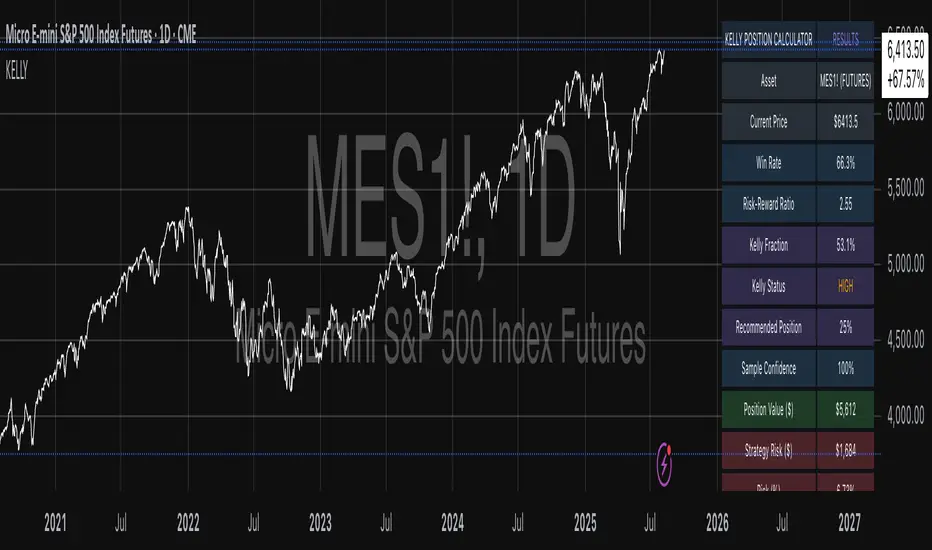
Example 4: MES1! Micro-Futures for Smaller Accounts
Micro-futures contracts provide enhanced accessibility for smaller trading accounts while maintaining identical strategy characteristics. Using the same systematic strategy statistics from the previous example but with available capital of $15,000 and micro-futures specifications of $5 per tick with reduced margin requirements, the implementation demonstrates improved position sizing granularity.
Kelly calculations remain identical to the full-sized contract example, maintaining the same risk-reward dynamics and statistical foundations. However, estimated margin per contract reduces to approximately $250 for micro-contracts, enabling allocation of 4-5 micro-contracts. Position value reaches approximately $1,200, while risk per trade calculates to $75, derived from 15 ticks multiplied by $5 per tick. This granularity advantage provides better position size precision for smaller accounts, enabling more accurate Kelly implementation without requiring large capital commitments.
Example 5: Bitcoin Swing Trading
Cryptocurrency markets present unique challenges requiring modified Kelly application approaches. A Bitcoin swing trading strategy on BTCUSD encompasses 67 total trades with a 71% win rate, generating average winning trades of $3,200 and average losing trades of $1,400. Maximum drawdown reached 28% during testing, with available capital of $30,000. The strategy employs technical analysis for exits without fixed stop losses, relying on price action and momentum indicators.
Implementation requires conservative approaches due to cryptocurrency volatility characteristics. Quarter Kelly mode is recommended despite the high win rate to account for crypto market unpredictability. Expected position sizing remains reduced due to the limited sample size of 67 trades, requiring additional caution until statistical confidence improves. Regular parameter updates are strongly recommended due to cryptocurrency market evolution and changing volatility patterns that can significantly impact strategy performance characteristics.
Advanced Usage Scenarios
Portfolio position sizing requires sophisticated consideration when running multiple strategies simultaneously. Each strategy should have its Kelly fraction calculated independently to maintain mathematical integrity. However, correlation adjustments become necessary when strategies exhibit related performance patterns. Moderately correlated strategies should receive individual position size reductions of 10-20% to account for overlapping risk exposure. Aggregate portfolio risk monitoring ensures total exposure remains within acceptable limits across all active strategies. Professional practitioners often consider using lower fractional Kelly approaches, such as Quarter Kelly, when running multiple strategies simultaneously to provide additional safety margins.
Parameter sensitivity analysis forms a critical component of professional Kelly implementation. Regular validation procedures should include monthly parameter updates using rolling 100-trade windows to capture evolving market conditions while maintaining statistical relevance. Sensitivity testing involves varying win rates by ±5% and average win/loss ratios by ±10% to assess recommendation stability under different parameter assumptions. Out-of-sample validation reserves 20% of historical data for parameter verification, ensuring that optimization doesn't create curve-fitted results. Regime change detection monitors actual performance against expected metrics, triggering parameter reassessment when significant deviations occur.
Risk management integration requires professional overlay considerations beyond pure Kelly calculations. Daily loss limits should cease trading when daily losses exceed twice the calculated risk per trade, preventing emotional decision-making during adverse periods. Maximum position limits should never exceed 25% of account value in any single position regardless of Kelly recommendations, maintaining diversification principles. Correlation monitoring reduces position sizes when holding multiple correlated positions that move together during market stress. Volatility adjustments consider reducing position sizes during periods of elevated VIX above 25 for equity strategies, adapting to changing market conditions.
Troubleshooting and Optimization
Professional implementation often encounters specific challenges requiring systematic troubleshooting approaches. Zero position size displays typically result from insufficient capital for minimum position sizes, negative expected values, or extremely conservative Kelly calculations. Solutions include increasing account size, verifying strategy statistics for accuracy, considering Quarter Kelly mode for conservative approaches, or reassessing overall strategy viability when fundamental issues exist.
Extremely high Kelly fractions exceeding 50% usually indicate underlying problems with parameter estimation. Common causes include unrealistic win rates, inflated risk-reward ratios, or curve-fitted backtest results that don't reflect genuine trading conditions. Solutions require verifying backtest methodology, including all transaction costs in calculations, testing strategies on out-of-sample data, and using conservative fractional Kelly approaches until parameter reliability improves.
Low sample confidence below 50% reflects insufficient historical trades for reliable parameter estimation. This situation demands gathering additional trading data, using Quarter Kelly approaches until reaching 100 or more trades, applying extra conservatism in position sizing, and considering paper trading to build statistical foundations without capital risk.
Inconsistent results across similar strategies often stem from parameter estimation differences, market regime changes, or strategy degradation over time. Professional solutions include standardizing backtest methodology across all strategies, updating parameters regularly to reflect current conditions, and monitoring live performance against expectations to identify deteriorating strategies.
Position sizes that appear inappropriately large or small require careful validation against traditional risk management principles. Professional standards recommend never risking more than 2-3% per trade regardless of Kelly calculations. Calibration should begin with Quarter Kelly approaches, gradually increasing as comfort and confidence develop. Most institutional traders utilize 25-50% of full Kelly recommendations to balance growth with prudent risk management.
Market condition adjustments require dynamic approaches to Kelly implementation. Trending markets may support full Kelly recommendations when directional momentum provides favorable conditions. Ranging or volatile markets typically warrant reducing to Half or Quarter Kelly to account for increased uncertainty. High correlation periods demand reducing individual position sizes when multiple positions move together, concentrating risk exposure. News and event periods often justify temporary position size reductions during high-impact releases that can create unpredictable market movements.
Performance monitoring requires systematic protocols to ensure Kelly implementation remains effective over time. Weekly reviews should compare actual versus expected win rates and average win/loss ratios to identify parameter drift or strategy degradation. Position size efficiency and execution quality monitoring ensures that calculated recommendations translate effectively into actual trading results. Tracking correlation between calculated and realized risk helps identify discrepancies between theoretical and practical risk exposure.
Monthly calibration provides more comprehensive parameter assessment using the most recent 100 trades to maintain statistical relevance while capturing current market conditions. Kelly mode appropriateness requires reassessment based on recent market volatility and performance characteristics, potentially shifting between Full, Half, and Quarter Kelly approaches as conditions change. Transaction cost evaluation ensures that commission structures, spreads, and slippage estimates remain accurate and current.
Quarterly strategic reviews encompass comprehensive strategy performance analysis comparing long-term results against expectations and identifying trends in effectiveness. Market regime assessment evaluates parameter stability across different market conditions, determining whether strategy characteristics remain consistent or require fundamental adjustments. Strategic modifications to position sizing methodology may become necessary as markets evolve or trading approaches mature, ensuring that Kelly implementation continues supporting optimal capital allocation objectives.
Professional Applications
This calculator serves diverse professional applications across the financial industry. Quantitative hedge funds utilize the implementation for systematic position sizing within algorithmic trading frameworks, where mathematical precision and consistent application prove essential for institutional capital management. Professional discretionary traders benefit from optimized position management that removes emotional bias while maintaining flexibility for market-specific adjustments. Portfolio managers employ the calculator for developing risk-adjusted allocation strategies that enhance returns while maintaining prudent risk controls across diverse asset classes and investment strategies.
Individual traders seeking mathematical optimization of capital allocation find the calculator provides institutional-grade methodology previously available only to professional money managers. The Kelly Criterion establishes theoretical foundation for optimal capital allocation across both single strategies and multiple trading systems, offering significant advantages over arbitrary position sizing methods that rely on intuition or fixed percentage approaches. Professional implementation ensures consistent application of mathematically sound principles while adapting to changing market conditions and strategy performance characteristics.
Conclusion
The Kelly Criterion represents one of the few mathematically optimal solutions to fundamental investment problems. When properly understood and carefully implemented, it provides significant competitive advantage in financial markets. This calculator implements modern refinements to Kelly's original formula while maintaining accessibility for practical trading applications.
Success with Kelly requires ongoing learning, systematic application, and continuous refinement based on market feedback and evolving research. Users who master Kelly principles and implement them systematically can expect superior risk-adjusted returns and more consistent capital growth over extended periods.
The extensive academic literature provides rich resources for deeper study, while practical experience builds the intuition necessary for effective implementation. Regular parameter updates, conservative approaches with limited data, and disciplined adherence to calculated recommendations are essential for optimal results.
References
Archer, M. D. (2010). Getting Started in Currency Trading: Winning in Today's Forex Market (3rd ed.). John Wiley & Sons.
Baker, R. D., & McHale, I. G. (2012). An empirical Bayes approach to optimising betting strategies. Journal of the Royal Statistical Society: Series D (The Statistician), 61(1), 75-92.
Breiman, L. (1961). Optimal gambling systems for favorable games. In J. Neyman (Ed.), Proceedings of the Fourth Berkeley Symposium on Mathematical Statistics and Probability (pp. 65-78). University of California Press.
Brown, D. B. (1976). Optimal portfolio growth: Logarithmic utility and the Kelly criterion. In W. T. Ziemba & R. G. Vickson (Eds.), Stochastic Optimization Models in Finance (pp. 1-23). Academic Press.
Browne, S., & Whitt, W. (1996). Portfolio choice and the Bayesian Kelly criterion. Advances in Applied Probability, 28(4), 1145-1176.
Estrada, J. (2008). Geometric mean maximization: An overlooked portfolio approach? The Journal of Investing, 17(4), 134-147.
Hakansson, N. H., & Ziemba, W. T. (1995). Capital growth theory. In R. A. Jarrow, V. Maksimovic, & W. T. Ziemba (Eds.), Handbooks in Operations Research and Management Science (Vol. 9, pp. 65-86). Elsevier.
Kahneman, D., & Tversky, A. (1979). Prospect theory: An analysis of decision under risk. Econometrica, 47(2), 263-291.
Kaufman, P. J. (2013). Trading Systems and Methods (5th ed.). John Wiley & Sons.
Kelly Jr, J. L. (1956). A new interpretation of information rate. Bell System Technical Journal, 35(4), 917-926.
Lo, A. W., & MacKinlay, A. C. (1999). A Non-Random Walk Down Wall Street. Princeton University Press.
MacLean, L. C., Sanegre, E. O., Zhao, Y., & Ziemba, W. T. (2004). Capital growth with security. Journal of Economic Dynamics and Control, 28(4), 937-954.
MacLean, L. C., Thorp, E. O., & Ziemba, W. T. (2011). The Kelly Capital Growth Investment Criterion: Theory and Practice. World Scientific.
Michaud, R. O. (1989). The Markowitz optimization enigma: Is 'optimized' optimal? Financial Analysts Journal, 45(1), 31-42.
Pabrai, M. (2007). The Dhandho Investor: The Low-Risk Value Method to High Returns. John Wiley & Sons.
Shannon, C. E. (1948). A mathematical theory of communication. Bell System Technical Journal, 27(3), 379-423.
Tharp, V. K. (2007). Trade Your Way to Financial Freedom (2nd ed.). McGraw-Hill.
Thorp, E. O. (2006). The Kelly criterion in blackjack sports betting, and the stock market. In L. C. MacLean, E. O. Thorp, & W. T. Ziemba (Eds.), The Kelly Capital Growth Investment Criterion: Theory and Practice (pp. 789-832). World Scientific.
Van Tharp, K. (2007). Trade Your Way to Financial Freedom (2nd ed.). McGraw-Hill Education.
Vince, R. (1992). The Mathematics of Money Management: Risk Analysis Techniques for Traders. John Wiley & Sons.
Vince, R., & Zhu, H. (2015). Optimal betting under parameter uncertainty. Journal of Statistical Planning and Inference, 161, 19-31.
Ziemba, W. T. (2003). The Stochastic Programming Approach to Asset, Liability, and Wealth Management. The Research Foundation of AIMR.
Further Reading
For comprehensive understanding of Kelly Criterion applications and advanced implementations:
MacLean, L. C., Thorp, E. O., & Ziemba, W. T. (2011). The Kelly Capital Growth Investment Criterion: Theory and Practice. World Scientific.
Vince, R. (1992). The Mathematics of Money Management: Risk Analysis Techniques for Traders. John Wiley & Sons.
Thorp, E. O. (2017). A Man for All Markets: From Las Vegas to Wall Street. Random House.
Cover, T. M., & Thomas, J. A. (2006). Elements of Information Theory (2nd ed.). John Wiley & Sons.
Ziemba, W. T., & Vickson, R. G. (Eds.). (2006). Stochastic Optimization Models in Finance. World Scientific.
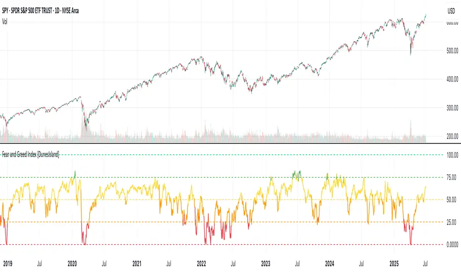
Fear and Greed Index [DunesIsland]The Fear and Greed Index is a sentiment indicator designed to measure the emotions driving the stock market, specifically investor fear and greed. Fear represents pessimism and caution, while greed reflects optimism and risk-taking. This indicator aggregates multiple market metrics to provide a comprehensive view of market sentiment, helping traders and investors gauge whether the market is overly fearful or excessively greedy.How It WorksThe Fear and Greed Index is calculated using four key market indicators, each capturing a different aspect of market sentiment:
Market Momentum (30% weight)
Measures how the S&P 500 (SPX) is performing relative to its 125-day simple moving average (SMA).
A higher value indicates that the market is trading well above its moving average, signaling greed.
Stock Price Strength (20% weight)
Calculates the net number of stocks hitting 52-week highs minus those hitting 52-week lows on the NYSE.
A greater number of net highs suggests strong market breadth and greed.
Put/Call Options (30% weight)
Uses the 5-day average of the put/call ratio.
A lower ratio (more call options being bought) indicates greed, as investors are betting on rising prices.
Market Volatility (20% weight)
Utilizes the VIX index, which measures market volatility.
Lower volatility is associated with greed, as investors are less fearful of large market swings.
Each component is normalized using a z-score over a 252-day lookback period (approximately one trading year) and scaled to a range of 0 to 100. The final Fear and Greed Index is a weighted average of these four components, with the weights specified above.Key FeaturesIndex Range: The index value ranges from 0 to 100:
0–25: Extreme Fear (red)
25–50: Fear (orange)
50–75: Neutral (yellow)
75–100: Greed (green)
Dynamic Plot Color: The plot line changes color based on the index value, visually indicating the current sentiment zone.
Reference Lines: Horizontal lines are plotted at 0, 25, 50, 75, and 100 to represent the different sentiment levels: Extreme Fear, Fear, Neutral, Greed, and Extreme Greed.
How to Interpret
Low Values (0–25): Indicate extreme fear, which may suggest that the market is oversold and could be due for a rebound.
High Values (75–100): Indicate greed, which may signal that the market is overbought and could be at risk of a correction.
Neutral Range (25–75): Suggests a balanced market sentiment, neither overly fearful nor greedy.
This indicator is a valuable tool for contrarian investors, as extreme readings often precede market reversals. However, it should be used in conjunction with other technical and fundamental analysis tools for a well-rounded view of the market.
Market Zone Analyzer[BullByte]Understanding the Market Zone Analyzer
---
1. Purpose of the Indicator
The Market Zone Analyzer is a Pine Script™ (version 6) indicator designed to streamline market analysis on TradingView. Rather than scanning multiple separate tools, it unifies four core dimensions—trend strength, momentum, price action, and market activity—into a single, consolidated view. By doing so, it helps traders:
• Save time by avoiding manual cross-referencing of disparate signals.
• Reduce decision-making errors that can arise from juggling multiple indicators.
• Gain a clear, reliable read on whether the market is in a bullish, bearish, or sideways phase, so they can more confidently decide to enter, exit, or hold a position.
---
2. Why a Trader Should Use It
• Unified View: Combines all essential market dimensions into one easy-to-read score and dashboard, eliminating the need to piece together signals manually.
• Adaptability: Automatically adjusts its internal weighting for trend, momentum, and price action based on current volatility. Whether markets are choppy or calm, the indicator remains relevant.
• Ease of Interpretation: Outputs a simple “BULLISH,” “BEARISH,” or “SIDEWAYS” label, supplemented by an intuitive on-chart dashboard and an oscillator plot that visually highlights market direction.
• Reliability Features: Built-in smoothing of the net score and hysteresis logic (requiring consecutive confirmations before flips) minimize false signals during noisy or range-bound phases.
---
3. Why These Specific Indicators?
This script relies on a curated set of well-established technical tools, each chosen for its particular strength in measuring one of the four core dimensions:
1. Trend Strength:
• ADX/DMI (Average Directional Index / Directional Movement Index): Measures how strong a trend is, and whether the +DI line is above the –DI line (bullish) or vice versa (bearish).
• Moving Average Slope (Fast MA vs. Slow MA): Compares a shorter-period SMA to a longer-period SMA; if the fast MA sits above the slow MA, it confirms an uptrend, and vice versa for a downtrend.
• Ichimoku Cloud Differential (Senkou A vs. Senkou B): Provides a forward-looking view of trend direction; Senkou A above Senkou B signals bullishness, and the opposite signals bearishness.
2. Momentum:
• Relative Strength Index (RSI): Identifies overbought (above its dynamically calculated upper bound) or oversold (below its lower bound) conditions; changes in RSI often precede price reversals.
• Stochastic %K: Highlights shifts in short-term momentum by comparing closing price to the recent high/low range; values above its upper band signal bullish momentum, below its lower band signal bearish momentum.
• MACD Histogram: Measures the difference between the MACD line and its signal line; a positive histogram indicates upward momentum, a negative histogram indicates downward momentum.
3. Price Action:
• Highest High / Lowest Low (HH/LL) Range: Over a defined lookback period, this captures breakout or breakdown levels. A closing price near the recent highs (with a positive MA slope) yields a bullish score, and near the lows (with a negative MA slope) yields a bearish score.
• Heikin-Ashi Doji Detection: Uses Heikin-Ashi candles to identify indecision or continuation patterns. A small Heikin-Ashi body (doji) relative to recent volatility is scored as neutral; a larger body in the direction of the MA slope is scored bullish or bearish.
• Candle Range Measurement: Compares each candle’s high-low range against its own dynamic band (average range ± standard deviation). Large candles aligning with the prevailing trend score bullish or bearish accordingly; unusually small candles can indicate exhaustion or consolidation.
4. Market Activity:
• Bollinger Bands Width (BBW): Measures the distance between BB upper and lower bands; wide bands indicate high volatility, narrow bands indicate low volatility.
• Average True Range (ATR): Quantifies average price movement (volatility). A sudden spike in ATR suggests a volatile environment, while a contraction suggests calm.
• Keltner Channels Width (KCW): Similar to BBW but uses ATR around an EMA. Provides a second layer of volatility context, confirming or contrasting BBW readings.
• Volume (with Moving Average): Compares current volume to its moving average ± standard deviation. High volume validates strong moves; low volume signals potential lack of conviction.
By combining these tools, the indicator captures trend direction, momentum strength, price-action nuances, and overall market energy, yielding a more balanced and comprehensive assessment than any single tool alone.
---
4. What Makes This Indicator Stand Out
• Multi-Dimensional Analysis: Rather than relying on a lone oscillator or moving average crossover, it simultaneously evaluates trend, momentum, price action, and activity.
• Dynamic Weighting: The relative importance of trend, momentum, and price action adjusts automatically based on real-time volatility (Market Activity State). For example, in highly volatile conditions, trend and momentum signals carry more weight; in calm markets, price action signals are prioritized.
• Stability Mechanisms:
• Smoothing: The net score is passed through a short moving average, filtering out noise, especially on lower timeframes.
• Hysteresis: Both Market Activity State and the final bullish/bearish/sideways zone require two consecutive confirmations before flipping, reducing whipsaw.
• Visual Interpretation: A fully customizable on-chart dashboard displays each sub-indicator’s value, regime, score, and comment, all color-coded. The oscillator plot changes color to reflect the current market zone (green for bullish, red for bearish, gray for sideways) and shows horizontal threshold lines at +2, 0, and –2.
---
5. Recommended Timeframes
• Short-Term (5 min, 15 min): Day traders and scalpers can benefit from rapid signals, but should enable smoothing (and possibly disable hysteresis) to reduce false whipsaws.
• Medium-Term (1 h, 4 h): Swing traders find a balance between responsiveness and reliability. Less smoothing is required here, and the default parameters (e.g., ADX length = 14, RSI length = 14) perform well.
• Long-Term (Daily, Weekly): Position traders tracking major trends can disable smoothing for immediate raw readings, since higher-timeframe noise is minimal. Adjust lookback lengths (e.g., increase adxLength, rsiLength) if desired for slower signals.
Tip: If you keep smoothing off, stick to timeframes of 1 h or higher to avoid excessive signal “chatter.”
---
6. How Scoring Works
A. Individual Indicator Scores
Each sub-indicator is assigned one of three discrete scores:
• +1 if it indicates a bullish condition (e.g., RSI above its dynamically calculated upper bound).
• 0 if it is neutral (e.g., RSI between upper and lower bounds).
• –1 if it indicates a bearish condition (e.g., RSI below its dynamically calculated lower bound).
Examples of individual score assignments:
• ADX/DMI:
• +1 if ADX ≥ adxThreshold and +DI > –DI (strong bullish trend)
• –1 if ADX ≥ adxThreshold and –DI > +DI (strong bearish trend)
• 0 if ADX < adxThreshold (trend strength below threshold)
• RSI:
• +1 if RSI > RSI_upperBound
• –1 if RSI < RSI_lowerBound
• 0 otherwise
• ATR (as part of Market Activity):
• +1 if ATR > (ATR_MA + stdev(ATR))
• –1 if ATR < (ATR_MA – stdev(ATR))
• 0 otherwise
Each of the four main categories shares this same +1/0/–1 logic across their sub-components.
B. Category Scores
Once each sub-indicator reports +1, 0, or –1, these are summed within their categories as follows:
• Trend Score = (ADX score) + (MA slope score) + (Ichimoku differential score)
• Momentum Score = (RSI score) + (Stochastic %K score) + (MACD histogram score)
• Price Action Score = (Highest-High/Lowest-Low score) + (Heikin-Ashi doji score) + (Candle range score)
• Market Activity Raw Score = (BBW score) + (ATR score) + (KC width score) + (Volume score)
Each category’s summed value can range between –3 and +3 (for Trend, Momentum, and Price Action), and between –4 and +4 for Market Activity raw.
C. Market Activity State and Dynamic Weight Adjustments
Rather than contributing directly to the netScore like the other three categories, Market Activity determines how much weight to assign to Trend, Momentum, and Price Action:
1. Compute Market Activity Raw Score by summing BBW, ATR, KCW, and Volume individual scores (each +1/0/–1).
2. Bucket into High, Medium, or Low Activity:
• High if raw Score ≥ 2 (volatile market).
• Low if raw Score ≤ –2 (calm market).
• Medium otherwise.
3. Apply Hysteresis (if enabled): The state only flips after two consecutive bars register the same high/low/medium label.
4. Set Category Weights:
• High Activity: Trend = 50 %, Momentum = 35 %, Price Action = 15 %.
• Low Activity: Trend = 25 %, Momentum = 20 %, Price Action = 55 %.
• Medium Activity: Use the trader’s base weight inputs (e.g., Trend = 40 %, Momentum = 30 %, Price Action = 30 % by default).
D. Calculating the Net Score
5. Normalize Base Weights (so that the sum of Trend + Momentum + Price Action always equals 100 %).
6. Determine Current Weights based on the Market Activity State (High/Medium/Low).
7. Compute Each Category’s Contribution: Multiply (categoryScore) × (currentWeight).
8. Sum Contributions to get the raw netScore (a floating-point value that can exceed ±3 when scores are strong).
9. Smooth the netScore over two bars (if smoothing is enabled) to reduce noise.
10. Apply Hysteresis to the Final Zone:
• If the smoothed netScore ≥ +2, the bar is classified as “Bullish.”
• If the smoothed netScore ≤ –2, the bar is classified as “Bearish.”
• Otherwise, it is “Sideways.”
• To prevent rapid flips, the script requires two consecutive bars in the new zone before officially changing the displayed zone (if hysteresis is on).
E. Thresholds for Zone Classification
• BULLISH: netScore ≥ +2
• BEARISH: netScore ≤ –2
• SIDEWAYS: –2 < netScore < +2
---
7. Role of Volatility (Market Activity State) in Scoring
Volatility acts as a dynamic switch that shifts which category carries the most influence:
1. High Activity (Volatile):
• Detected when at least two sub-scores out of BBW, ATR, KCW, and Volume equal +1.
• The script sets Trend weight = 50 % and Momentum weight = 35 %. Price Action weight is minimized at 15 %.
• Rationale: In volatile markets, strong trending moves and momentum surges dominate, so those signals are more reliable than nuanced candle patterns.
2. Low Activity (Calm):
• Detected when at least two sub-scores out of BBW, ATR, KCW, and Volume equal –1.
• The script sets Price Action weight = 55 %, Trend = 25 %, and Momentum = 20 %.
• Rationale: In quiet, sideways markets, subtle price-action signals (breakouts, doji patterns, small-range candles) are often the best early indicators of a new move.
3. Medium Activity (Balanced):
• Raw Score between –1 and +1 from the four volatility metrics.
• Uses whatever base weights the trader has specified (e.g., Trend = 40 %, Momentum = 30 %, Price Action = 30 %).
Because volatility can fluctuate rapidly, the script employs hysteresis on Market Activity State: a new High or Low state must occur on two consecutive bars before weights actually shift. This avoids constant back-and-forth weight changes and provides more stability.
---
8. Scoring Example (Hypothetical Scenario)
• Symbol: Bitcoin on a 1-hour chart.
• Market Activity: Raw volatility sub-scores show BBW (+1), ATR (+1), KCW (0), Volume (+1) → Total raw Score = +3 → High Activity.
• Weights Selected: Trend = 50 %, Momentum = 35 %, Price Action = 15 %.
• Trend Signals:
• ADX strong and +DI > –DI → +1
• Fast MA above Slow MA → +1
• Ichimoku Senkou A > Senkou B → +1
→ Trend Score = +3
• Momentum Signals:
• RSI above upper bound → +1
• MACD histogram positive → +1
• Stochastic %K within neutral zone → 0
→ Momentum Score = +2
• Price Action Signals:
• Highest High/Lowest Low check yields 0 (close not near extremes)
• Heikin-Ashi doji reading is neutral → 0
• Candle range slightly above upper bound but trend is strong, so → +1
→ Price Action Score = +1
• Compute Net Score (before smoothing):
• Trend contribution = 3 × 0.50 = 1.50
• Momentum contribution = 2 × 0.35 = 0.70
• Price Action contribution = 1 × 0.15 = 0.15
• Raw netScore = 1.50 + 0.70 + 0.15 = 2.35
• Since 2.35 ≥ +2 and hysteresis is met, the final zone is “Bullish.”
Although the netScore lands at 2.35 (Bullish), smoothing might bring it slightly below 2.00 on the first bar (e.g., 1.90), in which case the script would wait for a second consecutive reading above +2 before officially classifying the zone as Bullish (if hysteresis is enabled).
---
9. Correlation Between Categories
The four categories—Trend Strength, Momentum, Price Action, and Market Activity—often reinforce or offset one another. The script takes advantage of these natural correlations:
• Bullish Alignment: If ADX is strong and pointed upward, fast MA is above slow MA, and Ichimoku is positive, that usually coincides with RSI climbing above its upper bound and the MACD histogram turning positive. In such cases, both Trend and Momentum categories generate +1 or +2. Because the Market Activity State is likely High (given the accompanying volatility), Trend and Momentum weights are at their peak, so the netScore quickly crosses into Bullish territory.
• Sideways/Consolidation: During a low-volatility, sideways phase, ADX may fall below its threshold, MAs may flatten, and RSI might hover in the neutral band. However, subtle price-action signals (like a small breakout candle or a Heikin-Ashi candle with a slight bias) can still produce a +1 in the Price Action category. If Market Activity is Low, Price Action’s weight (55 %) can carry enough influence—even if Trend and Momentum are neutral—to push the netScore out of “Sideways” into a mild bullish or bearish bias.
• Opposing Signals: When Trend is bullish but Momentum turns negative (for example, price continues up but RSI rolls over), the two scores can partially cancel. Market Activity may remain Medium, in which case the netScore lingers near zero (Sideways). The trader can then wait for either a clearer momentum shift or a fresh price-action breakout before committing.
By dynamically recognizing these correlations and adjusting weights, the indicator ensures that:
• When Trend and Momentum align (and volatility supports it), the netScore leaps strongly into Bullish or Bearish.
• When Trend is neutral but Price Action shows an early move in a low-volatility environment, Price Action’s extra weight in the Low Activity State can still produce actionable signals.
---
10. Market Activity State & Its Role (Detailed)
The Market Activity State is not a direct category score—it is an overarching context setter for how heavily to trust Trend, Momentum, or Price Action. Here’s how it is derived and applied:
1. Calculate Four Volatility Sub-Scores:
• BBW: Compare the current band width to its own moving average ± standard deviation. If BBW > (BBW_MA + stdev), assign +1 (high volatility); if BBW < (BBW_MA × 0.5), assign –1 (low volatility); else 0.
• ATR: Compare ATR to its moving average ± standard deviation. A spike above the upper threshold is +1; a contraction below the lower threshold is –1; otherwise 0.
• KCW: Same logic as ATR but around the KCW mean.
• Volume: Compare current volume to its volume MA ± standard deviation. Above the upper threshold is +1; below the lower threshold is –1; else 0.
2. Sum Sub-Scores → Raw Market Activity Score: Range between –4 and +4.
3. Assign Market Activity State:
• High Activity: Raw Score ≥ +2 (at least two volatility metrics are strongly spiking).
• Low Activity: Raw Score ≤ –2 (at least two metrics signal unusually low volatility or thin volume).
• Medium Activity: Raw Score is between –1 and +1 inclusive.
4. Hysteresis for Stability:
• If hysteresis is enabled, a new state only takes hold after two consecutive bars confirm the same High, Medium, or Low label.
• This prevents the Market Activity State from bouncing around when volatility is on the fence.
5. Set Category Weights Based on Activity State:
• High Activity: Trend = 50 %, Momentum = 35 %, Price Action = 15 %.
• Low Activity: Trend = 25 %, Momentum = 20 %, Price Action = 55 %.
• Medium Activity: Use trader’s base weights (e.g., Trend = 40 %, Momentum = 30 %, Price Action = 30 %).
6. Impact on netScore: Because category scores (–3 to +3) multiply by these weights, High Activity amplifies the effect of strong Trend and Momentum scores; Low Activity amplifies the effect of Price Action.
7. Market Context Tooltip: The dashboard includes a tooltip summarizing the current state—e.g., “High activity, trend and momentum prioritized,” “Low activity, price action prioritized,” or “Balanced market, all categories considered.”
---
11. Category Weights: Base vs. Dynamic
Traders begin by specifying base weights for Trend Strength, Momentum, and Price Action that sum to 100 %. These apply only when volatility is in the Medium band. Once volatility shifts:
• High Volatility Overrides:
• Trend jumps from its base (e.g., 40 %) to 50 %.
• Momentum jumps from its base (e.g., 30 %) to 35 %.
• Price Action is reduced to 15 %.
Example: If base weights were Trend = 40 %, Momentum = 30 %, Price Action = 30 %, then in High Activity they become 50/35/15. A Trend score of +3 now contributes 3 × 0.50 = +1.50 to netScore; a Momentum +2 contributes 2 × 0.35 = +0.70. In total, Trend + Momentum can easily push netScore above the +2 threshold on its own.
• Low Volatility Overrides:
• Price Action leaps from its base (30 %) to 55 %.
• Trend falls to 25 %, Momentum falls to 20 %.
Why? When markets are quiet, subtle candle breakouts, doji patterns, and small-range expansions tend to foreshadow the next swing more effectively than raw trend readings. A Price Action score of +3 in this state contributes 3 × 0.55 = +1.65, which can carry the netScore toward +2—even if Trend and Momentum are neutral or only mildly positive.
Because these weight shifts happen only after two consecutive bars confirm a High or Low state (if hysteresis is on), the indicator avoids constantly flipping its emphasis during borderline volatility phases.
---
12. Dominant Category Explained
Within the dashboard, a label such as “Trend Dominant,” “Momentum Dominant,” or “Price Action Dominant” appears when one category’s absolute weighted contribution to netScore is the largest. Concretely:
• Compute each category’s weighted contribution = (raw category score) × (current weight).
• Compare the absolute values of those three contributions.
• The category with the highest absolute value is flagged as Dominant for that bar.
Why It Matters:
• Momentum Dominant: Indicates that the combined force of RSI, Stochastic, and MACD (after weighting) is pushing netScore farther than either Trend or Price Action. In practice, it means that short-term sentiment and speed of change are the primary drivers right now, so traders should watch for continued momentum signals before committing to a trade.
• Trend Dominant: Means ADX, MA slope, and Ichimoku (once weighted) outweigh the other categories. This suggests a strong directional move is in place; trend-following entries or confirming pullbacks are likely to succeed.
• Price Action Dominant: Occurs when breakout/breakdown patterns, Heikin-Ashi candle readings, and range expansions (after weighting) are the most influential. This often happens in calmer markets, where subtle shifts in candle structure can foreshadow bigger moves.
By explicitly calling out which category is carrying the most weight at any moment, the dashboard gives traders immediate insight into why the netScore is tilting toward bullish, bearish, or sideways.
---
13. Oscillator Plot: How to Read It
The “Net Score” oscillator sits below the dashboard and visually displays the smoothed netScore as a line graph. Key features:
1. Value Range: In normal conditions it oscillates roughly between –3 and +3, but extreme confluences can push it outside that range.
2. Horizontal Threshold Lines:
• +2 Line (Bullish threshold)
• 0 Line (Neutral midline)
• –2 Line (Bearish threshold)
3. Zone Coloring:
• Green Background (Bullish Zone): When netScore ≥ +2.
• Red Background (Bearish Zone): When netScore ≤ –2.
• Gray Background (Sideways Zone): When –2 < netScore < +2.
4. Dynamic Line Color:
• The plotted netScore line itself is colored green in a Bullish Zone, red in a Bearish Zone, or gray in a Sideways Zone, creating an immediate visual cue.
Interpretation Tips:
• Crossing Above +2: Signals a strong enough combined trend/momentum/price-action reading to classify as Bullish. Many traders wait for a clear crossing plus a confirmation candle before entering a long position.
• Crossing Below –2: Indicates a strong Bearish signal. Traders may consider short or exit strategies.
• Rising Slope, Even Below +2: If netScore climbs steadily from neutral toward +2, it demonstrates building bullish momentum.
• Divergence: If price makes a higher high but the oscillator fails to reach a new high, it can warn of weakening momentum and a potential reversal.
---
14. Comments and Their Necessity
Every sub-indicator (ADX, MA slope, Ichimoku, RSI, Stochastic, MACD, HH/LL, Heikin-Ashi, Candle Range, BBW, ATR, KCW, Volume) generates a short comment that appears in the detailed dashboard. Examples:
• “Strong bullish trend” or “Strong bearish trend” for ADX/DMI
• “Fast MA above slow MA” or “Fast MA below slow MA” for MA slope
• “RSI above dynamic threshold” or “RSI below dynamic threshold” for RSI
• “MACD histogram positive” or “MACD histogram negative” for MACD Hist
• “Price near highs” or “Price near lows” for HH/LL checks
• “Bullish Heikin Ashi” or “Bearish Heikin Ashi” for HA Doji scoring
• “Large range, trend confirmed” or “Small range, trend contradicted” for Candle Range
Additionally, the top-row comment for each category is:
• Trend: “Highly Bullish,” “Highly Bearish,” or “Neutral Trend.”
• Momentum: “Strong Momentum,” “Weak Momentum,” or “Neutral Momentum.”
• Price Action: “Bullish Action,” “Bearish Action,” or “Neutral Action.”
• Market Activity: “Volatile Market,” “Calm Market,” or “Stable Market.”
Reasons for These Comments:
• Transparency: Shows exactly how each sub-indicator contributed to its category score.
• Education: Helps traders learn why a category is labeled bullish, bearish, or neutral, building intuition over time.
• Customization: If, for example, the RSI comment says “RSI neutral” despite an impending trend shift, a trader might choose to adjust RSI length or thresholds.
In the detailed dashboard, hovering over each comment cell also reveals a tooltip with additional context (e.g., “Fast MA above slow MA” or “Senkou A above Senkou B”), helping traders understand the precise rule behind that +1, 0, or –1 assignment.
---
15. Real-Life Example (Consolidated)
• Instrument & Timeframe: Bitcoin (BTCUSD), 1-hour chart.
• Current Market Activity: BBW and ATR both spike (+1 each), KCW is moderately high (+1), but volume is only neutral (0) → Raw Market Activity Score = +2 → State = High Activity (after two bars, if hysteresis is on).
• Category Weights Applied: Trend = 50 %, Momentum = 35 %, Price Action = 15 %.
• Trend Sub-Scores:
1. ADX = 25 (above threshold 20) with +DI > –DI → +1.
2. Fast MA (20-period) sits above Slow MA (50-period) → +1.
3. Ichimoku: Senkou A > Senkou B → +1.
→ Trend Score = +3.
• Momentum Sub-Scores:
4. RSI = 75 (above its moving average +1 stdev) → +1.
5. MACD histogram = +0.15 → +1.
6. Stochastic %K = 50 (mid-range) → 0.
→ Momentum Score = +2.
• Price Action Sub-Scores:
7. Price is not within 1 % of the 20-period high/low and slope = positive → 0.
8. Heikin-Ashi body is slightly larger than stdev over last 5 bars with haClose > haOpen → +1.
9. Candle range is just above its dynamic upper bound but trend is already captured, so → +1.
→ Price Action Score = +2.
• Calculate netScore (before smoothing):
• Trend contribution = 3 × 0.50 = 1.50
• Momentum contribution = 2 × 0.35 = 0.70
• Price Action contribution = 2 × 0.15 = 0.30
• Raw netScore = 1.50 + 0.70 + 0.30 = 2.50 → Immediately classified as Bullish.
• Oscillator & Dashboard Output:
• The oscillator line crosses above +2 and turns green.
• Dashboard displays:
• Trend Regime “BULLISH,” Trend Score = 3, Comment = “Highly Bullish.”
• Momentum Regime “BULLISH,” Momentum Score = 2, Comment = “Strong Momentum.”
• Price Action Regime “BULLISH,” Price Action Score = 2, Comment = “Bullish Action.”
• Market Activity State “High,” Comment = “Volatile Market.”
• Weights: Trend 50 %, Momentum 35 %, Price Action 15 %.
• Dominant Category: Trend (because 1.50 > 0.70 > 0.30).
• Overall Score: 2.50, posCount = (three +1s in Trend) + (two +1s in Momentum) + (two +1s in Price Action) = 7 bullish signals, negCount = 0.
• Final Zone = “BULLISH.”
• The trader sees that both Trend and Momentum are reinforcing each other under high volatility. They might wait one more candle for confirmation but already have strong evidence to consider a long.
---
• .
---
Disclaimer
This indicator is strictly a technical analysis tool and does not constitute financial advice. All trading involves risk, including potential loss of capital. Past performance is not indicative of future results. Traders should:
• Always backtest the “Market Zone Analyzer ” on their chosen symbols and timeframes before committing real capital.
• Combine this tool with sound risk management, position sizing, and, if possible, fundamental analysis.
• Understand that no indicator is foolproof; always be prepared for unexpected market moves.
Goodluck
-BullByte!
---

Directional Movement Indicator (DMI and ADX) - TartigradiaDirection Movement Indicator (DMI) is a trend indicator invented by Welles Wilder, who also authored RSI.
DMI+ and DMI- respectively indicate pressure towards bullish or bearish trends.
ADX is the average directional movement, which indicates whether the market is currently trending (high values above 25) or ranging (below 20) or undecided (between 20 and 25).
DMX is the non smoothed ADX, which allows to detect transitions from trending to ranging markets and inversely with zero lag, but at the expense of having much more noise.
This is an extended indicator, from the original one by BeikabuOyaji, please show them some love if you appreciate this indicator:
Usage: To use this indicator for entry: when DMI+ crosses over DMI-, there is a bullish sentiment, however ADX also needs to be above 25 to be significant, otherwise the move is not necessarily sustainable.
Inversely, when DMI+ crosses under DMI- and ADX is above 25, then the sentiment is significantly bearish, but if ADX is below 20, the signal should be disregarded.
This indicator automatically highlights the background in green when ADX is above 25, and in red when ADX is below 20, to ease interpretation.
Also, arrows can be activated in the Style menu to automatically show when the two conditions described above are met, or these can be used in a strategy.

MM SIGMA STC+ADXThe Schaff Trend Cycle (STC) is a charting indicator that is commonly used to identify market trends and provide buy and sell signals to traders. Developed in 1999 by noted currency trader Doug Schaff, STC is a type of oscillator and is based on the assumption that, regardless of time frame, currency trends accelerate and decelerate in cyclical patterns.12
How STC Works
Many traders are familiar with the moving average convergence/divergence (MACD) charting tool, which is an indicator that is used to forecast price action and is notorious for lagging due to its slow responsive signal line . By contrast, STC’s signal line enables it to detect trends sooner. In fact, it typically identifies up and downtrends long before MACD indicator.
While STC is computed using the same exponential moving averages as MACD, it adds a novel cycle component to improve accuracy and reliability. While MACD is simply computed using a series of moving average, the cycle aspect of STC is based on time (e.g., number of days).
It should also be noted that, although STC was developed primarily for fast currency markets, it may be effectively employed across all markets, just like MACD. It can be applied to intraday charts, such as five minutes or one-hour charts, as well as daily, weekly, or monthly time frames.
Introduction to ADX
ADX is used to quantify trend strength. ADX calculations are based on a moving average of price range expansion over a given period of time. The default setting is 14 bars, although other time periods can be used.1 ADX can be used on any trading vehicle such as stocks, mutual funds, exchange-traded funds and futures.
ADX is plotted as a single line with values ranging from a low of zero to a high of 100. ADX is non-directional; it registers trend strength whether price is trending up or down.2 The indicator is usually plotted in the same window as the two directional movement indicator (DMI) lines, from which ADX is derived (shown below).Quantifying Trend Strength
ADX values help traders identify the strongest and most profitable trends to trade. The values are also important for distinguishing between trending and non-trending conditions. Many traders will use ADX readings above 25 to suggest that the trend is strong enough for trend-trading strategies. Conversely, when ADX is below 25, many will avoid trend-trading strategies.
ADX Value Trend Strength
0-25 Absent or Weak Trend
25-50 Strong Trend
50-75 Very Strong Trend
75-100 Extremely Strong Trend
Low ADX is usually a sign of accumulation or distribution. When ADX is below 25 for more than 30 bars, price enters range conditions, and price patterns are often easier to identify. Price then moves up and down between resistance and support to find selling and buying interest, respectively. From low ADX conditions, price will eventually break out into a trend. Below, the price moves from a low ADX price channel to an uptrend with strong ADX.
Added Buy/Sell alerts
ADX filters based on the threshold you put in the settings.
great for trend and trade confirmation
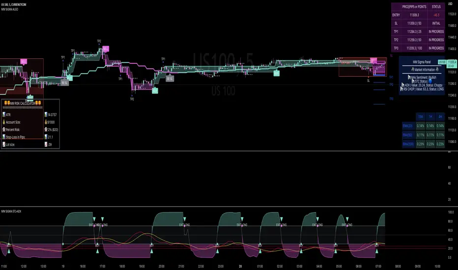
StableF-AdxThe script is ADX-DMI modified verison
-Adx is labeled as Weak trend Below 25 and strong Trend above 25
-Hline is drawn at 25 for better clarification of crossover above 25
-Wait for crossover in +dmi and -dmi and to cross above 25 for any trend clarifcation
-crossover i.e upside cross of +dmi over -dmi is shown buy UP shape
-crossunder i.e downside cross of +dmi over -dmi is Shown buy DN shape
--disclaimer --This is just modified version of Bulit in ADX_DMI indicatior \ NOT advised for buy / Sell purpose

EMR Strategy [H1 Backtesting]EMR Strategy base on EMA, MACD and RSI to supply signal on time frame H1.
Details of Rule as below:
===
1.EMA
+ Time frame: H1
+ Periods: 25, 100 (~ EMA 25 H4), 600 (~ EMA 25 D1)
===
2.MACD
+ Time frame: H1
+ Periods: 12,26,9
===
3.RSI
+ Time frame: H1
+ Periods: 14
===
4.Trading Rule
4.1.Long Position
+ MACD>0 and RSI>50 and close price moving above EMA 25
+ Close price crossed EMA 100 or crossed EMA 600 at the first time
4.2.Short Position
+ MACD<0 and RSI<50 and close price moving below EMA 25
+ Close price crossed EMA 100 or crossed EMA 600 at the first time
===
5.Money Management
+ This strategy concentrate into winrate.
+ So use trailing stop to protect your profits.
+ And use stoploss to avoid big loss on trades.
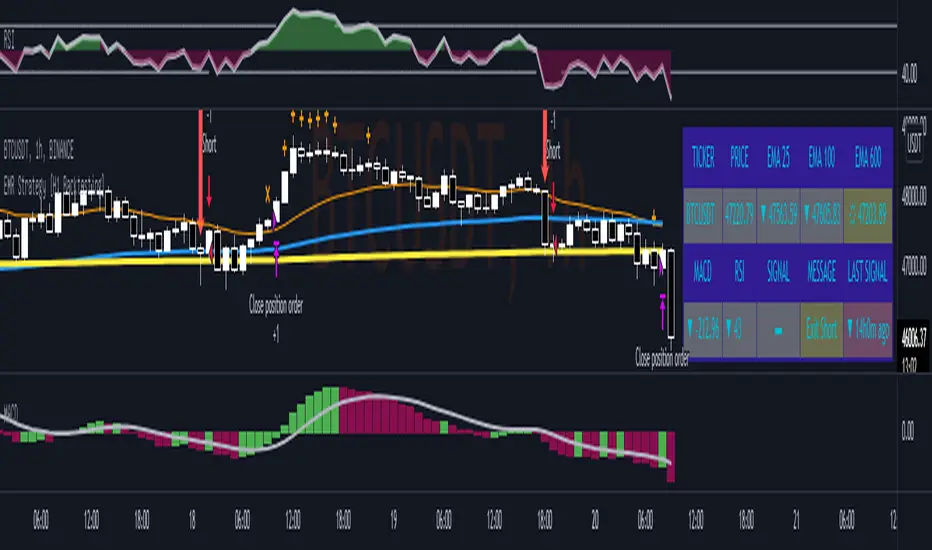
CHOP Zone Entry Strategy + DMI/PSAR ExitThis is a Strategy with associated visual indicators and Long/Short and Reverse/Close Position Alerts for the Choppiness Index (CHOP) . It is used to determine if the market is choppy (trading sideways) or not choppy (trading within a trend in either direction). CHOP is not directional, so a DMI script was ported into this strategy to allow for trend confirmation and direction determination; it consists of an Average Directional Index (ADX) , Plus Directional Indicator (+DI) and Minus Directional Indicator (-DI) . In addition, a Parabolic SAR is also included to act as a trailing stop during any strong trends.
Development Notes
---------------------------
This indicator, and most of the descriptions below, were derived largely from the TradingView reference manual. Feedback and suggestions for improvement are more than welcome, as well are recommended Input settings and best practices for use.
www.tradingview.com
www.tradingview.com
www.tradingview.com
Recommend using the below DMI and PSAR indicators in conjunction with this script to fully visualize and understand how entry and exit conditions are chosen. Variable inputs should correlate between the scripts for uniformity and visual compatibility.
THANKS to LazyBear and his Momentum Squeeze script for helping me quickly develop a momentum state model for coloring the Chop line by trend.
Strategy Description
---------------------------
CHOP produces values that determine whether the market is choppy or trending . The closer the value is to 100 , the higher the choppiness levels , while the closer it is to 0 , the stronger the market is trending . Territories for both levels, and their associated upper and lower thresholds, are popularly defined using the Fibonacci Retracements, 61.8 and 38.2.
Basic Use
---------------------------
CHOP is often used to confirm the market condition to help you stay out of sideways markets and only enter when there is movement or imminent explosions. When readings are above the upper threshold, continued sideways movement may be expected, while readings below the lower threshold are typically indicative of a continuing trend. It is also used to anticipate upcoming trendiness changes, with the general belief that extended periods of consolidation (sideways movement) are followed by extended periods of strong, trending, directional movement, and vice versa.
One limitation in this index is that you must be cautious in deciding whether the range or trend will likely continue, or if it will reverse.
Confidence in price action and trend is higher when two or more indicators are in agreement -- while this strategy combines CHOP with both DMI and PSAR, we would still recommend pairing with other indicators to determine entry or exit trade opportunities.
Recommend also choosing 'Once Per Bar Close' when creating alerts.
Inputs
---------------------------
Strategy Direction - an option to only trade Short, Long, Both, or only in the direction of the Trend (Follow Trend is the Default).
Sensitivity - an incremental variable to test whether the past n candles are in the same trend state before triggering a delayed long or short alert (1 is the Default). Can help filter out noise and reduces active alerts.
Show Chop Index - two visual styles are provided for user preference, a visible Chop line with a background overlay, or a compact column and label only view.
Chop Lookback Period - the time period to be used in calculating CHOP (14 is the Default).
Chop Offset - changing this number will move the CHOP either forwards or backwards relative to the current market (0 is the Default).
Smooth Chop Line and Length - if enabled, the entered time period will be used in calculating a smooth average of the index (Enabled and 4 are the Defaults).
Color Line to Trend Direction - toggles whether the index line is colored to visually depict the current trend direction (Enabled is the Default).
Color Background - toggles the visibility of a background color based on the index state (Enabled is the Default).
Enable DMI Option - if enabled, then entry will be confirmed by and dependent on the ADX Key Level, with any close or reversal confirmed by both ADX and +/-DI to determine whether there is a strong trend present or not (Enabled is the Default).
ADX Smoothing - the time period to be used in calculating the ADX which has a smoothing component (14 is the Default).
DI Length - the time period to be used in calculating the DI (14 is the Default).
ADX Key Level - any trade with the ADX above the key level is a strong indicator that it is trending (23 to 25 is the suggested setting).
Enable PSAR Option - enables trailing stop loss orders (Enabled is the Default).
PSAR Start - the starting value for the Acceleration Force (0.015 is our chosen Default, 0.02 is more common).
PSAR Increment - the increment in which the Acceleration Force will move (0.001 is our chosen Default, 0.02 is more common).
PSAR Max Value - the maximum value of the Acceleration Factor (0.2 is the Default).
Color Candles Option - an option to transpose the CHOP condition levels to the main candle bars. Note that the outer red and green border will still be distinguished by whether each individual candle is bearish or bullish during the specified timeframe.
Note too that if both DMI and PSAR are deselected, then close determinations will default to a CHOP reversal strategy (e.g., close long when below 38.2 and close short when above 61.8). Though if either DMI or PSAR are enabled, then the CHOP reversal for close determination will automatically be disabled.
Indicator Visuals
---------------------------
For the candle colors, black indicates tight chop (45 to 55), yellow is loose chop (38.2 to 45 and 55 to 61.8), dark purple is trending down (< 38.2), and dark blue is trending up (> 61.8).
The background color has additional shades to differentiate a wider range of more levels…
• < 30 is dark purple
• 30 to 38.2 is purple
• 38.2 to 45 is light purple
• 45 to 55 is black
• 55 to 61.8 is light blue
• 61.8 to 70 is blue
• > 70 is dark blue
Long, Short, Close, and Reverse labels are plotted on the Chop line, which itself can be colored based on the trend. The chop line can also be hidden for a clean and compact, columnar view, which is my preferred option (see example image below).
Visual cues are intended to improve analysis and decrease interpretation time during trading, as well as to aid in understanding the purpose of this strategy and how its inclusion can benefit a comprehensive trading plan.
DMI and Trend Strength
---------------------------
To analyze trend strength, the focus should be on the ADX line and not the +DI or -DI lines. An ADX reading above 25 indicates a strong trend , while a reading below 20 indicates a weak or non-existent trend . A reading between those two values would be considered indeterminable. Though what is truly a strong trend or a weak trend depends on the financial instrument being examined; historical analysis can assist in determining appropriate values.
DMI exits trade when ADX is below the user selected key level (e.g., default is 25) and when the +/- DI lines cross (e.g., -DI > +DI exits long position and +DI > -DI exits short position).
PSAR and Trailing Stop
---------------------------
PSAR is a time and price based indicator that excels at measuring direction and duration, though not the actual strength of a trend, which is why we use this in conjunction with DMI. It is also included in this script as a trailing stop option to maximize gains during strong trends and to mitigate any false ADX strengthening signals.
This creates a parabola that is located below the candle during a Bullish trend and above during a Bearish trend. A buy or reversal is signaled when the price crosses above or below the Parabolic SAR.
Long/Short Entry
---------------------------
1. CHOP must be over 61.8 (long) or under 38.2 (short).
2. If DMI is enabled, then the ADX signal line must be above the user selected Key Level (default is 25).
3. If Sensitivity is selected, then that past candle must meet the criteria in step 1, as well as all the intermediate candles in between.
4. If "Follow Trend" is selected and PSAR is enabled, then a long position can only open when the momentum and PSAR are in an uptrend, or short when both are in a downtrend, to include all intermediate candles if the Sensitivity option is set on a past candle.
Close/Reverse
---------------------------
1. If DMI is enabled, then a close flag will be raised when the ADX signal drops below the Key Level (of 25), and -DI crosses over +DI (if long), or +DI crosses over -DI (if short).
2. If PSAR is enabled, then a close flag will be raised when the current trend state is opposite the last state.
3. If both DMI and PSAR are disabled, then a close flag will be raised if the Chop line drops under 38.2 (if long) or goes over 61.8 (if short).
4. If a Long or Short Entry is triggered on the same candle as any of the above close flags, then the position will be reversed, else the position will be closed.
Strategy Alerts
---------------------------
1. Long Entry
2. Short Entry
3. Reverse
4. Close
The provided backtest result is based on a position sizing of 10% equity with 100k initial capital. When testing SPX, disabling the DMI performed the best, but EURUSD performed poorly without it enabled, and TSLA had a small reduction in net profit. Timeframe likewise differed between commodities with TSLA performing best at 30M, SPX at 15M, and EURUSD at 4H. I do not plan on using this as a standalone strategy, but I also was expecting better results with the inclusion of EMI and PSAR to compliment the CHOP. Key elements of this script will likely be included in future, more holistic strategies.
Disclaimer
---------------------------
Past performance may not be indicative of future results. Due to various factors, including changing market conditions, the strategy may no longer perform as well as in historical backtesting. This post and the script are not intended to provide any financial advice. Trade at your own risk.
No known repainting, though there may be if an offset is introduced in the Inputs. I did my best not to code any other variables that repaint, but cannot fully attest to this fact.
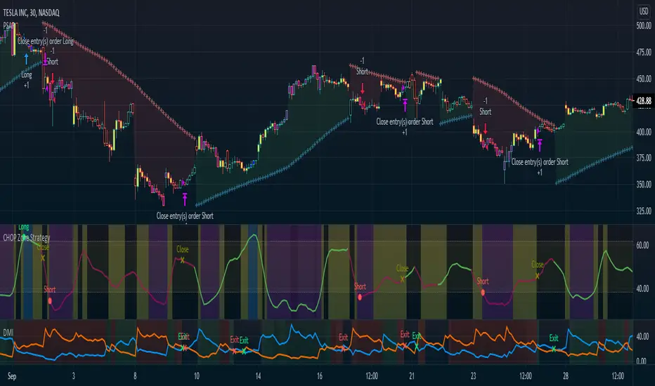
Dual SuperTrend, Ichimoku and DMI Color Weighted by DGTThis study interprets SuperTrend with Ichimoku Cloud, one of the popular technical analysis indicator, and interprets Directional Movement (DMI), which is another quite valuable technical analysis indicator.
Then combines the interpreted SuperTrend with interpreted Directional Movement (DMI) and Volume Based Colored Bars indicator created by Kıvaç ÖZBİLGİÇ (permission has been granted from the author)
Here are details of the concept applied
1- SuperTrend Line colored based on Ichimoku Cloud
Definition
The Ichimoku Cloud, developed by Goichi Hosoda and published in the late 1960s, is a collection of technical indicators that give it a unique capacity to show support and resistance levels, momentum and trend direction
What Does the Ichimoku Cloud Tells?
The overall trend is up when price is above the cloud, known as Kumo Cloud, down when price is below the Kumo Cloud, and trendless or transitioning when price is in the Kumo Cloud
When Senkou Span A (Leading Span A) is rising and above Senkou Span B (Leading Span B), this helps confirm the uptrend and space between the lines is typically colored green. When Senkou Span A is falling and below Senkou Span B, this helps confirm the downtrend. The space between the lines is typically colored red
Traders often use the Kumo Cloud as an area of support and resistance depending on the relative location of the price. The Kumo Cloud provides support/resistance levels that can be projected into the future. This sets the Ichimoku Cloud apart from many other technical indicators that only provide support and resistance levels for the current date and time
Crossovers, also known as TK Cross among Ichimoku Cloud traders, are another way the indicator can be used. Watch for the Tenkan-Sen Line, or Conversion Line, to move above the Kijun-Sen Line, or Base Line, especially when price is above the Kumo cloud. This can be a powerful buy signal. One option is to hold the trade until the Tenkan-Sen drops back below the Kijun-Sen Line. Any of the other lines could be used as exit points as well.
With this study:
Allow Traders to use the Ichimoku Cloud in conjunction with other technical indicators to maximize their risk-adjusted returns
The Ichimoku Cloud can make a chart look busy with all the lines. To Remedy this a different approach is applied in this study showing the Price and the Kumo Cloud relation as well as TK Crosses displayed. The SuperTrend Indicator is chosen to display Ichimoku Indicator, where the SuperTrend is another trend following indicator.
How it works:
SuperTrend Line is colored as:
Green when the Price is above the Kumo Cloud
Red when the Price is below the Kumo Cloud
Black when the Price is within the Kumo Cloud
And Finally Blue when the Kumo Cloud Is not ready to be drawn or not Kumo Cloud available
Additionally intensity of the colors used in all cases above are defined by values of Tenkan-Sen and Kijun-Sen Line, which allows us to detect TK Crosses
2- Plots Colored Directional Movement Line
Definition
Directional Movement (DMI) (created by J. Welles Wilder ) is actually a collection of three separate indicators combined into one. Directional Movement consists of the Average Directional Index (ADX) , Plus Directional Indicator (+D I) and Minus Directional Indicator (-D I) . ADX's purposes is to define whether or not there is a trend present. It does not take direction into account at all. The other two indicators (+DI and -DI) are used to compliment the ADX. They serve the purpose of determining trend direction. By combining all three, a technical analyst has a way of determining and measuring a trend's strength as well as its direction.
This study combines all three lines in a single colored shapes series plotted on the top of the price chart indicating the trend strength with different colors and its direction with triangle up and down shapes.
What to look for
Trend Strength : Analyzing trend strength is the most basic use for the DMI. Wilder believed that a DMI reading above 25 indicated a strong trend, while a reading below 20 indicated a weak or non-existent trend
Crosses : DI Crossovers are the significant trading signal generated by the DMI
With this study
A Strong Trend is assumed when ADX >= 25
Bullish Trend is defined as (+D I > -DI ) and (ADX >= 25), which is plotted as green triangle up shape on top of the price chart
Bearish Trend is defined as (+D I < -DI ) and (ADX >= 25), which is plotted as red triangle down shape on top of the price chart
Week Trend is assumed when 17< ADX < 25, which is plotted as black triangles up or down shape, depending on +DI-DI values, on top of the price chart
Non-Existent Trend is assumed when ADX < 17, which is plotted as yellow triangles up or down shape, depending on +DI-DI values, on top of the price chart
Additionally intensity of the colors used in all cases above are defined by comparing ADX’s current value with its previous value
3- Volume Based Colored Bars indicator created by Kıvaç ÖZBİLGİÇ
Volume Based Colored Bars colors the bars into volume weighted signals increasing the visibility of the Volume changes. Intensity of the colors of the bars varies according to average value of the volume for given length of bars (default value set to 30 bars)
Disclaimer: The script is for informational and educational purposes only. Use of the script does not constitutes professional and/or financial advice. You alone the sole responsibility of evaluating the script output and risks associated with the use of the script. In exchange for using the script, you agree not to hold dgtrd tradingview user liable for any possible claim for damages arising from any decision you make based on use of the script
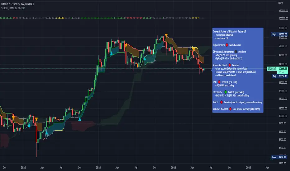
Colored Directional Movement and Bollinger Band's Cloud by DGTThis study combines Bollinger Bands, one of the most popular technical analysis indicators on the market, and Directional Movement (DMI), which is another quite valuable technical analysis indicator.
Bollinger Bands used in conjunction with Directional Movement (DMI) may help getting a better understanding of the ever changing landscape of the market and perform more advanced technical analysis
Here are details of the concept applied
1- Plots Bollinger Band’s (BB) Cloud colored based on Bollinger Band Width (BBW) Indicator’s value
Definition
Bollinger Bands (created by John Bollinger ) are a way to measure volatility . As volatility increases, the wider the bands become and similarly as volatility decreases, the gap between bands narrows
Bollinger Bands, in widely used approach, consist of a band of three lines. Likewise common usage In this study a band of five lines is implemented
The line in the middle is a Simple Moving Average (SMA) set to a period of 20 bars (the most popular usage). The SMA then serves as a base for the Upper and Lower Bands. The Upper and Lower Bands are used as a way to measure volatility by observing the relationship between the Bands and price. the Upper and Lower Bands in this study are set to two and three standard deviations (widely used form is only two standard deviations) away from the SMA (The Middle Line), hence there are two Upper Bands and two Lower Bands. The background between two Upper Bands is filled with a green color and the background between two Lower Bands is filled with a red color. In this we have obtained Bollinger Band’s (BB) Clouds (Upper Cloud and Lower Cloud)
Additionally the intensity of the color of the background is calculated with Bollinger Bands Width ( BBW ), which is a technical analysis indicator derived from the standard Bollinger Bands indicator. Bollinger Bands Width, quantitatively measures the width between the Upper and Lower Bands. In this study the intensity of the color of the background is increased if BBW value is greater than %25
What to look for
Price Actions : Prices are almost always within the bands especially at this study the bands of three standard deviations away from the SMA. Price touching or breaking the BB Clouds could be considered as buying or selling opportunity. However this is not always the case, there are exceptions such as Walking the Bands. “Walking the Bands” can occur in either a strong uptrend or a strong downtrend. During a strong trend, there may be repeated instances of price touching or breaking through the BB Clouds. Each time that this occurs, it is not a signal, it is a result of the overall strength of the move. In this study in order to get a better understanding of the trend and add ability to perform some advanced technical analysis Directional Movement Indicator (DMI) is added to be used in conjunction with Bollinger Bands.
Cycling Between Expansion and Contraction : One of the most well-known theories in regards to Bollinger Bands is that volatility typically fluctuates between periods of expansion (Bands Widening : surge in volatility and price breaks through the BB Cloud) and contraction (Bands Narrowing : low volatility and price is moving relatively sideways). Using Bollinger Bands in conjunction with Bollinger Bands Width may help identifying beginning of a new directional trend which can result in some nice buying or selling signals. Of course the trader should always use caution
2- Plots Colored Directional Movement Line
Definition
Directional Movement (DMI) (created by J. Welles Wilder ) is actually a collection of three separate indicators combined into one. Directional Movement consists of the Average Directional Index (ADX) , Plus Directional Indicator (+D I) and Minus Directional Indicator (-D I) . ADX's purposes is to define whether or not there is a trend present. It does not take direction into account at all. The other two indicators (+DI and -DI) are used to compliment the ADX. They serve the purpose of determining trend direction. By combining all three, a technical analyst has a way of determining and measuring a trend's strength as well as its direction.
This study combines all three lines in a single colored shapes series plotted on the top of the price chart indicating the trend strength with different colors and its direction with triangle up and down shapes.
What to look for
Trend Strength : Analyzing trend strength is the most basic use for the DMI. Wilder believed that a DMI reading above 25 indicated a strong trend, while a reading below 20 indicated a weak or non-existent trend
Crosses : DI Crossovers are the significant trading signal generated by the DMI
With this study
A Strong Trend is assumed when ADX >= 25
Bullish Trend is defined as (+D I > -DI ) and (ADX >= 25), which is plotted as green triangle up shape on top of the price chart
Bearish Trend is defined as (+D I < -DI ) and (ADX >= 25), which is plotted as red triangle down shape on top of the price chart
Week Trend is assumed when 17< ADX < 25, which is plotted as black triangles up or down shape, depending on +DI-DI values, on top of the price chart
Non-Existent Trend is assumed when ADX < 17, which is plotted as yellow triangles up or down shape, depending on +DI-DI values, on top of the price chart
Additionally intensity of the colors used in all cases above are defined by comparing ADX’s current value with its previous value
Summary of the Study:
Even more simplified and visually enhanced DMI drawing comparing to its classical usage (may require a bit practice to get used to it)
As said previously, to get a better understanding of the trend and add ability to perform some advanced technical analysis Directional Movement Indicator (DMI) is used in conjunction with Bollinger Bands.
PS: Analysis and tests are performed with high volatile Cryptocurrency Market
Source of References : definitions provided herein are gathered from TradingView’s knowledgebase/library
Disclaimer: The script is for informational and educational purposes only. Use of the script does not constitutes professional and/or financial advice. You alone the sole responsibility of evaluating the script output and risks associated with the use of the script. In exchange for using the script, you agree not to hold dgtrd tradingview user liable for any possible claim for damages arising from any decision you make based on use of the script

EMAs CloudEmas clouds is based on exponential moving averages 25 , 50, 100, 200
Ema 25/50 when crossed give you entry to the trend based on dipacmend forward ema 25/50 for 25 candles and ema 100/200
I add it also momentum based on close of the price moved back 25 candles.
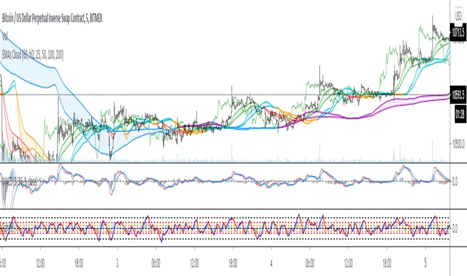
Trend Gazer v2English Follows;
---
# Trend Gazer v2 - マルチタイムフレーム トレーディング インジケータ
## 📊 概要
**Trend Gazer v2** は、**ボリューメトリックウェイテッドクラウド(VWC)**、**リバースRSIシグナル**、**ICTドンチアンスマートマネーストラクチャー**、**マルチタイムフレームボリンジャーバンド**、**EMA分析**を組み合わせた高度なトレーディングインジケータです。
**7種類のシグナルタイプ**と**4つの設定可能なフィルター**を搭載し、特にEMA塗りつぶし色遷移期間中のフィルタリング機能(**フィルター4**)により、トレンド変化時の偽シグナルを削減します。
---
## ✨ 主要機能
### v2の新機能: フィルター4 - EMA塗りつぶし遷移期間フィルター(デフォルト有効)
**フィルター4**は、EMA塗りつぶし色の遷移期間中に方向性バイアスを作成し、偽シグナルを削減します:
**動作ロジック:**
1. **すべて青 → 遷移開始(一部が赤に)→ BUYのみ表示 → すべて赤 OR 青に戻る(期間終了)**
- 遷移期間中はSELLシグナルをすべてブロック
2. **すべて赤 → 遷移開始(一部が青に)→ SELLのみ表示 → すべて青 OR 赤に戻る(期間終了)**
- 遷移期間中はBUYシグナルをすべてブロック
**終了条件:**
- 遷移が完了(すべて目標色になる)
- 元の色に戻る(遷移失敗)
**⭐ 特徴:** 他のフィルター(1,2,3)はシグナル1-5のみに適用されますが、**フィルター4はすべてのシグナル(S1-7)に適用**されます。これにより、トレンド変化時の一貫したフィルタリングを実現し、勝率向上に貢献します。
---
### 1. **複数シグナルタイプ(7種類)**
**シグナル1:** マーケットストラクチャーが強気(Bullish Structure) かつ リバースRSIが強気にシフト
**シグナル2:** (マーケットストラクチャーが強気 または リバースRSIが強気) かつ VWC UPシグナル検知
**シグナル3:** リバースRSIが強気 かつ マーケットストラクチャーが弱気から強気に変化(ストラクチャースイッチ)
**シグナル4:** マーケットストラクチャーが強気 かつ VWCシグナルがUP状態(初回のみ)
**シグナル5:** 15分足下部ボリンジャーバンドを上抜けた後、リバースRSI強気シグナル検知
**シグナル6:** 15分足下部BB または EMA50を上抜けた後、初回のリバースRSI強気シグナル(フィルター1,2,3をバイパス、フィルター4のみ適用)
**シグナル7:** マーケットストラクチャーが強気 かつ EMA20またはEMA50から上に反発後、最初のBUY検知(フィルター1,2,3をバイパス、フィルター4のみ適用)
*(SELLシグナルは逆ロジックに従う)*
---
### 2. **高度なフィルタリングシステム**
**フィルター1: RSI方向フィルター(デフォルト:ON) - シグナル1-5のみ**
- リバースRSIが強気 または マーケットストラクチャーが強気の時のみBUYを表示
- リバースRSIが弱気 または マーケットストラクチャーが弱気の時のみSELLを表示
- 強い方向性のある動きでの逆張りシグナルを防止
**フィルター2: EMA配列フィルター(デフォルト:ON) - シグナル1-5のみ**
- SELLシグナルはEMA配列が確認された時のみ表示:
- `ema20 > ema50 > ema100 > ema200`(強い下降トレンド)、または
- `ema20 < ema50 < ema100 < ema200`(強い上昇トレンド)
- レンジ相場での偽シグナルを削減
**フィルター3: ボリンジャーバンド方向フィルター(デフォルト:ON) - シグナル1-5のみ**
- 15分足上部BB かつ 60分足上部BBを下抜け後 → 15分足下部BBにタッチするまでSELLのみ表示
- 15分足下部BB かつ 60分足下部BBを上抜け後 → 15分足上部BBにタッチするまでBUYのみ表示
- 高確率エントリーのための方向バイアスゾーンを作成
**⭐ フィルター4: EMA塗りつぶし遷移期間フィルター(デフォルト:ON) - 全シグナル1-7に適用**
- すべてのEMA塗りつぶしが青から赤に遷移中 → BUYのみ表示(SELLブロック)
- すべてのEMA塗りつぶしが赤から青に遷移中 → SELLのみ表示(BUYブロック)
- 遷移が完了または元の色に戻ると期間終了
- トレンド変化時の偽シグナルを削減し、勝率向上に貢献
**注意:** シグナル6, 7はフィルター1,2,3をバイパスしますが、フィルター4は適用されます。
---
### 3. **マルチタイムフレームボリンジャーバンド**
- **15分足ボリンジャーバンド**(黒い点線): 短期ボラティリティゾーン
- **60分足ボリンジャーバンド**(黒/カスタマイズ可能): 長期サポート/レジスタンス
これらのバンドは以下を識別:
- **買われ過ぎ/売られ過ぎの状態**
- **ブレイクアウト確認**(シグナル5,6)
- **平均回帰の機会**
---
### 4. **7本の指数移動平均(EMA)**
- **EMA 7, 20, 50, 100, 200, 400, 800**
- EMA20-50間とEMA50-200間の動的**EMA塗りつぶし**でトレンドバイアスを色分け:
- **赤色塗りつぶし:** 弱気配列(ema20 > ema50 > ema200)
- **青色塗りつぶし:** 強気配列(ema20 < ema50 < ema200)
- EMAはシグナル7の反発検知のための動的サポート/レジスタンスとして機能
- **フィルター4はEMA塗りつぶし**の遷移を監視して方向性バイアスを作成
---
### 5. **ICTドンチアンスマートマネーストラクチャー**
- ローソク足の枠に色を付けてマーケットストラクチャーを可視化:
- **赤枠(Bullish Structure):** 強気ストラクチャー(買い手が優勢)
- **緑枠(Bearish Structure):** 弱気ストラクチャー(売り手が優勢)
- ドンチアンチャネルとピボットベースのストラクチャーブレイクに基づく
- シグナル1, 3, 4, 7の検知に不可欠
---
### 6. **リバースRSIシグナル**
- RSI計算を反転させてオシレーター値ではなく価格レベルを導出
- **RSIミッドラインのスーパートレンド**がトレンドシフトを判定:
- **強気シフト:** 上昇モメンタムの可能性
- **弱気シフト:** 下降モメンタムの可能性
- 半透明ラベル("Bullish"/"Bearish")として価格の上下に表示
---
### 7. **VWC(ボリューメトリックウェイテッドクラウド)トレンド検知器**
- 市場状況に応じて拡大/縮小する適応型ボラティリティベースバンド
- 価格がバンド内に入ると**UP/DOWNシグナル**を提供
- VWCステータステーブルには以下を表示:
- 現在のトレンド方向(BULLISH/BEARISH)
- EMA配列ステータス
- 最後に表示したシグナル(BUY/SELL)とシグナル以降のバー数
---
## 🎯 トレード戦略
### 推奨アプローチ
**1. トレンドフォロー(シグナル1, 2, 4)**
- 明確なマーケットストラクチャー(強気または弱気ストラクチャー)を待つ
- VWCトレンド + RSI方向 + ストラクチャー配列の合致でエントリー
- EMA塗りつぶしを動的ストップロスゾーンとして使用
**2. 反転トレード(シグナル5, 6, 7, 8)**
- **シグナル5,6**: ボリンジャーバンドブレイクアウトと反転を特定
- **シグナル7**: ストラクチャー確認を伴うEMA反発を探す
- **シグナル8**: **早期トレンド反転** - トレンド変化の最初期でエントリー
- これらのシグナルは特定フィルターをバイパスし早期エントリー機会を提供
**3. シグナル8 - 早期トレンド反転戦略 (v2新機能)**
**最適な使用ケース:**
- **上位時間軸(15分足〜1時間足)**: 主要なトレンド反転の捕捉に最も信頼性が高い
- **スイングトレード**: 数日間のポジションエントリーに最適
- **確認トレード**: 他のシグナルと組み合わせて高信頼度エントリー
**シグナル8のトレード方法:**
- **BUY(青→赤遷移)**:
- すべてのEMA塗りつぶしが青から赤に変化するのを監視
- エントリー: シグナル8 BUYラベルが出現した時
- ストップロス: 直近スイング安値またはEMA200の下
- 利確: 次のレジスタンスを目標、またはEMA50でトレーリングストップ
- **SELL(赤→青遷移)**:
- すべてのEMA塗りつぶしが赤から青に変化するのを監視
- エントリー: シグナル8 SELLラベルが出現した時
- ストップロス: 直近スイング高値またはEMA200の上
- 利確: 次のサポートを目標、またはEMA50でトレーリングストップ
**シグナル8の利点:**
- 他のシグナルより5-10バー早くトレンド反転を捕捉
- 新トレンド開始時の低リスクエントリー
- より高いリワード可能性(トレンド初期でのエントリー)
**シグナル8のリスク:**
- レンジ/不規則相場では偽シグナルを生成する可能性
- 上位時間軸での確認と組み合わせるのがベスト
- 早期エントリーのため、より大きなストップロスの使用を検討
---
### リスク管理
- **EMA20/EMA50**をトレーリングストップロスレベルとして使用
- シグナル8では:**EMA200**を主要トレンドストップロスとして使用
- 反対シグナルまたは主要EMAクロス時に決済
- 上位時間軸のトレンド確認と組み合わせ(60分足以上チャート)
- VWCステータステーブルが矛盾するシグナルを示す時は取引を避ける
### 推奨時間軸
- **シグナル8最適時間軸:** 15分足〜1時間足(早期トレンド反転用)
- **他のシグナル:** 1分足~15分足(スキャルピング/デイトレード)
- **上位時間軸:** 1時間足以上でも機能するがシグナル数は減少
- **補完的使用:** 4時間足/日足チャートで全体トレンド方向を確認
---
## 🔄 MTF OB & FVG Detectorとの統合トレード戦略
**Trend Gazer v2**と**MTF OB & FVG Detector**を組み合わせることで、機関投資家のオーダーフロー(OB)と市場の需給ギャップ(FVG)を活用した高度なトレーディング戦略を実現できます。
### 統合戦略の利点
**1. 最高確率エントリーポイントの特定**
- Trend GazerのBUY/SELLシグナル + OB/FVGゾーン = **最高確率エントリーポイント**
- 複数の時間足(5分、15分、60分)からのOB統合 + Trend Gazerシグナル = **機関投資家とトレンドの合致**
**2. 精密なエントリー価格の決定**
- Trend Gazerでトレンド方向と市場バイアスを確認
- OB/FVGゾーンで正確なエントリー価格を特定
- 不要なリスクを削減し、リワード比率を最大化
**3. 強化されたストップロス管理**
- EMA20/50(Trend Gazer)をトレーリングストップロスとして使用
- OBゾーン(MTF OB & FVG)を追加の防御ラインとして設定
- 多層防御によるリスク管理
---
### 推奨統合戦略
#### 戦略1: 高確率コンフルエンスエントリー 【最推奨】
**セットアップ:**
1. Trend Gazer v2でBUY/SELLシグナルを監視
2. MTF OB & FVG Detectorで統合OB/FVGゾーン(3つ以上の時間足)を特定
3. 両者が同じ価格ゾーンで一致するのを待つ
**エントリー条件(BUY例):**
- ✅ Trend Gazer: BUYシグナル発生(シグナル1-7のいずれか)
- ✅ MTF OB & FVG: ブリッシュOBゾーン(特に統合ゾーン)に価格がタッチ
- ✅ フィルター4(EMA遷移期間): 青→赤遷移中(BUYのみ期間)
- ✅ マーケットストラクチャー: 強気(赤枠)
- ✅ 高ボリューム: OBゾーンのボリュームパーセンテージが75%以上
**エントリー:**
- 価格がOBゾーン内でTrend GazerのBUYシグナルが点灯したバーの終値でエントリー
- または、次バーの始値でエントリー
**ストップロス:**
1. **初期SL**: OBゾーンの下端 - (5-10 pips/ポイント)
2. **代替SL**: EMA50の下(より広いSL、スイングトレード向け)
3. **タイトSL**: 直近安値 - (3-5 pips/ポイント)(スキャルピング向け)
**利確ターゲット:**
1. **T1(50%)**: 次の上位時間足ベアリッシュOB/FVGゾーン
2. **T2(30%)**: 60分足ボリンジャーバンド上限
3. **T3(20%)**: EMA20/50でトレーリング、逆シグナルまで保持
**SELL例は逆ロジック適用**
---
#### 戦略2: 精密反転エントリー【中級者向け】
**最適使用場面:**
- 強いトレンドの終了時
- 重要な統合OB/FVGゾーンでの反転
- 上位時間足のサポート/レジスタンスレベル
**エントリー条件(SELL例):**
1. **上位時間足確認:**
- 60分足でベアリッシュOB統合ゾーンを特定
- 価格が統合ゾーンに到達
2. **Trend Gazerシグナル:**
- **シグナル5**: 15分足上部BBを下抜け + リバースRSI弱気シフト、または
- **シグナル6**: 15分足上部BB/EMA50下抜け後の初回RSI弱気シグナル、または
- **シグナル7**: マーケットストラクチャー弱気 + EMA20/50からの下方反発
3. **OB/FVG確認:**
- 15分足または60分足のベアリッシュOBゾーンで反発確認
- FVGが上方に残っている(価格磁石効果)
**エントリー:**
- Trend Gazerシグナル + OBゾーン反発の両方確認後
- ローソク足パターン確認(ピンバー、エンガルフィング等)推奨
**ストップロス:**
- OBゾーン上端 + 10-15 pips/ポイント
- または60分足上部BBの上
**利確:**
- **T1**: 下位時間足ブリッシュOB/FVGゾーン(未充填FVG優先)
- **T2**: 15分足下部BB
- **T3**: 逆シグナルまたはEMA20/50タッチ
**BUY例は逆ロジック適用**
---
#### 戦略3: トレンドフォロー with OBサポート【初心者向け】
**シンプルなアプローチ:**
**BUY戦略:**
1. **トレンド確認(Trend Gazer):**
- EMA塗りつぶしが赤色(弱気配列)
- VWCステータスがBULLISH
- マーケットストラクチャーが強気(赤枠)
2. **押し目待ち:**
- 価格が下位時間足(5分または15分)のブリッシュOBゾーンまで調整
- Trend Gazerの**シグナル1, 2, または4**が発生
3. **エントリー:**
- OBゾーン内でBUYシグナル点灯時
- ローソク足の実体終値でエントリー
4. **ストップロス:**
- OBゾーン下端 - 10 pips/ポイント
5. **利確:**
- **簡易**: リスクの2倍(1:2 R:R)
- **動的**: 次のベアリッシュOBまたは逆シグナルまで
**SELL戦略は逆ロジック適用**
---
#### 戦略4: FVGフィリング with Trend Gazer確認【スキャルピング】
**短期トレーダー向け:**
**セットアップ:**
- 未充填のFVG(ブリッシュまたはベアリッシュ)を特定
- FVGが現在価格から離れている(最低20-30 pips/ポイント)
**BUY例(ブリッシュFVG下方):**
1. **FVG識別:**
- 下方に未充填のブリッシュFVG(オレンジボックス)
- 高ボリュームFVG優先(75%以上)
2. **Trend Gazer確認:**
- 価格がFVGに近づく
- マーケットストラクチャーが強気に転換
- **シグナル3, 4, または7**がFVGゾーン近辺で発生
3. **エントリー:**
- 価格がFVG内に入り、Trend GazerシグナルでFVGからの反発確認
- ローソク足の実体終値でエントリー
4. **ストップロス:**
- FVG下端 - 5-7 pips/ポイント(タイト)
5. **利確:**
- **T1(70%)**: FVG上端(ギャップ充填)
- **T2(30%)**: 次のレジスタンスまたは逆シグナル
**SELL例(ベアリッシュFVG上方)は逆ロジック適用**
---
### 統合使用のベストプラクティス
**1. チャート設定:**
- **メインチャート時間足**: 5分足または15分足
- **Trend Gazer v2**: すべてのシグナルとフィルター有効
- **MTF OB & FVG Detector**: 5分、15分、60分を有効化、統合機能ON
**2. アラート設定:**
- Trend Gazer: BUY/SELLシグナルアラート有効
- MTF OB & FVG: 反発アラート + 統合ゾーンアラート有効(Min 3 OBs)
- 両方のアラートが同時に鳴る = 最高確率エントリー
**3. 確認チェックリスト(エントリー前):**
- Trend GazerのBUY/SELLシグナル確認
- OB/FVGゾーンが価格に重なっている
- フィルター4が方向を支持(遷移期間中)
- マーケットストラクチャーが一致
- OB/FVGの高ボリューム確認(70%以上推奨)
- 上位時間足のトレンドが矛盾していない
- リスク:リワード比率が最低1:1.5以上
**4. リスク管理ルール:**
- 1トレードあたりの資金リスク: 口座残高の0.5-1%
- 同時ポジション: 最大2-3(相関性の低い銘柄のみ)
- 連続損失後: 3連敗後は休憩、戦略見直し
- 日次損失上限: 口座残高の2-3%
**5. 避けるべき状況:**
- ❌ Trend Gazerシグナルなしで、OB/FVGのみでエントリー
- ❌ 重要経済指標発表の直前/直後(ボラティリティスパイク)
- ❌ 複数フィルターが矛盾している時
- ❌ OB/FVGゾーンが既に複数回テストされている(弱体化)
- ❌ 流動性が低い時間帯(アジア早朝等)
---
### 統合戦略のパフォーマンス向上Tips
**1. 時間足の選択:**
- **スキャルピング**: 1分/3分足OB + 5分足Trend Gazerシグナル
- **デイトレード**: 5分/15分足OB + 15分足Trend Gazerシグナル
- **スイングトレード**: 15分/60分足OB + 60分足Trend Gazerシグナル
**2. 統合ゾーンの優先順位:**
- **最高優先**: 60分足OB統合(3つ以上)+ Trend Gazer Signal 6 or 7
- **高優先**: 15分足OB統合 + フィルター4遷移期間 + Signal 1-5
- **中優先**: 5分足OB + マーケットストラクチャー一致 + Signal 1-4
- **低優先**: 単一時間足OB + 基本シグナル(確認重視)
**3. バックテスト推奨:**
- 過去1-3ヶ月のデータで各戦略をテスト
- 勝率、平均R:R、最大ドローダウンを記録
- 自分のトレードスタイルに最適な組み合わせを発見
**4. 継続的改善:**
- トレード日誌を記録(スクリーンショット含む)
- 週次でパフォーマンスレビュー
- 有効な組み合わせパターンを文書化
- 市場環境の変化に応じて調整
---
### 統合戦略の実例
**実例1: 完璧なコンフルエンスBUY**
```
状況:
- 15分足チャート、EUR/USD
- 価格が60分足ブリッシュOB統合ゾーン(5分+15分+60分)にタッチ
- Trend Gazer Signal 6発生: 15分足下部BB上抜け後、初回RSI強気シグナル
- フィルター4: EMA塗りつぶし青→赤遷移中(BUYのみ期間)
- マーケットストラクチャー: 強気(赤枠)に転換
- OBボリューム: 82%(強い買い圧力)
エントリー: 1.0850(OBゾーン中央)
ストップロス: 1.0835(OBゾーン下端 - 5 pips)
利確T1: 1.0875(次の15分足ベアリッシュOB)- 達成
利確T2: 1.0895(60分足上部BB)- 達成
利確T3: 1.0920(EMA20トレーリング)- 逆シグナル手前で決済
結果: +70 pips、リスク15 pips = 4.67:1 R:R
```
**実例2: FVGフィリング with 反転確認SELL**
```
状況:
- 5分足チャート、GBP/JPY
- 上方に未充填ベアリッシュFVG(アクアボックス、15分足)
- 価格が急騰してFVGに到達
- Trend Gazer Signal 7発生: マーケットストラクチャー弱気 + EMA50からの下方反発
- リバースRSI: 弱気シフト
- FVGボリューム: 78%(強い売り圧力)
エントリー: 191.50(FVG上端での反発確認)
ストップロス: 191.75(FVG上端 + 25 pips)
利確T1: 191.00(FVG下端、ギャップ充填)- 達成
利確T2: 190.70(次のブリッシュOB)- 部分達成
結果: +50 pips(加重平均)、リスク25 pips = 2:1 R:R
```
---
### まとめ: なぜこの統合が強力なのか
**Trend Gazer v2の役割:**
- ✅ トレンド方向の確認(VWC、EMA、ストラクチャー)
- ✅ タイミングシグナル(7種類のエントリー機会)
- ✅ 複数フィルターによる偽シグナル削減
- ✅ 動的ストップロス管理(EMA、BB)
**MTF OB & FVG Detectorの役割:**
- ✅ 機関投資家のオーダーフロー可視化
- ✅ 正確な価格ゾーン特定(精密エントリー)
- ✅ 高確率サポート/レジスタンスレベル
- ✅ ボリューム分析による強度確認
**統合による相乗効果:**
- 🎯 **確率の掛け算**: 各インジケーター単独でも有効だが、両者の一致で確率が大幅向上
- 🎯 **リスク削減**: より精密なストップロス設定で損失を最小化
- 🎯 **リワード最大化**: 最適なエントリー価格で利益幅を拡大
- 🎯 **多様な戦略**: トレンドフォロー、反転、スキャルピング、スイング全てに対応
**推奨開始手順:**
1. デモ口座で戦略1(コンフルエンスエントリー)を2週間テスト
2. トレード日誌を記録し、パターンを学習
3. 小額リアル口座で同じ戦略を実践(最小ロット)
4. 自信がついたら戦略2, 3に拡張
5. 継続的にバックテストと改善を実施
この統合アプローチにより、市場の**需給ゾーン(OB/FVG)**と**トレンドモメンタム(Trend Gazer)**の両方を活用した、プロフェッショナルレベルのトレーディング戦略を実現できます。
---
## ⚙️ 入力パラメータ
### シグナル8設定 (v2新機能)
- **シグナル8を有効化: EMA塗りつぶし色遷移:** シグナル8のオン/オフ切り替え(デフォルト:OFF)
- **EMA傾きルックバック:** EMA傾き計算の期間(デフォルト:5、範囲:2-20)
- 低い値: より敏感、早期シグナル
- 高い値: より安定、偽シグナル減少
### シグナル表示設定
- **BUY/SELLラベルを表示:** メインエントリーシグナルの切り替え
- **RSIトレンドシフトラベルを表示:** Bullish/Bearish RSIシフトの表示
- **ラベルサイズ:** Small、Normal、Large、Huge
- **ラベル位置:** バー上またはATRでオフセット
### フィルター設定
- **RSI方向フィルターを有効化:** RSIトレンドでシグナルをフィルター(デフォルト:ON)
- **EMA配列フィルターを有効化:** SELLシグナルにEMA配列を要求(デフォルト:ON)
- **BB方向フィルターを有効化:** BBブレイクアウト後に方向バイアスゾーンを作成(デフォルト:ON)
### ビジュアル設定
- **ストラクチャーキャンドルを表示:** マーケットストラクチャーでキャンドルの枠に色付け
- **EMAを表示:** 7本の指数移動平均を表示
- **EMA塗りつぶしを表示:** 主要EMA間の色付き塗りつぶしを表示(シグナル8に重要)
- **15分足ボリンジャーバンドを表示:** 短期BBを表示
- **60分足ボリンジャーバンドを表示:** 長期BBを表示
- **VWCステータステーブル:** ステータステーブル表示の切り替え
---
## 🆕 v2の新機能
1. **シグナル8 - EMA塗りつぶし色遷移検知**
- 早期トレンド反転識別
- EMA傾きフラット化分析
- EMA収束パターン認識
- ATRを使用した正規化傾き計算
2. **強化されたツールチップドキュメント**
- すべてのシグナルが入力ツールチップに明確に文書化
- シグナル8の説明を含む
3. **改善されたアラートシステム**
- シグナル8 BUY/SELL用の新しいアラート
- EMA塗りつぶし色遷移専用アラート
4. **より優れた視覚的明瞭性**
- EMA塗りつぶしはシグナル8可視化に重要
- すべての塗りつぶしが色遷移している時が見やすい
---
## ⚠️ 免責事項
本インジケータは**教育および情報提供のみを目的**として提供されています。**金融アドバイスではありません**。
取引には多大な損失リスクが伴い、すべての投資家に適しているわけではありません。過去の実績は将来の結果を保証するものではありません。ユーザーは独自の調査を行い、取引決定を行う前に資格のある金融アドバイザーに相談することを検討してください。
作成者は本インジケータを使用して発生したいかなる損失についても責任を負いません。
---
## 📝 クレジット
- **リバースRSIシグナル:** AlgoAlphaのコンセプトに基づく
- **VWCトレンド検知器:** オリジナル実装
- **ICTドンチアンストラクチャー:** ICTコンセプトとドンチアンチャネルからインスピレーション
- **ボリンジャーバンド:** ジョン・ボリンジャー開発
- **EMA分析:** 標準的なテクニカル分析ツール
- **シグナル8 EMA遷移:** Trend Gazer v2のためのオリジナル実装
---
## 📜 ライセンス
このPine Script™コードは、https://mozilla.org/MPL/2.0/ の**Mozilla Public License 2.0**の条項に従います
---
## 🔔 アラート
インジケータには以下の内蔵アラート条件が含まれます:
- BUYシグナル(全8タイプ)
- SELLシグナル(全8タイプ)
- **新機能: シグナル8 EMA塗りつぶし色遷移アラート**
- リバースRSI強気/弱気シフト
- VWC UP/DOWNシグナル
TradingViewのアラート作成メニューからアラートを設定してください。
---
**バージョン:** 2.0
**プラットフォーム:** TradingView Pine Script™
**タイプ:** インジケータ(オーバーレイ)
---
## 🚀 最良の結果を得るためのヒント
1. **シグナルを組み合わせる:** シグナル8を他のシグナルと組み合わせて合致を確認
2. **シグナル8は上位時間軸で:** 15分足〜1時間足で最も信頼性が高い
3. **EMA塗りつぶしを使用:** シグナル8の遷移を見るためEMA塗りつぶしを表示
4. **マーケットストラクチャーを尊重:** 大きな時間軸のトレンドに逆らわない
5. **シグナル8をバックテスト:** 過去データでテストして動作を理解
6. **EMA傾きルックバックを調整:** トレードスタイルと時間軸に合わせて微調整
7. **テーブルを監視:** VWCステータステーブルで迅速なトレンド評価
8. **シグナル8 + ストラクチャー:** シグナル8がストラクチャー変化と一致する時に最良の結果
---
**ハッピートレーディング! 📊💹**
**v2アップグレード: シグナル8でトレンド反転をより早く捕捉!**
ーーー
# Trend Gazer v2 - Multi-Timeframe Trading Indicator
## 📊 Overview
**Trend Gazer v2** is an advanced trading indicator that combines **Volumetric Weighted Cloud (VWC)**, **Reverse RSI Signals**, **ICT Donchian Smart Money Structure**, **Multi-Timeframe Bollinger Bands**, and **EMA Analysis** for comprehensive market analysis.
**7 signal types** with **4 customizable filters**, featuring the **Filter 4 (EMA Fill Transition Period Filter)** which reduces false signals during trend changes by default.
---
## ✨ Key Features
### NEW in v2: Filter 4 - EMA Fill Transition Period Filter (Default ON)
**Filter 4** creates directional bias during EMA fill color transition periods to reduce false signals:
**Operation Logic:**
1. **ALL Blue → Transition Starts (some turn red) → BUY ONLY → ALL Red OR Back to Blue (period ends)**
- Blocks all SELL signals during transition period
2. **ALL Red → Transition Starts (some turn blue) → SELL ONLY → ALL Blue OR Back to Red (period ends)**
- Blocks all BUY signals during transition period
**Termination Conditions:**
- Transition completes (all fills become target color)
- Reverts to original color (transition fails)
**⭐ Key Feature:** While other filters (1,2,3) only apply to Signals 1-5, **Filter 4 applies to ALL signals (S1-7)**. This provides consistent filtering during trend changes and improves win rate.
---
### 1. **Multiple Signal Types (7 Types)**
**Signal 1:** Market Structure is Bullish (Bullish Structure) AND Reverse RSI shifts to Bullish
**Signal 2:** (Market Structure is Bullish OR Reverse RSI is Bullish) AND VWC UP signal detected
**Signal 3:** Reverse RSI is Bullish AND Market Structure changes from Bearish to Bullish (Structure Switch)
**Signal 4:** Market Structure is Bullish AND VWC Signal is in UP state (first time only)
**Signal 5:** Reverse RSI Bullish signal detected AFTER breaking above 15min Lower Bollinger Band
**Signal 6:** First Reverse RSI Bullish signal AFTER breaking above 15min Lower BB OR EMA50 (Bypasses Filter 1,2,3, Filter 4 still applies)
**Signal 7:** Market Structure is Bullish AND price bounces from EMA20 or EMA50, then first BUY detected (Bypasses Filter 1,2,3, Filter 4 still applies)
*(SELL signals follow inverse logic)*
---
### 2. **Advanced Filtering System**
**Filter 1: RSI Direction Filter (Default: ON) - Signals 1-5 Only**
- Only displays BUY when Reverse RSI is Bullish OR Market Structure is Bullish
- Only displays SELL when Reverse RSI is Bearish OR Market Structure is Bearish
- Prevents counter-trend signals in strong directional moves
**Filter 2: EMA Order Filter (Default: ON) - Signals 1-5 Only**
- SELL signals only appear when EMA alignment is confirmed:
- `ema20 > ema50 > ema100 > ema200` (Strong downtrend), OR
- `ema20 < ema50 < ema100 < ema200` (Strong uptrend)
- Reduces false signals during choppy/ranging markets
**Filter 3: Bollinger Band Direction Filter (Default: ON) - Signals 1-5 Only**
- After breaking below 15min Upper BB AND 60min Upper BB → Only SELL signals until touching 15min Lower BB
- After breaking above 15min Lower BB AND 60min Lower BB → Only BUY signals until touching 15min Upper BB
- Creates directional bias zones for high-probability entries
**⭐ Filter 4: EMA Fill Transition Period Filter (Default: ON) - ALL Signals 1-7**
- During ALL EMA fills transitioning blue→red → Show BUY only (block SELL)
- During ALL EMA fills transitioning red→blue → Show SELL only (block BUY)
- Period ends when transition completes OR reverts to original color
- Reduces false signals during trend changes and improves win rate
**Note:** Signals 6, 7 bypass Filters 1,2,3 but Filter 4 still applies.
---
### 3. **Multi-Timeframe Bollinger Bands**
- **15-Minute Bollinger Bands** (Black dotted lines): Short-term volatility zones
- **60-Minute Bollinger Bands** (Black/customizable): Longer-term support/resistance
These bands identify:
- **Overbought/Oversold Conditions**
- **Breakout Confirmations** (Signal 5 & 6)
- **Mean Reversion Opportunities**
---
### 4. **7 Exponential Moving Averages (EMA)**
- **EMA 7, 20, 50, 100, 200, 400, 800**
- Dynamic **EMA Fills** between EMA20-50 and EMA50-200 with color-coded trend bias:
- **Red Fill:** Bearish alignment (ema20 > ema50 > ema200)
- **Blue Fill:** Bullish alignment (ema20 < ema50 < ema200)
- EMAs act as dynamic support/resistance for Signal 7 bounce detection
- **Filter 4 monitors EMA fills** to create directional bias during transitions
---
### 5. **ICT Donchian Smart Money Structure**
- Colors candle borders to visualize market structure:
- **RED Border (Bullish Structure):** Bullish structure (buyers in control)
- **GREEN Border (Bearish Structure):** Bearish structure (sellers in control)
- Based on Donchian channels and pivot-based structure breaks
- Critical for Signal 1, 3, 4, and 7 detection
---
### 6. **Reverse RSI Signals**
- Inverts RSI calculations to derive price levels rather than oscillator values
- **Supertrend on RSI Midline** determines trend shifts:
- **Bullish Shift:** Potential upward momentum
- **Bearish Shift:** Potential downward momentum
- Displayed as semi-transparent labels ("Bullish"/"Bearish") above/below price
---
### 7. **VWC (Volumetric Weighted Cloud) Trend Detector**
- Adaptive volatility-based bands that expand/contract with market conditions
- Provides **UP/DOWN signals** when price enters the bands
- VWC Status Table displays:
- Current trend direction (BULLISH/BEARISH)
- EMA alignment status
- Last displayed signal (BUY/SELL) and bars since signal
---
## 🎯 Trading Strategy
### Recommended Approach
**1. Trend Following (Signals 1, 2, 4)**
- Wait for clear market structure (Bullish or Bearish Structure)
- Enter on confluence of VWC trend + RSI direction + Structure alignment
- Use EMA fills as dynamic stop-loss zones
**2. Reversal Trading (Signals 5, 6, 7, 8)**
- **Signal 5 & 6**: Identify Bollinger Band breakouts and reversals
- **Signal 7**: Look for EMA bounces with structure confirmation
- **Signal 8**: **EARLY TREND REVERSAL** - Enter at the very beginning of trend changes
- These signals bypass certain filters for early entry opportunities
**3. Signal 8 - Early Trend Reversal Strategy (NEW in v2)**
**Best Use Cases:**
- **Higher Timeframes (15m-1H)**: Most reliable for catching major trend reversals
- **Swing Trading**: Perfect for multi-day position entries
- **Confirmation Trading**: Use with other signals for high-confidence entries
**How to Trade Signal 8:**
- **BUY (Blue→Red transition)**:
- Watch for all EMA fills turning from blue to red
- Entry: When Signal 8 BUY label appears
- Stop Loss: Below recent swing low or EMA200
- Take Profit: Target next resistance or use trailing stop with EMA50
- **SELL (Red→Blue transition)**:
- Watch for all EMA fills turning from red to blue
- Entry: When Signal 8 SELL label appears
- Stop Loss: Above recent swing high or EMA200
- Take Profit: Target next support or use trailing stop with EMA50
**Signal 8 Advantages:**
- Catches trend reversals 5-10 bars BEFORE other signals
- Lower risk entry at the start of new trends
- Higher reward potential (entering at trend inception)
**Signal 8 Risks:**
- May produce false signals in choppy/ranging markets
- Best combined with higher timeframe confirmation
- Consider using larger stop losses due to early entry
---
### Risk Management
- Use **EMA20/EMA50** as trailing stop-loss levels
- For Signal 8: Use **EMA200** as major trend stop-loss
- Exit on opposite signal or when price crosses major EMA
- Combine with higher timeframe trend confirmation (60min+ chart)
- Avoid trading when VWC Status Table shows conflicting signals
### Timeframe Recommendations
- **Signal 8 Best Timeframes:** 15min to 1H (for early trend reversal)
- **Other Signals:** 1-minute to 15-minute charts (scalping/day trading)
- **Higher timeframes:** Works on 1H+ but may produce fewer signals
- **Complementary:** Use 4H/Daily chart for overall trend direction
---
## 🔄 Integrated Trading Strategy with MTF OB & FVG Detector
Combining **Trend Gazer v2** with **MTF OB & FVG Detector** creates a powerful trading approach that leverages institutional order flow (OB) and market supply-demand imbalances (FVG) alongside trend momentum.
### Benefits of Integration
**1. Highest Probability Entry Points**
- Trend Gazer BUY/SELL signals + OB/FVG zones = **Highest probability entry points**
- Multi-timeframe OB confluence (5m, 15m, 60m) + Trend Gazer signals = **Institutional + trend alignment**
**2. Precise Entry Price Determination**
- Trend Gazer confirms trend direction and market bias
- OB/FVG zones pinpoint exact entry prices
- Reduces unnecessary risk and maximizes reward ratios
**3. Enhanced Stop Loss Management**
- Use EMA20/50 (Trend Gazer) as trailing stop loss levels
- Set OB zones (MTF OB & FVG) as additional defensive lines
- Multi-layer risk protection
---
### Recommended Integration Strategies
#### Strategy 1: High-Probability Confluence Entry 【MOST RECOMMENDED】
**Setup:**
1. Monitor Trend Gazer v2 for BUY/SELL signals
2. Identify combined OB/FVG zones (3+ timeframes) on MTF OB & FVG Detector
3. Wait for both to align at the same price zone
**Entry Conditions (BUY example):**
- ✅ Trend Gazer: BUY signal triggered (any Signal 1-7)
- ✅ MTF OB & FVG: Price touches Bullish OB zone (especially combined zones)
- ✅ Filter 4 (EMA Transition Period): Blue→Red transition active (BUY-only period)
- ✅ Market Structure: Bullish (red border)
- ✅ High Volume: OB zone volume percentage ≥75%
**Entry:**
- Enter at close of bar when Trend Gazer BUY signal appears within OB zone
- Or enter at open of next bar
**Stop Loss:**
1. **Initial SL**: OB zone lower edge - (5-10 pips/points)
2. **Alternative SL**: Below EMA50 (wider SL, for swing trades)
3. **Tight SL**: Below recent low - (3-5 pips/points) (for scalping)
**Take Profit Targets:**
1. **T1 (50%)**: Next higher timeframe Bearish OB/FVG zone
2. **T2 (30%)**: 60min Bollinger Band upper limit
3. **T3 (20%)**: Trail with EMA20/50, hold until opposite signal
**SELL example follows inverse logic**
---
#### Strategy 2: Precise Reversal Entry 【INTERMEDIATE】
**Best Use Cases:**
- End of strong trends
- Reversals at significant combined OB/FVG zones
- Higher timeframe support/resistance levels
**Entry Conditions (SELL example):**
1. **Higher Timeframe Confirmation:**
- Identify Bearish OB confluence zone on 60min chart
- Price reaches confluence zone
2. **Trend Gazer Signals:**
- **Signal 5**: Break below 15min upper BB + Reverse RSI bearish shift, OR
- **Signal 6**: First RSI bearish signal after breaking 15min upper BB/EMA50, OR
- **Signal 7**: Market Structure bearish + bounce down from EMA20/50
3. **OB/FVG Confirmation:**
- Confirm bounce at 15min or 60min Bearish OB zone
- FVG remains above (price magnet effect)
**Entry:**
- Enter after confirming both Trend Gazer signal + OB zone bounce
- Candlestick pattern confirmation recommended (pin bar, engulfing, etc.)
**Stop Loss:**
- Above OB zone upper edge + 10-15 pips/points
- Or above 60min upper BB
**Take Profit:**
- **T1**: Lower timeframe Bullish OB/FVG zone (unfilled FVG preferred)
- **T2**: 15min lower BB
- **T3**: Until opposite signal or EMA20/50 touch
**BUY example follows inverse logic**
---
#### Strategy 3: Trend Following with OB Support 【BEGINNER-FRIENDLY】
**Simple Approach:**
**BUY Strategy:**
1. **Trend Confirmation (Trend Gazer):**
- EMA fills are red (bullish alignment)
- VWC Status shows BULLISH
- Market Structure is Bullish (red border)
2. **Wait for Pullback:**
- Price retraces to lower timeframe (5m or 15m) Bullish OB zone
- Trend Gazer **Signal 1, 2, or 4** triggers
3. **Entry:**
- Enter when BUY signal appears within OB zone
- Enter at candle body close
4. **Stop Loss:**
- Below OB zone lower edge - 10 pips/points
5. **Take Profit:**
- **Simple**: 2x risk (1:2 R:R)
- **Dynamic**: Until next Bearish OB or opposite signal
**SELL Strategy follows inverse logic**
---
#### Strategy 4: FVG Filling with Trend Gazer Confirmation 【SCALPING】
**For Short-Term Traders:**
**Setup:**
- Identify unfilled FVG (Bullish or Bearish)
- FVG should be away from current price (minimum 20-30 pips/points)
**BUY Example (Bullish FVG below):**
1. **FVG Identification:**
- Unfilled Bullish FVG below current price (Orange box)
- Prefer high-volume FVG (75%+)
2. **Trend Gazer Confirmation:**
- Price approaches FVG
- Market Structure turns Bullish
- **Signal 3, 4, or 7** triggers near FVG zone
3. **Entry:**
- Price enters FVG and Trend Gazer signal confirms bounce from FVG
- Enter at candle body close
4. **Stop Loss:**
- Below FVG lower edge - 5-7 pips/points (tight)
5. **Take Profit:**
- **T1 (70%)**: FVG upper edge (gap fill)
- **T2 (30%)**: Next resistance or opposite signal
**SELL Example (Bearish FVG above) follows inverse logic**
---
### Best Practices for Integrated Usage
**1. Chart Setup:**
- **Main Chart Timeframe**: 5min or 15min
- **Trend Gazer v2**: All signals and filters enabled
- **MTF OB & FVG Detector**: Enable 5m, 15m, 60m; Combine Overlapping OBs = ON
**2. Alert Configuration:**
- Trend Gazer: BUY/SELL signal alerts enabled
- MTF OB & FVG: Bounce alerts + Combined Zone alerts enabled (Min 3 OBs)
- Both alerts firing simultaneously = Highest probability entry
**3. Pre-Entry Checklist:**
- Trend Gazer BUY/SELL signal confirmed
- OB/FVG zone overlaps with price
- Filter 4 supports direction (during transition period)
- Market Structure aligns
- OB/FVG high volume confirmed (70%+ recommended)
- Higher timeframe trend doesn't conflict
- Risk:Reward ratio minimum 1:1.5
**4. Risk Management Rules:**
- Risk per trade: 0.5-1% of account balance
- Concurrent positions: Maximum 2-3 (low-correlation pairs only)
- After consecutive losses: Pause after 3 losses, review strategy
- Daily loss limit: 2-3% of account balance
**5. Situations to Avoid:**
- ❌ Entering with OB/FVG alone, without Trend Gazer signal
- ❌ Immediately before/after major economic releases (volatility spikes)
- ❌ When multiple filters contradict each other
- ❌ OB/FVG zones tested multiple times (weakened)
- ❌ Low liquidity periods (Asian early morning, etc.)
---
### Performance Enhancement Tips
**1. Timeframe Selection:**
- **Scalping**: 1m/3m OB + 5m Trend Gazer signals
- **Day Trading**: 5m/15m OB + 15m Trend Gazer signals
- **Swing Trading**: 15m/60m OB + 60m Trend Gazer signals
**2. Confluence Zone Priority:**
- **Highest**: 60min OB confluence (3+) + Trend Gazer Signal 6 or 7
- **High**: 15min OB confluence + Filter 4 transition period + Signal 1-5
- **Medium**: 5min OB + Market Structure alignment + Signal 1-4
- **Low**: Single timeframe OB + basic signal (require more confirmation)
**3. Backtesting Recommended:**
- Test each strategy on 1-3 months of historical data
- Record win rate, average R:R, maximum drawdown
- Discover optimal combinations for your trading style
**4. Continuous Improvement:**
- Keep trade journal (with screenshots)
- Weekly performance review
- Document effective combination patterns
- Adjust to changing market conditions
---
### Real-World Examples
**Example 1: Perfect Confluence BUY**
```
Situation:
- 15min chart, EUR/USD
- Price touches 60min Bullish OB confluence zone (5m+15m+60m)
- Trend Gazer Signal 6: First RSI bullish signal after 15min lower BB breakout
- Filter 4: EMA fills transitioning blue→red (BUY-only period)
- Market Structure: Turns Bullish (red border)
- OB Volume: 82% (strong buying pressure)
Entry: 1.0850 (OB zone middle)
Stop Loss: 1.0835 (OB zone lower edge - 5 pips)
Take Profit T1: 1.0875 (Next 15min Bearish OB) - Hit
Take Profit T2: 1.0895 (60min upper BB) - Hit
Take Profit T3: 1.0920 (EMA20 trailing) - Closed before opposite signal
Result: +70 pips, Risk 15 pips = 4.67:1 R:R
```
**Example 2: FVG Filling with Reversal Confirmation SELL**
```
Situation:
- 5min chart, GBP/JPY
- Unfilled Bearish FVG above (Aqua box, 15min)
- Price surges to reach FVG
- Trend Gazer Signal 7: Market Structure bearish + downward bounce from EMA50
- Reverse RSI: Bearish shift
- FVG Volume: 78% (strong selling pressure)
Entry: 191.50 (bounce confirmed at FVG upper edge)
Stop Loss: 191.75 (FVG upper edge + 25 pips)
Take Profit T1: 191.00 (FVG lower edge, gap fill) - Hit
Take Profit T2: 190.70 (Next Bullish OB) - Partially hit
Result: +50 pips (weighted average), Risk 25 pips = 2:1 R:R
```
---
### Summary: Why This Integration is Powerful
**Trend Gazer v2's Role:**
- ✅ Trend direction confirmation (VWC, EMA, Structure)
- ✅ Timing signals (7 types of entry opportunities)
- ✅ Multiple filters reduce false signals
- ✅ Dynamic stop loss management (EMA, BB)
**MTF OB & FVG Detector's Role:**
- ✅ Institutional order flow visualization
- ✅ Precise price zone identification (exact entries)
- ✅ High-probability support/resistance levels
- ✅ Volume analysis for zone strength confirmation
**Synergy from Integration:**
- 🎯 **Probability Multiplication**: Each indicator is effective alone, but alignment dramatically increases probability
- 🎯 **Risk Reduction**: More precise stop loss placement minimizes losses
- 🎯 **Reward Maximization**: Optimal entry prices expand profit potential
- 🎯 **Strategy Diversity**: Applicable to trend-following, reversals, scalping, and swing trading
**Recommended Getting Started:**
1. Test Strategy 1 (Confluence Entry) on demo account for 2 weeks
2. Keep trade journal and learn patterns
3. Practice same strategy on small real account (minimum lot)
4. Expand to Strategies 2, 3 as confidence grows
5. Continuously backtest and improve
This integrated approach enables professional-level trading strategies that combine market **supply-demand zones (OB/FVG)** with **trend momentum (Trend Gazer)**.
---
## ⚙️ Input Parameters
### Signal 8 Settings (NEW in v2)
- **Enable Signal 8: EMA Fill Color Transition:** Toggle Signal 8 on/off (Default: OFF)
- **EMA Slope Lookback:** Period for EMA slope calculation (Default: 5, Range: 2-20)
- Lower values: More sensitive, earlier signals
- Higher values: More stable, fewer false signals
### Signal Display Settings
- **Show BUY/SELL Labels:** Toggle main entry signals
- **Show RSI Trend Shift Labels:** Display Bullish/Bearish RSI shifts
- **Label Size:** Small, Normal, Large, Huge
- **Label Position:** On bar or offset by ATR
### Filter Settings
- **Enable RSI Direction Filter:** Filter signals by RSI trend (Default: ON)
- **Enable EMA Order Filter:** Require EMA alignment for SELL signals (Default: ON)
- **Enable BB Direction Filter:** Create directional bias zones after BB breakouts (Default: ON)
### Visual Settings
- **Show Structure Candles:** Color candle borders by market structure
- **Show EMAs:** Display 7 exponential moving averages
- **Show EMA Fills:** Display colored fills between key EMAs (critical for Signal 8)
- **Show 15min Bollinger Bands:** Display short-term BB
- **Show 60min Bollinger Bands:** Display longer-term BB
- **VWC Status Table:** Toggle status table display
---
## 🆕 What's New in v2
1. **Signal 8 - EMA Fill Color Transition Detection**
- Early trend reversal identification
- EMA slope flattening analysis
- EMA convergence pattern recognition
- Normalized slope calculation using ATR
2. **Enhanced Tooltip Documentation**
- All signals now clearly documented in input tooltips
- Signal 8 explanation included
3. **Improved Alert System**
- New alerts for Signal 8 BUY/SELL
- Dedicated alert for EMA fill color transitions
4. **Better Visual Clarity**
- EMA fills now critical for Signal 8 visualization
- Easy to see when all fills are transitioning colors
---
## ⚠️ Disclaimer
This indicator is provided for **educational and informational purposes only**. It is **not financial advice**.
Trading involves substantial risk of loss and is not suitable for all investors. Past performance does not guarantee future results. Users should conduct their own research and consider consulting with a qualified financial advisor before making any trading decisions.
The author is not responsible for any losses incurred using this indicator.
---
## 📝 Credits
- **Reverse RSI Signals:** Based on concepts by AlgoAlpha
- **VWC Trend Detector:** Original implementation
- **ICT Donchian Structure:** Inspired by ICT concepts and Donchian channels
- **Bollinger Bands:** Developed by John Bollinger
- **EMA Analysis:** Standard technical analysis tool
- **Signal 8 EMA Transition:** Original implementation for Trend Gazer v2
---
## 📜 License
This Pine Script™ code is subject to the terms of the **Mozilla Public License 2.0** at mozilla.org
---
## 🔔 Alerts
The indicator includes built-in alert conditions for:
- BUY signals (all 8 types)
- SELL signals (all 8 types)
- **NEW: Signal 8 EMA Fill Color Transition alerts**
- Reverse RSI Bullish/Bearish shifts
- VWC UP/DOWN signals
Configure alerts via TradingView's alert creation menu.
---
**Version:** 2.0
**Platform:** TradingView Pine Script™
**Type:** Indicator (Overlay)
---
## 🚀 Tips for Best Results
1. **Combine Signals:** Use Signal 8 with other signals for confluence
2. **Signal 8 on Higher TF:** Most reliable on 15m-1H timeframes
3. **Use EMA Fills:** Keep EMA fills visible to see Signal 8 transitions
4. **Respect Market Structure:** Don't fight the trend on larger timeframes
5. **Backtest Signal 8:** Test on historical data to understand its behavior
6. **Adjust EMA Slope Lookback:** Fine-tune for your trading style and timeframe
7. **Watch the Table:** The VWC Status Table provides quick trend assessment
8. **Signal 8 + Structure:** Best results when Signal 8 aligns with Structure change
---
**Happy Trading! 📊💹**
**v2 Upgrade: Catch trend reversals EARLIER with Signal 8!**

India VIX Based Nifty/BankNifty Range Calculator (Auto Fetch)VIX-Based Expected Daily Range (Auto Volatility Forecast)
Created by: Harshiv Symposium
📖 Purpose
This indicator automatically fetches the India VIX value and calculates the expected daily price range for major Indian indices such as Nifty and BankNifty.
It helps traders understand how much the market is likely to move today based on current volatility conditions.
Designed for educational and analytical awareness, not for signals or profit-making systems.
⚙️ Core Logic
Expected Daily Move (Range) = (India VIX × Current Index Price) ÷ Multiplier
- Multiplier for Nifty: 1000
- Multiplier for BankNifty: 700
This calculation projects the 1-standard-deviation (≈ 68% probability) and 2-standard-deviation (≈ 95% probability) movement zones for the day.
📊 Example
If India VIX = 15 and Nifty = 25,000:
Expected Move ≈ (15 × 25,000) ÷ 1000 = 375 points
Hence,
- 68% Range: 24,625 – 25,375
- 95% Range: 24,250 – 25,750
This gives traders a realistic idea of daily volatility boundaries.
🧭 Key Features
✅ Auto-Fetch India VIX
No need for manual input — automatically pulls live data from NSE:INDIAVIX.
✅ Dynamic Range Visualization
Plots upper/lower boundaries for 1σ and 2σ probability zones with shaded expected-move area.
✅ Dashboard Panel
Displays:
- Current VIX
- Expected Move (in points and %)
- Upper and Lower Ranges
✅ Smart Alerts
Alerts when price crosses upper or lower volatility range — potential breakout signal.
🎯 How It Helps
Intraday Traders:
Know the likely daily movement (e.g., ±220 pts on Nifty) and plan realistic targets or stops.
Options Traders:
Quickly assess whether it’s a seller-friendly (low VIX, small range) or buyer-friendly (high VIX, large range) session.
Risk Managers:
Use volatility context for stop-loss width and position sizing.
Breakout Traders:
If price breaks beyond the 2σ range → indicates potential volatility expansion.
💡 Interpretation Guide
Condition Market Behavior Strategy Insight
VIX ↓ ( < 14 ) Calm / Range-bound Option Selling Edge
VIX ↑ ( > 20 ) Volatile Sessions Option Buying Edge
Price within Range Stable Market Mean Reversion Setups
Price breaks Range Volatility Expansion Breakout Trades
⚠️ Disclaimer
This indicator is for educational and awareness purposes only.
It does not generate buy/sell signals or guarantee returns.
Always apply your own analysis and risk management.

ADX - Globx Options & Futures 2.0The ADX Globx Options & Futures is a custom-built trend strength indicator designed to replicate and enhance the classic Average Directional Index (ADX) model, commonly used in professional trading platforms such as IQ Option.
This version is optimized for options and futures trading, providing precise directional strength readings through adaptive smoothing and configurable parameters.
Concept and Logic
This indicator measures the strength of the current trend, regardless of its direction (bullish or bearish), by comparing directional movement between price highs and lows over a defined period.
It uses three main components:
+DI (Positive Directional Indicator): represents bullish strength.
–DI (Negative Directional Indicator): represents bearish strength.
ADX (Average Directional Index): measures the intensity of the prevailing trend, independent of direction.
The script follows the original logic proposed by J. Welles Wilder Jr., but introduces enhanced smoothing flexibility.
Users can choose between EMA (Exponential Moving Average) and Wilder’s RMA (Running Moving Average) for both DI and ADX calculations, allowing closer alignment with various platform implementations (IQ Option, MetaTrader, etc.).
How It Works
Directional Movement Calculation
The script computes upward and downward movements (+DM and –DM) by comparing the differences in highs and lows between consecutive candles.
Only positive directional changes that exceed the opposite side are considered.
This ensures each bar contributes only one valid directional movement.
True Range and Smoothing
The True Range (TR) is calculated using ta.tr(true) to include price gaps—replicating how professional derivatives platforms account for volatility jumps.
Both TR and DM values are smoothed using the selected averaging method (EMA or Wilder).
Directional Index and ADX
The smoothed +DI and –DI values are normalized over the True Range to form the Directional Index (DX), which measures the percentage difference between the two.
The ADX is then derived by smoothing the DX values, providing a stable reading of overall market strength.
Visual Representation
The ADX (white line) indicates the overall trend strength.
The +DI (dark blue) and –DI (dark red) lines show which side (bullish or bearish) is currently dominant.
Reference levels at 20 and 25 serve as strength thresholds:
Below 20 → Weak or sideways market.
Above 25 → Strong and directional trend.
Usage and Interpretation
When ADX rises above 25, the market shows a strong trend — use +DI > –DI for bullish confirmation, or the opposite for bearish momentum.
A falling ADX suggests decreasing trend strength and potential consolidation.
The default parameters (ADX Length = 34, DI Length = 34, both smoothed by EMA) match IQ Option’s internal ADX configuration, ensuring consistency between platforms.
Works on any timeframe or asset class, but is especially tuned for futures and options volatility dynamics.
Originality and Improvements
Unlike many open-source ADX indicators, this version:
Recreates IQ Option’s 34-length EMA-based ADX calculation with exact parameter alignment.
Provides selectable smoothing algorithms (EMA or Wilder) to switch between modern and classic formulations.
Uses dark-theme-optimized visuals with fine line weight and subtle contrast for clean visibility.
Maintains constant guide levels (20/25) rendered globally for precision and style compliance in Pine Script v6.
Is fully rewritten for Pine Script v6, ensuring compatibility and optimized execution.
Recommended Use
Combine with trend-following systems or breakout strategies.
Ideal for identifying market strength before engaging in options directionals or futures entries.
Use the ADX to confirm breakout momentum or filter sideways markets.
Disclaimer
This script is for educational and analytical purposes. It does not constitute financial advice or a trading signal. Users are encouraged to validate the indicator within their own trading strategies and risk frameworks.
Deviation Rate Crash SignalDescription
This indicator provides entry signals for contrarian trades that aim to capture rebounds after sharp declines, such as during market crashes.
A signal is triggered when the deviation rate from the 25-day moving average falls below -25% (default setting). On the chart, a red circle is displayed below the candlestick to indicate the signal.
Backtest (2000–2024, Nikkei 225 stocks):
Win rate: 64.73%
Payoff ratio: 1.141
Probability of ruin: 0.0% (with proper risk control)
Trading Rules (Long only):
Entry: Market buy at next day’s open when the closing price is 25% or more below the 25-day MA.
Exit: Market sell at next day’s open when:
The closing price is 10% above the entry price (take profit), or
The closing price is 10% below the entry price (stop loss), or
40 days have passed since entry.
Notes:
This indicator is tuned for crisis periods (e.g., 2008 Lehman Shock, 2011 Great East Japan Earthquake, 2020 COVID-19 crash, 2024 Yen carry trade reversal).
In normal market conditions, signals will be rare.
Pine Screener BETA Support:
Add this indicator to your favorites and scan with long condition = true.
Screener results display both the MA deviation rate and current price.
When multiple signals occur, use the deviation rate as a reference to prioritize setups.
説明
このインジケーターは、暴落時など短期間で急落した銘柄のリバウンドを狙う逆張りトレードのエントリーシグナルを提供します。
25日移動平均線からの乖離率が -25% を下回ったときにシグナルが点灯します(初期設定)。シグナルはメインチャートのローソク足の下に赤い丸印で表示されます。
バックテスト結果(2000~2024年、日経225銘柄):
勝率: 64.73%
ペイオフレシオ: 1.141
破産確率: 0.0%(適切なリスク管理を行った場合)
トレードルール(買いのみ):
エントリー: 終値が25日移動平均線から25%以上下方乖離した場合、翌日の寄り付きで成行買い。
手仕舞い: 翌日の寄り付きで成行売り(以下のいずれかの条件を満たした場合)
終値が買値より10%以上上昇(利確)
終値が買値より10%以上下落(損切り)
エントリーから40日経過
注意点:
このインジケーターは、2008年リーマンショック、2011年東日本大震災、2020年コロナショック、2024年円キャリートレード巻き戻しショックなど、危機的局面で効果を発揮するように調整されています。
通常の相場ではシグナルはほとんど出現しません。
Pine Screener BETA 対応:
このインジケーターをお気に入り登録し、long condition = true をフィルター条件にしてスキャンしてください。
スクリーナー結果には移動平均乖離率と現在値が表示されます。
シグナルが同時に多数出現した場合は、移動平均乖離率を参考に優先順位をつけてください。

Hilly's Advanced Crypto Scalping Strategy - 5 Min ChartTo determine the "best" input parameters for the Advanced Crypto Scalping Strategy on a 5-minute chart, we need to consider the goals of optimizing for profitability, minimizing false signals, and adapting to the volatile nature of cryptocurrencies. The default parameters in the script are a starting point, but the optimal values depend on the specific cryptocurrency pair, market conditions, and your risk tolerance. Below, I'll provide recommended input values based on common practices in crypto scalping, along with reasoning for each parameter. I’ll also suggest how to fine-tune them using TradingView’s backtesting and optimization tools.
Recommended Input Parameters
These values are tailored for a 5-minute chart for liquid cryptocurrencies like BTC/USD or ETH/USD on exchanges like Binance or Coinbase. They aim to balance signal frequency and accuracy for day trading.
Fast EMA Length (emaFastLen): 9
Reasoning: A 9-period EMA is commonly used in scalping to capture short-term price movements while remaining sensitive to recent price action. It reacts faster than the default 10, aligning with the 5-minute timeframe.
Slow EMA Length (emaSlowLen): 21
Reasoning: A 21-period EMA provides a good balance for identifying the broader trend on a 5-minute chart. It’s slightly longer than the default 20 to reduce noise while confirming the trend direction.
RSI Length (rsiLen): 14
Reasoning: The default 14-period RSI is a standard choice for momentum analysis. It works well for detecting overbought/oversold conditions without being too sensitive on short timeframes.
RSI Overbought (rsiOverbought): 75
Reasoning: Raising the overbought threshold to 75 (from 70) reduces false sell signals in strong bullish trends, which are common in crypto markets.
RSI Oversold (rsiOversold): 25
Reasoning: Lowering the oversold threshold to 25 (from 30) filters out weaker buy signals, ensuring entries occur during stronger reversals.
MACD Fast Length (macdFast): 12
Reasoning: The default 12-period fast EMA for MACD is effective for capturing short-term momentum shifts in crypto, aligning with scalping goals.
MACD Slow Length (macdSlow): 26
Reasoning: The default 26-period slow EMA is a standard setting that works well for confirming momentum trends without lagging too much.
MACD Signal Smoothing (macdSignal): 9
Reasoning: The default 9-period signal line is widely used and provides a good balance for smoothing MACD crossovers on a 5-minute chart.
Bollinger Bands Length (bbLen): 20
Reasoning: The default 20-period Bollinger Bands are effective for identifying volatility breakouts, which are key for scalping in crypto markets.
Bollinger Bands Multiplier (bbMult): 2.0
Reasoning: A 2.0 multiplier is standard and captures most price action within the bands. Increasing it to 2.5 could reduce signals but improve accuracy in highly volatile markets.
Stop Loss % (slPerc): 0.8%
Reasoning: A tighter stop loss of 0.8% (from 1.0%) suits the high volatility of crypto, helping to limit losses on false breakouts while keeping risk manageable.
Take Profit % (tpPerc): 1.5%
Reasoning: A 1.5% take-profit target (from 2.0%) aligns with scalping’s goal of capturing small, frequent gains. Crypto markets often see quick reversals, so a smaller target increases the likelihood of hitting profits.
Use Candlestick Patterns (useCandlePatterns): True
Reasoning: Enabling candlestick patterns (e.g., engulfing, hammer) adds confirmation to signals, reducing false entries in choppy markets.
Use Volume Filter (useVolumeFilter): True
Reasoning: The volume filter ensures signals occur during high-volume breakouts, which are more likely to sustain in crypto markets.
Signal Arrow Size (signalSize): 2.0
Reasoning: Increasing the arrow size to 2.0 (from 1.5) makes buy/sell signals more visible on the chart, especially on smaller screens or volatile price action.
Background Highlight Transparency (bgTransparency): 85
Reasoning: A slightly higher transparency (85 from 80) keeps the background highlights subtle but visible, avoiding chart clutter.
How to Apply These Parameters
Copy the Script: Use the Pine Script provided in the previous response.
Paste in TradingView: Open TradingView, go to the Pine Editor, paste the code, and click "Add to Chart."
Set Parameters: In the strategy settings, manually input the recommended values above or adjust them via the input fields.
Test on a 5-Minute Chart: Apply the strategy to a liquid crypto pair (e.g., BTC/USDT, ETH/USDT) on a 5-minute chart.
Fine-Tuning for Optimal Performance
To find the absolute best parameters for your specific trading pair and market conditions, use TradingView’s Strategy Tester and optimization features:
Backtesting:
Run the strategy on historical data for your chosen pair (e.g., BTC/USDT on Binance).
Check metrics like Net Profit, Profit Factor, Win Rate, and Max Drawdown in the Strategy Tester.
Focus on a sample period of at least 1–3 months to capture various market conditions (bull, bear, sideways).
Parameter Optimization:
In the Strategy Tester, click the settings gear next to the strategy name.
Enable optimization for key inputs like emaFastLen (test range: 7–12), emaSlowLen (15–25), slPerc (0.5–1.5), and tpPerc (1.0–3.0).
Run the optimization to find the combination with the highest net profit or best Sharpe ratio, but avoid over-optimization (curve-fitting) by testing on out-of-sample data.
Market-Specific Adjustments:
Volatile Pairs (e.g., DOGE/USDT): Use tighter stop losses (e.g., 0.5–0.7%) and smaller take-profit targets (e.g., 1.0–1.2%) to account for rapid price swings.
Stable Pairs (e.g., BTC/USDT): Slightly wider stop losses (e.g., 1.0–1.2%) and take-profit targets (e.g., 1.8–2.5%) may work better.
Trending Markets: Increase emaSlowLen (e.g., to 25–30) to follow stronger trends.
Choppy Markets: Tighten bbMult (e.g., to 1.8) and lower rsiOverbought/rsiOversold (e.g., to 70/30) to filter noise.
Forward Testing:
After backtesting, run the strategy in real-time on a demo account for 1–2 weeks to validate performance under current market conditions.
Important Notes
No Universal "Best" Numbers: Optimal parameters vary by crypto pair, exchange, and market conditions (e.g., bull vs. bear market). The suggested values are a starting point based on common scalping practices.
Risk Management: Never risk more than 1–2% of your account per trade. Adjust position sizing in TradingView’s strategy settings to align with your risk tolerance.
Market Volatility: Crypto markets are highly volatile. Test the strategy on your specific pair and adjust parameters if signals are too frequent or too rare.
Not Financial Advice: This is an educational tool. Backtest thoroughly and use a demo account before trading with real funds.
If you want me to generate a chart showing backtest performance for specific parameters or to tweak the script further (e.g., adding more indicators or adjusting signal logic), let me know!can you add clear buy ans sell signs above the candles in this codeTo add clear buy and sell signals above the candles in the provided Pine Script, I'll modify the existing code to include prominent text labels directly above (for sell signals) and below (for buy signals) the candles. These labels will be larger, color-coded, and positioned to avoid clutter, ensuring they are easily visible on the chart. The core strategy logic (EMA, RSI, MACD, Bollinger Bands, candlestick patterns, and volume filter) will remain unchanged, and I'll reuse the same artifact_id since this is an update to the previous script.AdvancedCryptoScalpingStrategy.pinex-pine
