Ghosty's MACD ROCThis indicator takes the classic MACD (Moving Average Convergence Divergence) and gives it a fresh twist to help you spot trading opportunities faster and smoother. It uses a single MACD—set to a medium speed (24, 52, 18)—and focuses on how quickly the MACD is moving up or down, rather than waiting for it to cross its signal line.
Here’s how it works:
The purple line (MACD) and yellow line (signal) show you the trend’s strength, squished into a simple -1 to 1 range so they’re easy to read. When they merge and flatten, a change is brewing.
The blue line above (Rate of Change, or ROC) tracks the MACD’s speed. It’s smoothed out to cut through market noise, so you’re not distracted by tiny wiggles.
Green crosses pop up on the MACD line when its speed turns positive—think of it as a “go” signal for buying. Red crosses appear when the speed turns negative—a “stop” or sell signal.
It’s designed to catch moves early, before the trend fully kicks in, while keeping false signals in check. Perfect for traders who want a clear, no-fuss way to time their entries and exits. You can tweak the settings—like the MACD lengths or smoothing—to match your style or market.
enjoy -
👻
Kecepatan Perubahan / Rate of Change (ROC)

ROC + SMI Auto Adjust
This indicator combines the Rate of Change (ROC) and the Stochastic Momentum Index (SMI) with automatically adjusted parameters for different time frames (short, medium, long). It normalizes the ROC to match the SMI levels, displays the ROC as a histogram and the SMI as lines, highlights overbought/oversold zones and includes a settings table. Ideal for analyzing momentum on different time frames.
Key Features:
Automatic Parameter Adjustment:
The script detects the current chart time frame (e.g. 1-minute, 1-hour, daily) and adjusts the parameters for the ROC and SMI accordingly.
Parameters such as ROC length, SMI length and smoothing periods are optimized for short, medium and long term time frames.
Rate of Change (ROC):
ROC measures the percentage change in price over a specified period.
The script normalizes the ROC values to match the SMI range, making it easier to compare the two indicators on the same scale.
The ROC is displayed as a histogram, where positive values are colored green and negative values are colored red.
Stochastic Momentum Index (SMI):
SMI is a momentum oscillator that identifies overbought and oversold conditions.
The script calculates the SMI and its signal line, plotting them on the chart.
Overbought and oversold levels are displayed as dotted lines for convenience.
SMI and SMI Signal Crossover:
When the main SMI crosses the signal line from below upwards, it may be a buy signal (bullish signal).
When the SMI crosses the signal line from above downwards, it may be a sell signal (bearish signal).
Configurable Inputs:
Users can use the automatically adjusted settings or manually override the parameters (e.g. ROC length, SMI length, smoothing periods).
Overbought and oversold levels for SMI are also configurable.
Parameter Table:
A table is displayed on the chart showing the current parameters (e.g. timeframe, ROC length, SMI length) for transparency and debugging.
The position of the table is configurable (e.g. top left, bottom right).
How it works:
The script first detects the chart timeframe and classifies it as short-term (e.g. 1M, 5M), medium-term (e.g. 1H, 4H) or long-term (e.g. D1, W1).
Based on the timeframe, it sets default values for the ROC and SMI parameters.
ROC and SMI are calculated and normalized so that they can be compared on the same scale.
ROC is displayed as a histogram, while SMI and its signal line are displayed as lines.
Overbought and oversold levels are displayed as horizontal lines.
Use cases:
Trend identification: ROC helps to identify the strength of the trend, while SMI indicates overbought/oversold conditions.
Momentum analysis: The combination of ROC and SMI provides insight into both price momentum and potential reversals.
Time frame flexibility: The auto-adjustment feature makes the script suitable for scalping (short-term), swing trading (medium-term) and long-term investing.
Normalized ROC²Normalized Rate of Change of Rate of Change (ROC²) Histogram
Overview
The Normalized ROC² Histogram is a momentum-based indicator designed to detect potential trend reversals by measuring the rate of change of the rate of change of price (the second derivative of price movement). This provides insight into when momentum is slowing down, signaling that a price reversal may be approaching.
The indicator also dynamically changes color to highlight shifts in momentum strength, allowing traders to visualize when price acceleration is increasing or decreasing.
How It Works
🔹 Zero Line Crossovers → Potential Direction Change
• When the histogram approaches zero and crosses over, it suggests that price momentum is shifting and a reversal may be imminent.
• Positive to Negative Crossover: Bearish momentum shift.
• Negative to Positive Crossover: Bullish momentum shift.
🔹 Momentum Strength Visualization → Color Shift
• Dark Blue (⬆️ Increasing Positive Momentum) → Price is accelerating upward.
• Light Blue (🔽 Decreasing Positive Momentum) → Uptrend is weakening.
• Dark Red (⬇️ Increasing Negative Momentum) → Price is accelerating downward.
• Light Red (🔼 Decreasing Negative Momentum) → Downtrend is weakening.
🔹 Normalization for Cleaner Visualization
• Prevents extreme volatility spikes from distorting the histogram.
• Normalizes values on a 0 to 100 scale, ensuring consistent bar height.
How to Use It
✅ Watch for Crossovers Near Zero → These can indicate a trend reversal is forming.
✅ Observe Color Changes → A shift from dark to light signals a deceleration, which often precedes price turning points.
✅ Combine with Other Indicators → Works well with Volume Profile, Moving Averages, and Market Structure analysis.
Why This Indicator is Unique
🚀 Second-derivative momentum detection → Provides early insight into potential price shifts.
📊 Normalized bars prevent distortion → No more extreme spikes ruining the scale.
🎯 Color-coded visual cues → Instantly see when momentum is gaining or fading.
📌 Add the Normalized ROC² Histogram to your charts today to detect potential reversals and momentum shifts in real-time! 🚀
ROC with closed based coloring & info table [DB]Rate of Change (ROC) Basics
The Rate of Change (ROC) is a momentum oscillator measuring the percentage price change between the current close and the close from N periods ago.
Calculated as: ROC = * 100
Traders use ROC to:
Identify overbought/oversold conditions
Spot momentum shifts
Confirm trend strength
My improvements:
Visual Clarity
Color-Coded Direction: ROC line changes color (green/red/yellow) based on intra-candle momentum shifts.
Direction Table: Instant view of the last change in ROC with the candle close (▲ UP / ▼ DOWN / ▶ FLAT).
Cells for current value and previous change between timeframe bar period.
What you can benefit with this over the regular ROC:
Faster Analysis: The visual cues make direction and strength instantly obvious and it allows for faster decision making while preserving more mental capital.

MomentumQ Momentum ROCMomentumQ Momentum Rate of Change (ROC) Indicator
The MomentumQ Momentum ROC Indicator is a powerful and user-friendly tool designed to measure the speed and strength of price momentum. By calculating the percentage change in price over a customizable period, this indicator helps traders identify trend shifts and market momentum with ease.
How It Works :
Rate of Change (ROC) Calculation :
Measures the percentage price change over a specified period (default: 14).
Helps traders determine whether an asset's momentum is increasing or decreasing.
Moving Average Smoothing :
A Simple Moving Average (SMA) is applied to the ROC for better trend visualization.
This helps filter out market noise and highlights sustained momentum trends.
Zero-Level Reference Line :
A dashed horizontal line at 0% provides a clear reference point for momentum shifts.
Above 0%: Indicates positive momentum (potential uptrend).
Below 0%: Indicates negative momentum (potential downtrend).
Key Features :
Customizable Input Parameters:
Adjust the ROC period (default: 14) to analyze short- or long-term momentum.
Modify the SMA period (default: 10) for smoother trend identification.
Intuitive Visualization :
Blue Line: Represents the Rate of Change (ROC) to track momentum shifts.
White Line: Represents the SMA of ROC, helping traders see long-term momentum.
Gray Dashed Line: A fixed reference at 0% for trend interpretation.
Momentum-Based Trading Signals :
Rising ROC: Increasing momentum, potential breakout.
Falling ROC: Weakening momentum, possible reversal.
ROC Crossing Zero: Signals a possible trend change.
User-Friendly Input Options :
Grouped settings menu for an intuitive setup experience.
Tooltips included to help traders understand each parameter.
Concepts and Calculations :
Momentum Rate of Change (ROC):
ROC = ((Close - Close ) / Close ) * 100
where n is the selected ROC period.
Simple Moving Average (SMA) of ROC :
Smooths ROC fluctuations for clearer trend insights.
How to Use :
Open the indicator settings.
Customize the ROC period (14 by default).
Enable and adjust the SMA period for smoothing (default: 10).
Analyze the plotted ROC and its SMA in relation to the zero line:
ROC > 0: Momentum is positive (uptrend).
ROC < 0: Momentum is negative (downtrend).
ROC rising or falling: Indicates strengthening or weakening momentum.
Use the insights to refine your entries and exits in trades.
Why It’s Useful :
Identifies Trend Strength – Helps detect early momentum shifts.
Confirms Trend Reversals – Zero-line crossovers can indicate changes in direction.
Works Across Multiple Markets – Stocks, Forex, Crypto, Commodities.
Customizable & Easy to Use – Adjustable settings for different strategies.
Use the MomentumQ Momentum ROC Indicator to gain deeper insights into market momentum and improve your trading decisions.
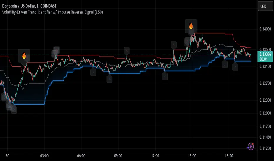
Johnny's Volatility-Driven Trend Identifier w/ Reversal SignalsJohnny's Volatility-Driven Trend Identifier w/ Reversal Signals is designed to identify high-probability trend shifts and reversals by incorporating volatility, momentum, and impulse-based filtering. It is specifically built for traders who want to capture strong trend movements while minimizing false signals caused by low volatility noise.
By leveraging Rate of Change (ROC), Relative Strength Index (RSI), and Average True Range (ATR)-based volatility detection, the indicator dynamically adapts to market conditions. It highlights breakout trends, reversals, and early signs of momentum shifts using strategically placed labels and color-coded trend visualization.
Inspiration taken from Top G indicator .
What This Indicator Does
The Volatility-Driven Trend Identifier works by:
Measuring Market Extremes & Momentum:
Uses ROC normalization with standard deviation to identify impulse moves in price action.
Implements RSI filtering to determine overbought/oversold conditions that validate trend strength.
Utilizes ATR-based volatility tracking to ensure signals only appear when meaningful market movements are occurring.
Identifying Key Trend Events:
Power Peak (🔥): Marks a confirmed strong downtrend, ideal for shorting opportunities.
Surge (🚀): Indicates a confirmed strong uptrend, signaling a potential long entry.
Soft Surge (↗): Highlights a mild bullish reentry or early uptrend formation.
Soft Peak (↘): Shows a mild bearish reentry or early downtrend formation.
Providing Adaptive Filtering for Reliable Signals:
Filters out weak trends with a volatility check, ensuring signals appear only in strong market conditions.
Implements multi-level confirmation by combining trend strength metrics, preventing false breakouts.
Uses gradient-based visualization to color-code market sentiment for quick interpretation.
What This Indicator Signals
Breakouts & Impulse Moves: 🚀🔥
The Surge (🚀) and Power Peak (🔥) labels indicate confirmed momentum breakouts, where the trend has been validated by a combination of ROC impulse, RSI confirmation, and ATR volatility filtering.
These signals suggest that the market is entering a strong trend, and traders can align their entries accordingly.
Early Trend Formation & Reentries: ↗ ↘
The Soft Surge (↗) and Soft Peak (↘) labels indicate areas where a trend might be forming, but is not yet fully confirmed.
These signals help traders anticipate potential entries before the trend gains full strength.
Volatility-Adaptive Trend Filtering: 📊
Since the indicator only activates in volatile conditions, it avoids the pitfalls of low-range choppy markets where false signals frequently occur.
ATR-driven adaptive windowing allows the indicator to dynamically adjust its sensitivity based on real-time volatility conditions.
How to Use This Indicator
1. Identifying High-Probability Entries
Bullish Entries (Long Trades)
Look for 🚀 Surge signals in an uptrend.
Confirm with RSI (should be above 50 for momentum).
Ensure volatility is increasing to validate the breakout.
Use ↗ Soft Surge signals for early entries before the trend fully confirms.
Bearish Entries (Short Trades)
Look for 🔥 Power Peak signals in a downtrend.
RSI should be below 50, indicating downward momentum.
Volatility should be rising, ensuring market momentum is strong.
Use ↘ Soft Peak signals for early entries before a full bearish confirmation.
2. Avoiding False Signals
Ignore signals when the market is ranging (low ATR).
Check RSI and ROC alignment to ensure trend confirmation.
Use additional confluences (e.g., price action, support/resistance levels, moving averages) for enhanced accuracy.
3. Trend Confirmation & Filtering
The stronger the trend, the higher the likelihood that Surge (🚀) and Power Peak (🔥) signals will continue in their direction.
Soft Surge (↗) and Soft Peak (↘) act as early warning signals before major breakouts occur.
What Makes This a Machine Learning-Inspired Moving Average?
While this indicator is not a direct implementation of machine learning (as Pine Script lacks AI/ML capabilities), it mimics machine learning principles by adapting dynamically to market conditions using the following techniques:
Adaptive Trend Selection:
It does not rely on fixed moving averages but instead adapts dynamically based on volatility expansion and momentum detection.
ATR-based filtering adjusts the indicator’s sensitivity to real-time conditions.
Multi-Factor Confirmation (Feature Engineering Equivalent in ML):
Combines ROC, RSI, and ATR in a structured way, similar to how ML models use multiple inputs to filter and classify data.
Implements conditional trend recognition, ensuring that only valid signals pass through the filter.
Noise Reduction with Data Smoothing:
The algorithm avoids false signals by incorporating trend intensity thresholds, much like how ML models remove outliers to refine predictions.
Adaptive filtering ensures that low-volatility environments do not produce misleading signals.
Why Use This Indicator?
✔ Reduces False Signals: Multi-factor validation ensures only high-confidence signals are triggered.
✔ Works in All Market Conditions: Volatility-adaptive nature allows the indicator to perform well in both trending and ranging markets.
✔ Great for Swing & Intraday Trading: It helps spot momentum shifts early and allows traders to catch major market moves before they fully develop.
✔ Visually Intuitive: Color-coded trends and clear signal markers make it easy to interpret.
US Treasury Yields ROC1. Motivation and Context
The yield curve, which represents the relationship between bond yields and their maturities, plays a pivotal role in macroeconomic analysis and market forecasting. Changes in the slope or curvature of the yield curve are often indicative of investor expectations about economic growth, inflation, and monetary policy. For example:
• Steepening curves may indicate economic optimism and rising inflation expectations.
• Flattening curves are often associated with slower growth or impending recessions.
Analyzing these dynamics with quantitative tools such as the rate of change (ROC) enables traders and analysts to identify actionable patterns in the market. As highlighted by Gürkaynak, Sack, and Wright (2007), the term structure of interest rates embeds significant economic information, and understanding its movements is crucial for both policy makers and market participants.
2. Methodology
2.1 Input Parameters
The script takes the following key input:
• ROC Period (roc_length): Determines the number of bars over which the rate of change is calculated. This is an adjustable parameter (14 by default), allowing users to adapt the analysis to different timeframes.
2.2 Data Sources
The yields of the US Treasury securities for different maturities are fetched from TradingView using the request.security() function:
• 2-Year Yield (TVC:US02Y)
• 5-Year Yield (TVC:US05Y)
• 10-Year Yield (TVC:US10Y)
• 30-Year Yield (TVC:US30Y)
These yields are central to identifying trends in short-term versus long-term rates.
2.3 Visualization
Plots: The ROC values for each maturity are plotted in distinct colors for clarity:
• 2Y: Blue
• 5Y: Yellow
• 10Y: Green
• 30Y: Red
Background Highlight: The script uses color-coded backgrounds to visualize the identified curve regimes:
• Bull Steepener: Neon Green
• Bear Steepener: Bright Red
• Bull Flattener: Blue
• Bear Flattener: Orange
2.4 Zero Line
A horizontal zero line is included as a reference point, allowing users to easily identify transitions from negative to positive ROC values, which may signal shifts in the yield curve dynamics.
3. Implications for Financial Analysis
By automating the identification of yield curve dynamics, this script aids in:
• Macroeconomic Forecasting:
Steepeners and flatteners are associated with growth expectations and monetary policy changes. For instance, Bernanke and Blinder (1992) emphasize the predictive power of the yield curve for future economic activity.
• Trading Strategies:
Yield curve steepening or flattening can inform bond market strategies, such as long/short duration trades or curve positioning.
4. References
1. Bernanke, B. S., & Blinder, A. S. (1992). “The Federal Funds Rate and the Channels of Monetary Transmission.” American Economic Review, 82(4), 901–921.
2. Gürkaynak, R. S., Sack, B., & Wright, J. H. (2007). “The U.S. Treasury Yield Curve: 1961 to the Present.” Journal of Monetary Economics, 54(8), 2291–2304.
3. TradingView Documentation. “request.security Function.” Retrieved from TradingView.

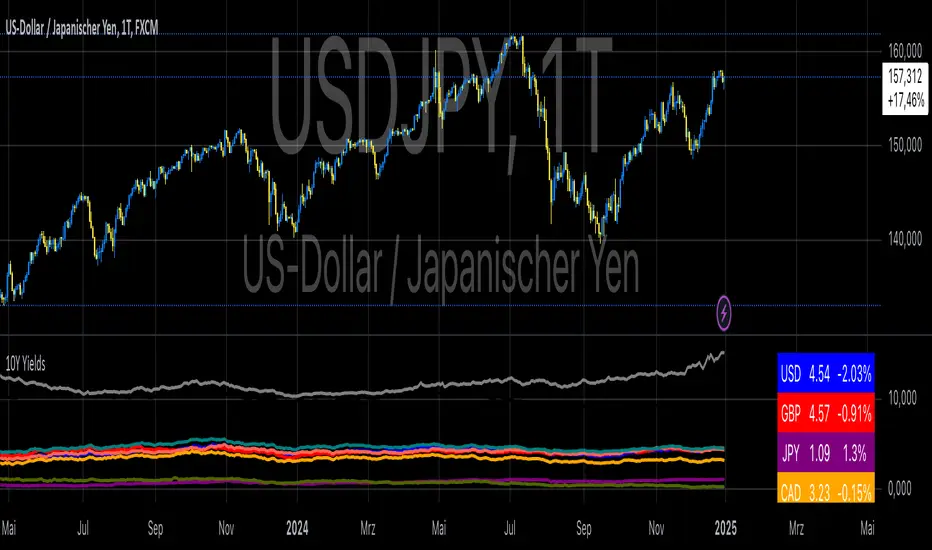
10-Year Yields Table for Major CurrenciesThe "10-Year Yields Table for Major Currencies" indicator provides a visual representation of the 10-year government bond yields for several major global economies, alongside their corresponding Rate of Change (ROC) values. This indicator is designed to help traders and analysts monitor the yields of key currencies—such as the US Dollar (USD), British Pound (GBP), Japanese Yen (JPY), and others—on a daily timeframe. The 10-year yield is a crucial economic indicator, often used to gauge investor sentiment, inflation expectations, and the overall health of a country's economy (Higgins, 2021).
Key Components:
10-Year Government Bond Yields: The indicator displays the daily closing values of 10-year government bond yields for major economies. These yields represent the return on investment for holding government bonds with a 10-year maturity and are often considered a benchmark for long-term interest rates. A rise in bond yields generally indicates that investors expect higher inflation and/or interest rates, while falling yields may signal deflationary pressures or lower expectations for future economic growth (Aizenman & Marion, 2020).
Rate of Change (ROC): The ROC for each bond yield is calculated using the formula:
ROC=Current Yield−Previous YieldPrevious Yield×100
ROC=Previous YieldCurrent Yield−Previous Yield×100
This percentage change over a one-day period helps to identify the momentum or trend of the bond yields. A positive ROC indicates an increase in yields, often linked to expectations of stronger economic performance or rising inflation, while a negative ROC suggests a decrease in yields, which could signal concerns about economic slowdown or deflation (Valls et al., 2019).
Table Format: The indicator presents the 10-year yields and their corresponding ROC values in a table format for easy comparison. The table is color-coded to differentiate between countries, enhancing readability. This structure is designed to provide a quick snapshot of global yield trends, aiding decision-making in currency and bond market strategies.
Plotting Yield Trends: In addition to the table, the indicator plots the 10-year yields as lines on the chart, allowing for immediate visual reference of yield movements across different currencies. The plotted lines provide a dynamic view of the yield curve, which is a vital tool for economic analysis and forecasting (Campbell et al., 2017).
Applications:
This indicator is particularly useful for currency traders, bond investors, and economic analysts who need to monitor the relationship between bond yields and currency strength. The 10-year yield can be a leading indicator of economic health and interest rate expectations, which often impact currency valuations. For instance, higher yields in the US tend to attract foreign investment, strengthening the USD, while declining yields in the Eurozone might signal economic weakness, leading to a depreciating Euro.
Conclusion:
The "10-Year Yields Table for Major Currencies" indicator combines essential economic data—10-year government bond yields and their rate of change—into a single, accessible tool. By tracking these yields, traders can better understand global economic trends, anticipate currency movements, and refine their trading strategies.
References:
Aizenman, J., & Marion, N. (2020). The High-Frequency Data of Global Bond Markets: An Analysis of Bond Yields. Journal of International Economics, 115, 26-45.
Campbell, J. Y., Lo, A. W., & MacKinlay, A. C. (2017). The Econometrics of Financial Markets. Princeton University Press.
Higgins, M. (2021). Macroeconomic Analysis: Bond Markets and Inflation. Harvard Business Review, 99(5), 45-60.
Valls, A., Ferreira, M., & Lopes, M. (2019). Understanding Yield Curves and Economic Indicators. Financial Markets Review, 32(4), 72-91.
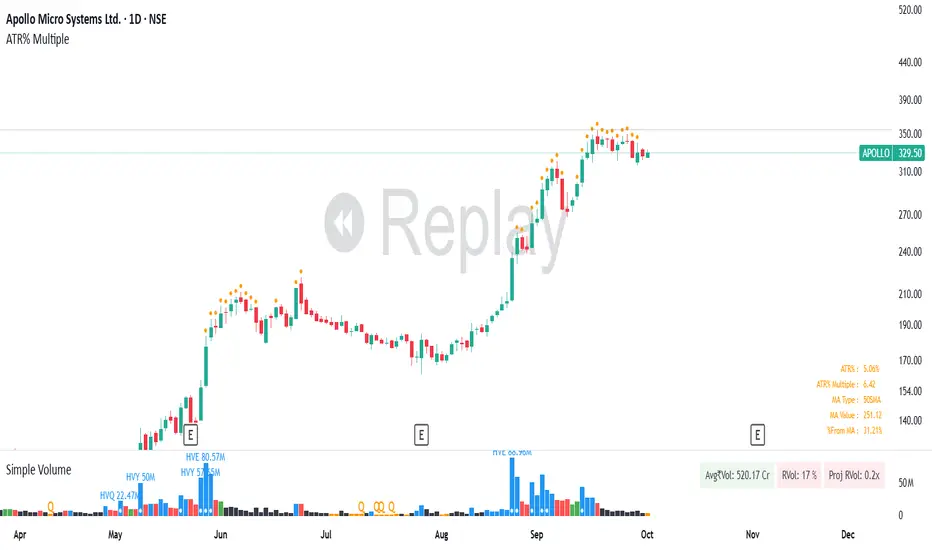
ATR% Multiple from Key Moving AverageThis script gives signal when the ATR% multiple from any chosen moving average is beyond the configurable threshold value. This indicator quantifies how extended the stock is from a given key moving average.
A lot of traders use ATR% multiple from 10DMA, 21EMA, 50SMA or 200SMA to determine how extended a stock is and accordingly sell partials or exit. By default the indicator takes 50SMA and when the ATR% multiple is greater than 7 then it gives the signal to take partials. You can back test this indicator with previous trades and determine the ideal threshold for the signal. For small and midcaps a threshold of 7 to 10 ATR% multiples from 50SMA is where partials can be taken while large caps can revert to mean even earlier at 3 to 5 ATR% multiples from 50SMA.
You can modify this script and use it anyway you please as long as you make it opensource on TradingView.
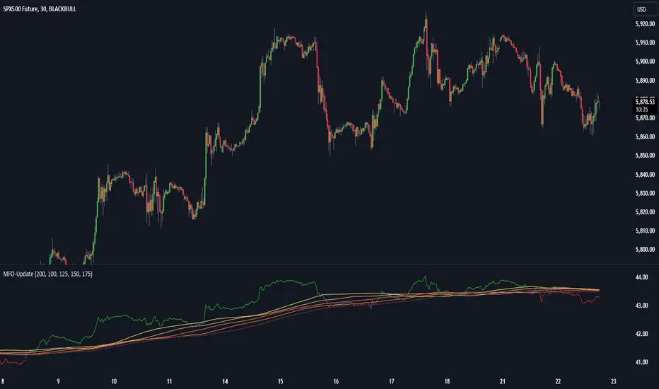
Momentum Flow OscillatorIndicator Overview: Momentum Flow Oscillator (MFO)
The Momentum Flow Oscillator (MFO) is a powerful tool for detecting shifts in market momentum. It combines a momentum-based calculation with a dynamic ribbon of moving averages to help traders identify trend reversals, continuations, and market consolidations. The MFO offers a clear visual representation of market conditions and assists traders in making informed decisions based on the relationship between momentum and its underlying trends.
The MFO line (green) is plotted alongside a Base Line (black) and a series of moving averages (ribbon). The ribbon is composed of five moving averages of different lengths, which allow traders to spot trends, momentum shifts, and potential trade opportunities. It is important to note that the ribbon tends to be a slower-moving component of the indicator, providing long-term trend signals rather than quick, reactive signals.
Components of the Indicator:
Momentum Flow Index (MFI):
This green line is the core of the indicator, representing market momentum derived from price and volume action. It reacts to changes in market dynamics and helps identify periods of strength and weakness.
Base Line (Black Line):
The black line is a 200-period moving average of the momentum flow. This acts as a dynamic support/resistance level for the MFI, smoothing out the price action over a longer period and providing a clearer trend signal.
Moving Averages Ribbon:
The ribbon is composed of five moving averages with different periods (100, 125, 150, 175, and 200). These moving averages create a visual "ribbon" that helps identify trends and consolidations, allowing traders to visualize the market’s momentum over different time frames.
The ribbon acts as a slower-moving indicator, helping to confirm long-term trends. Traders should keep in mind that the ribbon provides signals with a lag, making it ideal for trend-following rather than quick, short-term trades.
How to Use the Momentum Flow Oscillator (MFO):
1. Bullish Momentum Signals:
When the MFI (green line) crosses above the Base Line and the SMA ribbon, it indicates increasing momentum in the market. This signal is particularly strong when the MFI stays above the ribbon for an extended period.
Trade Example: Traders can use this as a buy signal when the MFI crosses above the ribbon, indicating that momentum is shifting to the upside. If the ribbon starts fanning out, it suggests the market is trending strongly upward, which may support a long position.
2. Bearish Momentum Signals:
When the MFI crosses below the Base Line and the SMA ribbon, it signals decreasing momentum. This is a bearish sign, indicating that the market may be preparing for a downturn.
Trade Example: A trader can use the cross below the ribbon as a sell signal or consider entering a short position when momentum weakens. If the ribbon fans out in a downward direction, it suggests the market is trending lower, and a short position may be warranted.
3. Neutral or Caution Signals:
When the MFI fluctuates within the SMA ribbon or crosses in and out frequently, the market may be in a consolidation phase or range-bound. In this situation, the trend is uncertain, and momentum is not strong enough to break decisively in either direction.
Trade Example: Traders may want to avoid taking new positions when the MFI is moving sideways within the ribbon, as this indicates indecision in the market. Waiting for a breakout above or below the ribbon can provide clearer signals for trading.
4. Trend Confirmation with Ribbon Expansion:
When the SMA ribbon expands, it indicates strong momentum in the direction of the trend. A clear widening of the ribbon with the MFI above (bullish) or below (bearish) signals a strong, sustainable trend.
Trade Example: As the ribbon expands, it confirms the strength of the trend, and traders can use this as confirmation to either hold an existing position or add to it.
5. Reversal Signals from Ribbon Contraction:
When the SMA ribbon contracts or the MFI crosses back and forth over the Base Line, it signals a potential reversal or a weakening of the existing trend.
Trade Example: In these cases, traders might consider closing positions or preparing for a reversal, as the contraction often signals a potential breakout in the opposite direction.
Example of Using the MFO in Trading:
In the provided chart image, you can see the MFI moving below the Base Line and the SMA ribbon for an extended period. This indicates bearish momentum, and traders could use this signal to enter a short position or avoid long positions until the MFI shows signs of crossing back above the ribbon. When the MFI crosses above the ribbon, it can signal a potential bullish reversal, indicating it might be time to re-enter long positions or close short positions.
Additional Trading Tips:
Combine with Other Indicators: The MFO can be used in combination with other technical tools such as volume-based indicators, trendlines, or oscillators like RSI or MACD to confirm signals and increase accuracy.
Use Different Time Frames: Traders can apply the MFO on different time frames (e.g., daily, weekly) to capture both short-term and long-term trends. Crossovers in longer time frames provide stronger confirmation of trend direction.
Conservative Entry: For more conservative traders, waiting for the MFI to fully cross above or below the ribbon (rather than within it) can help filter out false signals and avoid entering trades during consolidation phases.
Conclusion:
The Momentum Flow Oscillator offers traders a versatile and visual approach to gauging market momentum and trend strength. By observing the interaction between the MFI and the SMA ribbon, traders can spot trend changes early, confirm existing trends, and stay out of choppy, sideways markets. Keep in mind that the ribbon is a slower-moving part of the indicator—perfect for trend-following strategies but less ideal for fast, reactive trades. Use this indicator to increase your confidence in your trading decisions and improve your ability to capture trends in the market.
Burst PowerThe Burst Power indicator is to be used for Indian markets where most stocks have a maximum price band limit of 20%.
This indicator is intended to identify stocks with high potential for significant price movements. By analysing historical price action over a user-defined lookback period, it calculates a Burst Power score that reflects the stock's propensity for rapid and substantial moves. This can be helpful for stock selection in strategies involving momentum bursts, swing trading, or identifying stocks with explosive potential.
Key Components
____________________
Significant Move Counts:
5% Moves: Counts the number of days within the lookback period where the stock had a positive close-to-close move between 5% and 10%.
10% Moves: Counts the number of days with a positive close-to-close move between 10% and 19%.
19% Moves: Counts the number of days with a positive close-to-close move of 19% or more.
Maximum Price Move (%):
Identifies the largest positive close-to-close percentage move within the lookback period, along with the date it occurred.
Burst Power Score:
A composite score calculated using the counts of significant moves: Burst Power =(Count5%/5) +(Count10%/2) + (Count19%/0.5)
The score is then rounded to the nearest whole number.
A higher Burst Power score indicates a higher frequency of significant price bursts.
Visual Indicators:
Table Display: Presents all the calculated data in a customisable table on the chart.
Markers on Chart: Plots markers on the chart where significant moves occurred, aiding visual analysis.
Using the Lookback Period
____________________________
The lookback period determines how much historical data the indicator analyses. Users can select from predefined options:
3 Months
6 Months
1 Year
3 Years
5 Years
A shorter lookback period focuses on recent price action, which may be more relevant for short-term trading strategies. A longer lookback period provides a broader historical context, useful for identifying long-term patterns and behaviors.
Interpreting the Burst Power Score
__________________________________
High Burst Power Score (≥15):
Indicates the stock frequently experiences significant price moves.
Suitable for traders seeking quick momentum bursts and swing trading opportunities.
Stocks with high scores may be more volatile but offer potential for rapid gains.
Moderate Burst Power Score (10 to 14):
Suggests occasional significant price movements.
May suit traders looking for a balance between volatility and stability.
Low Burst Power Score (<10):
Reflects fewer significant price bursts.
Stocks are more likely to exhibit longer, sustainable, but slower price trends.
May be preferred by traders focusing on steady growth or longer-term investments.
Note: Trading involves uncertainties, and the Burst Power score should be considered as one of many factors in a comprehensive trading strategy. It is essential to incorporate broader market analysis and risk management practices.
Customisation Options
_________________________
The indicator offers several customisation settings to tailor the display and functionality to individual preferences:
Display Mode:
Full Mode: Shows the detailed table with all components, including significant move counts, maximum price move, and the Burst Power score.
Mini Mode: Displays only the Burst Power score and its corresponding indicator (green, orange, or red circle).
Show Latest Date Column:
Toggle the display of the "Latest Date" column in the table, which shows the most recent occurrence of each significant move category.
Theme (Dark Mode):
Switch between Dark Mode and Light Mode for better visual integration with your chart's color scheme.
Table Position and Size:
Position: Place the table at various locations on the chart (top, middle, bottom; left, center, right).
Size: Adjust the table's text size (tiny, small, normal, large, huge, auto) for optimal readability.
Header Size: Customise the font size of the table headers (Small, Medium, Large).
Color Settings:
Disable Colors in Table: Option to display the table without background colors, which can be useful for printing or if colors are distracting.
Bullish Closing Filter:
Another customisation here is to count a move only when the closing for the day is strong. For this, we have an additional filter to see if close is within the chosen % of the range of the day. Closing within the top 1/3, for instance, indicates a way more bullish day tha, say, closing within the bottom 25%.
Move Markers on chart:
The indicator also marks out days with significant moves. You can choose to hide or show the markers on the candles/bars.
Practical Applications
________________________
Momentum Trading: High Burst Power scores can help identify stocks that are likely to experience rapid price movements, suitable for momentum traders.
Swing Trading: Traders looking for short- to medium-term opportunities may focus on stocks with moderate to high Burst Power scores.
Positional Trading: Lower Burst Power scores may indicate steadier stocks that are less prone to volatility, aligning with long-term investment strategies.
Risk Management: Understanding a stock's propensity for significant moves can aid in setting appropriate stop-loss and take-profit levels.
Disclaimer: Trading involves significant risk, and past performance is not indicative of future results. The Burst Power indicator is intended for educational purposes and should not be construed as financial advice. Always conduct thorough research and consult with a qualified financial professional before making investment decisions.

Outlier changes alertAn indicator that calculates click (price change), percentage change, and Z-score changes while displaying outliers based on defined ranges.
Outlier Detection:
Mark outliers (for price, percentage, Z-score) based on user-defined thresholds. For example, any price movement exceeding a certain Z-score or percentage change could be marked as an outlier and displayed on chart.
Indicator Overview:
1. Click (Price Change):
Calculate the absolute price change from one period to another (e.g., from the current closing price to the previous closing price).
2. Percentage Change:
Calculate the percentage price change over a specific period, showing how much the price has changed in relative terms compared to the previous price.
3. Z-Score:
Compute the Z-score to standardize the price change relative to its historical average and standard deviation. The Z-score helps in detecting whether a price movement is an outlier or falls within a normal range of volatility.

[ROC3] Rate of Change Candle ColorROC is a statistical indicator which tracks how much a security's price has changed over a certain period, showing whether momentum is picking up or slowing down. It’s a handy tool because it helps traders spot trend changes and understand how strong a trend is.
My ROC3 indicator will color the candlesticks based on the Rate of Change (ROC) and its Exponential Moving Average (EMA). This indicator helps traders visually identify bullish and bearish trends by applying color to the candles, making it easier to spot momentum shifts and trend changes.
How It Works:
Rate of Change (ROC): Calculates the percentage change in the price over a specified number of bars. This indicator measures the speed at which price changes.
EMA of ROC: Applies an Exponential Moving Average to the ROC values to provide a smoothed benchmark. The EMA helps to reduce noise and make trend identification more reliable.
Coloring Logic:
Bullish Candles (Green): When the current ROC is higher than the EMA of the ROC.
Bearish Candles (Red): When the current ROC is lower than the EMA of the ROC.
Settings:
ROC Length (Default: 60): The number of bars used to calculate the Rate of Change. Adjust this parameter to change the sensitivity of the ROC calculation.
ROC EMA Length (Default: 7): The number of bars used to calculate the Exponential Moving Average of the ROC. This length determines how smooth the EMA is. A shorter length reacts faster to price changes, while a longer length provides a smoother, slower response.
How to Use:
Apply the Indicator: Add the Rate of Change Candle Color indicator to your TradingView chart.
Interpret the Colors:
Green Candles: Indicate bullish momentum. The current ROC is greater than its EMA, suggesting upward pressure.
Red Candles: Indicate bearish momentum. The current ROC is less than its EMA, suggesting downward pressure.
Adjust Settings: Customize the ROC Length and ROC EMA Length based on your trading strategy. Shorter ROC lengths may capture more short-term trends, while longer lengths provide a broader view.
Combine with Other Indicators: Use the in conjunction with other technical indicators or chart patterns to enhance your trading analysis.
Example Use Case:
Trend Confirmation: Use the color changes to confirm bullish or bearish trends. Green candles can confirm uptrends, while red candles may signal downtrends or potential reversals.
Momentum Analysis: Monitor how frequently the ROC crosses above or below its EMA to gauge momentum strength and make informed trading decisions.
Note:
This indicator is designed to assist with trend analysis and should be used as part of a broader trading strategy. Always conduct your own research and analysis before making trading decisions.
Cherio...

Gaussian Acceleration ArrayIndicators play a role in analyzing price action, trends, and potential reversals. Among many of these, velocity and acceleration have held a significant place due to their ability to provide insight into momentum and rate of change. This indicator takes the old calculation and tweaks it with gaussian smoothing and logarithmic function to ensure proper scaling.
A Brief on Velocity and Acceleration: The concept of velocity in trading refers to the speed at which price changes over time, while acceleration is the rate of change(ROC) of velocity. Early momentum indicators like the RSI and MACD laid foundation for understanding price velocity. However, as markets evolve so do we as technical analysts, we seek the most advanced tools.
The Acceleration/Deceleration Oscillator, introduced by Bill Williams, was one of the early attempts to measure acceleration. It helped gauge whether the market was gaining or losing momentum. Over time more specific tools like the "Awesome Oscillator"(AO) emerged, which has a set length on the datasets measured.
Gaussian Functions: Named after the mathematician Carl Friedrich Gauss, the Gaussian function describes a bell-shaped curve, often referred to as the "normal distribution." In trading these functions are applied to smooth data and reduce noise, focusing on underlying patterns.
The Gaussian Acceleration Array leverages this function to create a smoothed representation of market acceleration.
How does it work?
This indicator calculates acceleration based the highs and lows of each dataset
Once the weighted average for velocity is determined, its rate of change essentially becomes the acceleration
It then plots multiple lines with customizable variance from the primary selected length
Practical Tips:
The Gaussian Acceleration Array offers various customizable parameters, including the sample period, smoothing function, and array variance. Experiment with these settings to tailor it to preferred timeframes and styles.
The color-coded lines and background zones make it easier to interpret the indicator at a glance. The backgrounds indicate increasing or decreasing momentum simply as a visual aid while the lines state how the velocity average is performing. Combining this with other tools can signal shifts in market dynamics.
SMCL - Trend Change StructuresSMCL Indicator - Detailed Functionality
The SMCL (Structure Market Change Levels) indicator is designed to help traders visually detect and analyze changes in market structure. It focuses on identifying key pivot points and possible trend reversals by marking Change of Character (CHoCH) signals and calculating important levels like Premium and Discount zones.
Key Features:
Bullish and Bearish Structure Detection: Marks key trend changes on the chart using price pivots, with options to display only bullish or bearish structures.
Premium and Discount Zones Visualization: Identifies areas where the price may be in an overbought (Premium) or oversold (Discount) zone.
Win Rate Calculation: Calculates and displays the win rate on the chart to help you assess the indicator's effectiveness in real-time.
Full Customization: Adjust the colors of the structures and Premium/Discount zones to match your analysis style.
How to Use:
Bullish Structures: Look for CHoCH labels above recent highs indicating a potential shift to an uptrend.
Bearish Structures: Watch for CHoCH labels below recent lows indicating a potential shift to a downtrend.
Premium/Discount Levels: Use these zones to identify potential overbought or oversold conditions, ideal for planning entries or exits.
Win Rate: Monitor the win rate to gauge the reliability of the indicator over time.
This indicator is ideal for both intraday traders and swing traders looking for a simple yet powerful tool to identify market trend changes. Try it out and improve your trading decisions!
Technical Details:
1. Inputs:
Structure Period (prd): Defines the lookback period for detecting significant highs and lows (pivots). A higher period will consider a broader price range, identifying more prominent structures.
Response Period (resp): Determines how reactive the indicator is to recent price movements, affecting how quickly new structures are identified.
Show Bullish Structure (bull): A toggle to display bullish (uptrend) market structures on the chart.
Show Bearish Structure (bear): A toggle to display bearish (downtrend) market structures on the chart.
Show Premium & Discount (showPD): When enabled, the indicator will draw Premium (overbought) and Discount (oversold) levels on the chart.
2. Colors:
Bullish Color (bullColor): The color used to highlight bullish market structures.
Bearish Color (bearColor): The color used to highlight bearish market structures.
Premium Color (premColor): The color used to display the Premium (overbought) level.
Discount Color (discColor): The color used to display the Discount (oversold) level.
3. Structure Detection:
High and Low Pivot Points (Up, Dn): The indicator continuously tracks the highest and lowest prices over the specified structure period (prd). These pivot points are used to identify potential trend changes.
Change of Character (CHoCH) Detection:
When a new high is detected (Up > previous Up), it signifies a potential bullish trend change. A label with "CHoCH" is placed on the chart, if bullish structures are enabled.
Similarly, when a new low is detected (Dn < previous Dn), it signifies a potential bearish trend change. A "CHoCH" label is placed if bearish structures are enabled.
4. Premium & Discount Levels:
Premium Level (PremiumTop): Calculated as 10% below the detected high pivot. It represents a zone where the price may be considered overbought, suggesting a possible reversal or pullback.
Discount Level (DiscountTop): Calculated as 10% above the detected low pivot. It represents a zone where the price may be considered oversold, suggesting a possible buying opportunity.
These levels are drawn on the chart if the showPD option is enabled, helping traders visually assess the market's condition.
5. Probability Calculation:
Win Rate Calculation (WinRate): The indicator tracks the number of times the market structure changes from bullish to bearish and vice versa. It calculates the win rate as the ratio of bullish to bearish changes, providing insight into the strength of the detected structures.
This win rate is displayed on the chart in the latest bar, giving a real-time assessment of the indicator's performance.
6. Display Options:
The indicator offers full customization of colors and visibility for different components, allowing traders to tailor the visuals to their preferences.
Labels and lines are drawn with a 50% opacity by default, making them less intrusive while still visible on the chart.

Dynamic Rate of Change OscillatorDynamic Rate of Change (RoC) Oscillator with Color-Coded Histogram
Detailed Description for Publication
The Dynamic Rate of Change (RoC) Oscillator with Color-Coded Histogram is a sophisticated technical analysis tool designed to enhance your understanding of market momentum. Created using Pine Script v5 on the TradingView platform, this indicator integrates multiple Rate of Change (RoC) calculations into a unified momentum oscillator. The resulting data is displayed as a color-coded histogram, providing a clear visual representation of momentum changes.
Key Features and Functionality
Multi-Length RoC Calculation:
Short-term RoC: Calculated over a user-defined period (shortRoCLength), this captures variations in price momentum over a shorter duration, offering insights into the immediate price action.
Long-term RoC: This uses a longer period (longRoCLength) to provide a broader view of momentum, helping to smooth out short-term fluctuations and highlight more established trends.
Mid-term RoC: A weighted average of the short-term and long-term RoCs, the mid-term RoC (midRoCWeight) allows you to balance sensitivity and stability in the oscillator's behavior.
Weighted RoC Calculation:
The indicator calculates a single weighted average RoC by integrating short-term, long-term, and mid-term RoCs. The weighting factor can be adjusted to prioritize different market dynamics according to the trader’s strategy. This flexible approach enables the oscillator to remain applicable across diverse market conditions.
Oscillator Calculation and Smoothing:
The oscillator value is computed by subtracting a 14-period Weighted Moving Average (WMA) from the weighted RoC, which helps to normalize the oscillator, making it more responsive to changes in momentum.
The oscillator is then smoothed using a Simple Moving Average (SMA) over a user-defined period (smoothLength). This process reduces market noise, making the oscillator's signals clearer and easier to interpret.
Color-Coded Histogram:
The smoothed oscillator is displayed as a histogram, which is color-coded to reflect bullish or bearish momentum. You can customize the colors to match your charting style, with green typically representing upward momentum and red representing downward momentum.
The color-coded histogram allows for quick visual identification of momentum changes on the chart, aiding in your market analysis.
Zero-Line Reference:
A horizontal line at the zero level is plotted as a reference point. This zero-line helps in identifying when the histogram shifts from positive to negative or vice versa, which can be useful in understanding momentum shifts.
The zero-line offers a straightforward visual cue, making it easier to interpret the oscillator's signals in relation to market movements.
Customization and Versatility
The Dynamic RoC Oscillator with Histogram is designed with flexibility in mind, making it suitable for a wide range of trading styles, from short-term trading to longer-term analysis. Users have the ability to fine-tune the indicator’s input parameters to align with their specific needs:
Adjustable RoC Periods: Customize the short-term and long-term RoC lengths to match the timeframes you focus on.
Weighted Sensitivity: Adjust the mid-term RoC weight to emphasize different aspects of momentum according to your analysis approach.
Smoothing Options: Modify the smoothing moving average length to control the sensitivity of the oscillator, allowing you to balance responsiveness with noise reduction.
Use Cases
Momentum Analysis: Gain a clearer understanding of momentum changes within the market, which can aid in the evaluation of market trends.
Trend Analysis: The oscillator can help in assessing trends by highlighting when momentum is increasing or decreasing.
Chart Visualization: The color-coded histogram provides a visually intuitive method for monitoring momentum, helping you to more easily interpret market behavior.
Conclusion
The Dynamic Rate of Change (RoC) Oscillator with Color-Coded Histogram is a versatile and powerful tool for traders who seek a deeper analysis of market momentum. With its dynamic calculation methods and high degree of customization, this indicator can be tailored to suit a variety of trading strategies. By integrating it into your TradingView charts, you can enhance your technical analysis capabilities, gaining valuable insights into market momentum.
This indicator is easy to use and highly customizable, making it a valuable addition to any trader’s toolkit. Add it to your charts on the TradingView platform and start exploring its potential to enrich your market analysis.
T3 [RATE OF CHANGE] by SKiNNiEHDeveloped by Tim Tillson, the Tilson Moving Average (T3) is a trend indicator with the advantage of having less lag than other ones. That is, a faster moving average. The T3 moving average is an "indicator of an indicator" as it includes several EMAs of another EMA. Unlike other moving averages, the t3 adds the so-called volume factor, a value between 0 and 1.
The T3 RATE OF CHANGE by SKiNNiEH is a unique indicator that integrates the T3 moving average with a normalized Rate of Change (RoC) calculation. Unlike traditional T3 moving averages, this indicator provides additional smoothing modes (SINGLE, DOUBLE & TRIPLE) for the T3, whilst enhancing visual feedback of the plotted line by generating a dynamic line thickness, a dynamic line color & brightness and trade entry bars, offering traders a more dynamic view of market conditions without going "overboard" with settings.
How It Works
Visualization
The T3 line varies in thickness and color based on the RoC values, giving traders visual cues about market strength and direction.
Thicker and brighter lines indicate stronger trends, while thinner and duller lines suggest weaker trends.
Rate of Change Filte r
This filter refines trend detection by using the line thickness measurement.
Adjustable from 0 (disabled) to 4, where higher settings only consider stronger trends for signals.
The T3 line turns gray when the filter is triggered or when the RoC is extremely low, signaling a weak or neutral market.
T3 Calculation (mode)
SINGLE
The T3 calculation is applied once to the closing price.
This mode has the least smoothing effect and the least lag. It reacts more quickly to price changes but is less smooth.
DOUBLE
The T3 calculation is applied twice sequentially.
The first T3 calculation smooths the closing price.
The second T3 calculation smooths the result of the first T3 calculation.
This mode provides more smoothing and introduces more lag compared to SINGLE mode. It is smoother but reacts slower to price changes.
TRIPLE
The T3 calculation is applied three times sequentially.
The first T3 calculation smooths the closing price.
The second T3 calculation smooths the result of the first T3 calculation.
The third T3 calculation smooths the result of the second T3 calculation.
This mode provides the most smoothing and introduces the most lag by reacting the slowest to price changes.
Rate of Change (RoC) Calculation
The script calculates the Rate of Change (RoC) for the T3 values based on the selected mode (SINGLE, DOUBLE, TRIPLE). The RoC measures the percentage change between the most recent value and a value in the past. The measurement is then normalized in three different ranges.
Normalization 5: Determines T3 line thickness on a scale from 0 - 5
Normalization 10: Determines T3 color brightness on a scale from 0 - 10
Normalization 100: Determines Rate of Change percentage
Rate of Change Filter
The script uses the RoC filter to refine the trend detection logic. By using the line thickness measurement, a filter can be enabled by setting this input on 1 - 4. As an example, setting this to 4 means that only a line thickness of 5 would be considered for a trade signal. Setting this to 0 disables the filter. The T3 line will turn gray when the filter is triggered, the T3 line can also turn gray without the filter, when the Rate of Change is extremely low.
Trade Signals
A trade signal is printed as a vertical green or red bar when the following conditions are met:
Long:
Closing price is above the T3 line
Rate of Change percentage is above 0
Previous trade signal was a short signal **
Rate of Change is not filtered
Short:
Closing price is below the T3 line
Rate of Change percentage is below 0
Previous trade signal was a long signal **
Rate of Change is not filtered
** Or this is the very first recorded trade signal
It should be noted that the trade signals in this script are trade entry signals, not trade exit signals. Use at your own risk.
Instructions for Use
Setting Up the Indicator
Apply the indicator to your trading chart.
Choose the desired T3 mode (SINGLE, DOUBLE, TRIPLE) based on your need for smoothing and lag.
Set the desired length (lookback period).
Set the desired factor between 0 and 1 (increments of 0.1)
Choose an overall line thickness and brightness that suits your screen and taste preferences.
Apply the Rate of Change filter. Setting this to 0 will disable the filter
Tip: use the trade entry vertical bars as a visual calibration tool the adjust mode, length, factor and filter.
Interpreting Visual Cues
Observe the T3 line's thickness: thicker lines indicate stronger trends, while thinner lines suggest weaker trends.
Observe the T3 line's color and color brightness: green indicates a more bullish trend, while red indicates a more bearish trend. A brighter color suggest a stronger trend. A gray color means the RoC is very low / neutral, or the RoC filter is active.
Observe the T3 line's location relative to price: below price indicates a more bullish trend, above price indicates a more bearish trend. The T3 line distance from price can also be an indication of trend strength.
Observe vertical bars: a vertical bar is printed green when long conditions are met, a vertical bar is printed red when short conditions are met. See the rules that explain the trigger for this bar above.
Alerts
Go to the settings tab, set the condition to T3.RoC.S + LONG or SHORT.
Enter an alert name and message.
Configure your notification preferences in the notifications tab and create the alert
Notifications-tab: Choose your notification preferences
Create the alert.

LBR-S310ROC @shrilssOriginally made by Linda Raschke, The S310ROC Indicator combines the Rate of Change (ROC) indicator with the 3-10 Oscillator (Modified MACD) and plots to capture rapid price movements and gauge market momentum.
- Rate of Change (ROC): This component of the indicator measures the percentage change in price over a specified short interval, which can be set by the user (default is 2 days). It is calculated by subtracting the closing price from 'X' days ago from the current close.
- 3-10 Oscillator (MACD; 3,10,16): This is a specialized version of the Moving Average Convergence Divergence (MACD) but uses simple moving averages instead of exponential. Using a fast moving average of 3 days and a slow moving average of 10 days with a smoothing period of 16.
- ROC Dots: A great feature based on the oscillator's readings. Dots are displayed directly on the oscillator or the price chart to provide visual momentum cues:
- Aqua Dots: Appear when all lines (ROC, MACD, Slowline) are sloping downwards, indicating bearish momentum and potentially signaling a sell opportunity.
- White Dots: Appear when all lines are sloping upwards, suggesting bullish momentum and possibly a buy signal.
ROC [CHE] with Kernel SelectionIntroduction:
The script titled "ROC with Kernel Selection" utilizes Rate of Change (ROC) to analyze price momentum in financial markets. It incorporates a kernel selection mechanism to smooth ROC values, enhancing clarity in trend identification.
Middle Part:
The script begins by calculating ROC over a specified period using the formula:
roc = (close - close ) / close * 100
The period length determined by the user. The result is plotted alongside a zero line for reference.
The kernel selection aspect allows users to choose from various smoothing techniques:
Linear
Exponential
Epanechnikov
Triangular
Cosine
Each kernel applies a different weighting function to ROC values, influencing the sensitivity and smoothness of the plotted line. Users can customize parameters such as bandwidth and color preferences for up and down movements, facilitating visual interpretation.
The main logic of the script involves iterating through historical data to compute weighted averages of ROC values based on the selected kernel. It adjusts graphical elements dynamically, highlighting changes in momentum direction with color-coded lines and directional symbols (▲ or ▼).
Conclusion:
In conclusion, "ROC with Kernel Selection" offers a flexible toolset for traders and analysts to assess price momentum robustly. By integrating kernel-based smoothing techniques, it enhances the clarity of ROC signals, aiding in the identification of trends and potential reversals in financial markets.

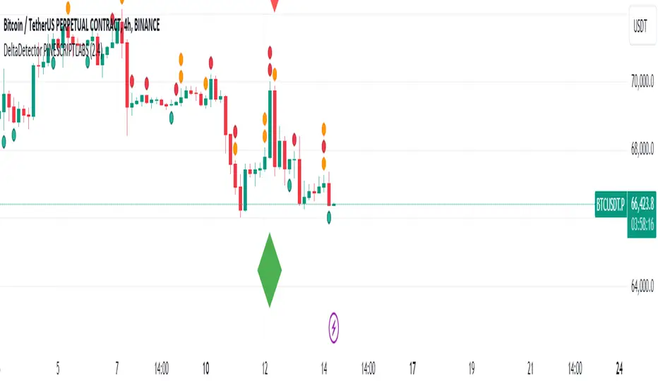
DeltaDetector PINESCRIPTLABSDescription:
This technical indicator, DeltaDetector PINESCRIPTLABS, is designed to identify significant changes in the price of an asset relative to the previous close. Users can customize the percentage change they want to monitor.
Usage Instructions:
Adjust the desired percentage change using the "Price Change Value (%)" user input.
Observe the green diamonds to identify significant price increases above the specified percentage.
Observe the red diamonds to identify significant price decreases below the specified percentage.
"In the following image, we observe a 4-hour timeframe for EURUSD, where we set a candle change percentage of 0.45%. We can see how the price reacts afterwards to the size of these candles."
"In the pair BTCUSDT.P, we designated a single candle change percentage of 3%, and observed how the price reacted after that candle."
This allows you to easily identify significant price movements within the range specified by the percentage change you have set.
Español:
Descripción:
Este indicador técnico, DeltaDetector PINESCRIPTLABS, está diseñado para identificar cambios significativos en el precio de un activo en relación con el cierre anterior. Los usuarios pueden personalizar el porcentaje de cambio que desean monitorear.
Instrucciones de uso:
Ajuste el porcentaje de cambio deseado utilizando la entrada de usuario "Price Change Value (%)".
Observe los diamantes verdes para identificar aumentos significativos en el precio por encima del porcentaje especificado.
Observe los diamantes rojos para identificar disminuciones significativas en el precio por debajo del porcentaje especificado.
"En la siguiente imagen, observamos un marco de tiempo de 4 horas para EURUSD, donde establecimos un porcentaje de cambio de vela del 0,45%. Podemos ver cómo reacciona el precio después al tamaño de estas velas."
"En el par BTCUSDT.P, designamos un porcentaje de cambio de vela único del 3%, y observamos cómo reaccionó el precio después de esa vela."
Esto te permite identificar fácilmente movimientos significativos en el precio dentro del rango especificado por el porcentaje de cambio que has establecido.
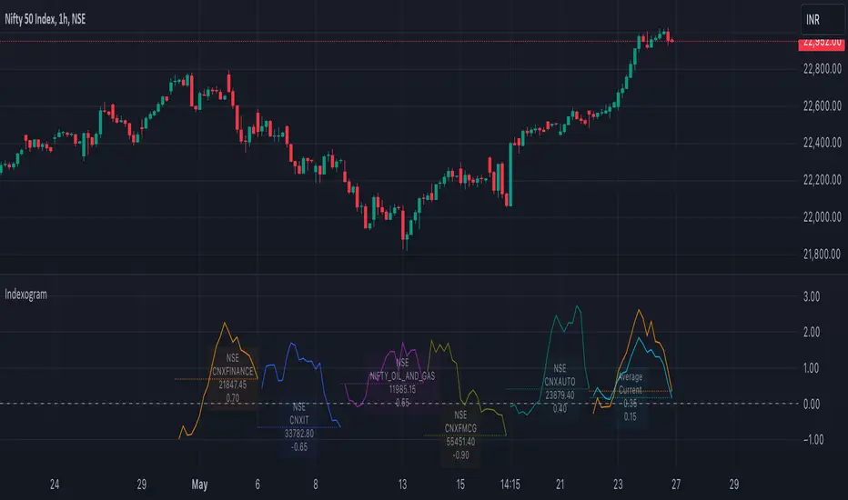
IndexogramIndexogram is a platform designed to help traders analyze the Commitment of Traders (COT) report data. It specifically focuses on the Rate Of Change (ROC) of the COT data, visualized using a unique polyline plotting technique.
Commitments of Traders % Rate Of Change (%ROC):
The COT %ROC indicates the momentum of trader positions over a specified period. This measure is crucial for understanding shifts in market sentiment and potential future price movements.
Unique Polyline Plotting Technique:
Unlike traditional line or bar charts, the polyline plotting technique used in Indexogram offers a more nuanced and detailed view of the %ROC data.
Multiple Ticker Monitoring:
Indexogram allows the setup of up to five different tickers. Traders can assign different weightages to these tickers, enabling a customized and weighted view of their %ROC data. This feature is beneficial for tracking a diversified portfolio or comparing different assets.
Average ROI Plot:
An additional feature is the Average ROI plot, which provides the average return on investment (ROI) of the five selected tickers. This plot helps traders quickly assess the overall performance of their monitored assets.
Strategy for Traders
Diversified Monitoring:
By setting up five different tickers with varying weightages, traders can diversify their monitoring efforts across different assets or markets. This diversification helps in reducing risk and identifying opportunities in different sectors or asset classes.
Weightage Customization:
Assign weightages based on market conditions or personal trading strategy. For example, if a trader believes that commodities are likely to outperform equities in the near term, they can assign a higher weightage to commodities-related tickers.
Analyzing %ROC Trends:
Use the polyline plots to identify significant %ROC trends. A rising %ROC might indicate increasing momentum and a potential buying opportunity, while a falling %ROC could signal decreasing momentum and a potential selling opportunity.
Average ROI Analysis:
Use the Average ROI plot to gauge the overall performance of the selected assets. If the average ROI is positive and trending upwards, it indicates a generally favorable market condition for the monitored assets.
Tactical Adjustments:
Regularly review and adjust the selected tickers and their weightages based on changing market conditions, news, and personal insights. This flexibility allows traders to adapt their strategy in response to new information.
Important Notes:
Indexogram is a tool to identify potential tradings, not a guaranteed predictor of future price movements.
Trend, Momentum, Volume Delta Ratings Emoji RatingsThis indicator provides a visual summary of three key market conditions - Trend, Momentum, and Volume Delta - to help traders quickly assess the current state of the market. The goal is to offer a concise, at-a-glance view of these important technical factors.
Trend (HMA): The indicator uses a Hull Moving Average (HMA) to assess the overall trend direction. If the current price is above the HMA, the trend is considered "Good" or bullish (represented by a 😀 emoji). If the price is below the HMA, the trend is "Bad" or bearish (🤮). If the price is equal to the HMA, the trend is considered "Neutral" (😐).
Momentum (ROC): The Rate of Change (ROC) is used to measure the momentum of the market. A positive ROC indicates "Good" or bullish momentum (😀), a negative ROC indicates "Bad" or bearish momentum (🤮), and a zero ROC is considered "Neutral" (😐).
Volume Delta: The indicator calculates the difference between the current trading volume and a simple moving average of the volume (Volume Delta). If the Volume Delta is above a user-defined threshold, it is considered "Good" or bullish (😀). If the Volume Delta is below the negative of the threshold, it is "Bad" or bearish (🤮). Values within the threshold are considered "Neutral" (😐).
The indicator displays these three ratings in a compact table format in the top-right corner of the chart. The table uses color-coding to quickly convey the overall market conditions - green for "Good", red for "Bad", and gray for "Neutral".
This indicator can be useful for traders who want a concise, at-a-glance view of the current market trend, momentum, and volume activity. By combining these three technical factors, traders can get a more well-rounded understanding of the market conditions and potentially identify opportunities or areas of concern more easily.
The user can customize the indicator by adjusting the lengths of the HMA, ROC, and Volume moving average, as well as the Volume Delta threshold. The colors used in the table can also be customized to suit the trader's preferences.

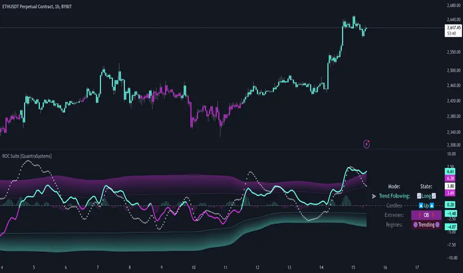
Rate of Change Suite [QuantraSystems]Rate of Change Suite
Introduction
The "Rate of Change Suite" (𝓡𝓸𝓒 𝓢𝓾𝓲𝓽𝓮) refines traditional RoC concepts by incorporating additional elements that provide more nuanced views of market trends, potential reversions, and momentum shifts.
Its main benefits are that it allows traders to detect momentum changes and frontrun trend shifts.
The suite is designed to be highly adaptable, catering to various trading styles, timeframes and market conditions. It is comprised of 3 metrics:
The RoC base line plots the rate of change, the Signal Histogram to confirm trends, and the Signal Confirmation Oscillator to inform reversal probabilities. For the early detection of trend shifts, the 𝓡𝓸𝓒 𝓢𝓾𝓲𝓽𝓮 is a comprehensive tool for the toolkit of modern traders.
A core component of the 𝓡𝓸𝓒 𝓢𝓾𝓲𝓽𝓮 is the ability to apply its processing techniques to any other indicator found on TradingView - essentially leveraging the signal power of existing analysis methods. This is achieved by modifying the ‘Source’ input.
Legend
𝓡𝓸𝓒 base line: The primary component of the suite, the RoC Line, offers a direct view of market momentum. An upward trending RoC line informs the potential for a long position, while a downward trend might signal the opportunity for a short position. Both include a secondary confirmation by the color change of the line itself. The Heikin Ashi transformed version of the RoC line provides greater resistance to rapid movements, or outliers.
Signal Histogram: This feature works in tandem with the base RoC Line, providing an additional third confirmation of trends. A rising histogram supports the presence of an upward trend. Conversely, a declining histogram aligns with downward trends.
Signal Confirmation Oscillator: This dotted-line is crucial for detecting peaks or troughs in market momentum: These can precede reversals or shifts in the prevailing trend. Traders can use this signal to anticipate and prepare for potential changes quicker than others.
Case Study
Primarily a tool to follow trends, the 𝓡𝓸𝓒 𝓢𝓾𝓲𝓽𝓮 implies much more – you can trade with a confirmed trend signal entry and a mean reversion signal for the exit:
Here we see two practical cases of the 𝓡𝓸𝓒 𝓢𝓾𝓲𝓽𝓮 on the 1h BTC chart.
In the first scenario, the trader waits for three confirmations from the indicator.
The 𝓡𝓸𝓒 baseline to lead the run and looks for confirmation two and three:
𝓡𝓸𝓒 base line color shifts
and the Signal Histogram follows past the null midline.
The trader has adjusted their risk beforehand and enters the long position.
The 𝓡𝓸𝓒 𝓢𝓾𝓲𝓽𝓮 shows traders when to take profit:
The Signal Confirmation Oscillator (SCO, dotted line) moves beyond the 𝓡𝓸𝓒 baseline and the Signal Histogram. The trader can take 50% of the profit already.
The trader waits patiently, and if the SCO reverses, the rest of the position is closed.
The same works inversely for the second trade, which successfully frontran the decline shortly after.
Recommended Settings
Day Trading (1H chart)
Length: 30
Smooth Length: 10
Display Variant: Classic
Choose Mode: Trend Following
Investing – Follow Trend (1D chart)
Default settings
Notes
Quantra Standard Value Contents:
The Heikin-Ashi (HA) candle visualization smoothes out the signal line to provide more informative insights into momentum and trends. This allows earlier entries and exits by observing the indicator values transformed by the HA.
Various visualization options are available to adjust the indicator to the user’s preference: Aside from HA, a classic line, or a hybrid of both.
A special feature of Quantra’s indicators is that they are probabilistically built - therefore they work well as confluence and can easily be stacked to increase signal accuracy.
To add to Quantra's indicators’ utility we have added the option to change the price bars’ colors based on different signals:
Choose Mode for Coloring
Trend Following (Indicator above mid line counts as uptrend, below is downtrend)
Extremes (Everything beyond the SD bands is highlighted to signal mean reversion)
Candles (Color of HA candles as barcolor)
Reversions (Only for HA) (Reversion Signals via the triangles if HA candles change trend while beyond the SD bands, high probability entries/exits)
Divergence Sensitivity: Quantra’s 𝓡𝓸𝓒 𝓢𝓾𝓲𝓽𝓮 is finely tuned to detect divergences, a key feature for identifying possible trend reversals.
Trend Following and Reversions: Primarily a tool for trend following, the 𝓡𝓸𝓒 𝓢𝓾𝓲𝓽𝓮 is also adept at spotting potential reversions and slowdowns in momentum.
Range Trading Compatibility: In its Heikin Ashi Candles mode, the suite becomes particularly effective for range trading strategies.
High Customizability: Traders can customize the suite with various visualization options, including classic line representation, HA transformation, and bar coloring. These can be based on Heikin Ashi Candles or Trend Following approaches, providing flexibility to adapt to different trading scenarios.
Methodology
The 𝓡𝓸𝓒 𝓢𝓾𝓲𝓽𝓮 is built on a foundation of functions that define and calculate the Rate of Change. They employ a variety of moving average types (SMA, EMA, DEMA, TEMA, WMA, etc.) which can be selected to optimize the RoC line.
A bespoke function to calculate Heikin-Ashi values is engineered to offer a more consistent view of the trend.
The Signal Histogram is derived by mathematically processing the base RoC signal. The Signal Confirmation Oscillator is based on a modified formula, adjusted to align with the RoC dynamics.
With a range of customization options for its visual presentation, including color schemes and display styles, the 𝓡𝓸𝓒 𝓢𝓾𝓲𝓽𝓮 is designed to cater to both trend following indications as well as finding signals for mean reversion trades. This multifaceted approach enables the 𝓡𝓸𝓒 𝓢𝓾𝓲𝓽𝓮 to allow the trader to combine signals of both types to de-risk his positions.