Pullback Levels from ATH# ATH Pullback Levels
**Assess correction depth with precision – 5%, 10%, 15%, 20% below All-Time High**
---
### Overview
This indicator draws **horizontal support lines** at **5%, 10%, 15%, and 20%** below the **All-Time High (ATH)** of any asset. Perfect for **swing traders**, **long-term investors**, and **bull market participants** who want to:
- Measure **pullback depth** in real-time
- Identify **potential support zones**
- Set **alerts** when price enters key retracement levels
---
### Features
| Feature | Description |
|--------|-------------|
| **Dynamic ATH Tracking** | Automatically updates with every new high |
| **4 Pullback Levels** | 5%, 10%, 15%, 20% below ATH |
| **Live Pullback % Label** | Shows current % drop from ATH (top-right) |
| **Customizable Lines** | Toggle visibility, change colors & styles |
| **Built-in Alerts** | Trigger on entry into each zone |
| **No Errors** | Works on 50k+ bar charts (BTC, SPX, etc.) |
| **Time-Based Lines** | Uses `xloc.bar_time` – no 500-bar future limit |
---
### How to Use
1. Apply to any chart (stocks, crypto, forex, indices)
2. Watch the **info box** for current pullback %
3. Use lines as **potential buy zones** during corrections
4. Set **alerts** to be notified when price enters a level
> Example: If ATH = $100 →
> - 5% = $95
> - 10% = $90
> - 15% = $85
> - 20% = $80
---
### Inputs
- **Show 5% / 10% / 15% / 20% Level** → Toggle on/off
- **Line Colors** → Fully customizable
- **Line Style** → Solid, Dashed, or Dotted
---
### Alerts
Create alerts directly from the indicator:
- `"Entered 5% Pullback"`
- `"Entered 10% Pullback"`
- etc.
---
### Best For
- Bull market corrections
- Long-term position sizing
- Risk management in uptrends
- Swing entries on dips
---
### Notes
- Works on **all timeframes**
- **Log scale compatible** (lines adjust correctly)
- No repainting – ATH only updates on confirmed highs
---
**Built with Pine Script v6 – Clean, fast, reliable.**
*Happy trading!*
Manajemen portofolio

Rolling Correlation vs Another Symbol (SPY Default)This indicator visualizes the rolling correlation between the current chart symbol and another selected asset, helping traders understand how closely the two move together over time.
It calculates the Pearson correlation coefficient over a user-defined period (default 22 bars) and plots it as a color-coded line:
• Green line → positive correlation (move in the same direction)
• Red line → negative correlation (move in opposite directions)
• A gray dashed line marks the zero level (no correlation).
The background highlights periods of strong relationship:
• Light green when correlation > +0.7 (strong positive)
• Light red when correlation < –0.7 (strong negative)
Use this tool to quickly spot diversification opportunities, confirm hedges, or understand how assets interact during different market regimes.

Forex Dynamic Lot Size CalculatorForex Dynamic Lot Size Calculator for Forex. Works on USD Base and USD Quote pairs. Provides real-time data based on stop-loss location. Allows you to know in real-time how the number of lots you need to purchase to match your risk %.
Number of Lots is calculated based on total risk. Total risk is calculated based on Stop-Loss + Commission + Spread Fees + Slippage measured in pips. Also includes data such as break-even pips, net take profit, margin required, buying power used, and a few others. All are real-time and anchored to the current price.
The intention of creating this indicator is to help with risk management. You know exactly how many lots you need to get this very moment to have your total risk at lets say $250, which includes commission fees, spread fees, and slippage.
To put it simply, if I was to enter the trade right now and willing to risk exactly $250, how many lots will I need to get right this second?
---
- To use adjust Account Settings along with other variables.
- Stop Loss Mode can be Manual or Dynamic. If you select Dynamic, then you will have to adjust Stop Loss Level to where you can see the reference line on the screen. It is at 1.1 by default. Just enter current price and the line will appear. Adjust it by dragging it to where you want your stop loss to be.
- Take Profit Mode can also be Manual or Dynamic. I just keep my TP at Manual and use Quick Access to set Quick RR levels.
- Adjust Spreads and Slippage to your liking. I tried to have TV calculate current spread, but it seem like it doesn't have access to real-life data for me like MT5 does. I just use average instead. Both are optional, depending on your broker and type of account you use.
- Pip Value for the current pair, Return on Margin, and Break-even line can be turned on and off, based on your needs. I just get the Break-even value in pips from the pannel and use that as reference where I need to relocate my stop loss to break-ever (commission + spreds + slippage).
- Panel is fully customizable based on your liking. Important fields are highlighted along with reference lines.

AlfaBitcoin Dashboard – Estrategia Combinada (Juan + Gael)Integrate the TradingView (TV) indicators with the sessions from October 16 and 21 (Gael Sánchez Smith and Juan Rodríguez). We can build an alert system or dashboard that combines what was discussed in both sessions with your custom indicators on TradingView.

Quantum Portfolio vs S&P 500 (Base: May 2, 2021)This script compares the performance of a custom Quantum Portfolio — a weighted basket of quantum computing, semiconductor, and cybersecurity stocks — against the S&P 500 Index, with both series rebased to 100 on May 2 2021.
It provides a clear, normalized view of cumulative returns, allowing you to visualize portfolio outperformance or underperformance relative to the broader market benchmark.

Quantum Portfolio vs NASDAQ (Base: May 2, 2021)This custom Pine Script indicator tracks and compares the cumulative performance of a multi-asset “Quantum Portfolio” against the NASDAQ 100 benchmark, rebased to a common starting point on May 2, 2021.
Both series are normalized to a base value of 100 on that date, allowing direct visual comparison of percentage growth or decline over time.

Market Screener - NarwingThis is a 20 cryptocurrency market screener, it's goal is to provide a broad view of the state of cryptocurrencies using 4 key components
1. ROC
2. Sharpe Ratio
3. Sortino Ratio
4. Omega Ratio
All these metrics are calculated twice with two different lengths, 7 day and 30 days
This allows for broad market screening instead of focusing on one particular asset
This tool is meant for research purposes only, never invest money you can't afford to lose

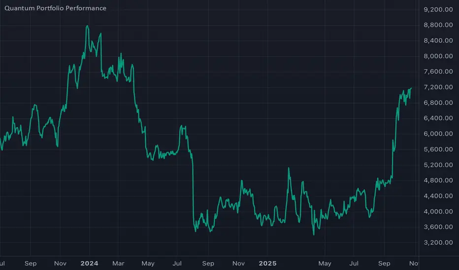
Thematic Portfolio: Quantum Computing & Core TechThis indicator tracks the aggregated performance of a curated thematic portfolio representing the Quantum Computing & Core Technology sector.
It combines leading equities and ETFs with predefined weights to reflect a diversified exposure across quantum hardware, AI infrastructure, and semiconductor backbones.
Composition:
Stocks: Rigetti (RGTI), IonQ (IONQ), D-Wave (QBTS), Palantir (PLTR), Intel (INTC), Arqit (ARQQ)
ETFs: BUG, QTUM, SOXX, IHAK
Methodology:
Each component’s normalized performance is weighted according to its strategic importance within the theme (R&D intensity, infrastructure leverage, and hardware dependence). The indicator dynamically aggregates the weighted series to visualize the cumulative return of the quantum computing ecosystem versus traditional benchmarks.
Intended use:
Compare thematic returns vs. S&P 500 or NASDAQ
Identify macro inflection points in the quantum tech narrative
Backtest thematic exposure strategies or structure twin-win / delta-one certificates
Note: This script is for analytical and educational purposes only and does not constitute financial advice.
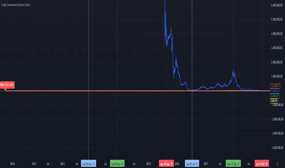
5-Year Returns Chart BTCvsSPXvsGOLDvsNVDACompare between thes 4 assets:
BTC
NVDA
SPX
GOLD
With an initial 1000$ investment in the last 5 years each return
ETD-A BELLEarly Trend Detection with Engulfing Pattern Recognitio n
This indicator is designed to identify early trading trend reversals by combining trend-based EMA analysis with candlestick pattern detection. It automatically plots up and down arrows on the chart to signal potential bullish or bearish shifts in market momentum.
A key feature of this tool is its Engulfing Pattern Detection, which highlights strong reversal zones confirmed by price action. When an engulfing pattern aligns with an EMA crossover or momentum change, the indicator provides an early alert helping traders anticipate potential entry or exit points before larger market moves occur.

J.P. Morgan Efficiente 5 IndexJ.P. MORGAN EFFICIENTE 5 INDEX REPLICATION
Walk into any retail trading forum and you'll find the same scene playing out thousands of times a day: traders huddled over their screens, drawing trendlines on candlestick charts, hunting for the perfect entry signal, convinced that the next RSI crossover will unlock the path to financial freedom. Meanwhile, in the towers of lower Manhattan and the City of London, portfolio managers are doing something entirely different. They're not drawing lines. They're not hunting patterns. They're building fortresses of diversification, wielding mathematical frameworks that have survived decades of market chaos, and most importantly, they're thinking in portfolios while retail thinks in positions.
This divide is not just philosophical. It's structural, mathematical, and ultimately, profitable. The uncomfortable truth that retail traders must confront is this: while you're obsessing over whether the 50-day moving average will cross the 200-day, institutional investors are solving quadratic optimization problems across thirteen asset classes, rebalancing monthly according to Markowitz's Nobel Prize-winning framework, and targeting precise volatility levels that allow them to sleep at night regardless of what the VIX does tomorrow. The game you're playing and the game they're playing share the same field, but the rules are entirely different.
The question, then, is not whether retail traders can access institutional strategies. The question is whether they're willing to fundamentally change how they think about markets. Are you ready to stop painting lines and start building portfolios?
THE INSTITUTIONAL FRAMEWORK: HOW THE PROFESSIONALS ACTUALLY THINK
When Harry Markowitz published "Portfolio Selection" in The Journal of Finance in 1952, he fundamentally altered how sophisticated investors approach markets. His insight was deceptively simple: returns alone mean nothing. Risk-adjusted returns mean everything. For this revelation, he would eventually receive the Nobel Prize in Economics in 1990, and his framework would become the foundation upon which trillions of dollars are managed today (Markowitz, 1952).
Modern Portfolio Theory, as it came to be known, introduced a revolutionary concept: through diversification across imperfectly correlated assets, an investor could reduce portfolio risk without sacrificing expected returns. This wasn't about finding the single best asset. It was about constructing the optimal combination of assets. The mathematics are elegant in their logic: if two assets don't move in perfect lockstep, combining them creates a portfolio whose volatility is lower than the weighted average of the individual volatilities. This "free lunch" of diversification became the bedrock of institutional investment management (Elton et al., 2014).
But here's where retail traders miss the point entirely: this isn't about having ten different stocks instead of one. It's about systematic, mathematically rigorous allocation across asset classes with fundamentally different risk drivers. When equity markets crash, high-quality government bonds often rally. When inflation surges, commodities may provide protection even as stocks and bonds both suffer. When emerging markets are in vogue, developed markets may lag. The professional investor doesn't predict which scenario will unfold. Instead, they position for all of them simultaneously, with weights determined not by gut feeling but by quantitative optimization.
This is what J.P. Morgan Asset Management embedded into their Efficiente Index series. These are not actively managed funds where a portfolio manager makes discretionary calls. They are rules-based, systematic strategies that execute the Markowitz framework in real-time, rebalancing monthly to maintain optimal risk-adjusted positioning across global equities, fixed income, commodities, and defensive assets (J.P. Morgan Asset Management, 2016).
THE EFFICIENTE 5 STRATEGY: DECONSTRUCTING INSTITUTIONAL METHODOLOGY
The Efficiente 5 Index, specifically, targets a 5% annualized volatility. Let that sink in for a moment. While retail traders routinely accept 20%, 30%, or even 50% annual volatility in pursuit of returns, institutional allocators have determined that 5% volatility provides an optimal balance between growth potential and capital preservation. This isn't timidity. It's mathematics. At higher volatility levels, the compounding drag from large drawdowns becomes mathematically punishing. A 50% loss requires a 100% gain just to break even. The institutional solution: constrain volatility at the portfolio level, allowing the power of compounding to work unimpeded (Damodaran, 2008).
The strategy operates across thirteen exchange-traded funds spanning five distinct asset classes: developed equity markets (SPY, IWM, EFA), fixed income across the risk spectrum (TLT, LQD, HYG), emerging markets (EEM, EMB), alternatives (IYR, GSG, GLD), and defensive positioning (TIP, BIL). These aren't arbitrary choices. Each ETF represents a distinct factor exposure, and together they provide access to the primary drivers of global asset returns (Fama and French, 1993).
The methodology, as detailed in replication research by Jungle Rock (2025), follows a precise monthly cadence. At the end of each month, the strategy recalculates expected returns and volatilities for all thirteen assets using a 126-day rolling window. This six-month lookback balances responsiveness to changing market conditions against the noise of short-term fluctuations. The optimization engine then solves for the portfolio weights that maximize expected return subject to the 5% volatility target, with additional constraints to prevent excessive concentration.
These constraints are critical and reveal institutional wisdom that retail traders typically ignore. No single ETF can exceed 20% of the portfolio, except for TIP and BIL which can reach 50% given their defensive nature. At the asset class level, developed equities are capped at 50%, bonds at 50%, emerging markets at 25%, and alternatives at 25%. These aren't arbitrary limits. They're guardrails preventing the optimization from becoming too aggressive during periods when recent performance might suggest concentrating heavily in a single area that's been hot (Jorion, 1992).
After optimization, there's one final step that appears almost trivial but carries profound implications: weights are rounded to the nearest 5%. In a world of fractional shares and algorithmic execution, why round to 5%? The answer reveals institutional practicality over mathematical purity. A portfolio weight of 13.7% and 15.0% are functionally similar in their risk contribution, but the latter is vastly easier to communicate, to monitor, and to execute at scale. When you're managing billions, parsimony matters.
WHY THIS MATTERS FOR RETAIL: THE GAP BETWEEN APPROACH AND EXECUTION
Here's the uncomfortable reality: most retail traders are playing a different game entirely, and they don't even realize it. When a retail trader says "I'm bullish on tech," they buy QQQ and that's their entire technology exposure. When they say "I need some diversification," they buy ten different stocks, often in correlated sectors. This isn't diversification in the Markowitzian sense. It's concentration with extra steps.
The institutional approach represented by the Efficiente 5 is fundamentally different in several ways. First, it's systematic. Emotions don't drive the allocation. The mathematics do. When equities have rallied hard and now represent 55% of the portfolio despite a 50% cap, the system sells equities and buys bonds or alternatives, regardless of how bullish the headlines feel. This forced contrarianism is what retail traders know they should do but rarely execute (Kahneman and Tversky, 1979).
Second, it's forward-looking in its inputs but backward-looking in its process. The strategy doesn't try to predict the next crisis or the next boom. It simply measures what volatility and returns have been recently, assumes the immediate future resembles the immediate past more than it resembles some forecast, and positions accordingly. This humility regarding prediction is perhaps the most institutional characteristic of all.
Third, and most critically, it treats the portfolio as a single organism. Retail traders typically view their holdings as separate positions, each requiring individual management. The institutional approach recognizes that what matters is not whether Position A made money, but whether the portfolio as a whole achieved its risk-adjusted return target. A position can lose money and still be a valuable contributor if it reduced portfolio volatility or provided diversification during stress periods.
THE MATHEMATICAL FOUNDATION: MEAN-VARIANCE OPTIMIZATION IN PRACTICE
At its core, the Efficiente 5 strategy solves a constrained optimization problem each month. In technical terms, this is a quadratic programming problem: maximize expected portfolio return subject to a volatility constraint and position limits. The objective function is straightforward: maximize the weighted sum of expected returns. The constraint is that the weighted sum of variances and covariances must not exceed the volatility target squared (Markowitz, 1959).
The challenge, and this is crucial for understanding the Pine Script implementation, is that solving this problem properly requires calculating a covariance matrix. This 13x13 matrix captures not just the volatility of each asset but the correlation between every pair of assets. Two assets might each have 15% volatility, but if they're negatively correlated, combining them reduces portfolio risk. If they're positively correlated, it doesn't. The covariance matrix encodes these relationships.
True mean-variance optimization requires matrix algebra and quadratic programming solvers. Pine Script, by design, lacks these capabilities. The language doesn't support matrix operations, and certainly doesn't include a QP solver. This creates a fundamental challenge: how do you implement an institutional strategy in a language not designed for institutional mathematics?
The solution implemented here uses a pragmatic approximation. Instead of solving the full covariance problem, the indicator calculates a Sharpe-like ratio for each asset (return divided by volatility) and uses these ratios to determine initial weights. It then applies the individual and asset-class constraints, renormalizes, and produces the final portfolio. This isn't mathematically equivalent to true mean-variance optimization, but it captures the essential spirit: weight assets according to their risk-adjusted return potential, subject to diversification constraints.
For retail implementation, this approximation is likely sufficient. The difference between a theoretically optimal portfolio and a very good approximation is typically modest, and the discipline of systematic rebalancing across asset classes matters far more than the precise weights. Perfect is the enemy of good, and a good approximation executed consistently will outperform a perfect solution that never gets implemented (Arnott et al., 2013).
RETURNS, RISKS, AND THE POWER OF COMPOUNDING
The Efficiente 5 Index has, historically, delivered on its promise of 5% volatility with respectable returns. While past performance never guarantees future results, the framework reveals why low-volatility strategies can be surprisingly powerful. Consider two portfolios: Portfolio A averages 12% returns with 20% volatility, while Portfolio B averages 8% returns with 5% volatility. Which performs better over time?
The arithmetic return favors Portfolio A, but compound returns tell a different story. Portfolio A will experience occasional 20-30% drawdowns. Portfolio B rarely draws down more than 10%. Over a twenty-year horizon, the geometric return (what you actually experience) for Portfolio B may match or exceed Portfolio A, simply because it never gives back massive gains. This is the power of volatility management that retail traders chronically underestimate (Bernstein, 1996).
Moreover, low volatility enables behavioral advantages. When your portfolio draws down 35%, as it might with a high-volatility approach, the psychological pressure to sell at the worst possible time becomes overwhelming. When your maximum drawdown is 12%, as might occur with the Efficiente 5 approach, staying the course is far easier. Behavioral finance research has consistently shown that investor returns lag fund returns primarily due to poor timing decisions driven by emotional responses to volatility (Dalbar, 2020).
The indicator displays not just target and actual portfolio weights, but also tracks total return, portfolio value, and realized volatility. This isn't just data. It's feedback. Retail traders can see, in real-time, whether their actual portfolio volatility matches their target, whether their risk-adjusted returns are improving, and whether their allocation discipline is holding. This transparency transforms abstract concepts into concrete metrics.
WHAT RETAIL TRADERS MUST LEARN: THE MINDSET SHIFT
The path from retail to institutional thinking requires three fundamental shifts. First, stop thinking in positions and start thinking in portfolios. Your question should never be "Should I buy this stock?" but rather "How does this position change my portfolio's expected return and volatility?" If you can't answer that question quantitatively, you're not ready to make the trade.
Second, embrace systematic rebalancing even when it feels wrong. Perhaps especially when it feels wrong. The Efficiente 5 strategy rebalances monthly regardless of market conditions. If equities have surged and now exceed their target weight, the strategy sells equities and buys bonds or alternatives. Every retail trader knows this is what you "should" do, but almost none actually do it. The institutional edge isn't in having better information. It's in having better discipline (Swensen, 2009).
Third, accept that volatility is not your friend. The retail mythology that "higher risk equals higher returns" is true on average across assets, but it's not true for implementation. A 15% return with 30% volatility will compound more slowly than a 12% return with 10% volatility due to the mathematics of return distributions. Institutions figured this out decades ago. Retail is still learning.
The Efficiente 5 replication indicator provides a bridge. It won't solve the problem of prediction no indicator can. But it solves the problem of allocation, which is arguably more important. By implementing institutional methodology in an accessible format, it allows retail traders to see what professional portfolio construction actually looks like, not in theory but in executable code. The the colorful lines that retail traders love to draw, don't disappear. They simply become less central to the process. The portfolio becomes central instead.
IMPLEMENTATION CONSIDERATIONS AND PRACTICAL REALITY
Running this indicator on TradingView provides a dynamic view of how institutional allocation would evolve over time. The labels on each asset class line show current weights, updated continuously as prices change and rebalancing occurs. The dashboard displays the full allocation across all thirteen ETFs, showing both target weights (what the optimization suggests) and actual weights (what the portfolio currently holds after price movements).
Several key insights emerge from watching this process unfold. First, the strategy is not static. Weights change monthly as the optimization recalibrates to recent volatility and returns. What worked last month may not be optimal this month. Second, the strategy is not market-timing. It doesn't try to predict whether stocks will rise or fall. It simply measures recent behavior and positions accordingly. If volatility has risen, the strategy shifts toward defensive assets. If correlations have changed, the diversification benefits adjust.
Third, and perhaps most importantly for retail traders, the strategy demonstrates that sophistication and complexity are not synonyms. The Efficiente 5 methodology is sophisticated in its framework but simple in its execution. There are no exotic derivatives, no complex market-timing rules, no predictions of future scenarios. Just systematic optimization, monthly rebalancing, and discipline. This simplicity is a feature, not a bug.
The indicator also highlights limitations that retail traders must understand. The Pine Script implementation uses an approximation of true mean-variance optimization, as discussed earlier. Transaction costs are not modeled. Slippage is ignored. Tax implications are not considered. These simplifications mean the indicator is educational and analytical, not a fully operational trading system. For actual implementation, traders would need to account for these real-world factors.
Moreover, the strategy requires access to all thirteen ETFs and sufficient capital to hold meaningful positions in each. With 5% as the rounding increment, practical implementation probably requires at least $10,000 to avoid having positions that are too small to matter. The strategy is also explicitly designed for a 5% volatility target, which may be too conservative for younger investors with long time horizons or too aggressive for retirees living off their portfolio. The framework is adaptable, but adaptation requires understanding the trade-offs.
CAN RETAIL TRULY COMPETE WITH INSTITUTIONS?
The honest answer is nuanced. Retail traders will never have the same resources as institutions. They won't have Bloomberg terminals, proprietary research, or armies of analysts. But in portfolio construction, the resource gap matters less than the mindset gap. The mathematics of Markowitz are available to everyone. ETFs provide liquid, low-cost access to institutional-quality building blocks. Computing power is essentially free. The barriers are not technological or financial. They're conceptual.
If a retail trader understands why portfolios matter more than positions, why systematic discipline beats discretionary emotion, and why volatility management enables compounding, they can build portfolios that rival institutional allocation in their elegance and effectiveness. Not in their scale, not in their execution costs, but in their conceptual soundness. The Efficiente 5 framework proves this is possible.
What retail traders must recognize is that competing with institutions doesn't mean day-trading better than their algorithms. It means portfolio-building better than their average client. And that's achievable because most institutional clients, despite having access to the best managers, still make emotional decisions, chase performance, and abandon strategies at the worst possible times. The retail edge isn't in outsmarting professionals. It's in out-disciplining amateurs who happen to have more money.
The J.P. Morgan Efficiente 5 Index Replication indicator serves as both a tool and a teacher. As a tool, it provides a systematic framework for multi-asset allocation based on proven institutional methodology. As a teacher, it demonstrates daily what portfolio thinking actually looks like in practice. The colorful lines remain on the chart, but they're no longer the focus. The portfolio is the focus. The risk-adjusted return is the focus. The systematic discipline is the focus.
Stop painting lines. Start building portfolios. The institutions have been doing it for seventy years. It's time retail caught up.
REFERENCES
Arnott, R. D., Hsu, J., & Moore, P. (2013). Fundamental Indexation. Financial Analysts Journal, 61(2), 83-99.
Bernstein, W. J. (1996). The Intelligent Asset Allocator. New York: McGraw-Hill.
Dalbar, Inc. (2020). Quantitative Analysis of Investor Behavior. Boston: Dalbar.
Damodaran, A. (2008). Strategic Risk Taking: A Framework for Risk Management. Upper Saddle River: Pearson Education.
Elton, E. J., Gruber, M. J., Brown, S. J., & Goetzmann, W. N. (2014). Modern Portfolio Theory and Investment Analysis (9th ed.). Hoboken: John Wiley & Sons.
Fama, E. F., & French, K. R. (1993). Common risk factors in the returns on stocks and bonds. Journal of Financial Economics, 33(1), 3-56.
Jorion, P. (1992). Portfolio optimization in practice. Financial Analysts Journal, 48(1), 68-74.
J.P. Morgan Asset Management. (2016). Guide to the Markets. New York: J.P. Morgan.
Jungle Rock. (2025). Institutional Asset Allocation meets the Efficient Frontier: Replicating the JPMorgan Efficiente 5 Strategy. Working Paper.
Kahneman, D., & Tversky, A. (1979). Prospect Theory: An Analysis of Decision under Risk. Econometrica, 47(2), 263-291.
Markowitz, H. (1952). Portfolio Selection. The Journal of Finance, 7(1), 77-91.
Markowitz, H. (1959). Portfolio Selection: Efficient Diversification of Investments. New York: John Wiley & Sons.
Swensen, D. F. (2009). Pioneering Portfolio Management: An Unconventional Approach to Institutional Investment. New York: Free Press.

Fixed Dollar Risk LinesFixed Dollar Risk Lines is a utility indicator that converts a user-defined dollar risk into price distance and plots risk lines above and below the current price for popular futures contracts. It helps you place stops or entries at a consistent dollar risk per trade, regardless of the market’s tick value or tick size.
What it does:
-You choose a dollar amount to risk (e.g., $100) and a futures contract (ES, NQ, GC, YM, RTY, PL, SI, CL, BTC).
The script automatically:
-Looks up the contract’s tick value and tick size
-Converts your dollar risk into number of ticks
-Converts ticks into price distance
Plots:
-Long Risk line below current price
-Short Risk line above current price
-Optional labels show exact price levels and an information table summarizes your settings.
Key features
-Consistent dollar risk across instruments
-Supports major futures contracts with built‑in tick values and sizes
-Toggle Long and Short risk lines independently
-Customizable line width and colors (lines and labels)
-Right‑axis price level display for quick reading
-Compact info table with contract, risk, and computed prices
Typical use
-Long setups: use the green line as a stop level below entry to match your chosen dollar risk.
-Short setups: use the red line as a stop level above entry to match your chosen dollar risk.
-Quickly compare how the same dollar risk translates to distance on different contracts.
Inputs
-Risk Amount (USD)
-Futures Contract (ES, NQ, GC, YM, RTY, PL, SI, CL, BTC)
-Show Long/Short lines (toggles)
-Line Width
-Colors for lines and labels
Notes
-Designed for futures symbols that match the listed contracts’ tick specs. If your symbol has different tick value/size than the defaults, results will differ.
-Intended for educational/informational use; not financial advice.
-This tool streamlines risk placement so you can focus on execution while keeping dollar risk consistent across markets.

Trading Lot & Margin Calculator
# 💹 Trading Lot & Margin Calculator - Professional Risk Management Tool
## 🎯 Overview
A comprehensive, all-in-one calculator dashboard that helps traders determine optimal position sizes, calculate margin requirements, and manage risk effectively across multiple asset classes. This indicator displays directly on your chart as a customizable table, providing real-time calculations based on current market prices.
## ✨ Key Features
### 📊 Three Powerful Calculation Modes:
**1. Calculate Lot Size (Risk-Based Position Sizing)**
- Input your risk percentage and stop loss in pips
- Automatically calculates the optimal lot size for your risk tolerance
- Respects margin limitations (configurable margin % cap)
- Ensures positions don't exceed minimum lot size (0.01)
- Perfect for risk management and proper position sizing
**2. Calculate Margin Cost**
- Input desired lot size
- See exactly how much margin is required
- Shows percentage of deposit used
- Displays free margin remaining
- Warns when insufficient funds
**3. Margin to Lots**
- Specify a fixed margin amount you want to use
- Calculator shows how many lots/contracts you can buy
- Ideal for traders with fixed margin budgets
## 🤖 Auto-Detection of Instruments
The calculator **automatically detects** what you're trading and adjusts calculations accordingly:
### ✅ Fully Supported:
- **💱 Forex Pairs** - All majors, minors, exotics (EURUSD, GBPJPY, etc.)
- Standard lot: 100,000 units
- JPY pairs: 0.01 pip size, others: 0.0001
- **🛢️ Commodities** - Gold, Silver, Oil
- XAUUSD (Gold): 100 oz per lot
- XAGUSD (Silver): 5,000 oz per lot
- Oil (WTI/Brent): 1,000 barrels per lot
- **📈 Indices** - US500, NAS100, US30, DAX, etc.
- Correct contract sizes per point
- **📊 Stocks** - All individual stocks
- 1 lot = 1 share
- Direct share calculations
### ⚠️ Known Limitation:
- **₿ Crypto calculations may not work properly** on all crypto pairs. Use manual contract size if needed.
## 📋 Dashboard Information Displayed:
- 🎯 Optimal/Requested Lot Size
- 💰 Margin Required
- 📊 Margin % of Deposit
- 💵 Free Margin Remaining
- 💎 Position Value
- 📈 Pip/Point Value
- ⚠️ Safety Warnings (insufficient funds, high risk, etc.)
- 🔍 Detected Instrument Type
- 📦 Contract Size
## ⚙️ Customizable Settings:
**Account Settings:**
- Account Deposit
- Leverage (1:1 to 1:1000)
- Max Margin % of Deposit (default 5% for safety)
**Risk Management:**
- Risk Percentage (for lot size calculation)
- Stop Loss in Pips
- Lot Amount (for margin cost calculation)
- Margin to Use (for margin-to-lots calculation)
**Display Options:**
- Show/Hide Dashboard
- Position: Top/Middle/Bottom, Left/Right
- Auto-detect instrument ON/OFF
- Manual contract size override
## 🎨 Professional Design
- Clean, modern table interface
- Color-coded warnings (red = danger, yellow = caution, green = safe)
- Large, readable text
- Minimal screen space usage
- Non-intrusive overlay
## 💡 Use Cases:
1. **Day Traders** - Quick position sizing based on account risk
2. **Swing Traders** - Calculate optimal positions for longer-term setups
3. **Risk Managers** - Ensure positions stay within margin limits
4. **Beginners** - Learn proper position sizing and risk management
5. **Multi-Asset Traders** - Seamlessly switch between forex, commodities, indices, and stocks
## ⚠️ Important Notes:
- ✅ Works on all timeframes
- ✅ Updates in real-time with price changes
- ✅ Minimum lot size enforced (0.01)
- ✅ Margin calculations use current chart price
- ⚠️ **Crypto calculations may be inaccurate** - verify with your broker
- 📌 Always verify calculations with your broker's specifications
- 📌 Contract sizes may vary by broker
## 🚀 How to Use:
1. Add indicator to any chart
2. Click settings ⚙️ icon
3. Enter your account details (deposit, leverage)
4. Choose calculation mode
5. Input your parameters
6. View optimal lot size and margin requirements on dashboard
## 📈 Perfect For:
- Forex traders managing multiple currency pairs
- Commodity traders (Gold, Silver, Oil)
- Index traders (S&P 500, NASDAQ, etc.)
- Stock traders
- Anyone who wants professional risk management
## 🛡️ Risk Management Features:
- Configurable margin % cap prevents over-leveraging
- Risk-based position sizing protects your account
- Warnings for high risk, insufficient funds, margin limitations
- Prevents positions below minimum lot size
---
**Trade smarter, not harder. Calculate before you trade!** 📊💪
---
## Version Notes:
- Pine Script v6
- Overlay mode for chart display
- No external dependencies
- Lightweight and fast
**Disclaimer:** This calculator is for educational and informational purposes only. Always verify calculations with your broker and trade at your own risk. Past performance does not guarantee future results.
---

Crypto Index Price# Crypto Index Price - Indicator Description
## 📊 What is this indicator?
**Crypto Index Price** is an indicator for creating your own cryptocurrency index based on an equal-weighted portfolio. It allows you to track the overall dynamics of the cryptocurrency market through a composite index of selected assets.
## 🎯 Key Features
- **Up to 20 assets in the index** — create an index from any trading pairs
- **Equal-weighted methodology** — each asset has the same weight in the index
- **Moving average** — optional trend filter for the index
- **Flexible visualization settings** — customizable colors and line thickness
## 📈 How to Use
The indicator is displayed in a separate pane below the chart and shows:
1. **Blue line** — crypto index value
2. **Orange line** (optional) — moving average of the index
### Trading Applications:
- **Identify overall market trend** — if the index is rising, most coins are in an uptrend
- **Divergences** — divergence between your asset and the index may signal local opportunities
- **Signal confirmation** — use the index to confirm trading decisions on individual coins
- **Market condition filter** — trade longs when index is above MA, shorts when below
## ⚙️ Settings
### Assets (Symbols)
- **Asset 1-10** — main cryptocurrencies (default: BTC, ETH, BNB, SOL, XRP, ADA, AVAX, LINK, DOGE, TRX)
- **Asset 11-20** — additional slots for index expansion
### Visual Parameters
- **Index line color** — main line color (default: blue)
- **Line width** — from 1 to 5 pixels
- **Show moving average** — enable/disable MA
- **MA period** — moving average calculation period (default: 20)
- **MA color** — moving average line color (default: orange)
## 💡 Recommendations
- For a top coins index, use 5-10 largest cryptocurrencies by market cap
- For an altcoin index, add medium and small coins from your sector
- Use MA to filter false signals and identify the global trend
- Compare individual asset behavior with the index to find anomalies
## ⚠️ Important
The indicator uses equal-weighted methodology — each coin contributes equally regardless of price or market cap. This differs from cap-weighted indices and may provide a different market perspective.
---
*This indicator is intended for analysis and is not trading advice. Always conduct your own analysis before making trading decisions.*
---

Stock Fundamental Overlay [DarwinDarma]Stock Fundamental Overlay
Stock Fundamental Overlay is a comprehensive valuation indicator that displays multiple fundamental analysis metrics directly on your price chart.
Key Features:
• Graham Number - Benjamin Graham's intrinsic value formula
• Book Value Per Share (BVPS) - Net asset value baseline
• DCF Valuation - Discounted Cash Flow analysis (non-financial stocks)
• DDM Valuation - Dividend Discount Model (dividend-paying stocks)
• Visual Value Zones - Color-coded undervalued/overvalued regions
• Real-time Fundamental Table - Live metrics and valuations
• Price vs Graham Comparison - Quick valuation assessment
• Built-in Alerts - Notification when price crosses key levels
Valuation Models:
• Graham Number: √(22.5 × EPS × BVPS)
• DCF: Customizable discount rate, growth rate, and forecast period
• DDM: Gordon Growth Model for dividend analysis
Visual Elements:
• Plot lines for BVPS, Graham Number, and DCF values
• Shaded value zone between BVPS and Graham Number
• Background coloring: Deep value (below BVPS), Undervalued (below Graham), Overvalued (>1.5x Graham)
• Dynamic table showing all metrics with theme-aware text colors
Special Handling:
• Financial sector detection - DCF disabled for banks/financials where FCF metrics are distorted
• Automatic light/dark theme adaptation
• TTM (Trailing Twelve Months) data for current metrics
How to Use - Value Investing Approach:
1. Identifying Undervalued Stocks:
• Look for price trading BELOW the Graham Number (green zone) - potential value opportunity
• Deep value: Price below BVPS indicates trading below net asset value
• Check "Price vs Graham" % in table - negative values suggest undervaluation
• Compare multiple models: When price is below Graham, DCF, and BVPS simultaneously, stronger buy signal
2. Margin of Safety:
• Benjamin Graham recommended buying at 2/3 of intrinsic value (33% margin of safety)
• Monitor the gap between current price and valuation lines
• Larger gaps = greater margin of safety = lower downside risk
• Use the shaded "Value Zone" as your target buying range
3. Setting Alerts:
• "Price Below Graham Number" - Notifies when stock enters value territory
• "Price Below Book Value" - Extreme value alert for deep value hunters
• "Price Below DCF Value" - Cash flow-based value signal
• Set alerts on watchlist stocks to catch value opportunities
4. Customizing for Your Strategy:
• Conservative investors: Use lower growth rates (3-4%) and higher discount rates (12-15%)
• Growth-value investors: Adjust growth rate (6-8%) for quality compounders
• Dividend investors: Focus on DDM value and Div/Share metrics
• Adjust forecast years based on business predictability (stable = 10 years, cyclical = 5 years)
5. Red Flags to Avoid:
• Negative EPS or FCF (red values in table) - proceed with caution
• Financial sector stocks - Use DDM and Graham, ignore DCF
• Price far above Graham (>1.5x) with red background = overvalued territory
• No fundamental data = "N/A" in table - stock may lack reporting or be too small
• Stock persistently below BVPS for extended periods - potential value trap or business in distress
• Price significantly above ALL models (BVPS, Graham, DCF) - sentiment-driven, lacks intrinsic value foundation (fragile)
⚠️ Important Value Investing Warnings:
• Value Trap Alert: A stock staying below BVPS for months/years may signal fundamental deterioration, asset impairments, or dying industry - not just "cheap." Investigate WHY it's cheap before buying
• Sentiment Bubble Risk: When price trades far above BVPS, Graham Number, AND DCF simultaneously, the stock has no intrinsic value basis. Examples: commodity stocks during boom cycles (gold miners in gold rallies), meme stocks, hype-driven sectors. These are highly fragile and vulnerable to mean reversion
• Cyclical Trap: Commodity/cyclical stocks can appear "cheap" at peak earnings (low P/E, high FCF) but are actually expensive. Normalize earnings across the cycle before valuing
• Quality Matters: Some excellent businesses (asset-light, high ROIC) naturally trade above book value. Don't avoid quality - adjust expectations for business model
6. Monitoring Positions:
• Watch for price approaching or exceeding Graham Number - consider taking profits
• Track EPS and FCF trends quarter-to-quarter in the table
• If fundamentals deteriorate (falling BVPS, negative FCF), reassess thesis
• Use background colors for quick visual check: green = hold/buy, red = overvalued
Perfect for:
Value investors seeking multi-model fundamental analysis, long-term investors comparing intrinsic value to market price, dividend investors evaluating yield stocks, and fundamental traders looking for entry/exit signals.
Note: Only works with stocks that have financial data available. Not applicable to crypto, forex, or futures. This indicator provides analysis tools; always conduct thorough research and due diligence before investing.

Risk-On / Risk-Off Composite (Elliot) – Macro+Vol Upgrade v2drop-in upgrade of indicator that adds three optional macro components with adjustable weights:
Inverted VIX (risk-on when down → we use 100/VIX)
Inverted MOVE (bond vol; risk-on when down → we use 1/MOVE)
Inverted DXY (USD; risk-on when down → we use 1/DXY)

Risk-On / Risk-Off CompositeReal-time Risk-On / Risk-Off Composite from your four ratios:
SPY / TLT (equities vs long bonds)
HYG / LQD (high-yield vs IG credit)
HG / GOLD (copper vs gold)
BTC / GOLD (speculative vs defensive)
It:
normalizes each ratio with a z-score (so they’re comparable),
lets you weight them,
plots a composite line + histogram (up = risk-on, down = risk-off),
shows a small heat-table for each sub-signal,
and includes alert conditions for Risk-On / Risk-Off flips.

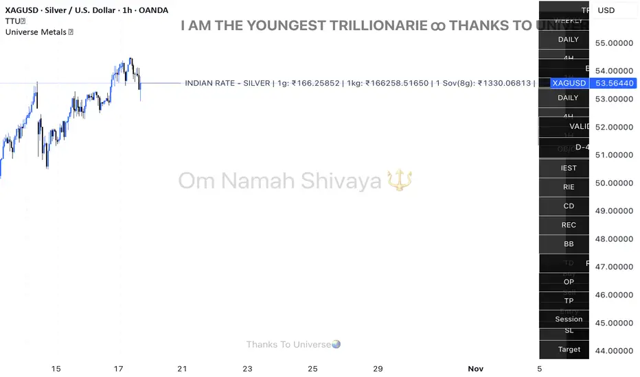
Universe Metals 🌏Live Indian rates for Gold & Silver — powered by Universe 🌏
Universe Metals 🌏 is a refined real-time tracker that brings Gold (XAU) and Silver (XAG) to life in Indian Rupees (₹) — combining precision, purpose, and a touch of gratitude.
Designed especially for MCX, COMEX, and international bullion traders, it automatically detects Gold or Silver charts and instantly converts live USD prices into Indian rates using the latest USDINR feed.
💎 For Gold: Displays 24K and 22K prices per gram and per sovereign (8g).
⚪ For Silver: Displays live 1 gram, 1 kilogram, and 1 sovereign equivalents.
Simple. Elegant. Minimal. Yet powerful — built for traders who value both clarity and meaning in their charts.
Features:
Auto-detects Gold & Silver charts (XAU / XAG / MCX)
Converts USD rates to INR in real time
Clean design with customizable toggles
CCT Gold Synthetic Market Cap🌎 Gold Synthetic Market Cap
Overview
The Gold Synthetic Market Cap indicator transforms the Gold Spot price (XAU/USD) into a synthetic market capitalization chart, allowing traders and analysts to visualize gold’s total estimated valuation as a global asset — similar to how cryptocurrencies are evaluated by total market cap.
This tool uses the current XAU/USD price multiplied by the total amount of gold ever mined (~210,000 metric tons), automatically converting the result into trillions of US dollars (USD T).
The outcome is a precise and dynamic representation of gold’s real-time market value — displayed as full OHLC candles in a separate chart panel.
🧠 Core Concept
Gold’s price per ounce doesn’t tell the full story of its global valuation.
By converting it to market capitalization, we can compare it to other asset classes such as:
Bitcoin’s total market cap (CRYPTOCAP:BTC)
Global equities and ETFs
Precious metals or commodities benchmarks
This indicator bridges the gap between price analysis and macro asset valuation, offering a quantitative visualization of gold’s total monetary footprint.
⚙️ Technical Mechanics
Base Symbol: OANDA:XAUUSD (or any gold pair available on your chart)
Conversion Constant:
210,000 tons × 32,150.7 oz/ton = 6.76 × 10⁹ ounces
Calculation:
MarketCap = (XAUUSD × total_ounces) / 1e12
Displayed Units: Trillions of USD (USD T)
Chart Type: Full OHLC candles (plotcandle)
Each candle represents the daily/weekly/monthly change in gold’s total market value.
🎛️ User Controls (Inputs)
Toggle Function
Show Average Line? Displays a 21-period SMA (in trillions) for trend-following analysis.
Show Info Table? Adds a small info table at the bottom-right corner showing the current market cap value.
Show Market Cap Label? Displays a live label above the last candle showing the latest market cap value.
Normalize Scale? Adjusts scaling for better visual fit. Leave enabled to avoid flat or off-screen candles.
📈 How to Use
1 - Add the indicator to your Gold Spot chart (XAUUSD).
2 - When added, TradingView automatically creates a separate panel below the main price chart.
3 - You can hide the original XAUUSD chart to focus solely on the synthetic market cap.
4 - Maximize the indicator panel (double-click or use the arrow icon) to view the synthetic market cap in full-screen mode.
Apply any drawing tools, trendlines, or visual overlays directly on this panel (they won’t affect the base chart).
Optionally, compare it side by side with Bitcoin Market Cap (CRYPTOCAP:BTC) for macro-level correlation studies.
🪙 Practical Applications
Compare Gold’s global valuation to Bitcoin, equities, or global M2 supply.
Analyze macro rotation trends between risk-off and risk-on assets.
Estimate how much capital is stored in physical gold versus digital assets.
Integrate into broader multi-asset dashboards for portfolio allocation analysis.
💡 Suggested Workflow
Keep the normalize toggle enabled (default).
Maximize the lower panel for a full synthetic chart view.
Combine this tool with the F!72 SuperTrade or MarketMonitor indicators for contextual macro insight.
Use a weekly or monthly timeframe for clearer long-term structure visualization.
📊 Notes
This indicator uses public XAU/USD pricing and does not require any external API.
Works seamlessly with any TradingView theme (light or dark).
Best viewed with logarithmic scale off, as values are already represented in trillions.
Compatible with all resolutions and broker feeds that support XAUUSD.
🔬 Example Interpretation
If Gold trades around $4,000/oz,
the total market cap is approximately:
4,000 × 32,150.7 × 210,000 ≈ 27 Trillion USD
If Gold rises to $5,000/oz,
the global valuation crosses 33.9 Trillion USD —
a move equivalent to adding the entire market cap of all major tech stocks combined.
🧭 Final Recommendation
This script is designed as an analytical overlay, not a trading signal tool.
It complements technical analysis by providing macro context — showing where gold stands as a global store of value in relation to other capital markets.
For best experience:
Use higher timeframes (1W or 1M)
Maximize the indicator panel
Keep Normalize Scale = ON
⚠️ Disclaimer
This indicator is a visualization and educational tool.
It does not provide financial advice or investment recommendations.
Always perform your own research before making financial decisions.
Author: Central Crypto Traders
Version: 1.0 (October 2025)
Type: Informational Overlay
License: Open for personal and educational use

Conviction Ratio | viResearchConviction Ratio | viResearch
Conceptual Foundation and Innovation
The Conviction Ratio by viResearch is a trend strength indicator designed to measure the conviction behind market movements by analyzing price returns over a defined period. It reflects how consistently and powerfully an asset has trended within that time window. The higher the ratio, the stronger and more confident the trend.
This approach provides a clear and intuitive way to gauge whether recent price action is supported by genuine momentum or merely short-term noise. By quantifying return intensity, the indicator helps traders identify assets that are trending with conviction versus those moving without sustained direction.
Technical Composition and Calculation
The Conviction Ratio evaluates an asset’s performance by comparing its current price level to past values over a customizable lookback period. It measures how much the market has advanced or declined, translating that movement into a normalized ratio that reflects overall trend conviction.
A rising ratio indicates strong and accelerating trend strength, while a falling or negative ratio suggests fading momentum or potential reversal. This dynamic view helps traders visually assess whether a trend is strengthening, weakening, or entering a transition phase.
Features and User Inputs
To accommodate different trading styles and timeframes, the indicator offers several adjustable settings:
Period (Days): Defines how far back the indicator measures return performance, allowing users to analyze short-term bursts or longer-term trends.
Start Date: Sets the beginning of the analysis window, useful for backtesting or focusing on a specific time period.
The Conviction Ratio line changes color dynamically to reflect market conviction:
Aqua: Positive ratio, indicating strong upward trend strength.
Pink: Negative ratio, signaling weak or declining market conviction.
Practical Applications
The Conviction Ratio can be applied across all asset classes — equities, cryptocurrencies, forex, and commodities — to identify where the strongest trends are forming. It’s particularly useful for:
Measuring Trend Strength: Quickly determine how strong or sustained a trend is within the chosen timeframe.
Identifying Momentum Shifts: Spot when market conviction is increasing or fading, signaling potential trend continuation or reversal.
Comparative Analysis: Compare multiple assets to find which ones are trending with greater conviction and consistency.
Advantages and Strategic Value
The Conviction Ratio offers a simple yet powerful way to quantify trend quality. Instead of relying on price direction alone, it evaluates the strength and persistence behind that movement. This makes it an ideal tool for trend followers, momentum traders, and portfolio managers seeking to align with assets showing genuine directional confidence.
Its normalized structure ensures consistency across different volatility environments, making it suitable for both discretionary and systematic trading strategies.
Visual Cues and Interpretation
The indicator plots a smooth, color-coded ratio line centered around zero, with key reference levels at +1.0 and –1.0.
Ratios above +1.0 indicate strong, confident uptrends.
Ratios below +1.0 suggest weakening or unstable market conditions.
Ratios below 0 represent unprofitable or negative-return periods.
Sharp declines in the ratio, even from high positive levels, can serve as early warning signals of weakening momentum or potential trend reversal.
By tracking both the level and the rate of change of the ratio, traders can detect when market conviction starts to fade — often before price itself shows clear reversal signs.
Summary and Usage Tips
The Conviction Ratio | viResearch provides traders with a clean, data-driven way to interpret market strength. By focusing on return-based trend conviction, it highlights where the market is moving with genuine confidence and warns when conviction begins to erode.
Use it to confirm breakout strength, identify fading rallies, or monitor early signs of trend exhaustion. The higher the ratio, the stronger the conviction — but when it starts falling sharply, take note. It might be your first signal that the trend is losing strength.
Note: Historical results are for reference only and do not guarantee future performance.

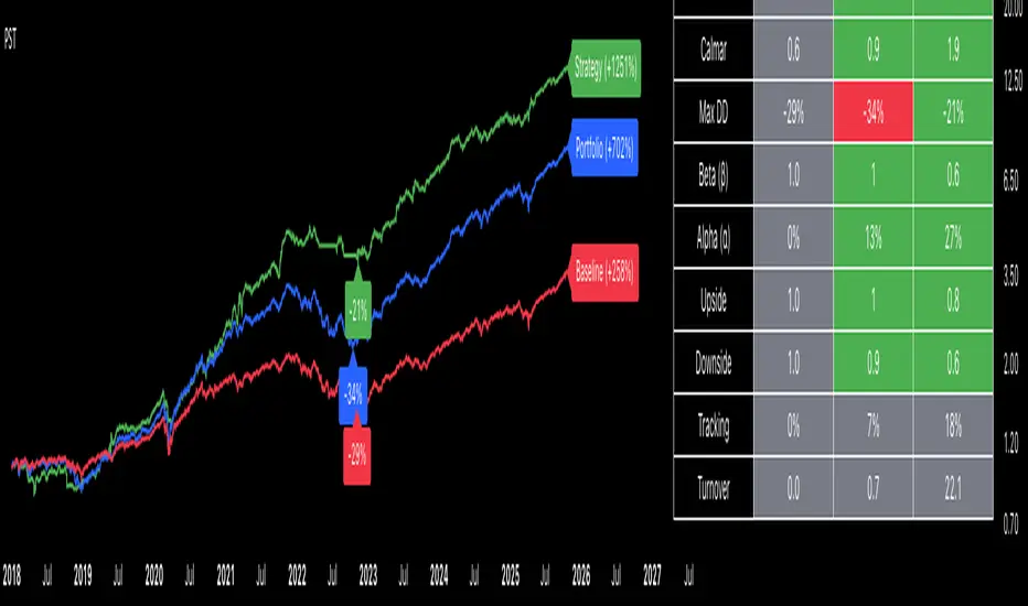
Portfolio Strategy TesterThe Portfolio Strategy Tester is an institutional-grade backtesting framework that evaluates the performance of trend-following strategies on multi-asset portfolios. It enables users to construct custom portfolios of up to 30 assets and apply moving average crossover strategies across individual holdings. The model features a clear, color-coded table that provides a side-by-side comparison between the buy-and-hold portfolio and the portfolio using the risk management strategy, offering a comprehensive assessment of both approaches relative to the benchmark.
Portfolios are constructed by entering each ticker symbol in the menu, assigning its respective weight, and reviewing the total sum of individual weights displayed at the top left of the table. For strategy selection, users can choose between Exponential Moving Average (EMA), Simple Moving Average (SMA), Wilder’s Moving Average (RMA), Weighted Moving Average (WMA), Moving Average Convergence Divergence (MACD), and Volume-Weighted Moving Average (VWMA). Moving average lengths are defined in the menu and apply only to strategy-enabled assets.
To accurately replicate real-world portfolio conditions, users can choose between daily, weekly, monthly, or quarterly rebalancing frequencies and decide whether cash is held or redistributed. Daily rebalancing maintains constant portfolio weights, while longer intervals allow natural drift. When cash positions are not allowed, capital from bearish assets is automatically redistributed proportionally among bullish assets, ensuring the portfolio remains fully invested at all times. The table displays a comprehensive set of widely used institutional-grade performance metrics:
CAGR = Compounded annual growth rate of returns.
Volatility = Annualized standard deviation of returns.
Sharpe = CAGR per unit of annualized standard deviation.
Sortino = CAGR per unit of annualized downside deviation.
Calmar = CAGR relative to maximum drawdown.
Max DD = Largest peak-to-trough decline in value.
Beta (β) = Sensitivity of returns relative to benchmark returns.
Alpha (α) = Excess annualized risk-adjusted returns relative to benchmark.
Upside = Ratio of average return to benchmark return on up days.
Downside = Ratio of average return to benchmark return on down days.
Tracking = Annualized standard deviation of returns versus benchmark.
Turnover = Average sum of absolute changes in weights per year.
Cumulative returns are displayed on each label as the total percentage gain from the selected start date, with green indicating positive returns and red indicating negative returns. In the table, baseline metrics serve as the benchmark reference and are always gray. For portfolio metrics, green indicates outperformance relative to the baseline, while red indicates underperformance relative to the baseline. For strategy metrics, green indicates outperformance relative to both the baseline and the portfolio, red indicates underperformance relative to both, and gray indicates underperformance relative to either the baseline or portfolio. Metrics such as Volatility, Tracking Error, and Turnover ratio are always displayed in gray as they serve as descriptive measures.
In summary, the Portfolio Strategy Tester is a comprehensive backtesting tool designed to help investors evaluate different trend-following strategies on custom portfolios. It enables real-world simulation of both active and passive investment approaches and provides a full set of standard institutional-grade performance metrics to support data-driven comparisons. While results are based on historical performance, the model serves as a powerful portfolio management and research framework for developing, validating, and refining systematic investment strategies.
Blick Trades Position Size CalculatorThe Blick Trades Position Size indicator is a comprehensive Position Size Calculator designed for futures traders on TradingView. It automatically detects the asset type (Gold, Nasdaq, or ES futures - both regular and micro contracts) and calculates the optimal number of contracts to trade based on your risk amount and stop loss price.
The indicator features a "Maximize Risk" option that intelligently switches between regular and micro contracts to get as close as possible to your target risk amount, plus support for limit orders with custom entry prices. It displays visual elements on the chart including entry and stop loss lines with live risk calculations, and uses an asset-specific display system so you can control which charts show the indicator (preventing parameter confusion when switching between different futures contracts).
The calculator handles all the complex math automatically - just input your risk amount and stop loss, and it tells you exactly how many contracts to trade while showing your precise dollar risk in real-time.

Ultimate Risk Management Toolkit [ T W K ] :Smart Levels is Smart Trades!
All Trading View users and Stock market Enthusiast, get charged with the all new ( never seen before ) " Ultimate Risk Management Toolkit ⚙📏⚙ " .
Inputs and Features:
1: Drag the Bar-Time vertical line to the desired Entry candle ( manually ) for R:R management and controlling emotional trading.
2: Target, Entry, and SL line style, Width input.
3: Manual specific level Entry and Stop-Loss, input option.
4: Three types of Auto / Manual ' R:R ' risk reward ratio, targets with proper Entry, Stop-Loss points, and Stop-Loss level.
5: Three types of Entry options to fix Emotional trading habit.
6: Trailing Stop-Loss input option ( can be utilize as profit locking/booking ).
It will give more Power to manage your trades with proper R:R ( Auto / manual ) ratio, defined Entry and controlled Stop-Loss Levels.
Compatible with All Devices (Laptop / Mobile / Tablet / PC).
✅ HOW TO GET ACCESS :
Add to favorite and enjoy the true Trading View's sprit of community growth, without any limitations.
If you like any of my Invite-Only indicators, kindly DM and let me know!
⚠ RISK DISCLAIMER :
All content provided by "@TradeWithKeshhav" is for informational & educational purposes only.
It does not constitute any financial advice or a solicitation to buy or sell any securities of any type. All investments / trading involve risks. Past performance does not guarantee future results / returns.
Regards :
Team @TradeWithKeshhav
Happy trading and investing!
